Gotta hand it to the FBI. Take their proposal of a completely custom system build that would circumvent various protections that are designed to keep people away from your information, and consider it on purely technical matters. It’s simple to explain to technical people, and it’s simple to explain to people that are not that well-versed in technology.
But consider this. There is no such thing as a safe-guarded backdoor. Do you really believe that once one government agency gets their hands on such a system build, it will only be used to help the “good guys”? If you are, I’d love to live in the fantasy world you’re inhabiting.
In the real world that the rest of us live in, this will be nothing short of a disaster. This custom build will get shared between various government agencies and branches, with an absolute guarantee of two things happening. First, it will get to an agency that is solely overseen by secret courts that rubberstamp pretty much every request. Second, it will get into the hands of general public, sooner rather than later – through social-engineered hacking or another Snowden-like act of political activism.
And then there’s another absolute guarantee. Let’s for a minute say that if you’re a law-abiding US citizen, then the US government is good guys. Then there are other governments who are our allies, which makes them good guys by proxy, and there are other governments which are our enemies which makes them bad guys.
What is going to stop other governments from demanding access to the same special system build? How many countries can a multi-national corporation withdraw their business from before it has no more places to do business in? How do you as a supporter of lawful information “extraction” decide on which laws you agree with and which step over “the line” that separates the good guys from the bad guys?
There’s not a single line in Tim Cook’s letter that is a gratuitous exaggeration of the dangers that lie ahead. I’ve spent the first twenty years of my life living in the communist USSR, where it was pretty safe to assume that the state had the capabilities and the means to do mass surveillance of anybody and everybody.
How does the self-aggrandizing beacon of democracy turn into the omnipresent surveillance state? Two ways. Gradually, then suddenly (in the mighty words of Ernest Hemingway). Just don’t tell your kids that you didn’t see it coming.
Two types of tech reporting / analysis out there.
The intellectually honest, hard working one where you look at publicly announced products (and maybe vaguely hinted future plans) and invest effort to make intelligent, thoughtful, researched predictions of how the different players in different interrelated markets will evolve in the next couple of years.
And then there’s “building your reputation” on top of some anonymous source inside the company that feeds you the actual plans and blueprints. The lazy kind where you’re just the conduit of plans and upcoming product announcements, always at the mercy of that source being continuously employed in that position of “close knowledge”. The kind that is disguised as “original content”, and is anything but.
Guess which one is more respectable even if you might make a mistake or two down the road. Play the long game.
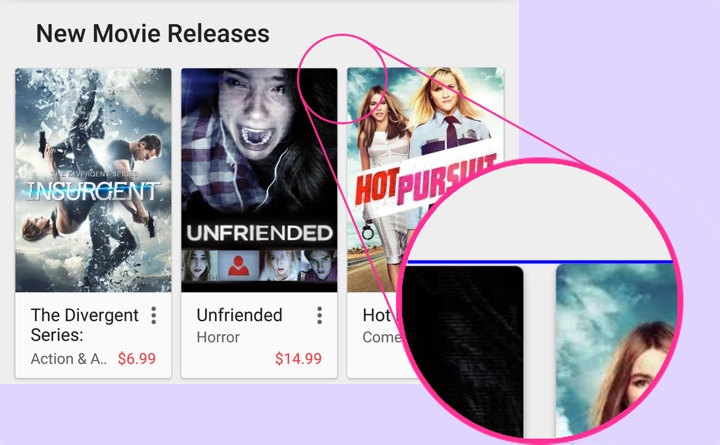
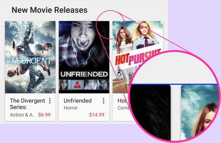
About a month ago I was tagged by Ron Amadeo who spotted an off-by-a-pixel misalignment in some of the content rows in the Play Store app. This is the story of that extra pixel – as illustrated above with zoomed in portion in the inset showing that the last card in the row is by one pixel taller than the other two cards.
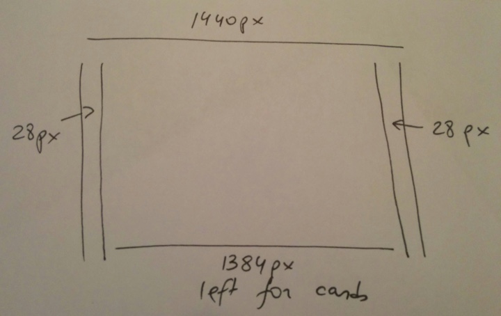
We start with a Nexus 6 device (which showed this problem). The screen is 1440px wide and we have margins of 28px on each side. This leaves us with 1384px horizontal space for the three cards. This is where things get interesting:
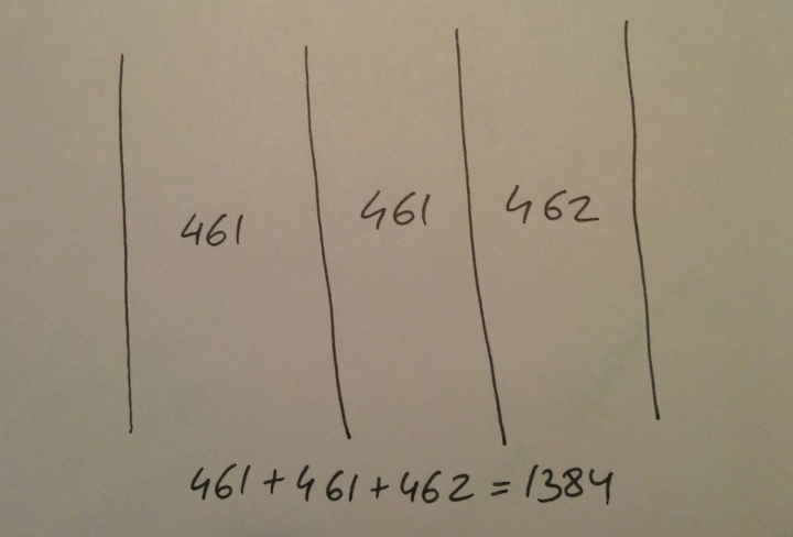
Dividing 1384 by 3 gives us 461px for each card with one pixel remaining. Where should that pixel go?
In the previous implementation of the layout the custom onMeasure pass iterated over all child views in the row keeping track of the horizontal space already “given” to the previous children. Starting with the first child, it gave it 1384/3=461px, leaving us with 923 pixels. The second child got 923/2=461px, leaving us with 462 pixels. And those pixels are given to the last child. All is nice and good since we’ve used all the horizontal space available to the card content.
However, we’re operating in a two-dimensional space and each card type is responsible for determining its height based on how much horizontal space is available to it. As we operate in a continuum of screen sizes and screen densities, the grid spec starts from the edges of the screen and proceeds inwards. That means that instead of predefining hard-coded sizes for cards, it instead defines the margins and the maximum width of the content area and that, in turn, defines the width of individual cards within that content area – as illustrated above.
Once the card width is determined, each card proceeds to determine how much height it needs. Cards in this cluster lay out their content as a vertical “stack”. It starts with the cover image and then proceeds downwards to item title, subtitle, price and other textual elements that can be displayed in the card. The height of the cover image is determined based on the available width and the aspect ratio of the image itself:
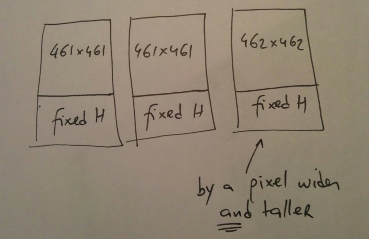
And this is how we’ve ended up with the last card being by one pixel taller than the other two – that extra horizontal pixel bubbled through the measure pass of the card itself, respecting the aspect ratio of the cover art and maintaining the edge-to-edge layout of the cover image.
After considering possible options, the layout logic in a card row has been revised to use constant card width, in this case 1384/3=461px:
This means that on some devices the right margin is going to be by one (or two on larger screens) pixel wider than the left one. What are other alternatives?
We can keep the current logic that makes the trailing card(s) by one pixel wider than the leading ones. In our case, the trailing card is 462px wide as compared to 461px wide. Then tweak the measure logic within individual cards to account for this off-by-a-pixel difference to enforce consistent height of all cards in the row. What are we going to do? If all the cards are 462px tall, then the first two need to account for an extra vertical pixel. It can go above the image, between the image and the texts or below the last line of texts. In all the cases that extra pixel will create keyline inconsistency within the row. And if the last card is 461px tall, we need to take that extra vertical pixel out of something. We can crop off the image or reduce the vertical space above, between or below the texts. In the first case we’re removing visual information from the cover image – and we don’t want to do that. In the rest of the cases we’re back to breaking the keylines.
Alternatively, we can push that extra pixel in between the cards. That would break the horizontal spacing rhythm of the entire grid instead of the vertical one.
To summarize, there is no magic solution here. In an ecosystem with a continuum of screen sizes and screen densities you cannot create pixel-perfect designs. You can always end up with an extra pixel or two to account for. There are multiple options to shuffle them around, each with its own consequences on what it breaks in the grid. In the absence of a solution that eliminates the visual disruption the next best thing is the solution that minimizes it. In this particular case the visual “barrier” (card content) between the left and the right side margin would be such a minimizer.
A long long time ago I wrote about companies being in control of their own long-term destiny. HP? Seriously? Silly me. And where’s Amazon? Anyways…
Not so long ago it used to be that a platform provider would give you a nice set of core widgets, along with access to the network stack, the local file system and a few lower-level graphics APIs. Good old times of shrink-wrapped software and platform updates that happened once every five years. In a good decade, that is.
Then the Internet happened, and after the dark old times of IE 6 a couple of big companies realized that not only they needed to have a fast and standards compliant browser available on their platforms, but that it’s such a basic block that it can’t be left to other parties. And so browsers developed by the platform providers became a table stake.
Somewhere in between, GPUs became more affordable to be included in the standard consumer-grade computers. Hello Moore’s law. They also happened to become quite powerful. Hello Moore’s law again. And OpenGL happened along the way, paving the road to gradually hardware accelerating all the things that find their way to the pixels. Along the way, local and streaming video became the expected part of a platform offering. Table stakes, if you will.
As a parallel track, platform providers started offering (built internally from scratch or acquired in a mad dash so as not to appear to fall behind) email services, ad platforms, office suite of apps (documents / presentations / spreadsheets) and search engines. Table stakes 2.0.
Then mobile happened. Not the kind focused on texting or plain-text email. Mobile as in having a frigging supercomputer in your pocket.
First came the app stores, along with the whole infrastructure around them such as authentication, serving downloads, replicating across multiple devices, user reviews, and search and recommendation engines. And oh, dipping the toes in the wonderfully macabre world of payments. Table stakes level++.
And you also had the other, more traditional media – books, movies, music and magazines. So the platform providers expanded the store capabilities to serve those, along with the matching applications to consume that content – reading books and magazines, watching movies and listening to music. Along the way came movie streaming, music streaming and music subscription services. You might also throw in the TV media players and TV streaming / casting sticks into the mix. Table stakes again.
The platforms themselves started branching into ever more form factors, from the traditional desktop screens and the just introduced mobile screens (a phone-sized screen and a tablet-sized screen) into a screen continuum. From phablets to TV screens, jumping into the wearable space (watches and glasses) and most recently into the automotive space. Along the way the platform providers started working on seamless integration flows between multiple devices owned by the same user. That included persisting the flow state and replicating it between devices, as well as unifying the user experience between the various “manifestations” of the underlying platform. And as the platform had successively more chunks moving into the cloud, the companies started investing ever more design resources into defining their own interface language and guidelines to help developers create apps that feel part of the platform. Table stakes raised another level.
And indeed the platform became this amorphous thing, with individual devices and screens at the edges and the data storage / sync layer in the middle. Platform providers offer their own storage and syncing solutions, with (mostly) generous free tier, spanning a variety of user-generated content, from documents to spreadsheets to, most recently, comprehensive photo services. And hey, let’s throw a mapping solution into the mix while we’re at it. Hello table stakes 2015.
There are quite a few pieces whose timelines I’ve generously rearranged in this article. There are a few pieces that were left out for brevity. To name just one, how about a bespoke system font that is used throughout the multiple manifestations of the specific platform. While we’re at it, how about the overall typesetting system in the world of high definition screens and the amazing “inventiveness” of various languages, living and dead. But I digress. Oh wait, how about a frigging voice-controlled assistant that predicts what you want even before you know that you want it?
Being a platform provider in 2015 is a big undertaking. And getting into the platform game might never have been as formidable. And when you’re in that game, you better up your game every year on the clock. At your own developer conference. But hey, no pain no gain. And the gains these days are enormous.
