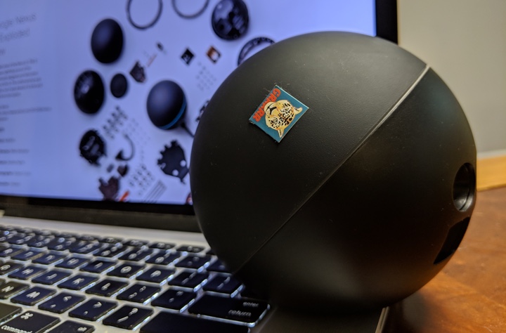
This happened during the testing phase of the short-lived Nexus Q (back around early 2012 probably). I placed the unit in my home office and connected it to a pair of speakers. As Q was controlled via Galaxy Nexus, I put it on the bottom shelf of my printer stand. What was the bug you ask? Every time I started printing a page, a few seconds later Q’s volume went to the max.
As some of you may remember, the top dome of Q controls the volume. The printer stand I bought wasn’t overly sturdy and would wobble a bit when the printer was printing. The wobble wasn’t enough to cause dome rotation (you can see the sticker I put on Q to look at the rotation), but just enough to have one of the shakes spike something inside Q to turn the volume all the way up. Most of the shakes looked to be blocked by some kind of a stabilization mechanism around, but that occasional shake had just the right combination of amplitude and frequency to get through.
I don’t think that anything happened with that bug report, although a few people had a good laugh or two joking about minor California earthquakes jolting all Q’s to max volume. Not that that ever happened as the device was discontinued shortly after it was announced.
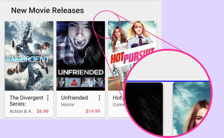
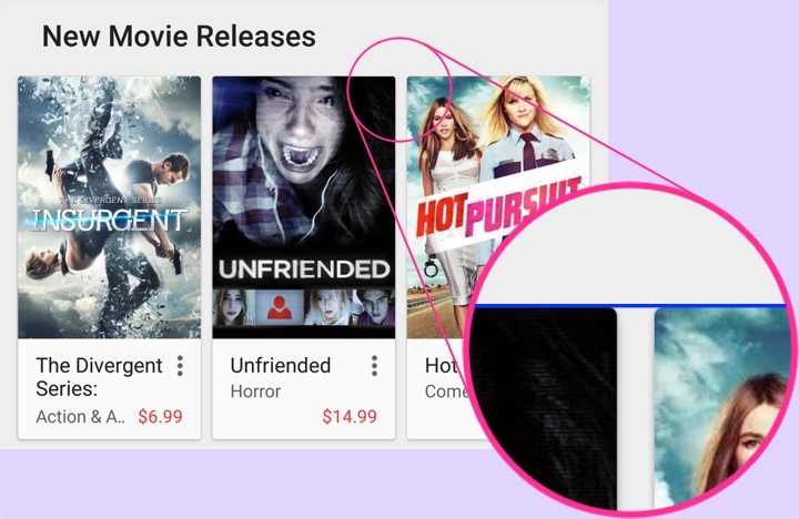
About a month ago I was tagged by Ron Amadeo who spotted an off-by-a-pixel misalignment in some of the content rows in the Play Store app. This is the story of that extra pixel – as illustrated above with zoomed in portion in the inset showing that the last card in the row is by one pixel taller than the other two cards.
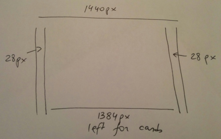
We start with a Nexus 6 device (which showed this problem). The screen is 1440px wide and we have margins of 28px on each side. This leaves us with 1384px horizontal space for the three cards. This is where things get interesting:
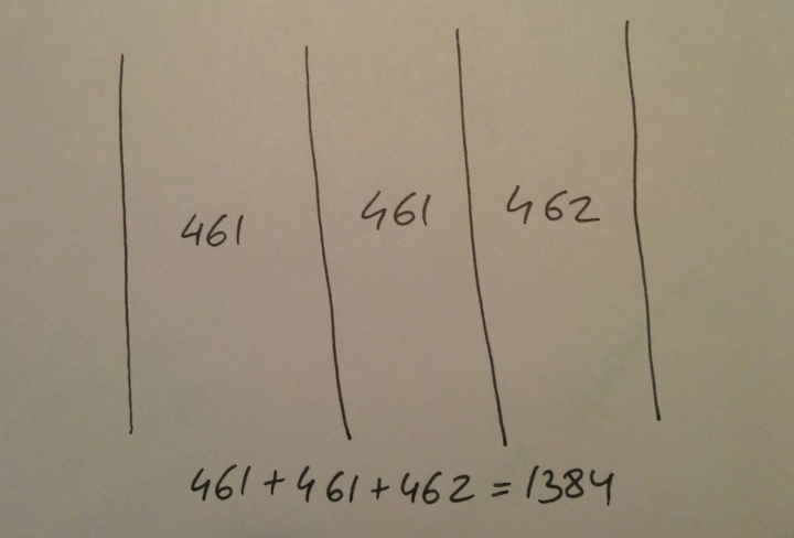
Dividing 1384 by 3 gives us 461px for each card with one pixel remaining. Where should that pixel go?
In the previous implementation of the layout the custom onMeasure pass iterated over all child views in the row keeping track of the horizontal space already “given” to the previous children. Starting with the first child, it gave it 1384/3=461px, leaving us with 923 pixels. The second child got 923/2=461px, leaving us with 462 pixels. And those pixels are given to the last child. All is nice and good since we’ve used all the horizontal space available to the card content.
However, we’re operating in a two-dimensional space and each card type is responsible for determining its height based on how much horizontal space is available to it. As we operate in a continuum of screen sizes and screen densities, the grid spec starts from the edges of the screen and proceeds inwards. That means that instead of predefining hard-coded sizes for cards, it instead defines the margins and the maximum width of the content area and that, in turn, defines the width of individual cards within that content area – as illustrated above.
Once the card width is determined, each card proceeds to determine how much height it needs. Cards in this cluster lay out their content as a vertical “stack”. It starts with the cover image and then proceeds downwards to item title, subtitle, price and other textual elements that can be displayed in the card. The height of the cover image is determined based on the available width and the aspect ratio of the image itself:
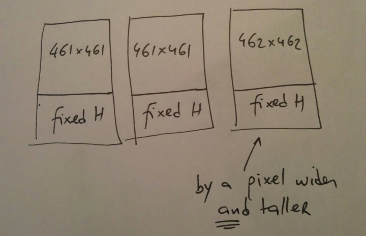
And this is how we’ve ended up with the last card being by one pixel taller than the other two – that extra horizontal pixel bubbled through the measure pass of the card itself, respecting the aspect ratio of the cover art and maintaining the edge-to-edge layout of the cover image.
After considering possible options, the layout logic in a card row has been revised to use constant card width, in this case 1384/3=461px:
This means that on some devices the right margin is going to be by one (or two on larger screens) pixel wider than the left one. What are other alternatives?
We can keep the current logic that makes the trailing card(s) by one pixel wider than the leading ones. In our case, the trailing card is 462px wide as compared to 461px wide. Then tweak the measure logic within individual cards to account for this off-by-a-pixel difference to enforce consistent height of all cards in the row. What are we going to do? If all the cards are 462px tall, then the first two need to account for an extra vertical pixel. It can go above the image, between the image and the texts or below the last line of texts. In all the cases that extra pixel will create keyline inconsistency within the row. And if the last card is 461px tall, we need to take that extra vertical pixel out of something. We can crop off the image or reduce the vertical space above, between or below the texts. In the first case we’re removing visual information from the cover image – and we don’t want to do that. In the rest of the cases we’re back to breaking the keylines.
Alternatively, we can push that extra pixel in between the cards. That would break the horizontal spacing rhythm of the entire grid instead of the vertical one.
To summarize, there is no magic solution here. In an ecosystem with a continuum of screen sizes and screen densities you cannot create pixel-perfect designs. You can always end up with an extra pixel or two to account for. There are multiple options to shuffle them around, each with its own consequences on what it breaks in the grid. In the absence of a solution that eliminates the visual disruption the next best thing is the solution that minimizes it. In this particular case the visual “barrier” (card content) between the left and the right side margin would be such a minimizer.

One of the more useful things that was “graduated” from the internal package in the latest drop of support libraries is ListPopupWindow.
No more need to try and emulate the look and feel of a popup window with a custom styled and positioned dialog for older platform releases.
Use R.layout.abc_popup_menu_item_layout for platform-consistent appearance (text style, margins, regular / ripple highlights) in your list adapter. Then set it with ListPopupWindow.setAdapter, optionally register a dismiss listener (note how the overflow dots for the “active” popup are darker), set anchor view for properly positioning the popup, compute the content width based on the content of your list, optionally mark it as modal so that it can be dismissed by tapping outside and don’t forget to call show().
With a bit more emphasis on content recommended by your friends, we wanted to make people avatars in Play Store more visually pleasing. In our previous release the avatars were round with a thin translucent grey outline, and in our latest release the visuals are a bit more polished. There’s a white ring surrounding the avatar, and an offset drop shadow, with both of these scaling to match the overall size of the avatar. Let’s talk more about the specifics.
The avatars themselves are fetched from the network, which gives us a square – and sometimes rectangular – source image. Our first step is to create a normalized square image based on the target dimensions on the screen. That normalized image preserves the source aspect ratio, upscaling the source if necessary to fill at least one dimension edge-to-edge and filling the second dimension with white pixels (taking care of non-square sources). This is done with Canvas.drawBitmap that takes a source and destination rectangles as the parameters.
The next step is to compute the pixel size of the ring outline and the drop shadow. The ring outline starts at 1dip and is capped at 4dips, while the drop shadow starts at 2dips and is capped at 3dips. The actual size is determined based on the avatar size, setting the cap at 96x96dips (based on our current design metrics). This results in visuals that scale with the avatar size (seen below), while still capping the ring and drop shadow to not be too big for larger avatars.

Now it’s time to take a look at the avatar layers. We have the avatar itself cropped to a circular shape, the ring outline and the drop shadow. In our first implementation pass we used Paint.setShadowLayer to combine the last two together into a single Canvas operation. We first painted the white ring, and then the avatar itself (since the drop shadow extends to both sides of the path, and we didn’t want the shadow to be visible on top of the “inner” image). However, the runtime performance of shadow layer was not very satisfactory. It took about 2.5ms to draw a single outline, and when we had a few avatars on the screen, the numbers started adding up.
Instead, we’re doing three separate layers.
First, we draw the drop shadow as Canvas.drawOval with a single translucent grey color. We use Paint.setStrokeWidth to set the interpolated drop shadow size, and Paint.setColor to set the interpolated drop shadow color (for larger shadows we use more translucency to keep the same overall shadow “weight” across different avatar sizes).
Second, we draw the avatar itself. We create a BitmapShader with the normalized square avatar source and TileMode.CLAMP and set it with Paint.setShader. Using that Paint object on a Canvas.drawRoundRect call results in the circular crop of the source image. There’s some extra bookkeeping to make sure that we’re scaling down the normalized source to make the white ring outline external to the image, not losing the few top/bottom/left/right pixels. This can be done with a combination Canvas.scale and Canvas.translate operations to keep the scaled-down avatar centered on canvas.
Third, we draw the ring outline as Canvas.drawOval with opaque white color. We use Paint.setStrokeWidth to set the interpolated ring outline size.
There’s a bunch of small objects used for the custom drawing operations, usually involving a mix of Paint and Rect ones. It’s recommended to create them once at the class level, initializing as much of the state as you can in your constructor. Then, during the actual transformation / draw operations that can happen multiple times during the layout / render passes, only set those fields that are dynamic (size / color). This way you won’t be creating transient objects which are discarded after they’re used – saving yourself from unexpected GC pauses in the middle of your rendering. Also try to use Canvas operations (transforms, scaling) instead of creating intermediate Bitmap objects. And measure every step to make sure that you’re not using operations that are too expensive.
![]()