Continuing the ongoing series of interviews on fantasy user interfaces, it’s my pleasure to welcome Ryan Uhrich. In this interview he talks about what it takes to create engaging and compelling screen graphics for the imagined worlds of feature film and episodic productions, and what considerations go into finding the right balance between the their technical nature and the demands of the overall story around them. In between and around, Ryan dives deeper into his work on “Star Trek: Beyond” and “Altered Carbon”.
 Kirill: Please tell us about yourself and the path that took you to do screen graphics for film and TV.
Ryan: I was one of those kids who daydreamed… a lot. I would doodle and draw during most of my classes. But, in high school, I started to realize that art class was something I was actually pretty good at. It was around this time that I saw a computer lab running a brand new copy of 3D Studio v3 for DOS (now called 3DS Max). I saw a computer generated sphere on the screen and I was awestruck. I remember thinking it looked so realistic! haha. This moment sparked a lifelong passion – but at the time I didn’t know how far it would take me. In the early nineties, computers were quite primitive and art class was where you went to avoid doing the “real” classes. Fortunately for me, I got to make a career out of it.
After high school, I taught myself how to make graphics with Photoshop and make web pages in HTML. The internet was brand spanking new and it was calling me in a big way. It satisfied my excitement for art and computers and I quickly found companies wanting to pay me to make stuff for them. From there, I got a job at a multimedia company converting old text manuals to interactive 2D & 3D lessons for Bombardier aircrafts. I started to learn Flash and I was a huge fan. I loved how it combined art & code and it gave me my first taste of animation. Eventually, by the mid 2000’s I enrolled in Grant MacEwan College for their Design Foundations program and subsequently went to Vancouver Film School for the Digital Design program, specializing in motion graphics.
Right after graduation, I moved to Copenhagen, Denmark to work at a studio called Thank You, where we created TV commercials. It was pretty nerve-racking to leave my home in Canada and venture off for my career, but I would definitely recommend it. It was an amazing opportunity and ended up providing a lot of experience, both personally and professionally. Another move to Sydney, Australia meant working for MTV, Z Space, and Collider. After three years abroad I somehow ended up back in Vancouver and was provided with the opportunity to work on an upcoming film called Ender’s Game. I instantly jumped on the offer because I was passionate about the aesthetics of UI and screen graphics and it felt like the right path.
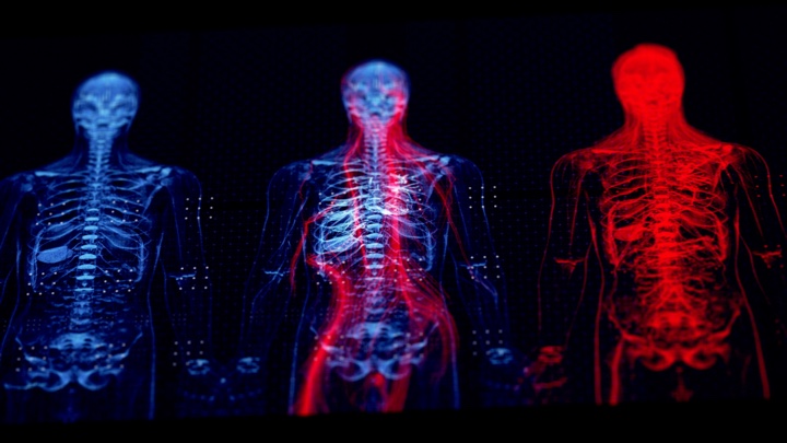
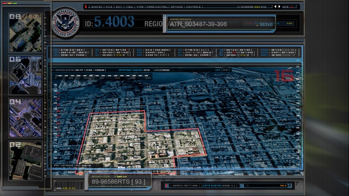
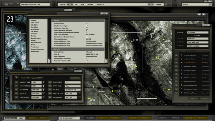
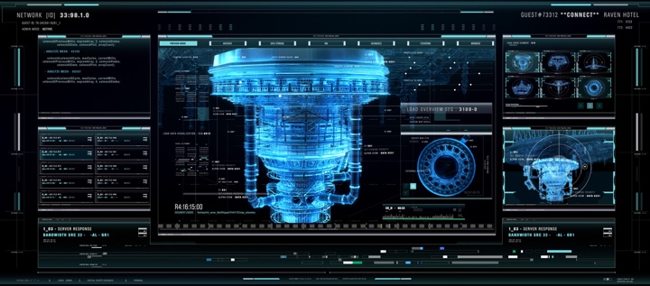
Screen graphics for “Altered Carbon” under the creative direction of G Creative. Courtesy of Ryan Uhrich.
Kirill: Looking back at your first production, what was the most unexpected part of working in film?
Ryan: I was accustomed to tight deadlines from advertising and conceptualizing on the fly. However, the software pipeline was quite different and I found myself struggling to convert the 3D camera data from Maya to Cinema 4D. I remember spending a lot of time with those technicalities rather than designing and animating – which was what I was hired to do. Unfortunately, all these years later, VFX to motion graphics pipelines can still be problematic. I hope someday it will get easier. Haha.
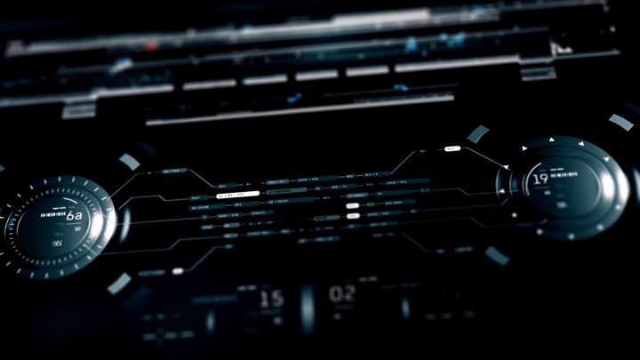
Screen graphics for “Altered Carbon” under the creative direction of G Creative. Courtesy of Ryan Uhrich.
Kirill: How do you craft something compelling that keeps the viewer in the story?
Ryan: The largest component to screen graphics is storytelling. Our goal is to provide a tool for the director to convey important information to the audience at the right moment. It should communicate quickly and move the story forward without distracting the viewer. The second layer is the mood or feeling we are trying to elicit from the audience – it should harmonize with the narrative and not feel out of place. Once those are dialled we spend time thinking about all the fun stuff like plausibility and sexiness.

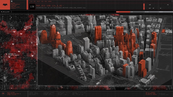
Screen graphics for “Altered Carbon” with Chris Cooper under the creative direction of G Creative. Courtesy of Ryan Uhrich.
Continue reading »
Continuing the ongoing series of interviews on fantasy user interfaces, it’s my pleasure to welcome Gladys Tong. She started her company G Creative Productions about 20 years ago, and since then the studio’s work was featured in a wide array of productions such as I, Robot, Fantastic Four, 2012, Watchmen, Man of Steel, Ender’s Game, Elysium, Chappie, Godzilla, Altered Carbon, The Cloverfield Paradox, Batman v Superman and Star Trek Beyond.
Screen graphics for Batman v Superman: Dawn of Justice. Courtesy of G Creative and Warner Bros.
Kirill: Please tell us about yourself and your path so far
Gladys: My name is Gladys Tong and I run a small company called G Creative Productions. I have always loved art and science so when I discovered that I could make a living combining the two, I jumped in with both feet! When I started 20 years ago, there were not a lot of people doing what I do today so the path for me has been relatively uncharted. It has led me to an interesting career and some wonderful people whom I have had the good fortune to work with.
Kirill: What drew you into the field of interactive motion graphics, and how has that changed since you’ve started working professionally in this field?
Gladys: As I mentioned, I was always interested in art and science. From drawing at an early age to learning about multimedia with computers it was a natural evolution for me to be drawn to interactive motion graphics. Twenty years ago most people including my friends and family did not understand what I did. Now with more exposure through films and tv shows as well as online access to information it has exploded and now there are more people and companies in this field. It’s an exciting time.
Screen graphics for X-Men: Last Stand. Courtesy of G Creative and 20th Century Fox.
Kirill: What can you tell us about G Creative?
Gladys: I started the company in Canada and chose the name in a hurry. I wanted something short and simple – just a letter but wasn’t allowed to incorporate a company with just one letter of the alphabet so I had to come up with a longer name. Many people assume that the G stands for Gladys but it actually represents more than me – graphics, geek, gear, green (for green screen) to name a few. I like the ambiguity and endless possibilities. Much like what we do there are no right answers to everything but many possible answers.
G Creative’s mission statement is to fuse compelling imagery with targeted technology to present a story that inspires, entertains, and informs an audience. This represents a philosophy that I try very hard to achieve in practice through the work we do both in hardware and software services as well as the people I work with. I have a great collective of talented artists, designers, and technicians whom I am thankful for.
Screen graphics for The A-Team. Courtesy of G Creative and 20th Century Fox.
Kirill: When you meet a new person and they ask you what you do for a living, how do you describe it?
Gladys: When I meet a person that I don’t know I tend to describe what I do with words that are more general and easy to comprehend. So I tend to say computer graphics as that seems to be received with nods of understanding. If the conversation goes further, I usually elaborate with the film industry which yields similar nods of familiarity. If I actually describe what I do, I get perplexed facial expressions that suggest a need to decipher this cryptic job I have.
What I do for a living is not as common so people have a harder time grasping the fact that there is a job like this and that it involves a seemingly unusual combination of tech and creativity. Even people that I work with within the film industry sometimes find what we do strange or surprising. In a world that’s increasingly converging I think that will be less so.
Screen graphics for Robocop. Courtesy of G Creative and Columbia.
Continue reading »
Continuing the ongoing series of interviews on fantasy user interfaces, it’s my pleasure to welcome Guy Hancock. In this interview he talks about the work that goes into creating screen graphics, the qualities of a good design, working within an established visual vocabulary and learning from screens in our daily lives. In between and around, Guy talks about his work on “Spectre” and the recently released first season of “Altered Carbon”.
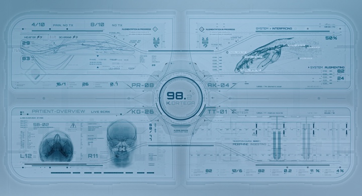
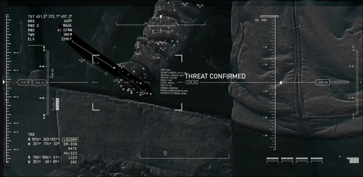
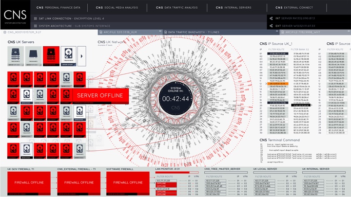
Screen graphics of “Altered Carbon”, courtesy of Rushes Creative.
Kirill: Please tell us about your path so far.
Guy: I kind of stumbled into design. I studied traditional film at a university, working a lot with 16mm and specialised in editing. After university I started looking for my first job in London, and got my foot in the door at Rushes which was predominantly a commercials post-production facility. I started as a runner and then moved to the machine room. That’s where I was introduced to the broad pipeline of visual effects (VFX).
We had copies of After Effects, Illustrator and Photoshop that we used to prep the artwork, I buried myself in these programs and I fell in love animating and creating graphics. I was given odd motion graphics jobs to do and regularly harassed the MGFX guys, eventually I merged into that team and I’ve been with them ever since. I was at Rushes for 10 years, and when they closed down the facility last December, the majority of the team moved up to DNEG to start their motion graphics department.
 Kirill: Between the ideas in your head and the tools at your disposal to makes those ideas into reality, which side do you think is more important?
Guy: I don’t have a very traditional design background. I can’t even draw very well, and I much prefer to get in with the tools, start moving things about and take it from there.
Sometimes we’ll have an initial concept, and I’ll start to articulate that within the appropriate program and doodle from there. If it’s a screen interface, I’ll go into Illustrator and just start drawing shapes. That’s generally how I like to build up my designs.
Kirill: Would you say that with enough money one can do anything in these tools these days from the VFX perspective?
Guy: Technology advances so quickly in the VFX industry, both for hardware and software. Given an extensive budget, a lot of time and a lot of talent, we are at a stage now where you can create pretty much anything.
But a tool is still a tool. It comes down to the artists and how they can manipulate those tools. It’s about the skills, technique and the experience in using them. We’re a bit away from software doing it all for us. Who knows how it will be in the future, but for now you still need the talent to create those worlds. Technology helps us work faster, more efficiently and across large scale pipelines.
Kirill: How difficult is it to get across the complexity of what you do when people ask you what you do for a living? There’s so much design in our daily lives, and people probably take for granted that things just exist.
Guy: It’s a tricky one, especially when you’re talking about motion graphics. It’s such a wide umbrella term for so many things. You have screen interface design, title sequences, 3D, simulation, VR and so much more. It’s hard to explain what you do quickly.
I’m not sure the average person considers how much work is often involved in design. Unless you’ve involved in it, it’s hard to understand. You are literally building something from scratch. Of course, you have the software and plugins that help to fill it out, but you need to create it. We’re actually completely surrounded by design. You have hundreds of apps on your phone, expertly crafted for usability. I think that good design can be unappreciated and often taken for granted.
Screen graphics of “Altered Carbon”, courtesy of Rushes Creative.
Kirill: A seamless design that almost dissolves into its environment sometimes feels so effortless and natural. Should good design be in the business of drawing attention to itself?
Guy: It depends on what your product is. If you’re creating something user-friendly and it does its job, people probably are not going to notice it so much. Apple software, for example, is on the whole incredibly well-designed. To a lot of people that probably comes across as straightforward and clean, but the actual consideration behind it is extremely well thought-out and crafted.
I think that you might indeed overlook good design and take it for granted. It’s serving its purpose and doing its job. It’s easy to pick out information. It’s easy to move around it. It’s easy to understand. If it’s all of those things, it’s well-designed.
Kirill: Does it get easier to do what you do as you go from project to project?
Guy: The first thing that you need to consider on a new screen interface project is what is the purpose behind it. If it’s a hero screen, it’s going to be a part of the storytelling. How does it serve its purpose? How does it fit into the world that the director or the VFX team are trying to create?
Each time it’s a different challenge. A typical sci-fi interface might be more abstract and complex, whilst a contemporary film is likely to be more realistic and believable. Our work on “Spectre” for example had to be functional and convincing. The director didn’t want too much in there that didn’t serve a purpose. He would ask us to get rid of stuff that was unnecessary and just looked pretty. That’s a different challenge.
Screen graphics of “Spectre”, courtesy of Rushes Creative.
Continue reading »
Continuing the ongoing series of interviews on fantasy user interfaces, it’s my pleasure to welcome Serge Khomutovskiy. In this interview he talks about what drew him into the field, the relationship between tools and ideas, the crazy pace of work in the world of episodic television, and what goes into creating screen graphics that support the story. In between and around, Serge talks about his work on “Legends of Tomorrow”, “Arrow”, “The Flash”, “Supergirl” and “Wayward Pines”.
Kirill: Please tell us about yourself and your path so far.
Serge: Hi! My name is Serge and I am a creative designer based in Vancouver, BC. I graduated from Simon Fraser University’s School of Interactive Arts and Technology with a BA in Design and Media Arts. During my co-op placement the second Iron Man movie came out and inspired me to start an ambitious project that led me to where I am. I only had a basic knowledge about green screen and compositing from the few courses and videos I learned from. The project was to create a promotional video that showed a co-op student interacting with a virtual environment like menu that explored co-operative education options available to her. This project was a stepping stone to my career now as a motion designer and lead me to invest more time into learning and exploring the industry.
Kirill: What drew you into the field of motion and graphic design, and how did that change now that you do this for a living?
Serge: I’ve always been somewhat creative and originally wanted to get into print design or do some sort of graphic design. Growing up I read and watched a lot of sci-fi and was hugely inspired and enchanted by the worlds built in Neuromancer, Dune, Gundam, Star Wars and Star Trek, and a bunch of other less prominent franchises. Those stories will always have a special place in my heart and have definitely inspired me to explore and grow.
I was very fortunate and got to work with and learn from the amazing Robyn Haddow, Jeremy Unrau and Nick Oja at Scarab Digital. I have always been inspired by the works of Ash Thorp, Danny Yount, Corey Bramall, Jayse Hansen, to name a few. Direct exposure to motion graphics community was what drew me in. The openness, sharing of knowledge and support is what amazes me and keeps me going.
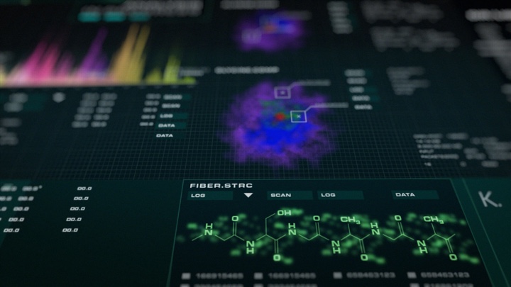
Screen graphics for “Arrow” season 4. Courtesy of Serge Khomutovskiy.
Kirill: Between the ideas in your head and the tools at your fingertips, do they have equal importance, or is one more important than the other?
Serge: Tools are important when you first start, but as you gain experience you build a library of various skills and techniques you can use that come naturally. Once those skills are developed and you have a workflow figured out, ideas become much more important.
Kirill: When you read a script and start thinking about the particular screens, do you go to pencil-and-paper, or straight to digital tools?
Serge: It largely depends on the scene, actor action and what’s been already built. Smaller background screens don’t require any interaction and are simply there for one reason, and that is to be a cool background. Those don’t require a lot of work and sometimes can be thrown together from previously created pieces. Most of the time it really helps to draw down a few things, sometimes a mind map, sometimes a diagram, to figure out what will actually be happening on the screen.
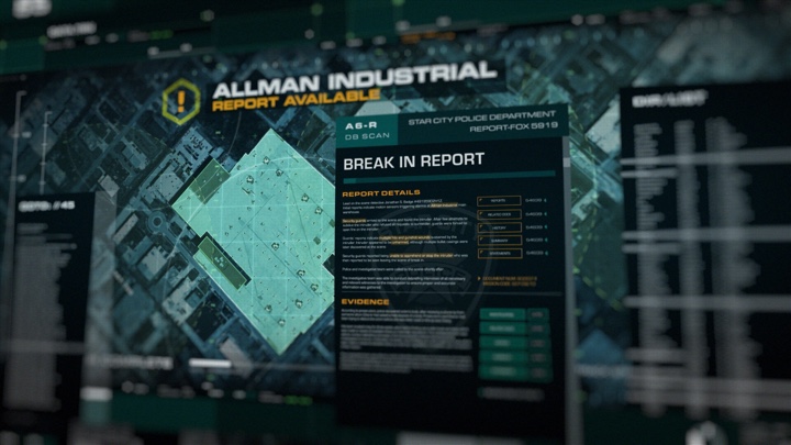
Screen graphics for “Arrow” season 5. Courtesy of Serge Khomutovskiy.
Kirill: What was, or perhaps still is, the most surprising or unexpected thing about doing screen graphics in episodic television?
Serge: Variety. I’m still surprised by the amount of variety that screen graphics can bring. Anything from your usual and very basic email and text editor to a complex schematic managing ion drive manifold (or something like that).
Kirill: What do you say when people ask what you do for a living? Are people surprised to hear that every single screen needs to be explicitly designed?
Serge: At the very basic level, “motion design and animation” usually gets the idea across. If I need to get into details then yeah, explaining that most if not all of the screens that people see in the scene are specifically designed, surprises a lot of people. It’s a simple thing that stays in the background and a lot of the time, out of focus, but every little detail contributes to the set and atmosphere.
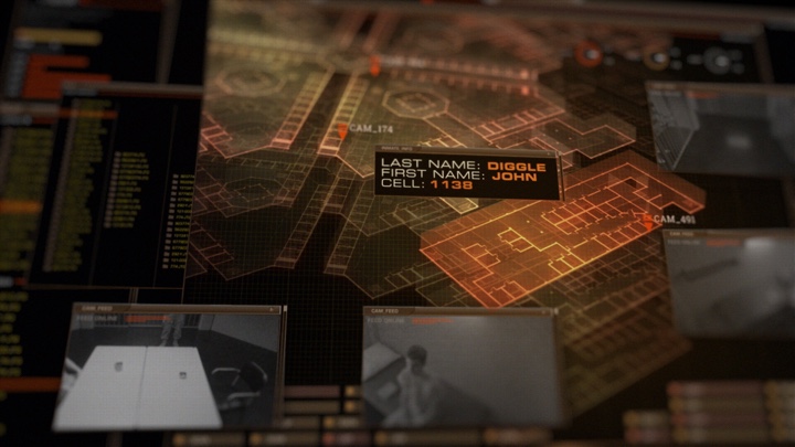
Screen graphics for “Arrow” season 5. Courtesy of Serge Khomutovskiy.
Continue reading »
