The art and craft of screen graphics – interview with Guy Hancock
Continuing the ongoing series of interviews on fantasy user interfaces, it’s my pleasure to welcome Guy Hancock. In this interview he talks about the work that goes into creating screen graphics, the qualities of a good design, working within an established visual vocabulary and learning from screens in our daily lives. In between and around, Guy talks about his work on “Spectre” and the recently released first season of “Altered Carbon”.
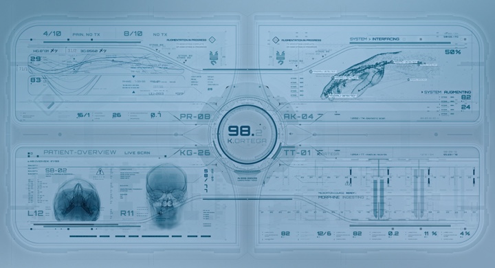
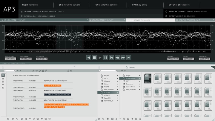
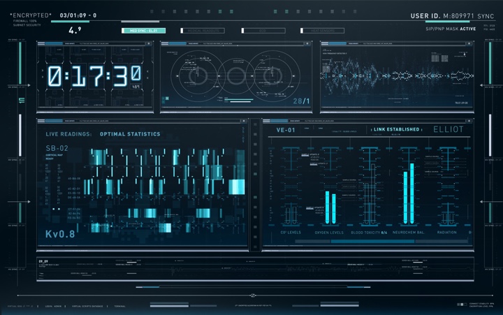
Screen graphics of “Altered Carbon”, courtesy of Rushes Creative.
Kirill: Please tell us about your path so far.
Guy: I kind of stumbled into design. I studied traditional film at a university, working a lot with 16mm and specialised in editing. After university I started looking for my first job in London, and got my foot in the door at Rushes which was predominantly a commercials post-production facility. I started as a runner and then moved to the machine room. That’s where I was introduced to the broad pipeline of visual effects (VFX).
We had copies of After Effects, Illustrator and Photoshop that we used to prep the artwork, I buried myself in these programs and I fell in love animating and creating graphics. I was given odd motion graphics jobs to do and regularly harassed the MGFX guys, eventually I merged into that team and I’ve been with them ever since. I was at Rushes for 10 years, and when they closed down the facility last December, the majority of the team moved up to DNEG to start their motion graphics department.
 Kirill: Between the ideas in your head and the tools at your disposal to makes those ideas into reality, which side do you think is more important?
Guy: I don’t have a very traditional design background. I can’t even draw very well, and I much prefer to get in with the tools, start moving things about and take it from there.
Sometimes we’ll have an initial concept, and I’ll start to articulate that within the appropriate program and doodle from there. If it’s a screen interface, I’ll go into Illustrator and just start drawing shapes. That’s generally how I like to build up my designs.
Kirill: Would you say that with enough money one can do anything in these tools these days from the VFX perspective?
Guy: Technology advances so quickly in the VFX industry, both for hardware and software. Given an extensive budget, a lot of time and a lot of talent, we are at a stage now where you can create pretty much anything.
But a tool is still a tool. It comes down to the artists and how they can manipulate those tools. It’s about the skills, technique and the experience in using them. We’re a bit away from software doing it all for us. Who knows how it will be in the future, but for now you still need the talent to create those worlds. Technology helps us work faster, more efficiently and across large scale pipelines.
Kirill: How difficult is it to get across the complexity of what you do when people ask you what you do for a living? There’s so much design in our daily lives, and people probably take for granted that things just exist.
Guy: It’s a tricky one, especially when you’re talking about motion graphics. It’s such a wide umbrella term for so many things. You have screen interface design, title sequences, 3D, simulation, VR and so much more. It’s hard to explain what you do quickly.
I’m not sure the average person considers how much work is often involved in design. Unless you’ve involved in it, it’s hard to understand. You are literally building something from scratch. Of course, you have the software and plugins that help to fill it out, but you need to create it. We’re actually completely surrounded by design. You have hundreds of apps on your phone, expertly crafted for usability. I think that good design can be unappreciated and often taken for granted.
Screen graphics of “Altered Carbon”, courtesy of Rushes Creative.
Kirill: A seamless design that almost dissolves into its environment sometimes feels so effortless and natural. Should good design be in the business of drawing attention to itself?
Guy: It depends on what your product is. If you’re creating something user-friendly and it does its job, people probably are not going to notice it so much. Apple software, for example, is on the whole incredibly well-designed. To a lot of people that probably comes across as straightforward and clean, but the actual consideration behind it is extremely well thought-out and crafted.
I think that you might indeed overlook good design and take it for granted. It’s serving its purpose and doing its job. It’s easy to pick out information. It’s easy to move around it. It’s easy to understand. If it’s all of those things, it’s well-designed.
Kirill: Does it get easier to do what you do as you go from project to project?
Guy: The first thing that you need to consider on a new screen interface project is what is the purpose behind it. If it’s a hero screen, it’s going to be a part of the storytelling. How does it serve its purpose? How does it fit into the world that the director or the VFX team are trying to create?
Each time it’s a different challenge. A typical sci-fi interface might be more abstract and complex, whilst a contemporary film is likely to be more realistic and believable. Our work on “Spectre” for example had to be functional and convincing. The director didn’t want too much in there that didn’t serve a purpose. He would ask us to get rid of stuff that was unnecessary and just looked pretty. That’s a different challenge.
Screen graphics of “Spectre”, courtesy of Rushes Creative.
Kirill: Was “Spectre” your first screen graphics job?
Guy: At Rushes we did a lot of short-form productions, such as commercials, documentaries, and web films. Sometimes these involved some form of screen graphics or interface design, but these are generally quick turn around.
When it comes to the film and TV world, the budgets are bigger and you have more time. “Spectre” was a different beast and an important learning experience.
Kirill: Do you remember what was the most surprising or unexpected thing for you when you started working within that larger structure that is a feature film?
Guy: It was the first time I had come across playback which I found quite eye-opening. Generally in post-production you have your shot and you know the framing and exactly how many frames you need to account for.
On “Spectre” they wanted to capture as much as they could onset, the actors could interact with something and there is also more realistic lighting effects. It was odd at the beginning to not only generate the asset, but also do long looping sequences which are then passed to the playback crew. That dramatically increases the amount of work that you need to do, and you don’t even know if that animation is going to make it into the film. There was a heartbreaking moment for one of our team members who worked on this piece that was supposed to be on a laptop, and the director just closed the lid on set because it was distracting for him.
Screen graphics of “Spectre”, courtesy of Rushes Creative.
Kirill: Does it feel that the non-hero screens become part of the set decoration? Screen hardware is so cheap these days, so they can throw dozens of screens into a room and they become part of the thing, but not the thing on its own.
Guy: Absolutely. With contemporary films such as Bond or Mission Impossible, you expect that everyone has smartphones and laptops all over the place. It’s an important part of the aesthetic. If you’re in MI5, you expect to see a lot of computers doing stuff, plowing through data, checking out databases or looking at CCTV footage.
The set for Oberhauser’s lair on “Spectre” required hundreds of screens to show that they are gathering everyone’s personal data from all over the world. When designing the screens individually we had to balance the level of detail for each screen with speed to get all the designs finished on time. You can go crazy with the detail and the animations, but you have to take a step back and realize that it’s the combination of the screens in the background that provide the overall effect.
Kirill: How much time did you spend on “Spectre”?
Guy: About 13 months through production and post-production. Almost all screens were shot in camera, but we replaced a lot afterwards.
Kirill: How does it feel to sit in a movie theater and watch those 13 months compressed into two hours that happen, occasionally, to show your work?
Guy: A lot of stuff didn’t really make it in but I’m still proud of the work. I’m still glad that I did it. I feel like the graphics sit really well within the film and hopefully add to the overall aesthetic of an action packed Bond romp.
It’s hard to watch a film objectively when you’ve worked on it for a long time. I’ve seen it a few times, and every time I look at the same monitors and miss half of what I’m supposed to be watching for the story. It doesn’t matter how many times I watch it, I can’t help but look at the same bits [laughs].
Screen graphics of “Spectre”, courtesy of Rushes Creative.
Kirill: Like you mentioned earlier, we have so many screens and so much well-done UI in our daily lives. As we grow used to having all those pretty pixels around us, do you feel that it’s becoming harder for you to compete with that in the fictional worlds of productions that you work on?
Guy: I would say a lot of what we do doesn’t translate particularly well into real life. There is an established visual language for a lot of screen graphics. It has styles that are popular, and things that you perhaps expect to see – that might not necessarily be that realistic. If it’s a military system, you as the viewer would expect to see a lot of thin lines, crosshairs, and packets of data registering things. In reality a high grade military system is probably not like that at all.
I recently noticed a CCTV screen in a restaurant, and the interface design had big toy icons and buttons. That’s a legitimate interface, but I was thinking to myself ‘that’s not very convincing’. If we were to see that CCTV system designed for the big screen, It would look drastically different.
On the other hand there’s still a great deal to take from real world applications. Because of what I do, I look at everything now. I go on the London underground and spot the most basic of screens with data on trains coming in and out and really admire the layout of the rows of numbers. Very inspiring for data screen graphics… It’s funny what turns me on these days [laughs].
Kirill: What I also find unrealistic, in a sense, in the military installations in these movies, is how well-designed and cohesive everything is. In a real NASA room they’d probably have dozens of differently looking windows on the same monitor, each one quickly thrown together at some different point in time to show that data.
Guy: Yeah they’re likely several applications from thousands of different programmers over years and years thrown together to visualize various different pieces of data. They don’t have time or consideration for a nice modular grid layout and a complementary colour palette!
Kirill: Lingering on “Spectre” for a moment longer, was the idea to show that MI5 is, perhaps, just half a step ahead with the technology they have at their disposal?
Guy: That was the brief. It was to be future-ready, believable but slightly futuristic. It needed to hold up for a few years.
Screen graphics of “Spectre”, courtesy of Rushes Creative.
Kirill: Do you worry how your work in film or TV is going to survive the test of time? Do you think about how your kids will see what you’re doing today when, if ever, they watch it as they are surrounded by the technology in their adult lives?
Guy: I wouldn’t say that I worry about it. Things change so fast. Probably by that time my kids will have chips in their head for augmented reality [laughs].
I hope it’s designed well. I hope it’s visually pleasing. It’s impossible to know how it’s going to hold up. Hopefully it does.
Kirill: The Bond franchise seems to be one of the few that people come back to, again and again, to rewatch the older movies. And while some of the earlier takes on technology seem a bit quaint by today’s measure, I think you need to watch each movie as a product of its time.
Guy: You might look at an older Bond film where instead of using a smartphone, they use an old Nokia 3210 or something. You can still appreciate that the design fits and works within film’s setting. You’re right, the context is important.
You might look at older films like “Blade Runner” where the screen graphics are, by today’s standards, quite simplistic. But they are still lovely visually. For me they are timeless.
Kirill: Moving on to “Altered Carbon”, how did it start for you, and how early on did you know how much work it would end up being?
Guy: We were approached by DNEG who we had worked with closely at Rushes before. We were to complete the post-production on the screen graphics, holographic adverts and end ‘coda sequences’.
We gradually got our hands on the scripts and a ‘bible’ explaining the AC universe. You end up guesstimating on what might be involved. It’s hard to tell from the script what graphic is going to be important. We knew that it was going to be a big Netflix 10-episode series, so we anticipated a lot of work.
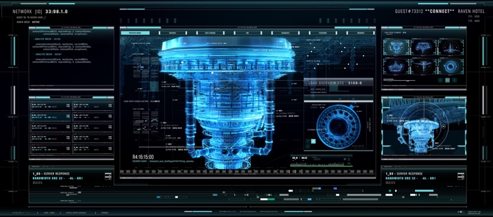
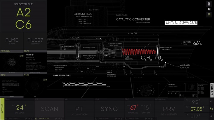
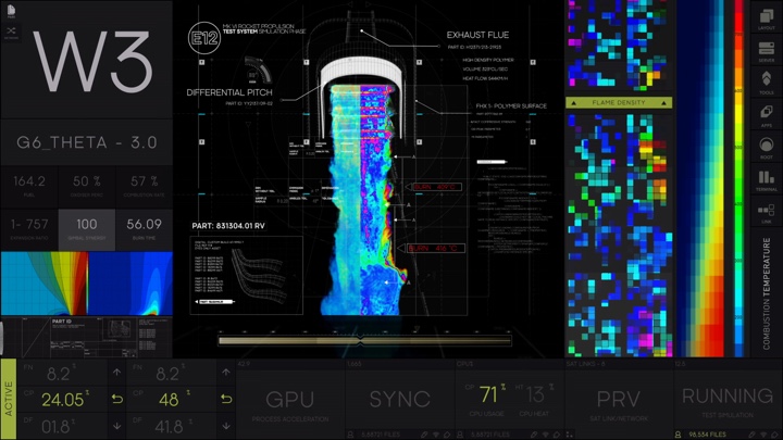
Screen graphics of “Altered Carbon”, courtesy of Rushes Creative.
Kirill: And like you said, the script is not too heavy on the details on the exact layout and content of the screens. It might say something like “And they look at their screens while they are at the police station” which you need to translate into the actual technology. How do you even start discussing where the technology might be a few centuries down the line?
Guy: DNEG have very talented production and art departments and we had a few references from the world. They showed us some set models, props and vehicles. We had pre-vis sequences of the police station, and that gave us a sense of those big plexiglass monitors.
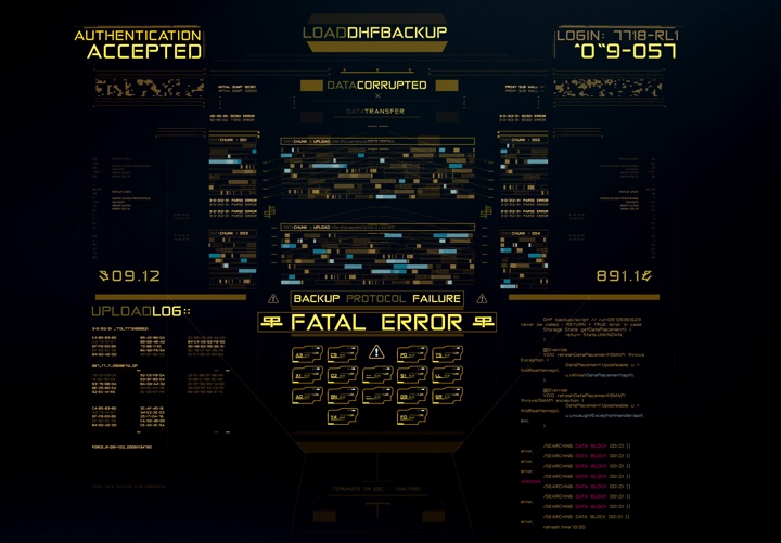
Then you do your research. We knew the world was a bit ‘neo Tokyo’ so you have a lot of Asian influence and big cities. We also had the reference bible which describes the entire lore of “Altered Carbon” that went, among other things, into the technology and scifi elements such as cortical stacks and DHFs. You have to use all the information at your disposal along with references to try and piece together how the tech might blend into the world the production is trying to create.
When you talk about police technology, you imagine the budget is probably stretched and is not necessarily over-designed. On the other hand a technology used by the multi-billionaire Meths that have been around for hundreds of years is probably much sleeker, better developed and ‘futuristic’ looking. This is what you have to consider as you start designing the templates for each different technology.
Kirill: How much of it was on set and how much was done in post-production?
Guy: Quite a lot was shot on set, done by a different company, and then we did the post work. Probably it was 60% on set and 40% in post.
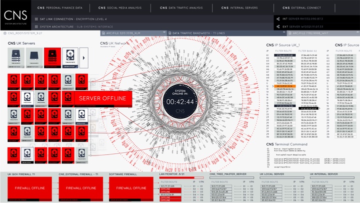
Screen graphics of “Altered Carbon”, courtesy of Rushes Creative.
Kirill: Pretty much all the information displayed on the transparent plexiglass screens in the police station was in monochromatic blue. Was that an artistic choice to keep the actors’ faces in the frame while also conveying the complexity of information at their disposal?
Guy: The keyboard device was shot in camera, and you have to take into consideration the way it was lit. It was obviously intended to be in blue because that was indicated by everything around it, so that led the design choices.
Kirill: Going back to what you mentioned about exploring that world and how much money the police would budget to those interfaces, it’s probably why the interfaces themselves feel pretty approachable even though they are set in the 24th century. It’s not a floating cloud of particles or some crazy full-room hologram. It feels like it’s matching the overall atmosphere of a police department from today, or even how it was back in Scotland Yard in the 1890s.
Guy: It was also a lesson learned from “Spectre”. We tried to consider the practicality of it. I know it’s sci-fi and that it’s supposed to look pretty. But it’s important to think about it functionally.
The whole framework was supposed to be modular so that the hypothetical user can easily open up documents, which would lead to database searches, which would lead to something like an address list etc. It is sci-fi, but we did want to consider it as being first and foremost a police station, and how it was going to work and function practically.
Kirill: Were there any particular challenges presented by the medium of the translucent screens itself? If the camera is behind the shoulder as the two characters are talking, and the graphics kind of float in the air between them, it needs to be in the right place to strike the right visual balance.
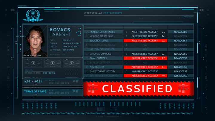
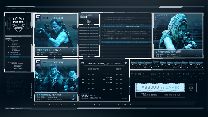
Guy: There’s one shot in particular that is exactly like that. The camera is behind the screen as we’re looking at Ortega and Abboud looking at Kovacs and his envoy background. You have to consider that the graphics are going to be more or less completely covering them.
We worked closely with DNEG and had a good pipeline, receiving plates and the color information so that we could slap-comp it beforehand. That way we would have the layout information for how it could work in comp. They also gave us tracking information and roto so we could see how the design would work within the full shot sequence. There was a lot of moving about and considering eye lines. We would reduce a gap here, increase the transparency there, introduce more grid structure – to find the right compromise. It was a lot of trial and error.
Screen graphics of “Altered Carbon”, courtesy of Rushes Creative.
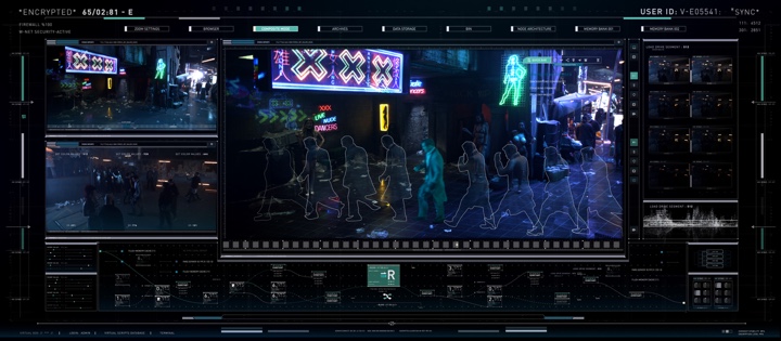
Kirill: As it gets closer to the end of the season, they get to more advanced screens as they are planning their attack. The graphics there looked so much sleeker, and it also felt that you started exploring more colors.
Guy: We were trying to create that variety in design and technology. The Elliots are hackers and programmers by trade, and the idea behind the technology they used to hack into the Head in the Clouds was to be less about looking pretty, but more complex and customized. It’s almost like he has a whole custom OS for hacking.
Those screen designs are a little more busy. The feel is that of multiple console windows running scripts and programs.
Kirill: It felt quite close to what we see in the more traditional layouts with a 3D wireframe of a building, and a bunch of data widgets surrounding it. How difficult is it to break away from the established vocabulary that you mentioned earlier? Would you even want to challenge me, the viewer, with something completely different?
Guy: There is that visual language that we seem to adhere to. You always want to try to do your own thing, to make something that is a bit different and a little unique. Some tricks are still good, and you know what you’re looking at when you see it. It has to be clear you’re looking at the CG schematic building, and it makes sense to show that.
Kirill: Was a wider palette of colors interesting to explore?
Guy: Always. Colour is an important thing to me as a designer. It’s nice to play with it. We were trying to explore a variation across styles, in terms of aesthetic as well as the advancement from the stripped down, usable police interfaces to the fancy Meth systems. You always have to consider the setting, lighting, action and props from within the scene.
Screen graphics of “Altered Carbon”, courtesy of Rushes Creative.
Kirill: Let’s talk about ONI (Optical Neural Interface) and the layout of it. What was the approach that was discussed to show those overlays without obscuring too much of the frame?
Guy: That design came up quite early in the concept stage. It was one of the first things we played with. I can’t take credit for coming up with the arc design. That was the work of Fraser Macedo which we then took and explored further. It’s a shame it didn’t feature more, I think that it’s quite unique.
We’re used to some kind of a Terminator vision with moving crosshairs and blocks of data. But the whole idea of ONI is that everyone has one, like smartphones today. Everybody’s using it, so it has to be usable.
We tried different variations across different uses of it. Kovacs has one that is more everyday and quite appy in its functionality. And the police officers have slightly more custom interface which is more militaristic, with scrolling data across the bottom to show police reports, for example. The design had to be more targeted towards practical police tasks, while Kovacs has a more universal one, the same thing as a teenager might have to make calls or browse the net.
Kirill: Is there such a thing as your favorite design on this show, or are they all sort of your babies?
Guy: They are all a bit my own babies [laughs]. Some of Reileen’s stuff was a bit different and less traditional. She touches the coffin that Ortega is in, so we had to explore unusual shapes and layouts. And the same applies to when she touches her table. That was fun, because I had been doing a lot of more conventional rectangular screens for the hacking sequences.
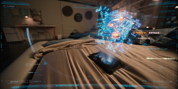
I did also enjoy working on designs for Head in the Clouds stuff. When Kovacs is upstairs in the Raven Hotel, the interface is supposed to look like it was created by AI, and I like the way it came out. I enjoyed working with the model that DNEG supplied, shading and animating it.
Screen graphics of “Altered Carbon”, courtesy of Rushes Creative.
Kirill: Is there such a thing as just enough time to complete the design that you have in your head?
Guy: I think so. You can tweak forever. Design for me is a collaborative process. I work closely with my team, and I like getting other people’s opinions. There are things that you haven’t perhaps considered. There are things that you think are cool, but are actually distracting and are getting in the way of the story.
Kirill: Somebody at work recently told me, and I love her approach, that without having a deadline it’s too easy to go around in circles and not work towards converging on something. If there’s no pressure of the deadline, there’s no pressure to make hard decisions.
Guy: Deadlines are incredibly important. Otherwise you’re casually messing about. That’s a good way to put it – you wouldn’t be making those decisions and committing to things.
Kirill: What are your thoughts on how much we depend on technology in our daily lives, and how much it may or may not contribute to our wellbeing?
Guy: Technology is one of the most important things today. It’s incredible to look at the pace of it. As to whether some things are good or bad? We’re so reliant on it, and we really are a generation of smartphone users.
If you just lift your head up on the train, everyone is looking at their phone or tablet, or playing on their Switch or something. Social media is so prevalent, and I don’t think anyone would be able to predict how crazy that would get, myself included. I just got into Instagram, and it’s pretty addictive.
Screen graphics of “Altered Carbon”, courtesy of Rushes Creative.
Kirill: Do you worry about how much autonomy we seem to be losing along the way? We’ve moved to the Atlanta area a few years ago, and I still don’t remember the names of most of the streets right outside my neighborhood. I’m relying on GPS and navigation so much that I don’t even spend any mental energy to map my immediate surroundings.
Guy: You have a device in your pocket that literally has access to all the information in the world. It’s bonkers. It’s interesting to think about the world that our children are going to grow up in. We remember what it was like before the Internet.
Is that going to affect how people interact socially? Is that going to affect the way we think, because we don’t need to rely on our sense of direction? Like you said, we have this thing in our pocket that will tell us exactly where to go. It is going to be interesting to see what happens in the future and how our children cope with this technology. What might be next? Is it an augmented reality universe that we all live in?
Kirill: What keeps you going? What do you stay in this field?
Guy: I really enjoy the work. I enjoy creating and designing. Sometimes it’s hard, but it’s also quite exciting. You’re challenged every day and every project is unique.
I’m trying to keep up with how the software is progressing. Every year it gets more interesting as the tools allow you to generate stuff faster and make it look cool. I enjoy making stuff look cool [laughs].

Screen graphics of “Altered Carbon”, courtesy of Rushes Creative.
Kirill: It’s also quite interesting to follow trends in the two worlds, the real life interfaces and the interfaces we see in film or TV. It’s kind of a push-and-pull as there’s an exchange of ideas over time, as things flow and morph between these two worlds.
Guy: When you’re doing an interface like that, the real-world aspect is almost secondary. You have to create something that is clear and tells the story, but also looks interesting and fits within the world of that film or show. There’s also a bit of audience expectations. If I’m doing a militaristic screen, you’re going to expect the aesthetic that goes along with that. And that aesthetic might be far from the truth.
But at the same time, real-life technology is what drives a lot of it. I’ve been looking at what Leap Motion is doing with augmented reality, and it’s awesome. You can see how that could translate into some of your 3D work. It’s important to keep in sync with what’s happening in real life.
Kirill: It feels to me that the entire field of AR is still struggling to find a model that really works without a very awkward intermediary between your eyes and the world that is being overlaid on. And I’m quite pessimistic about how close we are to being able to do those “brain” interfaces where it’s hacking directly into our internal systems.
Guy: It is the thing of sci-fi, really. And the technology of AR and VR has been indeed knocking around for a while. It still hasn’t necessarily found a proper home yet.
If I could just give a shout out to my amazingly talented teammates whom I’ve worked with over the years on these projects: Barry Corcoran, Tania Nunes, Caroline Laing and Domhnall Malone. You guys rock!
Screen graphics of “Spectre”, courtesy of Rushes Creative.
And here I’d like to thank Guy Hancock for taking the time out of his busy schedule to talk with me about the art and craft of screen graphics. You can find more of his work on Behance and Instagram. The first season of “Altered Carbon” is available for streaming on Netflix.
Finally, if you’re interested to read additional interviews about the wonderful world of screen graphics and user interfaces for film and TV, click here for more.
