Continuing the ongoing series of interviews on fantasy user interfaces, it’s my pleasure to welcome Noah Schloss. In this interview he talks about defining success, communication skills, the difference between design and art, supporting the storyline, and the impact of generative AIs on human creativity. In between these and more, Noah talks about his work on screen graphics for “Star Trek: Picard” and “Westworld”.
 Kirill: Please tell us about yourself and the path that took you to where you are today.
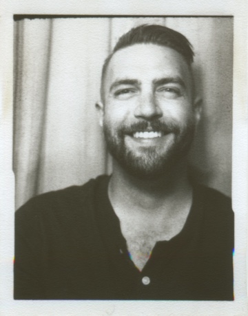
Noah: My name is Noah Schloss, I’m a senior motion designer specializing in FUI currently working at Twisted Media. I have about fifteen years of experience, the last seven of which have been focused in the TV and film space. I’ve had the opportunity to work on some incredible projects like “Westworld”, “Star Trek: Picard”, “Fast and Furious Hobbs and Shaw”, “Morbius”, “The Godzilla/Kong” films, “Fallout”, “Borderlands” and others.
I started my career in advertising and made the switch over to TV/film when my good friend (now coworker) Clark Stanton, asked if I would freelance for Twisted. I started freelancing, and then joined the team full time, and have been at Twisted Media for quite a while now.
Kirill: Was there any particular thing that was surprising or unexpected when you started working in this field?
Noah: I didn’t expect to work on TV and movies from here in my home office [laughs]. The film industry can have some unexpected twists and turns, it can take some time to learn how to navigate. There are also technical aspects unique to film/TV that don’t have parallels in other industries.
Notes and feedback may also fall into this category. For the most part, folks in the film/TV space do a great job of focusing on what’s successful and supportive of the story we’re trying to communicate. Other industries might fixate on what’s wrong. It may seem like a subtle difference in communication but the net result is more concise directives. In an industry where directives are ever changing, the compounding effect can be substantial. Overall, I find this to be a more constructive environment for creative problem solving within large groups.
How to define success has also been a surprising take away from working in the Film/TV space. Over the last couple of years, I’ve been outlining what’s important in my process and learning how I internally define success more objectively. Success always starts with the resources available – not the least of which is time. If I only have 15-30 minutes to complete something, I take that into consideration when judging my own performance. Sometimes when talking with students coming out of school, they talk about a need to get a portfolio-ready piece every time that they put pixels on the screen. I had a similar attitude when I started, and it has changed quite a bit over the years.
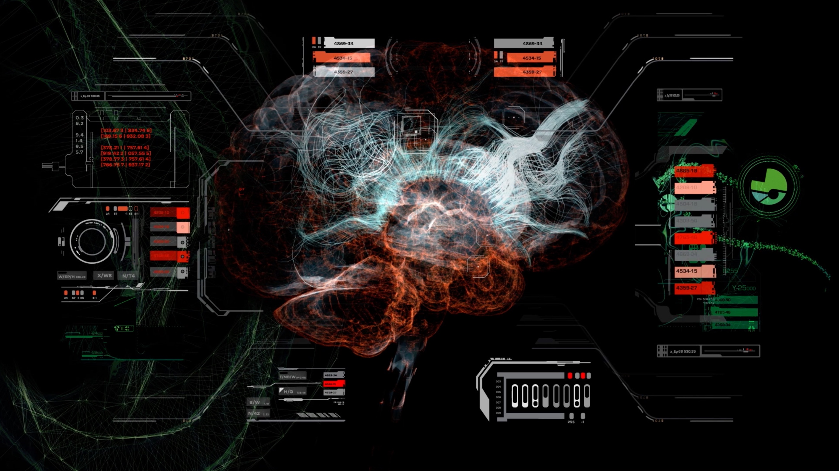
Screen graphics for Season 2 of “Star Trek: Picard” by Noah Schloss.
Kirill: You work for a studio, and the studio works for this big production, and there’s hundreds of people, sometimes maybe thousands of people. Does it feel sometimes that you can’t put a finger on something and say “This is mine”, because so many people participate in that?
Noah: Ownership, and the thoughts and feelings around that can be tricky for a lot of people. I always think of it like playing a team sport, my involvement is one part of the overall team’s success.
I’ve definitely run into people who don’t think like that. It’s difficult, because everybody is there to make a good product at the end of the day. The thing that ties it all together for me is understanding that this is a team environment, everybody’s here to pitch in and make their voice intermingle with everybody else’s, and hopefully make a cohesive whole versus a standalone piece of their own.
Kirill: Do you feel that for somebody who is just starting, for somebody who has strong ideas, it might be a little bit more difficult to participate in this team environment if they are not willing to compromise or accept feedback?
Noah: It totally depends on the person. I’ve found a lot of people in film/TV are looking for what’s right versus what’s wrong. That way of communicating with constructive criticism is the best way forward in any creative endeavor. It’s almost as important to focus on how you’re saying the thing that you’re trying to convey in relation to what you’re saying. Those communication skills help get the job done. You want everybody involved to feel like one cohesive unit versus a fragmented, segmented silo.

Screen graphics for Season 2 of “Star Trek: Picard” by Noah Schloss.
Kirill: How many times have you heard feedback along the lines of “I’ll know it when I’ll see it”, where the feedback is not concrete, where it’s not clear what it is that needs to be changed?
Noah: I’ve heard it a fair bit over the years. That’s part of the role that we’re filling in the filmmaking process though. We are sometimes charged with figuring out what the directive is, and in turn, try to come up with a “right” answer to that directive. I have this conversation a fair bit with one of my co-workers Chris Kieffer. You can have so many “correct” answers to the creative problem solving associated with FUI and filmmaking. Part of that process can be reverse engineering the design brief, and maybe saying that this works for this situation, and we’re going to move forward with that.
Given the timelines that a lot of film and TV productions have, you don’t have time to infinitely explore every idea. We are charged with dissecting the brief, coming up with a game plan, and quickly executing that, and then getting feedback and having this cycle to get where we need to go.
Kirill: What’s the difference between design and art for you?
Noah: I go back to what one of my professors at design school said in his human centered design program. His take on it was artists were always responding to the world around them, and then designers create the world around them. It was always an interesting distinction in my mind to categorize design and art differently like that. I still haven’t found a firm footing in one camp or the other, because one influences the other and vice versa.
You can take a framework like gestalt principles that’s supposed to be the “right way” to organize thought or lead people’s eye in the right direction. Those are helpful rubrics, but there’s also the postmodern school of thought, which is about throwing that out the window and see what else happens. I have Wolfgang Weingart’s book on typography, and he’s one of my favorite typographers that talks about throwing the traditional principles out the window. Even the cover of it removes most of the typographic form, and you still can read it. He was a master at toeing that line of form and function.
Screen graphics for Season 2 of “Star Trek: Picard” by Noah Schloss.
Continue reading »
Continuing the ongoing series of interviews on fantasy user interfaces, it’s my pleasure to welcome Darby Faccinto. In this interview he talks about designing for the story, the difference between basic and simple design, the drive to learn new things, and the impact of generative AIs on human creativity. In between these and more, Darby talks about his work on screen graphics for “Loki” and “Black Adam”.
 Kirill: Please tell us about yourself and the path that took you to where you are today. I love the bit you mentioned in the article on your alma mater website about doing Iron Man graphics when you were running for the high school class president.
Darby: I’ve always loved movies and I’ve loved good storytelling. I remember when Ironman one came out back in 2008, and I was around nine. I had this dirt bike that I would ride around at my parents’ house. We had like a little farm, and I would ride it, and as I would wear my helmet, I would pretend to talk to Jarvis. I was a little kid, but I would imagine myself in the Ironman suit, hanging out and doing whatever.
That was probably how I got into this field on the subconscious level. I started paying attention to the HUD scene, and I thought they were super interesting. And then when I got to high school as a freshman, I thought to myself that maybe I could attempt to make a cheap version of this for this election I have coming up, that I would put a video on the school news and everybody will get excited. And I actually never was able to do it. I failed [laughs]. I made something, but I didn’t want to show anyone because it was so bad. It was like a shape layer with a couple of circles, but it was enough for me to feel like I could take it somewhere else. I felt that this was enough of an accomplishment to where I proved myself I can learn a new skill.
I didn’t know After Effects or any other programs. During that time I was Googling all this information about it, and that’s how I found Jayse Hansen. I reached out to him and I asked him if he could make an Iron Man HUD for my class election [laughs], and he said that he can’t, and gave me a link to a video tutorial to check out. That’s how I got hooked, wanting to make it better. I started going back and forth throughout high school and into college, taking a few months here and there, not doing it and picking it back up, and then trying it again – to eventually a point where I felt like I got really comfortable with it. And that was the beginning of Jayse encouraging me to maybe think about this career seriously.
Kirill: Would you say that a person needs to go through a formal art design training to get into this field, or is there enough information online for a determined individual to pull themselves by the bootstraps?
Darby: To be honest, the answer is both. I know a lot of people that I work with came out of Otis Design College. There’s plenty of great design colleges, but Otis is what I’m most familiar with. They have a great program, and a lot of studios snipe people out of there as they graduate and bring them in.
And I know a lot of people like me who have no formal design training at all. I was in college for something completely different, and I was doing this on the side of the hobby, and everything I knew was from YouTube or online. A lot of what helped me develop a strong taste for it was repetition and studying and comparing to what’s in film. Anybody can do that. If you have the drive and termination go out there and learn it, you don’t necessarily need to be in any formal training for it.
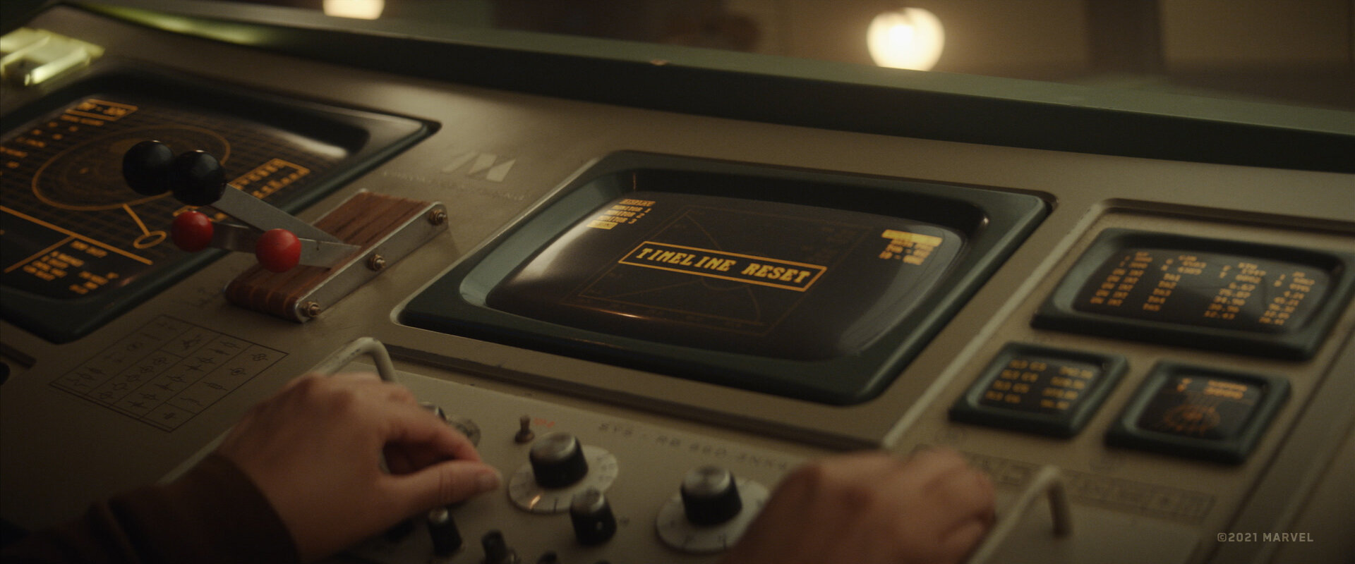
Screen graphics of “Loki”, courtesy of Cantina Creative and Darby Faccinto.
Kirill: There’s this rule of thumb that says that in order to get good at something, you need to put 10,000 hours into it. With everything being so accelerated now, do you feel that it’s still true in the age of the Internet?
Darby: From at least what I can attest in my field, you may not need 10,000 hours to learn the software. Maybe you can get comfortable with the toolset in a thousand hours. But then it would still take the other 9,000 hours or so to develop the taste, and I’m still developing mine.
I love blues. I love B.B. King and other old school performers. You’ll have this steady beat and there’s some quiet, and in between you’ll have tasteful guitar licks that are maybe four or five notes, but it’s a presentation. That’s how I see it for what I do. It’s important to master the tool set, but it’s more about what you are able to do with that to create that beautiful complete picture of what should be on the screen or how that moment should be told. And that comes in time. It’s not something that can be generated by AI.
Kirill: If you compare “Loki” to “Black Adam”, it feels that “Loki” elevated the screens to a bit more prominent place in the story. In “Black Adam” they were there, but they kind of existed in those spaces, but “Loki” made them hero elements. Maybe some productions do not necessarily promote or elevate the screen graphics to be these hero elements all the time.
Darby: “Black Adam” wasn’t necessarily about screens, and they were there to help tell the story a little bit more. But on “Loki” it’s a huge hero piece. It’s helping the audience understand the story, and that comes down to what am I working on and what is being asked of me. The graphics on “Black Adam” had a few story beat moments where they told a story, but for the most part it was there to help elevate the “futureness” of where they were. If we went over the top and made something absolutely crazy, that would have completely distracted from what the director wanted to get across, which was the moment between the actors, and not the screen. So in a way, that’s just as tasteful – to be able to restrain yourself and have something elegant that blends into what’s happening and does not take away from what’s going on.
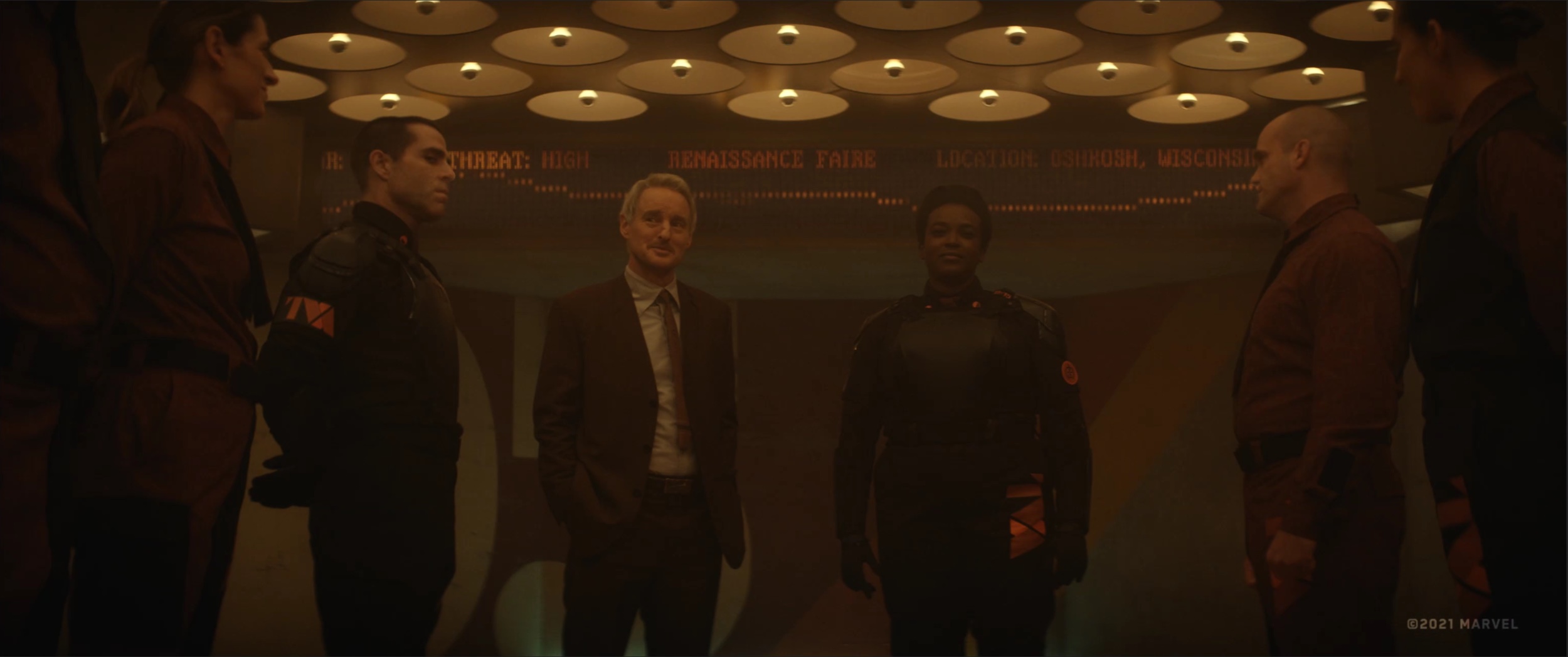
Screen graphics of “Loki”, courtesy of Cantina Creative and Darby Faccinto.
Continue reading »
Mark passed away in June 2024. As domain registration for his portfolio site expired, I am hosting the reconstructed version of it on my site at this location. You’ve single-handedly created this whole field out of thin air. It all stands on your giant shoulders. Enormous talent, quick wit, and an unmatched personality. We will all miss you, Mark.
Continuing the ongoing series of interviews on fantasy user interfaces, it’s my honor to welcome Mark Coleran. His seminal work defined computer screens in film in early 2000s, influencing a whole generation of artists that do screen graphics and motion design, and he’s widely credited with coining the term FUI itself. In this interview Mark talks about the early days of doing interface design for film, his transition to the world of real-life software, application of VR and its potential future for storytelling, the difference between art and design, the slow pace of evolution of the software tools at his disposal, and how to not get burned out after a couple of decades in the design industry.
 Kirill: Please tell us about yourself, and your path to where you are today.
Mark: I’m Mark Coleran, and I usually call myself a designer. To me being a designer means to cross a broad range of things, but I would say I am mostly in the field of communication design. Communication design is about telling people something. It’s about communicating an idea, a principle, a policy.
Back in the late ’80s I worked as a graphic designer in quick print shops, large print places and agencies, and I always had a penchant for the more technical side of things. I was fascinated by tools and their potential. I’ve been using Photoshop from version one, and started using AfterEffects early on. Video production was always there in the mix of things, and my first motion graphics piece was to do a quasi stop motion animation of a logo, all done on tape-to-tape, loading them one frame at a time onto a cassette.
As I was playing with motion graphics, I almost bankrupted myself buying machines and software things like Electric Image and After Effects which had just changed owners from Aldus to Adobe, originally Cosa. It was quite limited at the time, essentially Photoshop that could do multiple frames, and it was fantastic. I was playing with these bits and pieces, and as the market was evolving, it felt to me that I was perfectly positioned as an individual designer and production artist. It is production art because you are doing things for other people.
It was a good place to be, and it opened up certain opportunities. I worked with a prosthetics company in Pinewood that was doing a digital back end to the prosthetics people to extend that prosthesis out. So somebody might build a smaller part of a dinosaur as a prosthesis, and we would build the rest of the dinosaur digitally. I wasn’t too much into character animation, but it gave me an opportunity to work on a wide range of things like 3D modeling and compositing. While I was there I collaborated with special effects companies that were working on rendered wireframe sequences like a jump stunt off the top of a building. You add a lot of detail into that image to essentially reproduce what the stunt would be like in a cut, and that keeps the insurance people and the director happy and calms nerves as it gives a clearer idea of the “real” shot.
I always loved techy graphics, especially in movies like “Dr Strangelove” and “2001: A Space Odyssey”. The graphics there are geometric and mechanical, and they work to tell a story. So it just happened to be that on “Entrapment” they needed a screen to show how long this rope was, and I asked them if I could work on that screen. There was another company already working on it, and I ended up doing some visual effects and compositing on this little handheld computer. That was a good experience, and it got me in the door to work with Useful Companies, specialized in display work and screen graphics.
That would later be coined FUI, and I’m not sure I can take credit for that name, even though I’m given credit for it. Nobody knew what to call it and I was not quite happy with that name, but sadly it worked. Nobody outside of our little industry knows what that actually means, so maybe it’s a half success.
From there I learned a lot about doing screen graphics and got to work on some really good projects. It also came with the realization that I was a terrible designer. I don’t have any background or training for it specifically, but I do have a background in engineering drawing. I used to work with large, complex documents, and I started bringing that aesthetic and precision into my work on screen graphics. There two things married up quite well and worked for me rather than against me. I got to work with great people like Simon Staines. He’s a phenomenal designer, probably one of the best that you’ve never heard of as he prefers to keep his head way below the parapet.
People give me a lot of credit for this field, and a lot of it goes to him. I’m good because he’s good. He taught me a lot and turned me into a proper designer. He deserves a lot of credit in our field.
Screen graphics for “The Island”, 2005, courtesy of Mark Coleran.
Kirill: And then around 2007 you stepped away from the “fantasy” world into the “real” world projects.
Mark: That is true, but not quite as clear-cut. I love the software people create. You use it and you use it for a long time, and as they say, familiarity breeds contempt. And it’s absolutely not contempt for the people, believe me. People who make this software are amazing and talented, but you get frustrated with the limits of the software itself. You reach out, you talk to people, you find that sometimes those limits can’t be changed and sometimes they can. I got a chance to work with a lot of different people and contribute towards some of that as well. It was gradual, as it goes back and forth. I also had people reaching out to me asking to work on the interface part of their software.
All of this combined led to quite a few years of doing UI work, and that work is not as simple as people think. There’s a lot of factors involved in that. You have the technical capabilities of software and the systems they are running on. You have the user experience and the interaction part of it, which is massive. It took me a long time to learn this new craft and its considerations, going through the same process as I did with screen graphics. I had a couple of full-time jobs, and then joining GridIron who were known for their Nuclear Pro software.
We had discussions about some new ideas, and I joined them to contribute to the creation of a piece of software called Flow. It was designed specifically for artists like myself, and the idea was to try to improve how we do things. It was a great lesson and a great experience. I worked with phenomenally smart and brilliant people. It was a brilliant product and everybody loved it, but nobody bought it [laughs]. It was a lesson in so many aspects. It was an interesting experience to try to tie the film fantasy type of work to real products, because people love that aesthetic.
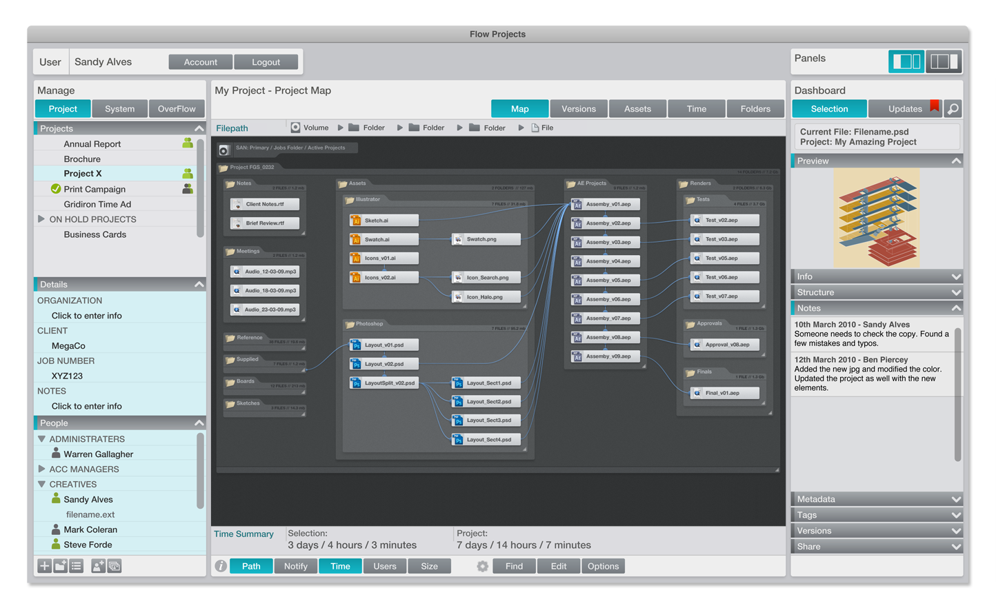
GridIron’s Flow, courtesy of Mark Coleran.
I recently did a conference talk with RGD in Canada, and it was about taking away the wrong lessons from FUI. I talked about the work I’ve done in films, and how I tried to apply it to the real world, and how I tried to apply the wrong things. We tend to fall in love with the aesthetic, and we think that the good looks are what makes it work. But the work we do in film is to create a diegetic prop. In film, you need to create a feeling about the person using it or the scene that it is in, or to articulate something about a piece of action or other plots.
It’s an illustration and a storytelling device, and there’s not much more to it. I say this not to dismiss it, as it is a really important thing. But it is not an interface. It was not designed to be used.
We spend so much time in film to make things look sophisticated and complex. It is sometimes horrendous how much time we put into the amount of detail we put into interfaces, and that is needed to impart a feeling of what it is supposed to be. And yet, real world software goes the opposite way of that. You try to make it less detailed, simpler, focused on the task that needs to be completed – and those things don’t work together. The film aesthetic fails here, in a sense.
But there are so many ways we can use the stuff from film. In film, you are telling a story, and in a sense, this part is quite under-utilized in real life software. When I work on interfaces for film, I use the same principles of composition as it’s used on the wider scene. I use light, shape, form, movement and sound to draw people’s attention to the right place. Each film screen has to have what we call a read. I see this thing, I have to understand it, and it has to tell the viewer exactly what is happening. And it has to happen instantly.
But I didn’t initially take these lessons back to the real world. It took time. It is not about the aesthetics. It is about how these cinematographic principles could make software better. The cinematic interface is not necessarily about how it looks like, but rather how it feels like. Adding animation to interfaces was one innovation that started in film. I was teaching it to myself, based on the same principles. Where am I? How did I get here? What can I do? Where can I go? Animation can assist with answering these questions. It was a great lesson on what to do and what not to do.
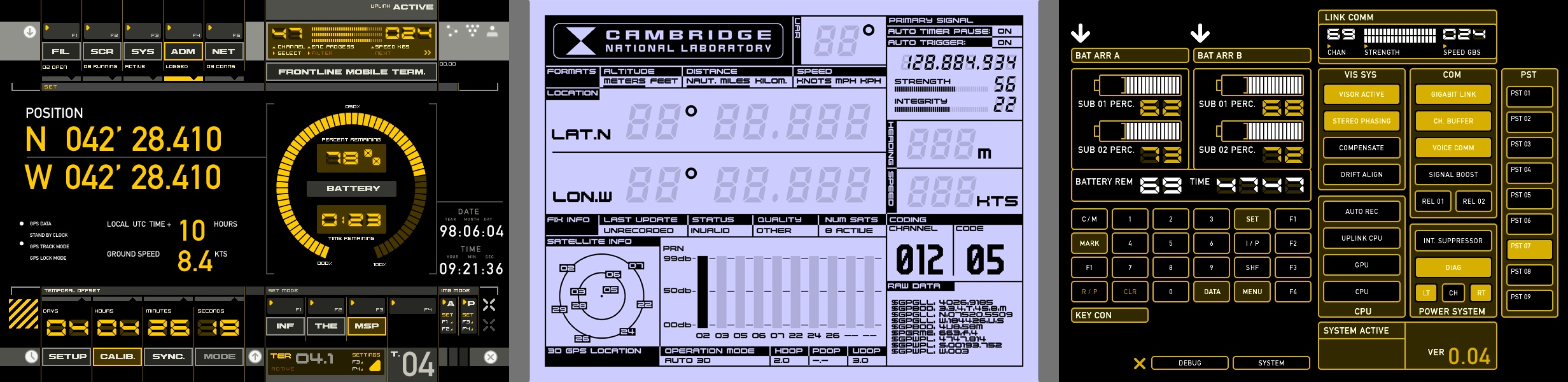
Screen graphics for “Deja Vu”, 2006, courtesy of Mark Coleran.
Continue reading »
Continuing the ongoing series of interviews on fantasy user interfaces, it’s my pleasure to welcome Rhys Yorke. In this interview he talks about concept design, keeping up with advances in consumer technology and viewers’ expectations, breaking away from the traditional rectangles of pixels, the state of design software tools at his disposal, and his take on the role of technology in our daily lives. In between these and more, Rhys talks about his work on screen graphics for “The Expanse”, its warring factions and the opportunities he had to work on a variety of interfaces for different ships.
 Kirill: Please tell us about yourself and the path that took you to where you are today.
Rhys: My background is pretty varied. I was in the military, I’ve worked as a computer technician, I’ve worked as a programmer, I’ve worked as a comic book artist, I’ve worked in video games, I’ve done front end web development, I’ve done design for web and mobile, I’ve worked in animation, and now film and TV.
It’s been a long winding road, and I find it interesting. I continue to draw on a lot of those varied experiences in video games and comic books, but also from the military as I’ve worked on “G.I. Joe” and now “The Expanse” when we’re doing large ship battles. It’s an interesting, and it’s a bit weird to think of how I got where I am now. It wasn’t something necessarily planned, but I just adapted to the times.
Kirill: Do you think that our generation was lucky enough to have this opportunity to experience the beginning of the digital age, to have access to these digital tools that were not available before? I don’t even know what I’d be doing if I was born 300 years ago.
Rhys: My first computer was Commodore 64. My dad brought that home when I was eight years old. He handed me the manual and walked away, and I hooked it up and started typing the programs in Basic. Certainly it’s not like today when my son started using an iPhone when he was two and could figure it out, but at the same time it’s not something that we shied away from.
I feel like we probably are unique in that we’ve had the opportunity to see what interfacing with machines and devices were like prior to the digital age, as well as deep into the digital age where we currently are. You look at rotary phones and even television sets, and how vastly different is the way we interact with them. We’ve been fortunate enough to see how that’s evolved. It does put us in a unique situation.
Screen graphics of the Agatha King, “The Expanse”, by Rhys Yorke
Kirill: If I look at your web presence on your website and Instagram, you say you are a concept artist. When you meet somebody at a party, how difficult or easy is it to explain what it is?
Rhys: I even have that trouble of explaining what a concept artist does with my family too. I refer to it sometimes more as concept design and boil it down to as I design things. I’ll say that for instance on “The Expanse” I’ll design the interfaces that the actors use that appear on the ships. Or that I’ll design environments or props that appear in a show. People seem to understand more when you talk about what a designer does, as opposed to the title of a concept artist.
Unless somebody is into video games or specifically into the arts field, concept artist is still a title that is a bit of a mystery for most people.
Kirill: It also looks like you do not limit yourself, if you will, to one specific area. Is that something that keeps you from getting too bored with one area of digital design?
Rhys: I find it’s a challenge and a benefit as well when people look at my portfolio. I have things ranging from cartoony to highly realistic, rendered environments. I do enjoy a balance of that.
I enjoy the freedom of what the stylized art allows. Sometimes I feel that you have the opportunity to be a little bit more creative and to take a few more risks. And on the other hand, the realistic stuff poses a large technical hurdle to overcome. From the technical standpoint, it’s challenging to create things that look like they should exist in the real world. And it’s a different challenge than it would be to create something that’s completely stylized, something that requires the viewer to suspend their disbelief.
These experiences feed into each other. I’m working in animation, and then I’ll take that experience and apply it to the stuff on “The Expanse”. I do enjoy not being stuck into a particular area, so I try to adapt. If someone will ask “What’s your own style?” I’ll say that it’s a bit fluid.
Screen graphics of the Agatha King, “The Expanse”, by Rhys Yorke
Continue reading »
