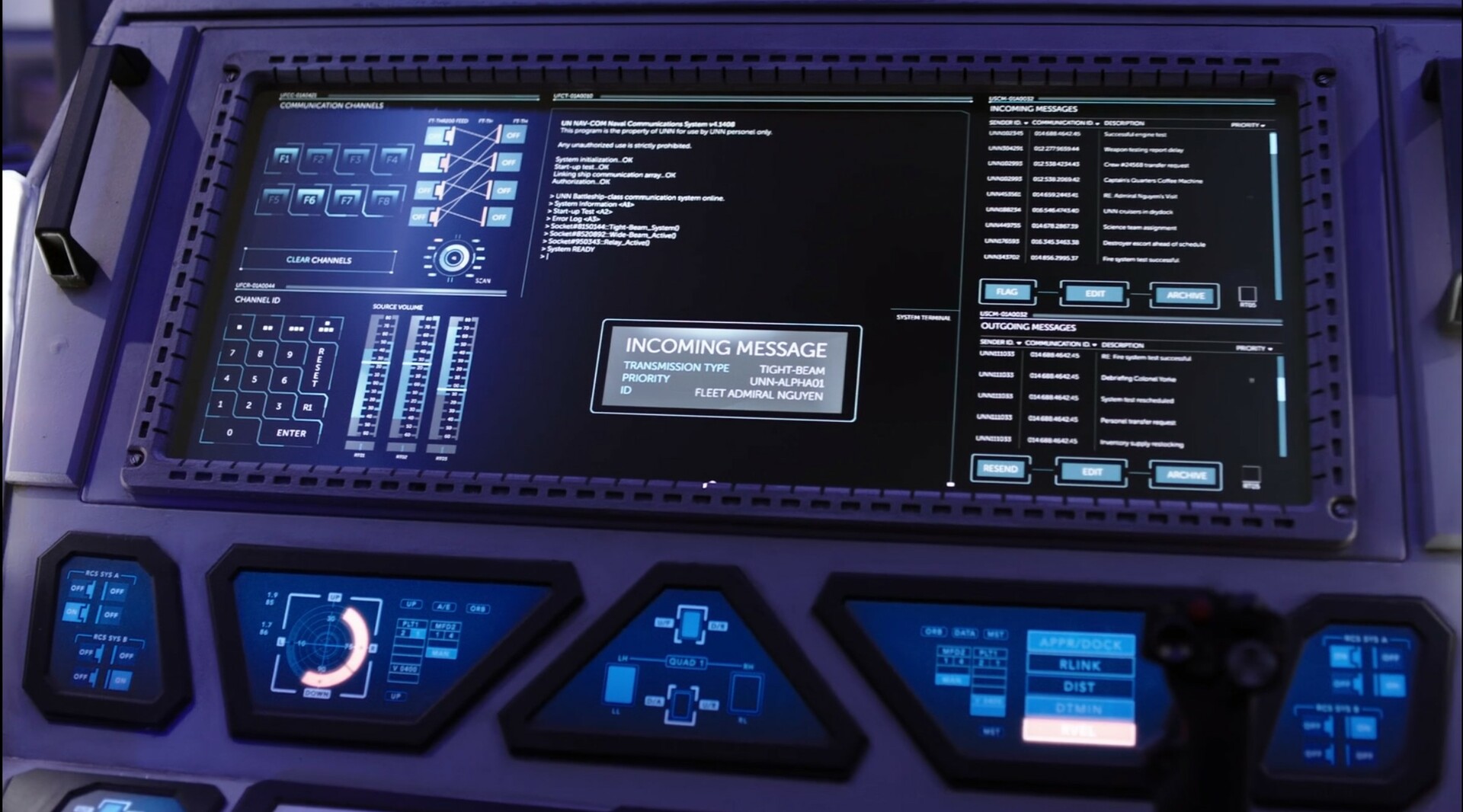
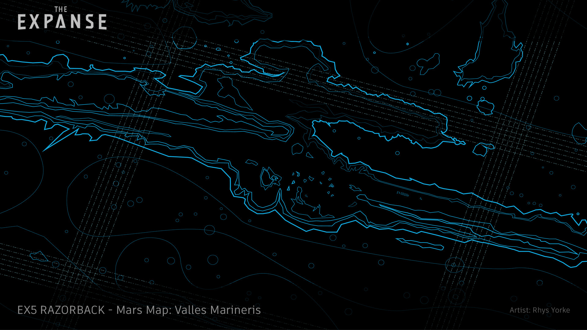
 Screen graphics of the Razorback's approach to Valles Marineris, "The Expanse", by Rhys Yorke
The art and craft of screen graphics – interview with Rhys Yorke
Continuing the ongoing series of interviews on fantasy user interfaces, it’s my pleasure to welcome Rhys Yorke. In this interview he talks about concept design, keeping up with advances in consumer technology and viewers’ expectations, breaking away from the traditional rectangles of pixels, the state of design software tools at his disposal, and his take on the role of technology in our daily lives. In between these and more, Rhys talks about his work on screen graphics for “The Expanse”, its warring factions and the opportunities he had to work on a variety of interfaces for different ships.
 Kirill: Please tell us about yourself and the path that took you to where you are today.
Rhys: My background is pretty varied. I was in the military, I’ve worked as a computer technician, I’ve worked as a programmer, I’ve worked as a comic book artist, I’ve worked in video games, I’ve done front end web development, I’ve done design for web and mobile, I’ve worked in animation, and now film and TV.
It’s been a long winding road, and I find it interesting. I continue to draw on a lot of those varied experiences in video games and comic books, but also from the military as I’ve worked on “G.I. Joe” and now “The Expanse” when we’re doing large ship battles. It’s an interesting, and it’s a bit weird to think of how I got where I am now. It wasn’t something necessarily planned, but I just adapted to the times.
Kirill: Do you think that our generation was lucky enough to have this opportunity to experience the beginning of the digital age, to have access to these digital tools that were not available before? I don’t even know what I’d be doing if I was born 300 years ago.
Rhys: My first computer was Commodore 64. My dad brought that home when I was eight years old. He handed me the manual and walked away, and I hooked it up and started typing the programs in Basic. Certainly it’s not like today when my son started using an iPhone when he was two and could figure it out, but at the same time it’s not something that we shied away from.
I feel like we probably are unique in that we’ve had the opportunity to see what interfacing with machines and devices were like prior to the digital age, as well as deep into the digital age where we currently are. You look at rotary phones and even television sets, and how vastly different is the way we interact with them. We’ve been fortunate enough to see how that’s evolved. It does put us in a unique situation.
Screen graphics of the Agatha King, “The Expanse”, by Rhys Yorke
Kirill: If I look at your web presence on your website and Instagram, you say you are a concept artist. When you meet somebody at a party, how difficult or easy is it to explain what it is?
Rhys: I even have that trouble of explaining what a concept artist does with my family too. I refer to it sometimes more as concept design and boil it down to as I design things. I’ll say that for instance on “The Expanse” I’ll design the interfaces that the actors use that appear on the ships. Or that I’ll design environments or props that appear in a show. People seem to understand more when you talk about what a designer does, as opposed to the title of a concept artist.
Unless somebody is into video games or specifically into the arts field, concept artist is still a title that is a bit of a mystery for most people.
Kirill: It also looks like you do not limit yourself, if you will, to one specific area. Is that something that keeps you from getting too bored with one area of digital design?
Rhys: I find it’s a challenge and a benefit as well when people look at my portfolio. I have things ranging from cartoony to highly realistic, rendered environments. I do enjoy a balance of that.
I enjoy the freedom of what the stylized art allows. Sometimes I feel that you have the opportunity to be a little bit more creative and to take a few more risks. And on the other hand, the realistic stuff poses a large technical hurdle to overcome. From the technical standpoint, it’s challenging to create things that look like they should exist in the real world. And it’s a different challenge than it would be to create something that’s completely stylized, something that requires the viewer to suspend their disbelief.
These experiences feed into each other. I’m working in animation, and then I’ll take that experience and apply it to the stuff on “The Expanse”. I do enjoy not being stuck into a particular area, so I try to adapt. If someone will ask “What’s your own style?” I’ll say that it’s a bit fluid.
Screen graphics of the Agatha King, “The Expanse”, by Rhys Yorke
Kirill: I feel that design is a subjective field, in the sense that you make something that you feel is a great solution to represent something or solve something, but then there’s also a lot of people around you that you are working for, that may have their own subjective feeling towards it. Do you struggle sometimes with it where you have to maybe give up on something that you feel strongly about because those who you work for do not connect to it as strongly?
Rhys: When you work in TV and film, that’s something that you’re presented with all the time. Typically, you’re working for the production designer and, ultimately, the showrunner – and everyone has different tastes. There were a couple of time on a show where I have pitched designs that were clean and flat, and the art director was leaning towards the more skeuomorphic approach. In that case, they had a five year old phone, so they were not necessarily up to date with the current UX.
Sometimes it’s a matter of having to educate the people you’re working with as well. You also don’t want to be right in the time period as well, because it’s easy to design something that might be current but will immediately get dated next year. You don’t want to be too on the on the trend. But at the same time, you still want to be current because there are expectations with the viewer as well.
For the most part, when it comes to film and TV, if it serves the story, then typically you can pitch your own aesthetic ideals when you’re doing the designs. I find they’re usually pretty open to that, as long as things look consistent, especially if you’re working on a team.
Kirill: Is there such a thing as a timeless design? Do we make that presumptuous pronouncement on the scale of decades, centuries, millennia? Does design go in sort of a spiral where trends come and go, and then get rediscovered some time later?
Rhys: That’s hard to say. If I was tasked with creating something that would be timeless, it would certainly be hard to achieve. I would also feel the same way – it would be a bit presumptuous to think I could design something that is timeless.
But I would immediately look to things that occur naturally. It is hard. What does timeless mean? Are we talking decades? Centuries? Or at our current pace, are we talking this year or next year? Archaeologists would probably agree that you can date things pretty easily by the way they’re designed by their form or function.
Screen graphics of the Agatha King, “The Expanse”, by Rhys Yorke
Kirill: There are so many screens in our lives in the last few years, phones, tablets, smart TVs, car dashboards, etc. Do you find that you have to compete against this plethora of designs that I as a viewer am surrounded with almost everywhere I go?
Rhys: Absolutely. As people become more used to interacting with screens, there is often a suggested language of how they’ll interact with it, and that is typically perpetuated by our smartphones these days. So when we hand an actor a device or a prop that has some interaction with it, they’ll naturally go to how they use their phone if it’s a handheld device.
That means that if we want to try to break out of that and try to design something that might be unique, or something that goes outside of the rectangle that we’re used to interfacing with, it becomes challenging as well. And audiences have expectations too. We might be working in a fictional world centuries in the future, they still have expectations about how you interact with these things. So it does limit you for sure.
So as long as you’re aware of what the expectations are and how far you can try and push that, you can balance that as much as you can and try to give the viewer a cool experience.
Kirill: Speaking of existing expectations, what are your thoughts on the color blue in screen graphics?
Rhys: It’s certainly overused [laughs] as the default. Directors of photography in particular tend to ask for different shades of blue, and that’s the main reasoning. It blends in. It doesn’t draw attention too much. It compliments their approach to lighting a scene.
Kirill: Have you ever been asked to use a color that nobody has seen before?
Rhys: Luckily no. But I have been fortunate enough to be able to try the colors of purple. It’s not really used all that much, and I’ve had the opportunity to blend in elements of amber as well, which dates back to old, retro screens. These are not your typical screens, but luckily, the production companies that I have an opportunity to work with are willing to take that chance.
The earlier seasons of “The Expanse” were a challenge to design the Martian ships with a red interface. There’s not a lot of existing examples I can think of beyond the Imperial interfaces in “Star Wars” and the “Terminator” machine screens. You get the feeling it would be the bad guys. Also, red draws your eye very clearly, and that was certainly a challenge.
I look back at some of the most fun interface designs that I’ve seen, and it’s nice. It stands out a little bit. It isn’t your standard blue. You don’t often see those.
Screen graphics of the Agatha King, “The Expanse”, by Rhys Yorke
Kirill: That was a light bulb moment for me, either in the first or the second season of the show. It was this Martian spaceship being attacked by the Earth fleet, and the warning lights are blue. It took me a second to realize that blue stands for Earth, so that would be the all-out-warning on a Martian ship, because they’re surrounded by red everywhere on their planet. Getting into the show, did it provide you an opportunity to play with a bigger canvas, as you have three different world of Earth, Mars and the belters?
Rhys: One of the things that I tried to look at when I came on board “The Expanse” was what the design language was for each faction. My first goal was that immediately as soon as the shot opened in a ship, I wanted the viewer to know that they were on a Martian ship, an Earth fleet ship, or a Belter ship. And we tried to tell that through the palette as well.
I put together a design guide for the belters, and it was inspired by Atari oranges and browns. Then the Martians have their harsh red. And you have the shape language too. When you do that, you start asking if we can have blue on a Martian UI. Of course you can, but it can’t be the Earth blue. Ultimately, if it serves the story, that’s when you know you’ve succeeded.
It gave us an opportunity to look at it holistically. Obviously, in the real world you wouldn’t have just one designer or one team of people like the team that we had, so we tried to implement a few elements in that. So you might see some discrepancies in a UN UI from different ships. Or maybe it’s a newer ship vs an older ship, and then you might see a little bit of design discrepancy in it. That would account for a different designer working on those, or the design itself evolving.
Kirill: Or they forgot to update their Windows XP installation…
Rhys: Exactly, UN runs on Windows XP [laughs], and Belters run on Linux. It certainly was great, especially on a series like “The Expanse”. You don’t often get that opportunity to have a canvas like that with the different factions.
Usually you might have one or two, maybe the Earth UI and the alien stuff, or the hero and the villain. But here there was an opportunity to do quite a wide range which is fantastic.
Kirill: Outside of the scope of interviews like this that do go into these details, do you want me as a regular viewer to explicitly notice this visual support that you give to the story, or do you want it to be in the background?
Rhys: When it comes down to it, if it supports the story then you really shouldn’t be thinking too much about it. I do appreciate seeing a great design interface design and thinking how amazing it is, and I like to see those moments. But at the same time, if it’s taking away from what you’re trying to tell as far as the story, then I don’t think it’s as effective as it could be. A good user interface should blend in with the background. It should feel like it’s naturally there, not stand out and say “Hey, this is a unique interface, look at me”.
As much as my ego would probably love to have people look at the show and say “Hey, look at that, that’s amazing” I feel that it should be more about what’s going on and if it’s supporting the story.
Screen graphics of the Rocinante, “The Expanse”, by Rhys Yorke and the Motion Graphics Team
Kirill: How does it feel when you do look back at those long months of work that have been compressed into a rather limited time frame on these productions?
Rhys: You deal with that a lot as a designer or an artist in general. I’ll start with thumbnail sketches, I’ll do some research, but on the show you don’t see that. You see the final product.
We try to make the interfaces as practical as possible, especially on shows like “The Expanse”. We try to make them for the actors to interact with when they’re on set, when they’re in the moment, instead of doing it in post. And we do some stuff in post which is just not possible to do during the day. Going back to it, some time passes between you designing it, it getting to be displayed on the screen, the actors interacting with it, it going through the whole editing process and color grading, and then it showing up in the final product. And at that point, the shot that you spent a week on is only on for a second or two. Or sometimes the screen that you spent a day on is on the screen for a whole minute.
It’s certainly interesting to see it in its final stage, and to know all the work that’s gone in behind that. I feel like if you’re growing as a designer, then it’s all worth it. If I can look at the screens that I did in season 3 compared to the screens that I’ve done in the most recent season 6, and I see a growth – even if only I see that growth, that’s OK. To me that’s what makes it all worthwhile.
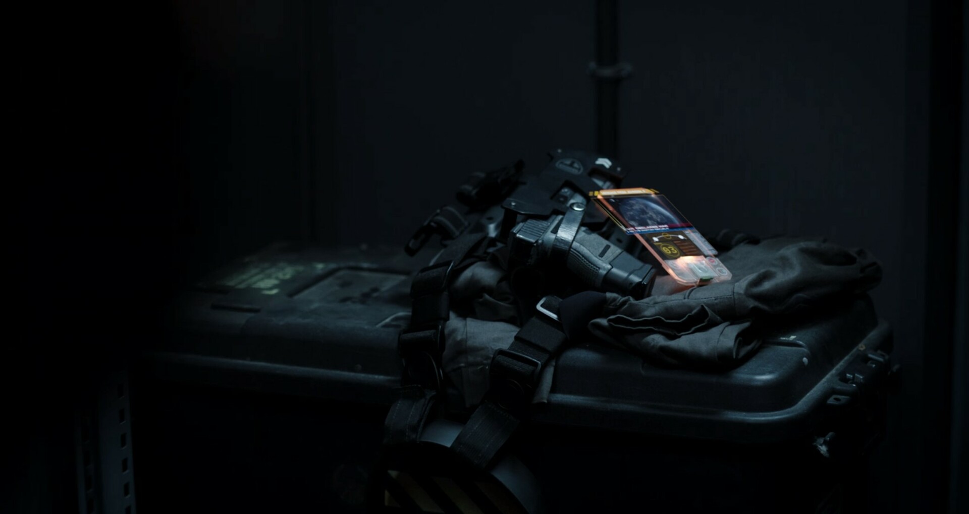
Screen graphics of the handheld comm units, “The Expanse”, by Rhys Yorke
Kirill: When I asked you about competing against the screens in our life, you mentioned the desire to break away from this rectangle of pixels. This show has two pieces of technology that do break that paradigm, the first being that handheld communicator where the projection goes beyond the edges, and the second being the holographic sphere projection of a sorts in the ship HUDs. Do you see that as an attempt to make it a little bit more interesting for the viewer?
Rhys: The holographic components of the communicator is something we tried to push a little bit. In one way, it serves a practical purpose of the story where it allows us to display more information on a device that is smaller. But at the same time, it does make things look a little more interesting. So you might have a floating, rotating ship off the side of the comm, sort of floating in space, and in meanwhile the person’s looking at the schematics. It does serve to add a little bit of visual interest to that, which could be a dull shot if you’re looking at just that slab of acrylic.
Kirill: Do you feel they ever run out of power with those handheld communicators?
Rhys: I would certainly love my laptop to be powered by those devices, whatever they’re powered by [laughs]. I imagine that they probably are wirelessly charged.
Kirill: As you work on your laptop, or perhaps a two-monitor setup, how do you envision these designs floating in space, floating beyond the edges of the screen, expanding to fill a whole bridge on a spaceship?
Rhys: I know that a lot of people that work in film and TV that design interfaces might not even see the sets at all. One of the nice things with “The Expanse” was that right from day one they encouraged me to go down to the set. I also watched a few shots of how the actors were interfacing and working with the screens that we had designed. Seeing that firsthand really helped inform me when it came to designing everything else.
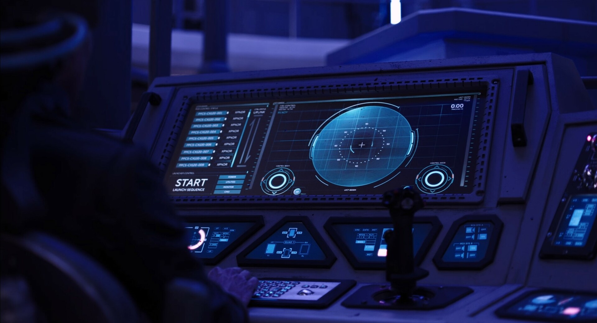
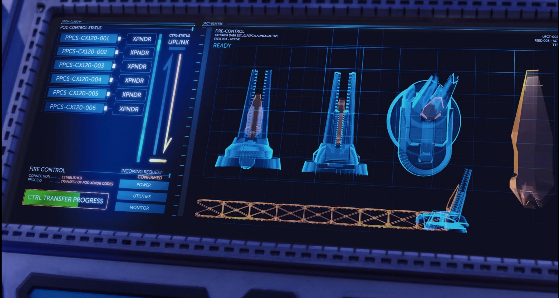
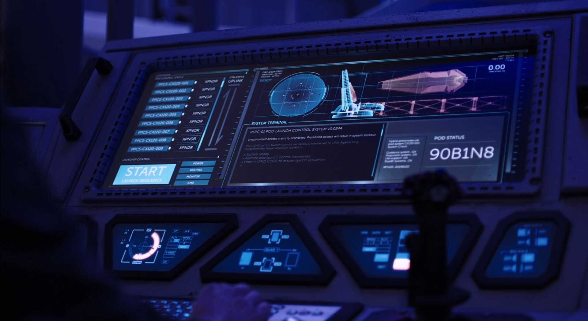
On ships like the Thomas Prince or the Rocinante we could go in on to the set and see how physically big is the screen that we’re designing for. I feel like you can’t design on a 42-inch monitor when it’s going to be on a 14-inch monitor on set. You can’t effectively do that well. So I tried to get as much hands-on practical as I could. Keeping things simple and understanding what the utility of each screen was for helped with that too. Nothing was meant to be superfluous or just there for visual interest. Everything was a part of that UI for purpose.
Kirill: Do you find yourself designing for the character that is operating the screen, or for the camera that shows me as a viewer that more detached view of the screen that the character is operating on?
Rhys: I always try to design first for the situation. If I’m designing for a warship like the Rocinante, I’m trying to picture myself piloting the ship. I’m under duress, I need to arm something, I need to turn the ship. What am I looking at? What needs to grab my attention? You try to put yourself in not necessarily the actors shoes, but the character shoes. That’s a challenge when it comes to the fictional UI, but that’s the only way we can be effective.
If something needs to change in order to better serve the story, that happens all the time. We really need this to be shifted over to the right because that’s the shot that we got that day, and that’s when we’ll make adjustments. But I try to always start to be as authentic as I can by trying to put myself into the operator’s shoes.
We were fortunate to have a visit by a NASA astronaut who talked to us about how NASA designs their interfaces. That was eye-opening and it certainly helped us to understand what the hierarchy of what needs to happen when all that’s between you and the vacuum of space is a few inches of steel. That helped us prioritize what our design philosophy should be.
Kirill: How many times have you found yourself designing one of those giant flashing “Access Denied” dialog boxes?
Rhys: A few times for sure. The nice thing is that the showrunner didn’t want these giant boxes. For the most part, you want to avoid the giant flashing text across the screen that you can see from the other side of the ship. He was very good about trying to avoid that, and wanted a more practical approach. There were some directors that asked for that, but luckily because the showrunner already had established a particular look, we could avoid doing that.
That happens on other shows too. We always try to pitch a better way to do something like that, but sometimes it just comes down to that being the best way to get the story across.

Screen graphics of the Behemoth, “The Expanse”, by Rhys Yorke and the Motion Graphics Team
Kirill: Do you want to design for the viewer that is viewing it today as the show is released? Do you worry how this work will be seen in 15-20 years?
Rhys: That’s always something that’s on your mind when you’re designing something. Is your design going to look outdated?
If you’re designing for the moment in the story, and it fits in that world for that time, then you’ve achieved it as best as you can. That’s the only thing you do. You’ll drive yourself crazy if you try to predict it. You’ll drive yourself crazy if try to design for the future, and also design for the past, and also design for the present.
I look at the Rocinante and think what type of design was there at that particular time in the chronology of the story, and I try to design for that. It’s a little easier to make the language for the show itself and where it exists if it’s a fictional world. You have the best opportunity to keep your design fresh in that moment.
If you see a Star Wars interface, you’ll probably recognize it as one. Same thing with the earlier Star Trek, or even The Next Generation that might be a better example where the LCARS is immediately recognizable. It certainly looks dated now with our design tastes, but it fits for that moment. That’s the best that we can hope for – design for the world in the time that the show takes place. If it ages well, that’s great, and if it doesn’t, then it doesn’t.
Trying to chase that idea that we can design something that’ll be timeless is certainly something that’s unachievable. And maybe it’s not something that we should be attempting anyway.
Kirill: Is there such a thing as your favorite design for one of the ships maybe of one of the technology pieces that you’ve particularly enjoyed working on in “The Expanse”?
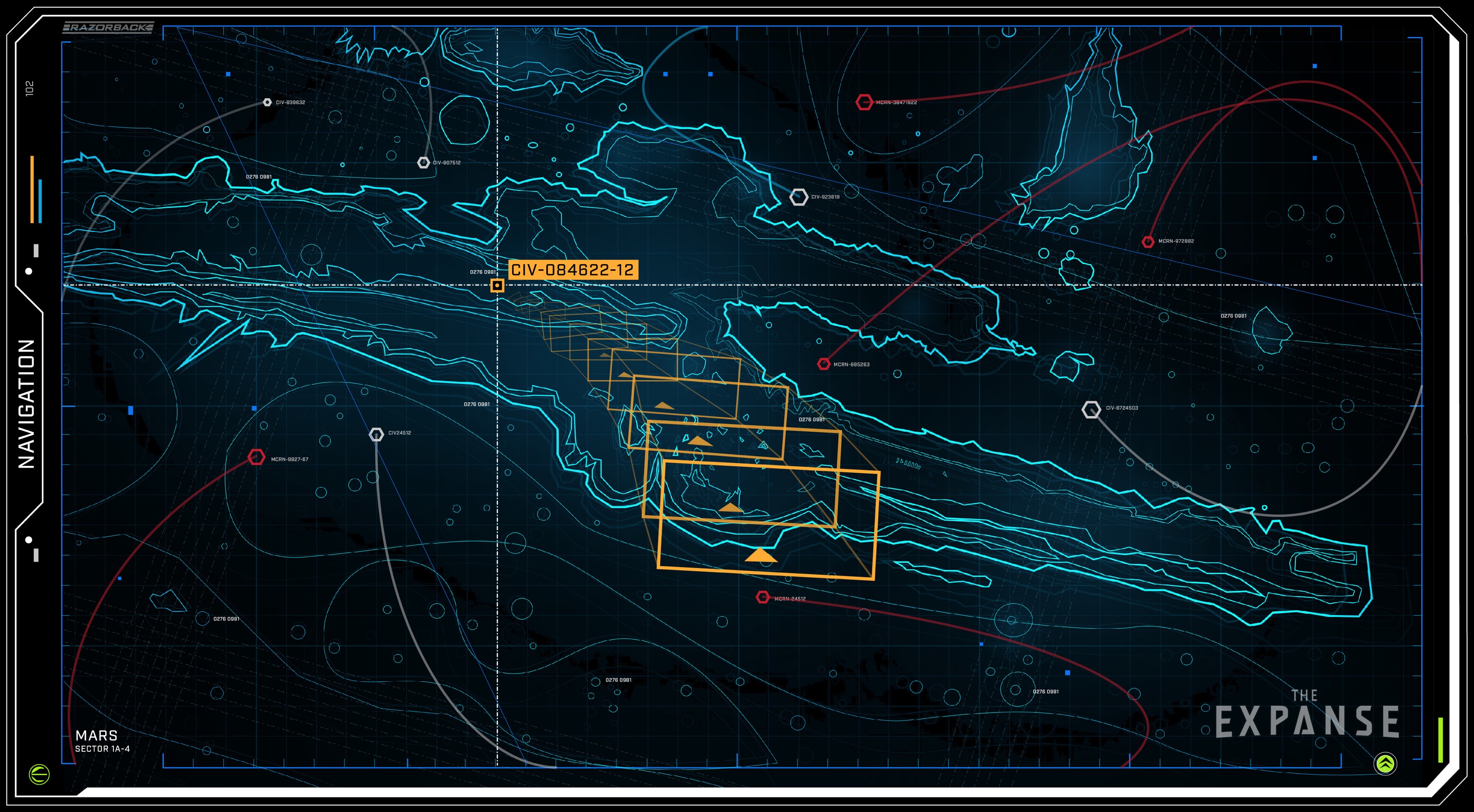
Rhys: My favorite design on “The Expanse” is the Razorback. I love designing maps, and it’s probably because I played a lot of D&D when I was a kid. I liked to sit and draw maps. Sometimes I would never even play those maps, but I would have pages and pages of maps.
Doing the Mars trench map for last season was so much fun to do, and I really liked the way it turned out in that holographic spherical display. It broke with the whole square screen, it was a unique and fun design. Of all the things, that certainly stood out as one of my favorites to work on.
Kirill: My last question on “The Expanse”. If you had one wish for genie, what piece of technology from the show’s universe would you want to have today in your life?
Rhys: Certainly those comm units are pretty amazing. That would probably be one of the more practical things to take with me. If I had a piece of technology that was a little more dangerous, I would certainly end up hurting myself with it [laughs].
Kirill: Those marine suits?
Rhys: I would end up hurting myself more than anything else. They are all fantastic designs, from the suits to the warships. But I wouldn’t last two seconds in one of those.
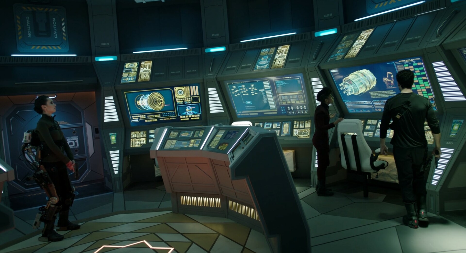
Screen graphics of the Behemoth, “The Expanse”, by Rhys Yorke and the Motion Graphics Team
Kirill: Do you like the software that you have today at your disposal? Do you find sometimes that it stands in your way or do you manage expectations?
Rhys: I have made no secret that I absolutely hate Adobe After Effects, and I don’t think I’m alone in this. It’s quite challenging to try and design good interfaces in After Effects. I use Maya, Octane, Unreal and other software packages. A lot of these are node-based, and it feels like After Effects has been cobbled together over the years. It needs to be redesigned from the bottom up, and the fact that there’s no competition out there for it in the motion graphics industry is probably why it really hasn’t been redesigned at all.
During the last season I ended up focusing mostly on the design, and I’d hand off the designs to other artists so that they could animate in After Effects. I was too slow and clumsy with that software. I had long ago decided that I want to use it as little as I have to, so I ended up focusing on Illustrator and other tools to create the designs, and then handing them off to other artists. This season though I’ve had to roll up my sleeves again, get down into After Effects and relearn how to put everything together. It’s certainly been challenging and frustrating.
I know that some people that work in film use Nuke and some people have tried using Blackmagic Fusion, but they don’t have a lot of the features. There are a lot of third-party tools in After Effects, so if people were to move over to different software, that would require abandoning those tools. I tend not to use a lot of third-party tools. I try to focus on good design and minimal flashy stuff. I’m happy in Illustrator. Sometimes I use Affinity Designer if I’m doing something quickly and then Photoshop as well. I’ll often take the screenshot and do a rough sketch to design the initial outline.
Kirill: Do you do anything on paper and pen?
Rhys: Absolutely. I have sketchbooks full of drawings and designs. I do these little thumbnails, and it usually starts when I read the script. As I’m reading the script, I’ll do a little sketch in the corner of the page. I love any opportunity I can to use a sketchbook.
Kirill: Is there such a thing as a hard disk big enough or a graphics card fast enough to keep up with what you do?
Rhys: [Laughs] That’s the thing. The more power you have, the more you want. I’ve been working on a new show for this past year, and I ended up having to buy a whole new machine. There was a shortage of 3000 series card, so if I wanted it, I had to buy the card and the machine to go with.
Screen graphics of the Razorback, “The Expanse”, by Rhys Yorke
Kirill: Speaking of this past year, how has Corona treated you?
Rhys: Luckily, this past year I was working more in the concept art field. A few designs had user interfaces as pieces of the set, and I jumped at that opportunity. Whether or not the person that’s actually doing the motion graphics decides to take those designs and use them – that’s totally up to them.
Certainly I found it beneficial to be able to not worry about getting last-minute things to the set, at least this time around. It helped to have high-speed internet, a good powerful computer at home, and being in constant connection with the production office.
There are some things that you miss, especially the nuances of communication. You miss that back and forth with the production designer when you’re trying to come up with a quick sketch on something. Being side by side would have been ideal, but you do what you can. We’re definitely lucky in that sense that we had the technology to handle that.
Kirill: Going back to your first experiences with Commodore 64, it was that rectangle of pixels on the screen, with the keyboard and the mouse attached to it. And here we are in 2021, looking at a slightly more dense and vibrant rectangle of pixels on the screen, with the keyboard and the mouse attached to it. Are we stuck? Do we need something different, or is this the pinnacle of human-computer interaction?
Rhys: I will use Photoshop as an example, as I was discussing this with another artist the other day. When I first started using Photoshop, I believe it was on a Pentium 2. You had to save every now and then, it would crash all the time, and fast-forward to 2021 – it really hasn’t changed all that much. There are still times when it’ll chug if you try to draw across the screen. We have more powerful Cintiqs and things like that to facilitate certain flows, but in the end it really hasn’t changed that much.
I miss the simplicity. I use Mac, PC and Linux, and it’s nice to see the terminal sometimes, when it’s just you and the command prompt [laughs]. When I’m working on Linux, it’s either in a VM or on a Raspberry Pi. It’s just me and the terminal, and it’s nice sometimes to push everything away and deal directly with the machine. That’s how I learned it as a kid. There’s a lot of stuff with drag-and-drop UI coding that tries to facilitate ease of use, but it does obfuscate what’s going on behind the scenes. We’ve become really good at trying to hide what’s happening.
My son takes very quickly to technology, and I find this is common with a lot of kids his age, and even 20-somethings too. They’re very keen and good with technology, but they might not understand how it actually works. Growing up and having to write the config files on my PC in order to play the game properly, you had to learn about how to the technology worked.
Screen graphics of the Rocinante, “The Expanse”, by Rhys Yorke
Kirill: And yet the technology today is accessible to billions instead of millions back then.
Rhys: It certainly has become more accessible, which is fantastic. You can buy Raspberry Pi for $30, and it’s probably more powerful than the PCs that we used as kids.
But it does feel like we’re stuck. We’re still using a keyboard. We’re still using a mouse. We’re still typing. Voice recognition is not quite there yet. Predictive text is not there yet. We’ve certainly refined the interfaces that we’ve had, but it’s still the same thing as the Commodore 64. You’ve got a keyboard, you’ve got a monitor, and you’ve got a mouse. We’re still stuck on that.
Kirill: On the scale between “I want to go back and live in the woods with no technology” to “I want to become one with the machine” where do you find yourself?
Rhys: It depends on the day [laughs]. We just spent a no-screen weekend as a family, and it was nice. I had a chance to read a bit more, to take account of different things that I wouldn’t normally if I was working on the weekend. But it’s definitely a difficult question.
There’s a lot of dystopian ideas that you read in science fiction about becoming one with the machine. I don’t think the machines have quite been able to come to the level of complexity that nature has, and it’s not even close. It would almost feel like a step back in that sense. Maybe we’re headed in a direction where things might be indistinguishable between reality and these virtual worlds.
We’ve been training ourselves, and I think it continues as well, for our memories to be non-permanent. We no longer retain a lot of that information of how do we get to the corner store [laughs]. Well, maybe not to that extreme yet. But when you go to a friend’s house, you’re plugging in their address into your GPS and letting it guide you, instead finding and remembering the directions. We’re losing that function.
Kirill: Maybe WALL-E near future of people being transported everywhere by those fully automated chairs will come to fruition if self-driving cars ever come to existence.
Rhys: That’s very possible. It’s the trade-off of technology of convenience. When you’re learning something now, it is about how good of a researcher are you, as opposed to how much information can you obtain and keep in your head at the same time. It certainly has changed.
Kirill: How do you choose what you do on social media as a consumer and as a producer?
Rhys: It’s interesting, maybe because social media is fairly new for us. I don’t find it has as big of an impact on how I value myself, as opposed to how some younger people do. I think it is a real danger, especially for my son. I don’t want him to put value on how many likes he has.
I usually share bits and pieces that I’m proud of, a quick sketch or something like that. I keep it fairly light. But I’m not thinking that if I don’t get a thousand likes, it means it’s not a good piece. I try to post fairly frequently, but I feel like the less frequently I post, the more work I’m actually getting done [laughs]. If I’m not posting frequently on social media, then it must mean that I’m fairly busy creating art, which I find is a positive thing.
For better or worse, you can certainly get caught up in just browsing for hours on different social media platforms. There are a lot of great benefits to various places like Youtube where you can watch instructional videos on different painting techniques and different approaches, and even critiques of UIs on different shows. You’ve got channels for that and it’s valuable, but it’s easy to get caught up into that. I try to not make it my main focus, and that’s the key. If people want to see my work, they can go to ArtStation or my website.
Kirill: My last question has two versions. One is what keeps you going in this field. And the other is what happens if you go to that corner stone and buy a lottery ticket that wins you a billion dollars. Do you keep on doing what you’re doing today?
Rhys: Absolutely, I wouldn’t hesitate. Maybe I’ll take a couple days off [laughs].
I love creating things. Since I was a kid, I’ve been creating things with my imagination, drawing maps or building transformers with my classic Lego pieces before they had these kits. I love to build different things, and that is what keeps me going.
It’s about creating, building new things, exploring cool ideas, trying to come up with things that people haven’t seen before, and learning. Another thing that excites me is seeing great illustrations and great designs. It inspires me to try something like that maybe in my next design. It’s pretty neat to see how that has evolved, even in the way that we consume concepts, designs and UIs. Things change, things evolve, and people have different tastes.
All of that is a lot to keep someone interested and keep things from getting stale and boring. Certainly if things got to a point where I wasn’t finding enjoyment anymore, I would probably look at something else. I find inspiration everywhere, and that’s definitely something that keeps me going.
If I had a billion dollars, I would probably add a little bit more space to have an art studio [laughs], but I would certainly keep going.
Screen graphics of the Agatha King, “The Expanse”, by Rhys Yorke
And here I’d like to thank Rhys Yorke for taking the time out of his busy schedule to talk with me about the art and craft of screen graphics, and for sharing the supporting materials for the interview. You can find more of his work on his ArtStation and Instagram profiles. And if you’re interested to read additional interviews about the wonderful world of screen graphics and user interfaces for film and TV, click here for more.
