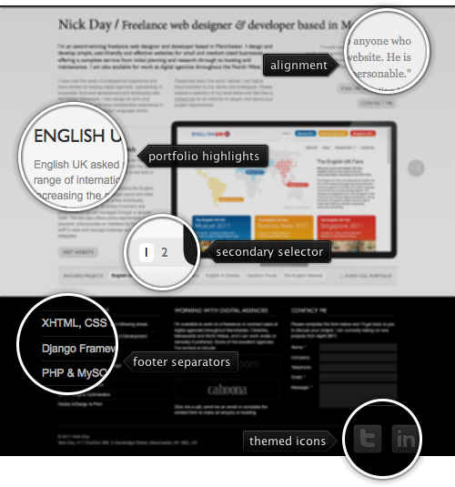
Today’s post highlights the design of NJDay.com. I like the simple and unassuming color choice of this single page site and the nice way that the main section text seems to flow around the portfolio highlights. The barely noticeable vertical background gradient with faint traces of yellow adds a nice touch of color to the main section, followed by the switch to white-on-black footer that aligns to the same three column grid.
The typography seems to strike an awkward balance between the embedded Gill Sans used in the header, the increasingly bland Arial for the body and image-based title and footer ampersand. The last two seem a particularly brittle contraption given the ever increasing capabilities of web typography and CSS selectors. On a more positive note, don’t miss the “Show full portfolio” element below the right bottom corner of that section to see a nice expanding effect. Showing a circular download progress indicator framed in the matching outline is a nice touch to address the portfolio entry switches; cross fading to the loaded image is the perfect complement in this transition.

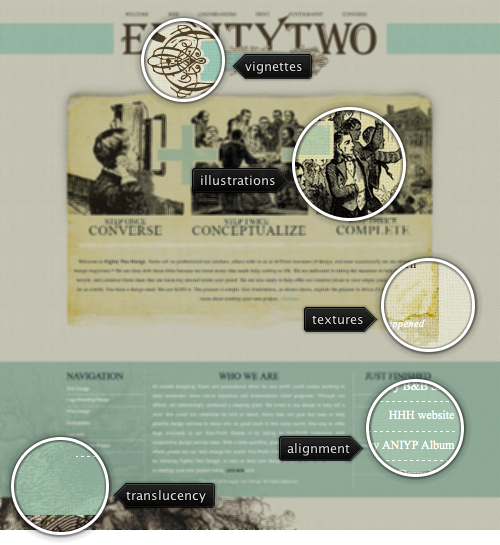
Today’s post highlights the design of EightyTwoDesign.com. It’s a nice blend of vintage elements, from burnt irregular textures to vignettes, from the hatch illustration style to a great looking letterhead font in the header. It’d be even more interesting to see a step away from the Times New Roman used as the body font – and experimentation with retro-styled web fonts to further highlight the vintage elements. Improving the legibility of white text on very light sea green footer would also be welcome.

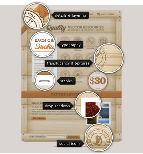
Today’s post highlights the design of VectorMill.com. Playing off the “crate” as the unit of digital delivery, the content is placed on top of a detailed wooden crate, complete with planks, stamps and stapled sheets of paper. The brown color dominates the palette, reaching into the oranges and grays to aid in visual distinction of different sections. The main logo serves as a work specimen, highlighting the intricate precision of the studio work.
Where most of the sites fall back on using images for precise positioning and alignment of header and section text, this one is a great example of we typography, mixing the robustness of Museo Slab with the vintage calligraphy of Corner Store. And if i had to pick one more element, it would be the social icons “stamped” on the bottom right edge of the crate. Note the subtle touch of cutting of some of the explanation text around the icons in favor of maintaining an authentic look of shipping crater stamps. Also, make sure to visit other pages such as Contact and About to see the consistent application of typography, colors, textures and other elements.

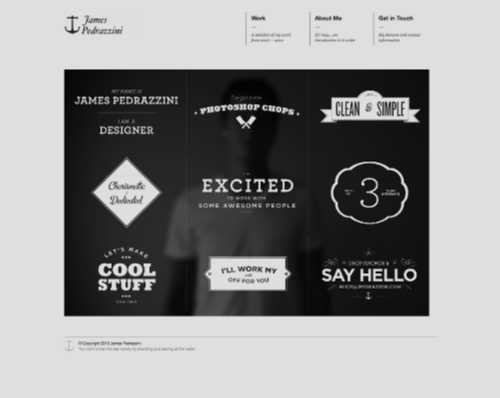
Today’s post highlights the design of JPedrazzini.com. An original, clean and memorable landing page that uses typography and illustration on the backdrop of the blurred designer’s torso. This is a really great way to set yourself apart and highlight your skills at the same time.