I’ve been talking about responsive mobile design for quite some time now, but was kind of neglecting my own blog and how it looks like on smaller devices. My main focus is on readability, and this was severely impaired on smaller screens. I was using the WPtouch plugin on the blog, and while it was doing a somewhat decent job at scaling down the content, it was not very good.
And so I spent the last few evenings doing semi-random things in my CSS and poking around the developer tools in Chrome. It’s not finished, of course. I still need to figure out how to bring back the search. But otherwise I’m quite happy with how things look now when you browse this site on smaller screens.
Mobile web is a commonly used name for browsing web on mobile devices. It is a rather useful, but very misleading way to talk about how web pages look on a variety of smaller screens. Screens which are, at least at the present moment, associated with devices that are more mobile than traditional screens found on your desk. The ill-fated push for netbooks and the recent wave of hybrid tablets that have desktop docks with full-size physical keyboards are blurring this traditional line between mobile and desktop screens, but I digress.
As Jeremy Keith points out in his “There Is No Mobile Web” presentation, and as I have mentioned a number of times on my blog, one of the more important facets of responsive design is adapting the presentation of the content to the current context:
Now the important thing is, each time I switch the layout there, going from two to three to six, those break-points, those changes, were not dictated by the size of devices; they were dictated by the content. When did it make sense for the content to switch from two to three to six? Because again, I don’t think it scales to just choose your break points based on whatever’s currently popular. So at the moment we’ve got 320, 480, 640, whatever, but there’s so many different devices out there with so many different sizes and dimensions that it makes much more sense to let your content decide when is it time to expand; when is it time to allow some breathing room.
One of the greatest strength of Web as a platform is the ubiquity of access. A device, no matter how small or big, that ships without a built-in web browser is quickly becoming a thing of the past, a curiosity, a gadget at a severe disadvantage in the fiercely competitive landscape. This landscape is seeing a lot of experimentation in the physical screen size, aspect ratio and pixel density. Designing your structure around a few “well-known” pixel widths of a small subset of popular devices is a losing proposition. Instead, the logical hierarchy of your content – the blocks, their logical importance and the spatial relationships between them – must be the primary factor in the decision to switch between different representations of it.
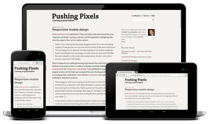
This blog has four blocks: header, content, sidebar and footer. The word “content” is rather overloaded here, and by “content block” I mean the left column that contains the article(s) that you’re reading. As part of the recent redesign the content column switched from 600px width to 720px width to accommodate larger font sizes (with a nice side-effect of being able to use larger images for interviews and other articles). As I started thinking about the different ways to scale down the presentation of the blog to smaller screens, my main goal was to reserve as much horizontal space as possible for the main content block, and to preserve its width (720px) for as long as possible.
At its widest, the current representation is 1120px wide, with 720px going to the content and 365px to the sidebar. Using auto as left and right margins centers the entire content in the browser window. This worked nicely when you viewed the site on a large screen – or rather when your browser window was sufficiently wide to fully fit the entire 1120px span under the current zoom level. However, if you started to make the browser window smaller, horizontal scrolling kicked in and the entire experience was not very user-friendly.
In the new implementation, after a rather short intermediate step where the content column remains at 720px and the sidebar shrinks to 245px, the entire layout switches to one vertical stack – header, content, sidebar, footer. In fact, the transition from displaying this secondary content (“about” blurb, links to recent entries and links to social media profiles) at the right side of the main content to displaying it below the main content reveals a rather unfortunate naming convention for it. It goes along the same vein as the distinction between the semantic <em> (for emphasis) and the presentational <i> (for italics).
At width of 1000px – encoded with @media (max-width: 1000px) – I switch to width=auto, margin=auto and max-width=720px. Here’s a screenshot to illustrate what this does:
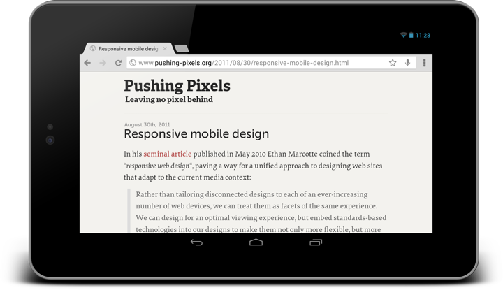
As the sidebar is no longer displayed to the right side of the main content, there’s a certain range of screen sizes where I can display the main content in an area which is wider than 720px. My decision here is to limit the content to its “original” width with max-width=720px and center it horizontally in the parent with margin=auto.
As you go along the axis of progressively smaller screen sizes, at some point you need to decide what to do when you just don’t have enough room to display even a single block of content at its “ideal” width. This is where width=auto kicks in, making sure that your content wraps within the available horizontal space.
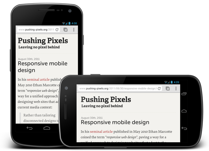
Once you have a decent presentation figured out, there’s a lot of things that you can refine and polish. Depending on the the logical structure of your content you can have multiple breakpoints (or switching points) where content shifts between a number of possible presentation structures. You can play with font sizes (as I did for the main title and subtitle in the header). You can play with content paddings to give it more breathing room on slightly larger devices. For example, in the next screenshot you can see that in portrait I use 12px padding, while in landscape I use 24px. The difference here, of course, is not the specific pixel size or orientation of the specific device, but rather the available width. Currently I encode the switch from 12px to 24px by @media (max-width: 480px). Some sites use percentage based paddings and margins, at the expense of not following a well-defined grid rhythm.
At slightly over 100 lines of CSS and one extra meta directive in the <head> section, with no changes to the overall content structure, this has been much less painful than what I feared it to be.
The full explanation of the viewport meta tag is somewhat over my head, and I don’t quite understand why this needs to be specified explicitly for optimizing the content viewport and default font size on smaller screens, but suffice it to say that without the magic of adding <meta name="viewport" content="width=device-width; initial-scale=1.0; maximum-scale=1.0; user-scalable=yes;" /> to the <head> section the site looked quite badly on a variety of devices and browsers.
I’m not a web developer, nor do I pretend to be creating a complete guide for turning any blog into a fully responsive one. This is just documenting a first and very important step towards making Pushing Pixels look good on a much more diverse variety of screens.
Steve Simpson‘s work spans editorial print illustration, packaging design, children’s books, postal stamps, album cover art and much more. His unique approach combines such unlikely elements as retro vintage colors, folk art references and mid-century cartoons, bringing them together in a vibrant and immediately recognizable style. His active digital presence includes his main portfolio site, as well as Behance and Twitter. Selected prints are available for sale at Society6 and The Copper House Gallery.
Today I am thrilled to have an opportunity to ask Steve a few questions about the art and craft of illustration in the digital era.
 Kirill: Tell us a little bit about yourself and how you got started in the field.
Steve: Originally from the UK, I’m an illustrator and designer now based in Dublin, Ireland. I’ve been working in the area of design for print for the last 20 years. Previous to that, I spent 7 years working in TV animation and also had a short spell in comics. I studied technical illustration way back in the early 80s in the time before computer aided design:).
Kirill: You move with ease between a number of illustration styles. Is this a conscious decision to diversify and be flexible?
Steve: With my background in TV animation, the ability to change style from one to project to the next was an essential, even lorded part of the game. When I started to sell myself as an illustrator in Ireland, having multiple styles really helped kick start my career. Mainly, I was being asked to produce brightly coloured cartoony type illustration. It had a broad inoffensive appeal I guess.
It was only later that I noticed a style evolving, particularly in my personal work. Initially it was difficult to sell this new style to local clients, but as the style started to gain success in international award competitions it became easier.
I think these days I tweak my style according to the target audience rather than making wholesale changes to it.
Kirill: You seem to be moving away from your earlier cartoony style. Is it hard to let go of something that is not finding its place among the current trends?
Steve: A few years ago I made the difficult decision (financially) to move away from the cartoony style by removing it from my online portfolios.
Doing this helped consolidate my portfolio into a single(ish) style. There’s still a local market in Ireland (and probably elsewhere) for the cartoony style.
Kirill: How has your own stylistic taste evolved over the years? Is there ever a thought of exploring radically different directions? Is there a concern of falling into a certain rigidity of style?
Steve: I think my style is constantly evolving, but by fractions rather than huge leaps these days. Fashion trends are constantly shifting and working in the areas of design and advertising you get shifted along with it. Getting stuck with a style is always something I’m aware of but I wouldn’t say it was a concern at the moment. I use personal projects to experiment with new ideas.

Kirill: Folk art is one of your stronger visual references. What shapes and informs your taste and style?
Steve: I’ve had an interest in history and archaeology for as long as I can remember. My parents house is built on the site of a Roman fort and my father was always digging up incredible pieces of decorated pot, coins and broaches. Over the years this has led to an interest in ancient civilizations and in particular folk art which influences much of my work these days. For centuries pictograms, textiles and graphic iconography have been created all over the world and used to communicate and preserve legends, myths and narratives as a part of daily life rather than for commercial gain.
I love South American folk art, everything from the Incas to the Chachapoya in Peru and particularly the imagery based around the Mexican Day of the Dead (Día de los Muertos) holiday. It’s not just the South American influences, there’s also Asian, African and local Celtic imagery. Medieval Bestiary imagery is also fascinating!
Kirill: What do you think when you look at your own work from, say, five years ago?
Steve: This is the main reason I haven’t designed my own tattoo yet:) I’m always pushing myself, experimenting a little. Sometimes it works, other times it doesn’t. If after 5 years my work hadn’t evolved I’d be very disappointed. Naturally, there are some jobs that I’m still happy with but they would tend to be in areas I haven’t been concentrating a whole lot. I do have a piece of technical drawing I did in college in 1983 that I’m still amazed by. This probably proves my point, as I haven’t drawn a technically accurate bevel cog using Rotring pens and ellipse guides since 1983!
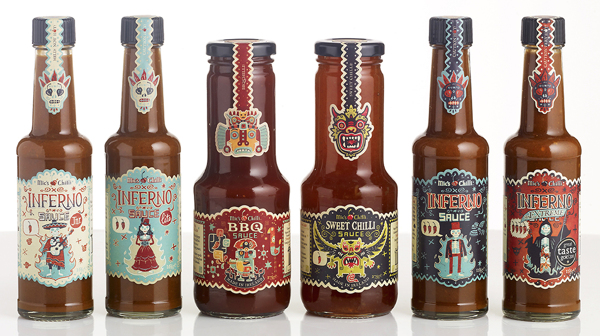
Packaging design and illustration for
BBQ and
Sweet Chilli. Courtesy of Steve Simpson.
Kirill: What draws you into working on physical branding and packaging?
Steve: I like the idea of producing the whole thing, being responsible for the whole design. Especially with packaging projects where you get to fine tune everything down to the tiniest details (I love messing around with barcodes). I like to think of my job on these projects being akin to the commercial artist’s role in ad agencies in the mid twentieth century when they were expected to produce the illustrations, hand lettering, design and even photography and animation. It’s a very fulfilling feeling.
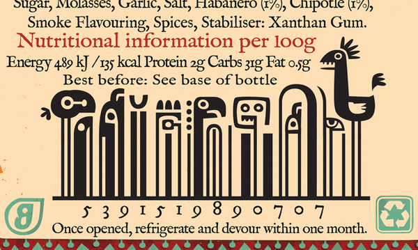
Barcode details for
Sweet Chilli. Courtesy of Steve Simpson.
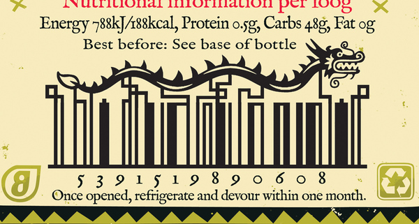
Barcode details for
BBQ Chilli. Courtesy of Steve Simpson.
Kirill: Do you prefer getting a full artistic freedom for a project, or a more defined direction from the client?
Steve: I like having a definite problem to solve. Too much freedom can lead to a lot of indecision:)
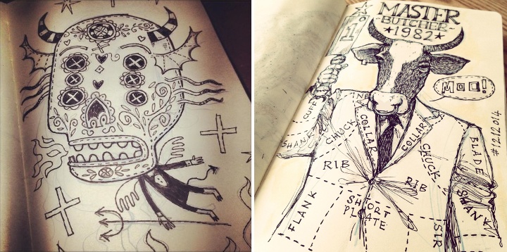
Kirill: Do you keep a sketchbook to develop ideas in between projects?
Steve: I’d like to have one of those beautifully collated sketchbooks, with amazing pieces of art at every turn… unfortunately mine tend to be a mix of hurried scamps, scribbles, lists and the occasional highly considered ink and wash drawing. I’m constantly sketching, mainly on any scraps of paper that come to hand. I’m always planning on sticking them into sketchbooks, but it never happens. My latest idea is an amended version of my previous failed idea, which was to have 2 sketchbooks one for best and the other for scribbles. The amended idea is to have best at the front and then turn it upside down and use the back for scribbles and notes and workings-out…
Kirill: Pen and paper, or digital? How has your choice of tools evolved since you’ve started in the field?
Steve: In 20 years it’s actually evolved very little. It was the early nineties when I first started scanning my pencils and working over them in Photoshop using the vector tool and I still do that now. Along the way I’ve played around with tablets (I’m still using a mouse) and various 3d programs but I’ve always come back to same old method. Works for me I guess:) Previously, when I was working in animation as a background artist, I would have used inks, watercolour, acrylics, collage and even the airbrush.
Kirill: Do you spend time on personal projects, and how important is that for you?
Steve: I always have a personal project on the desk. Something I can work on in between commercial jobs or when I need a break. It’s what keeps me sane!
Kirill: Your site has a special section for children books and projects. Is this a personal passion?
Steve: As anyone knows who works in children’s books, there’s not a huge amount of money involved, you really have to do it for the love. I illustrate a couple of picture books a year. They tend to have long deadlines so I can usually spend the first 2 hours of the day working on one before going back to the tighter deadlines of the design and advertising work.
Kirill: What’s the best thing about being an illustrator?
Steve: Sitting in a coffee shop thinking can be considered working! You can’t get away with that if you’re a window cleaner:)

And here I’d like to thank Steve Simpson for this great opportunity to get a small glimpse into his world. Selected prints are available for sale at Society6 and The Copper House Gallery.
Circling back to the topic of unsolicited redesigns, the discussion over at Branch largely talks on one of the points I mentioned last week – focusing on visual instead of interaction.
Looking at the existing screens of a product (be it a web site, web app, mobile app or desktop app) and making them prettier is all about visual design. Playing with colors, fonts, alignments, paddings, margins, gaps – or adding crisp stock photography – is a very visceral way to show your skills as a visual designer. This process sometimes omits certain technical aspects, such as, say the impact on the loading time and network (monthly bill) consumption, limitations of the underlying platform and the impact on framerate for some transitions, font rendering capabilities that can make your nice typography look quite bad and more.
But what about the interaction design? What about taking a hard look at some of the products you’re using on the daily basis and seeing how you can smooth the bumps that you encounter along the way of completing a certain task.
How about the process of finding the certain episode of your favorite TV show, buying it and watching it? How many screens does it take? How many taps, swipes and flings does it take? How much do you type on that small virtual keyboard? How much of that annoyance can you shave away without degrading the functionality scope?
What about making an hotel reservation? Direct messaging somebody on Twitter? Muting an annoying hash tag? Finding what is the closest movie theater that is playing The Hobbit in HFR 3D? Buying a ticket to that movie? Bookmarking the location of that movie theater? Navigating to that theater a few hours later? Taking a few pictures of yourself and your friends in the theater lobby and creating a booth-style photo strip? Ordering a pizza after you get back home?
There’s plenty of apps that do these tasks. You can redesign the outer layer of each one of those. But what about looking at the navigation models of each one, really looking at them and trying to improve them? Talking about what bothers you in the particular flow, showing how you restructure it and convincing the reader that your changes are an actual improvement? Taking those changes and applying them to the rest of the app? Making those change consistently better across various form factors where larger devices may combine two or more smaller screens at the time?
This is not shiny. This is not sexy. Interaction designers operate on the level of wireframes and flow charts that show transitions between various screens. A vibrant pixel-perfect mock with glamorous stock photography is visceral. Easy to look at. Easy to consume. Easy to understand the change. A wireframe that rearranges the content to move some things above the fold, or group related things is not. It takes time to understand. Words from you to describe why your change is better. Attention from the reader to look at how things were arranged before, how they are arranged now and what is your reasoning behind this.
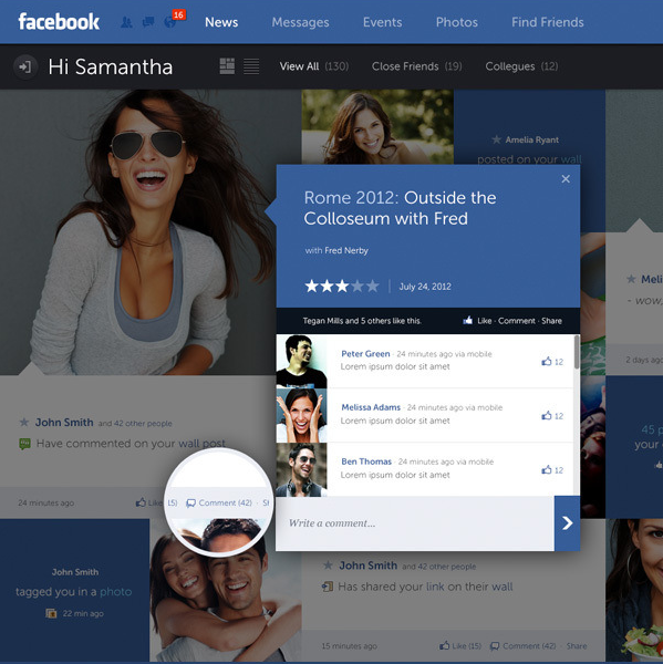
Fred Nerby’s “Facebook – New Look & Concept” is the latest in a stream of unsolicited redesigns of well-known products.
Some random thoughts having survived a few redesigns myself, and having seen quite a few unsolicited redesigns for other apps.
- The mockups always (really always) use full-bleed nicely balanced pictures of young smiling handsome people. The vast majority of the actual content as seen during the development cycle is somewhat less appealing.
- 50% of the replies say “I hope Company X is listening”. Another 25% say “Company X should hire this guy”.
- Companies are listening, and in quite a few cases the redesigns live in an ideal world divorced from harsh business and marketing realities of the specific product.
- “Hiring the guy” assumes that “the guy” is actually willing to do the dirty work of understanding all the non-glamorous details of various scenarios and tweaking the initial mocks endlessly to adapt. A non-trivial number of proposed mocks are a no-go to begin with.
- Static mocks are static. It’s only when you start putting them on the actual device / browser that you start thinking about the myriad dynamic aspects of layouts, transitions, animations and other pixel-level mechanics.
- On a related note, most of such redesigns that I’ve seen focus on the visual design, and put very little emphasis on addressing problems in the existing interaction design or moving between the redesigned screens.
- By the time an actual implementation is ready to ship, the pixels on the screen don’t bear much resemblance to the original mocks. They are not necessarily less pretty. Just different.
- In a world of an almost continuous spectrum of device form factors, it’s very rare to see a redesign that bothers to address how the layouts respond to changes in screen size and orientation.
If you’re doing such a redesign, it’s an opportunity to show your skills. If you get noticed, people will link to you, and you might get hired to work on good projects – or even on a product that you’ve tried to redesign.
If you’re a reader looking at the redesign, you can look at the nice pixels and do “your part” by saying that Company X should hire this guy or do exactly what he did. You essentially did nothing, and you’re feeling superior because if Company X is not going to do this today, they’re a bunch of clueless dudes. It sure gives you a nice warm feeling, but otherwise is a waste of time for everybody involved.
