Continuing the ongoing series of interviews on fantasy user interfaces, it’s my pleasure to welcome Guy Hancock. In this interview he talks about the work that goes into creating screen graphics, the qualities of a good design, working within an established visual vocabulary and learning from screens in our daily lives. In between and around, Guy talks about his work on “Spectre” and the recently released first season of “Altered Carbon”.
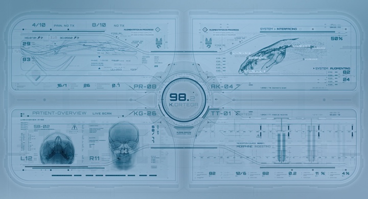
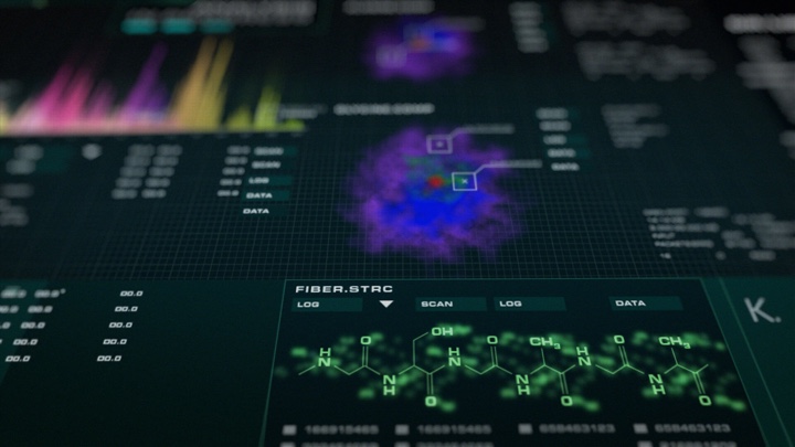
Screen graphics of “Altered Carbon”, courtesy of Rushes Creative.
Kirill: Please tell us about your path so far.
Guy: I kind of stumbled into design. I studied traditional film at a university, working a lot with 16mm and specialised in editing. After university I started looking for my first job in London, and got my foot in the door at Rushes which was predominantly a commercials post-production facility. I started as a runner and then moved to the machine room. That’s where I was introduced to the broad pipeline of visual effects (VFX).
We had copies of After Effects, Illustrator and Photoshop that we used to prep the artwork, I buried myself in these programs and I fell in love animating and creating graphics. I was given odd motion graphics jobs to do and regularly harassed the MGFX guys, eventually I merged into that team and I’ve been with them ever since. I was at Rushes for 10 years, and when they closed down the facility last December, the majority of the team moved up to DNEG to start their motion graphics department.
 Kirill: Between the ideas in your head and the tools at your disposal to makes those ideas into reality, which side do you think is more important?
Guy: I don’t have a very traditional design background. I can’t even draw very well, and I much prefer to get in with the tools, start moving things about and take it from there.
Sometimes we’ll have an initial concept, and I’ll start to articulate that within the appropriate program and doodle from there. If it’s a screen interface, I’ll go into Illustrator and just start drawing shapes. That’s generally how I like to build up my designs.
Kirill: Would you say that with enough money one can do anything in these tools these days from the VFX perspective?
Guy: Technology advances so quickly in the VFX industry, both for hardware and software. Given an extensive budget, a lot of time and a lot of talent, we are at a stage now where you can create pretty much anything.
But a tool is still a tool. It comes down to the artists and how they can manipulate those tools. It’s about the skills, technique and the experience in using them. We’re a bit away from software doing it all for us. Who knows how it will be in the future, but for now you still need the talent to create those worlds. Technology helps us work faster, more efficiently and across large scale pipelines.
Kirill: How difficult is it to get across the complexity of what you do when people ask you what you do for a living? There’s so much design in our daily lives, and people probably take for granted that things just exist.
Guy: It’s a tricky one, especially when you’re talking about motion graphics. It’s such a wide umbrella term for so many things. You have screen interface design, title sequences, 3D, simulation, VR and so much more. It’s hard to explain what you do quickly.
I’m not sure the average person considers how much work is often involved in design. Unless you’ve involved in it, it’s hard to understand. You are literally building something from scratch. Of course, you have the software and plugins that help to fill it out, but you need to create it. We’re actually completely surrounded by design. You have hundreds of apps on your phone, expertly crafted for usability. I think that good design can be unappreciated and often taken for granted.
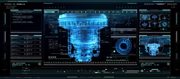
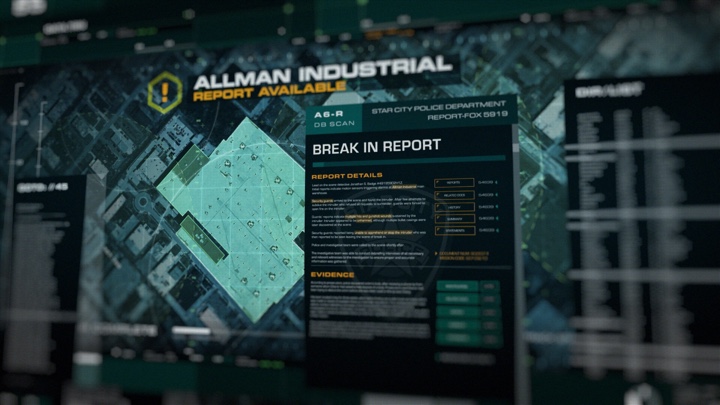
Screen graphics of “Altered Carbon”, courtesy of Rushes Creative.
Kirill: A seamless design that almost dissolves into its environment sometimes feels so effortless and natural. Should good design be in the business of drawing attention to itself?
Guy: It depends on what your product is. If you’re creating something user-friendly and it does its job, people probably are not going to notice it so much. Apple software, for example, is on the whole incredibly well-designed. To a lot of people that probably comes across as straightforward and clean, but the actual consideration behind it is extremely well thought-out and crafted.
I think that you might indeed overlook good design and take it for granted. It’s serving its purpose and doing its job. It’s easy to pick out information. It’s easy to move around it. It’s easy to understand. If it’s all of those things, it’s well-designed.
Kirill: Does it get easier to do what you do as you go from project to project?
Guy: The first thing that you need to consider on a new screen interface project is what is the purpose behind it. If it’s a hero screen, it’s going to be a part of the storytelling. How does it serve its purpose? How does it fit into the world that the director or the VFX team are trying to create?
Each time it’s a different challenge. A typical sci-fi interface might be more abstract and complex, whilst a contemporary film is likely to be more realistic and believable. Our work on “Spectre” for example had to be functional and convincing. The director didn’t want too much in there that didn’t serve a purpose. He would ask us to get rid of stuff that was unnecessary and just looked pretty. That’s a different challenge.
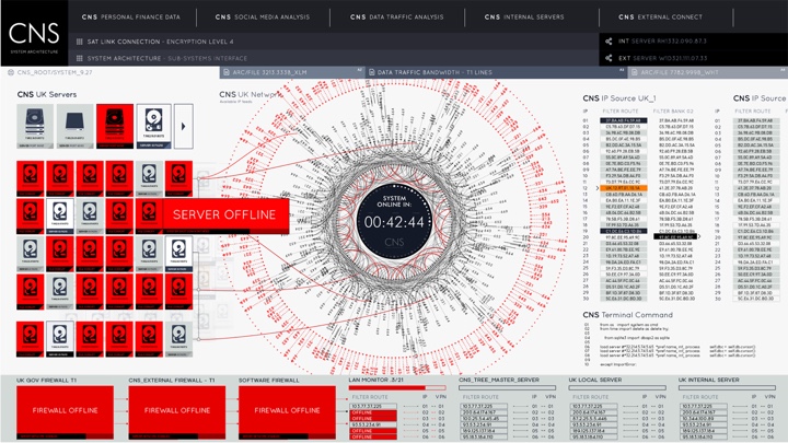
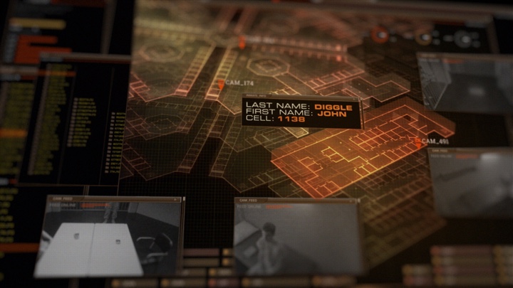
Screen graphics of “Spectre”, courtesy of Rushes Creative.
Continue reading »
Continuing the ongoing series of interviews on fantasy user interfaces, it’s my pleasure to welcome Serge Khomutovskiy. In this interview he talks about what drew him into the field, the relationship between tools and ideas, the crazy pace of work in the world of episodic television, and what goes into creating screen graphics that support the story. In between and around, Serge talks about his work on “Legends of Tomorrow”, “Arrow”, “The Flash”, “Supergirl” and “Wayward Pines”.
Kirill: Please tell us about yourself and your path so far.
Serge: Hi! My name is Serge and I am a creative designer based in Vancouver, BC. I graduated from Simon Fraser University’s School of Interactive Arts and Technology with a BA in Design and Media Arts. During my co-op placement the second Iron Man movie came out and inspired me to start an ambitious project that led me to where I am. I only had a basic knowledge about green screen and compositing from the few courses and videos I learned from. The project was to create a promotional video that showed a co-op student interacting with a virtual environment like menu that explored co-operative education options available to her. This project was a stepping stone to my career now as a motion designer and lead me to invest more time into learning and exploring the industry.
Kirill: What drew you into the field of motion and graphic design, and how did that change now that you do this for a living?
Serge: I’ve always been somewhat creative and originally wanted to get into print design or do some sort of graphic design. Growing up I read and watched a lot of sci-fi and was hugely inspired and enchanted by the worlds built in Neuromancer, Dune, Gundam, Star Wars and Star Trek, and a bunch of other less prominent franchises. Those stories will always have a special place in my heart and have definitely inspired me to explore and grow.
I was very fortunate and got to work with and learn from the amazing Robyn Haddow, Jeremy Unrau and Nick Oja at Scarab Digital. I have always been inspired by the works of Ash Thorp, Danny Yount, Corey Bramall, Jayse Hansen, to name a few. Direct exposure to motion graphics community was what drew me in. The openness, sharing of knowledge and support is what amazes me and keeps me going.
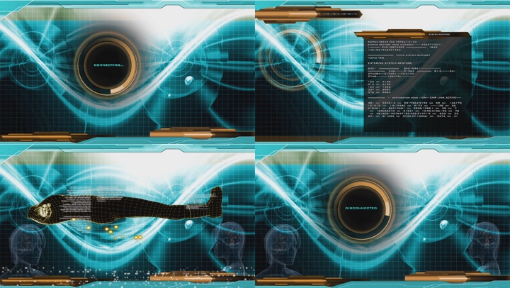
Screen graphics for “Arrow” season 4. Courtesy of Serge Khomutovskiy.
Kirill: Between the ideas in your head and the tools at your fingertips, do they have equal importance, or is one more important than the other?
Serge: Tools are important when you first start, but as you gain experience you build a library of various skills and techniques you can use that come naturally. Once those skills are developed and you have a workflow figured out, ideas become much more important.
Kirill: When you read a script and start thinking about the particular screens, do you go to pencil-and-paper, or straight to digital tools?
Serge: It largely depends on the scene, actor action and what’s been already built. Smaller background screens don’t require any interaction and are simply there for one reason, and that is to be a cool background. Those don’t require a lot of work and sometimes can be thrown together from previously created pieces. Most of the time it really helps to draw down a few things, sometimes a mind map, sometimes a diagram, to figure out what will actually be happening on the screen.
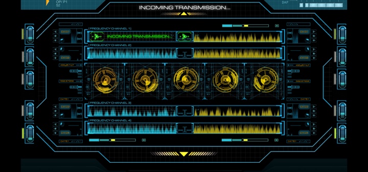
Screen graphics for “Arrow” season 5. Courtesy of Serge Khomutovskiy.
Kirill: What was, or perhaps still is, the most surprising or unexpected thing about doing screen graphics in episodic television?
Serge: Variety. I’m still surprised by the amount of variety that screen graphics can bring. Anything from your usual and very basic email and text editor to a complex schematic managing ion drive manifold (or something like that).
Kirill: What do you say when people ask what you do for a living? Are people surprised to hear that every single screen needs to be explicitly designed?
Serge: At the very basic level, “motion design and animation” usually gets the idea across. If I need to get into details then yeah, explaining that most if not all of the screens that people see in the scene are specifically designed, surprises a lot of people. It’s a simple thing that stays in the background and a lot of the time, out of focus, but every little detail contributes to the set and atmosphere.
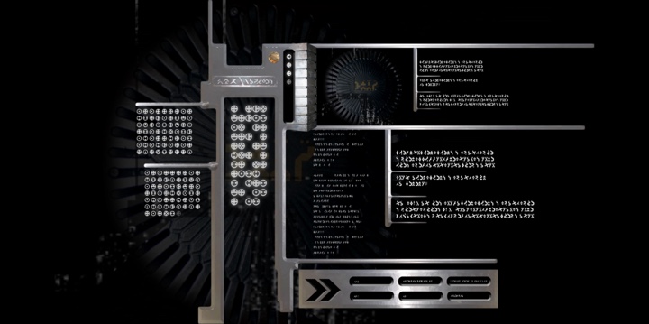
Screen graphics for “Arrow” season 5. Courtesy of Serge Khomutovskiy.
Continue reading »
 This week marks the beginning of a new phase for a bunch of my long-running open-source Swing projects. Some of them have started all the way back in 2005, and some have joined later on along the road. Over the years, they’ve been hosted on three sites (java.net, kenai.com and github.com) in three version control systems (cvs, svn, git). Approaching the 15th year mark (with a hiatus along the way), it’s clear that it’s time to revisit the fundamental structure of these projects and bring them into a more modern world.
Since these projects have been brought back to life in the last two years, the entire codebase has been revisited to clean up the cruft that has accumulated over time. Some of the explorations that I’ve embarked on have not went as well as I hoped they would be. That has been the fate of laf-plugin and laf-widget projects that aimed to bring common functionality across a variety of third-party look-and-feels, a field that is only seeing Substance and Synthetica as the two lone survivors.
Today I’m happy to announce the beginning of Project Radiance, the new umbrella brand that will unify and streamline the way Swing developers can integrate my libraries into their projects. At a high-level:
- Radiance is a single project that provides a Gradle-based build that no longer relies on knowing exactly what to check out and where the dependent projects need to be located. It also uses proper third-party project dependencies to pull those at build time.
- Starting from the very first release (planned for second half of 2018), Radiance will provide Maven artifacts for all core libraries – Trident (animation), Substance (look-and-feel), Flamingo (components), Ibis (SVG icons) and others.
- The Kormorant sub-project is the first exploration into using Kotlin DSLs (domain-specific languages) for more declarative way of working with Swing UIs.
- Flamingo components will only support Substance look-and-feel, no longer doing awkward and unnecessary tricks to try and support core and other third-party look-and-feels.
All the open bugs on existing GitHub projects have been migrated to be under Radiance. Once the migration of all the relevant documentation and older binaries to Radiance is complete in the next couple of weeks, those projects will be deleted from GitHub.
Starting from today, all new development such as bug fixes, feature work and documentation updates will only be done under Radiance. The versioning of all the projects will be unified going forward, resetting to 1.0. Some public APIs might move between sub-projects (going into Neon).
Continuing the ongoing series of interviews on fantasy user interfaces, it’s my pleasure to welcome Krista Lomax. In this interview she talks about the relationship between tools and ideas, the increased presence of screen graphics across all genres of movies and TV shows, working with limited color palettes, and the many hats she wears on her productions. We go back to Krista’s earlier work on “Stargate” and “Stargate: Atlantis”, and then step closer to her more recent productions such as “Dark Matter” and “Continuum”.
Screen graphics for “Stargate: Atlantis”, courtesy of Krista Lomax.
Kirill: Please tell us about yourself and your path so far.
Krista: I started way back with drawing and I was doing little videos and really lo-fi stuff using VHS cameras we rented from the gun & video store. Graphic design was a natural progression from there, and I started working for a film company that was creating tons of movies. They needed everything, and they threw me into creating visual effects with them. The next step was creating title sequences, and that’s how I got into animation with Premiere and After Effects.
 Kirill: Looking back at that time with what you know today, what was the state of tools back then?
Krista: I was mostly making stop-motion videos for animation. Ever since then I stuck with the basics, but definitely the technology today is amazing compared to what we had back then. You can make things look really gorgeous, and you can do it quick. It used to take two days to render something, and now two hours seems like a long time. It’s amazing what happened in just the last five years.
Kirill: Between the tools at your disposal and the ideas in your head, as a designer, do you think that one is more important than the other?
Krista: I don’t use tools to their extent. I mostly use the basics, because I like to keep things simple. This is why I like 2D animation. I like a more collage-y, scrapbook-y style.
Definitely there are two schools of people. The first is people who use the tools to get the ideas out of their head and onto the screen. And then there’s those who use the tools to create the ideas. Some people use every single tool they have, and everything looks flashy, and some people take simple ideas and use simple tools in more effective ways. I guess I’m less adventurous with filters and presets, I’m one of those for whom the ideas are more important.
Kirill: Without talking about specific productions, do you think there’s a certain overload recently in screen graphics that are a bit too flashy in how they use holograms, 3D and animations?
Krista: Some of them are over the top. I was reading an article that was showing before and after of some movie scenes. The before shows two actors and everything else is green screen. This is amazing, because it has its own audience and its own future. There are a lot of people who are sticking to the old-school way of doing it, kind of an indie, DIY look, but there’s definitely an explosion of CGI right now.
Screen graphics for “Continuum”, courtesy of Krista Lomax.
Kirill: Does it matter in the end as long as what we see on the screen looks believable in that universe? “Life of Pi” was an amazing visual journey ever though I knew that most of it was done in CGI. As long as the story doesn’t break the rules that it sets, then perhaps both approaches are equally valid.
Krista: I guess it’s like when the first cartoons were aired. The effect of intense realistic CGI is the same for this day and age. When people first saw a completely fictitious world created from scratch, they must have felt the same way as we do with the newest CGI. It’s suspension of disbelief either way, but it’s not taking over or ruining film or anything. Cartoons were always a fantasy world that kids loved, and we knew that it wasn’t real. These productions are just the evolution of those early cartoons.
Kirill: How did you get to doing screen graphics?
Krista: I was doing graphic design, and somebody called me to ask if I knew how to design playback. I said “Sure”, not really knowing what that was. He asked if I could design a radar screen. It was back around 2005, and I figured out how to do that in Flash. He loved it and brought me back to do a whole show. I did a lot of spaceship screens, and more calls came after that, and I ended up designing playback full time learning as I went.
Kirill: What was, or perhaps still is, the most surprising or unexpected part of your workday in this field?
Krista: Screen interface design is sort of a new industry, even though it is now in everything from romantic comedies to dramas. You have your phones, your tablets, your laptops. And the most surprising thing for me is how easy people think it is to create those screens. It blows my mind that you get requests hours before shooting for huge intricate things. It’s as if people think there is an “app for that” and you just press a button to make revisions. Some small changes take hours of work. And then there’s rendering time!
When I’m doing an episodic TV series, I’m there on set every day with new graphics. People have no idea how much time it takes to animate something, export the pieces, program them for playback, load them onto the machines and then test them. I do the whole process from script to playback, and I’m amazed that people think there’s an automatic button [laughs] that you just press to make these things happen.
It’s one of the most intensive things I’ve ever done. That is always shocking to me.
Screen graphics for “Dark Matter”, courtesy of Krista Lomax.
Kirill: Do you think it’s connected to how many screens we now have in our daily lives in the last few years? Perhaps people expect it to be easy because they are exposed to so much of it.
Krista: Absolutely. If there’s a problem with the playback, or if they want to change something on the fly, the first thing that people say is “But at home my phone / tablet does this when I press the button”. But what they don’t realize is that all of the interfaces are completely fictitious. They’ve been created from scratch, and they’ve been programmed to function in a scripted way.
It’s great that these interfaces are believable. But people on the set go “Well, just press that button” and I know that that button does nothing, because I did that whole interface. People are so used to interactive screens from ordering food to going to exhibitions. They are so used to interfaces being interactive and on-demand. They cannot comprehend the amount of time and pre-thought that has to go into any actions that need to be done in each interfaces.
Something may look similar to an Apple interface or to an Android interface, so they think that limitless options are available. But these are created on the daily basis for that one tiny specific piece of the script and don’t do anything else.
People expect everything to be fully functional. But these are different. These are pretend [laughs].
Kirill: Perhaps this is more relevant to the sci-fi genre, but I often find myself watching movies and shows to escape from reality for a few hours. So it would be pretty boring to see screens that are similar to what I have around me at home and at work. Do you find yourself competing against such contemporary interfaces, to make the story more interesting and compelling for the viewers?
Krista: Definitely, but that’s where we are lucky. We get to create things that look cool, but don’t actually have to be fully functional. That’s the fun part, to think about what would this character be using in a future universe. What would it look like? How would it function?
When I was working on Stargate Universe, they asked me to invent an interface that has never been seen before but would function in a new way if it did exist. They gave me two weeks to come up with it. So I flipped our usual interfaces inside out and rather than starting at one point and selecting larger and larger menus, I had every possible point accessible in a rotating sphere. That’s the fun – being able to invent something that has never been seen and think about how it would function differently from what we see in our daily lives. We are also cheating a tiny bit because we get to make cool-looking stuff that doesn’t have to have the back-end programming.
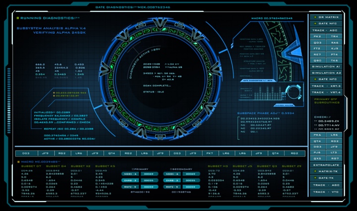
Screen graphics for “Stargate”, courtesy of Krista Lomax.
Continue reading »
