Continuing the ongoing series of interviews with creative artists working on various aspects of movie and TV productions, it is my delight to welcome Fiona Crombie. In this interview, she talks the art department and the changes it’s seen in the last fifteen years, finding balance between historical accuracy and emotional authenticity, the rise of generative AI, and what advice she’d give to her younger self. Between all these and more, Fiona takes a deep dive into her Oscar-nominated work on the recently released “Hamnet”.
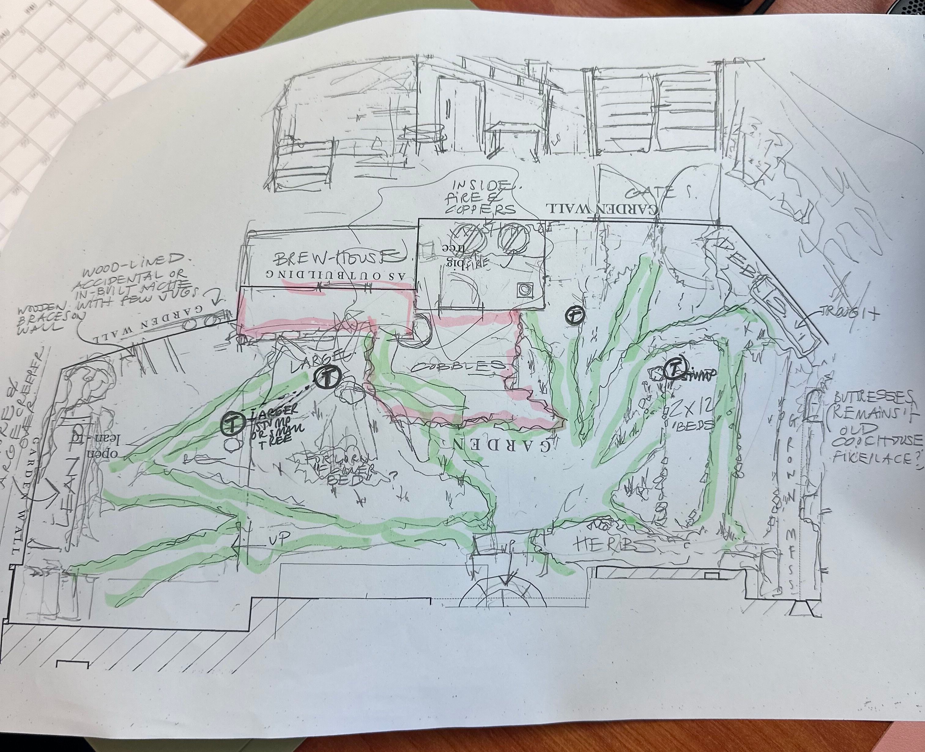
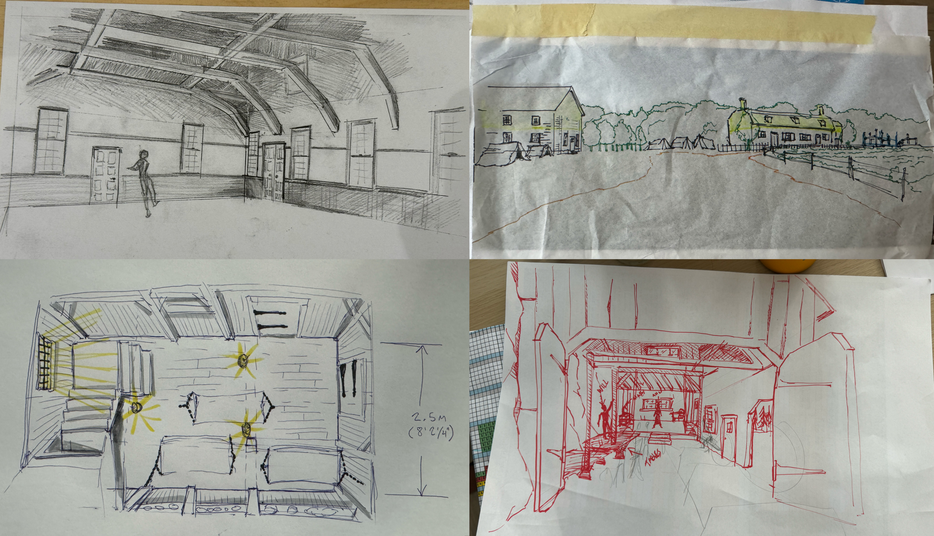
The initial sketch of the Henley Street house, courtesy of Fiona Crombie and Focus Features.
Kirill: Please tell us about yourself and the path that took you to where you are today.
Fiona: I’m second generation film industry. My father was a film director in Australia. When I was little, I didn’t really understand it, but I was fascinated by his passion, his happiness, and the fact that I could see that he was engaged in something that he loved. My mother was a film executive, and as a couple they were always engaged and excited to talk about what was happening. Back in the ’80s and the ’90s my father would go off and he would disappear for months and months making films and television mini series. The way I remember it is that he was having adventures.
I definitely visited his sets. I was always drawn to looking at the production design without knowing it was production design. I thought of it as playhouses, and actors dressing up. When I was 15, I did a work experience on one of his TV mini series in the art department. I thought that I can’t ever do this, because the hours were unbelievable. I was leaving with my father at the end of a shoot day, and everybody was staying in the office. People were saying to me “Don’t do this, you’ll have no personal life”.
So I thought to myself that I won’t, and I started studying arts law, but that was terrible. I didn’t fit in at all, and I wound up in theater school. I feel that I’ve always wanted to be a storyteller, and it felt natural to be telling stories through visuals.
I was a theater designer for about 10 years, and in that time I was dipping my toe into short films and music promos, and working with some friends. One of those friends got his first feature film in 2010 and that was the first film that I made called “Snowtown”. I did production design and costume design, and that was the beginning. Since then, I haven’t stopped, other than to have children [laughs].
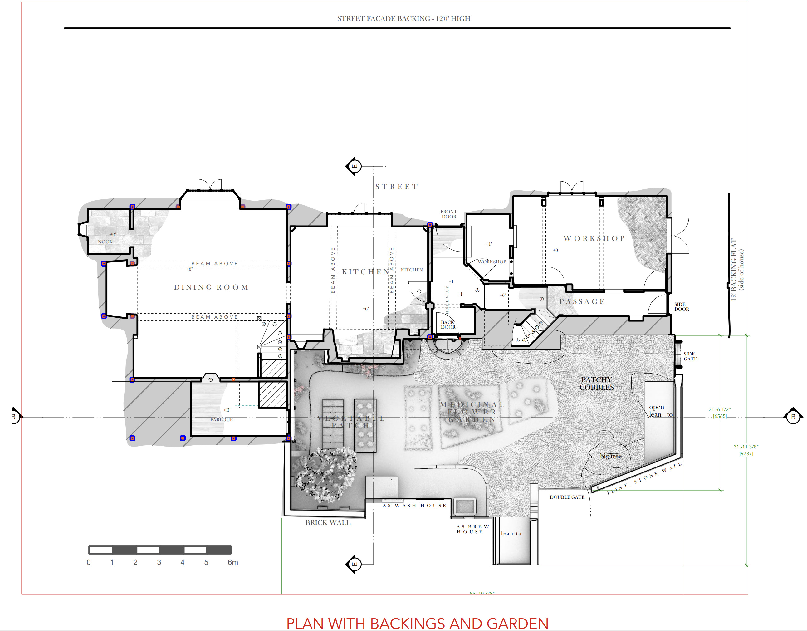
Construction plans of the Henley Street house, courtesy of Fiona Crombie and Focus Features.
Kirill: When you look at these 15 years doing production design, what are the bigger changes in the art department?
Fiona: One of the things is time – trying to make films quickly and trying to compress that pre-production process. The whole thing with filmmaking is about tension – and not tension necessarily in a bad way. It’s trying to jam things into short windows, and trying to do things as economically as possible. Sometimes that makes it quite hard, where once upon a time there might be more people, they’re trying to do it with less people.
There’s the whole question of AI and its involvement. Will that mean that we don’t have the time for thinking and contemplation, because productions will realize that you can generate quickly. That’s something that is starting to creep into my working mind. Today we’re sitting at a table, mulling over something and coming up with five or six things. Is there an expectation that we’ll make a hundred things instead with AI?
3D printing is an absolute game changer. It’s been amazing for prop making, for set construction, and for model making. It’s been great for us.
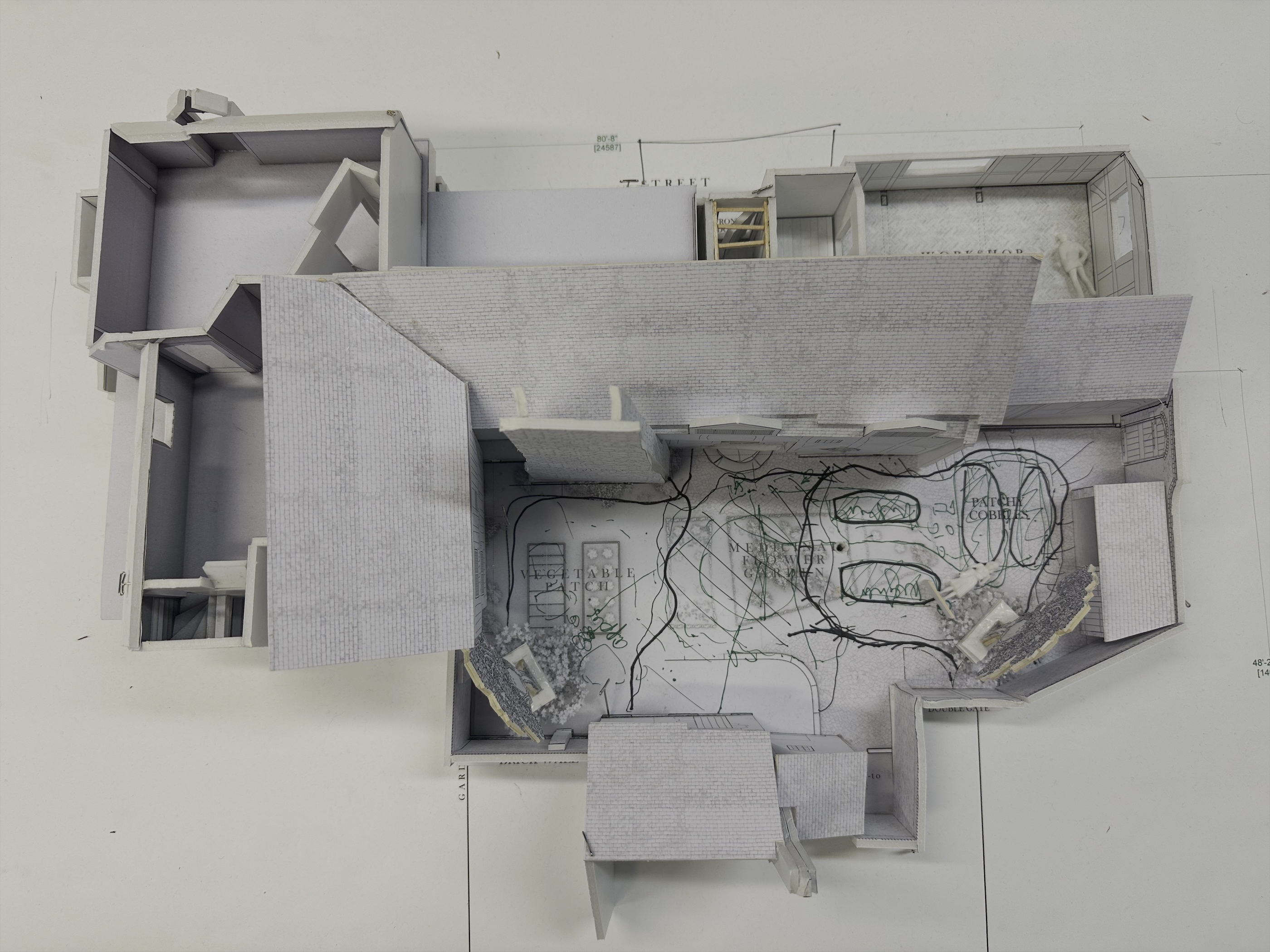
White cardboard model of the Henley Street house, courtesy of Fiona Crombie and Focus Features.
Continue reading »
Continuing the ongoing series of interviews with creative artists working on various aspects of movie and episodic productions, it is my delight to welcome Richard Bullock. In this interview, he talks about the changes in the art department in the last few decades, what makes a great artist, the popularity of the spy genre in British storytelling, productions that he considers to be the golden standard of production design, and his thoughts on generative AI. Between all these and more, Richard dives deep into his work on the upcoming “The Day of the Jackal”, a contemporary reimagining of the classic ’70s story.
 Kirill: Please tell us about yourself and the path that took you to where you are today.
Richard: My path into the art department and production designing is quite an unusual one. I studied art up to A level, and then at university I studied English literature and history of ideas. I’d always loved films and TV, and the English literature side of things took me towards cinema studies. Looking at films academically made me start to think about them as not just something on a screen, but something that gets made – how they get written, how they get directed, etc. I never really thought seriously about the process of filmmaking before that point.
Then I realized that there was a film industry in the UK, and it was something that you could possibly get involved with. I started off doing short films with a couple of friends, and then we decided to make a little science fiction movie. I went back to my limited art background. I’d kept on drawing and painting, and I designed some sets for it. I loved the experience and found it exciting. That’s when I started to realize that maybe that was my thing, combining the narrative disciplines that I had learned about in literature studies with my love of film and the visual side of storytelling.
Production design combines those things in an exciting way that I hadn’t realized existed. The average viewer doesn’t really think about production design, and that’s probably a good thing. Production design succeeds if the audience is unaware of it. But when you scratch the surface, you realize it’s a whole discipline and art form with history. That was quite exciting to me.
That was in mid ’90s, and I started assisting a production designer who was making high-end commercials and advertising films being made in the UK. That was a massive eye-opener. You realize the degree to which an environment could be manufactured and the amount of effects that could be involved. On commercials you had quite a high turnover of projects, and so it was very good training. One day you work on a Pirelli tire commercial that involves someone running down a mountain and across a dam and through a tunnel. And then you work on a beer commercial that is set in a stately home.
I started by making coffee, taking location photos, researching reference and other stuff as an assistant, then moved to doing small technical drawings and making models. It was a roots up learning process that went over a number of years in the art department. I did some films, and it was exciting to suddenly be working on long form narrative productions as a standby art director. Then I got the opportunity to start designing commercials and music videos myself, and I did that for a while. As I was making them, I realized that while the commercials are interesting, they were not what I set out to do. So I made the decision to step away from them, and do more films and television as an art director. Eventually I got the opportunity to start designing lower budget films, and it kept on going.
I love that all the different crafts and disciplines combine in the art department. You have special effects, vehicles, set decoration and other elements that create the physical world of the film that goes in front of the camera. You speak to costume, make-up and other departments, and of course the director and the cinematographer. You have all the different things that come into making a film. All these disparate elements of the production come together to create something, and if it’s successful, it feels as if it has one voice. That is so exciting.
Design render for “The Day of the Jackal”, courtesy of Richard Bullock.
Kirill: What do you feel are the biggest misconceptions about the art department and about your role?
Richard: Audiences often imagine that the action takes place in an environment that is simply found. People probably don’t appreciate the amount of forethought that goes into it. Even if it is simply a found environment, which environment is found – as opposed to all the other options? I suspect that a lot of the time people aren’t quite aware that they’re looking at a set. I’ve done things where we filmed an exterior up a mountain in France, and then the interior on a soundstage in Wales – and people have been astonished when I’ve said that.
If you know the tricks of the industry, that would have been fairly obvious. When you’re in it, it’s sometimes easy to lose sight of what is quite magical about what we do. And for sure, that’s part of the pleasure of it. We’re making illusions, and when an illusion works, it’s really satisfying.
Design render for “The Day of the Jackal”, courtesy of Richard Bullock.
Continue reading »
Continuing the ongoing series of interviews with creative artists working on various aspects of movie and TV productions, it is my delight to welcome back Tamara Deverell. In this interview, she talks about making stories for big screens, what makes a great artist, pushing for physical builds, and the rise of generative AI. Between all these and more, Tamara goes back to her work on “Priscilla” and takes a deep dive into the recently released “Frankenstein”.
 Kirill: We spoke about your work on “Nightmare Alley” in mid 2022. How have these last three years been for you, professionally and personally?
Tamara: I’ve moved from Toronto, which was our home base for many years, while working in the film industry. We built a house in the woods in Cape Breton by the ocean, and we’re living here now, which is really nice. It’s been a big year of change, finishing “Frankenstein” just over a year ago and landing here in Cape Breton.
I’ve taken this year off. I’m at an age now where I’m going to be picky and choosy about what I’m going to work on. I’m trying to do stuff that is a little bit more appealing to me emotionally and politically – not that “Frankenstein” wasn’t – but that’s also a little more accommodating to a change of lifestyle. “Frankenstein” was a very long project for me. I worked on it for almost two years and then took the year off. And now I’ve been doing a lot of publicity and interviews about it. It’s come back at me in a big way, which is wonderful because the movie is doing well.
It was a passion project for Guillermo and me. One of the things that we intended for the film was to make it very handmade, particularly in this age of the increasing use of AI. Guillermo is a big supporter of not letting AI replace human creativity. It’s not something we should be relying on to create our own artwork, masterpieces, and cinematic journeys. Ones and zeros don’t have human emotions. I’ve been thinking a lot about that. I’ve been trying to do my own artwork, which is actually hard [laughs]. It’s much easier to work on a film that I’ve been doing for almost 40 years. But I’ve been trying. I’ve been trying to do a graphic novel as well.
I was so involved in living and breathing while I was doing “Frankenstein” every moment of my day, 24/7. I was dreaming about what I was going to do for sets, there were so many sets and layers within sets, it took over my psyche. We had approximately 110 sets and locations, and 20 or more studio sets. The lab in the water tower was comprised of eight different separate set builds, both in studio and on location, exterior and interior. It had several different looks. It started as an abandoned water tower, and then there’s a scene where it’s renovated. Following this, there’s a scene where it’s the operational lab during the moment of creation. Finally, there’s the destruction scene and the aftermath. The same goes for the tower lobby. When you come in, it’s run down but intact. And then later on, it is post explosion, and it’s winter when the creature goes back and finds out his true story of creation and how he came to be.
All of the “Frankenstein” sets had to be carefully orchestrated and planned out to tell those stories. We ended up shooting it in order, because we were making changes that we couldn’t go back on. It was also helpful to be in story order as much as we could for the actors and for Guillermo while directing.
Production design of “Priscilla” by Tamara Deverell.
Kirill: How was “Priscilla” for you?
Tamara: It was great, it was a breath of fresh air. It was really nice working with Sophia. It was like working on a memory poem, in a way. People ask me how I replicated Graceland, and I both did and did not. I did what I considered to be Priscilla’s actual memory of Graceland when she first arrived. Then we evolved it with two distinct looks for different time periods.
When Priscilla lived at Graceland, it was not the Graceland of today. So when people ask if I visited Graceland, I say that I didn’t as it wouldn’t have served a purpose; it’s so different in our movie. We wanted to be this poetic memory. Memories are strange things. When Priscilla first arrived there, Sophia wanted this feeling of a white, creamy wedding cake. That’s what I wanted to evoke in the space.
We did want to make it feel like Graceland. Elvis had this crazy 15-foot-long couch, and we custom-built it. I purposely made it very tall because Jacob Elordi is such a tall man. I did have the blueprints from the original Graceland, and I extended the ceiling height to accommodate Jacob. So we heightened that couch a bit for him, and when Cailee Spaeny, who played Priscilla, sits on it, her feet are dangling. We thought carefully about a lot of things that we could control in that movie, because we didn’t have a big budget for that. It was certainly no “Frankenstein”.
We cobbled it together. It’s amazing the things you can do. You don’t have to have all the money in the world – just some clever and creative choices and a thoughtful colour palette. We had a wonderful cinematographer, Philippe Le Sourd, he had worked with Sophia many times in the past. Sophia is not used to shooting in studio sets, but we had to shoot in the studio because you’re making Graceland. You’re not going to find that anywhere. And she found the whole thing quite magical to see this set come out of nowhere. It was a beautiful film, and I was very proud of it.
We built Priscilla’s little teenage bedroom and the family home that would have been part of the U.S. Army base in Germany. We built onto the front of an existing Southern plantation style building for the exterior of Graceland, which I had used many years ago on “The Feast of All Saints”. I remembered the mansion, which is how we found it again. We built a facade onto the existing exterior of the house to make it look similar to the real Graceland. Again, poetic notions and poetic license freed us up to give the essence of Graceland without actually being there.
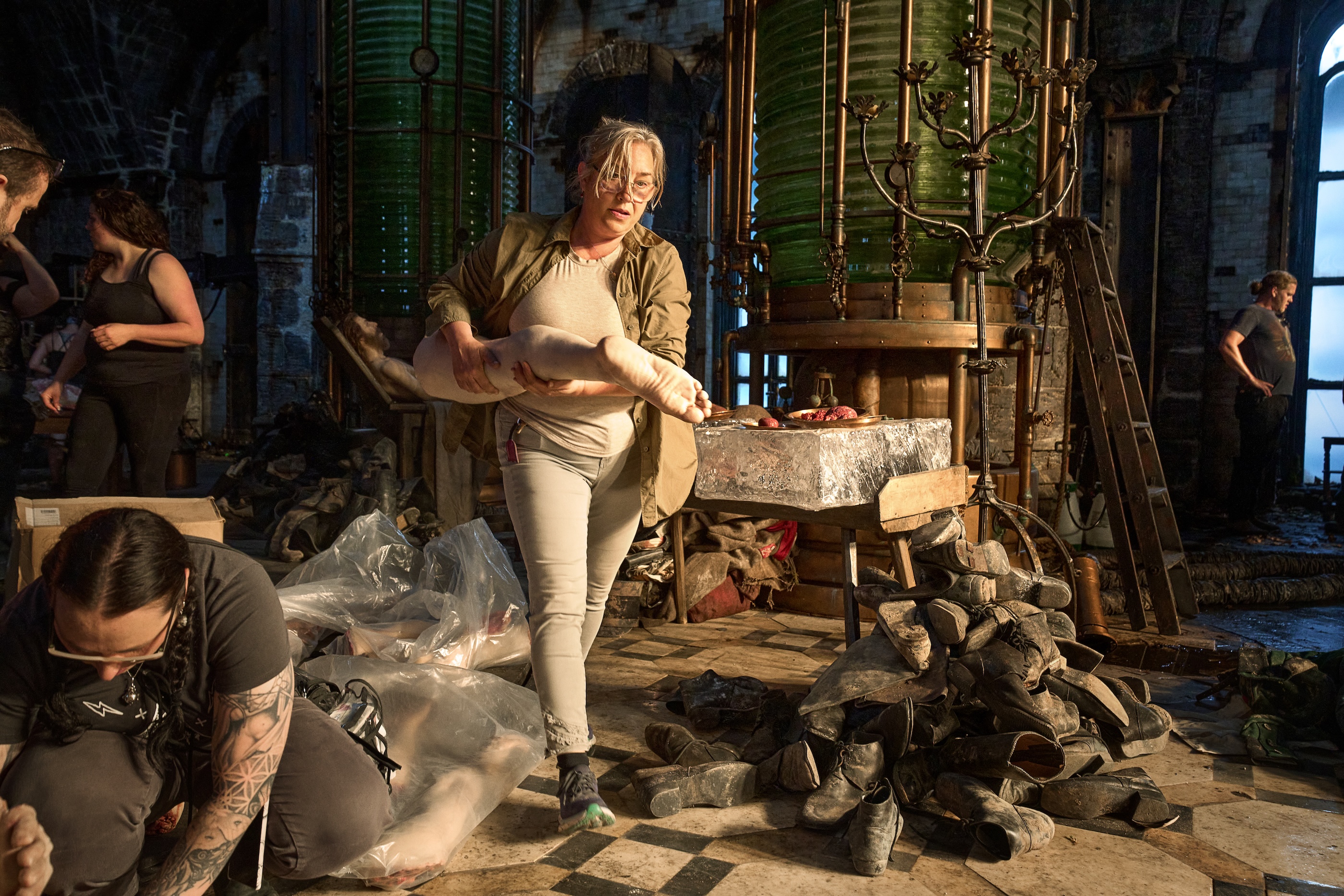
Tamara Deverell on the water tower lab set in “Frankenstein”, courtesy of Netflix.
Continue reading »
Continuing the ongoing series of interviews with creative artists working on various aspects of movie and episodic productions, it is my delight to welcome Sam Bader. In this interview, he talks about the responsibilities of the production designer, the importance of layering for visual storytelling, what is art and what makes a great artist, and his thoughts on generative AI. Between all these and more, Sam dives deep into his work on the upcoming “The Testament of Ann Lee”, a wonderful reminder of the sublime magic of this delightful art form.
 Kirill: Please tell us about yourself and the path that took you to where you are today.
Sam: My name is Sam Bader and I production designed “The Testament of Ann Lee”. I grew up in the middle of the country, St. Louis, Missouri, and starting at a very young age, I found myself doing oil painting and figurative drawing. I had a lifelong fascination with cinema, and as I was growing up, it was that golden era of TV with “The Sopranos”, “The Wire”, and later on “Breaking Bad”. Those were my formative years, the lexicon of culture in my brain from music, books, movies and video games.
I went to college at the University of Southern California in Los Angeles, and I was circling around the film school without ever having taken a major there. My paintings attracted the attention of some of the producing students who were doing the thesis projects, and I was asked if I wanted to pitch to production design. I knew notionally what that meant, and I had certain intuitions about how to approach it, and I’m pretty proud to say a lot of those intuitions carried forth. It was reading a script, breaking it down, pulling references, doing drawings, trying to figure out the structure of what you have to build in terms of staff, as well as graphics and construction.
I had that experience when I was about 22 years old, and I was gravitating in the direction of the film industry. Having come from a place where there was no real industry knowledge of what that meant, I followed the proverbial North Stars. Out of college, I was lucky to intern at Indian Paintbrush, where Wes Anderson’s whole team worked, reading and writing script coverage. That was still miles away from what I would end up doing, but I made good friends with the people who ran that day-to-day office. They put me in touch with a phenomenal production designer named Adam Stockhausen, who hired me as an art PA.
That’s when I moved to New York, and I wasn’t totally sure what I was going to do. I had a painting studio. I was working a construction job for set building. And Adam hired me to be on “Bridge” of Spies as the art assistant in the design office. I clasped at that quite firmly, and you could draw a pretty linear line from that point in 2014 to now. I stayed in the art department, and gradually – and then suddenly – went from having not ever drafted or done graphic design or organized databases of reference imagery, to doing all of those things over 7-8 years.
Once I was in that seat, I knew I wanted to be a production designer. There’s a tradeoff between striking out on your own in indie productions and staying in the big art departments. You can go out into the world, design little things on your own, and climb that ladder. Or you can stay in the “incubator” of these massive art departments with white glove teams, some of the best draftsmen, concept illustrators, graphic designers, getting to be on the floor, seeing how bigger construction and scenic teams make these worlds. I stuck to the latter pretty narrowly for the first half of my now 12-year career, and would jump out and design a commercial or design a $600,000 indie feature – trying to have one foot on both sides of the line.
And then, around 2020-21 I got to leap up and be an art director in full, which meant managing construction, managing scenic, overseeing all the designing, all the drawing, working with a production designer. I got a ton out of that. On some of these projects that I art directed, the overall budget for just wood and paint and foam exceeded the cost of a lot of middle indie features. That helped me fortify a level of knowledge and gain an amount of confidence that I am grateful for.
There were moments when I did question it. Should I be out just designing indie? Am I losing nine or ten months doing a TV series or a studio feature? But looking back on it, all of these things really harmonized for me around the time Mona asked me if I wanted to design “The Testament of Ann Lee”. I could not have done the work I did and managed the team I did, had I not really cut my teeth in that arena.
Mood sketches for “The Testament of Ann Lee” by Sam Bader. Courtesy of Searchlight Pictures.
Kirill: How do you see the role of the production designer? What do you feel are the bigger misconceptions about it from the outside of the art department?
Sam: I think a production designer stands at the crossroads of the directing side and the producing side. It’s a little cheesy to say, but you are designing the production. You’re not just designing the film. You are working with producers to frame out the scaffolding – financially and logistically – of how you’re going to achieve this film with the money and the time you have.
If you were to ask the average person what they thought a production designer did, you’d get an answer about having the sets, the paint finishes, the furniture, the aesthetic, and the visual through line of the whole film. That is certainly true, but the misconception is the extent to which you have to shave down the contours of this whole machine, in terms of staffing and locations and budget and timeline to make it work.
You have to be able to draw and illustrate and communicate ideas on paper. And you have to be able to pull abstract ideas out of yours and the director’s heads, and communicate them to a vast group of people who are all coming with their own sensibilities.
Another misconception might be that everything that you see in front of the camera was touched by a designer. On a very small movie where you are doing everything, that might be more the case. But on most films, you have to ingest imagery, ingest information, ingest ideas from a director, and then communicate them to other people with the trust and the knowledge that they too will interpret and produce their version of what they think it is. And then it’s your job to absorb all of what you’re being shown, and know how to tweak it, and edit it, and understand the extent to which you should tell somebody that something doesn’t work at all. You steer the art department and your artists to make them motivated and inspired to do their work.

Production design renders for “The Testament of Ann Lee” by Sam Bader. Courtesy of Searchlight Pictures.
Continue reading »
