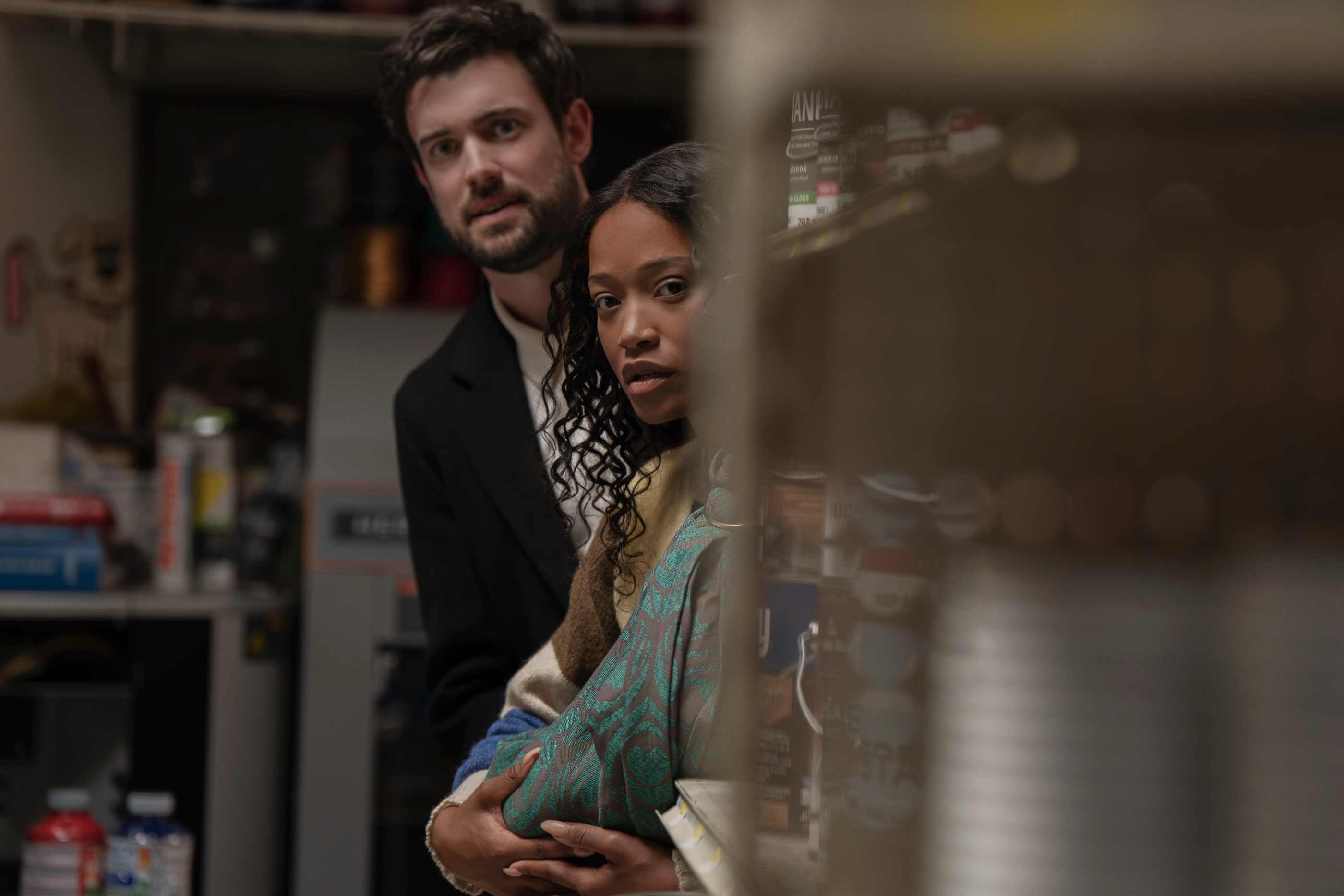
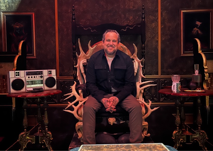
Continuing the ongoing series of interviews with creative artists working on various aspects of movie and episodic productions, it is my pleasure to welcome Joel Froome. In this interview, he talks about the transition of the industry from film to digital, the role of the cinematographer, the evolution of tools at his disposal, key ingredients to longevity in the industry, and his thoughts on generative AI. Between all these and more, Joel takes a deep dive into his work on the just released “The Yeti”.
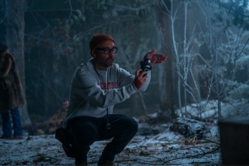
Joel Froome on the sets of “The Yeti”.
Kirill: Please tell us about yourself, the path that took you to where you are today, and how early you knew you wanted to be a part of this industry.
Joel: It’s a fascinating question because the film industry is such a unique and diverse place, and people definitely don’t have the same journey to get there.
I grew up in Sydney, Australia. I went to Balgowlah Boys High school, and when I was about 15 years old, I saw an article in the newspaper that a legendary cinematographer named John Seale had won the Academy Award for “The English Patient”. That was big news because I was at the high school that he went to many years earlier – and that’s how I had heard of cinematography, but that’s not what made me want to be a cinematographer, obviously.
Fast forward years later, I was trying to discover what I wanted to do. A career advisor put me in touch with a course at the Australian Film School. One day a director spoke in the morning and an editor spoke in the afternoon, and while it was interesting, it didn’t resonate. And then it was Thursday afternoon, and a cinematographer came in and spoke for three hours, explaining what a cinematographer does from start to finish on a project. That cinematographer was Andrew Lesnie who went on to do the “Lord of the Rings” and “The Hobbit” movies, and that day is such a vivid memory for me.
I’d been doing photography all through high school, and I wasn’t sure what I wanted to do with my life. I remember Andrew’s talking about the collaborative nature, telling stories visually through photography, and using light – and it hit me so hard. And I was sitting there thinking that I just graduated high school, so how do I do this now? And then I thought back to that time hearing about how there was a former student that had won the Academy Award, so through some people I got in touch with John, and I was able to ask him a few questions and pick his brain a little bit.
I went on to work in the camera department for a little bit, and then worked at Panavision for a little bit to learn gear, and then eventually went to the Australian Film School to study cinematography a number of years later. After graduating and spending a bit more time in Australia, we decided to move to the US with my wife in 2011. I didn’t know anyone over here, so I volunteered to work on short films and try to get on anything possible. Through some connections I had in Australia, I did a short film out in the California desert for pretty much no money, and through one of the actors on that short that later auditioned for a feature film I connected with the director that loved the look of our short. That’s how I ended up in Sweden in 2013 shooting my first feature film.
After spending a few years in New York City we moved up to Buffalo, where my wife’s from, and I’ve been living in Buffalo for about 10 years now. And now, “The Yeti” was the first opportunity to do work in Buffalo itself.
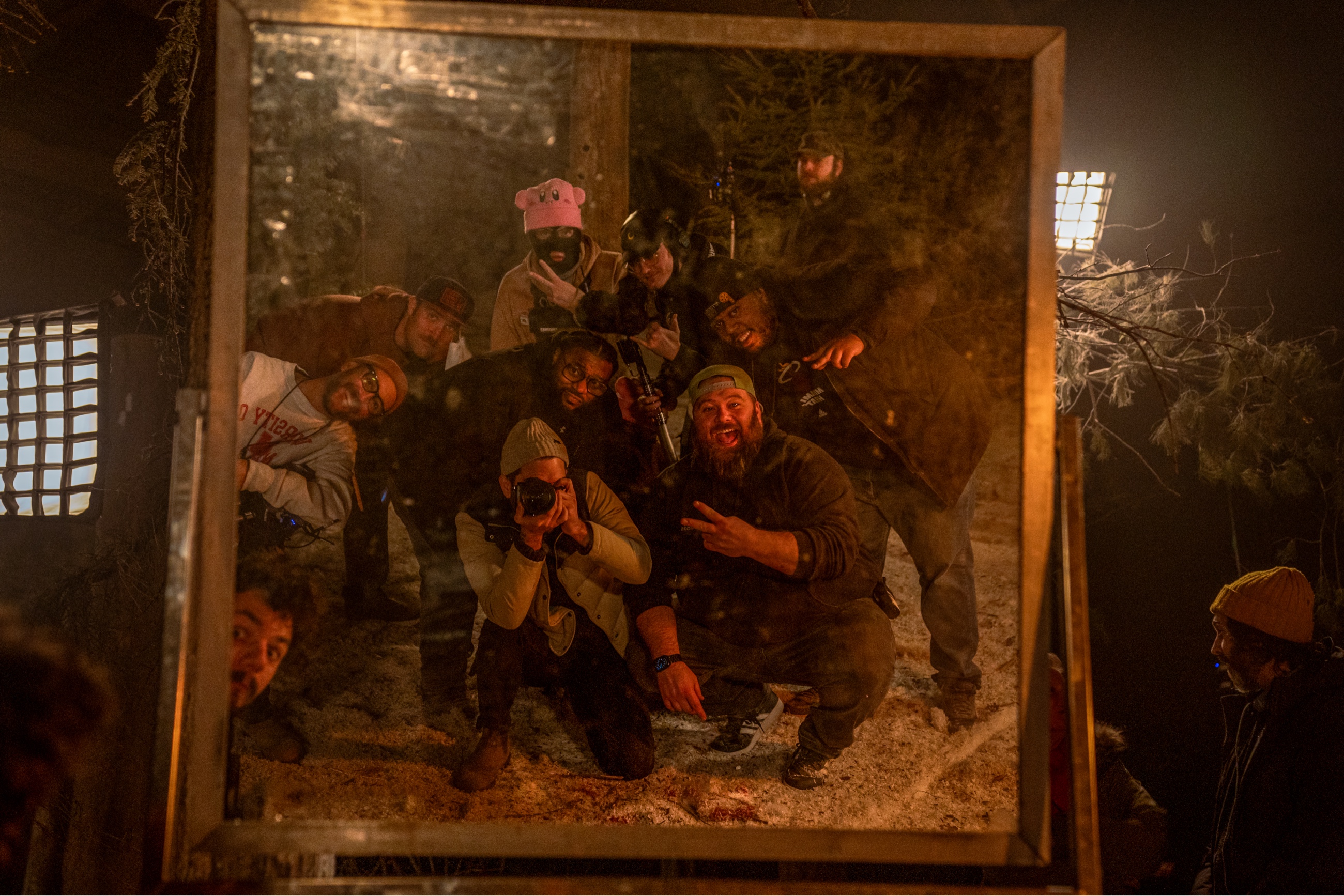
On the sets of “The Yeti”.
Kirill: Over this period of roughly 20 years, how do you see this debate / divide / transition from film to digital?
Joel: It’s interesting, because even if you’re shooting film now, it goes through a digital process. It’s an important debate.
I was the last of a certain generation that only learned on film. When I was at the Australian Film School in 2009, there was a distinct point about halfway through the year when RED One camera came out. All of our projects and tests up until that point were on 16mm and 35mm, and from that point on we were on digital. I was terrified. I didn’t know what to do with all those buttons.
At first I was scared, but then we started talking about it and starting to use it. For myself, I decided that I was going to do the same process that I used to do when shooting film, and that I was going to approach this as a negative. How do I get the best exposure? How can I get the most latitude? What’s the look of the story that’s going to be able to be the best for this? So I still use a light meter. I still use a contrast viewer. I try to approach things like I still shoot on film. I like the discipline of shooting film and not doing 50 takes because we can.
The discipline of shooting film is important. I was helping out at a film school and teaching a course, and I saw those young students shooting something and their image was overexposed. They looked at the monitor and saw that, they went over and closed it down, and everything was good. But my question to them was – how did you get to the point that you were two stops overexposed? If this had been film and you didn’t have the monitor, you would have rolled and it would have been overexposed. It’s important to understand the process as to how you’re going to expose, and nothing was better for film than doing that.
It’s hard to get film cameras approved from production, especially, but it’s getting more common because it has become popular again to shoot film.
If you’re shooting digital now, there are great cameras that can give you so much detail. And when you go through the digital intermediate, there are software packages that add grain that react with your image instead of being a static overlay. You are able to get those filmic images. That’s the feeling that we love and resonate with from film.
In the debate of film versus digital, each project has its own merits. As long as you understand the fundamentals of film and you bring that to digital, you can get the most out of whatever format you’re shooting on.
Kirill: What do you feel are the bigger misconceptions about cinematography and the role of the cinematographer?
Joel: One of the biggest misconceptions is that cinematography is just beautiful images. I have friends not in the industry, and they say “check out this beautiful cinematography” and it’s some compilation of drone footage of sunsets. That’s nice to have as a screensaver, but that’s not what cinematography is.
A lot of people think it’s purely based on beauty, whereas it’s the art of telling the story and collaborating and bringing a director’s vision to life. Sometimes that’s ugliness. Sometimes that isn’t beautiful. But it gives what the story needs. Good cinematography is when you can best serve the story, to get the emotions needed for that film to make it an overall experience that the directors wanted the viewer to have. That is the most important thing about cinematography. It isn’t just these beautiful images or moody images. It’s what helps the story convey the right tone for the director.
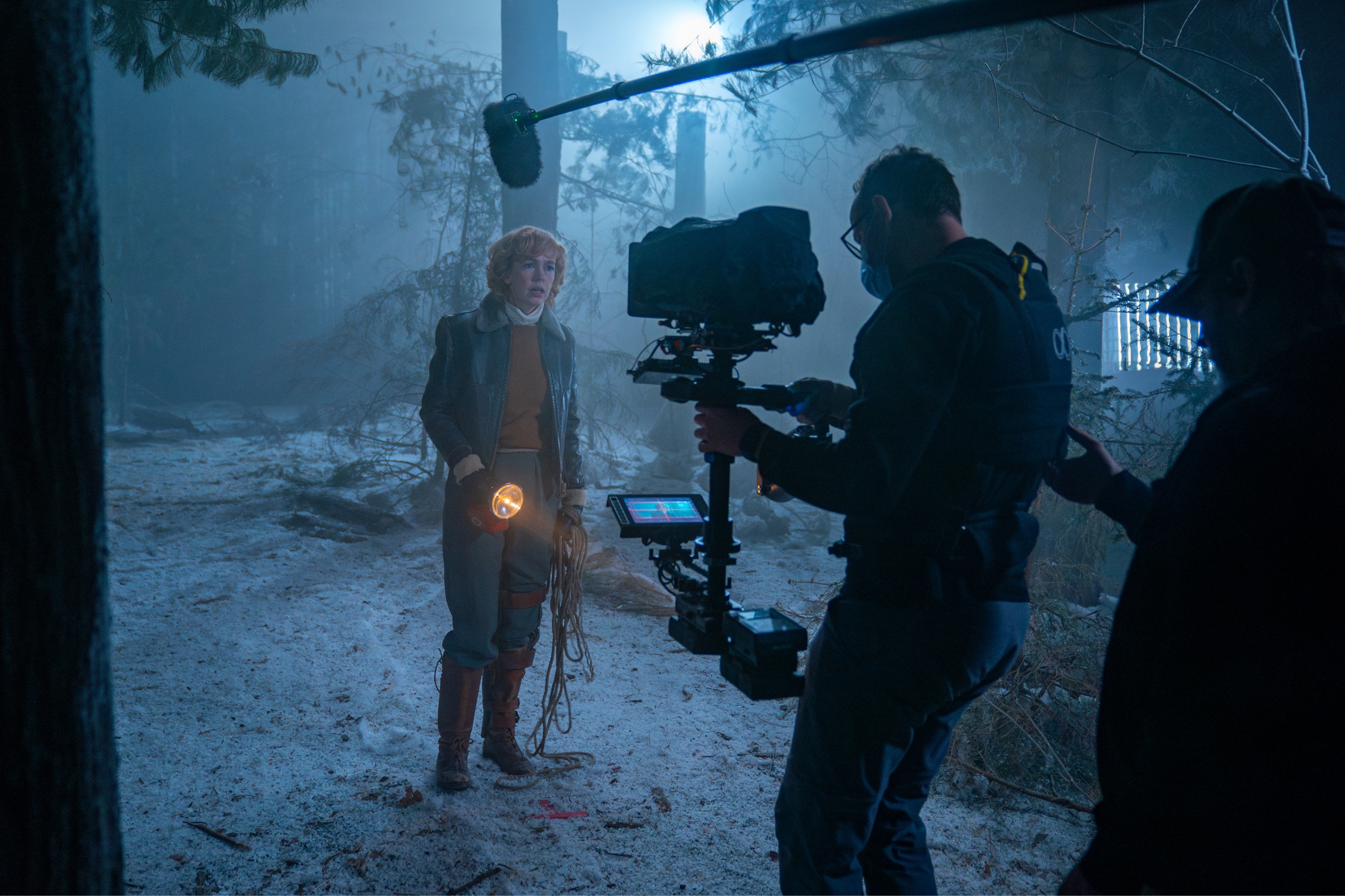
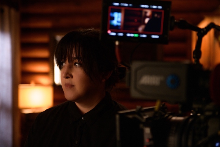
On the sets of “The Yeti”.
Continue reading »
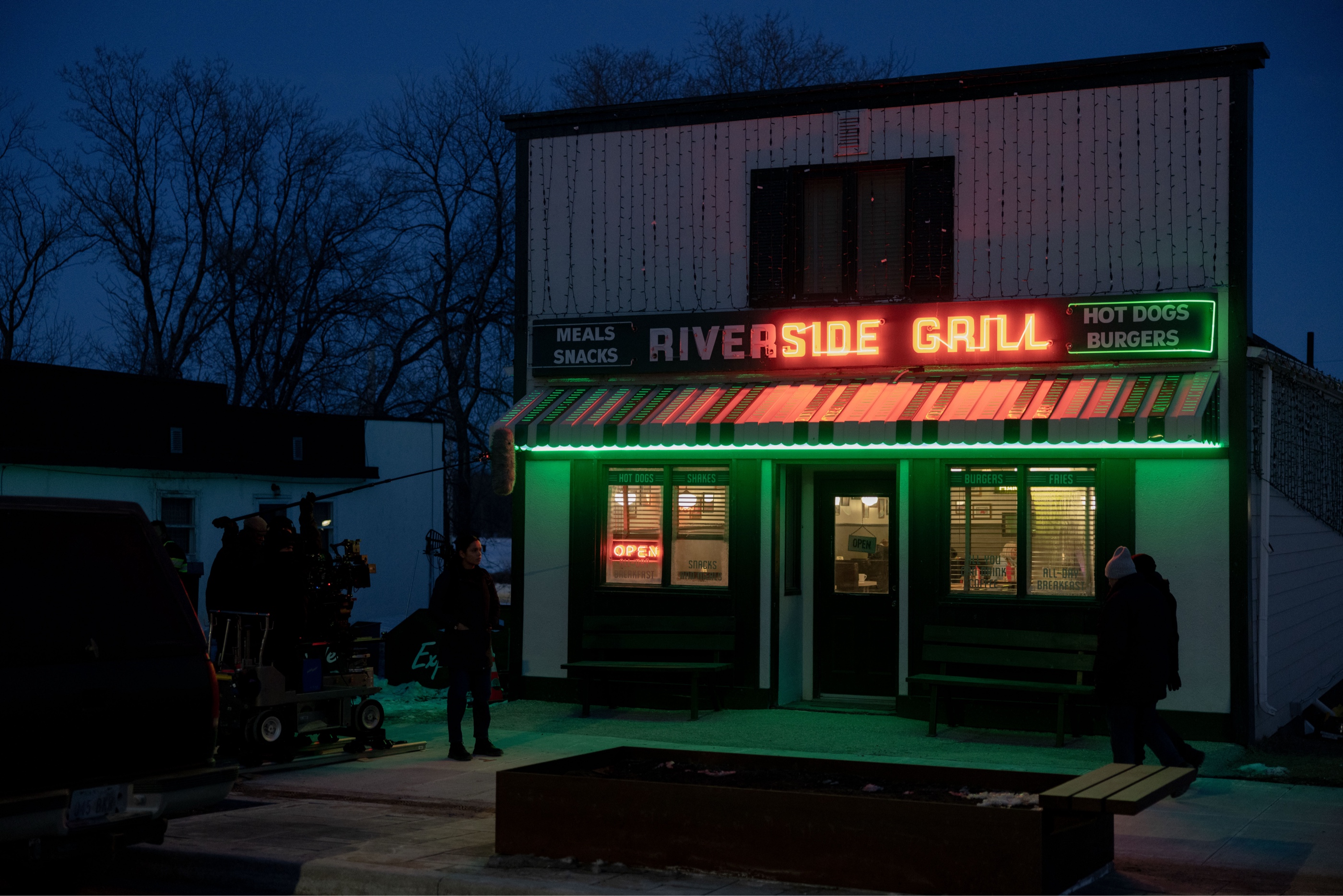
Continuing the ongoing series of interviews with creative artists working on various aspects of movie and episodic productions, it is my pleasure to welcome Jonathan Furmanski. In this interview, he talks about the transition of the industry from film to digital, the role of the cinematographer, the evolution of tools at his disposal, key ingredients to longevity in the industry, and his thoughts on generative AI. Between all these and more, Jonathan takes a deep dive into his work on the recently released “The Burbs”.
Jonathan Furmanski on the sets of “The Burbs”, courtesy of Universal Pictures.
Kirill: Please tell us about yourself and the path that took you to where you are today.
Jonathan: When I was twelve, I told my parents that I wanted to work in movies, and honestly, I can’t say I was serious I was when I said this. I think I said it only because I loved going to the movies. I was a kid who grew up on “Star Wars” and “Raiders of the Lost Ark”, and I wanted to be involved in that. I didn’t have any idea what that meant or what position I would have, and my parents didn’t take it seriously.
But then, seven years later, I got into film school and that’s where I almost accidentally discovered cinematography. I had no ambitions towards cinematography, but when you get there you learn the basics of what a camera is, what a lens is, how film stock works, etc. I was fascinated by all of it. I devoured as much as I possibly could about all of the technical and creative aspects of being a cinematographer. My friends noticed I was always talking about and thinking about this stuff, and they started asking me to shoot their student films.
So I never really had to make the choice. The choice was made for me, but I don’t say that regretfully or anything close to that. I feel it’s almost like we found each other – cameras and me.
After college I spent a brief amount of time working as an electrician, and then several years working as a camera assistant. Then a documentary opportunity fell in my lap. I had no ambitions towards documentaries, but it turned out that I really loved that experience. It led to another documentary, and I spent about 10 years working almost exclusively on documentaries. Then off of one of those documentaries, a scripted comedy show with a small budget fell in my lap. That led to another thing and another thing, and I ended up doing scripted comedy for a long time. I still do, and I’m lucky enough to be able to dip my toe back into documentaries every now and then.
Kirill: How was the transition from film to digital for you?
Jonathan: This transition happened at almost the same time when I went from working as a camera assistant, which was mostly on 35mm film, to working in documentaries. We started seeing these new digital cameras coming on the market, and people started shooting video on DSLRs.
In documentaries at the time you had a choice between Super 16 or Digital Betacam, and all of a sudden there were all these options that were inherently more cinematic. Some of them were 24 frames per second, and in the case of the Canon 5D you had access to a full frame sensor – all of these technical attributes that were out of reach for most documentaries. So when I shifted over into docs, I fell into all of the digital stuff at the same time. And by the time I got back into scripted, the industry had shifted over and it wasn’t even a question. By the time I was doing “Delocated” or “Inside Amy Schumer”, nobody was even thinking about shooting those shows on film.
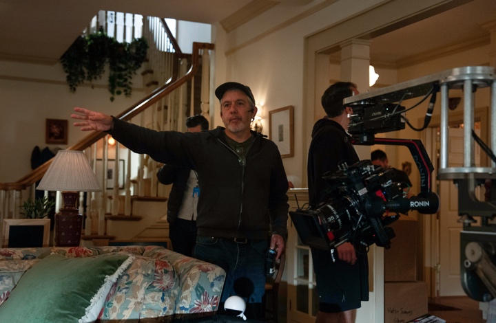
Cinematography of “The Burbs” by Jonathan Furmanski, courtesy of Universal Pictures.
Continue reading »
Continuing the ongoing series of interviews with creative artists working on various aspects of movie and episodic productions, it is my pleasure to welcome Julia Swain. In this interview, she talks about the role of the cinematographer, the evolution of tools at her disposal, making plans and reacting to changes, and her thoughts on generative AI. Between all these and more, Julia takes a deep dive into her work on the recently released “The Dreadful”.
Kirill: Please tell us about yourself and the path that took you to where you are today.
Julia: I’m a director of photography, and have never wanted to do anything else. There was definitely some exploration of different roles in filmmaking as I was discovering it. I am the daughter of two cinephiles who were constantly sharing their love of films with me so I was curious about it from childhood. My first job as a teenager was in a movie theater. I never strayed from this. I thought about editing and directing, but it was in the practice of making films in school when I was really young that I figured out that cinematography was the best fit for me.
I grew up in Southern California and I knew that Los Angeles made the most sense for a move, being such a hub for filmmakers and the industry. I did an MFA in cinematography at UCLA, and we shot non-stop. We weren’t writing papers. We weren’t studying theory. We just lived on soundstages.
After film school, I shot anything I could. I didn’t come up through crewing but that also meant I couldn’t curate the work I took too much because I had to survive. But after a little while, features started materializing, commercials took off. It’s been a really exciting journey.
Kirill: Is LA still the place to be? Is LA still the place to start one’s career in this field?
Julia: I do think Los Angeles is a valuable place to start with all the resources it has to offer but it’s not THE place to start. Production is really abundant in a lot of places all over the world. There are a lot of great hubs around the world where you can get started, full of great filmmakers. Everyone’s path is different. Everyone comes from a different place. Nowadays I’m barely in LA anyway. I am constantly flying elsewhere to shoot. But Los Angeles is getting busy again and there are some of the best crews and resources, along with the best theaters, galleries, events. You can stay so extremely busy even when not on set consuming cinema, learning, meeting great filmmakers.
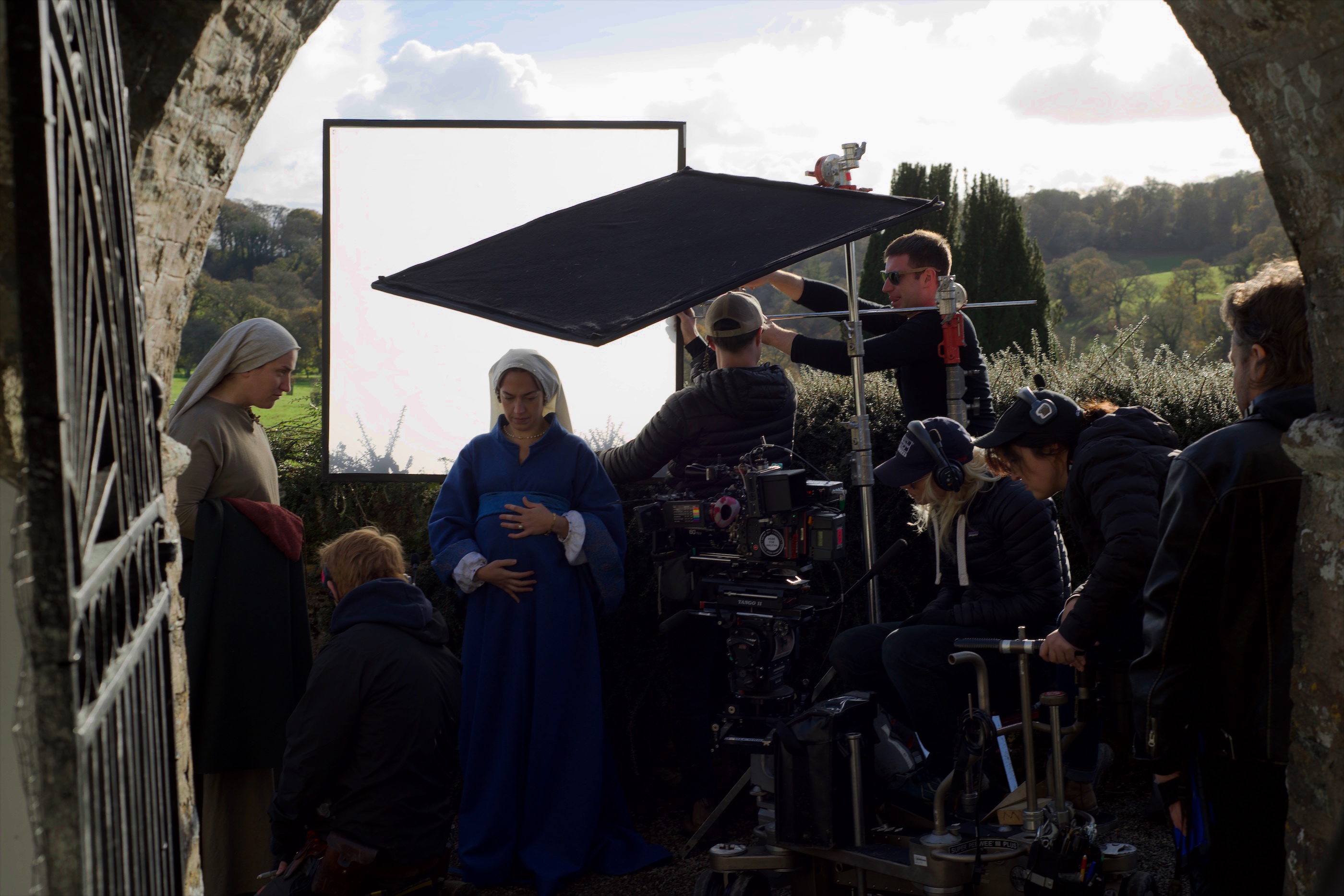
Behind the scenes of “The Dreadful”, courtesy of Lionsgate
Kirill: What do you feel are the misconceptions or misunderstandings about the role of cinematographer and what cinematography is inside the industry?
Julia: One misconception is that it’s this pure focus on camera and lighting. The visual language is the fun part. In fact, it’s the easy part. Maybe this isn’t a misconception more than it is something people often forget.
The job is leading the set with the assistant director, leading and working alongside your crew. There are politics, working with your budget, the schedule. You have to know how to structure a shooting day. You have to be able to look at a shot list and know if you can make your day. You have to know how to reorganize or plan differently should a day fall behind for some reason. You have to be a great communicator and a fast, creative problem solver.
Kirill: Digital looks to continue to dominate your field. Is film a thing of the past?
Julia: I don’t think film is the past. Look at the Oscar nominations this year – a lot of amazing films continue to be shot on film. I definitely believe that we feel that impact.
I love shooting on film. I went to UCLA right as they were transitioning away from it, so all of us were shooting on digital, and all our thesis films had to be digital for the first time. But they were adamant we don’t just roll and roll, that we maintain the discipline and intention that inherently comes with shooting on film when shooting projects digitally.
Even though we’re lucky to have so many digital options, film continues to be a beloved medium and personally, I’m never disappointed when I get dailies back. It’s never not magical.
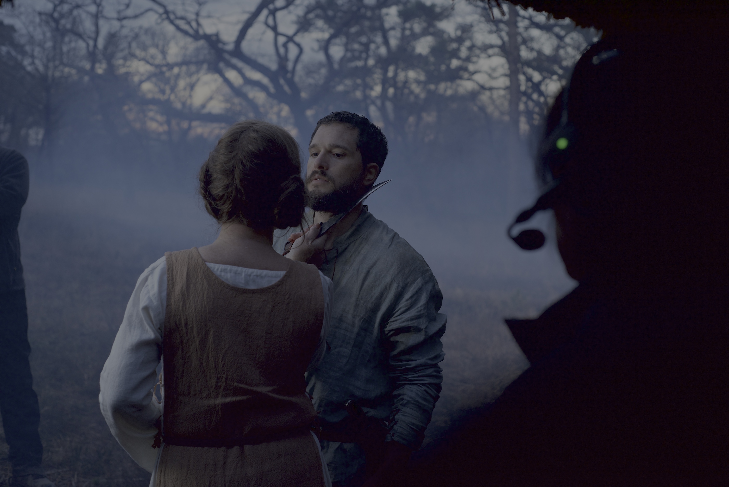
Behind the scenes of “The Dreadful”, courtesy of Lionsgate
Continue reading »
Continuing the ongoing series of interviews with creative artists working on various aspects of movie and episodic productions, it is my pleasure to welcome Roger Fires. In this interview, he talks about the role of the production designer, the changes that Covid brought to the industry, watching movies on the big screen, and his thoughts on generative AI. Between all these and more, Roger takes a deep dive into his work on the recently released “Psycho Killer”.
Roger Fires on the set of “Psycho Killer”, courtesy of 20th Century Studios.
Kirill: Please tell us about yourself and the path that took you to where you are today.
Roger: My name is Roger Fires. I’m a production designer, currently residing in Vancouver, Canada, and originally from Brazil. My passion for film started at an early age. My parents weren’t wealthy, and we didn’t travel the world. The thing that we used to do as a family was to go to movies and plays. When my mom went to do groceries or to a mall, she’d drop me off to watch a play, and she’d pick me up after. That’s how my passion for film and theater started.
I started with interior design and graphic design. In the middle of taking the graphic design course, one of the workshop tasks was to create branding for a travel agency inspired by a movie that we liked. It was right around the time “The English Patient” came out, and I wanted to design something related to it. My project had the ambience from the movie, extending to the uniforms and other elements. Then, during my presentation, the teacher started asking about the texture, the fabric, the outlets, the light switches and all these other things, and that’s when I saw that it goes way deeper than just that look and the concept behind it.
That’s when I started doing deeper dives. I was lucky that all my early jobs were connected to creativity. I was doing illustrations. I was doing vinyls and signage. I was doing fashion design. I was doing interior design. I was doing graphic design, with art direction and advertisement agencies. It feels like I was preparing my whole life to be a production designer, and touching every single aspect of the creative world on the way.
I had a band in Brazil for a while, traveling and doing a lot of things. After a while I wanted to go back and to follow my passion. When I was with that band, I was happier to see people wearing our shirts or doing the artwork, rather than making the music itself. That was around 2009 when I decided that I wanted to be in the movie industry as a production designer – not in Brazil, but in one of the bigger places like Los Angeles, New York or Vancouver. I remember I was talking with the father of my then-girlfriend, and he asked me what I wanted to be, what is my benchmark, who inspires me. I said the name of David Wasco, the production designer that worked with Tarantino and Wes Anderson.
We applied for the permanent residency while we were still in Brazil, then we got approved, and six months later we were moving and jumping into the industry here. I started doing graphic design on a couple of projects, and it wasn’t too long until I asked the production designer I was working with if I could work for him as an assistant art director. He told me that his art director was not coming back, and that I could be his art director. I did “Lost In Space”, got pulled into “Timeless” and a lot of other things. For me it was the matter of absorbing the knowledge and the experience, and trying to jump to the next step. There were some opportunities to make that next step, but I didn’t think that it was the right time. And then it happened at the perfect time, and that’s where I am today.
On the sets of “Psycho Killer”, production design by Roger Fires, courtesy of 20th Century Studios.
Kirill: Do you feel that the role of the production designer and what you do is well understood inside the industry? If not, what are the bigger misconceptions around it?
Roger: It’s been so many times that I have to tell people what I do. When people like the set, I am introduced as the set designer quite often.
I was just in LA, and I was talking with David Wasco who did this big exhibition about “La La Land” to educate people on the role of the production designer. There was a fantastic exhibition at the Academy Awards from the production design team of “Barbie” to show the process behind it.
We’re the first to get hired. We talk with the director to get the visual direction for the project. One of the things people don’t always realize is how early the art department gets involved in shaping the visual world of a film. There’s a lot of collaboration within the process. This partnership between the production designer and the director is not fully seen by a lot of people. The director Ilya Naishuller of “Nobody” had this funny analogy for it. He says that the production designer and the director are married, and we have a kid, and it’s beautiful. And when we’re about to shoot, I get a divorce and then he gets married to the cinematographer, but we still have a kid. And we still have to talk about the kid and what we’re going to do.
This analogy explains how intense that relationship is between the production designer and the director at the beginning of a project. When I present the pitch, it should align with the director’s vision, and then we elaborate that pitch into the project itself.
The misconception here is that I am not a set designer. Production design is about the broader approach of what the project is, from the details of the props and colors, to the relationship between actors and the set.
Continue reading »
