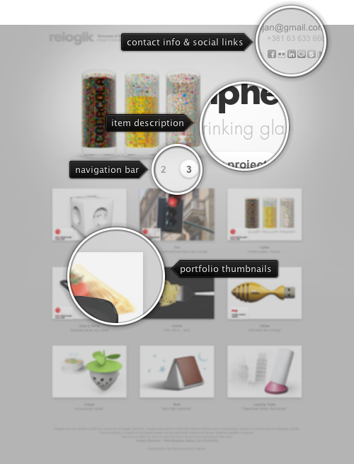
Today’s post highlights the design of relogik.com by Damjan Stanković. With an exclusive focus on highlighting the industrial concept designs, the background and text are set in lighter shades of gray (and letterpress effect on the main logo). The header section loops through four projects, with cross fading animations on each transition. The graphics for the currently shown project blends seamlessly with the background through a clever use of fades, back lighting and drop shadows. The full portfolio is laid in a strong and balanced grid, with captions playing secondary role to beautifully inset thumbnails accentuated by faint drop shadows. The contact information is neatly tucked in the top right corner of the page, with themed social icons that show full color on mouse rollover.

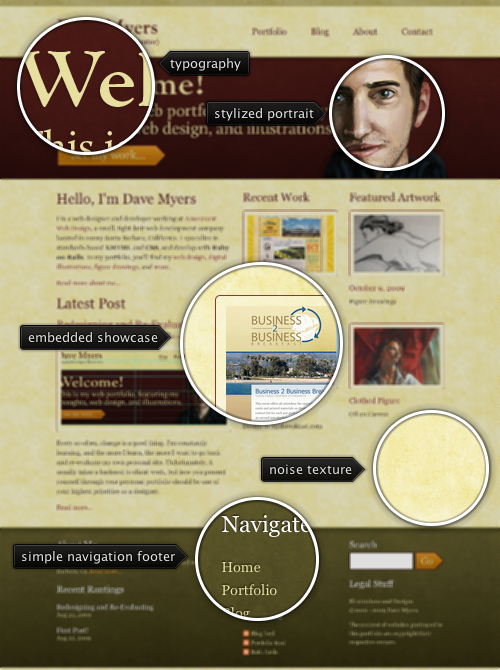
Today’s post highlights the design of ArtOfDaveMyers.com. Set in rich autumn colors of mahogany, olive and faded yellow, the design uses a lot of white space around prominent elements. Big and beautifully set typographical header, stylized self-portrait, thick horizontal separators, large section headers and big action buttons all contribute to the feeling of warmth and openness. The background noise texture breathes life into the white space around the elements. To prevent overloading the already rich color palette of the site, the design uses a lighter shade of mahogany for links, image borders and action button borders.
You’ve cost the economy untold billions of hours spent on analyzing every minute detail with the coworkers. You’ve posed questions and gave answers that led to even more questions. You’ve made a bunch of unknown (but good looking) actors famous for the rest of their lives. And now you are gone. At least one question was answered – who was Kate’s true love. Good bye, “Lost”.

Today’s post highlights the design of BasilGloo.com. About a week ago the site was switched to a summertime bamboo theme, but i prefer the more colorful and polished appearance of the old design. It’s a simple and clean one page design that uses a strong and colorful palette of ribbons. Blurring the ribbons towards the bottom edge creates an illusion of a 3D space (something that is missing from the new design, where both foreground and background elements are in focus). This added dimension serves as a perfect backdrop for the full height image of the designer and bright “Personal” / “Business” headers that use reflection to clearly position them between the “back wall” and the designer figure.
A clean and balanced grid of social icons highlights the personal activities and serves as a portal to follow Basil’s activity on the web. The business side of the ribbons is a perfectly aligned mini-grid with bio blurb and professional snippets. A folded top-left link to the blog adds the final touch to the outstanding design.