
Today’s post highlights the design of SweetSallies.com. With a soothing background palette of teal and light aquamarine, and splashes of olive brown for the texts, it uses a repeating floral pattern to create a friendly and playful vibe. The main page content is laid out in a narrow two-column grid that is framed to look like a real-life menu (with drop shadows elevating it above the background).
A lot of attention has been spent to fit all the essential information into a relatively small grid. The menu sections in the right column are interactive. Clicking on day names smoothly expands the relevant subsection, and moving the mouse over each menu entry (cupcakes and coffee) fades in a slightly translucent overlay with more information – all using the same teal color found in the header section.
The playful flowery theme is reinforced with multiple elements – woven chains in the header, vignettes around the main logo, hand-written fonts used on the logo, navigation menu elements and horizontal separators between the left-column information sections. Overall a very inviting and warm impression.
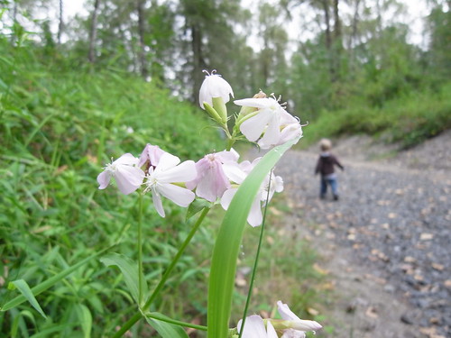
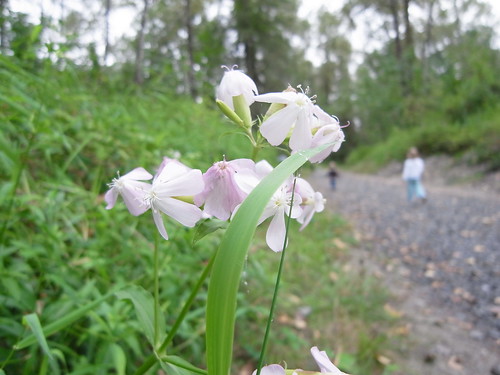
My son and daughter taking a walk in the forest

Today’s post highlights the design of FoundationSix.com. There are two main things that i like about the site – the color palette and the lighting effects. An austere color selection of muted teal, desaturated brick brown and light grayish yellow is masterfully reinforced in all the visual elements. Various shades of teal are used for both the grainy background and the texts in the top half of the site framing the attractive three-dimensional portfolio that occupies the center part. To improve the legibility of navigation links the design uses both all-caps and darker drop shadows (in the same teal hue). Move the mouse over the navigation links to see the inverse inset effect that uses darker hue with lighter drop shadows. Brick brown is only used sparingly in the top part – for the main logo which has a nice rollover effect and adds a little depth by displaying a blurred drop shadow below the navigation bar separator line.
This is a recurring theme throughout the design – using drop shadows, radial gradients and other effects to add perspective and depth without overwhelming the visuals. Note the radial gradient behind the main tagline (“Beauty * Brains”), the perspective tilt of the side thumbnails in the center portfolio piece, the double soft drop shadows cast by the thumbnails (hinting at not one but two light sources), and slight vertical gradient in the bottom part of the site. Instead of being distracting, all of the effects gently guide the eye towards the center that highlights the existing work done by the agency.
Finally, note how the highlight brick brown from the main logo and footer section highlights is used in the left and right thumbnail. While the center thumbnail uses the same teal hue, extending the radial highlight into the footer, it is flanked by perfectly balanced bursts of brown which are then further offset (towards the left and right edge) by the double soft shadows.

Today’s post highlights the design of MarkJardine.com. Mark is the designer for Tapbots, and the site design borrows heavily from the colors, textures, lighting and geometrical elements from the Tapbots applications (such as Convertbot). Set in a cold monochromatic palette that mixes in saturated steel blue, it uses a simple two-column grid with a separator gutter panel that uses a number of lighting effects to add extra dimensionality to the layout. The main content is using a strict monochromatic palette, adding noise texture to break large areas of white space, subtle drop shadows around the folded corners of embedded images and slightly curved callout contours around the entry texts. Note the marker icons in the separator gutter panels that differentiate between various content types (links, images, video clips, quotes etc).
