While the main focus of release 3.4 of Android Market client was improving performance and stability, we also continued refining and polishing the visuals of the different screens. Instead of taking a long hiatus, the philosophy is to release often, adding new features and polishing the existing ones in every single release. Release 3.4.4 (which is now at 100% rollout target) is not an exception, and today I want to talk about improving the layout and visuals of the details page for various screen sizes.
This is how the details page looked like in version 3.3.12 (Nexus S on left, Galaxy Nexus on right):

And this is how the details page looked like on a larger screen – a 10″ Xoom tablet in landscape mode:

First (and long overdue), we’ve moved the video preview into the screenshot gallery. It used to be in its own section below the fold, unbalanced and quite awkward. Here is its new place:

Note how the video thumbnail goes into the left margin, with the left sprocket strip aligned with the content in the sections below it.
Next it was time to take a much closer look at arranging the information for larger screen sizes. The existing layout and styling were functional, but not very pretty. The location of action buttons to the right of the thumbnail made the entire left column too wide for the rest of the content, while at the same time restricting the maximum width of the thumbnail itself. This also had another chain effect – due to large width of the left column, we only switched to two column layout at 1000dips, resulting in a very sparse (and quite ugly) single column layout on 10″ tablets in portrait mode.
Our designers had a good starting point for reimagining this layout. The addition of music support in version 3.3.12 added a new type of page – music artist:

Using this layout as a starting point, the new layout for the details page moves the item title and owner into the colored banner, and the action button(s) below the now larger thumbnail:

Tracing the alignment and contents of the screenshot section, you would notice a couple of things (in addition to hosting the video thumbnail). First, the bottom edge of this section is perfectly aligned with the bottom edge of the summary block in the left column, providing nice anchored balance of predominantly image-based content. Second, the screenshots extend into the right margin, taking full advantage of the available screen estate, while the rest of the sections in the right column are restricted to improve scannability and readability of predominantly text-based content.
As with the artist page, the right column scrolls below the colored banner. However, the left column has a new scroll-to-snap behavior “borrowed” from the purchase page. The content scrolls fully, until the rating stars reach the top edge. Then, the rest of the content continues scrolling while the rating stars and the action buttons snap to remain always visible:

While full vertical scrolling, as will be shown later, is particularly relevant for smaller device sizes, snapping the action buttons to always be visible reinforces their functional importance.
A more balanced two-column layout means that we can switch to it at an earlier point. Switching to two-column layout at 800dip means that a 10″ Xoom in portrait mode looks like this (with better layout for embedded cells coming in the next Market release):

The same layout structure is used for details pages of all media verticals. Here is the details page of a movie (note the new and consistent styling of the movie preview section, with darker background extending into the right margin, and the video preview thumbnail horizontally centered in a black box that is bottom aligned with the summary section in left column):

Here is the details page of a book (note that, as with movies, a more non-square thumbnail is right-aligned with the action buttons below it). Some items have very long titles, and in this case the title extends into the right margin and, if necessary, wraps to a second line.

And here is the details page of an album (note that, as with books, the right column is mainly text-based content that starts scrolling directly below the colored banner):

A more compact two-column layout scales down well to smaller 7″ screens. Here is the details page on an Acer Iconia A100 in landscape mode:

This highlights the importance of full scrolling left column – limiting the scrolling to the area below the summary section would have resulted in a very frustrating experience. What about portrait orientation for a device such as Acer Iconia A100 or HTC Flyer?
These are 7″ tablets with 1024*600 pixel screens at MDPI resolution. In landscape we have enough space to show the two-column layout (as mentioned above, we switch at 800 dips). There is not enough space to display this layout in portrait mode (at 600 dips), but we wanted to use the little extra width that we have – compared to the phone screens – to revisit the layout of the summary section. Here is how the details page looks like on a portrait Iconia A100:

Here you see the same visual language, from layout to styling to margins, paddings and gaps. This effectively means that we have three “buckets” of screen configurations for the details page:
- Default single column layout
- Single column layout with a different look for the summary section. This is enabled at 600dp.
- Two-column layout. This is enabled at 800dp.
The numbers are, effectively, switching points of the responsive mobile design, where the presentation of the content adapts to the current context. In addition, a more compact two-column layout has the margin point of 1000dp, with only item title and screenshot section extending into the right margin. The next entry will talk about the technical aspects of implementing the switching points in the current version of the Android Market client. In the meantime, I wanted to show another element of the details page, and how it fits into these different layouts. Here, once again, is the details page on devices with small form factor (Nexus S and Galaxy Nexus):
When the user initiates the download sequence, we show a dynamic section just below the summary to keep track of the download and install process:

Instead of making room for this dynamic section on larger form factors, we show it “embedded” in the summary section for the 600dp-800dp range:

Note how nicely it fits to the right of the thumbnail, as there is no need for a full-width progress bar that will look unnecessarily wide and unbalanced. And in two column layout, the dynamic download progress is shown in the summary section in the left column, replacing the action buttons as long as the download is running:

Stay tuned for more in the coming months as we continue refining and polishing the application across the entire gamut of supported devices.
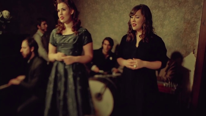
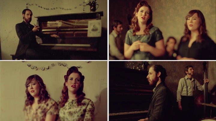
The Band Perry’s “If I Die Young”, LeAnn Rimes’ “Probably Wouldn’t Be This Way” and The Secret Sisters’ “Tennessee Me” are some of my favorite music videos in the last few months, and imagine my delight to find that they were all directed by the same man – David McClister. I’m very honored that David has found time in his busy schedule to answer a few questions I had about the art and craft of directing music videos, and to delve deeper into the particulars of some of the videos in his portfolio.
Kirill: You’re a photographer and a music video director. Tell us a little bit about your background.
David: I studied English and Art History in college. We didn’t have a film program there, so it was the closest I could come to actually studying film. Both disciplines have served as great backgrounds for film making and music videos – the English background for writing treatments, and the Art History background for concepts and inspiration. I started out as a film maker first, then at my wife’s encouragement, I began approaching some of the artists that I wanted to work with that couldn’t afford to do music videos. That’s when I picked up a still camera and started shooting stills and fell in love with it, especially the spontaneity and level of intimacy you have with the artist. I’ve been doing both mediums for about 10-12 years now.
Kirill: Let’s talk about the creative process behind music videos. What is your interaction with the performer to define the story and the look?
David: Each project is different. In a typical process, the director will be sent the song, along with an idea how much money they have to spend, and often an idea where they want to shoot – depending on their touring schedule, where the artist lives and so forth. Sometimes they’ll have an idea of the creative direction – do they want a performance-driven piece, a narrative-driven piece, or something totally different from what they’ve done before. So a lot of times they’ll give you a bit of an idea of where they’re thinking they want to go with it.
On my side, what I typically do is download the song and go to a very quiet, often dark place, put on the headphones and listen to it, keeping in the very back of my mind what they think they might want to do. The record label, the artist, the management may have ideas on where they think they want to go with this particular video project, but you never know where the music is going to take you creatively. Once you have the idea, that’s part one. The second part is to write a treatment, and that can take very little time, or it can take days. Sometimes it’s very easy to put into words exactly what you’re thinking, and sometimes it’s a little bit harder to describe your visions.
Kirill: Is a treatment some kind of a story board with sketches of different scenes?
David: It’s very open to how a director wants to present it. I think the more visual the presentation, the better. You have to keep in mind that not everyone that is going to be looking at the treatment is a visual person – so you should try to be as specific and visual as you can to show them what you’re thinking, from hair and makeup to production design to photography to wardrobe to props. It could be anything that is key to your idea.
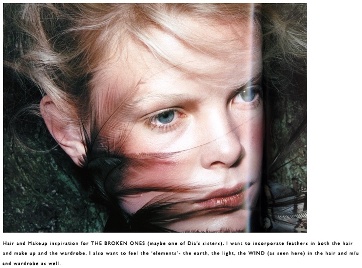
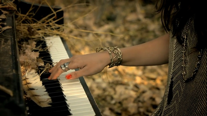
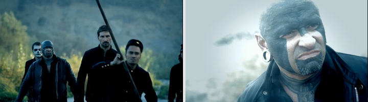
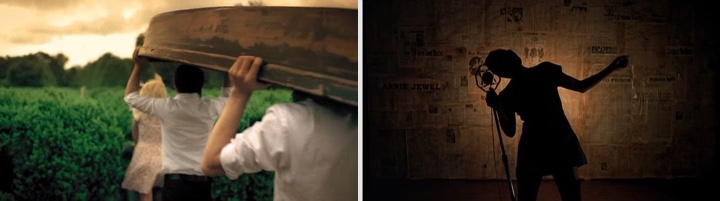
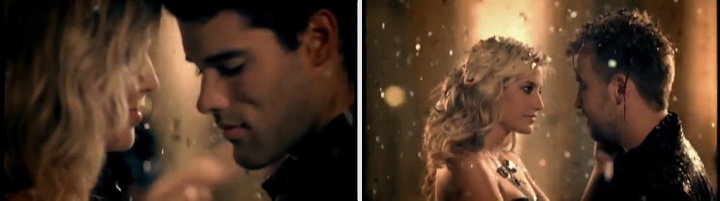
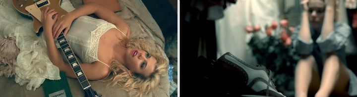
Top – treatment proposal for Dia Frampton‘s “The Broken Ones”. Bottom – still from the final video.
Typically it’s one to three pages of text, and then some visuals to go with it, and hopefully that gives them a strong idea of what you’re seeing in your head. The video that I just shot last week in Los Angeles is for a song that I fell in love with, from an artist named Dia Frampton from the last season of “The Voice”. When soliciting treatments for her song, Dia shared several links to past videos that she really loved that she wanted all the directors to have a look at. The record label and management also had some notes on what they thought they wanted to do with the video. But I felt so inspired by the particular song and so strong about the idea that came up with, that I went with that. It was totally not what they said they were looking for, but I got the job.
I guess the lesson I’m trying to make is that if you’re passionate about your idea, you pursue it. You go for it, and hopefully that passion comes across in your presentation.
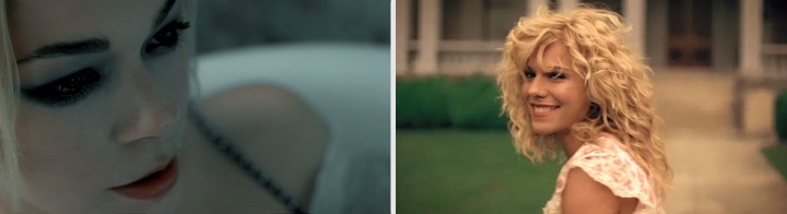
Kirill: You worked with LeAnn Rimes and The Band Perry on multiple videos. Do they get more open to your ideas and trust your direction more after the first collaborations?
David: Definitely. The comfort level grows, the confidence level grows, and I think there becomes sort of a shorthand between you and the artist. You tend to really know each other, to know each other’s likes and dislikes. The process becomes very unspoken, the same as when you work with the DP [director of photography] or production designer on several jobs. Plus, the more you work with the artist, the more you see the potential, their strengths and weaknesses, and what you can do to take them to a different level. You see things on set – production-wise or performance-wise – and you think that this will be great to explore later on in another video down the road. And of course you’re always sharing ideas, even when you’re not working on a job together.
And to the credit of both artists that you’ve mentioned, LeAnn and The Band Perry, they’re constantly trying to reinvent themselves, to push themselves to do concepts they haven’t done before, to show new sides to their fans, to keep it fresh and to continually challenge themselves. They’re not only doing it musically in the studio, but they’re also challenging themselves visually, to try things that might be a little bit outside their comfort zone.
Kirill: How big is a typical production in terms of your crew?
David: It depends, obviously, on the budget and, kind of hand in hand, on the idea behind it. The bigger the budget, the bigger the artist, the more people there are involved, and there will also be a lot of media there covering the video itself, so it can become a pretty huge event. I did a video a couple of months ago that was very low budget for a song I really loved, and it was more of a photoshoot, with less than ten people on the set. And the one last week with Dia, because of the excitement about the project and “The Voice” we had around 40 people with cast, crew and all the extras.
Kirill: How much time do you have to shoot a video?
David: It’s hard to get multiple days for shoots anymore. Typically they’re almost always single day shoots, and you’ve got an average range of 12-14 hours to shoot it. Depending on the idea and budget we can have a single camera or multiple cameras. Oftentimes I’ll employ multiple cameras if I can pull it off, just to get more coverage and to keep the day moving, and to get as much variety as possible. To me, you want all the images to be beautiful, but you want a great variety to keep the audience interested for the full three or four minutes. You need to be consistently showing something new, some new information. I don’t think you can show the audience everything in the first 30-45 seconds and expect them to be as engaged three minutes later. You need to be consistently creating something new for them to look at.
Kirill: And how long is the post-production stage?
David: Part of that depends on the format you are shooting – if it’s film, you probably didn’t shoot more than a couple of hours of footage – so 2-3 days possibly on the first cut. If it’s digital, you might have shot several hours of footage, which is obviously a lot more for the editor to look through. In that case it might be a week before you have a first cut ready to show everyone.
Kirill: There’s a lot of attention to details in your videos. Does this go back to capturing the viewer’s interest and have them go back to watching the video again and again?
David: I think that’s the key. As the director you have to keep in mind that the fans, even the casual ones, are going to watch that video numerous times. To maintain that attention, to keep their attention and focus you need to have a lot of depth, a lot of layers to your video, and to pay a lot of attention to the details throughout. It goes beyond the props, the framing and the editing. It needs to be multi-layered, and hopefully each time they watch it, even many views later, they’re picking up little details that they didn’t pick up on in previous viewings.
Kirill: And on the other hand, there’s a certain fleeting aspect to a music video. In a few weeks there’s the next song, the next album, and people don’t go to a music store to buy a DVD with that video.
David: I don’t think it’s as fleeting you might believe. What amazes me is I will still get comments from an artist or someone about a video that was done years ago that made a strong impression on them. I think videos, even though they tend to come and go fairly quickly on broadcast, have a lasting impact on the audience. I know that when I listen to certain songs, on the radio or in my home, I find myself watching the video in my head – but then I’m a director, so maybe it’s part of it. But I think in general it stays with people even more than photography, which is an image that you can hold in your hand – unlike video – but there’s something about video that connects with an audience that really makes a lasting impression, something that people think about years later that stills have a hard time competing with.
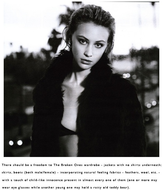
Top – treatment proposal for Dia Frampton‘s “The Broken Ones”. Bottom – still from the final video.
Kirill: With music programming practically disappearing from MTV and VH1, once mammoth conduits of music videos, a large swath of the audience gets new videos from YouTube and other streaming sites. Do you still plan and construct your sets for high-definition, high-quality capturing?
David: Well, I grew up when MTV was still playing videos, and that’s how I discovered so many artists. FM Radio wasn’t the answer either, so the only way I could discover new music was on MTV. So it is sad that it has changed. There were so many incredible videos that came about because of that.
With the Internet, YouTube, iTunes, being able to download videos – it’s a new dawn. I think people are very much into music videos again, and they have been for several years now. There was definitely a period after MTV and VH1 changed their programming to be all content, and before Internet took hold and the music business knew how to use it, that there was a real down period with music video. But it’s back, there’s a real buzz about it. Unfortunately most people only see it on a small screen. I still prepare my shoots as if they’re going to be on a big screen.
Probably the main difference with videos now comes from shooting primarily with digital cameras. The more we see the digital formats, which have different look than 35mm or 16mm film, we as an audience become more accustomed to that look. I’m not saying it’s a good or bad thing, it just is what it is. It’s just the nature of an evolving medium.
Top – treatment proposal for Dia Frampton‘s “The Broken Ones”. Bottom – still from the final video.
Kirill: What happened after that down period? Do you see bigger budgets, do you see artists pushing to shoot more videos from a single album?
David: I don’t know that it has changed that much. The music business has been through a difficult time over the last several years. As far as the music videos and photo shoots, the budgets aren’t where they used to be. But the creativity level has not changed, and it’s more challenging now with limited budgets.
Kirill: There’s an almost cinematic quality to your videos, with so much attention to focus, framing and lighting. It feels like I’m watching a small movie. Is this something that you insist on doing when you’re negotiating with the artist and the label?
David: At a certain point you have a body of work and a style that the artist, the management and the record label all know. When they come to you, they kind of know what they’re going to get, in a sense. My approach is pretty consistent in all the things you’ve mentioned, and this is just how I see things.
Kirill: There’s a certain style to shoot a video where the song takes an almost back stage to whatever story is shown, and the main attention is kept on the actors playing out that story. All your videos place main emphasis on the performer. Is that a conscious choice?
David: I never really thought about it. I think it’s incredibly poweful and cinematic when you have an artist giving a very strong, emotional and honest performance. There’s something about it that resonates with the audience, and if you have an artist that can really pull it off and the right song, there’s no need to cut away from that.
Kirill: Has it ever happened that a certain look or a set that you’ve created for a video affected the tour stage setup later?
David: Yes, I’ve been told that. I know that it’s happened with LeAnn, and it’s happened with The Band Perry too. They’ve been so happy with the choreography and the set, that they took it to award shows and on the road. It’s very rewarding that your work is being carried over to that level.
Kirill: Let’s go back to keeping the audience interested throughout the entire length of the video. Oftentimes you present us a story that happens in the background, cutting back and forth between figments of it, presenting a puzzle of a sorts. Do you feel constricted by this very short time frame, and by not being able to actually put that story into a spoken word?
David: Actually I feel the opposite, I feel like I have a lot of freedom. If you talk about a puzzle, I try to make most of my videos to be like a film, to have a conflict, to have a narrative arc, to have a payoff at the end. Hopefully, for the audience, the resolution is not the one you expect. For example, with Lady Antebellum “Need You Now” video, most people expected to see the two lead singers get together, but they ended up with two different people at the party at the end of the video. I wanted it to have a bit of a twist, something unexpected.
Kirill: While this video was a more literal interpretation of the lyrics, LeAnn’s “Nothin Better To Do” is a more loose version that captures the mood of the song, but takes it to a more open-ended visual journey.
David: Being literal is pretty boring, it gets very old to show exactly what the singer is saying on record. Obviously there are times when a song demands it, but in most cases I find it boring, and hope to reinterpret it in a different way. It can be the setting, the characters, the time period, the look of the film – and hopefully something that when you listen to the song as a fan, you thought it was going to be one way, and when you see it, you’re pleasantly surprised that it’s something that you hadn’t expected, and you enjoy it and have fun with it.
The particular video you’ve mentioned was a lot of fun. It’s actually a character that LeAnn had in mind when she wrote the song, a distant family member. And so we were able to take that as our inspiration and build around it, and it was a very long shoot, about 18-20 hours in a single day. It’s still performance-driven, an homage of sorts to the great director and choreographer Bob Fosse, and very much like a movie.
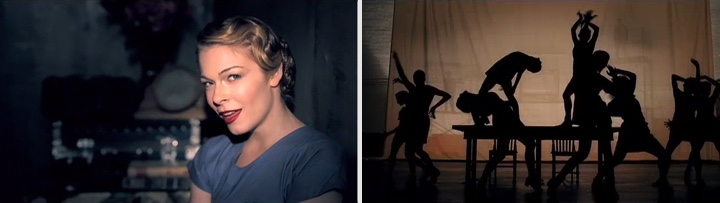
Kirill: Let’s talk about “Tennessee Me”. It has a lot of jumps, camera shifts, focus shifts, and feels like an unearthed home-edited piece stitched together from multiple reels.
David: We did almost all of it in camera. We shot on a 35mm camera (An Arri 435), and we tried pretty much everything you can possibly imagine with it. We changed camera speeds in camera while we were shooting, we would go forward and backward at times – and that’s how you get the double exposures. They were not layered in post, but rather in camera. And the overall effect, as you said, is that I wanted it to feel like a found film, an amateur film in the way it was photographed by a friend of family member many years ago, left in the attic and then found years later and played on a home projector. That was the intention of it, and that’s how we photographed it.
I liked that they allowed us to keep some scenes out of sync, where the voice didn’t match up perfectly with the picture. There were several instances where that happened, and always by the end of the shot it’s back in sync, but there are moments when it’s out of sync, lending itself to the amateur home film feel, like it was cut and spliced together on an old film splicer.
Kirill: And you can do this only once
David: In a way yes. You can definitely take some of the things that you learned and apply them to other jobs, but you don’t want to repeat yourself and do exactly the same thing. The original inspiration for the look was going to be toned black and white ambrotypes. Then, as we were shooting it, the girls looked so amazing in color that I changed my mind and we ended up toning the color film to a bit more of a hand tinted look. I have had the good fortune to work with a colorist in San Francisco named Chris Martin who has worked his magic on many of my transfers.
Although I couldn’t be there, I sent him several references and we talked on the phone about the shoot, the concept and the overall feel I was going for. He ended up transferring it about six different ways. The intent was that different sections of the ‘found’ film would have aged differently over time, and then been spliced together to make the film.
Kirill: And then you have “Hey Mama” by Mat Kearney where it looks like you just grabbed the camera and started following the guy on the street.
David: It was sort of an homage to a collection of documentary photographers that greatly inspired me over the years, Danny Lyon, Robert Frank, Bruce Davidson, Susan Meiselas – all phenomenal shooters. We shot it in New Orleans on 16mm black and white over the course of two long days using all natural light. Some of the people were cast, and others were just pulled off the street for a few minutes. I can’t say enough about how great it was to shoot in New Orleans and how wonderful everyone was to us while we were down there. I think the idea worked really well with that song, and Mat did a tremendous job.
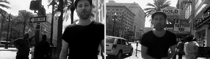
Kirill: Film camera, all natural lighting, constricted time limits. Did you actually have time to look at the raw footage and make some adjustments or corrections?
David: No, as it was film, there was no way to go back and look at what we had shot. We actually didn’t have a monitor to look at either, but I had a good feel after each scene about exactly what I had. I had a very detailed shot list, and kept a mental note of what we were getting.
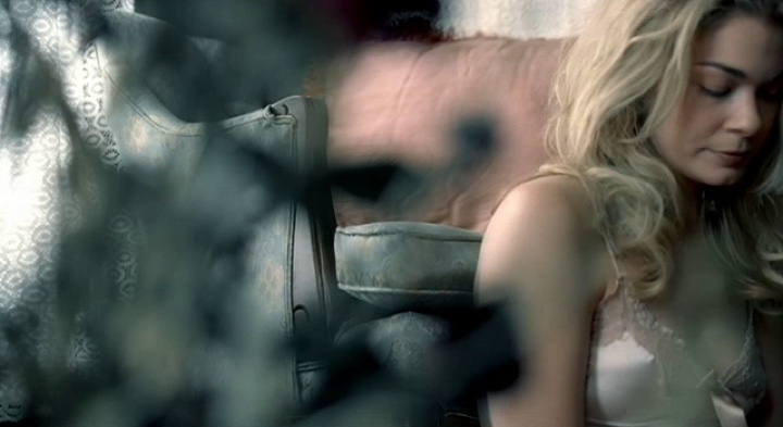
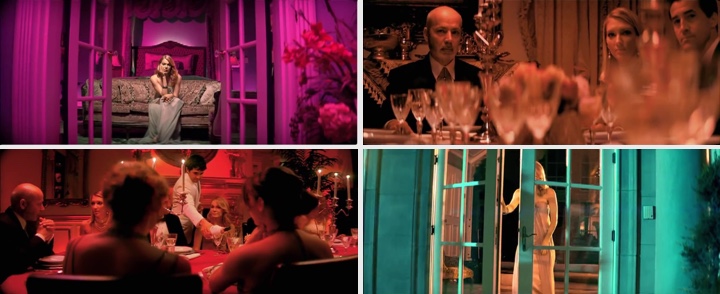
Kirill: And then, as an almost diametrical opposite, “And It Feels Like” from LeAnn Rimes with explosion of color, wide swaths of pinks and magentas, soft focused crystal chandeliers and richly decorated interiors.
David: We shot it in 35mm anamorphic, and I remember I was drawing inspiration from films of Stanley Kubrick, specifically Eyes Wide Shut. Norman Bonney was the director of photography and he did an amazing job. I told him during prep that I really wanted to push it color-wise, to be really bold. I wanted each room to have a different color, a powerful color wash. So I gave each room in the house a very dominant color theme, from the performance room where it’s all pinks and purples, to the study where they’re having pre dinner cocktails which was heavy yellow, to the dining room that was heavy red where things don’t go as she expects them to go when her ex lover shows up to the party with someone else on his arm. The colors were set to enhance the emotion of the scene, and I think it works very well.
You go in with a very concrete set of ideas when you write the treatment, but it’s a very fluid process. You’re consistently changing throughout the process – the pre-production, the day of the shooting itself, post – you see what works, what doesn’t work and have new ideas that continually come up during the process.
In the treatment for that specific video I did not say that I was going to have such a heavy color wash. The pitch was all about the narrative storyline. Once I saw the location, and the more I looked at it, it just sort of happened.
Kirill: Does it happen that you watch a music video done by somebody else and think to yourself that you would’ve done it in a completely different way?
David: No, I never think that. I don’t watch a lot of other videos. I tend to draw inspiration from films, photography, painting and so forth.
Kirill: Do you see yourself branching off into longer formats, documentaries, short movies or full-length features?
David: Definitely. I just finished a short film about six weeks ago that I’m very excited about. I’ll be submitting it to festivals in the coming months and have several more shorts that I’m prepping to shoot in 2012. I think every music video director has feature film aspirations, and I’m certainly no different.
And here I’d like to thank David McClister once again for his great work, and for this wonderful opportunity to glimpse into the world of directing music videos.