Chroma color system – part III, drawing Radiance components
Picking up where the second part ended, let’s take another look at the same application UI rendered by Radiance and its new Chroma color system, in light mode and in dark mode:
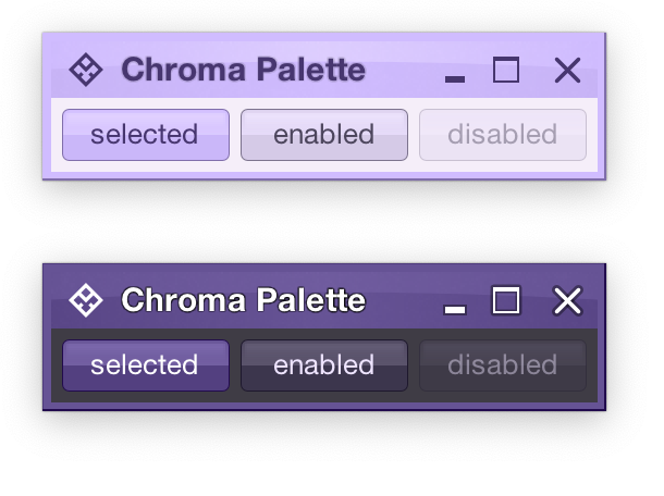
Recapping, Radiance has three types of containers – active, muted, and neutral. In this particular UI, the selected toggle button is drawn as an active container. The enabled button is drawn as a muted container. And the panel that contains the buttons is drawn as a neutral container.
Each container has three parts – surface, outline, and content. Radiance provides multiple color tokens to draw these parts, giving the apps the flexibility to choose a flat look, a gradient look, or any other custom look. In the particular example above, the surface part of each button (inner fill) is drawn with a vertical gradient that emulates the appearance of shiny plastic.
Let’s see how this approach extends to other Swing components rendered by Radiance
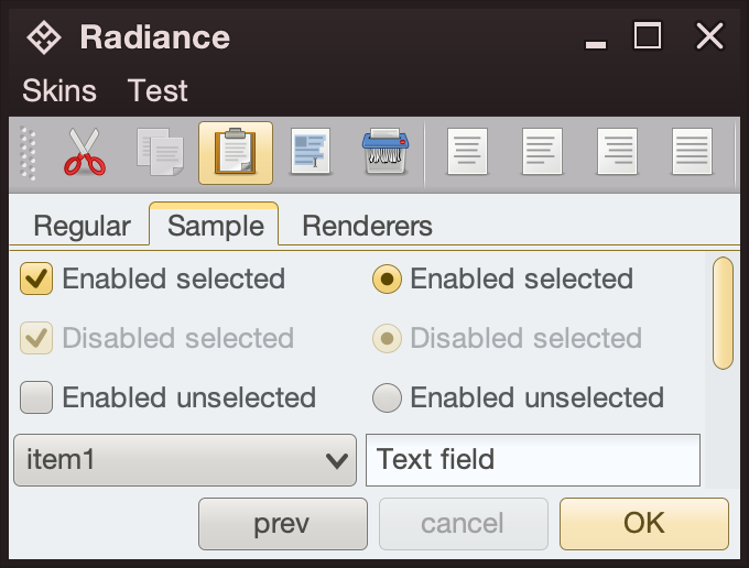
- The title pane and the menu bar are drawn as neutral containers, using dark brown as the seed color for the surface tokens
- The toolbar is also drawn as a neutral container, using medium gray as the seed color for its surface tokens
- The active tab is drawn with a combination of surface color tokens for the active container (the top yellow strip) and outline color tokens for its outline
- Selected checkboxes and radio buttons are drawn as active containers, same as the default “OK” button
- The scrollbar is also drawn as an active container
- The combobox is drawn as a muted container
- The text field is drawn as a neutral container, using a different / lighter surface color token for its inner fill

The same approach extends to renderer-based containers, such as the tree on the left and the list on the right
- The striped background is drawn with surface color tokens of a neutral container, alternating between
containerSurfaceandcontainerSurfaceHigh - The highlights are drawn with surface and outline color tokens of an active container
The usage of containers and color tokens is not skin-specific. The UI delegate for a specific Swing component, let’s say a button, does this:
- Get the surface painter and the outline painter from the current skin
- Determine the decoration area type of this component (menu bar, toolbar, control pane, footer, etc)
- Ask the skin for the container color tokens that match the decoration area type and designated container type. For example:
- The button UI delegate will ask for neutral container tokens for enabled buttons, or for active container tokens for buttons in active states (selected, rollover, pressed, etc)
- The checkbox UI delegate will ask for neutral container tokens for an unselected checkbox, or for active container tokens for active checkbox (selected, rollover, pressed, etc)
- The scrollbar UI delegate will always ask for active container tokens – as a design choice in Radiance
- Ask the surface painter to draw the inner part of the component using the obtained color tokens
- Ask the outline painter to draw the outline of the component using the obtained color tokens
What is achieved by this separation?
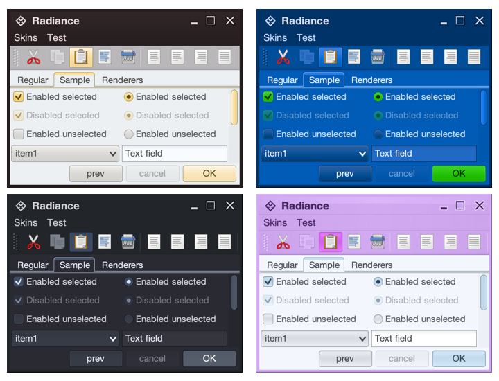
- Each skin defines its own colors for the different decoration area types, such as the purples for the title pane, the menu bar and the toolbar in the bottom right screenshot under the Nebula Amethyst skin.
- Each skin also defines the overall visuals of surfaces and outlines across all components, enforcing consistent application of visuals across buttons, comboboxes, scroll bars, checkboxes, etc.
- And at the same time, each component and its Radiance UI delegate is responsible for deciding how it combines the colors defined by the skin (for each decoration area type) and the visuals defined by the skin’s painters to draw its own distinct appearance.
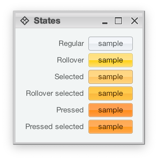
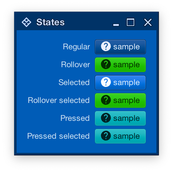
Radiance also provides support for using different color seeds for different active states. Seen above is the Office Silver 2007 skin and the visuals for the same button under rollover, selected, rollover + selected, pressed, and pressed + selected states. The application of the inner gradient fill is consistent, provided by the skin’s surface painter. The application of the outline visuals, including the slightly lighter inner outline, is consistent as well – since the skin’s outline painter uses the same color tokens – but from different color seeds provided by the skin.
And the same skin can mix light and dark visuals for different active states in the same decoration area type. Here, under the Magellan skin, components in rollover, rollover + selected, pressed, and pressed + selected states use light fill and dark content (text and icon), while the same component in the selected state uses dark fill and light content.
In the next post we’ll take a look at the flexibility provided by multiple surface color tokens, and how they can be used to build up a visual hierarchy of content in your applications.
