There’s a lot of hand-wringing around the changes Verizon corporate is bringing down on the Tumblr communities. People are talking about the freedom of creative expression, the future of safe spaces for fringe interests and the good old days before the engagement-driven ad “opportunities”. Yahoo’s billion-dollar purchase of the not-quite profitable platform was accompanied by grand promises:
We promise not to screw it up. Tumblr is incredibly special and has a great thing going. We will operate Tumblr independently. David Karp will remain CEO. The product roadmap, their team, their wit and irreverence will all remain the same as will their mission to empower creators to make their best work and get it in front of the audience they deserve. Yahoo! will help Tumblr get even better, faster.
…
In terms of working together, Tumblr can deploy Yahoo!’s personalization technology and search infrastructure to help its users discover creators, bloggers, and content they’ll love. In turn, Tumblr brings 50 billion blog posts (and 75 million more arriving each day) to Yahoo!’s media network and search experiences. The two companies will also work together to create advertising opportunities that are seamless and enhance user experience.
There’s a certain beauty in the natural cycles of web chaos. And there’s also a big difference between sustained and sustainable. The history so far has shown that it is not a sustainable endeavor to build a popular social platform that is held in high esteem by both users and the market forces. It’s a rather awkward place between being a sustained loss center, and being stuck in a somewhat unsavory self-reinforcing cycle of business decisions that go counter to the whole notion of, well, social.
As for me, with the impending shuttering of Google+, I’ll be writing more right here in my own little web garden.
Software is never quite done. Even if you have all the features put in, and all the known bugs fixed, if you stand still, the world will slowly pass you by and leave you behind.
A modern app is, more or less, expected to be everywhere. People expect seamless sync between all their devices, intelligent offline, presence of all the screens in their life, and constant adaptation of how the app behaves to the ever-evolving world of technology that we live in.
The same goes for web sites. Space Jam is a rather wonderful memento of the early web frozen in time. But it’s a curiosity, a rare peek into the world of yesteryear.
Content is king they say. Whoever they are, they don’t tell you that the presentation of content matters. As I was switching my site to be fully HTTPS earlier in the year, I was reminiscing on all the non-content maintenance work that I keep on doing on a semi-regular basis with my site to keep up with the latest and greatest. To keep up with what is “expected” of modern web sites. To get a feel of the burden the technology evolution is placing on hundreds of thousands (millions, tens of millions?) of web developers that find their carefully constructed houses of cards gather cobwebs.
- In 2012 I’ve switched to using web fonts, and I kept on tweaking those ever since – for body, headings and navigational elements.
- In 2013 I’ve switched to fully responsive design, scaling the overall layout to behave well on a variety of screen sizes.
- In 2014 I’ve switched to use 2x / retina images on relevant hardware, which required going back to the archives and resourcing all the images in the interviews that have been published until then.
- In 2015 I’ve switched to a single-column layout, rearranging the content to flow better across a variety of screens.
- In 2018 I’ve switched to HTTPS, even though the only user-facing input box is the search tucked at the very end of the page.
Is the latest 3 year gap an indication that things are slowing down? Maybe. But probably not. I’m still tending this little web garden of mine. The latest chapter, so far, has been adding support for dark mode:
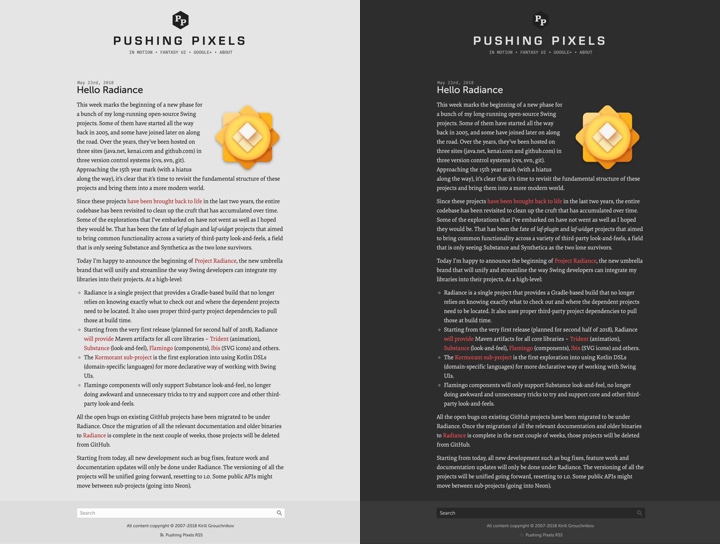
On the left is the regular version of Pushing Pixels. On the right is how it looks like running under Safari Technology Preview on the latest macOS 10.14.1 (Mojave), with the work under way to add the matching CSS selector support to Firefox and Chrome.
I hope this little web garden of mine will be there in 10 years. In 20 years. Hopefully in 40 years. There’s a lot of tending ahead.
Note: since this post was written, Safari for macOS 10.14.4+ and Firefox 67+ have added official support for dark mode. Chrome has added support for dark mode starting in 73 on Mac and starting in 74 on Windows.
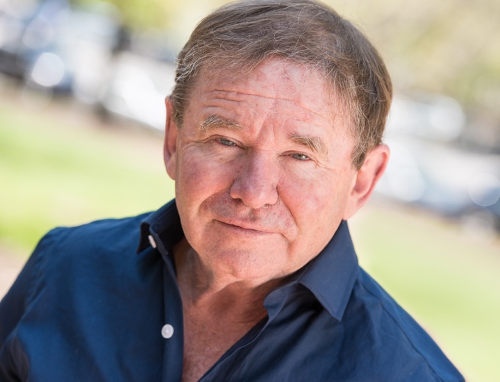
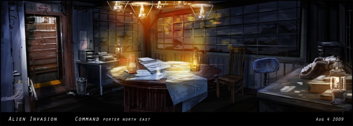
Continuing the ongoing series of interviews with creative artists working on various aspects of movie and TV productions, it is my pleasure to welcome Richard Hoover. In this interview he talks about the changes technology has brought to the world of art department in recent years, the meaning of success and the business side of the industry, and collaborating with directors and cinematographers on finding the right visuals for the story. Around these topics and more, Richard goes back to his work on “Twin Peaks” and “Girl Interrupted”, and dives deep into building the worlds of the upcoming family drama “Second Act” – out in theaters this December.
Kirill: Please tell us about yourself and what brought you to the world of storytelling.
Richard: I found the theater first and, of course, was an actor. In school I began designing stage sets and making plays. I think storytelling is a desire that grew and is being realized – as opposed to being in my mind at the beginning. Over recent years I’ve grown in the desire to learn the basics of storytelling, visually and verbally. I want now to know not only structure and construct, but also of what value story may have for others, for the audience, and how does it reflect a truth.
That interest had grown out of making scenery on stage. I still like building and making things. These days it is actually more critical that I use more of verbal muscle through writing.
Kirill: From your perspective, how has the world of storytelling evolved in the last 30-35 years since you started?
Richard: I think there have been advances but still story is still rooted in the basic human soul. We have an inherent need to tell stories, the desire to tell and to connect. In terms of story in film language there have been leaping advances in pacing and scope that are fascinating. “Twin Peaks”, for example, used a slowed down pace, wide angle shots, and a humorous witnessing that was very radical for TV at that time.
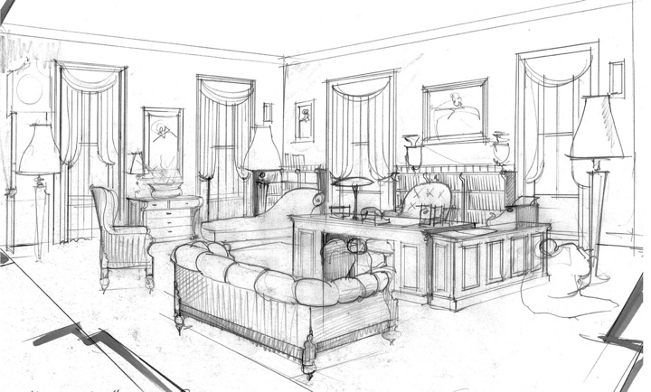
Sketch art for “Girl Interrupted”, courtesy of Richard Hoover.
Concerning the growth in digital infrastructure that has been happening in the last 20-25 years, there are now chances to do things in a virtual way not previously available. We used to build physical models, and now we do it digitally (as well as physically). We can look at it from all sides, explore it and figure out if we want to adjust things. That has become a major advance in what I have to do as a designer of a production. The digital world to me is both wonderful and painful in that it has also speeded us up and invaded quiet times.
We have less time now in film productions, and the economical pressure is more intense. So story is traded in often too speeded up a way. Communication has sped up, and sometimes in that speed-up things get lost. You sit in the same office with somebody, and you keep on emailing each other. I need to go stand in the room, and talk and show. That being said, if you’re working in a remote place, digital links are an advantage. You can send images, and that’s been amazing.
I remember my first cell phone which was this giant banana [laughs], and before that it was quarters in the pocket and payphones if you could find them.
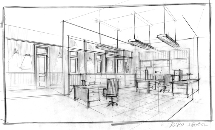
Sketch art for “Girl Interrupted”, courtesy of Richard Hoover.
It is amazing, but it still takes time and economical investment to get the technical people in place to help the designer illustrate and render. The key thing is interactive presentation to the director and the producers, so that there’s a sense of a commitment to tone and approach. During those presentations it’s critical to have digital tools and physical tools to really look at how things are going to want to be – as a hope, as a desire. That’s what I always try to do. If I have an illustrator, that’s a wonderful thing. If I have time to do it, I’ll do it in pencil or in Photoshop. It doesn’t happen in a moment though. It takes hours.
Kirill: What about how much the modern cameras can capture as far as the resolution goes? Do you find that your sets need to be more detailed?
Richard: High definition digital cameras have pushed change in design a lot. So much more can be seen now, and details might become much more of an issue than in normal film camera work.
I do find it very interesting to see how little lighting is needed these days. Sometimes I watch a film on my computer, and it’s all dark, but that’s fine. But it’s amazing to see what can be done with just a candle in the room.
Concept art for “Falling Skies”, courtesy of Richard Hoover.
Continue reading »
Continuing the ongoing series of interviews on fantasy user interfaces, it’s my honor to welcome Jamie McCallen. In this interview he talks about keeping the viewers in the story, the process of designing for screens in film, the differences between on-set and post production work, and the evolution of hardware and software tools at his disposal. In between and around, Jamie dives deeper into the first 15 years of his work that spanned productions as diverse as “Elysium” and “The Age of Adaline”, “Batman v Superman” and “Night at the Museum: Battle of the Smithsonian”, “Star Trek: Beyond” and “Godzilla”, and many more, including his most recent work on “Altered Carbon”, “Skyscraper” and “The Cloverfield Paradox”.

Kirill: Please tell us about yourself and the path that took you to doing screen graphics in film / TV.
Jamie: I am a freelance designer and developer based in Vancouver, Canada. Over the last 15 years, I have worked on just over 40 film and television productions providing interactive desktop and mobile applications and post-production motion graphics.
I took a bit of a detour before getting into the industry. Art and programming had been interests, but I always had a different career in mind. In my teens, I had had art lessons, attended summer computer camps, that sort of thing. In my first years at university, I had taken a few programming courses and I worked one summer developing research applications for a statistics professor. But my intended career path was law and labour relations and over the next few years that’s what I did: law school, human resources manager, lawyer, co-founder of a labour relations non-profit organization. To that point, I had enjoyed the work I was doing, but it was while building the website for the non-profit, that something clicked. I realized I was excited about what I was doing and really enjoyed the combination of coding and design. Not wanting to give that up, I started working with a Vancouver-based team building websites for game companies and their game titles.
Around this time, I had a chance encounter with Rick Lupton, owner of i.Solve, Inc. Rick had heard I was doing some work in Director and inquired if I could build a joystick-controlled gimbal screen for the x-jet in “X2: X-Men United”. Over the next few years, I worked with the i.Solve group and started to design more and more screens.
It would take a few more productions and the opportunity to work with Gladys Tong and the G Creative team before I stopped thinking of myself primarily as a developer and started to consider myself a hyphenate (designer-developer).
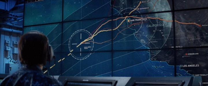
Screen graphics for “Godzilla” under the creative direction of G Creative. Courtesy of Jamie McCallen and Warner Bros.
Kirill: Looking back at your first couple of productions, what was the most unexpected part of working in film?
Jamie: On the first couple of films I worked on, I remember chasing some information that I thought would be helpful while building screens. “What city are they in? What is the last name of that character? What is the exact date?” It took a while to figure out there were often no solid answers and that productions sometimes wanted to keep those aspects as vague as possible on purpose. It just became easier to work around the details and get creative about hiding the holes. Nevertheless, I just remember expecting some of those details, especially timelines, would have been fleshed out.
Kirill: Do you worry about how your work will age / be seen in 20-30 years?
Jamie: Considering some of my work is nearly 15 years old, I should probably start to worry. But, no, I don’t worry about it. Style and design are a product of their time and some will age well, and some won’t.
While designing, I am definitely not thinking about future audiences. But I do have the contemporary audience in mind and am considering what they are familiar with, what visual shorthand can I use to reinforce the message. Mainly, I am trying to produce a style that matches the character and the set design. When my work is seen by future audiences, I just want it to continue to mesh with the overall production.
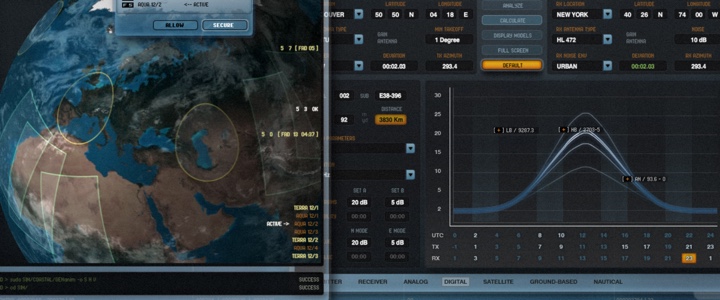
Screen graphics for “2012” under the creative direction of G Creative. Courtesy of Jamie McCallen and Columbia Pictures.
Kirill: Do you find yourself competing with screens in your daily life? How do you craft something compelling that keeps the viewer in the story?
Jamie: Absolutely, I think we all compete with screens to some extent. It’s fairly common to be in situations where a person you are with is trying to finish up a message or post. For the most part, I just keep doing my own thing. If the person knows I am there and chooses to continue with what they are doing, I’ll respect that choice.
It’s kind of the same way in movies. You need to know what your message is competing with and how important it is. It’s not always about demanding attention.
As for your second part of your question, keeping viewers in the story. That’s key. We have all watched a show where something was off. Display graphics can suffer from the same types of problems. Sometimes they can be overly distracting, have awkward mannerisms, look out of place.
So, the first part of designing any screen is to just try to make sure it doesn’t stand out for the wrong reasons. Screens have to play their role. If it is a background textural screen, it should not call too much attention to itself. If a screen is given the chance to drive the story – be a “hero” – it needs to command attention and, as you said, be compelling.
To build a compelling hero screen, I think it should offer something unique and it needs to read clearly. For me, the process starts with the message. What story does the screen need to tell? Usually a screen is only visible for a few seconds, so it is important to figure out the core of the message and eliminate anything else. I try to strip out anything that I can read past and still get the whole message. Some of what is stripped out can be reintroduced later as secondary elements, but the main message should be as simple as possible.
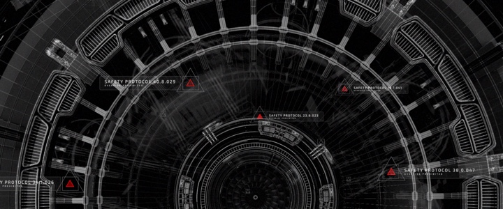
Screen graphics for “Star Trek: Beyond” under the creative direction of G Creative. Courtesy of Jamie McCallen and Paramount Pictures.
Continue reading »
