To mark the end of my third year on the Android team, here’s a TL;DR version of the last thousand days or so.
Do code reviews. You’ll occasionally butt heads, as there’s rarely a single “best” way to make even the simplest bug fix. But no matter what’s the seniority of your reviewer, you’ll always be better off at the end. I lost count of the number of times that I said to myself “Huh, I didn’t know that” after seeing a reviewer leaving his comments. Not to mention that you’ll have somebody else having at least some level of familiarity with your code if you ever get too swamped.
Every once in a while you’ll get out of your comfort zone working on a new feature or fixing a bug. At some point you know your reviewers, their style and their strengths. Don’t be tempted to add reviewers that will be inclined to rubber stamp such code. Seek out people who are deeply familiar and well versed in the specific area. You will be afraid that they’ll pick your code apart like a poorly constructed house of cards it is. Better now than after it ships. Such a reviewer knows how to do this better than you, and the result will be better for both you and your code base. It will just take longer. Don’t let your ego take a hit. It’s just code.
When you’re asked to do a review, do it quickly. Don’t drop everything and do it immediately, but do it the same day. The quicker you provide good and actionable feedback, the fresher it is on the side of the code author. Don’t let your reviewers rot. This also helps preventing unnecessary rebases. Not to mention spreading your strengths around, and learning from the strengths of others.
Don’t do gigantic code drops. If it’s a big feature, start on smaller steps towards the final goal. Mark unfinished places with TODOs so that the reviewer knows this is not the final thing. And make damn sure there’s not a single TODO left at the end.
Cross reference all code changes with bug tracker entries. Document all discussions, decisions and alternate solutions that didn’t work in the bug tracker. When somebody asks why things were done this way a year later, they’ll be thankful. In most cases, that somebody will be you.
Do code reviews. I might have mentioned it. But seriously. Don’t be that guy whose code ends up on The Daily WTF. By the way, if your team members start posting your code there, you might want to contact your internal security guy. Just saying.
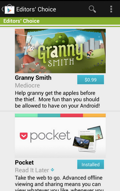
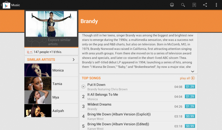
In an earlier post I talked how we restyled the “Similar artists” section in the latest release of Google Play Store app. Here is how the details page for an artist used to look like:
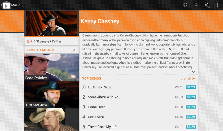
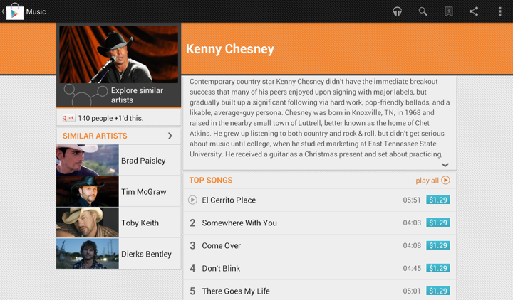
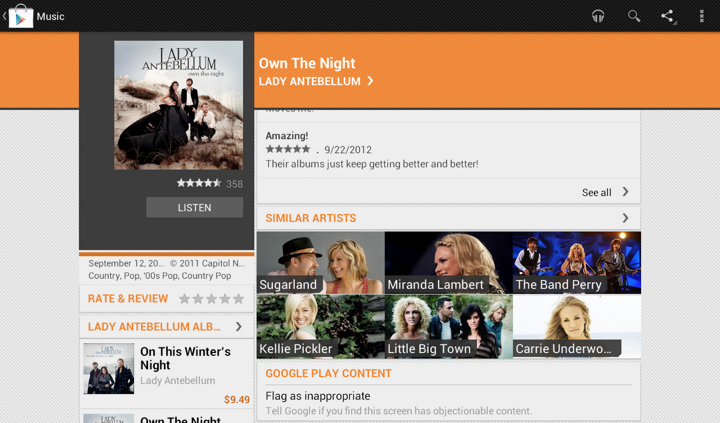
We display up to four similar artists (if we have that info), and using full-bleed artist images with overlayed names creates this gigantic block that completely overpowers the main artist image. It’s just too heavy, and it constantly draws your attention away from the rest of the content on this page. Here is the restyled version that provides the same information, but scales down the presentation to match its relative logical importance in the overall content hierarchy. The artist image takes half the cell, and the artist name is displayed to its right. And now we can also fit more of these cells above the fold.
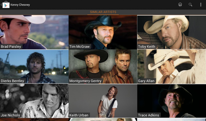
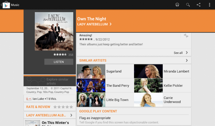
Tapping on the header of “Similar Artists” section opens the full list. Cells in that list are full-bleed to provide a richer listing, where each element has the same logical and visual importance. In the absence of a more “important” visual element (such as the main artist hero image on the details page) we can go back to the full-bleed presentation:
The implementation behind these two screens is quite straightforward. We define two XML layouts, let’s call them artist_reduced.xml and artist_full_bleed.xml. The first is used on the details page, and the second is used on the full listing. But what happens on smaller devices?
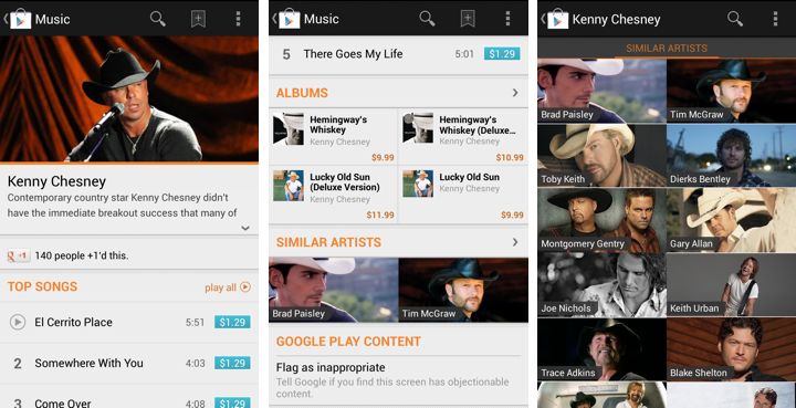
The first two screens show the details page of the specific artist, and the third screen is the full list of similar artists. As shown here, the target design is to use the full-bleed cell in both cases, preserving the existing presentation. The main reason not to switch to cells that display artist image side by side with artist title is that the current presentation is already following the logical importance of that content. The main artist image takes the full width of the screen, while similar artists section displays two cells side by side. Not only each such image is smaller, the vertical position of that section and full scrolling ensure that we won’t end up with both main and related images being visible on the screen at the same time. Finally, if we switch to the new presentation, we won’t have enough horizontal space to display two cells side by side (which is, by the way, why we switched from 3 columns to 2 columns in “Similar Artists” section on album details page on larger devices). So, to continue displaying two similar artists we’d need to add another row of content, which is not an immediate UX improvement.
Preserving the existing design poses an interesting problem. On smaller devices we want to use the same layout for both usages, while on larger devices we want to switch from “reduced” to “full bleed” layout. Suppose our switching point to differentiate between smaller and larger devices is -sw600dp. Then, the first approach would be to have:
- layout/artist_reduced.xml
- layout/artist_full_bleed.xml
- layout-sw600dp/artist_reduced.xml
In this approach, layout/artist_reduced.xml is a copy of layout/artist_full_bleed.xml which lays out the content as full-bleed image and overlapping title, while layout-sw600dp/artist_reduced.xml lays out the content as a smaller image in the left part of the container, and multi-line to its right. At runtime the system decides which layout bucket is used for the specific layout. For the full view that references R.layout.artist_full_bleed in its adapter it will return the instance inflated from layout/artist_full_bleed.xml. For the “Similar Artists” section on details page R.layout.artist_reduced will be resolved to either layout/artist_reduced.xml or layout-sw600dp/artist_reduced.xml based on the device.
The main disadvantage of this approach is maintaining two identical copies of the full-bleed layout in the layout/ folder. Even though we only have two child views in this cell, you still need to remember to sync any tweaks you make between the two copies. This can be addressed by extracting the content into yet another layout that has parent <merge> tag, and <include> that content in both XML files in the layout/ folder. That still doesn’t completely remove the sync problem as you still have identical parents defined in the two original files, and increases the amount of information you need to “parse” in understanding what is the right place to tweak the specific layout. Here is where we can use layout aliases.
What do we want in an ideal world? We want to define two basic layouts and, depending on which layout bucket we’re in, to map R.layout to one of them depending on which page / section we’re in. So this is what we’re going to do:
- Define the “full bleed” layout in layout/artist_full_bleed.xml
- Define the “reduced” layout in the bucket that is actually going to use it – layout-sw600dp/artist_reduced.xml
How do we make the code that uses R.layout.artist_reduced to be resolved to layout/artist_full_bleed.xml on smaller devices? By using this layout alias placed in values/layout.xml:
<resources>
<item type=”layout” name=”artist_reduced”>@layout/artist_full_bleed</item>
</resources>
This effectively maps R.layout.artist_reduced reference to layout/artist_full_bleed.xml on smaller devices, while layout-sw600dp/artist_full_bleed.xml is used on larger ones. Any change to layout/artist_full_bleed.xml will be reflected in all places that use it without need to remember syncing it across multiple XML files.
Some of your Android nine-patch assets may have transparent outer areas. For example, the buttons in Google Play Store have 4dip transparent outer area for the normal state. The assets for pressed and focused states then use that area for outer glows. What does this mean for aligning such controls with the rest of the UI?
If you place such a button in, say a vertical LinearLayout and set android:paddingRight on that container, you will get correct alignment for the physical content bounds, but not for the perceived content bounds. That transparent 4dip-space on the right side of the button will push it further inside the container, while the rest of the content (which does not have that extra space encoded in its asset) will be aligned on a different perceived vertical line.
Let’s take a look at the purchase dialog displayed on devices with larger form factor:
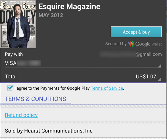
The “Accept & Buy” button is visually aligned with the “Secured by Google Wallet” text below it. But, the actual right edge of the button view is 4dips to the right of the right edge of that text view. Another option would be to set the right padding on that text view to 4dips as well. Sometimes, if you have such a button along the right edge of the container, you would need to set different paddings / margins on the content, depending on which side of the container it aligns to. And yes, the “Accept & buy” in pressed state shows the highlight halo that goes beyond the rest of the content that is aligned to the right edge of the screen. This, however, is a better compromise than having the button moved inwards when it’s in the normal state.

Sometimes you need to consider how view / background colors blend when you’re working on perceived alignment. Here’s how the app editorial cells looked like in the previous release of Google Play Store. It’s functional, and if you open hierarchy viewer to look at the physical bounds of promo image and the blue button below it, they are at the same right edge. But the outer transparent area encoded in the 9-patch asset (for outer glow of pressed / focused state) causes perceived misalignment.
The next screen accounts for that transparent area by moving the button to the right. So now you have the right edge of the image aligning with the right visible edge of the button. But there’s still misalignment, and now it’s even more pronounced (aka the uncanny valley). In most cases the blue action button is displayed on dark grey background, and its outer white edge is quite visible there. But in this context we have very light gray fill, and the button’s outer white edge is almost unnoticeable:
Our current solution is to nudge the button even further to the right, aligning the right edge of the promo image with the inner blue fill of the button, as shown here:
Here’s how an artist page used to look like in the Google Play Store app:

And this is its new look:
In addition to displaying the section that launches Music Explorer, we also scaled down the appearance of cells in the Similar Artists section in the left column. Why?
Take a look at the first image. We display up to four similar artists (if we have that info), and using full-bleed artist images with overlayed names creates this gigantic block that completely overpowers the main artist image. It’s just too heavy, and it constantly draws your attention away from the rest of the content on this page. The second image shows how we tweaked the visuals of that section to be more scaled down. The artist image takes half the cell, and the artist name is displayed to its right. And now we can also fit more of these cells above the fold.
This highlights how the visual styling of a content block follows its logical importance in the overall hierarchy of the screen content. Here’s the same principle applied to the album page. First, this is how the album page used to look like:
And this is how it looks like now:
Once again here, we are breaking this big heavy block into smaller pieces. As we’re displaying the artist image side by side with the artist name, we switched from 3 columns to 2. This provides enough space for reasonably short artist names, and we wrap them if necessary to multi-line mode.
