The man behind the camera – interview with Martin Ruhe
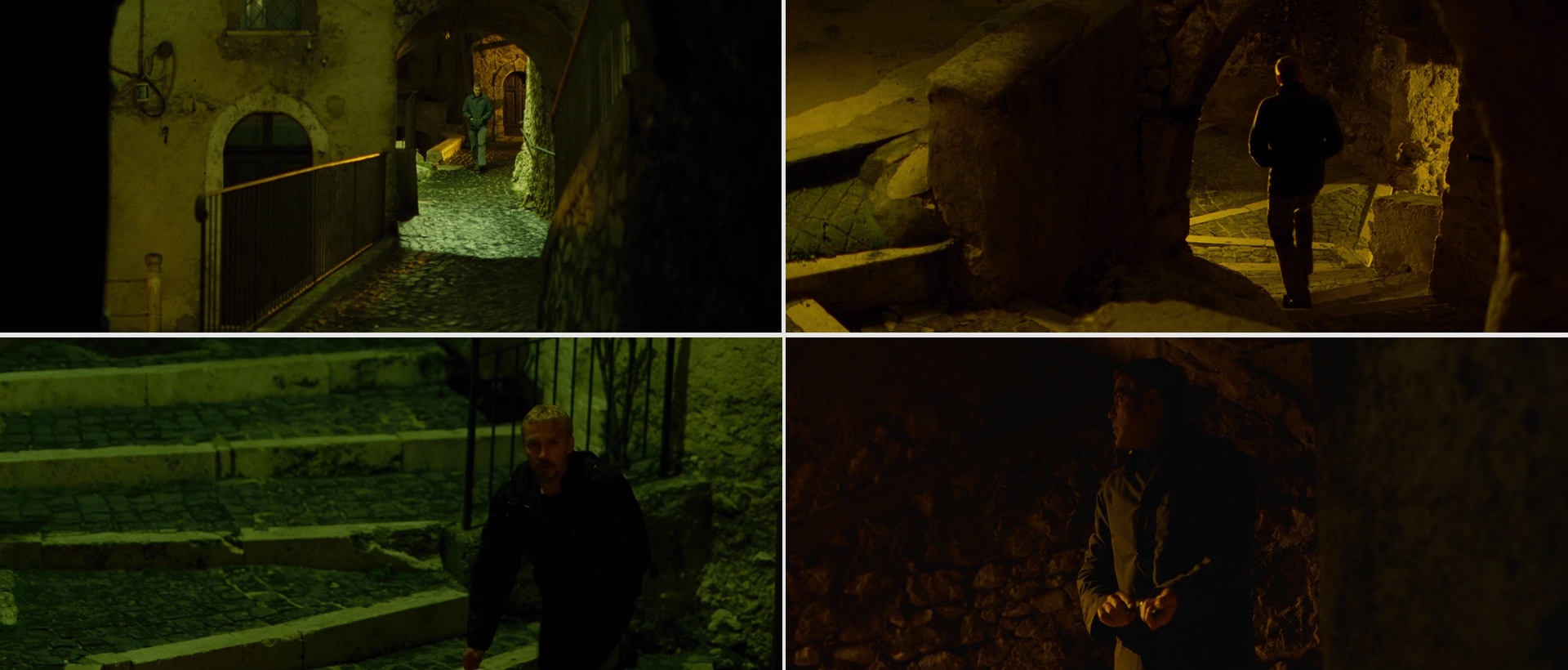
I must confess that when I first saw “The American” in the movie theater last fall, I was completely blown away by the exquisite visual treatment that permeates every single frame. Set in rustic Italy, the camera follows George Clooney that plays a craftsman that constructs a custom weapon for the female assassin played by Thekla Reuten.
Daylight outdoors scenes combine pale verdant greens and light sky blues into a perfect backdrop that frames and keeps the focus on the main characters, while still placing them slightly off center to convey the open space around them:
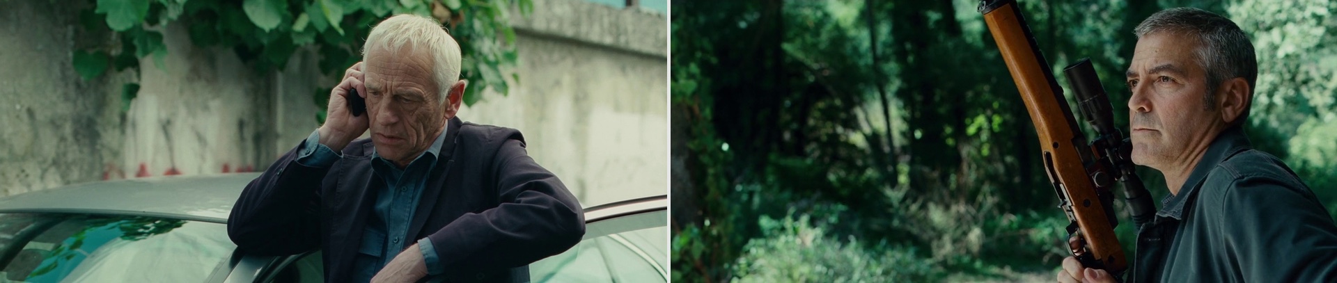
Clooney’s character spends a lot of time driving between different towns, with the camera placement forgoing the usual just-inside-the-front-shield position. Instead, the shooting is done mostly from outside the car, with a couple of great reflection shots that combine character faces with the outside scenery:

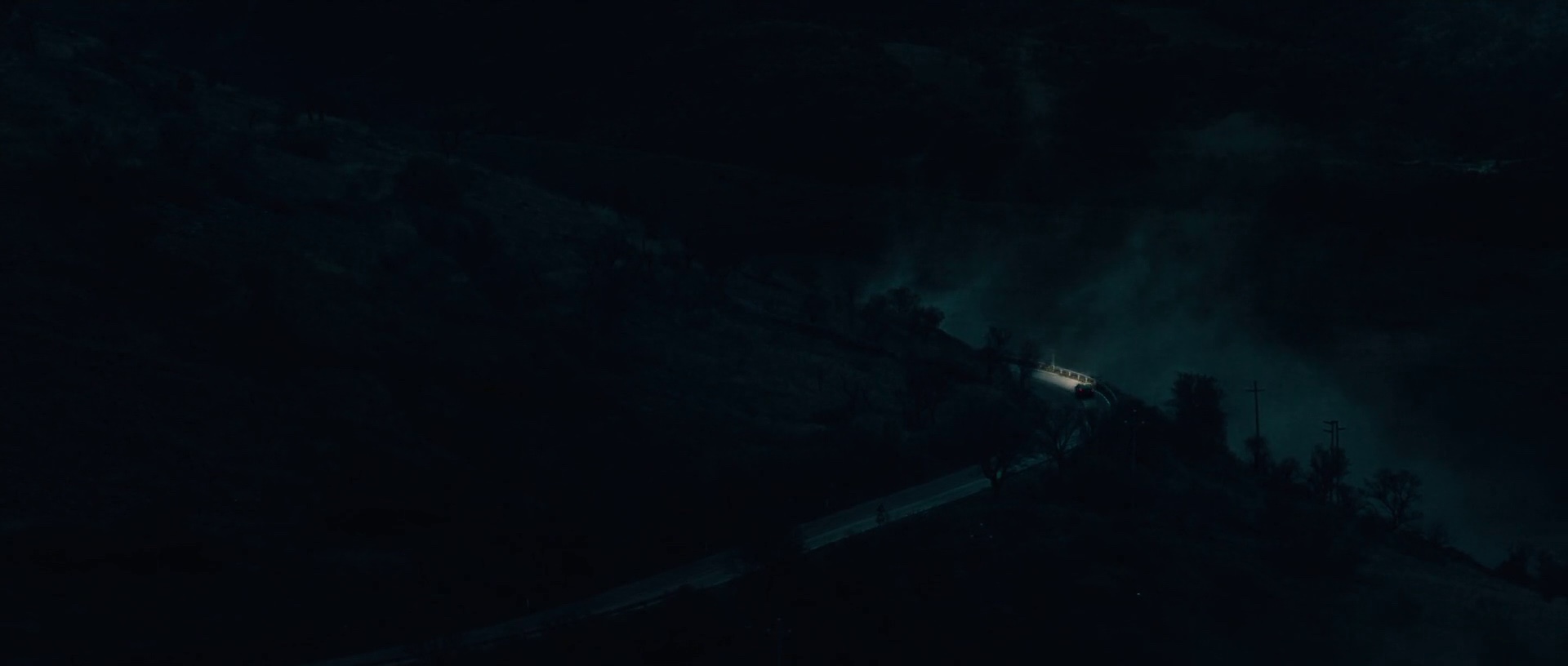
One particularly attractive shot shows the car traveling in moonlight on a winding road, with the headlights piercing the eerie emerald fog creeping along the hill side:
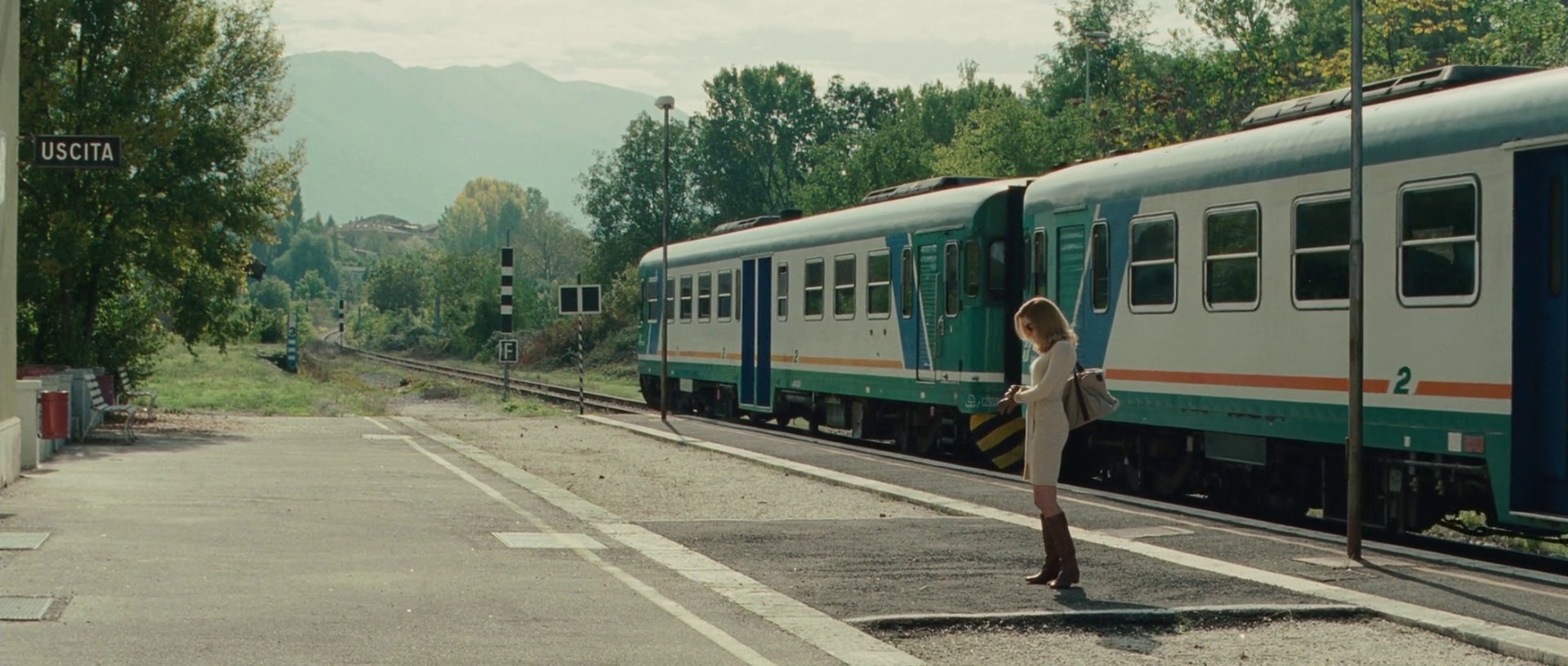
My favorite scene of the movie lasts less than a minute. Clooney goes to the train station to meet Reuten. The visual balance, colors and angle switches in this scene are simply fantastic. Here, the camera shoots from behind his left shoulder, keeping his blurred profile in frame and catching train’s reflection in the glass:

And this is shot from a slightly different angle, highlighting her confident pose and a deserted station:
I’m truly honored to have the cinematographer Martin Ruhe finding a few moments in his busy schedule to answer a few questions i had about his work on the movie and the industry in general.
Kirill: Tell us a little bit about yourself
Martin: I’m a german DP [director of photography] living in Berlin. I’ve done 6 films by now, hundreds of commercials and hundreds of music videos. That’s how i started with music videos 17 years ago. My first feature was a not a nice experience, so i waited a long time until Anton Corbijn asked me to do “Control” with him. I like the mixture of different projects and being able to wait for the right film to do by doing shorter projects. Plus it can be a good training in terms of gear, speed, working in different countries…
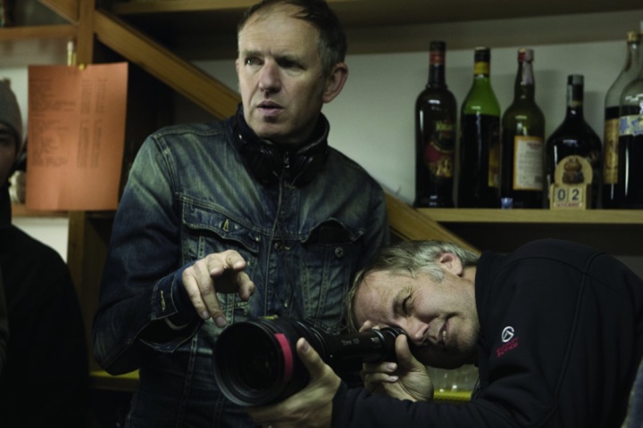
Corbijn and Ruhe on the set of “The American”
Kirill: Cinematography does not get as much limelight as directing, scripting, costume design or visual effects. Do you like working “behind the scenes”?
Martin: It’s OK because people who know and work in the industry understand what cinematographers do and appreciate it very much. Plus smaller films like “Control” get seen by a lot of people in the field, even though it’s not clear that they have an impact on the broad public. I was also lucky to get a lot of press attention on the cinematography on “The American”, “Harry Brown” and “Control”.
Kirill: How much creative freedom do you usually get, over specific scenes as well as the overall visual atmosphere of the movies you’re working on?
Martin: It’s always teamwork. I do not have to have a lot of freedom in how to do things. For me it has to come from within the story – what’s the right mood what does it feel like. It’s great to discover this together with the director. I am usually much involved and also like to mention things in the script if they do not make sense. In the past my directors trusted me a lot and it was a great collaboration. It’s nice to tell a story together.
Kirill: What is more frustrating, working with fickle weather conditions of unpredictable actors?
Martin: The weather i would think – there’s nothing you can do about it. On “The American” we started shooting in september in Abruzzo. We spent the first days of shooting in a village in the valley; it was like a very hot summer. When we finished in the mountains it was september and we had snow on some days. It was very tough also because all the trees had changed their color or lost their leaves, so maintaining the continuity was difficult. Here’s another example – Castel Del Monte lies 1600 meters above the sea level. You start shooting a scene in pure sunlight and then this cloud comes along and then you sit in it for hours (meaning in real heavy fog). What do you do? Do you start the scene again or wait or… The chase sequence and some other night scenes during that week are other example for bad weather. It was raining all night and at the end of the week the ground was freezing which was of course very tricky for cars chasing each other but also exhausting on crew and gear.
If an actor is unpredictable that’s OK. Most of the time, if it comes from within the story i think it’s cool because they can have a very different take on things. If it’s about insecurity then you have to earn their trust and protect them. For actors it can be difficult because unless they’re on set every day it might be hard for them to be fully part of it. There’s so much they don’t see happening and they don’t have a lot of say about things are done. Fortunately, the bigger stars i have been working with were trusting and relaxed about how we did things.
Kirill: Given the choice, would you prefer shooting as many takes as needed, or leave some of the visuals to the post-production phase?
Martin: Whatever you can do on set i think should be done there. But of course with post-production possibilities and schedules these days you always have to juggle and balance these things. On “The Countess” we used footage of Julie Delpy from a movie called “Homo Faber” from more than twenty years ago. We copied the lighting, tried to work out which lenses they used, Julie acted by a monitor to match the movement of the old scene and it worked. The effect was that in the final scene we tell how the countess gets married as a young woman, and we really see the young face of her. It was great because there’s also the way where you work and paint on the face in the post so you make a face of an actor of today younger. But it’s different – yes, there’s less wrinkles and all that but a face changes its shape so much and there’s more detail to it than a pure post solution can do. As far as i know we were the first ones to go this way.
Kirill: With advances in 3D shooting technology, we should expect this equipment to become available to even lower-budget productions in the next few years. Are you interested in exploring these new capabilities?
Martin: It’s OK. To be honest i have not seen a film yet where it has added that much to the story that i think it’s worth it. However, I am curious about the new Wenders movie about Pina Bausch and the art of her dance. But in general it seems to work well in animated films and not so much in the reality. It also seems to come from TV manufacturers trying to sell new products – rather than from movie goers missing anything. So it will be interesting whether that’s going to succeed. At the moment productions are very expensive, usually much longer and not too many of them have been that successful. Let’s see.
Kirill: The movie-going experience hasn’t changed much in the last few decades, with only incremental improvements in sound and picture quality. Do you foresee big changes in the decades to come?
Martin: Interesting question. I think the image on screen has gotten much better over the last decades, and the skills of crew are getting much better all over the place because also there’s so much more training available. And what about the 3D you mentioned in your question before? That’s a big change again, no?
But right now more and more films are produced on digital cameras. Having used them myself on commercials and two movies (“Harry Brown”, “Page Eight”) i can assure you that the best image quality is still on film. The new technology is getting better but the 35mm image is superior to all, yet it seems that more and more productions go digital. On films like “The Social Network” the decision is unlikely to have been about costs and there’s a lot of marketing going on for the new media; everybody seems to want to use the new technology but the decision is more and more not based on the cinematographers choice of what to use or on what’s the best quality. That seems weired to me.
Kirill: Among the movies you’ve worked on, what was your favorite location, and what would be the dream location if you were free to choose one?
Martin: There are so many beautiful places around so it’s hard to me to choose one… It probably would be in Italy! It’s such a beautiful country in every region. Definitely Abruzzo was the most beautiful location i visited for a film.
Kirill: At least in US, we’re constantly being bombarded by ads and trailers for big-budget movies. Can you recommend a few of your personal favorites that aren’t necessarily blockbusters?
Martin: “A Prophet” (french movie), “Let The Right One In” (swedish movie). I liked “Black Swan” and am very curious to see “Never Let Me Go“.
Kirill: Any exciting new projects that you’re working on?
Martin: I am reading some scripts but nothing is decided yet. I would love to do a movie in the states next. A good one.
And here i want to thank Martin once again for this great opportunity. Finally, if the train station sequence is my favorite one, then the night-time shots of the local coffee place are very close. Two dominant colors, golden brown and soft turquoise seems to spill into each other, with interior reflections superimposed on the street and wooden panels that match the color of the street lights. Also note how the two colors seem to “fight” over the skin tones of the actors:


 The
The 
