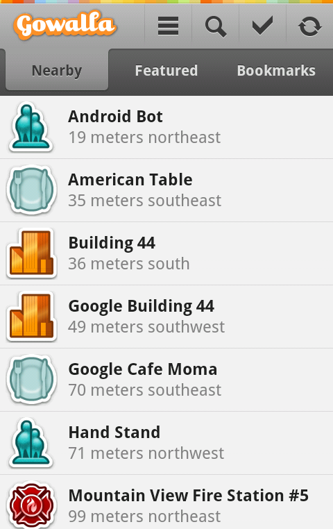
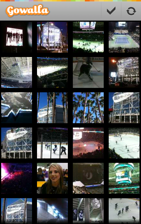
Screenshots of Gowalla 3 for Android
March 7th, 2011
A few screenshots of the redesigned Gowalla 3 for Android. Download on the Android Market.
A few screenshots of the redesigned Gowalla 3 for Android. Download on the Android Market.


It’s easy to dismiss animations as an unnecessary and, at times, superfluous layer that takes valuable development time and puts unwarranted strain on the device processing units. However, moderate amount of animations applied at the correct places can greatly enhance usability and improve the overall user experience of your application. Today i want to focus on a few techniques relevant to displaying images in your Android applications.
There are quite a few applications that display images or icons – user avatars in twitter / facebook clients, app icons in the market listings, preview thumbnails in restaurant listings – just to name a few. Since this information is dynamic, the images are loaded from the net on the first use. And even if the app caches the images for subsequent display, the cache entries may get evicted if the cache grows too large. There are a few patterns that can be seen while the image is loading – some apps display an empty (transparent) placeholder, some apps show an infinite circular progress indicator, and some apps show a default placeholder. Once the actual image is loaded from the network and transcoded into a BitmapDrawable, the vast majority of applications will “snap” to displaying that image.
While this is perfectly functionable, we can do better. The human eye has certain hereditary traits that automatically detect and react to sudden changes. This means that sudden snaps from a transparent placeholder to a full-opacity full-color image is an unnecessary distraction. This can be easily addressed by fading in the newly loaded image over a brief period of time. The new animation layer added by Chet Haase in Honeycomb makes it ridiculously easy. All you need to do is add one (!) line of code:
ObjectAnimator.ofFloat(bitmapDrawableView, "alpha", 0.0f, 1.0f).setDuration(100).start();
The first parameter of the ObjectAnimator.ofFloat() specifies the main object whose property is to be animated. The second parameter specified the property to be animated – alpha. Internally, the animation layer will use reflection to access the newly added View.setAlpha() API to interpolate the alpha value from 0.0f to 1.0f over an interval of 100ms. The call to setDuration() is optional and can be omitted if you’re OK with the default duration value. Note how the fluent API allows chaining the API calls and defining a fade-in animation is one short and quite readable call. Now all you need to do is define your ImageView with initial alpha of 0, set the bitmap or drawable once it’s loaded from the network and run the code above.
But wait, you say. These are new APIs in Android 3.0. What can i do if i’m targeting the older platform versions? Don’t despair. There are two handy ways to achieve the same functionality. The first is rather generic and can be applied to any scenario that requires running an animation. In fact, it’s pretty much the same approach as described in my older entry on writing Android live wallpapers:
The ImageView.setAlpha() API is available on the older framework versions and can be called on every animation frame. As a sidenote, it’s important to remember that even though the Handler.postDelayed() gets a millisecond-level delay, you should not make any assumptions on how much time has actually passed. The system may be busy, or there have been higher priority events scheduled in the mean time. You should store the timestamp at the “beginning” of your animation and update the views based on how much actual time has passed since the beginning. In the same vein, the animation is done (no more scheduling the runnable) based on the system clock and not on the total delays passed to the Handler.postDelayed().
This approach is rather generic and can be used to update multiple views that participate in the same animation scenario. If all you need to do is fade in an image, there’s a simple solution – the TransitionDrawable class. It’s a rather handy, albeit slightly awkward, way to cross-fade between two images – and if you need to just fade in a newly loaded image, you can can pass a completely transparent drawable as the initial value. Here, instead of setting the initial alpha value of your ImageView to 0, you set it to display a transparent drawable. Then, once the final image is loaded:
As mentioned above, the API of the TransitionDrawable class is rather awkward. The constructor gets an array of Drawables, and the Javadocs specify that you need to pass at least two layers. However, there is no explicit documentation on what happens when you pass more than two. The class-level Javadocs say that the class is “intended” to cross-fade between the first two layers, but makes no explicit statement what happens when you pass more than two layers. A glance at the code reveals that only the first two layers “participate” in the drawing sequence.
So, here you go. Now would be as good time as any to add fade-ins and cross-fades to your images and make your image loading transitions a little bit less distracting.

Today’s post highlights the design of SaraWhite.com (@Sara_, as an aside, Sara works as the creative director at MetaLab which is responsible for entry #3 on this series). This soothing tone of this single-page site is set by the creased paper texture and the beautiful watercolor illustration of a blooming lilac tree. Note how some of the rougher brush strokes emulate the physical appearance of a watercolor painting, defined by the paper creases and uneven travel of pigment through the paper pores. This muted lilac color also defines the color palette that adds a darker shade of lilac for section headers, link rollovers and a few tongue-in-cheek illustrations in the second section.
A relaxed tone set by the header illustration is mirrored in simple, human and soft tone of the text sections. Attractively styled thumbnails of Sara’s portfolio and her Flickr stream follow the precise four-column grid of the main content that switches effortlessly to one or two columns as needed. Note that while the thumbnails are not styled with the site’s color palette, they don’t appear to overload the eye with too much color; this can be attributed to subdued tones and a great color balance across the bottom row that stays within a rather narrow hue segment of soft natural colors.

Today’s post highlights the design of MinTran.com (@mintran). This Tumblr-powered site features a relaxed and attractive color palette of pastel blues, greens and browns, adding a number of fine-grained textures and beautifully styled “badges” in the header and footer; note the vignette typography, varied lighting, top double outlines and worn out texture in these two badges. The main content is laid out in two simple columns, with ample spacing and subdued drop shadows around embedded images. Note how the palette colors are used to code each entry based on its type (link, image, video, search box), and how the color is applied consistently to all the elements in the specific entry – from the thumbnail to background to title caption to hyperlinks.
