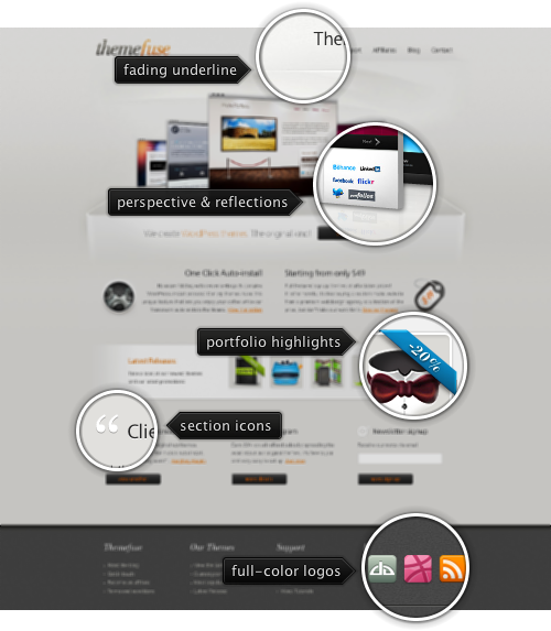
Today’s post highlights the design of ThemeFuse.com. It’s a nicely spaced and well balanced design that does a great job highlighting the company’s portfolio. A Flash-based carousel of promoted themes features attractive transitions, reflections and a 3D perspective shift as the thumbnails slide in and out. The reflection effect works particularly well with the “shelf” effect created by a fading rectangular outline with a strong vanishing point. Note how the background and texture elements above the fold artfully use a very small brightness interval of light gray, providing just enough visual support to the colorful portfolio – from fading lines to background swooshes to beveled outlines.
A combination of dark slate gray and orange is used for action buttons, section headers and hyperlinks with content transitioning from two columns (note the right alignment of the left column) to three columns, with an interactive thumbnail strip in between. I particularly like the white icons in the header titles of the last three sections, with just the right amount of dark drop shadow to prevent them from blending into the background. However, it feels that the action buttons should be center-aligned and not skew each column to the left.
If you follow this series, you’d notice that i’m a big fan of using monochrome theming for large rows of social icons. Given rather small sizes of those icons and their desire to be immediately recognizable, it’s no wonder that they augment the vector lines and typography with strong and often saturated colors. Placing a number of such icons in an otherwise balanced color palette usually creates too much visual noise and breaks the overall visual structure. However, a full-color strip of social icons looks just right on this page – playing off of color splashes in the large portfolio carousel, and, more importantly, following the saturation levels, horizontal layout and rough dimensions of vibrant icons in the smaller highlight strip. Speaking of which – move the mouse over those small thumbnails to see custom styled fading popups with bigger images.

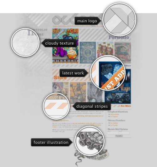
Today’s post highlights the design of Octophant.us by Phineas X. Jones (@Phineas). Playing off of the site title, the main header uses eight-way stripes in an attractive monochrome typographical logo. A detailed stippled octopus tentacle in the site footer frames the content from below, reminiscent of illustrations of sea creatures found in old books. Diagonal elements that start in the main logo continue throughout the site, serving as background textures, decoration elements and section separators. The simple light gray monochrome color scheme is enriched with a desaturated orange used for links, highlighter ribbons and some of the diagonal stripes.
Note the interesting layout of the portfolio and store thumbnails – the latest work has a larger thumbnail (placed on either left or right to preserve the overall visual balance), while other three thumbnails are smaller and have a translucent white overlay on top of them. The large diagonal stripe serves as the background for the section header; at the same time, it helps aligning the larger thumbnail within the section bounds. The translucent overlay focuses the attention on the latest work, while still providing enough visual details on the specific work – with full-color version appearing on mouse over. While i’m on the subject of rollovers, i’d like to point out that the site can benefit greatly by adding a short animation fade-in to the image rollovers, as well as using a darker shade of orange on hyperlink hovers.
Overall, it’s a nicely executed design that breaks away from the traditional paradigm of arranging all the work as a grid of thumbnails, with a unique twist on the site name serving as the inspiration for all the supporting illustrations.
The original slides
available for download from the SlideShare site.

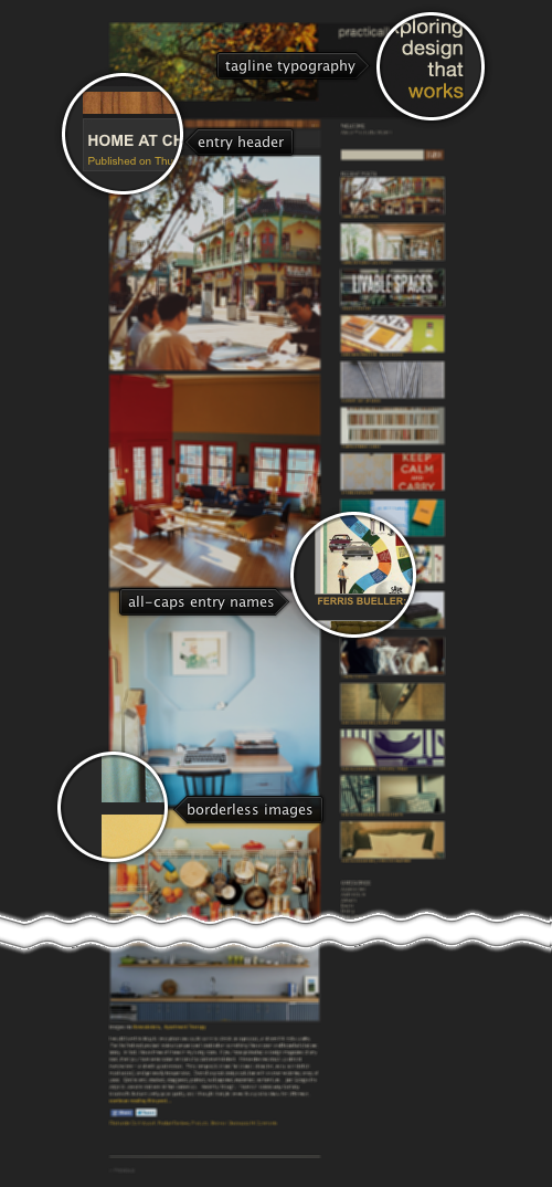
Today’s post highlights the design of PracticallyModern.com by Jesse Brew (recently featured in the Retro:Active series). The site takes you on a fascinating visual journey that features meticulously chosen images and a great color palette. With only minimal text content for every entry, the main focus is on exploring the visuals that surround us – taken through a retro lens. The images are rich in soft natural browns, yellows, blues and greens, with only minimal incursion towards the red-violet spectrum. The predominant golden browns also form the basis of the supporting graphical elements – from the textured wooden bar in each entry header to brownish yellow links to the textured lead photograph in the site header.
The sidebar navigation is my favorite element here. While most sites resort to a simple bullet list of the recent entries, Jesse has crafted a vertical list of thin thumbnail slivers, each one showing a small visual glimpse of the matching entry. Given such strong reliance on images in the main content column it’s not surprising to see the same amount of visual polish that went into this bar. And finally, if i had to change one thing, i’d play with theming the facebook / twitter buttons, at least for the default state – the bright blues stick out like a sore thumb.