Khoi Vinh on the limited edition of Herb Lubalin monograph from Unit Editions in his “Are Design Books Meant to be Read“:
Inside, pure gorgeousness awaits. Page after page of exquisite photographs of original Lubalin works to pore over, extensively captioned by Shaughnessy. There’s also a copious biography of Lubalin’s life and career, roughly seventy-five pages of well-illustrated narrative and analysis that I’m genuinely interested in reading.
But, I’ll probably never read it. The book weighs something like five pounds or more, so I’ll never carry it with me, and reading on the go is how I do the vast majority of my reading. If I’m honest with myself too, the same goes for the other books I’ve bought from Unit Editions — they all sit on my shelf, basically unread and very rarely touched.
“Never” is a strong word. Having said that, I probably am never going to buy another printed copy of a fiction novel. I don’t know for how long I’ll have access to my current collection of digital books. It would seem that digital bookshops have been with us forever, but really IBM is the only computer company that survived more than two human generations. How likely is it that the current digital media hubs (say, Amazon, Apple, Google, B&N, Netflix) will be with us when I’m retired?
A physical book perishes. It gathers dust, the paper crumbles, bugs eat it, water warps it and fire destroys it completely. A digital book perishes differently. Somewhere out “in the cloud” there is some database that stores pairs of bookId–userId associations. That database is probably backed up and replicated like crazy. But bugs happen. And companies disappear. If the customers are lucky, they’ll be able to extract their data before the cloud services are no longer available. Formats get deprecated, and custom software emulators / hardware that can display data in old formats get more expensive. We don’t see, because it happened so damn recently, and we just didn’t yet have a chance to see one of the behemoths implode.
Library of Alexandria has seen its 40,000 books perished in fire, never to be passed on to future generations. Us. Imagine a solar flare so powerful that it knocks off all electronic equipment on Earth. Ironically, printed copies would be the way to restore the lost digital copies. For those books that had physical copies to begin with.
And some books are best consumed in their physical form. The texture of the hard cover. The smell of the paper. Color illustrations fading away and losing some of the pigment to the opposite page. A medium that does not have a notification bar, or a mobile connection. A medium that makes it a mental effort to remember the last page you read. A medium that does not have word highlight or search, and requires a concerted effort to flip back to find and re-read that passage that you particularly liked. A medium that does not allow to quickly share it on your favorite social network with a couple of clicks.
Design books that are meant to be read. Words, sentences, stories. Beautifully formatted and perfectly suited to be read in a printed book. Still.
In this conversation Judy Rhee talks about the craft of production design and art direction, taking a look at her work on commercials, TV productions and feature films. After discussing the similarities and differences in scope and pace for the various productions, she talks about her work on “My Blueberry Nights”, a romantic drama that takes Norah Jones on a journey across America. I’ll just go til I run out of places to go, and her path takes her from New York to Tennessee to Nevada and back. Explosively colorful, and yet never flashy, the film is a veritable cinematic feast, and Judy talks about how this production was unlike any other she has worked on so far.
 Kirill: You’ve been doing a lot of things in movies, TV and commercials. How did it all start?
Judy: I went to film school and became interested in production design through watching films and taking a cinema studies class in the history of art direction. At the time they didn’t have any production design/art direction classes at NYU in the film department. They only had a Theater/Stage Design in the theater department, but as a film student you weren’t allowed to take classes in theater design unless you were a theater design major, so I ended-up taking related classes at Pratt Institute and SVA [School of Visual Arts].
While watching and critiquing films in classes, I found it puzzling how a lot of the films we’re just focusing on the camera work (i.e. renting helicopters and Steadicams), but no one was paying any attention to the environment they were shooting in – a lot of actors against white walls. I became interested in exploring how you can help tell the story visually by just making a few changes to the set(s) or locations. I offered my services to other students and started working on their student films to make their stories more interesting and compelling by modifying, adding or embellishing their film environments and sets.
I was bar-tending and waitressing while attending NYU and 1-day one of my regular customers, who worked at the Metropolitan Opera doing make-up, came in and said he was working on a horror film called “Frankenhooker”, and he said they we’re replacing the art department that day and I should go down there if I was interested in working in the Art Department. I went there and was hired as an art intern, doing everything from driving the van doing pickups/drop-offs, making and painting props, helping with shopping and set-dressing. It was a non-union film, so everyone did a little bit of everything. It was a lot of work and a lot of fun – a great learning experience!
After that film wrapped I was hired full-time in the art department for his second film, “Basket Case 2” dir. Frank Henenlotter. He did a lot of B-rated horror films. I wouldn’t mind working on a another horror film. From that point on it was just word of mouth, and I just continued to work steadily.
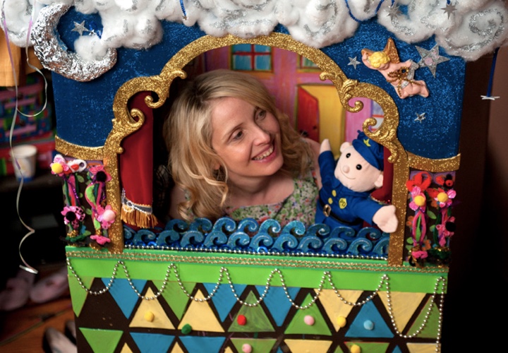
Opening scene of “2 Days in New York”, Julie Delpy in her child’s puppet theater, courtesy of Judy Rhee.
Cut to 20+ years later, I’m still working on films and commercials. Sometimes I travel or re-locate for work. I went to Jordan to work on a film, “Stoning of Soraya M.” for 4 months, which was really an interesting experience for me. I worked in Atlanta on Tyler Perry‘s TV series “Meet the Browns” for 2 seasons. For that TV show I was able to utilize my background in commercials and movies because the pace of it was like doing a small film on a commercial schedule. Sometimes we would get a script on Tuesday, design a set on Wednesday, start building on Thursday, paint on Friday, set-dress it on Saturday and then shoot it on Monday. Even for TV, it’s a very fast turnaround. My experience and knowledge in working on commercials where everything happens very quickly allowed me to deliver what was expected in an abbreviated timeline.
You still have to design these sets with narrative in mind of what the story is, who are these characters, what are we trying to convey visually – even if it’s a sitcom. My job is to support the director to help tell the story.
I currently have a film out now in theaters, “2 days in New York”, written, directed and starring July Delpy and Chris Rock. It’s a sequel to “2 Days In Paris”.
I just finished another comedy in NY called “My Man Is a Loser”. It was a very quick 24-day shoot. Written and directed by Mike Young, starring Michael Rappaport, Sean Young, John Stamos and Bryan Callen. It’s a first feature film for Mike Young, and he was one of the writers on “Entourage”. It went really well, I think it will be a funny movie. The current scheduled release is spring 2013.
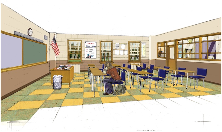
Classroom set rendering for season 3 of “Meet the Browns”, courtesy of Judy Rhee.
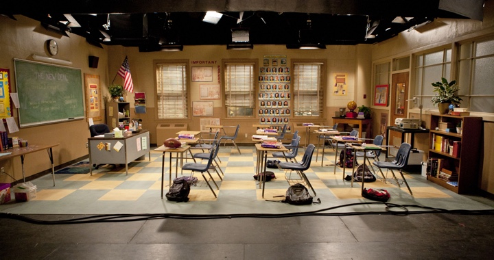
Classroom final set for season 3 of “Meet the Browns”, courtesy of Judy Rhee.
Kirill: Do you like moving between different types and scales of productions?
Judy: Every project is different and there are always new challenges, regardless of the size and scale. The process is different from commercials to TV studio shows to films. I can’t say that I prefer one over the other. I like them all because it engages different parts of my brain and there’s always something new, whether it’s time constraints, financial challenges or different and specific expectations. The end products are different. If I can generalize; on a commercial the details of props and set-dressing can sometimes be more important and very specific to the product you’re selling, who the director is and what the expectations are from the Ad Agency and Clients. For Film and TV, the details are sometimes less important – it’s more about the broad strokes of story and characters, obviously depending on the director. That’s not to say there isn’t a narrative you’re trying to create in 30-second spot, you just have to convey it in less time, hence the importance of the specific prop(s) and/or set-dressing.
Continue reading »
Josh Lehman on the value of UX design:
A weak user experience was forgivable during a time when software was more expensive (sunk-cost fallacy in action), the competitive playing field was much more “sparse” and users unwrapped a nice shiny manual which accompanied their software acquisition. Users in this bygone era understood that they would likely need to alter themselves to meet the demands of the software. When the interface didn’t make sense the user would blame themselves and cite the fact that they “hadn’t yet learned it”.
Things are very different today. Customers now expect the softwares (apps) to meet their needs and match their usability expectations right out of the proverbial box. If you’re building a new consumer-focused app, great design and solid usability are no longer just positive differentiators or features on a checklist. A solid, usable design is part of your entry fee into the software market, giving you a chance at success. Without a solid design your app can too easily become a casualty of the new “discardable apps” phenomenon.
Ben Brooks on his decision to leave Twitter:
I’ve stopped posting new updates. I’m only checking it a couple times a day. And if Twitter doesn’t do an about face I’ll be done with it very quickly. I’m giving them one last chance, but also slowing my usage to a crawl — imagine the power of the entire nerd community doing this. The easiest way to making Twitter take notice, is to remove your eyeballs from their advertising, and devalue the network by reducing the size of it.
First, nerds are running third-party clients that do not show promoted tweets or ads. Second, the number of people retweeting every single Justin Bieber’s tweet is vastly more than the number of people discussing the latest API restrictions. Third, removing these eyeballs is actually improving Twitter’s bottom line, as it is reducing the strain on backends and does not hurt the current business model any single bit.
