Here’s how an artist page used to look like in the Google Play Store app:

And this is its new look:
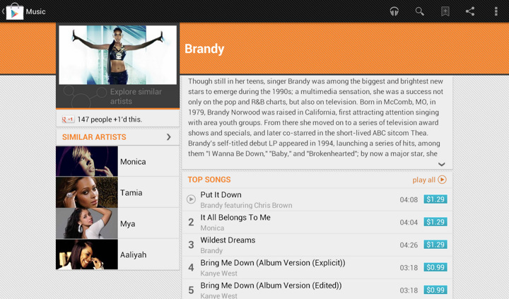
In addition to displaying the section that launches Music Explorer, we also scaled down the appearance of cells in the Similar Artists section in the left column. Why?
Take a look at the first image. We display up to four similar artists (if we have that info), and using full-bleed artist images with overlayed names creates this gigantic block that completely overpowers the main artist image. It’s just too heavy, and it constantly draws your attention away from the rest of the content on this page. The second image shows how we tweaked the visuals of that section to be more scaled down. The artist image takes half the cell, and the artist name is displayed to its right. And now we can also fit more of these cells above the fold.
This highlights how the visual styling of a content block follows its logical importance in the overall hierarchy of the screen content. Here’s the same principle applied to the album page. First, this is how the album page used to look like:
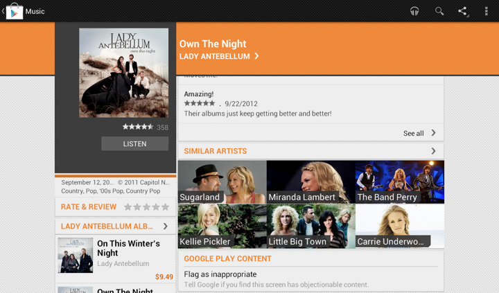
And this is how it looks like now:

Once again here, we are breaking this big heavy block into smaller pieces. As we’re displaying the artist image side by side with the artist name, we switched from 3 columns to 2. This provides enough space for reasonably short artist names, and we wrap them if necessary to multi-line mode.
I was hooked from the very first episode. The idea, the script and the cast were phenomenal. And the colors were absolutely gorgeous. Almost too bright and vivid to be true, and yet never flashy or harsh. As I sat down to relive those few precious episodes that saw the light of day (two seasons, twenty two episodes total), I was completely overtaken by how amazingly well this show was put together.
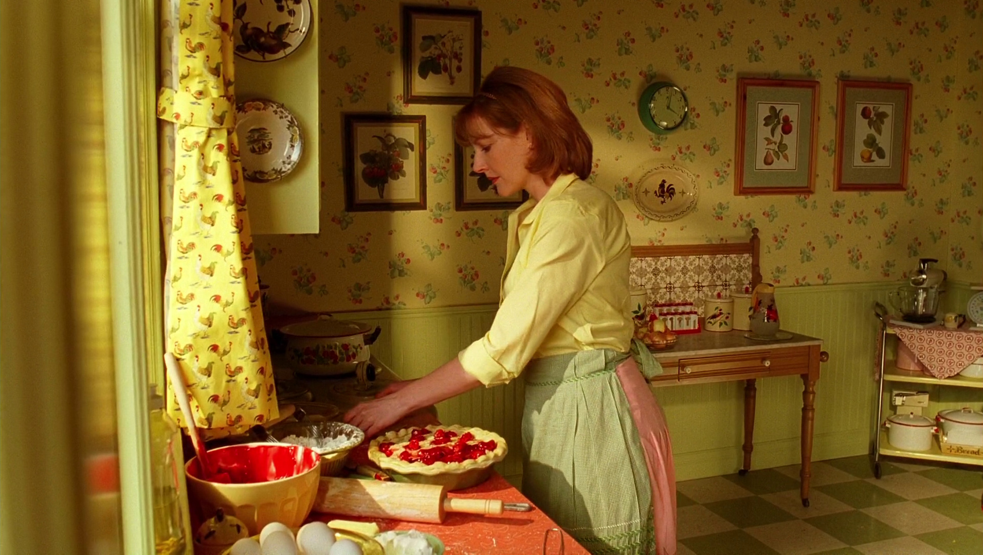
The very first sequence with young Ned running through the impossibly bright field of yellow flowers transitions into the kitchen scene with his mother. Every piece in this set has its place, every fabric and wallpaper lovingly textured with nature-based patterns, and the pop of bright red is a perfect compliment to the earthly yellows, olives and browns.
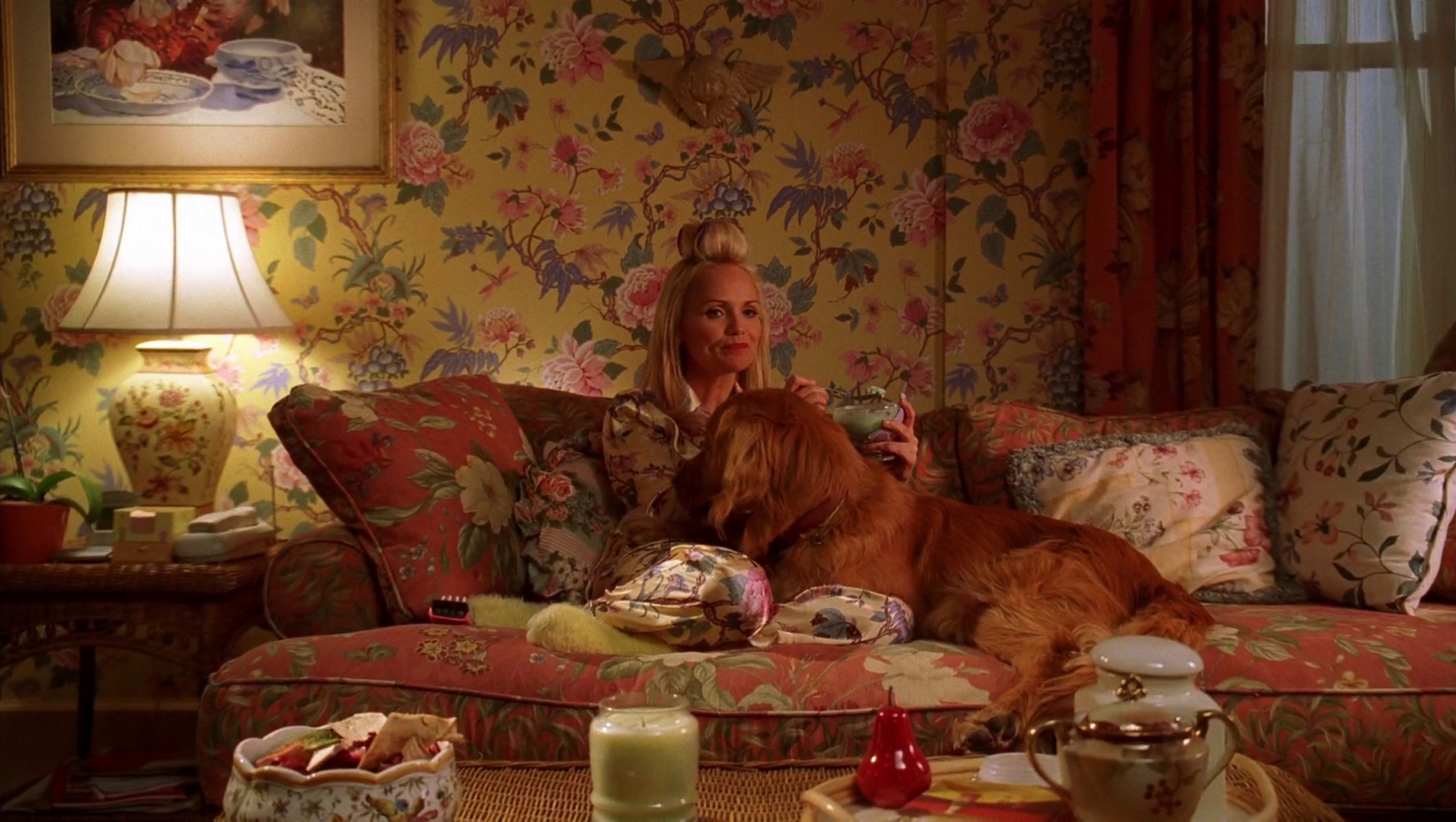
This style extended to all interior sets, never too vintage to mark any specific era, and yet never modern to break the charming spell of the deeply emotional connections between the different characters. Here’s Olive in her living room, surrounded by blooming flowers on the walls, sofa, pillows, lamp, her pajamas and even the tableware. Delicate, intricate, each with its own color palette, yet none screaming for attention, and all working together in a perfect unison.
Continue reading »
In this conversation the acclaimed production designer Sarah Greenwood talks about her craft, the research work that goes into the preparation stage of a new production, why every production is a period one, the famous Dunkirk beach scene in “Atonement”, her take on the advancement of digital tools, and “Anna Karenina” which is her latest collaboration with director Joe Wright, set decorator Katie Spencer and actors Jude Law and Keira Knightley.
 Kirill: Tell us about how it all started for you…
Sarah: I trained as a theater designer at the Wimbledon School of Arts, and I worked in theater for three years. I found it enjoyable, but it was strangely unsatisfying. There was something collaborative that was missing. When you work on a film set, you have a very close relationship with the director, and I certainly wasn’t finding that in the work I was doing in the theater. It also involved traveling a lot around the UK, and I quite liked being based in London, see my friends and earn proper money. So I sold my soul to the devil and started working at the BBC which actually was fantastic.
At that time BBC had a massive art department, and it was an amazing training ground. So making the transformation from theater to film television was helped by the training we got there and the work that we did. Working for the BBC was fantastic. You could go two routes – assistant art director or set designing on small productions. I went down the second route, and started designing moving quickly onto “Later with Jools Holland”. I moved into the drama department working with some fantastic directors like Patrick Marbur on “After Miss Julie” and with Mike Barker on “The Tenant of Wildfell Hall”. And then with demise the design department at the BBC in the mid 1990’ss, I joined the freelance world and started working in film.
That was the story of my transition from theater to television to film. I went backwards and forwards for a bit, and decided that I much prefer film. I’m much more suited to film design. I have friends who still work in theater, and I could never design as well as that. My design work in much more suited to film, and I’m happy to working in this medium.
Kirill: Do you see yourself going back to more restrained budgets of television productions?
Sarah: I would like to say yes creatively, but financially probably not. The budgets were tight then and it was fine because you were going through them, but I would probably struggle a bit now with the scale of the budgets. But why not? Although going back to Theatre is a step to far, Joe Wright [director] just has come back to theater and wanted me to do it with him – two shows next year. I’ve chosen not to because conceptually that is so different. As much as theater design informs film design, being character-based and script-led, I think aesthetically they are so different now for me to go back and design theater.
But to go back to television – as they say, never say never. There’s some brilliant television that’s done, particularly at the BBC. They do amazing things, but at the moment it’s probably not for me.
Set sketch for “Anna Karenina”, courtesy of Sarah Greenwood.
Kirill: Do you think that you’ve been “spoiled” by the much bigger budgets of your recent films?
Sarah: The bottom line is that there’s never enough money, no matter what your budget is or your scale. You never have enough time or enough money, which is fine,its the way. You can go from “Sherlock” which had a budget of $130M to “Anna Karenina” which had a budget of $25M, and they’re both equally short on time. There are compromises in both but, creatively good things often come out of those challenges that. If you tell me to go back to a television production with a budget of $2.5M, I’m sure I could do it, but that’s not the route that I’m going down at the moment. Equally, maybe in the future when I don’t want to be working away or stressing as much as the big productions demand I might want to change direction.
Continue reading »
Our daily job as programmers is to solve problems. Some view this as a just a job with a steady paycheck, rarely venturing outside the daily routine, not interested in learning new techniques or pushing their own boundaries. Some enjoy working on side projects, exploring new languages or just reading blogs to stay current. Hopefully, as the years pass, you grow and enrich your own personal arsenal of tips, tricks, techniques and ways to assess and solve problems. Finding the best solution to the specific problem at hand within the constraints of available time and specific programming environment.
Simple problems should have simple solutions. That’s kind of obvious. Except when people insist on creating artificial complexity while solving them, either out of lack of knowledge or out of fear that if simple solutions is all they have, they will fail to uphold their seniority status. And so you end up with people writing their own string replacement routines instead of using regular expressions, writing their own persistence layers with opaque binary blobs that serialize multi-field multi-level object hierarchies instead of using databases, or inventing WSDL and UML.
Complex problems can have simple solutions as well. At times, we tend to forget the underlying math complexity behind such elegant data structures as hash tables and balanced trees, the ingenuity behind bloom filters, Perlin noise generators and inverse square root approximation, or the sheer power of recursion that gives us such beauty as Quicksort. Once these are tucked safely behind library APIs – provided by either the runtime itself or written as a utility layer in your own project – they become just a few more entries in your toolbox, and you rarely spend time to appreciate their powerful elegance.
And then there are complex problems for which we don’t seem yet to have simple solutions. Sometimes you need to combine a few tools that you have, and sometimes you need to sit down and create a brand new complex solution. That’s what we’re paid for, after all. And then, sometimes, there is an existing solution. And it feels just the right fit for this problem we’re trying to solve.
Such is the case of using vector image formats for scalable graphics, which is most often boiled down to using – or at least trying to use – SVG for icons on platforms that run on a wide variety of screen pixel densities. On one hand, you have a problem of scaling your graphics on screens of various sizes and resolutions. On the other hand, you have a solution that claims to do just that. And it feels that these two are a perfect match.
And you can start by thinking that it’s a simple problem of scaling the entire icon up or down, and that it’s a simple solution of taking one of the existing SVG libraries and asking your designers to export all their assets in that format. And if your designers know what they’re doing, they’ll come back to say that they don’t want to just scale everything. They want to hide some visuals for smaller point sizes, tweak proportions as the target point size changes, or even switch to a different overall composition beyond a certain threshold. And while for you it’s all pixels, for them it’s points. And then you need to understand what’s the difference. And then you may realize that it’s no longer a simple problem, but you don’t want to throw away that nice simple solution. So you go read a bit more about the SVG format, and it’s this gigantic spec that supports embedded bitmaps, embedded fonts, animations and even interactivity layer that can run scripts on user interaction. And it’s no longer a simple solution. It’s this complex solution. And its complexity scope seems to match the new complexity scope of the problem.
And so now you have a complex problem and an existing complex solution. And it feels like they are a good match. If only you can just find the right subset of functionality and the right set of tools that will allow your designer to create those custom elements in the exported files. And with every objection your designer raises, you only are more determined to dig into the format spec and find a section that seems to be a good match. And as you dig deeper and deeper, the feeling that you have a good match becomes a firm conviction. And you never look back at the complexity you have built trying to match the “almost there, but not quite” solution to this problem. It was never “almost there”, mind you. But it takes time to actually realize that. And then SVG becomes another entry in your arsenal of tools. A tool that is not great – or even decent – at solving the problems that it claims to solve. Not yet. Not this year. Maybe the next one.
