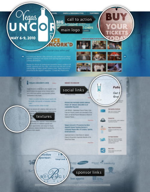
Today’s post highlights the design of VegasUncorked.com. Set in bright azure and metallic blue color scheme, it uses multiple overlaying translucent textures to offset the vivid colors of the large header section. The typographical layout of the header section is done with images to ensure the design fidelity across browsers and screen resolutions. The footer section features sponsor logos; monochrome effect creates a consistent and attractive area that is not overloaded with competing colors. The guider lines in the main section enforce the three-column layout, and the text snippets have plenty of white space around them.
The social links column can use a little more polish. Italicized sub-headers and pinkish glow effect feel disconnected from the rest of typography. The icons look disjointed and not normalized to have the same weight and color scheme. The rollover effects use gigantic rectangles of washed pink color, and the entire section should have received the same amount of attention and restraint as the footer section.
While careful design will pay special attention to the number of UI controls shown at any given moment, some scenarios may result in showing more controls than can fit in the available space – either horizontally or vertically. In Swing, these situations are usually addressed by wrapping the controls in a JScrollPane, which can be configured to show the scrollbars only when they are necessary. While the scroll bars are pervasive and an easily recognized solution, sometimes they add too much visual noise and hurt the application usability.
Here is an example from the last post on the breadcrumb bar:

Here, the application window is not wide enough to show the full selected path – and adding a horizontal scroll bar between the breadcrumb bar and the main file listing panel would be a very bad design decision. Instead, the scrolling is done using the two double-arrow buttons placed on both sides of the breadcrumb bar. Another example can be found in the post that talked about scrollable popup menus:


Additional examples can be found in the entry that talked about horizontal shrinking of the ribbon component.
Originally contributed as part of the breadcrumb bar component by Rick Jeliffe of Topologi, the scrolling functionality has since been extracted and reused across other parts of Flamingo. And now for the good news – the latest 5.0dev drop of Flamingo component library (code-named Imogene) exposes the scrollable panel as part of the published API.
The main class is org.pushingpixels.flamingo.common.JScrollablePanel. You construct it by passing the view and the ScrollType – either HORIZONTALLY or VERTICALLY (note that the scroll type cannot be changed once the component has been constructed). When needed, the component will show the scroller buttons – just the same way as JScrollPane shows the scroll bars. Moving the mouse over a scroller button (when it’s visible) starts auto-scrolling the view in the matching direction. To turn off the auto-scrolling and do the scrolling only on button press call JScrollerPanel.setScrollOnRollover(false) API.
To fully reveal a specific part of the view, call JScrollerPanel.scrollToIfNecessary(), passing the start position and span in pixels. The values are either in X or Y coordinates – depending on the scroll type of the scroller panel. You can also register a change listener on the component to be notified whenever the layout change occurs. This comes handy if you have custom drawing outside the scroller panel that depends on the position of the scroller panel view.
If you want to take the scroller panel for a spin, you will need the following:
Note that the last two are required if you’re running your application under one of Substance skins. You will need the 6.1dev drop of Substance Flamingo plugin – the latest 5.0dev drop of Flamingo core is incompatible with the 6.0 release of Substance Flamingo plugin – as mentioned before.

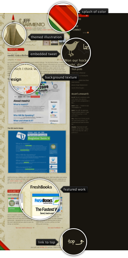
Today’s post highlights the design of JeffSarmiento.com. Set in earthen brown colors, it uses splashes of strong reds, greens and oranges in header / footer diagonal stripes to add a vibrant touch. This approach can also be seen in the illustration of the rocket ship that uses saturated orange colors atop the otherwise themed hull. The design is rife with hand drawn illustrations. These include the header titles, post title underline, stars / arrows next to some of the links, background illustrations for the tweet section and the rocket ship, as well as background texture for the main column.
The navigation menu deserves special attention. While most of the sites place it along the top or the left edge, this site places the navigation menu along the right edge. To alleviate the proximity to the string saturated stripes of color right next to it, the menu items use large font with custom kerning. To further reinforce the importance of the elements, each navigation item uses one of the adjacent colors for its background – red, orange, yellow, green and brown. Move the mouse over the navigation menu to see additional hand-drawn illustrations.
Flamingo component suite began its life in January 2006 when Rick Jeliffe of Topologi has contacted me and proposed to open-source their own implementation of the breadcrumb bar component. In the years since i have hacked at different pieces of the breadcrumb bar implementation. As with any significant piece of code that you get to maintain and extend, it takes some time to find your way around the code, and this was no exception.
Piece by piece i cleaned the component API, refactored the code into the model and UI delegates and integrated the API with the command button panel. The last (almost) untouched piece was the painting of individual segments. It was rather cumbersome, and i finally got around to replacing it all with command buttons. This not only helped removing a lot of code that was implementing the same functionality available in command buttons, but also pointed out missing pieces that were added in the last few weeks to command buttons and command popup menus.
If you’re using the breadcrumb bar component in your application, you should not see any difference – except more polished look. If you’re using command buttons in your application, here are a couple of tips on how to use them to their fullest potential. First, a screenshot of a file explorer that uses the breadcrumb bar (under the Gemini skin from Substance look-and-feel):

When the breadcrumb segment is inactive, its arrow points to the side. When the mouse is over the arrow icon, the arrow points downwards. Here is how the command button is configured:
button.setDisplayState(CommandButtonDisplayState.MEDIUM);
button.setPopupOrientationKind(CommandButtonPopupOrientationKind.SIDEWARD);
button.setHGapScaleFactor(0.75);
button.getPopupModel().addChangeListener(new ChangeListener() {
   @Override
   public void stateChanged(ChangeEvent e) {
      PopupButtonModel model = button.getPopupModel();
      boolean displayDownwards = model.isRollover()
            || model.isPopupShowing();
      CommandButtonPopupOrientationKind popupOrientationKind = displayDownwards ?
            CommandButtonPopupOrientationKind.DOWNWARD
            : CommandButtonPopupOrientationKind.SIDEWARD;
      button.setPopupOrientationKind(popupOrientationKind);
   }
});
First, we configure the button to be in MEDIUM display state (small icon and text right beside it), set the popup orientation kind to SIDEWARD and set the horizontal gap scale factor to 0.75 (to have smaller horizontal gap between the icon, text and arrow). Then, we add a ChangeListener to the button’s popup model. The listener checks to see if the mouse is over the popup area with PopupButtonModel.isRollover() or the popup is showing with PopupButtonModel.isPopupShowing(). Then we call JCommandButton.setPopupOrientationKind with DOWNWARD if either condition holds, or SIDEWARD otherwise. This is it – and using only published JCommandButton APIs.
If you use the breadcrumb bar in your application, try showing the popup menu and then move the mouse along the breadcrumb bar while the popup menu is showing. You will see that when you move the mouse over the popup area of another segment, the breadcrumb bar will automatically show the popup menu for that segment – without a need to click it. Here is the relevant code:
button.getPopupModel().addChangeListener(new ChangeListener() {
   boolean rollover = button.getPopupModel().isRollover();

   @Override
   public void stateChanged(ChangeEvent e) {
      SwingUtilities.invokeLater(new Runnable() {
         @Override
         public void run() {
            boolean isRollover = button.getPopupModel()
                  .isRollover();
            if (isRollover == rollover)
               return;

            if (isRollover) {
               // does any *other* button show popup?
               for (JCommandButton bcbButton : buttonStack) {
                  if (bcbButton == button)
                     continue;

                  if (bcbButton.getPopupModel().isPopupShowing()) {
                     // scroll to view
                     scrollerPanel.scrollToIfNecessary(button
                           .getBounds().x, button.getWidth());
                     // simulate click on the popup area
                     // of *this* button
                     button.doPopupClick();
                  }
               }
            }

            rollover = isRollover;
         }
      });
   }
});
What do we have here? Once again, we add a ChangeListener to the popup model of every segment. In the listener we are tracking changes to the rollover state. If we detect a change, and the new value is true, we go over all the buttons in the breadcrumb bar and try to locate a button that displays the popup menu (there can only be at most one at any time). If we found any – using PopupButtonModel.isPopupShowing() – it means that we need to show the popup menu for our button. We ask the scroller panel that wraps the breadcrumb bar to scroll our button so that it becomes full visible (more on this in the next blog entry) and then call JCommandButton.doPopupClick(). Internally this is handled as a regular mouse click on the popup area – dismissing the current popup menu, invoking the popup callback of our button to return the popup menu and displaying the popup menu aligned with our button.
In addition to being able to use the powerful published APIs of the command buttons, the breadcrumb bar now looks much better – both under core look-and-feels, and under the different Substance skins. The screenshot above shows the breadcrumb bar under Gemini skin that uses dark background for the header section. The breadcrumb bar gets all the right visuals since it is now implemented with command buttons which get all the right colors, and rollover animations.
If you want to take the new breadcrumb bar (with the same external APIs) for a spin, you will need the following:
Note that the last two are required if you’re running your application under one of Substance skins. You will need the 6.1dev drop of Substance Flamingo plugin – the latest 5.0dev drop of Flamingo core is incompatible with the 6.0 release of Substance Flamingo plugin – as mentioned before.


