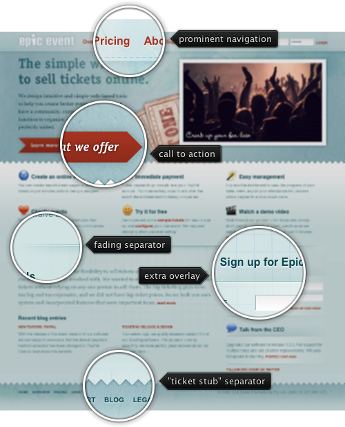
Today’s post highlights the design of EpicEvent.com that specializes in online ticket sales. The dark orange color used for links and the main action button is offset by the light desaturated sky blue background and dark slate blue used for the section subheaders. Clever use of stitch and zigzag elements as separators creates a realistic impression of a giant ticket stub – further reinforced by the crumpled paper texture used in the navigation menu and the main header section. The main section uses subtle gradients to add a little life around the text sections. The “about us” section uses multiple cross fading background layers that mesh perfectly together. The main section employs a precise three column layout maintained throughout all the subsections; “Sign up for Epic Event” is the only exception which is rather strange since its icon is the same size as the other two icons above it. I would spend a little bit more time on the main tagline (“The simple way to sell tickets online”) which suffers from rather sloppy kerning, especially in the last two words.
I was recently asked how to create multi-level menus with Flamingo command menu buttons. There is nothing preventing you from creating arbitrary hierarchies of menus – and you can do this even in the stable 4.2 release. The latest 5.0dev drop of the library brings small improvements for mixing menu buttons with and without icons, and here is a small code sample to create a two-level menu:
public class MultiLevelMenu extends JFrame {

   public MultiLevelMenu() {
      super("Multi level menu");

      JCommandButton main = new JCommandButton("click me");
      main.setCommandButtonKind(CommandButtonKind.POPUP_ONLY);
      main.setDisplayState(CommandButtonDisplayState.MEDIUM);
      main.setFlat(false);

      // first level menu
      main.setPopupCallback(new PopupPanelCallback() {
         @Override
         public JPopupPanel getPopupPanel(JCommandButton commandButton) {
            JCommandPopupMenu result = new JCommandPopupMenu();

            result.addMenuButton(new JCommandMenuButton("Copy",
                  new edit_copy()));
            result.addMenuButton(new JCommandMenuButton("Cut",
                  new edit_cut()));
            result.addMenuButton(new JCommandMenuButton("Paste",
                  new edit_paste()));

            result.addMenuSeparator();

            JCommandMenuButton second = new JCommandMenuButton("Find", null);
            second.setCommandButtonKind(CommandButtonKind.POPUP_ONLY);
            // second level
            second.setPopupCallback(new PopupPanelCallback() {
               @Override
               public JPopupPanel getPopupPanel(
                     JCommandButton commandButton) {
                  JCommandPopupMenu result = new JCommandPopupMenu();

                  result.addMenuButton(new JCommandMenuButton("Find",
                        new edit_find()));
                  result.addMenuButton(new JCommandMenuButton(
                        "Find replace", new edit_find_replace()));

                  return result;
               }
            });
            second.setPopupOrientationKind(CommandButtonPopupOrientationKind.SIDEWARD);
            result.addMenuButton(second);

            return result;
         }
      });

      this.setLayout(new FlowLayout(FlowLayout.LEADING));
      this.add(main);

      this.setSize(300, 200);
      this.setLocationRelativeTo(null);
      this.setDefaultCloseOperation(JFrame.DISPOSE_ON_CLOSE);
   }

   public static void main(String[] args) {
      SwingUtilities.invokeLater(new Runnable() {
         @Override
         public void run() {
            SubstanceLookAndFeel.setSkin(new GeminiSkin());
            JFrame.setDefaultLookAndFeelDecorated(true);

            new MultiLevelMenu().setVisible(true);
         }
      });
   }
}
And this is how it looks like:

Couple of things to note:
- It’s the same JCommandButton.setPopupCallback API that is used to create all menu levels
- By default the popups are displayed below the originator component (unlike the core Swing menus). Use JCommandButton.setPopupOrientationKind API passing the SIDEWARD enum value to it to recreate the core Swing behavior.

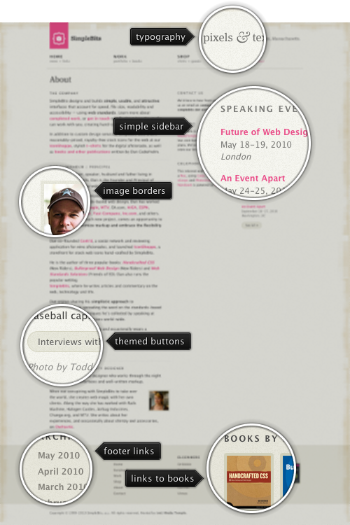
Today’s post highlights the design of SimpleBits.com, a design studio by Dan Cederholm. True to its name, the design is very clean and minimalistic. A spartan beige color scheme with beautiful geometric patterns running along the top, left and bottom edge is offset by increasingly popular shaded desaturated pink color for the logo and links. A simple three column grid provides a lot of whitespace around carefully chosen blocks of text. The navigation menu in the header is perfectly aligned with the main layout columns, and the links in the footer are themed with the darker beige color, blending perfectly with the rest of the site.
A few months ago Pedro Duque Vieira (@P_Duke) has asked me to provide support for menu buttons with checkboxes. This comes in handy when you have a number of options that affect the same visual aspect of the document / application element – such as font style, text alignment, grid borders etc. The relevant core Swing classes are JCheckBoxMenuItem and JRadioButtonMenuItem, but i have never been too happy with the way the API hierarchy of the classes themselves, their basic UI delegates and the UI delegates from core / third-party look-and-feels looked like.
Check box and radio button menu items aim to extend their “standalone” (outside of menus) counterparts. Radio button menu items represent a number of options with single selection – such as text alignment (left, right, center, fill). Check box menu items represent a number of options when multiple options can be selected – such as font style (bold, italic, underlined, strike-through). A good design calls for both types of selection controls to be visually grouped together, and be distinct from other selection groups and controls. This can be done by using extra white space, horizontal separators and group headers.
Placing selection controls in menus provides much less options for separating distinct groups – you can either place them in different menus, or use menu separators between the groups. Suppose you have two single-selection groups that need to go in the same menu. With core Swing, you will be using JRadioMenuButton controls, and you will need to use a menu separator to indicate where one group ends and another begins (unless you opt for much less attractive options such as different fonts, background or foreground colors). If you have a multi-selection group (of JCheckBoxMenuItems), you will also need to “delimit” it by menu separators to make it easier for the user to see that all the menu items belong to the same functional group. Finally, if you have a single JCheckBoxMenuItem, it may or may not require menu separators before and after it – but in most cases the design must make it apparent that this selection control is the only one in its group.
Given the need for extra separation of selection controls placed in menus, i took a few weeks to think about whether the distinction between the radio button and check box menu items – as far as the class hierarchy goes – is required. The only visual difference between these two control types is the check mark icon. The JRadioButtonMenuItem has a small round checkmark (just as JRadioButton), and JCheckBoxMenuItem has a small square checkmark (just as JCheckBox does). The shape of the checkmark thus conveys the selection mode in the group – single or multiple.
It is my current belief that the extra visual message conveyed by the checkmark shape is far outweighed by the resulting complexity of class hierarchy for both the controls and their UI delegates. The placement and grouping of selection controls, as well as the texts associated with the controls should be enough to make it clear whether the group is in single selection or multi selection mode. This decision is reflected in the latest Flamingo 5.0dev that provides support for placing toggle menu buttons in popup menus.
This is a sample popup menu with four toggle menu buttons that belong to the same toggle button group (single selection):

Note that the second option is selected and has a selection visual painted behind its icon. And here is a similar popup menu, but this time with multi-selection group (where toggle menu buttons are not associated with any toggle button group):

We have two elements selected – and they show the matching visuals around the icons.
As usual, to create a popup menu when the user activates the popup area of a command button, use the JCommandButton.setPopupCallback API. The new JCommandPopupMenu.addMenuButton(JCommandToggleButtonMenu) and the new JCommandToggleButtonMenu class can be used to add a toggle button menu to the popup menu. Use CommandToggleButtonGroup to create a single selection group and add one or more of your JCommandToggleButtonMenus to it.
If you want to take the toggle menu buttons for a spin, you will need the following:
Note that the last two are required if you’re running your application under one of Substance skins.


