The latest addition in the Flamingo component suite is support for rich tooltips on command buttons. This has been one of the items on the roadmap for version 4.0 (code named Fainnear), and is now available in the latest 4.0dev drop of Flamingo core and 5.1dev drop of Substance Flamingo plugin.
The org.jvnet.flamingo.common.RichTooltip class provides the API to define different parts of the rich tooltip:
- Title text
- Optional main image
- One or more description paragraphs
- Optional footer image
- Optional one of more footer paragraphs
To set the rich tooltip on the command buttons, use the following APIs:
- org.jvnet.flamingo.common.AbstractCommandButton.setActionRichTooltip to set the rich tooltip on the action area of a command button.
- org.jvnet.flamingo.common.JCommandButton.setPopupRichTooltip to set the rich tooltip on the popup area of a command button (does not apply to toggle command buttons in the JToggleCommandButton class that only has an action area).
In addition, you can set the rich tooltip on the ribbon application menu button with the org.jvnet.flamingo.ribbon.JRibbon.setApplicationMenuRichTooltip API.
Unlike the core Swing tooltips, there are rigid rules that define the location of the rich tooltips. The rich tooltips will appear directly below the associated command button, left aligned with it. Here is a screenshot of an action rich tooltip under Metal:

And here is the popup rich tooltip of the same button:

As you can see, the rich tooltip provides support for multi-paragraph sections with optional images.
When a command button is part of a ribbon band, its rich tooltips will be shown below the ribbon. Here is a rich tooltip of action area of the Paste button in the first ribbon band (note how the tooltip is displayed below the ribbon and does not hide any part of the ribbon):

The left horizontal alignment makes sure that the tooltip is clearly associated with the command button (since there is a considerable vertical space between them). The same command button has a different rich tooltip for the popup area:

As mentioned earlier, you can associate a rich tooltip with the application menu button:

Command buttons in the application task bar show the rich tooltip directly below:

The previous four screenshots were taken under the Windows look-and-feel in Vista. Since one of the most important goals of Flamingo is to support other core and third-party look-and-feels out of the box, the rich tooltips are not an exception. The customization hooks provide complete control over the layout and appearance of the rich tooltips (and these will be illustrated below for Substance), but the rich tooltips should look consistent even without any customizations.
Here is the rich tooltip under Nimbus:

Here is the rich tooltip under Looks PlasticXP (note how it takes the translucent shadow border):

And the rich tooltip of the application menu button:

The rich tooltip under Synthetica Blue Steel:

And under A03 (for the application menu button):

Finally, third-party look-and-feels can customize the appearance of the rich tooltips. Both the layout and the painting itself is customizable via the usual look-and-feel hooks (on the UI delegates), and Substance Flamingo plugin takes an advantage to provide custom gradient fill.
Here is the rich tooltip under the Substance Blue Steel (on the Cut button):

And the rich tooltip on the application menu button under the Substance Autumn:

To see the rich tooltips in action, click the WebStart launch button below:

In this test application the rich tooltips are installed on:
- the application menu button
- the Paste button in the Clipboard band
- the Cut button in the Clipboard band
- the Paste button in the application taskbar
- the Bold, Italic, Underline and Strikethrough buttons in the Font band
As always, you are more than welcome to leave comments and report bugs on the project issue tracker, mailing lists or forums.
A few weeks ago i have mentioned the Sage project, and it’s time for a deeper look into the project itself and its creator, Don DeCoteau.
Tell us a little bit about yourself.
I live in San Diego. I used to work for a company called SAIC. In my early days at SAIC I wrote the SAIC-HTTP web server and ran a technology lab (best job ever). From there I moved on to architecture and technology strategy consulting (still at SAIC) and only programmed as a hobby. That job turned into mostly writing white papers and doing studies and lots and lots of traveling. I got bored with it and quit (in mid 2002) to take a sabbatical and reboot. 3 months in I was bored and started programming again to keep myself busy. I ended up selling the technology I developed to a startup. In developing that technology I had to build a Swing-based IDE and it was very painful (I generally prefer writing servers and hate writing UIs). So, for my next pet project, I decided to implement an idea I had back in 1996; mainly taking what was great about web-based apps (URL-centric, markup-based, scriptable), bringing that to the desktop, and most of all, making it as painless as possible for people to use (couldn’t do the scriptable part back then).
What is your “elevator pitch” for Sage?
 Sage is a special purpose browser designed to render applications instead of documents. It lets you easily deploy web-enabled desktop apps that can run online, offline, or both. The online capabilities offer the same flexibility and dynamic customization capabilities of traditional web apps (customizable per-user, per-device, per-company, based on user-bandwidth, etc.) without sacrificing the power and convenience of a desktop application.
Traditional browsers use HTML to describe documents and JavaScript to make those documents interactive. Instead of HTML, Sage uses a special CSS-like markup language to describe the application, actions, and interactions. It supports JavaScript, Ruby, Python and a number of other scripting languages for controlling the application and enabling complex interactions. JavaScript is the default scripting language and comes embedded with the engine (via Rhino and BSF 3). Additionally, Sage’s functionality can be augmented via dynamically downloaded java libraries or OS specific shared libraries (the same way you can download browser plug-ins and ActiveX components).
Why another library? Is it your own itch to scratch, or are you addressing the deficiencies of the existing frameworks?
 Sage is not a library. It is actually a headless browser. You give sage a URL and it generates an application based on the MIME type of the URL. If you give it a URL to an image, it will launch an image viewer to render the image. For a plain text document it will launch a document viewer. For an html document it will launch a window with a JEditorPane (the document viewer), or an embedded version of Internet Explorer (via JDICPlus), or it will spawn the system browser to view the document (the decision is based on the OS and the engine’s configuration). Sage has a special markup language (SDF) and associated MIME type (text/x-sdf) that lets it render Swing-based applications, the same way a web browser uses HTML to render documents. The demo applications are just a bunch of markup files in conjunction with JavaScript files. The IDE is actually a Sage app and a large portion of the code is written in JavaScript. Java webstart is used as a mechanism for delivering the Sage engine and any supplemental jars that may be required for the demo. The applicationURL parameter in the JNLP file is what determines the application that will be presented to the user. This URL is essentially the first parameter that you would pass to the engine if you were invoking it manually. Sage supports any standard URL (that java supports) as well as some special Sage URLs (like lib: which is URL that points to a file in the JVM’s class path as opposed to jar: which points to a specific jar file). For performance and bandwidth reasons most of my demos are packaged in jars and use a lib: URL. The iTunes Clone demo however, runs directly from the web server in order to demonstrate the deferred image loading capability (you see the music icon prior the artwork being loaded) as well as changing the application on the file as I make enhancements.
It looks like the developer-facing APIs are intentionally targeting the wider audiences familiar with CSS, JavaScript, Python and other scripting languages. Is this a personal preference, or an inclination to follow the market trends?
I am not a big trend follower (which is why I wrote my own markup language instead of going the XML route. I do support XML and have an XML schema defined for my configuration objects but it is an undocumented feature and comes for free as a byproduct of a tool I have). The reason for the scripting languages and markup is because Sage is a runtime and everything is done in real-time. The markup is interpreted at runtime to create the actual application.
Have you looked at JavaFX script? Any intentions to support it in Sage?
I have looked at JavaFX and I am excited about the underlying technology but I think the scripting language is DOA. Sage supports any JSR-223 scripting language so JavaFX script is inherently supported (so far the only languages other that JavaScript that I have tested are Ruby and Python, I made a request to the JRuby guys to create a smaller footprint version of JRuby for client-side use). What I plan on doing in the future (and what I think Sun should do) is creating some high-level scriptable objects that encapsulate some common high-value JavaFX functionality. These objects will be available to any scripting language.
What are your biggest Swing pain points, and what can be done to address them?
Some of my biggest pain points are:
- Inability to completely customize the painting of a component without overriding the component. There is lot of time and effort being spent to get around this limitation (decorators and such). I had to override every component mainly in order to allow the painting behavior to be changed dynamically while still allowing the use of third party L&Fs.
- The lack of consistency in behavior and meaning. For instance the inconsistency in the behavior of setOpaque(). This one little thing has caused me a lot of grief.
- Inability to specify the component that should receive focus when a JPopupMenu goes away (one of the things I can’t fix).
- Inability of finding the triggering event for a focus change (mouse, keyboard, other).
Why did you choose Swing to implement the runtime engine?
I chose Swing because it was pure java. Even though it has a lot of issues and pitfalls, I know I can generally fix or work around them to suit my needs by subclassing or wholesale replacement. Also, I am more interested in usability and looks than in achieving native fidelity. I love the way iTunes looks on my PC and it looks nothing like my other PC apps but is does put the scrollbar buttons in the location that I am accustomed to (on the PC).
Sage provides a Widget Explorer and an IDE to edit and inspect Sage applications. What are your thoughts on visual designers in general? Do they make the initial learning simpler? Do they discourage the understanding of the underlying layers?
 I think IDEs lessens the learning curve. People who are not inclined to dig deeper would just find something else that is easy for them (but not necessarily better). I myself use the Sage IDE in combination with a plug-in text editor (for NetBeans) for doing Sage development. Sometimes it is just faster and easier to use a text editor. The curious people will dig into the examples and source code to see how things are done, and use the IDE to save time doing the simple repetitive stuff. Plus the IDE cuts down on questions. I my case, the IDE also serves as a demonstration of the capabilities of Sage and on how to use Sage to build more complex applications. The IDE exploits most of the more advanced Sage features.
Given full control, would you change anything in Swing core layer going forward?
I would:
- Provide a mechanism to completely change the painting of a component without having to override the component. In Sage I have the concept of a paint primer/finisher. The primer prepares the paint surface and returns the graphics object to paint on (the primer is passed to original Swing graphics object). If the primer returns a null surface then no further painting action is taken by the component. The finisher is passed the original Swing graphics to finish the painting. Sage animations, special effects and transitions are implemented as paint primer/finishers that insert themselves into the paint stream. I would love to see something like this added to swing.
- Add the concept of an application context to swing, or at least expose the app context facility that is currently provided for applets and provide an API for retrieving that context and storing context specific state. This would allow for the building of Swing-based window managers for embedded-devices or even desktops. Currently I am doing my own context management but it is not as robust as it could be. It is currently used by the IDE to provide fast previewing (the preview function in the IDE creates a new Sage ApplicationContext and runs the preview within the same JVM as the IDE).
- Add a mechanism to determine the trigger event for a focus change
There is a lot of exploration in RIA space from both major and minor players. Cutting the marketing and hype, what should the developers pay attention to as far as the trends go?
 What I personally believe, and what drove me to write sage, is that we are starting to hit the browser wall as far as building highly functional applications. You can build some beautiful web apps, but flash does not correspond to functionality. No matter the web app, you can build a better desktop version simply due to the limitations of the browser and the constraints that they have to work within. For example, most people are not willing to give up their desktop mail client for web version (and there are some really nice web versions). However, desktop apps have traditionally been inflexible, non-portable (tied to a specific device), and difficult to write. The next evolution will be to take what is great about desktop apps and what is great about web apps and bring them together while drastically simplifying the creation of such apps. Mozilla tried this with XULRunner but their implementation was lacking (cumbersome, not easy, required an install, and only addressed the UI). The only commercial company that seems to be going down this path is Adobe. I am always looking at new offerings to see if any is doing anything close to what I am doing. Adobe AIR is the closest (this it to is lacking incapability but I am biased). However, they cannot compete with Java or .Net as far as ecosystem, tools, and functionality. It is much easier to integrate Flash into a Swing or .Net app than it is to integrate a Swing or .Net app into AIR/Flash.
Anything else that you would like to add?
Already added liberally to my other answers :)
However, the one thing I must note that makes Sage significantly different for AIR and XULRunner is that Sage doesn’t just let you markup the UI, it also allows you to markup data. Being able to markup data is what truly makes an application dynamic. This is the main capability of HTML browsers that make them great. When you get data from a database you take that data and markup it up with HTML in order to create the appropriate visual representation. The visual representation can change dynamically based on any number of conditions. Sage allows you to do the same thing with data send to any of its list type widgets.
Thanks Don, and to finish the interview i would like to showcase the capabilities of Sage to create modern and visually rich applications. The latest Sage demo is an iTunes clone. You can view the screencast, browse the complete sources and launch the WebStart app.
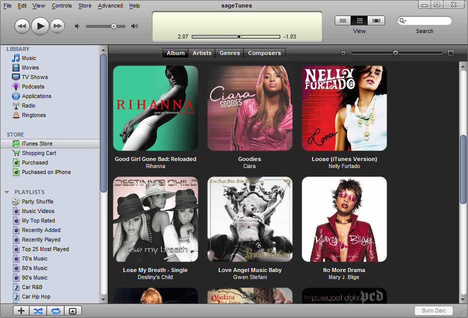
The first screenshot shows the grid view of the available albums (click to see fullsize view), along with the navigation tree and the media controls:

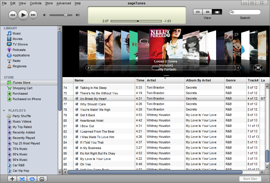
The second screenshot shows the coverflow view of the albums, along with the available tracks (click to see fullsize view):

And if you wondered, this is the live WebStart demo running on my Windows Vista machine.