It gives me great pleasure to announce the next major release of Radiance. The two main themes of this release are:
- Expanding on the foundational work of the previous release around color tokens
- Stability and bug fixes
Let’s get to what’s been fixed, and what’s been added. First, I’m going to use emojis to mark different parts of it like this:
 marks an incompatible API / binary change
 marks new features
 marks bug fixes and general improvements
Theming
Components
Radiance focuses on helping you make elegant and high-performing desktop applications in Swing. If you’re in the business of writing just such apps, I’d love for you to take this Radiance release for a spin. Click here to get the instructions on how to add Radiance to your builds.

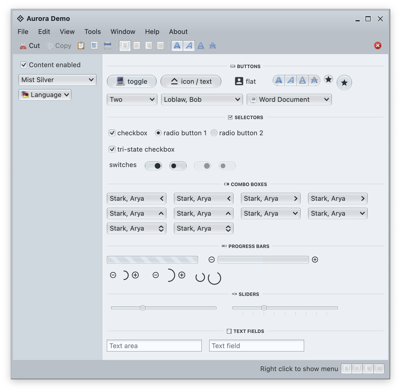
It’s been three years since the last Aurora release, and today I’m happy to announce its next major update.
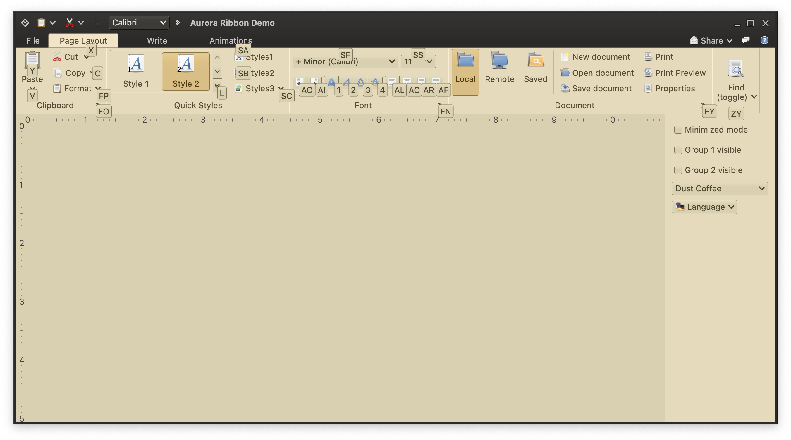
It took a bit of time to get here, but I’m hoping it was worth the wait. The first main addition in this release is the full-featured ribbon container that provides the functionality of the Microsoft Office command bar. It supports regular and contextual ribbon task groups, regular and flow ribbon bands, application menu, taskbar, and anchored command area. It also supports flexible and configurable resizing of the content for ribbon tasks, ribbon bands, and individual ribbon content pieces.
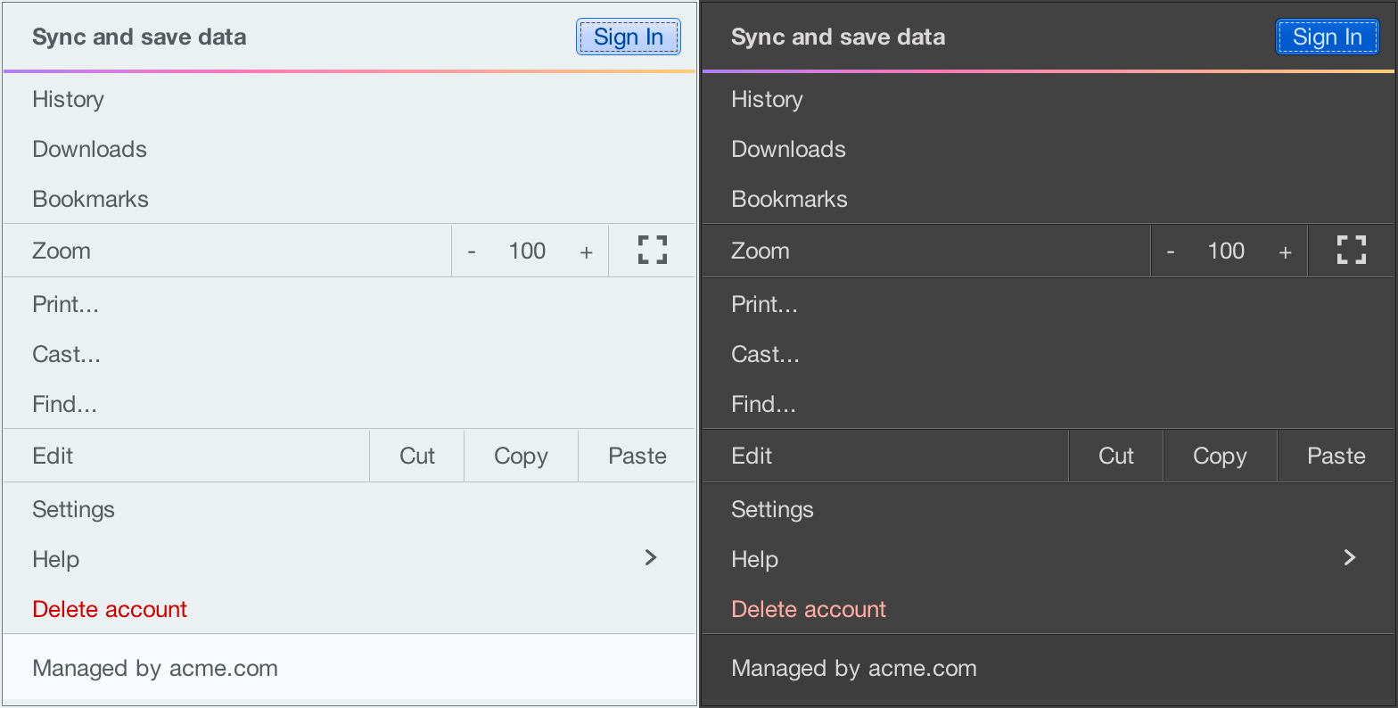
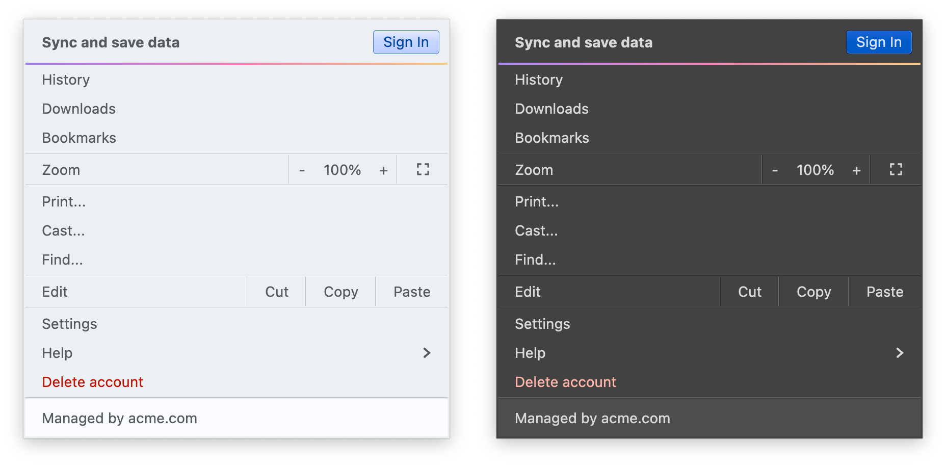
The second main addition is the full alignment with the changes that went into Radiance in the last year. Aurora 2 uses the Chroma color system from the Ephemeral design library, which builds on the core foundations of the Material color utilities.
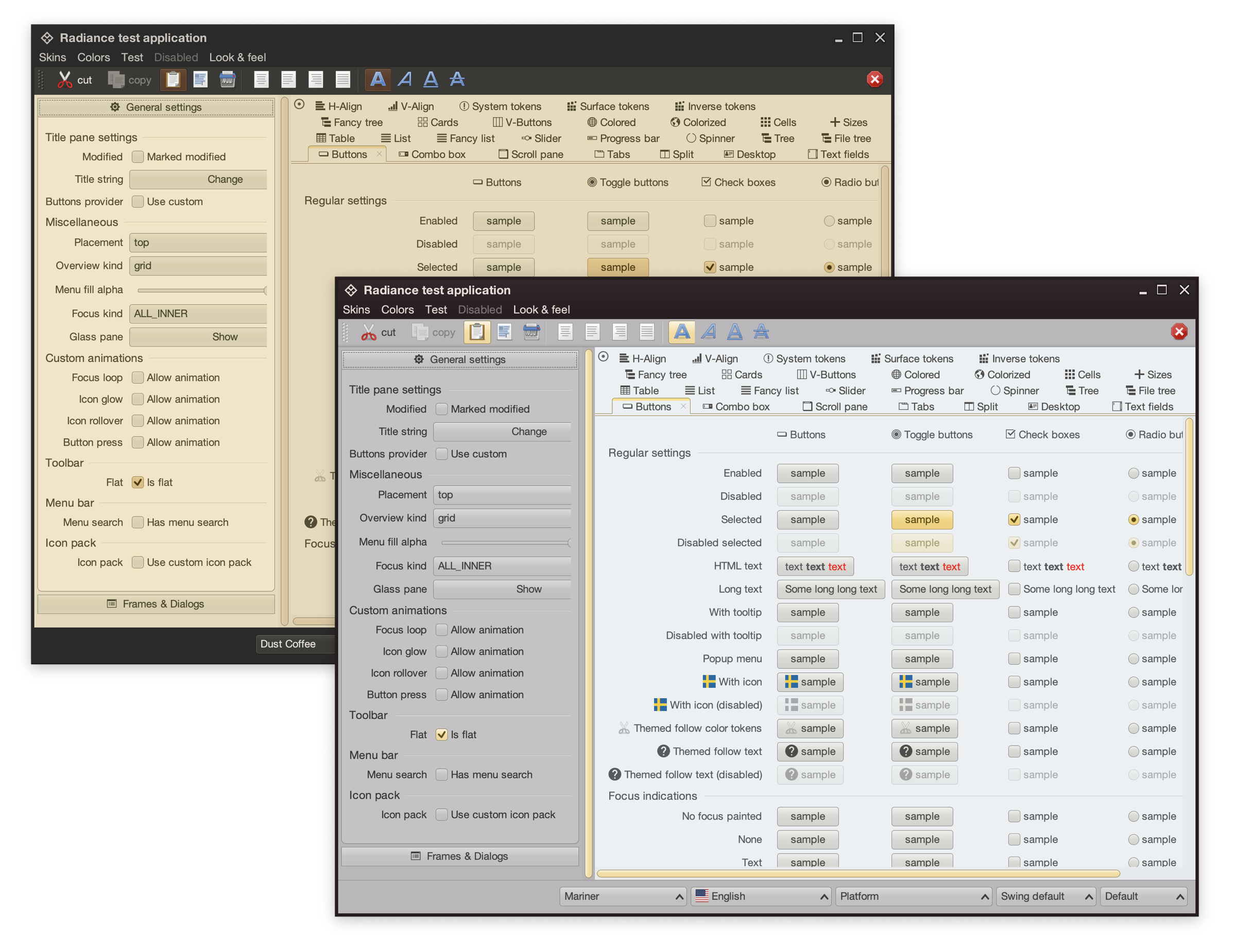
It introduces APIs for system tokens – info, warning, error, and success – that can be applied to any element in the UI hierarchy, like shown here for the “Sign In” button (info styling) and “Delete account” (error styling), seamlessly adapting to light and dark skins:
In addition to streamlining the painter APIs, this version adds new surface and outline painters that emulate the appearance of a 3D glass object lit from straight above, as can be seen here under the Mist Silver skin on buttons, combo boxes and other components:
Among the many other, smaller improvements in this release you will find:
The next couple of years are shaping up to be quite exciting for both Aurora and Radiance. If you’re in the business of writing desktop Compose apps, I’d love for you to take Aurora for a spin. Stay frosty for more features coming in 2026!
To wrap up the series on the Chroma color system introduced in the latest Radiance release, I wanted to look beyond the world of user interfaces, and to the world of physical products around us.
For quite some time now, Radiance supported the concept of decoration area types – recognizing that application menu bars, toolbars and status bars are common examples of special containers found in most user interfaces. These containers create functional grouping of application controls and bring order to complex screens. From the title pane at the very top, to the menu bar and the toolbar under it, to the control pane on the left, all the way down to the footer at the bottom – the visual grouping and separation of application content into distinct decoration areas follows the logical grouping of application content.
And with Chroma, a button component does not need to “know” about the decoration area it is displayed in – it asks the current Radiance skin to give it color tokens that correspond to wherever it happens to be in the application hierarchy, and then draws itself with surface, outline and content tokens.
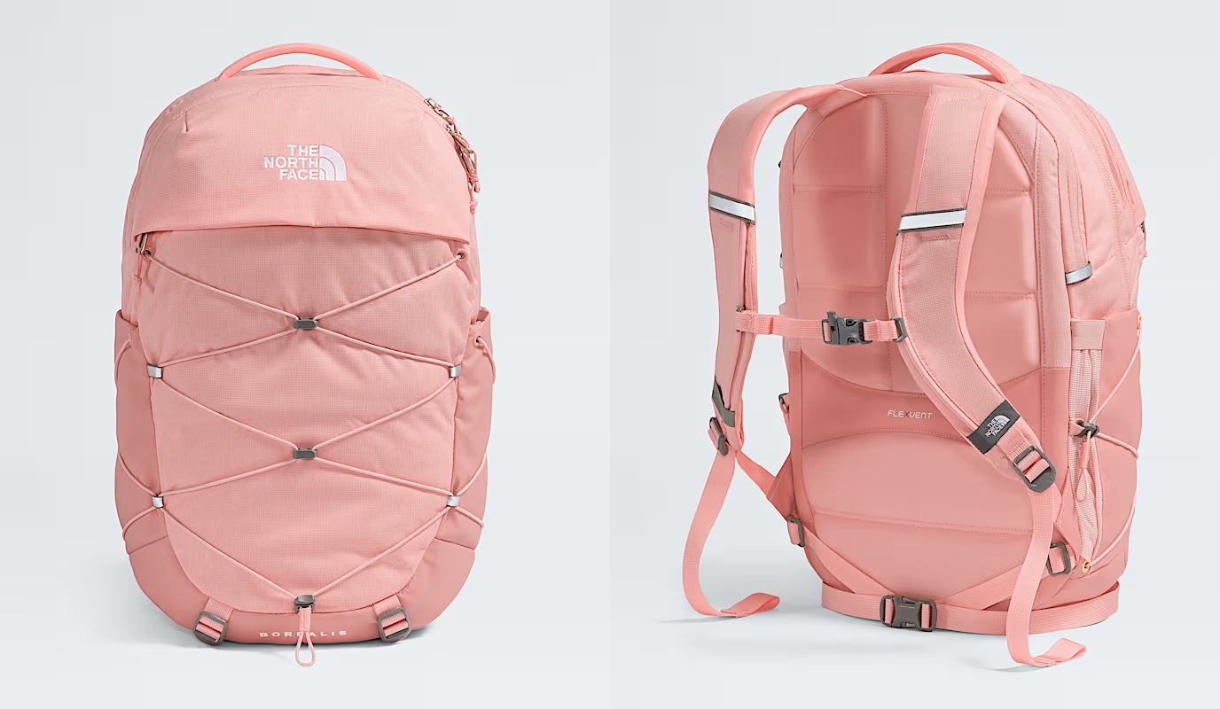
Tokens are design decisions that combine together to make up the whole design system. A design system can be in the digital world of user interfaces, or in the physical world of retail and wholesale goods. This is the Borealis backpack from The North Face:
Here, we have:
- A consistent color palette of terracotta heather.
- Applied in two tones – a lighter one for the bulk of the body, and a slightly darker one for the bottom, the sides, and the back cross.
- Company and product names as “content” on top of these “surfaces” in a consistent, much lighter tone from the same palette.
- And finally, consistent application of a darker grey accent on the buckles and additional elements
The overall design “system” is applied throughout the whole line of Borealis backpacks, that you can see by clicking the color selectors on that page.
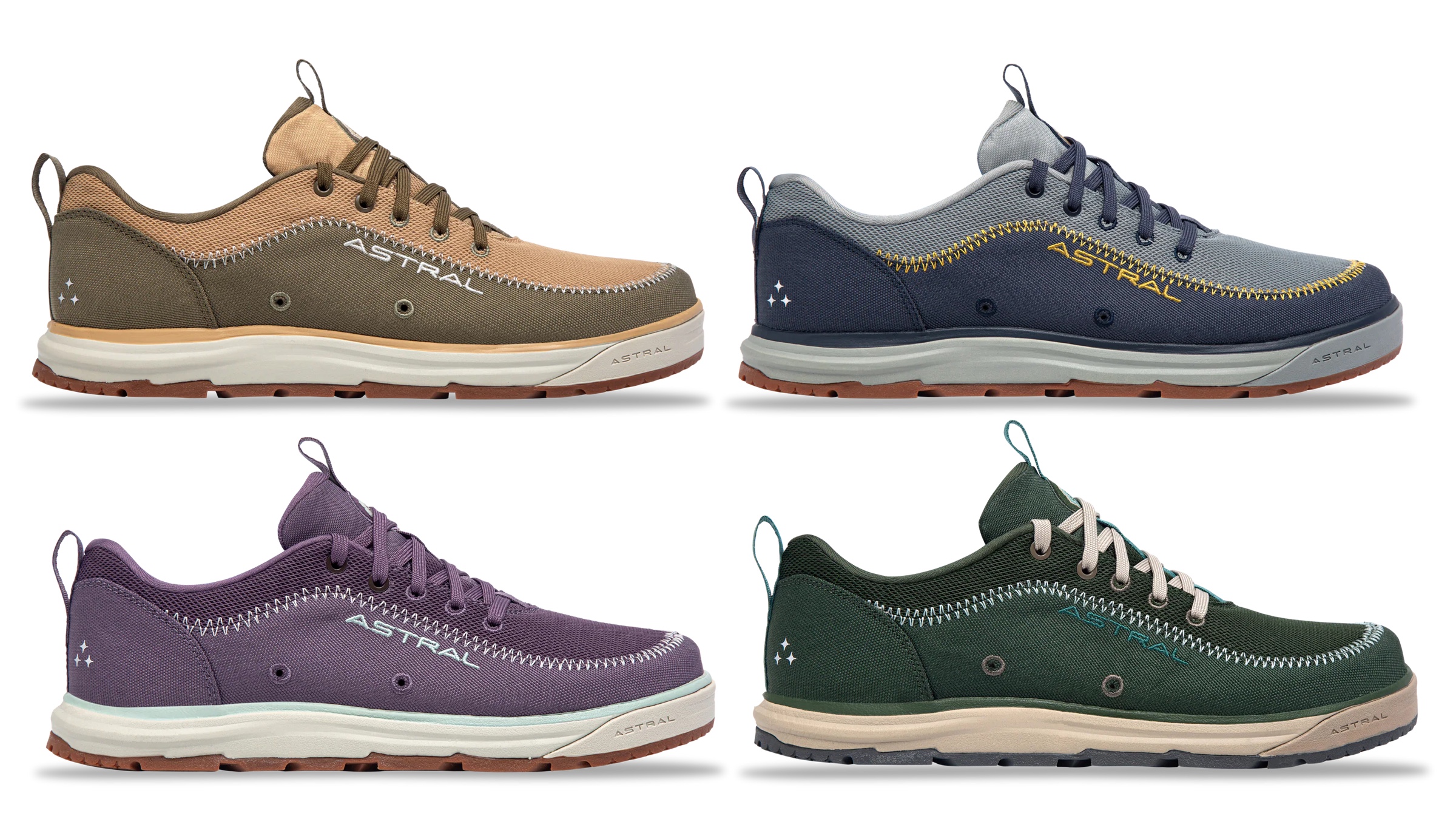
The same approach, extended to multiple “decoration areas”, can be seen in the line of Brewer 3.0 shoes from Astral – delineating design elements across the product, changing the color palette and color token mappings to create a coherent thematic connection across all variants:
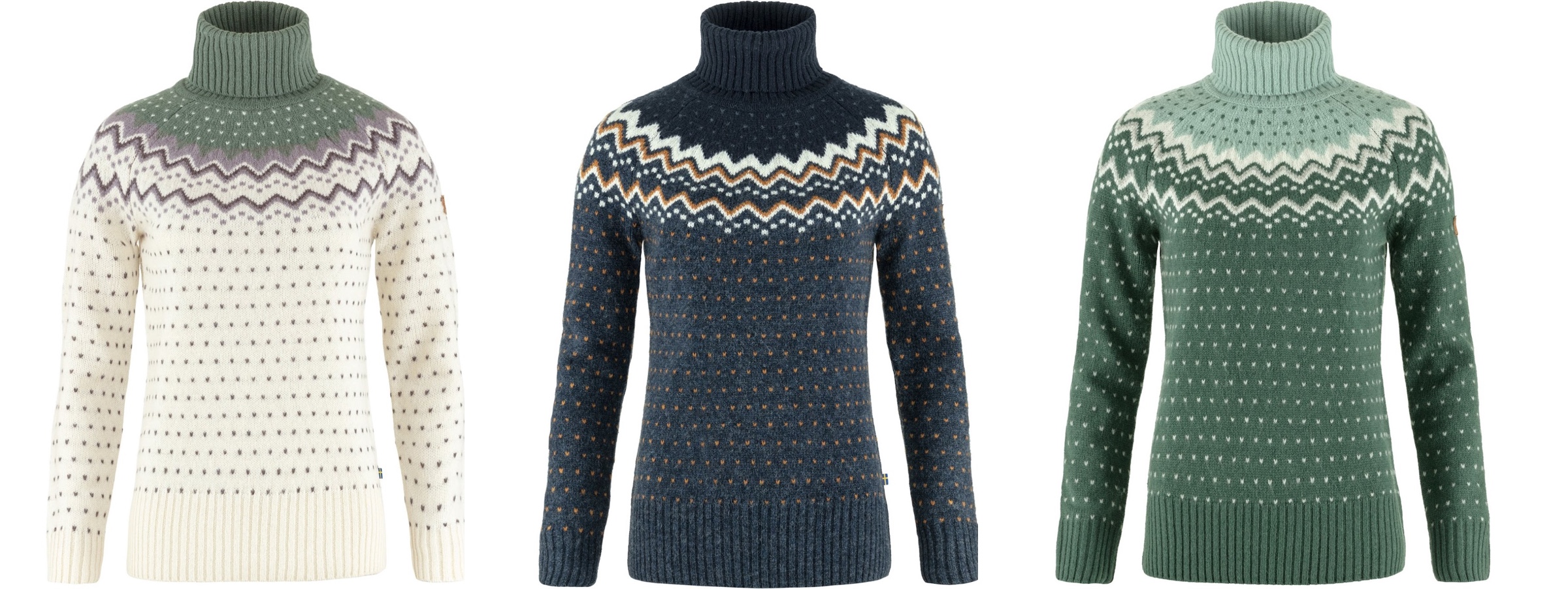
This is the Ovik knit roller neck collection from Fjallraven, again with a single strong underlying design, but multiple color variations:
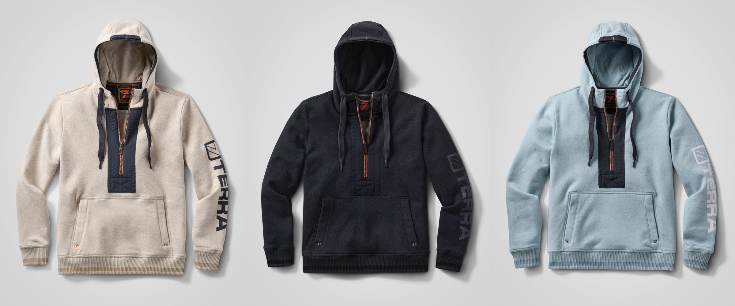
This is the Stokk hybrid hoodies line from 7Terra:
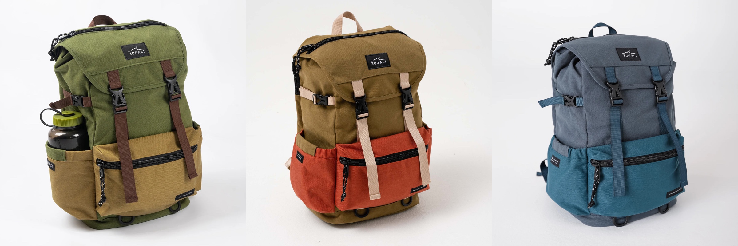
And this is Escapade backpack collection from Zorali:
The overall approach is similar:
- Create a “blueprint” for the product line, identifying key functional areas of the product that will be consistent across the entire line
- For each functional area, group the pieces into tiers – canvas (surface), logo (content), connectors (outline / line)
- For each tier, define which color tokens will be used on the physical material – plastic, metal, cloth, etc
- Define multiple color skins / combinations to be used across the product line, deriving palettes for each functional area, leading to the color tokens being mapped to the actual RGB colors
With a few tweaks, this approach works for wearable consumer products highlighted here – shoes, sweaters, and backpacks – and can extend into tupperware, cars, architecture and many more. Keep your eyes open for the design of the physical world around you as you go about your day, and see how it can be applied to the world of digital user interfaces.
About five years ago I wrote about vector format, and how it is not quite well suited to be used for application icons. Five years is a long time in our industry, and the things have changed quite dramatically since then. That post was written when pretty much all application icons looked like this: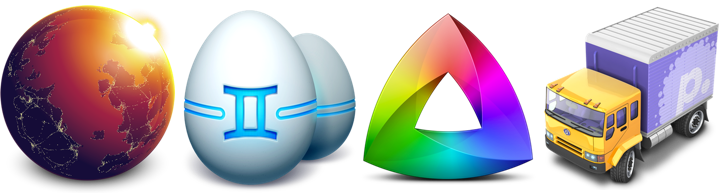
Some of these rich visuals are still around. In fact, the last three icons are taken from the latest releases of Gemini, Kaleidoscope and Transmit desktop Mac apps. However, the tide of flat / minimalistic design that swept the mobile platforms in the last few years has not spared the desktop. Eli Schiff is probably the most vocal critic of the shift away from the richness of skeuomorphic designs, showing quite a few examples of this trend here and here.
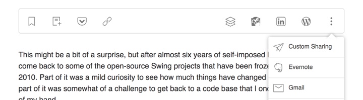
Indeed it’s a rare thing to see multi-colored textured icons inside apps these days. On my Mac laptop the only two holdouts are Soulver and MarsEdit. The rest have moved on to much simpler monochromatic icons that are predominantly using simple shapes and a few line strokes. Here is Adobe Acrobat’s toolbar:

and Evernote:

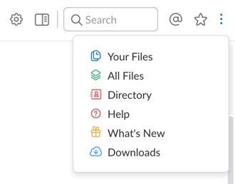
This is Slack:
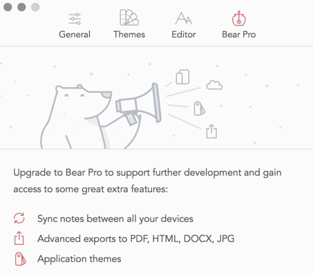
and Bear:
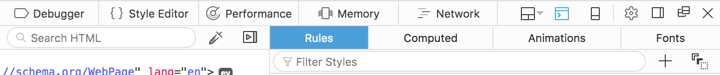
Line icons are dominating the UI of the web developer tools of Firefox:
They also have found their way to the web sites. Here is Feedly:
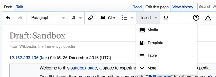
and Wikipedia’s visual editor:
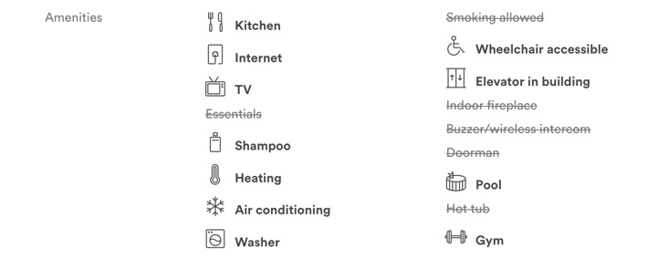
You can also see this style on Airbnb listing pages (with a somewhat misbalanced amenities list):
and, to a smaller extent, on other websites such as Apple’s:

Google’s Material design places heavy emphasis on simple, clean icons:

They can be easily tinted to conform to the brand guidelines of the specific app, and lend themselves quite easily to beautiful animations. And, needless to say, the vector format is a perfect match to encode the visuals of such icons.
Trends come and go, and I wouldn’t recommend making bold predictions on how things will look like in another five years. For now, vector format has defied the predictions I’ve laid out in 2011 (even though I’ve ended that post by giving myself a way out). And, at least for now, vector format is the cool new kid.
