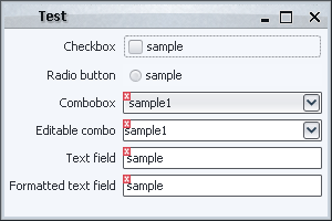
Before i start discussing the different implementations of validation overlays that illustrate the power and flexibility of the Swing rendering pipeline, i want to mention some of the common classes that will be used throughout this series. First, here is the screenshot of the sample UI that will be used for all the techniques:
Note that the code focuses on the painting itself, and leaves the custom validation logic (based on the contents of the text field, selected combobox entry etc) to the application code (which is not relevant for discussing the Swing painting pipeline). The common classes are located in the <a href="https://pushingpixels.dev.java.net/source/browse/pushingpixels/src/org/pushingpixels/validation/">org.pushingpixels.validation</a> and <a href="https://pushingpixels.dev.java.net/source/browse/pushingpixels/src/org/pushingpixels/validation/common/">org.pushingpixels.validation.common</a> packages that contain the following:
- The
SampleUi class is the UI itself. It uses the FormLayout to create a simple two-column layout with a few controls.
- The
common.ValidationUtils provides a very simple implementation of two helper methods. The first is hasError(Component c) that returns boolean indication whether the specified component should show the error overlay. The second is the paintErrorIcon(Component c, Graphics g, int x, int y) that paints small error icon at the specified location. More on these two methods below.
- The
ComponentVisitor interface follows the usual visitor pattern to allow some of the discussed implementations to visit all components starting from a specific root.
- The Visitor class implements the visitor pattern itself, with the
static void visit(ComponentVisitor visitor, Component c, Graphics g) method that recursively visits the entire hierarchy of the specified component, calling the custom visitor logic on each one of the children components.
Note that the first two would be application-specific, and the last two are relevant only for some techniques.
In addition, using the visitor pattern reveals one of the weaker sides of Swing. The basic JComponent class extends Container, which means that every core Swing component can have children components. While it allows some nifty tricks like putting a JOGL-powered icon on a button, it unnecessarily exposes the application code to the implementation details of some more complex components. For example, an editable JComboBox is implemented with a text field and a button. A JSpinner is implemented as a text field and two buttons. Unfortunately, these are counted in the getComponentCount() and returned in getComponent(int index), which makes it rather annoying for the visitor pattern.
Subsequently, the sample implementation of the hasError(Component c) method in common.ValidationUtils makes special checks when it is passed a text field. If the text field has either combobox or spinner parent, it is ignored.
The next entry will show the first extension point in the Swing rendering pipeline – the repaint manager.
In my presentation at OSCON 2007 (PDF slides available) i talked about the Swing painting pipeline and how easy it is to extend it to provide custom painting behavior and effects. In this series i’m going to talk about these extension points in a more detailed way, taking you on a journey along a very well-engineered and extensible implementation that makes Swing one of the best available UI toolkits.
The following two images show a high-level overview of the Swing painting pipeline which consists of three major players, the JComponent, the RepaintManager and the ComponentUI:
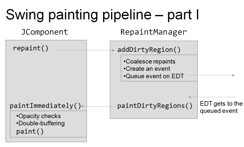
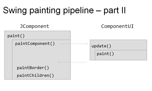
As i mentioned in the presentation, pretty much everything you see in this pipeline is extensible, which makes it very easy to override / extend the basic core implementation and to provide your own custom painting. These extension points (or hooks) vary in three main areas: flexibility, robustness and ease of use.
By flexibility i mean the degree of control exposed by the specific hook. For example, if you want to add drop shadows to all your labels, it’s very easy to do with the UI delegates, but next to impossible with other techniques (such as glass pane, for example, especially for anti-aliased texts). By robustness i mean how sure can you be that your custom code works as expected across different operating systems and JDK versions. In addition, this includes the “stability” itself of the custom logic. For example, the repaint manager is a singleton, and you can have two or more application modules fighting to install their own implementation. Finally, by ease of use i mean the complexity of the implementation itself. While the repaint manager is, in most cases, the hardest to implement, providing custom painting logic with glass pane or by overriding paintComponent might be considered the easiest.
The techniques will be discussed and compared using the following common task – provide validation indication on different controls. The validation indication itself will be painted as a small error icon in the top-left corner of the “invalid” component; in addition, any Swing component can be in the invalid state. The later includes, for example, simple text fields and editable comboboxes (which contain child components as the implementation detail).
The following techniques will be shown (links will be added as each technique is described):
- Repaint manager
- Overriding paint() manually
- Using AOP to override paint()
- Custom border
- Layered pane
- Glass pane
- JXLayer
- Extending look and feel
- Multiplex look and feel
See you in the next entries.
JTree component is very well suited for showing the contents of your file system. In this entry, i’m going to show how you can do it, pointing out a few interesting issues along the way.
The full source for this example can be found here. It contains the following functionality:
- The
FileSystemView object to query the contents of the local file system.
- The
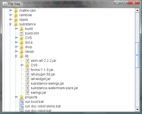
FileTreeCellRenderer to render the single file cell. It has two caches, one for storing the file icon, and another for storing system name for file system root. The second one if very important for performance since on some systems the call to FileSystemView.getSystemDisplayName can take considerable time. Note how we use the FileSystemView.getSystemIcon to show the system-consistent file icon (see screenshot below).
- The
FileTreeNode to present a single tree node. Note that the JTree implementation will not create the entire model (which is very good for the initial state where all the file system roots are collapsed).
- The main panel that creates the tree, sets the model and the renderer and wraps the tree in a scroll pane. Note that we use
File.listRoots to get the file system roots and JTree.setRootVisible(false) to remove the main tree root (so that we have “multi-root” tree, with each file system root being a top-level tree node) – see screenshot below.
Here is how it looks:
SwingX features a very useful API on the JXPanel. The setAlpha allows setting the alpha (translucency / opacity) value for the panel and all its children. For example, if you want all the child components to be painted with 50% translucency, call myJxPanel.setAlpha(0.5f) and you’re done. As a side note, you can have nested JXPanels; in this case the lowest value wins (see the implementation of JXPanel.getEffectiveAlpha). So, if the outer panel has 0.6 alpha, and the inner panel has 0.4 alpha, the children of the inner panel will be painted with 40% opacity (not 0.6*0.4 = 24% opacity).
One case in which you need to be aware of this setting is when you override the paint or paintComponent and use custom composites. In such a case, you need to respect the current composite set on the Graphics object passed to the paint method(s). The current implementation of JXPanel.paint uses the SRC_OVER alpha composite, and if this is what you’re using as well, you can call the following helper method to compute the “combined” composite to set during your custom painting routine:
   public static Composite getAlphaComposite(
         float translucency, Graphics g) {
      float xFactor = 1.0f;
      if ((g != null) && (g instanceof Graphics2D)) {
         Graphics2D g2d = (Graphics2D) g;
         Composite c2 = g2d.getComposite();
         if (c2 instanceof AlphaComposite) {
            AlphaComposite ac = (AlphaComposite) c2;
            if (ac.getRule() == AlphaComposite.SRC_OVER)
               xFactor = ac.getAlpha();
         }
      }
      if ((translucency == 1.0f) && (xFactor == 1.0f))
         return AlphaComposite.SrcOver;
      else
         return AlphaComposite.getInstance(
               AlphaComposite.SRC_OVER,
               translucency * xFactor);
   }
As you can see, the implementation is pretty straightforward, combining the alpha already set on the Graphics with the one passed to the method. The special case where both are 1.0f simply returns AlphaComposite.SrcOver.
Note that if you’re using a composite different from SRC_OVER, you’ll have to create a temporary image, paint on it and then paint that image back onto the original Graphics (that has the composite of the JXPanel alpha).
