Native text rendering in Swing applications – how does it work?
Two weeks ago i wrote about the first drop of Bramble plugin for Substance look-and-feel, which provides support for native text rendering in Swing applications. Today, it’s time to look at the actual implementation and see how it all works together.
Unlike SWT that passes the painting requests to the underlying native APIs, Swing handles all the painting itself (unless we’re talking about Windows and GTK look-and-feels under Mustang, which have their own set of problems). Swing’s greatest flexibility is in its “layered” approach to rendering the components (see this PDF presentation that shows one of the possible effects that are extremely easy to achieve with Swing UI delegates). Take, for example, painting a button. It’s all done in independent layers which are then composited together using the powerful Java2D APIs:
- Background
- Icon
- Text
- Focus
- Border
What happens when you want to provide custom rendering for one of these layers (text in our case)? Just override the relevant paint method and provide the logic there (not touching any other pixels). Seems easy, but since SWT has its own painting model dictated by the OS, it’s not. The main difference between text rendering in AWT / Java2D and SWT is that the later expects the background pixels to be fully specified (as detailed in this discussion on the platform-swt-dev mailing list and this discussion on the eclipse.swt.forum).
And as it turns out, this complicates the logic of plugging the SWT text rendering into the Swing painting pipeline, but the end result is most certainly worth it. I’ve already posted a few screenshots, and here is one more:

The first two rows (labels and text fields) are rendered by Swing (Vista + Mustang), while the last two rows are rendered by SWT / native code. While for labels the difference might not be that big, for the digits it is simply staggering (at least for the default Vista Segoe UI font). So, what do we have to do in order to have the native text rendering in Swing?
The current implementation has three stages:
- Filling the component bounds with the background color. The actual color depends on the component kind and component opacity (can come from the parent container).
- Painting all the overlay / highlight layers. List cells have rollover / selection highlights. Text components have multiple highlights depending on the text selection mode.
- Painting all the texts. There can be more than one with different fonts and colors. Menus have the menu text and accelerator text. Sliders have multiple labels. Text components have multiple selected and unselected sections.
The pure Swing implementation doesn’t have to be concerned with combining the results of these three stages together, since Java2D’s drawString method can operate on a translucent / transparent image (with questionable results in some cases, or otherwise there would be no need for this entry). The native text rendering expects all the background pixels to be filled before it can paint the text. Depending on the actual component, this can make the nice and structured Swing UI delegate implementation a little bit more coupled. This is especially true for such complex components as lists, trees, tables, combo boxes, sliders and all types of text components.
In addition to this limitation, there are technical issues with integrating Java2D and SWT rendering. What is the flow here?
- Java2D code paints the component background and overlay / highlight layers on an AWT image
- An SWT image is created from the pixels of the AWT image
- AWT font and color settings are use to create the matching SWT text layout
- SWT text layout is used to paint the text on the SWT image
- Another AWT image is created from the pixels of the SWT image (which at this point contains the background, overlay / highlight layers and the texts)
- This AWT image is painted back on the Java2D Graphics that is passed to the UI delegate
All these steps might add significant overhead to the overall painting performance, especially considering that text elements are pretty much everywhere in a common UI. The first drop that was available two weeks ago had some big performance issues on large lists and tables. This has been addressed by clipping the compositing area to only the necessary rectangle. In addition, there are minor differences between the two UI toolkits. For example, AWT uses pixels and SWT uses points. This means that the font size needs to be converted to maintain the visual results. In addition, most SWT resources need to be explicitly disposed (much like Java’s streams, for example, that need to be explicitly closed).
The components that are supported in the latest drop of Bramble plugin:
- Buttons, toggle buttons, check boxes and radio buttons
- All menu elements, including menus and menu items
- Tabbed panes
- Labels including the default cell renderers for trees, tables, lists and uneditable combo boxes
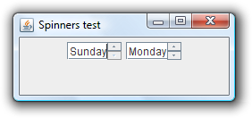
- Text fields and formatted text fields with simple documents, including default editors for editable combo boxes
- Decorated title panes for frames, dialogs, internal frames and desktop icons
- Slider labels
- Table headers
- Tooltips
- Components from the Flamingo component suite such as command buttons and ribbon
If you’re interested in testing this implementation, you need to do the following:
- Download the substance-bramble.jar here and add it to the classpath of your application.
- Add the org.eclipse.swt.win32 jar to the classpath of your application. Bramble distribution bundles this jar from Eclipse 3.2.1 in the ‘lib’ folder.
- Extract the matching swt-win32.dll and add it to the java.library.path of your runtime configuration. Bramble distribution bundles this DLL from Eclipse 3.2.1 in the ‘lib’ folder.
- Configure your application to run under the latest 4.2dev drop of Substance look and feel.
If you run into any issues with components mentioned above or custom cell renderers / editors, i would be more than interested hearing about it. The plugin is distributed under the Eclipse Public License (EPL).