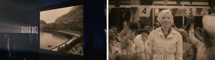
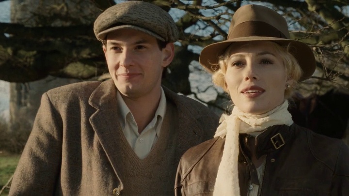
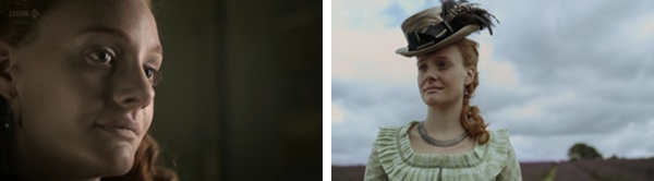
“Easy Virtue” is set in the late 1920s, following the story of a young American race driver played by Jessica Biel as, after an impetuous marriage, she arrives with her husband to his family home. A battle of wits between her and his mother starts almost immediately, swinging between comedy, romance and, at times, melancholy. The title sequence sets a nice visual mood, transitioning from the balcony view of an old movie theater into a semi-documentary scene of Monte Carlo racing, all set in faded sepia monochrome colors:
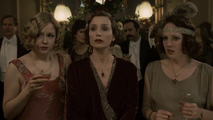
Stylish costumes and striking bleach blonde hair arrangement are reminiscent of Hollywood glamour era of Mae West and Jean Harlow:
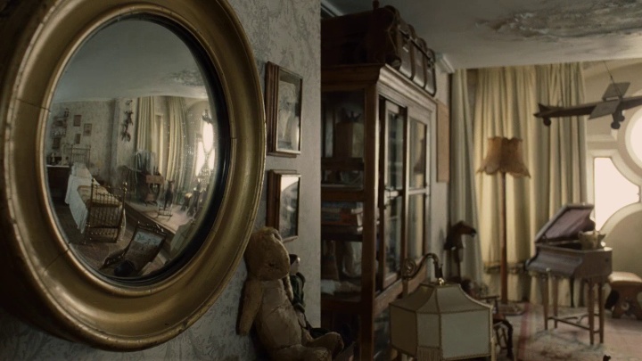
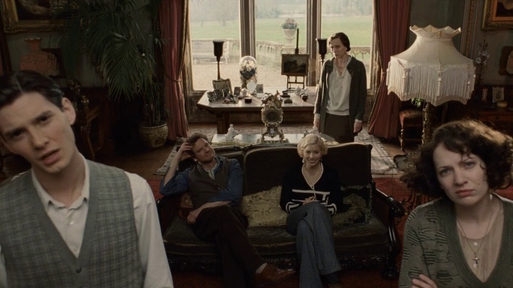
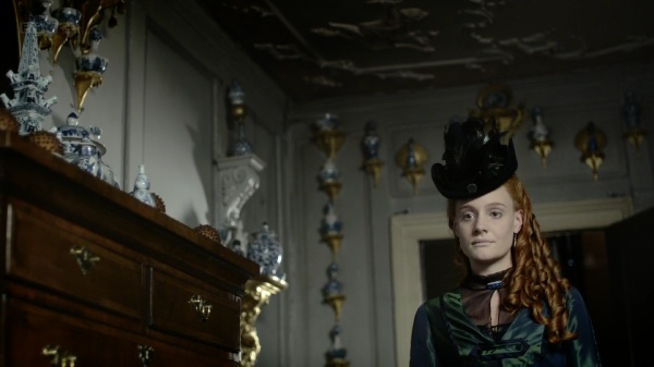
The family house is a vast mansion crowded by furniture, hunting artifacts, embroidery, sculptures and never-ending book shelves. As the camera moves between the rooms, it lingers on ornamental mirrors, adding yet another layer of depth to the beautifully arranged interiors:
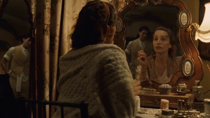
Mirrors play a central role in one of the more emotionally charged scenes; the camera catches the two characters in both mirrors, while they are talking to each other’s reflections. Also note the rich beige-brown color palette with just a touch of golden sand:
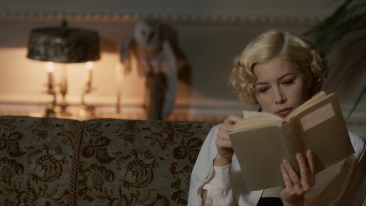
Jessica Biel’s character, Larita, struggles to find her place in this turbidly quiet setting, resorting to spend her time reading books and waiting to get back to the bustling landscapes of the big cities. Note how much lighter the color palette of this scene is when all heavy wooden browns are taken from it; even the deep vermillion brown of the upholstery is very relaxing:
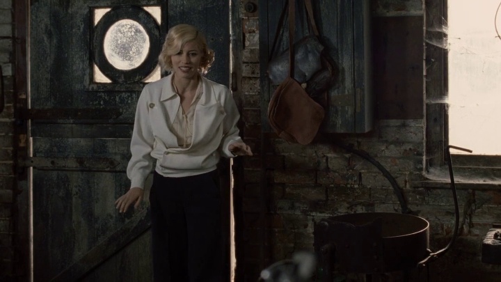
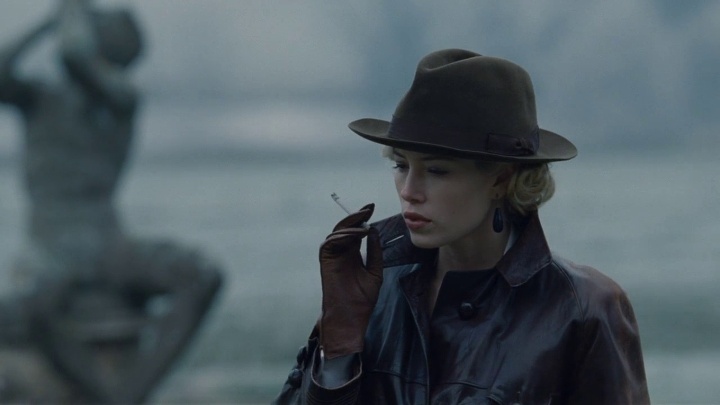
Larita finds a few moments of peace in a rather unexpected place – the garage where her father-in-law (played by Colin Firth) spends his days away from the family. Note the much cooler soothing grays with an almost imperceptible touch or laurel green:
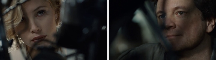
This is one of my favorite scenes, and the only one where there is any real intimacy in human conversation. This is also the only place where the shallow depth of field places the viewer directly behind the blurry pieces in front of the main characters:
As Larita’s struggle to convince her husband to leave stretches into the winter, so does the entire visual mood of the movie. Here, a rare outside scene with the sun washing their faces and green moss covering the branches:
And here a much more subdued mood, with heavy browns and blues taking over:
I am quite fortunate that Mark Scruton, the art director responsible for these beautiful sets, agreed to answer a few questions about the movie itself and the industry in general.
 Kirill: Tell us a little bit about yourself
Mark: I’m a freelance Art Director living and working in London. I wanted to work in the film industry ever since I watched “Krakatoa: East of Java” at the age of 6. I trained at the Bournemouth Film School and have been working in the industry for the last 15 years. In that time I’ve had the privilege to work on a wide selection of challenging projects.
Kirill: Can you elaborate on the initial design phase where you work with other production departments to define the visual language for each movie scene?
Mark: Filmmaking is always a team effort. One department can never exist in a vacuum. This was especially so on “East Virtue”. Stephan Elliott, the director, had very clear ideas on the look and style of the film right down to specific dressing and even colours. Obviously this was a period movie, which gives each department an immediate starting point but Stephan wanted to play with this. He wanted to use a more modern style of filming and he wanted to play with the period look to establish the differences between the characters. John Beard the designer, Niamh Coulter the set decorator and myself spent a long time in pre production visiting locations with the director and DOP (director of photography) trying to find just the right style of environment that also gave him the angles and relationships within the layout for what he wanted to achieve. There is no point in finding an amazing location if you all turn up and you can’t film it!
Kirill: Do you spend time designing and refining a complete set, even if some parts of it will never be captured on camera?
Mark: Yes, more so these days than ever before, for various reasons. Attention to detail and creating a “complete” environment is vital if a set is to be believable to an increasingly sophisticated audience but also to the cast and to some extent the crew as well. Film making is a lot more organic than it used to be and there is never any guarantee that when a director arrives on set he won’t turn his camera 180 degrees in the opposite direction, so you have to be covered. That said if it’s a tiny scene and you have a limited budget you have to try and cut your cloth accordingly. It’s always a bit of a balancing act.
Kirill: “Easy Virtue” takes place not long after the First World War. How do you research and recreate a look of days long gone? Do you strive for complete authenticity?
Mark: When you’re doing a period film the design is entirely led by research and you always aim for complete authenticity. Research is normally a mix of reference books, expert advice and personal knowledge. On “Easy Virtue” things were a little different though, as Stephan wanted to emphasize the difference in the characters using amongst other things, the props and dressing. So we had a bracketed time period rather than one specific date. The idea being that the Whitaker household was at one end and Jessica Biel’s character, Larita was very much at the other. Her car, accessories and wardrobe were all about 10-15 years later than everything else in the film and were specifically chosen for their “futuristic” look. The idea was to make her character look extremely incongruous and the Whitaker family, look antiquated and stale.
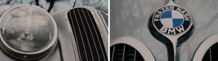
Kirill: Vintage cars and motorcycles are featured amply throughout the movie as the main passion of Jessica Biel’s character. Do studios have vast stocks of these vehicles, or do you obtain access via more exotic means (museums, private collectors, plaster molds on modern cars)?
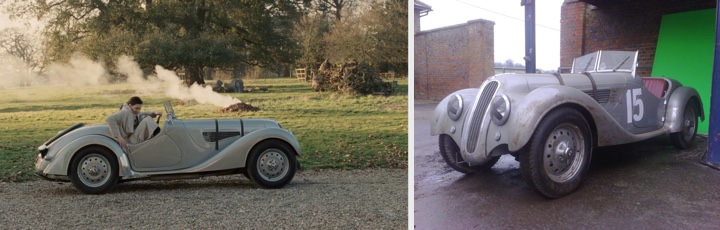
Mark: Nearly all-period vehicles on films are sourced from collectors or enthusiasts. Michael Geary was our action vehicle co-coordinator. He helped us track down the specific cars required or gave us options based on our brief. Jessica Biel’s car was the hardest. It needed to be silver, stylish & conceivably usable as a racing car but also needed to be a two seater with a trunk, not very common even for the later time period that applied to her character. We ended up using the BMW 328 as it fitted all the criteria except it’s production dates were slightly later than we wanted but it was too good not to use. In the end it all helped to highlight the differences of Larita’s world even further and it was a beautiful car. We used this device again with her motorbike. The bike she finally rides at the hunt is actually a later model than the one she is seen working on with Colin Firth. It was faster and more able to cope with the off road terrain plus it created a far greater juxtaposition with the horses.
Kirill: Apart from a few short scenes, the story takes place inside the spacious family house. How does a limited environment affect your designs for scenes with different emotional moods?
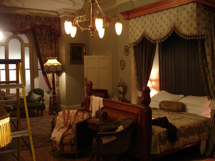
Mark: The house was in fact three different houses, chosen specifically for this reason. No one house had all the right scale rooms and exteriors for what we required. Blending different locations meant we could have exactly what we wanted in terms of scale and look. Even with this freedom we still couldn’t find the right environment for the re decorated suite of rooms that Mrs. Whitaker offers up to John & Larita. So we built it as a set within the theatre hall that would later become the “War Widows Review.” All the different locations were linked by pieces of set that carried the architecture through from one house to the next so hopefully audiences were none the wiser.
Kirill: Do you find yourself planning unrealistically large indoor sets to accommodate multiple camera angles and wide shots showing group scenes?
Mark: If you are building sets you normally have the flexibility of wild walls. That is, stretches of wall that can be removed to allow crew, equipment & camera to be outside the room you are filming in. If you are on location you always consider this and plan accordingly. Sometimes it can get a bit cozy in the smaller rooms but there is normally a way of getting what you want.
Kirill: Your work has spanned multiple genres, from Geonosis dungeons in “Star Wars” to stalactite caverns in “The descent”. Do you seek challenge working in such a variety of target environments?
Mark: The variety is one of the things I like about this industry. As a jobbing Art Director with a mortgage you generally have to take the work that comes your way. I’ve been lucky that most of the projects I’ve worked on have been varied and interesting, one minute you’re researching the past next you are inventing the future. It’s all part of the fun.
Kirill: Your portfolio shows an impressive level of detail in your sketches and final constructed sets for TV commercials. How different is your approach for these extremely short, but very frequently viewed spots?
Mark: In dollars per second, commercials can be as, if not more expensive than some films and will probably receive more scrutiny. You have three tiers of decision making, client, ad agency & director – all of whom have their own ideas. So they require as mush attention to detail as a film if not more, plus you are normally working within a corporate identity, which is often tricky to balance against the director’s creative requirements. It can make life very interesting.
Kirill: How is the movie production craft changing with progressively more movies shot on green screens, creating the entire environments with digital tools?
Mark: Certainly we are entering a new era of movie making. The digital palette is growing at a rapid pace. The film I have just finished was a very interesting mix of traditional movie making, tried and tested VFX and absolute cutting edge technology. If the whole thing comes together it will definitely open up some new and exciting possibilities. However I think movies will always be shot in a manner that is appropriate to the subject and story. “Easy Virtue” would be shot roughly the same way if were shot now, or in 20 years time.
Kirill: What are your favorite movies over the years that you can recommend us?
Mark: That is such a broad question, as different movie resonate at different points in your life. I guess the two that have had the greatest impact (aside from Krakatoa & Star Wars) have been Terry Gilliam’s “Brazil” & Terrence Malick’s “The Thin Red Line”. Both movies had a profound effect on me when I first saw them and I still find things in them that amaze me.
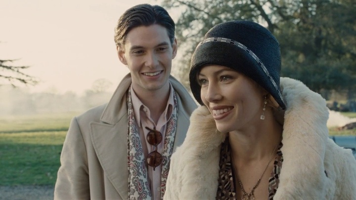
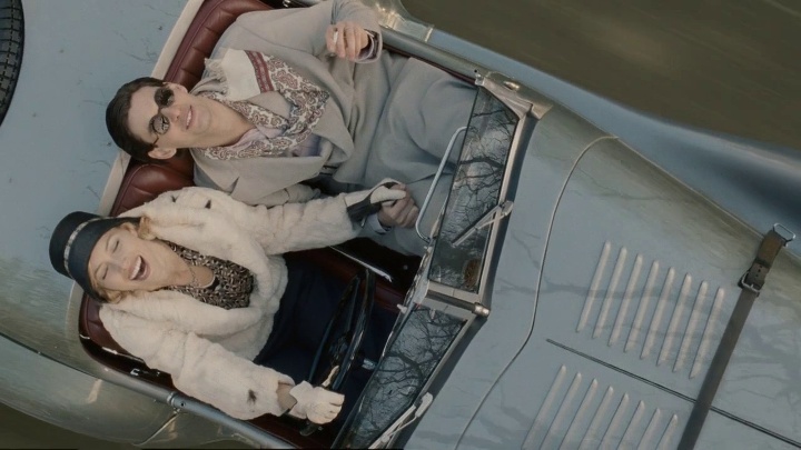
I’d like to thank Mark once again for his wonderful work on this movie, and for graciously agreeing to this interview. You can visit his portfolio page for “Easy Virtue” to view additional sketches and photographs. And here i want to leave you with another one of my favorites. A scene that lasts, perhaps, a mere 10-15 seconds, but manages to convey so much joy, energy and youthfulness of the blissful couple, just before they are sucked in to a power struggle that slowly corrodes their marriage:
Production design: John Beard
Art direction: Mark Scruton
Set decoration: Niamh Coulter
Costume design: Charlotte Walter
Cinematography: Martin Kenzie
Director: Stephan Elliott
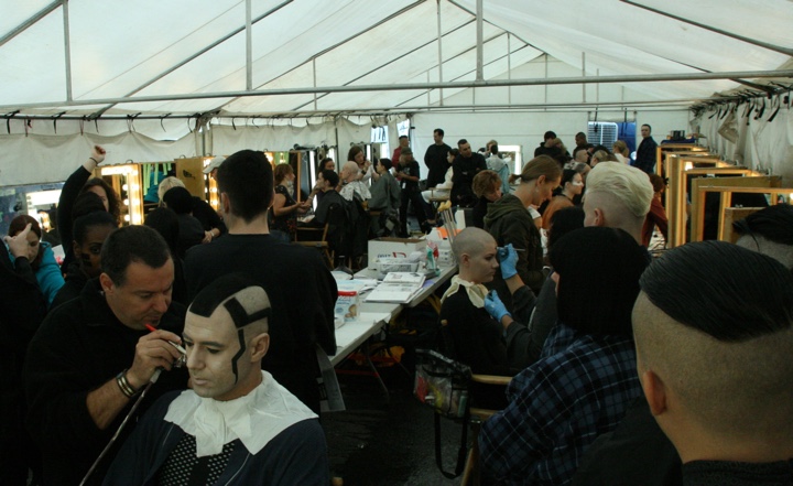
It seems like every time I watch “Tron: Legacy”, I find yet another visual layer to explore and enjoy. After talking with GMUNK about the visual effects, it’s time to take a deep dive into the beautiful world of Tron make-up. With X-Men, Fantastic 4, Watchmen, Sucker Punch, Tron: Legacy and the upcoming Underworld (just to name a few), Rosalina Da Silva has one of the most impressive resumes in the world of big budget sci-fi movies in the last decade. I’m very honored to host a conversation with Rosalina, starting from her work on Tron and later touching on the general craft of big screen make-up wizardry.
Kirill: Can you walk us through the process of interacting with different art departments and defining the visual look of the movie and the characters?
Rosalina: It depends. Sometimes I’m given a script, and other times – for example for Sucker Punch – I had access to a DVD that showed the concept and vision of the director. You start working on the script or these materials, and in general you do a lot of research. I research photographers, for example David LaChapelle and others that are very creative in the looks that they achieve. I go through different types of magazines and movies, trying to create something. I research the latest make-up looks of the European runways, I watch what the make-up artists are doing on those shows – it’s always a great inspiration. You cannot bring those shows to the screen, but you certainly be inspired by them.
 Kirill: Do you pitch a few different looks?
Rosalina: Usually i’ll build a book for the movie i’m working on with images and tearsheets from magazines, and i’ll show my ideas to the director, and then he’ll let me know if i’m on the right track. We start there and then narrow in given the director’s feedback and the look that he wants. Then we start testing and testing and testing and trying to achieve the look that they want. We’ll do the make-up tests to see how it looks on the screen; when you put it on the screen it’s different from how it looks on paper.
Kirill: At which point do you start working with hair stylist and costume designer?
Rosalina: Pretty much straight away. Makeup and hair stylist / designers usually get hired at the same time. Often the costume department starts earlier, so when we go in, we look through their sketches and the color scheme that they’re going for; that’s another inspirational point to look at everything they’ve done so far. And the same is true production designers and everybody else – Often they’ve been in production for months and had a lot of meetings. You look at the sketches and their vision for the movie, and that’s your main source of inspiration for the movie – to complement the work that they’re doing.
Kirill: Do you tweak your work based on the actual set lighting or preliminary post-production treatment?
Rosalina: Usually we tweak the looks once we get the actors. Sometimes the look does not complement the actor, so when they come in, we try to put our ideas on the skin and facial structure and make sure it all works together. They also have an opinion which we listen to, and then we do the make-up tests on screen.
Kirill: And you’re on the set every single day?
Rosalina: Exactly. We come in in the morning before everybody else, we get the actors ready for the day and then we go on set. Sometimes there are changes throughout the day if they shoot different parts of the movie, so you have to change the look, adding or taking off what is necessary.
Kirill: As I was looking for some background on your work, I happened upon a site that details dozens of products that go into the final look for one character. How much do you need every day to create that look?
Rosalina: Obviously the production wants to make it as fast as possible. The actors need to have some time off, and there’s only so many hours during the day that they can shoot, and of course they’d rather have them on set rather than sitting in the make-up chair. Some looks can be done in an hour or an hour and a half, including make-up, hair and wardrobe. It depends on how intricate the look is and how much works has to be done.
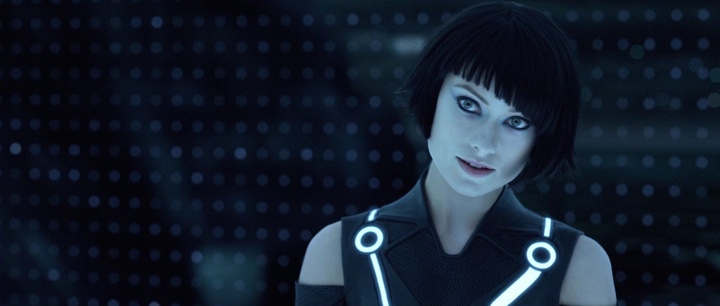
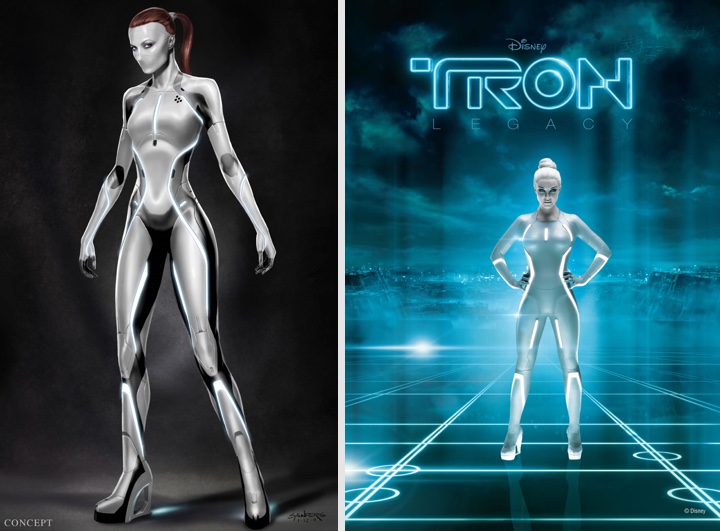
Kirill: Most of the story happens in a computer world, with very stylish black and white environment and precise lines. Was it an interesting challenge to create a look for what are essentially computer program characters?
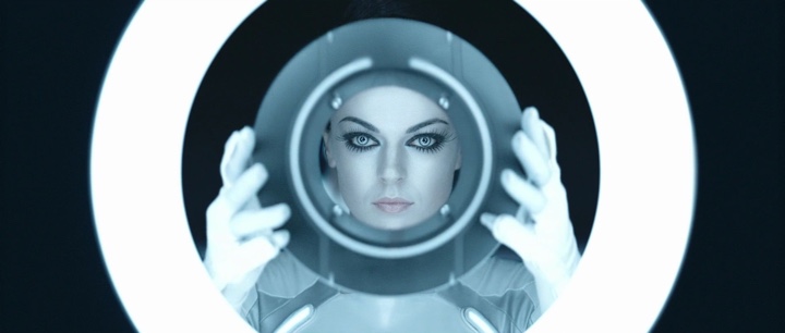
Rosalina: Absolutely. Honestly, when I first read the script I didn’t know what to do. It was challenging for me at the beginning. But as I said, the costumes had already been designed, so I started looking at the sketches. Our director [Joseph Kosinski] has background in architecture and he loves simple straight lines. I knew that whatever we had to do for him had to be very clean and streamlined. And since it was all very new to me, with computer world and a 3D production, I had to keep it very simple to make it stunning, sexy, beautiful and appealing to the eye. So me and my team started to work, and we decided to keep it monochromatic – the colors of the grid – and to develop the black and white make-up with straight lines.
Kirill: It resonates nicely with the binary nature of the computer world, zeroes and ones, black and white.
Rosalina: It was that. You look inside the computer and you see the structural grid, and you take all the little shapes from there and create those shapes on different faces.
Kirill: When you start with the surrounding set design and costume, how much freedom do you have in designing the looks of the specific characters?
Rosalina: I had all the freedom that I wanted, being inspired by this. The challenge is to work with the costumes, to make sure that this person looks amazing with the costume, the make-up and the hair.
Kirill: Even when you remove all the skin and lip color?
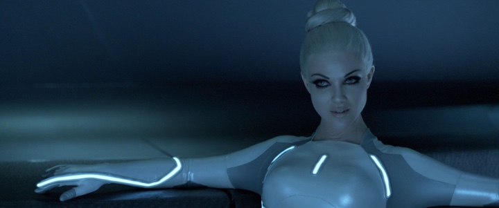
Rosalina: Exactly. The original design concept of the Sirens had a mask over their mouth – but that was not looking quite right. Things evolved and changed, and I decided to go for a nude lip, to create a naked look on a shapeless face, removing any redness on the lips, making it blend and bringing a lot of attention to the eyes. I wanted them to be dolls, since they were made by the other characters – flawless dolls with big eyes, just stunning women.
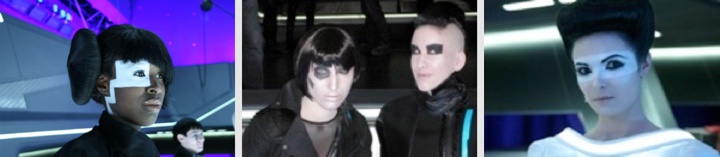
Kirill: The club scene in the “End of Line” has a lot of supporting cast, and every single one of them has his or her own style. How much effort do you spend on the supporting characters and how important is it to have a complete look for everybody?
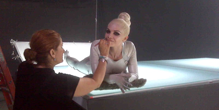
Rosalina: Very important since they are part of the scene since they must belong there and support the main cast. On the day we were doing that scene we had 21 make-up artists to get everybody ready. Everybody was fitted for hair, make-up and wardrobe to suit the whole look, and every single make-up was designed prior to that day. We put all the looks in a book, showing it to the director every day or so, and he would choose the looks that appealed to him.
Kirill: Do you work with stand-in replacements for a big scene like this?
Rosalina: We used the actual background actors. They would come in for fitting, and he or she would be designed on. They came for 3-4 days before starting the shooting, and we designed every single face.
Kirill: A scene like this is not shot in one day?
Rosalina: It takes a few days to shoot such a scene, maybe a week. We had quite a few scenes where the challenge is to make sure that different actors in different scenes do not have the same look. We had different types of programs in the script and we didn’t even have common names for them like people do. The whole script was computer language, and it was quite a bit of a challenge for me [laughs].
Kirill: For these multi-day scenes, how do you make sure that the look is consistent for the final cut?
Rosalina: We make charts to help with the continuity of the of the make-up…on a day to day basis, taking close-up photos and writing down everything we do – to have full references. We do continuity photos for everyone, not only for the next day, but also for reshoots six months later. We reshot some of the scenes in the lightcycle game, and you can barely see it.
Kirill: That’s the best outcome where the viewers can’t tell. What’s the reason for the reshoots?
Rosalina: Sometimes during the editing they want to make a scene more complete and have extra footage. Sometimes you want to develop or enhance a character a little bit more. This comes up at the end of the shoot when they start editing and putting the movie together. It hardly ever happens that there are no reshoots.
Kirill: I saw a few faces with deep scars running across. Was it part make-up, part computer-generated?
Rosalina: That was Bill Terezakis who designed the scars and the half-face man. The scar was fully make-up, and the half-face man was computer graphics together with make-up.
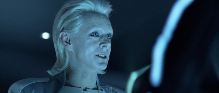
Kirill: Is it more fun to work on villain characters, like Castor and Jarvis?
Rosalina: Both characters were very challenging. We shaved James Frain’s head and bleached his eyebrows for his Jarvis character; most people don’t know who he is. And Michael Sheen underwent a total transformation as well, with the wig and full beauty make-up. He was wonderful to collaborate with, giving us ideas and taking inspiration from Ziggy Stardust. The Sirens were also very challenging and fun make-up to do. I kept Garrett very simple; as a human it was very important that he didn’t look like anybody else on the grid. I did a little bit of corrective make-up to just show off his good looks. Quorra could not look like a Siren, she had to be more human. She was undercover, hidden away, so she had to look different, but not very noticeably different. Olivia Wilde is a stunningly beautiful woman, and we had a lot of choice with her character.
Kirill: How did it feel to see the complete look on the set?
Rosalina: We went to the set for the nightclub scene, and my jaw just dropped. I have a group of very talented make-up artists that give me their best. I put my ideas, but at the end of the day they execute the job. So you never know how it will look like until you get to the set. I did my actors and arrived at the set, and it was absolutely amazing. To see the whole thing, the costumes, the make-up, the sets, everything together was just amazing. We were sitting in the basement for over a month creating, designing and developing looks and one of the producers said to me: “So this is what you’ve been doing?”
Kirill: Now that we’ve talked about Tron, perhaps we can turn to a more general conversation. You’ve started in the late 80s and 90s on TV movies and then transitioned to the big Hollywood productions. Was there any specific reason for this move?
Rosalina: You always want to do bigger and better, and that was it for me. I always look for the opportunities to work with amazing creative people. I believe that the ultimate product is the combination of a lot of people working very hard and working very well together. It just happened that I transitioned to work on sci-fi movies; I was just lucky to get those calls. You build a body of work and you keep on going and working very hard, and then you get the job and you’re very thankful. Many years ago in the television we didn’t have a lot of challenges in make-up, but nowadays people are doing beautiful work. And it was certainly great to venture to the big screen and do all this work. I am grateful every single day to have this chance.
Kirill: Is your work made more difficult by the high-definition projection systems, TV sets and BluRay discs where the viewers can see every single pore on the actors’ faces?
Rosalina: Yes, you have to think about this really seriously. You have to make good product choices, to choose the products that suit the screen. Everything – the big screens, high definition, 3D – is making your work very difficult. What I try to do is to go easy and simple, to do the simplest design I possibly can and leave as little room as possible for errors. The worst thing is the difficult skin with pores, pimples or breakouts that you cannot hide. Lighting plays the biggest part, it can make your job look beautiful or bad. I leave the lighting to experts and my job is to bring any particular challenge that I have to their attention and ask for their help. Otherwise I watch and learn and adapt.
Kirill: “Sucker Punch” is your latest release. Was it more fun working with colorful palettes for all the girls?
Rosalina: We went from one extreme to another. Zack Snyder is a genius director. He gave me a carte blanche, saying that he wants it to be very theatrical and big. The question is how much is too much – you just push the envelope and listen to what he says. My job as the make-up artist is to bring the director’s vision to the screen, to learn from the script what is the vision and do the best I can in order to create that.
Kirill: Are male actors less open to the experimentation with make-up?
Rosalina: The male actors in my last two movies were very willing to wear a lot of make-up. All the boys in “Sucker Punch” wore make-up, it was very theatrical, very film noire. And the same for the male characters in “Underworld” that I just did. This is especially true when you’re working with theater actors that are used to wearing make-up and playing different characters – they love to explore and they love to look in the mirror and see the character.
Kirill: And before that you worked, among the rest, on two “X-Men” movies. These movies have the human characters that transform into different mutants with non-human skin and faces. Do you have make-up artists creating the facial look and expressions for those characters?
Rosalina: There was a separate team working on the mutant characters, together with the visual effects people. The make-up artists take a look to a certain point, and then the VFX comes in and takes it further. You take it to a particular point, as far as the skin tone and shading, as far as you can and then hand it over to the visual effects. I also worked on the movies with prosthetic pieces and aging, where a separate team would apply the pieces and i’d do the make-up on top of the pieces to keep the continuity. For example, on “Watchmen” when Carla Gugino ages, Greg Cannom did the aging pieces and the I did the beauty make-up on top of it to keep the whole look.
Kirill: The advances in the capabilities of visual effects make it possible to go beyond non-human characters and experiment in creating fully computer-generated human ones. For example, the CLU character in Tron is a younger “version” of Jeff Bridges. Do you think that a human face can be done realistically at the present moment or in the near future?
Rosalina: Maybe in the future. I think it’s still very questionable and not completely perfected. Of course everything changes, and every six months there’s a new way of doing things; it’s unbelievable how fast visual effects evolve. It’s the eyes, the mouth and the skin texture. I think the skin texture is hard to achieve, and it always looks so smooth and plastic while in reality it’s not quite like that. But whatever they do is amazing, we couldn’t even think about doing that years ago.
Kirill: And in the future where these capabilities are more realistic, how is your craft affected? Do you see make-up artists reduced to specifying the overall look, and the post-production stage applying that look?
Rosalina: I hope that never arrives. I hope the human touch is always there. I think there’ll be a place where you take the artists in the morning and you transform them visually in the computer, but it’s going to be incredibly expensive. In my humble opinion, there’ll always be place for the human touch and contact.
Kirill: It’s quite fascinating to see how the landscape of movie making is changing as compared to a few decades ago. Can you recommend a few movies that keep on inspiring you?
Rosalina: If you think about any of the old movies, like “Casablanca” or any of Fellini movies, don’t we reminisce about how wonderful they are? The contrast was quite amazing, with very blunt use of saturated colors. When I do my research for movies, I always watch Fellini to get inspiration. “Sweet Charity” with Shirley MacLaine is the first movie he did in US and I just love the incredibly beautiful visuals. I like to watch the old French “Casino Royale” with Ursula Andress and David Niven, it’s visually stunning. “Juliet of the Spirits” was the first movie were Fellini used color and “8½” are some of my favorites. “La Dolce Vita” of course. How can you not watch “La Dolce Vita” with Marcello Mastroianni. And “Fellini’s Roma” is another great one.

You can find Rosalina Da Silva on her blog A More Beautiful Makeup, on Facebook and on Twitter.
Who am I? I am Sugar. I am what you would call a fallen woman. But I assure you I did not fall. I was pushed…
This is the tagline of “The Crimson Petal and the White”, a mini-series that unfolds the story of a young prostitute named Sugar living in London in 1875. Played by Romola Garai, the young girl chances upon a married heir to the family perfume business and uses her passion for literature to ensnare his mind away from the unstable situation at home. Pushing the limits of broadcasting censorship, “Crimson Petal” offers an unfettered look at the lives of rich and poor – alternating between unsettling and riveting, revolting and fascinating, voyeuristic and enchanting.
Sugar’s fiery golden tresses highlight the sensuous setting of the local brothel, with deep reds, greens and golden browns welcoming the customers onto the premises.
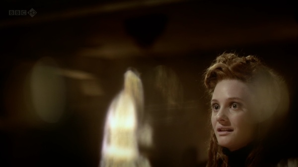
The first encounter between Sugar and William Rackham places the viewer at a nearby table, with dancing candlelight flames and blurred reflections framing her face. As she deftly weaves the conversation and plays to his vanity, the camera never goes below her neck, highlighting his noetic enchantment with Sugar.
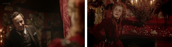
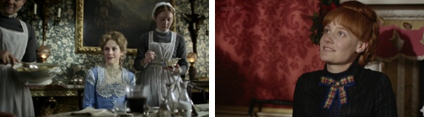
This is the beginning of a scene where Rackham talks to the brothel’s mistress, offering a full patronage arrangement for Sugar. While the conversation is very detached, deep reds and yellows highlight the very intimate nature of the transaction. Note the richness of the dress, chandelier and the tapestry – all in the area that welcomes the customers.
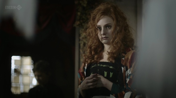
As Sugar herself is listening to the conversation, the camera places the viewer half peeking from behind a curtain. The cool colors of the environment – turning her fiery hair into sand brown – highlight her emotional detachment from the impending transaction. She has been planning this move all along, deftly planting the idea seed in his mind. All that is left to do is to complete the deal.
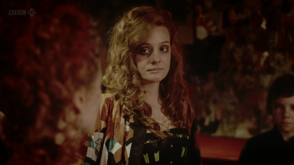
And here she is, a few moments later, entering the scene and “adopting” the rich sensual palette that washes her hair and face in deep ember. This color transition from warm to cool and back to warm is one of the best color sequences in “Crimson Petal” and is certainly worth rewinding a couple of times.
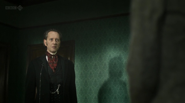
With Rackham back at his house, Sugar bids farewell to the mistress. A short conversation reveals many intimate details, including how the mistress (which is also her mother) pushed her to sell her body. The dialog is brief and very cold, and is washed in desaturated browns, cool blues and soft yellows – with not a single hint of a warm color anywhere in the frame.
As the story begins to unfold in the winter, the outside scenes in the Victorian slums are dominated by grays tinged with sea green.
Even these few short moments that the main characters spend outside are enough to show the destitution and despair that engulfs the poor parts of the capital. The stark contrast to the lush interiors of the Rackham residency is just another reminder of why Sugar is so desperate to claw her way out of this misery.
As Sugar’s plan begins to materialize, the plot gives additional meaning to the name of the series (and the book it is based upon). Michel Faber that wrote the original book explains the many meanings of the name:
It comes from a Tennyson poem that begins “Now sleeps the crimson petal, now the white”. But the poem has no particular relevance to my story. I like the complexity of associations suggested by crimson and white—Sugar is a “scarlet woman” but she is mistaken for an angel by Agnes Rackham, and is also desperate to move into a new life that’s respectable and innocent. Agnes is, by birth and inclination, pure white, but is troubled by the phenomenon of blood. William uses and destroys petals of both colours in his profession of perfume manufacture.
This is just one of many scenes that happen in the Agnes’s bedroom. Bedridden with frail body and mind, she spends most of her time surrounded by the sea-green floral patterns of the wallpaper, oppressed by the frequent visitors of the family doctor.
Elsewhere in the house, the wallpapers and tapestry are much lighter and warmer, with bright patterns dominating the dining room and mahogany red wrapping the main family room.
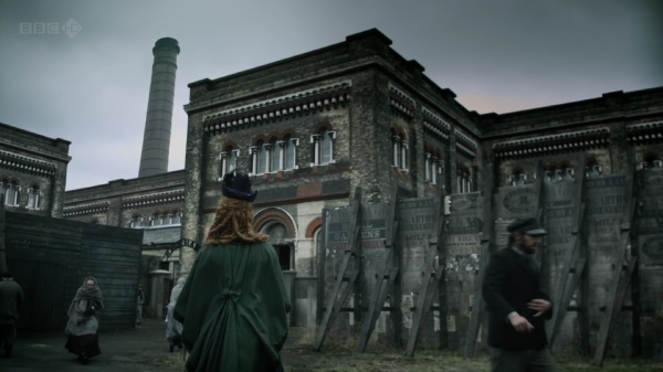
This is one of my favorite shots. This is the outside of Rackham’s factory that packages various perfumery products for domestic and international shipping. As inconspicuous and slightly decrepit as it is on the outside, it only serves to enhance the visual impact of the interior design, with its immaculate color palette, ornamental embellishments and intricate woodwork:
Luke Dunkley did the editing for this wonderful mini-series, and you can imagine how delighted i was when he graciously agreed to answer a few questions I had about his work on “Crimson Petal”
Kirill: Tell us a little bit about yourself and your busy schedule.
Luke: I’m a freelancer of TV drama and have been for 15 years. Budgets have steadily been reducing in real terms so schedules become ever more squeezed. So I find myself in the cutting room from pretty early to late in the evening.
Kirill: As the editor, how important is it to spend your time on the set reviewing the daily shoots?
Luke: I spend very little time on set. In fact I feel like a spare part when I’m there as there’s nothing for me to do except be positive about the dailies I’ve been given. There is the odd occasion where it’s necessary to visit the set for a specific problem but they’re rare. However, reviewing the dailies is terribly important; I need to be able to watch them and give constructive feedback to the director on set. Feedback can range from coverage (the lack of it and whether it will cut together as a story and whether we need any pickups) to an actors performance up to the look of the show.
Kirill: Given how much time you spend with the director during the post production stage, is there a special bond of trust that is developed?
Luke: Definitely. It’s essential. The more you work with a director the easier it is to interpret their vision. You build a trust that works both ways; so if I say something isn’t working, even if the director loves it, then they will listen. They won’t always change it but they will listen. Plus, if you’re with one person for 12/16 weeks you have to have fun.
Kirill: You’re mostly doing TV productions for BBC these days. Knowing the hard limits on each episode length, how far is the editor’s cut from the final product that the viewers see on the screen?
Luke: By editor’s cut you mean the 1st assembly I think. That is always 10 to 20 percent longer than the final product. It’s usually in scripted order and it has what I call fat in it. As an editor you know from that assembly where you want to make trims, add music, move scenes and generally start shaping it. Depending on the director you could do that before they see it in scripted form or, if they trust you, you can start shaping it before the end of the shoot. Mostly I’m somewhere in the middle.
Kirill: On a related note, how different are editor’s days between the movie and TV productions?
Luke: None really. They’re all long.
Kirill: How much of the eerie atmosphere of “fallen” London streets and the opulence of the upper class surroundings was done during the post production? Is it mostly the right selection of camera equipment or dynamic software processing?
Luke: Obviously the design was a huge factor, which meant that Lol Crawley (director of photography / DOP) could shoot it in a particular fashion. What we did in post was a combination of sound, light and image manipulation. Very early I started playing with the idea of drones. I sent Marc Munden (director) a cd of about 90 drones that he loved (not all of them). We added them to scenes for atmosphere and tension. Lol (DOP) and Grant Montgomery (designer) did such a fantastic job that when it came to grading the series they had a great deal of scope. And finally image manipulation; there are about 50 shots per episode that we changed from their original format. This might have been as simple as adding a zoom, but occasionally I would stretch an image (a bit like a circus mirror) to hopefully add unease. You can’t stretch it too much though or it looks silly.
Kirill: What part do the advances in professional editing software play in merging all editing responsibilities in the hands of a single editor? What are your current tools of trade?
Luke: I’m currently using Avid media composer and have done for years. I like to think that the tool doesn’t make that much difference it just makes you quicker (I can cut as quickly as I think). Obviously nowadays you are expected to add temp music, vfx and sfx and this is made easier in the non-linear world.
Kirill: “Crimson Petal” has a lot of close-ups with dynamic focus and lighting effects. Is this something that you’re doing during editing, dynamically altering the frame selection and applying various continuous effects?
Luke: Not really. Lol used 1970s Prime Canon lenses that had a very shallow depth of field and a slight softness to them. I thought it looked great but you should ask him about that.
Kirill: Some of the productions you’ve worked on (including this one) are adaptations of much lengthier books that have the luxury of conveying characters inner thoughts. How far can you as the editor take an adapted script and use the visual tools at your disposal to bring the viewer closer to the original complexity?
Luke: It’s very hard, especially if there’s an inner voice. you can get round that with voiceover/narration, but that is very much down to the screenplay/script.
Kirill: Some people spend inordinate amount of time ferreting the smallest physical discontinuities, even if they don’t matter for engaging the viewers in the emotional story lines. Is this something that bothers you?
Luke: Not at all. If someone is overly concerned with continuity then we have failed them because they’re not engrossed in the story. There’s a very obvious continuity jump in Crimson where Mark Gatiss’ character knocks over a teapot and the proceeding shot it’s upright. We kept it in because on numerous viewings it was never noticed, people were watching the actors not the props. The best take for performance is always the priority.
Kirill: Can you recommend a few of the productions (movies or TV) that have particularly impressed you?
Luke: There a whole host coming out at the moment that are very good, I think British drama is in rude health. I’m particularly enjoying the Shadow Line at the moment.
Kirill: What’s next for Luke Dunkley? What are you working on these days?
Luke: Currently I’m working on the first three episodes of a new BBC3 series called The Fades. A graphic comedy horror – should be on screen in September.
And here i’d like to thank Luke for his work on this production, and once again for taking the time to do the interview. As for the readers – i hope you enjoy the series as much as i did.
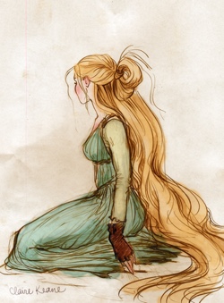
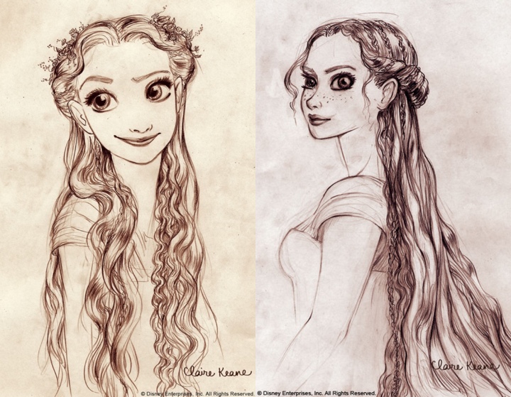
If you’re new here, let me introduce myself – I’m a giant fan of “Tangled”. It doesn’t happen a lot, but when it does, it sweeps you off your feet. A visual journey so wonderful that you catch yourself watching it over and over again, discovering yet another subtle layer of colors, textures, strokes and shapes. A splendid feast for your eyes that passes by in a blink of an eye without you noticing how the time has passed. In short, a movie that sets the bar so high that you never expect another movie in the same genre to be quite on the same level.
So you can only imagine my excitement when Claire Keane has graciously agreed to answer a few questions i had about her work on “Tangled” and the animation industry in general. Going under the rather dry title of “conceptual artist”, Claire’s work spans the entire movie, from the leading characters to Rapunzel’s surroundings – not to mention the intricate details of her magic hair.
Kirill: Tell us about yourself.
 Claire: I grew up in southern California until the age of 16 when my family decided to move to France for a year. After one year our family loved Paris so much we stayed many years thereafter. After graduating from the American School of Paris I went to Parsons School of Design in Paris for one year thinking I would like to go into fashion design but soon enrolled in the Ecole Superieure D’arts Graphiques realizing that illustrating and drawing was really my passion. In my fifth year at ESAG, I chose to write and illustrate a fairytale book for my thesis project. It wasn’t until then that I realized how much I loved the development phase of a project. When “Tangled” came to the point where they needed to bring people on to develop Rapunzel’s world I was ready to go with my thesis project in hand as my portfolio.
Kirill: How long have you been working on Rapunzel? Has it been an all-consuming adventure or a more structured “work” project?
Claire: I worked on Tangled (Rapunzel) for 6 years with a small break to do some work on Enchanted. Working on Tangled was an all-consuming adventure – I like it best that way.
Kirill: Where do you find your inspiration?
Claire: I usually find inspiration in other artists. A few that I tend to come back to a lot are: Matisse, Rembrandt, Klimt, Marie Laurencin, Ronald Searle.
Kirill: What is your preferred drawing medium and why?
Claire: I love pen and ink for the simplicity of being able to do it anywhere but since I’ve started using photoshop so much I have become completely addicted to the undo button… and I find it very hard getting back into using *real* medium again.
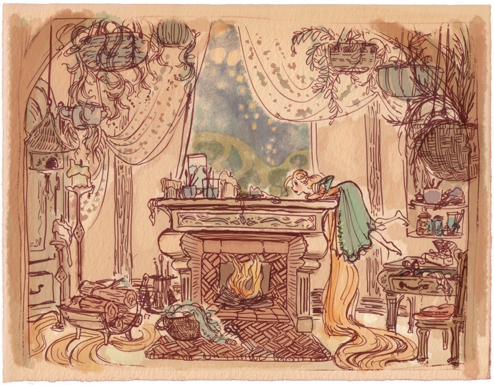
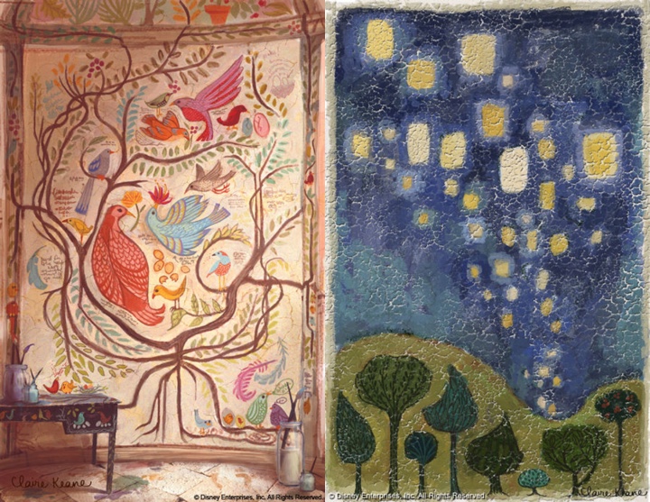
Kirill: How do you recreate the world as seen through the eyes of a girl that has spent all her life locked away in a tower? How much of yourself have you channeled into the fabulous wall paintings?
Claire: For Rapunzel I drew my inspiration from my own life. Early on I realized that the paintings on Rapunzel’s walls were going to be a representation of Rapunzel’s personality and her subconscious thoughts and desires. To be able to accomplish that I felt I really needed to know who she was. I ended up carrying a sketch diary with me on my free time to document what I was doing when I wasn’t doing anything in particular so that I could have a sense of what Rapunzel could be filling her days doing in her tower. So if I was putting my clothes away I would get out my sketchbook and draw Rapunzel hanging up her clothes in her room, and then I’d see that I was drawing while I was supposed to be doing chores which led me to an idea that Rapunzel would be constantly creating: if she had mending to do it would turn into a full-on craft project. Needless to say not much housework got done those few weeks of “research”!
Kirill: Your character and scene sketches are wonderfully expressive and exude a lot of vibrant warmth and energy. What does it feel to hand them to be transformed into precise mathematical models and how much (if any) of the original feel is lost in the process?
Claire: I’m honored if any of my sketches get handed off to be modeled! It is so rare to have your inspiration be taken all the way through to the finished product. As for the mural paintings, they weren’t really finished until they were mapped onto the CG model and lit. Once we saw them like that it all felt so much more real. It added another layer of believability to the character- as if Rapunzel had really spent all those years in her tower painting them.
Kirill: What do you think about the transition of the industry in general, and full-feature animation movies in particular, to the 3D world?
Claire: I feel really lucky to be apart of this time in animation. It feels like it is full of ripe ideas just ready to present themselves to the public. There are so many amazing things that are possible to do and very little of it has yet made it into a full-length feature film. I think we will start to see hybrids of 2D and CG animation and completely new styles and ways of animating that we have yet to conceive of coming out of the industry soon.
Kirill: “Tangled” has an amazing level of detail everywhere – tree leaves, grass blades, wall stones, pavement blocks, dresses and, of course, the magical hair. That leaves the characters’ faces as the only flat element lacking any level of realism. Is this related to the “uncanny valley” that has plagued movies such as “The Polar Express”, “Beowulf” and, to a much lessed degree, the Clu character in “Tron: Legacy”?
Claire: Yes, there was discussion about how naturalistic they wanted to make the characters. They ended up with a more stylized version for the sake of animation.
Kirill: Can you recommend a few of your all-time movie favorites? Have they influenced or shaped your artistic style?
 Claire
: Cinderella for the colors, composition, and story which are so magical. But I think the movie that has most inspired my visual development work on “Tangled” in particular was Sofia Coppola’s “Lost in Translation”. I loved how she spent time with the main character without having to get to a plot point right away. Everything I was doing in my sketch diary that I spoke of earlier was really inspired by watching Scarlett Johansen’s character just sit in her hotel room- you really start to feel like you could hear her inner thoughts even though nothing was really happening externally and no dialogue was being said. I’ve found I really love exploring a character’s private moments that may not necessarily be scripted in the movie but they make me believe in the character I am spending time working on. And I have seen that it helps me a lot when thinking about anything I would need to design for him/her: be it the character’s bedroom, costumes or even their paintings on the walls.
Kirill: What’s next for Claire Keane? Anything exciting you can share with us?
Claire: I am hoping someday to find the time to work on my own personal project. As for right now though, I’m having a lot of fun working with some wonderful people: Chris Buck (director of Tarzan and Surf’s Up) and Mike Giaimo (art director of Pocahontas) on a really fun and whimsical film. Mike has such a bold personal style and I am so excited to help get that style onto the screen.
And here again i would like to thank Claire Keane, not only for taking her time to answer my questions, but also for bringing us such a wonderful cinematographic experience. If it takes another six years for your next movie, my daughter and I will be waiting.
