Production design of “House of Cards” – interview with Steve Arnold
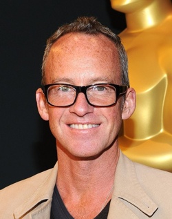
Back in 2011, in what was one of the bigger gambles in its history so far, Netflix entered the world of original programming, bypassing the traditional pilot model and committing to a massive two-season order of what proved to be an indisputable success with both viewers and critics – “House of Cards”. In this interview I talk with Steve Arnold, the production designer for the show. Steve, as the rest of the stellar crew, came from the world of big-budget Hollywood productions, having worked as the art director on “The Long Kiss Goodnight”, “Face/Off”, “Unbreakable”, “Spider-Man”, “Van Helsing” and “Appaloosa”. He talks about what sets “House of Cards” apart from the run-of-the-mill episodic TV shows, juggling multiple episodes at the same time, working with different directors and maintaining visual continuity across the entire season, exploring the new medium, how lifting restrictions on episode length and removing commercial breaks affected the structure and delivery of the story, working with VFX department on digital set extensions, and his general thoughts on the collaboration between physical and digital over the last few decades.
 Kirill: Please tell us about yourself and your journey so far.
Steve: My interest in doing what I do probably started when I was 5 years old and my family took a trip to Disneyland. The experience made a very strong impression on me, and my interest in design, art and architecture began there, although I didn’t really know it at the time. When I started college, I wasn’t really sure what I wanted to do, and I didn’t see a lot of career options available for someone with a degree in art. I got a degree in music, but eventually decided that I was more interested in theater.
I started doing sets for theater, and did that for quite a while. I went to graduate school for set design in theater and even though I hadn’t planned to do films I was asked by one of my professors to join him as his assistant on a small film he was doing in lieu of attending classes that semester. After that I started getting calls to do commercials, and back then in Pittsburgh we had a fairly good community of film-makers and quite a few projects were being shot there. I had been a starving artist for quite a few years [laughs] as theater doesn’t pay very well, so film seemed a much better option. That’s how I got started. I did quite a few films in and around Pittsburgh before moving to California.
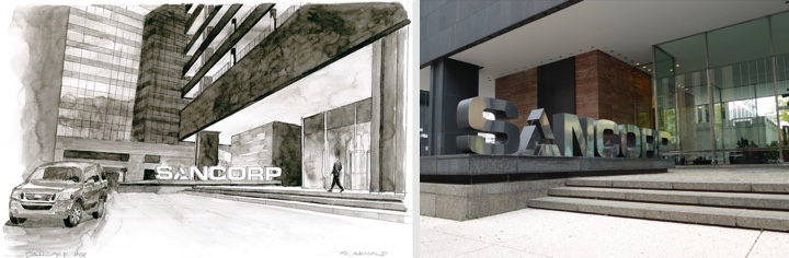
SanCorp building entrance, initial sketch and final set. Courtesy of Steve Arnold.
Kirill: How was that at the beginning? Did you start as an art director and then moved on to be a production designer?
Steve: I started out as a Set Designer, the entry level job in the art department. It’s a draughtsman/architect kind of position, you do the drawings that carpenters use to build the sets. On the East Coast they call the job Assistant Art Director, and on the West Coast they call it Set Designer. I did some small non-union projects, and eventually started getting bigger and better jobs, fairly soon becoming an Assistant Art Director, and then an Art Director. I was fortunate to work on some really large films like “Forrest Gump”, “Spider-Man”, “Face/Off” and “Unbreakable”.
I had always planned on becoming a Production Designer, but sometimes it takes quite awhile to work your way up the ladder. Finally a few years ago I started getting Production Designer jobs doing mostly smaller independent movies before getting the offer to do “House of Cards” which is like television, but with some differences.
When we started the show, none of us really had much experience doing television. David Fincher, Donald Burt (who was the original designer), myself, the Art Directors and Set Designers were all from the feature film world. Fincher has exacting standards and a very particular design aesthetic. We always approached the work like we were doing a feature film that has 13 one-hour sections. The attention to detail, preciseness of all the research and the luxury of adequate preparation time is very much like you would find on a feature film, and unlike quite a lot of television. In many cases television producers try to shoot a series as cheaply as possible. Fortunately for us we were able to avoid most of those restrictions because this was viewed as a completely new and different type of project.
“This isn’t television, this isn’t film, it’s for the Internet” is what we heard when we started. Netflix’s thought was to make the best quality series that they could in an effort to compete with the kind of programing that HBO is known for.
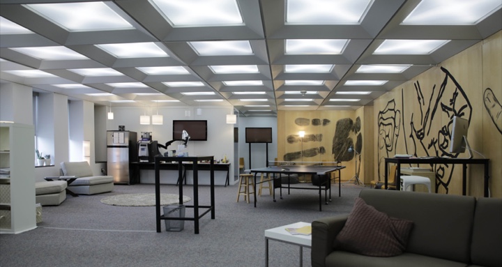
Slugline office space set. Courtesy of Steve Arnold.
Kirill: How much time did you have to prepare for season 1?
Steve: It was about 5 months, quite a bit more than the typical amount of prep time in television. Also instead of doing a pilot, after which the series will continue if it is received well enough, Netflix decided that they would buy two full 13 episode seasons up front without a pilot, and hope that the show was good enough to be successful. It was a leap of faith on their part, as they did spend a fair amount of money doing that.
We had four or five scripts to start with which is rare. With most television series the scripts are quite often not written until the last possible minute, so you’re always trying to keep up. In the first season we had the good fortune to have so many completed scripts up front, but in the second season we were under the gun most of the time, with scripts being finalized much closer to shooting.
Kirill: Would you say it was a more relaxed environment, as you have more material to work with, and also more time compared to the usual television productions?
Steve: I wouldn’t call it relaxed at all. We shoot two episodes concurrently. If there is a set, let’s say the Oval Office, in both episodes, we would shoot all of its scenes in one or two days. The two episodes are commingled by sets. Each episode takes 10 days to shoot, so, for example, the first two episodes require a month to shoot.
You start shooting the first two episodes, and about a week into the 4-week process you get scripts for the next two episodes, and you start scouting for those locations with the new director, since each pair of episodes has its own director. And when he (or she) arrives, you show them what you’ve scouted, you discuss the new sets that will be built, and you start working ahead. And then you get a little bit farther into those 4 weeks, and before the end you are already reading the next two episodes. So you have 6 episodes in your head most of the time.
That was new for me because on a feature you have one script, and you know pretty much everything that needs to be done. Things get changed, added or cut on every project, but on a series where you’re constantly juggling five or six story lines at the same time while you’re shooting on stage and opening every set if it’s a new set, then running around and scouting for future episodes, and trying to read even farther ahead to figure out what you’re going to need – it’s definitely not relaxing [laughs].
Kirill: With such a condensed schedule, do you prefer to build sets on stage, or doing location sets is a good option as well?
Steve: It varies quite a bit depending on the requirements of the script. It’s challenging to do a show like “House of Cards” as Washington D.C. can be a very difficult city to shoot in. You have congressmen, diplomats, and the President and Vice-President around, important people are always coming and going, stopping traffic, and making it very difficult to schedule shooting. Plus there is a myriad of governmental departments and agencies, all with red tape that must be dealt with. We actually did very little shooting in D.C. We used a lot of locations in Baltimore that have a similar feel and scale in their architecture. That’s one of the things that makes Washington unique: It’s architecture has a grand scale that you don’t find in most other cities, except maybe New York.
Depending on the script, we try to shoot on stage as much as possible, because it’s a much more controlled environment. But to get the scope and scale that you find in D.C. on a stage set can be difficult. We used existing buildings in and around Baltimore that had elements like grand staircases or large corridors, locations with monumental interiors to try to give you the feeling that you’re in Washington.
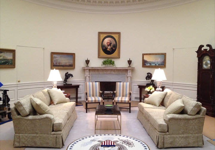
The Oval Office set. Courtesy of Steve Arnold.
And then there are a lot of very specific places that are quite recognizable in the show. We had to build most of them on stage. For example, the Oval Office that we’ve built is an exact match to the real one. Those kinds of sets require a great deal of research and a lot of detail to give them the verisimilitude of the real places. Most viewers know what the White House and the Oval Office look like. Images of important places are so prevalent now, particularly on the Internet. We have far better access to all of this than we had 20 or 30 years ago when I first started. Because people see these places on their TV or the Internet all the time it’s much harder to cheat or fake them.
We had a huge industrial warehouse that we used as a stage space which was far larger than you would normally have on a TV series, and bigger I think than many studios. Consequently we were were able to build some monumental sets, one of them being a sizeable section of the interior of the US Capitol building.
Kirill: Although you don’t see the Congress chambers, as most of the action is happening in the hallways and staff offices.
Steve: Yes, you see a lot of corridors, hallways and offices, since a majority of the story takes place out of view, behind the scenes, in more secret, private places. In conceptualizing the design of the show we wanted to avoid the flatness that you sometimes see in sets created for television. We tried to get depth with spaces that are often long and narrow like the corridors and hallways of our Capitol set.
In addition, the townhouse is a long skinny set where there are many opportunities for differentiation between foreground, mid-ground and background. Elements can be layered front to back, as opposed to across the screen, left to right. This was a visual device that we embraced in many of the sets.
Kirill: Does it help to have background in big screen productions, having experience in working with a lot of sets, investing a lot of time into research and preparation of each one?
Steve: I think it has made a difference in how the show looks, especially the attention to detail and the precision and care imparted to all aspects of the production. Fincher is a brilliant filmmaker and an equally brilliant photographer, and his vision informs all of the projects he does. These episodes were shot quite differently from most other television, and partly that involves the way the sets are lit. For the most part our sets are fairly light in color, the opposite of what you would normally do. The tone of the show is very dark and moody. We’re showing the underbelly of Washington D.C., the shadowy behind-the-scenes part of it. Generally you would have lighter characters against a darker background, but we have done just the opposite. We have darker characters against primarily lighter backgrounds. The characters are lit and you can see their faces, but there’s also a lot of silhouetting that happens against these lighter backgrounds.
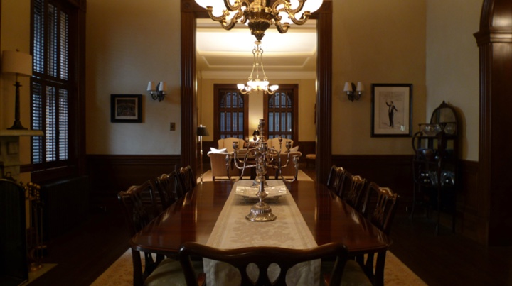
Dining room on the set of the Underwood residence. Courtesy of Steve Arnold.
Kirill: What about the Underwood residence? Is it a real house, or did you build a set for it?
Steve: It was all built on stage. It’s based on an actual townhouse in Baltimore. We shoot the exterior of the real townhouse when we need characters exiting and entering the house. Our stage set is a match to that house, but all the interiors are built sets on stage.
Kirill: But you don’t have to build a complete thing, right? You don’t have to stack the floors, or even have rooms actually connecting to each other. The downside would be, of course, not being able to do long shots that follow characters as they move around the house, and not letting the actors feel “surrounded” by a complete environment.
Steve: We have addressed that. There are three levels: basement, main floor and second floor with bedrooms and bathroom. It would be difficult to build it all on top of itself like a real house, also it’s more inefficient for access by the shooting crew. So each level is its own set. The basement is a set on the stage floor with a stairway that leads up to what would be the main floor, and you can go all the way up the stairs to the landing. Then the main floor is a separate set on a platform about six feet off the ground. It has a stairway that leads down as if you were going to the basement, and a stairway that leads up as if you are going up to the second floor. And the second floor set has a staircase that comes up to it because it is built on a platform also.
An actor can start going up the stairs on the main floor, stop at the top, then resume the shot with the actor coming up the stairs to the second floor, and it looks like it’s a continuous thing. You cut in between the two pieces of action, and would never know that it isn’t a single set.
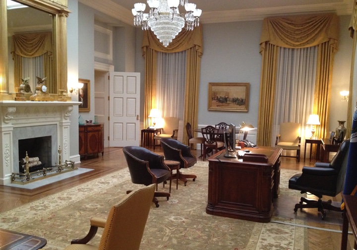
The set for the office of the Speaker of the House. Courtesy of Steve Arnold.
Kirill: How does it work out when you work with different directors on different episodes. How do you maintain a consistent visual language while providing at least some ways to directors to have their own take?
Steve: It was decided that we would have one Director of Photography [Eigil Bryld] for the entire season. He was our DP for almost the whole first season, except for the last two episodes where we had a different DP [Tim Ives]. The idea was that both the Director of Photography and I would be the guardians of the look of the show. We established some very basic design tenets that we have tried to maintain throughout the show. There is very little camera movement in most of the shots, and if the camera does move there has to be a really good reason for it. We do not use a steadi-cam at any time in any shots, we always find another way of getting moving shots. In many cases there are just a couple of actors in a room, the camera is set up and we just sit back and watch them act.
In the design of the sets for the most part we try to employ symmetry and balance wherever we can, giving the spaces a subtle sense of solidity and seriousness, along with a feeling that we are in the country’s seat of power.
The other thing that seems to be very critical to maintain is the color palette, the control of light and dark value, and the actual colors of the sets. We use a very narrow range of subdued colors, very carefully controlled. We shoot with The Red camera, and although digital technology is very good and is advancing quite quickly, there are still certain things that we have tried to control and one of them is how the camera reacts to certain colors. We do not use the color red in our sets at all. You will see the occasional red thing in a shot, like a “Stop” sign that we can’t avoid, but otherwise we avoid using red whenever possible in costuming, sets, set dressing – everywhere.
For set dressing, we have used the research that’s available for what would be accurate for many of the sets, but we have also chosen items for certain characters that emphasize and explain aspects of their character. For instance, in Francis’s townhouse and in his office we chose things that had sharpness and edge to them. He’s such a nefarious character, and we wanted things around him to have metaphorical teeth – in very subtle ways. For instance a table leg might be very pointy and sharp, because he is that kind of a character.

Francis Underwood’s office set. Courtesy of Steve Arnold.
Kirill: How much freedom does that leave to the director of the specific episode? Is it mostly focused on the dialog and acting?
Steve: It does limit the directors to some degree. However, most of them are quite clever, coming up with interesting shots and innovative ways of telling the story. They are confined by a fairly narrow set of parameters, for the look and feel of the show. Most tend to concentrate on casting, dialog and acting and all were chosen because their own style and technique were compatible with the overall vision of the show.
Kirill: As you said it’s a new medium, and Netflix embarked upon this rather bold experiment to invest in a few ambitious productions at the same time, without any guarantee of success. Was it difficult to convince people to join the production during the early phases?
Steve: No. I think when you have actors the caliber of Kevin Spacey, Robin Wright, Michael Kelly and Kate Mara with David Fincher at the helm; plus big-name producers like Eric Roth and Joshua Donen, we all knew it was going to be a quality project. Beau Willimon, who is the writer and the creator of the show, had previously written the film “The Ides of March”. He’s a very talented guy who’s been on the inside of Washington D.C. politics, and he understands that world very well. I don’t think we ever had too much trouble convincing people to join the project.
Kirill: There’s been so much uninspiring and shallow content on basic and cable TV in the last decade. Do you see shows like “House of Cards” to be sort of an uprising from the side of content creators, pushing to raise the quality bar?
Steve: Yes. Nowadays, many film studios base most of their work on big, splashy, special effects-driven story lines, and don’t seem to be as interested as they once were at telling adult dramatic stories. But I think there’s still an audience out there for them. Maybe with the success and popularity of shows like “Breaking Bad” and “Mad Men” coming out of the cable world, the studios will start to see there is a market for higher quality fare on screens that are not necessarily in a theater.

Initial sketch for the Sentinel library. Courtesy of Steve Arnold.
Kirill: Do you see such productions moving to premium cable networks – or Netflix in this case – seeking a more discerning audience?
Steve: Yes I do think they are trying to attract a much more specific audience. “House of Cards” is written to be shown without commercials. The story line is continuous from episode 1 all the way to episode 13, and continues into Season 2. In a way, it’s much more like a novel. For years novels were condensed down into 2-hour feature films, but in actuality a big grand story line can be told very effectively the way we tell ours with 13 or even 26 episodes. People want to see what happens next and follow the characters from the very beginning all the way through a long story arc to the end.
Kirill: And the interesting thing is that you don’t need to force breaks even within each episode to go to commercial breaks. It kind of flows.
Steve: It’s a continuous story thread. That’s the way it’s written, and that’s the way it’s presented. Since all the episodes are made available on the same day, if you want to sit for 13 hours and watch the whole story unfold, you can, and it will make sense. There are no gaps, jerks, or flashbacks needed.
Kirill: And there is no fixed length to an episode. Some are slightly shorter, and some are slightly longer to accommodate the story.
Steve: You don’t have speed up or slow things down in the presentation of the story to fill the required number of minutes for the TV episode. This flexibility in the telling of the story is groundbreaking.
Kirill: You mentioned that it’s television and not television. Netflix wants to be on pretty much all types of screens, except for the movie theaters. Do you put a name of what type of production “House of Cards” is?
Steve: I would call it a hybrid between a feature film and a made-for-television movie. When I first started on it, they told me that it was New Media, and maybe that’s what you’d call it.
Kirill: And on the same topic on being on a variety of screens, all the way down to smaller phones, and the streaming aspect of it where you don’t know what’s the data transfer quality – was it ever a consideration for you to not put too much detail into the frame?
Steve: Absolutely not, and in fact it’s the complete opposite. We shot the first season with the best camera system available. And now there’s a better chip for the camera, and Netflix is asking us to bump it up to the highest resolution. We shot Season 2 with the new camera that allowed us to get even more detail. Some people have very large screen TVs in their homes, and even if they are not sure how good the typical consumer’s connection speed is, Netflix would like to present the show with the highest level of quality possible.
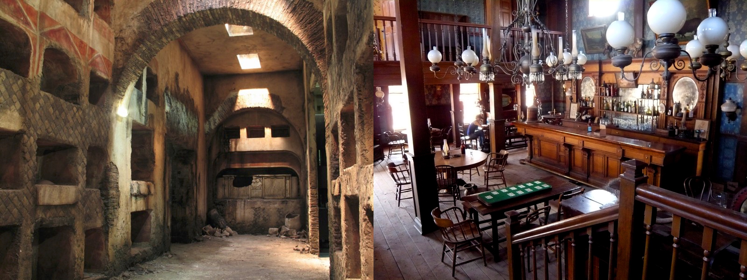
On the set of the Sentinel library, before and after digital set extensions. Courtesy of Steve Arnold.
Kirill: One of the images on your site mentions digital set extensions to the memorial library featured in one of the episodes on Season 1. What role did digital play in the production?
Steve: We have a visual effects supervisor on the show who’s been working with Fincher for around 20 years. Let’s say we’re shooting on stage, and out the window we want to see the Washington monument, we’ll shoot green screen out of the set window. Then we’ll coordinate with the VFX department, telling them that we need to add a certain image out the window, and then we will go back-and-forth on how much expense it will require and how best to accomplish it.
We actually do a fair amount of digital work in post on the show. All the driving in the show, anything inside the vehicle is done on stage, in a room that is a big three-sided green screen space. The car does not move, the actors are in the car, and the cameras are set up around them. We have very long strips of LED monitors hung above the car. We had a camera crew go to Washington, D.C. to drive around and shoot plates for what you see outside when you’re driving. And that is fed into the LED screens above the car. So as the scene is progressing, the LED screens are synched up to emit interactive light to match the light conditions you see in the scenery you’re driving past (that will be added in post). All the reflections on the car windows, the window frames and door jambs is being shot while we’re shooting the actors in the car. Then in post the green screens are replaced with the synced up driving plates, and it works really well. It gives you the sense of light passing over the actors’ faces, matching the lighting that is in the image of the plate.
And as you mentioned, one of the bigger computer-generated things that we did in the first season was the VFX extension of the exterior of The Francis J. Underwood Library. That was a one-story building on location, which was not very modern. We added some elements to it when we shot it, then in post the top of the building was extended per the design that we did in the Art Department to create the modernist look of that building. There were a few other spots where we did visual effects work to enhance things on the show.
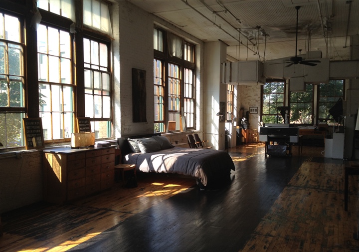
The set for Adam’s loft. Courtesy of Steve Arnold.
Kirill: You’ve been in the business since the 80s. Back then it was mostly special effects, like animatronics or matte paintings, and these days it’s almost exclusively all-digital. But we’re not moving towards a place where everything is shot on green screen and then replaced digitally in post. Will it continue being a collaboration?
Steve: I think so. One of the shows I did that had an enormous amount of VFX was “Van Helsing”. We built some of the biggest sets that I have ever been on for that show. It was a combination of massively huge reality-based sets, none of them less than 40 feet tall, with post-production digital extensions. I don’t think that computer generated effects are the solution to all the design issues out there, but they can definitely simplify our lives. They also allow you to make some corrections after the fact. Before digital you had to go back and reshoot things, and now you can also clean up or adjust little imperfections with photo retouching in post. It definitely has helped us quite a bit.
And in the art department itself we still have hand-drawn things and computer-drawn things, but it has made the organization of drawings and other information much more streamlined. It’s much simpler and more efficient to organize and disseminate information to the various departments on a show.
Kirill: And the last question on a more personal level. Do you find time to watch movies or TV shows, to see what you peers are doing, and if so, can you detach from looking at the technical aspects and just enjoy the story?
Steve: Yes, I do try to see as much as I can. I can get sucked into a really good story, but I have a very keen eye for things that are anachronistic (not from the right time period), inaccurate, or jarring to my aesthetic sensibility. Those will pull me out of the story. Most of the work out there, particularly in features, is fairly high quality, but occasionally I’ll see something that bothers me. I think I see both the technical and entertainment qualities of a show or film at the same time.

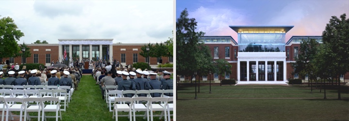
Gala event, initial sketch and final set. Courtesy of Steve Arnold.
And here I’d like to thank Steve Arnold for taking the time out of his busy schedule to talk about his art and craft. Second season of “House of Cards” will be available on Netflix on February 14, 2014.