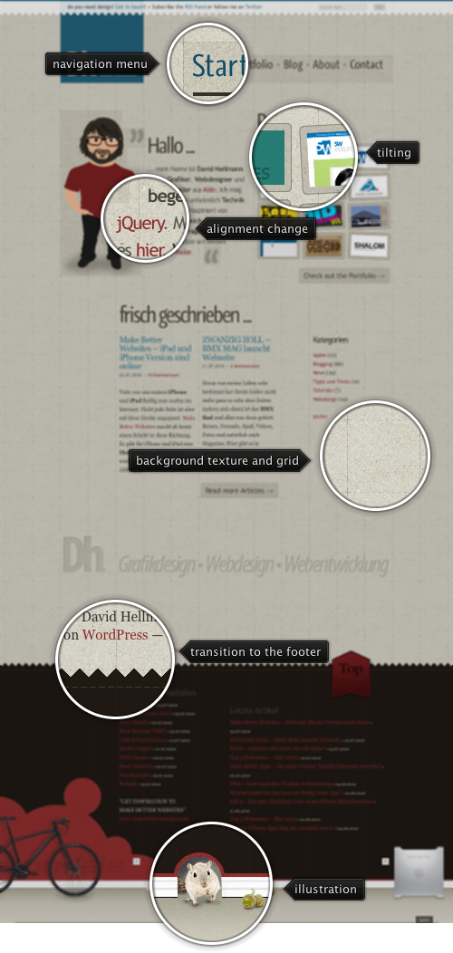
Today’s post highlights the design of DavidHellmann.com. With plenty of white space around the elements and a strong alignment highlighted by the dash gridlines, the main page features a lot of material and links, including the portfolio thumbnails, snippets from the last articles and an oversized footer with elaborate illustrations. A rather unusual choice of using two different colors for links – dark red and dark teal (also used in the main logo) adds some visual noise to an otherwise consistent color palette. Even more noise is added by using saturated green as rollover color for “Check out the portfolio” and “Read more articles” buttons. Rollover effects are pervasive throughout the design – move the mouse over the main logo, portfolio thumbnails and the big “Top” arrow in the right side of the footer.
I’ve just published the release candidates for the following projects:
Flamingo 5.0 release candidate contains:
- New scroller panel component
- New color selector popup
- Full right-to-left (RTL) support
- Toggle menu buttons
- Dock icon for ribbon frame on Mac
- Dynamic resize of ribbon components
Substance 6.1 release candidate contains:
- Platform specific keyboard shortcuts
- New Mariner skin
- New Office Black 2007 skin
- Better visual integration in Substance Flamingo plugin for ribbon under all core Substance skins
Trident 1.3 is mainly maintenance release with a few minor API additions to the repaint timelines. Flamingo uses Trident for some of the animations, and you will need to add the latest Trident jar to the classpath. If you’re running your Flamingo-based application under Substance, add the latest Substance Flamingo plugin jar to the classpath for consistent visual appearance and animation effects.
The final releases for all the projects are scheduled for August 9. Only bugs will be fixed until that date.
In an indirect response to my earlier post, David Grace writes:
All this talk about not being able to create something that looks good in JavaFX is hot air. JavaFX has the functionality to do so, you just have to know how. What JavaFX needs is for the preview controls and layouts to be finished, controls such as a table implemented, and the Prism renderer implemented. When this is done it will be easy to write any application that could be written in Swing quicker, looking much better and with far greater performance. Personally i would of rathered investment in Swing instead, but Sun/Oracle have invested in JavaFX and in many ways its already far better than Swing, except for missing components.
Modern programming languages provide abstraction layers and higher level concepts to shield the programmers from the low level drudgery of writing assembly code. In much the same way modern UI toolkits provide component libraries, image composition, transformations, animations and many other tools that make it simpler to translate the intended design into a living and breathing reality. But eventually, it’s pixels. All the way down.
Just as the vast majority of the programming languages are Turing complete, the vast majority of UI toolkits are what i call pixel complete. If the specific toolkit exposes the ability to control every single pixel in the window (with, say, paintComponent in Swing, onDraw in Android, paintControl in SWT or updateDisplayList in Flex just to name a few), there are no limits to what can be put on the screen. Modulo support for translucent and shaped windows, you can take any design and turn it into reality. Indeed, if you know how to do it, you can do anything. But that’s not the point.
How about this – instead of asking what people can do with JavaFX, ask what people are actually doing with it.

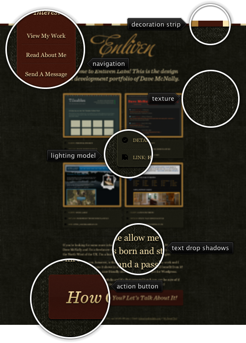
Today’s post highlights the design of EnlivenLabs.com. Set on the backdrop of dark olive denim texture, the site uses a earthen palette of brick red, golden brown and light ochre set early on in the decoration strip that runs along the top edge and applied consistently to all visual elements. The main emphasis is placed on large portfolio thumbnails that use beautifully crafted explanation boxes. Note how much visual attention went into the lighting model of the borders, drop shadows and depressed dash separators.
Irregular lighter spots in the background texture can hurt legibility even for larger font sizes, and the design address this issue by using darker drop shadows. The brick red color is used for two main design elements – the anchored navigation menu and the main action button. Move the mouse over the darker bird outline in the navigation menu vertical ribbon to see a full-color Twitter bird. A simple one-line footer completes this single page design.