In the last few years we are witnessing two intertwining evolutions of the movie-going experience. On one hand, the accelerated presence of large screen LCD and plasma TV sets is combined with BluRay as the winner of the high-definition optical disc format war to bring unprecedented viewing experience to the homes of hundreds of millions of viewers. On the other hand, the movie studios and leading producers are seeking to bring audiences back to the movie theaters, exploring novel ways to engage the movie goers and to stay ahead of the advances of home theater systems.
With relatively slow rollout of projecting equipment and small number of available films midway through the last decade, the year 2009 saw an explosion of 3D movie releases, culminating with the “Avatar” juggernaut that was released a week before Christmas and went to gross an unprecedented 2.78 billion dollars.
The 3D onslaught is only accelerating, spanning the lucrative genres of sci-fi and horror movies, teen concert documentaries and animation features (with DreamWorks switching all productions to 3D in early 2010). With the audiences streaming into the theaters and willing to pay a premium to enjoy a new experience, some studios have elected to take production shortcuts, seeking to quickly cash in on the new trend. Using traditional shooting equipment, these movies rely on the post-production phase to bring the third dimension not only to the computer generated visual effects, but to the live action itself. The abysmal “Clash of the Titans” and disoriented “Thor” are just two examples of post-converted productions; extrapolating the experience to the upcoming “Green Lantern” and “Captain America” does not bode well for the summertime superheroes movies.
Instead of beating a lame horse, let’s talk about the high-end productions that spared no resources, setting new standards for years to come and advancing the state of the art.
“Tangled” has captured my mind from the very first time i saw it in the theater, with me delving into the creative process behind the movie and interviewing one of the conceptual artists. After seeing it a couple of times in the “traditional” 2D format, i took a leap of faith and went to see the 3D version. Apart from a very few scenes that place the viewer in a dark tower, the movie is a veritable feast of vibrant colors, textures, strokes and patterns, with a small glimpse conveyed by this frame:
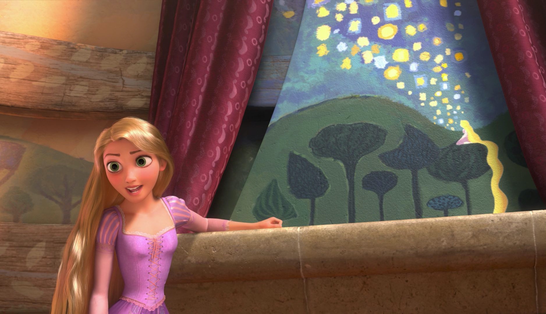
Here, we are placed in between Rapunzel and Flynn, with Rapunzel opening the curtains to reveal a gorgeous mural painting of floating lights, resting her hand on a ledge. The placement of the camera creates a very deliberate depth of field, with Rapunzel taking the front, and the mural serving as an inanimate companion to her words. As she is proposing the deal to have Flynn take her to see the lanterns, the mural becomes an integral part of the story that commands the viewer’s attention. This effectively creates two “planes of interest” – equally important and visually demanding.
As a viewer placed in such a scene, i found myself subconsciously switching my attention between these two planes, trying to take in the entire scene, following her words and attempting to study the finer details of the girl gazing into the night sky. This is something that we do every single moment that we’re awake. The brain directs the eyes to continuously scan our surroundings, partitioning the environment into different spheres of interest, gathering finer details in what it deems to be important and detecting peripheral changes. Think about driving on a highway – with the car immediately in front of you being the most important sphere, followed by the car before it, a few cars to your sides and perhaps the car right after you. The spheres of interest expand outwards to the traffic further down the road, the upcoming merging lanes or exits, or perhaps even the darkening clouds that indicate possible rain. All of this happens on a subconscious level, with the brain collecting, collating and condensing the immense amount of visual information.
As the eyes are directed to the different spheres, they change focus to converge on different planes – a process succinctly outlined by film editor Walter Murch in his letter to Roger Ebert. Murch swiftly moves in to point out the weakest link in the 3D movie experience:
[…] 3D films require us to focus at one distance and converge at another. And 600 million years of evolution has never presented this problem before. All living things with eyes have always focused and converged at the same point.
This was the biggest source of frustration for me in the specific scene, and throughout the entire movie. With equally rich and lush visuals in both planes of interest in the specific scene in “Tangled”, my brain was interested in exploring both, directing the eyes to refocus based on the perceived distance as conveyed by the camera placement and the ledge depth. As the mural was slightly out of focus to maintain a realistic depiction of the scene, i found myself constantly distracted by trying to converge beyond the physical movie screen, expecting the mural to come into focus – obviously to no avail.
Murch further elaborates that the fixed convergence plane causes the viewer to spend extra cycles adjusting himself to the changing focus plane. I think that there’s a much bigger issue with most of the 3D movies today – they have too many planes of interest in almost every single shot, without accommodating the brain-eye cycle that expects to be able to switch focus at will between the different planes and extract the relevant details from each one of them.

This is another one of my “Tangled” favorites. Rapunzel’s braided hair with intricate floral arrangement is the closest plane. Flynn holding the two lanterns, along with the satchel in her hands fill the second plane. The floating lanterns reflected in the serene bay water form the incredibly detailed third plane. This staggered arrangement that has progressive blurring of the visuals to maintain realistic visuals was also seen throughout the lush outside scenes of “Avatar”:
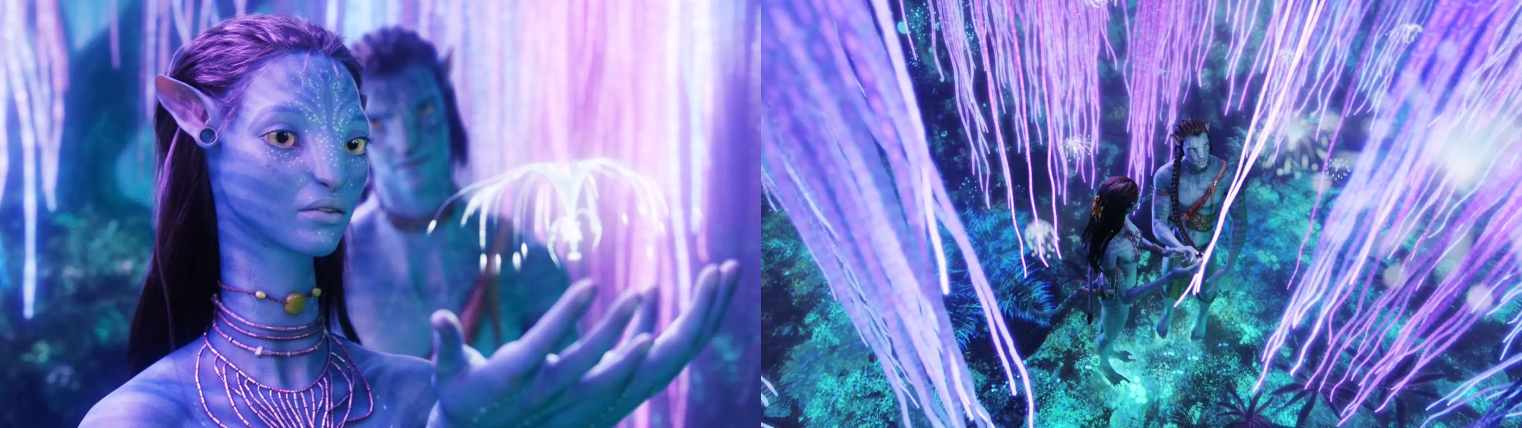
In both movies, the astounding realism of the surrounding scenery causes a rather opposite effect – when the camera dictates the main focus plane, your eyes do not obey the brain that directs them to switch focus to absorb all the details. Which brings me to the best 3D experience that i had so far – “Tron: Legacy“.
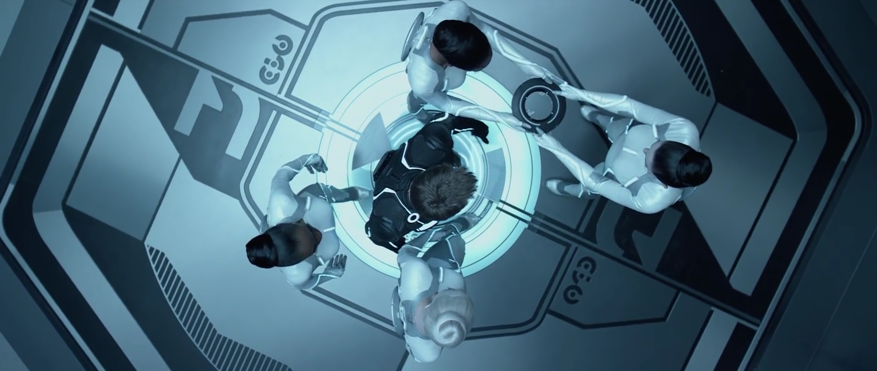
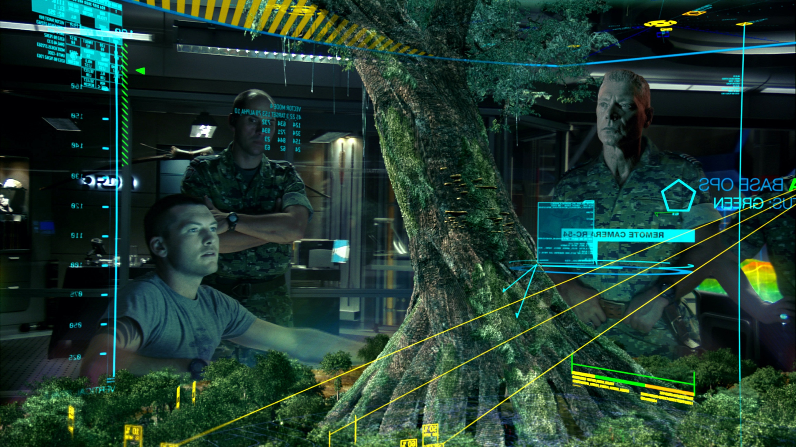
This overhead shot of the sirens getting Sam ready for the games is, as far as i could see from my three visits to the theater, the only time that the realism was sacrificed at the “altar” of 3D effects. Lasting a few short seconds, this angle creates a very unrealistic depiction of the scene. With the camera positioned directly above Sam, we have four planes – the heads, the shoulder pads, the disc exchanging hands and the floor – with every single plane in full sharp focus. With this rather unfortunate decision out of the way early on in the computer world, the extra dimension steps back and becomes just another artistic tool at the director’s disposal, simply blending away.
With an austere steel blue hue driving the predominantly monochrome color palette of the computer world, the production and set design cleverly masks away as much background as possible. Simple geometrical shapes, wide swaths of soft gradients and almost indistinguishable wall patterns make sure that the surrounding environment is not a plane of interest, but rather just a plane:
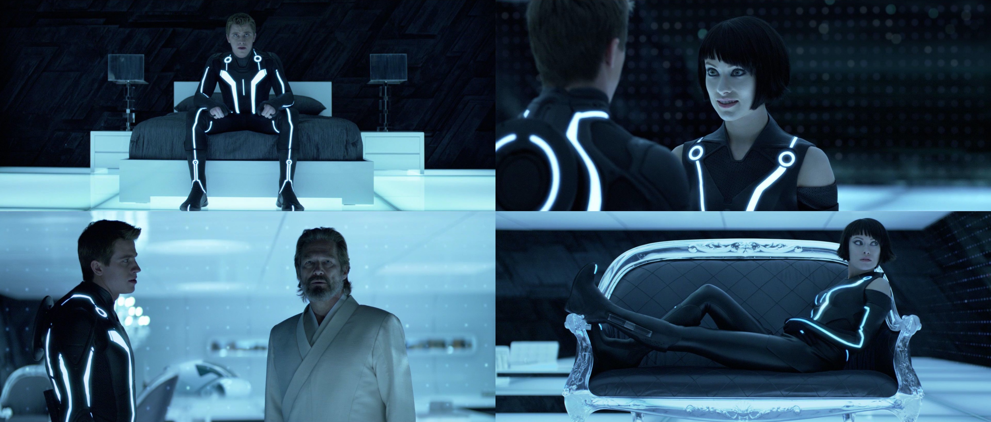
Note how little the brain is “stimulated” to spend time on the supporting visuals of the Safehouse – from the slanted slabs of obsidian to softly glowing curtain grid. The “End of Line” club is another masterful example of an environment that dissolves around the main characters:
“Tron: Legacy” does an extraordinary job at keeping 3D on a short leash, keeping it as unobtrusive as possible and limiting almost every single scene to only one plane of interest. It’s rather interesting to see how it falls back to the “old” trick of significant focus switches in the light runner ride:
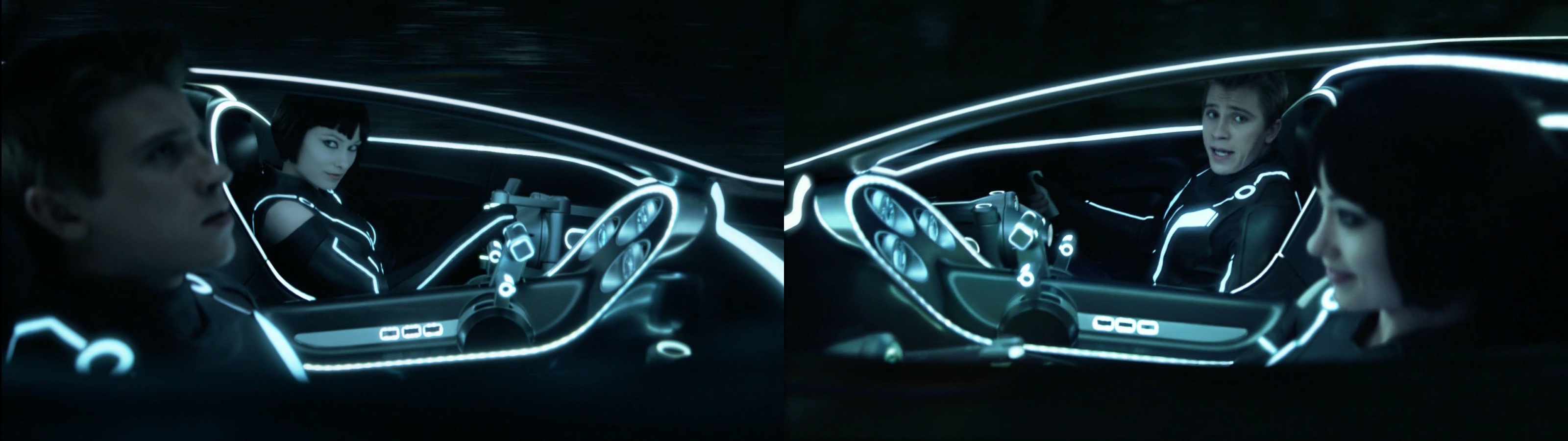
with the forced focus transitions between Sam and Quorra transitioning the viewer’s eye and providing just enough time to absorb the details surrounding the two characters before the next focus switch.
The next few years will undoubtedly see more experimentation and exploration in the 3D space. Some attempts will flop, and some will lead to breakthrough advances in the movie-going experience – that will find their way to our living rooms in due course. The sheer size of the consumer market will make sure that the movie studios and TV manufacturers will keep on relentlessly pushing the envelope, advancing the projecting hardware, screen technology and visual modeling in both academia and industry to new levels. More importantly, the movie creators will need to adapt the way the movies are filmed, composited and edited to maintain an immersive viewing experience. These are truly exciting times.

Today’s post highlights the design of CubanCouncil.com. The design has a rather loose layout, with heavy reliance on large images with significantly varying sizes and styling. From precise square corners of the images in the bottom row to slightly rounded corners and drop shadows of the four-cell portfolio to the completely round thumbnail of the blog post – it’s an interesting exploration that forgoes a rigid grid in favor of a more relaxed arrangement.
The round shape of the blog post thumbnail also serves as a very attractive way to skim the recent entries without leaving the main page. Moving the mouse over the diagonal arrow “expands” that arrow in place hinting at interactivity. Clicking on the arrow initiates a transition that slides the next thumbnail and cross fades the description section below. The same amount of visual polish can be seen by moving the mouse over the portfolio thumbnails, initiating a pleasantly quick fade in of explanation border.
The navigation menu in the left part of the header are particularly well thought out. A multi-state image is used to emulate the mouse as a light source that casts shadows below the protruding menu texts. Pixel-perfect alignment of textures and texts ensures that cross-fading between the matching rows in that image results in a visually pleasing and consistent sequence that is rarely seen in web pages. Finally, notice the double footer with expanding top part, detailed wooden texture of the header, ever so slight horizontal gradient on the wavy pattern of the main section, random perturbations of separators and simply perfect arrangement of client logos just above the footer (click the “show more clients” to see the full listing). Not to mention the great pairing of golden yellow and light blue for hyperlinks and highlights.

Today’s post highlights the design of LucidDesignConcepts.com by Joey Adkins. This single page site has an interesting visual rhythm, alternating between the strong brown, aquamarine teal and brick orange as background fills for the three main sections. This plays rather well with the site logo that not only defines the three main colors, but is also composed of bold large circles and custom slanted glyphs. The designer’s experimentation with typography is seen everywhere on the site, using different font styles, families and sizes (sometimes it feels a little bit too much, especially in the footer). Noise textures and serrated edges of section separators add nicely to the overall retro look of the page, with an extra touch of smooth rollover effects on the main navigation menu and social links in the footer.
As far as the usability is concerned, i’m rather puzzled by the placement and styling of secondary navigation buttons. These can be found in the two middle sections, with very misleading styling of the icons. I assumed that left and right pointing arrows would start paginating the content in the specific section – which is a well-known paradigm for navigating large portfolios. Instead, as i clicked the right arrow button, the whole page scrolled vertically to the next section, while i was expecting the next nine-pack of portfolio thumbnails to slide from the left. Perhaps extracting the secondary navigation to the right margin, or making the navigation header static would be a better solution that is aligned with what visitors have come to expect from in-page navigation.
