Following the extremely valuable feedback on the previous entry that introduced the application menu button and application taskbar to the Flamingo ribbon component, i have been busy this week fixing the usability issues and addressing some of the missing popup functionality available in the Office 2007 Command Bar component.
Christopher Deckers has pointed out a few usability issues that eluded me as i was focusing too much on the pixels. He was correct to point out that everything related to popups (such as the main application menu button and ribbon gallery expansion) and the task toggle buttons should happen on mouse press and not on mouse release. This has been addressed in the latest 4.0dev drop of Flamingo (code-named Fainnear) and is also available as a configuration API on the org.jvnet.flamingo.common.model.ActionButtonModel.
A number of comments pointed out that the application menu is showing on top of the application menu button, thus losing the visual connection between the two components. The solution had to work on both lightweight and heavyweight popups, and the latest 4.0dev drop provides such a solution.
Here is the application menu under Metal:

And under Windows look-and-feel when the mouse is moved over the primary Open entry:

And under Synthetica Blue Ice look-and-feel showing a split Save As menu entry in action:

And under Nimbus showing the split Print primary menu entry with two groups in the secondary menu:

And finally, under Substance Business Blue Steel skin showing the popup-only Send primary menu entry with one group in secondary menu. One of the secondary menu entries is a popup button itself and has the associated PopupMenuListener. This listener populates two items in the third-level popup menu – click to see full-size:

The latest 4.0dev drop also allows placing mixed content into the popup panels. Most of Office 2007 split / popup buttons show a button panel wrapped in a scroll panel, followed by a mix of menu items and separators:

This is now available for Flamingo ribbon galleries and split / popup command buttons. Here is an unexpanded ribbon gallery under Synthetica Blue Moon look-and-feel:

When the expand button is clicked, the following popup is shown:

The top portion of this popup has the scrollable panel that hosts all the gallery buttons, and the bottom portion hosts the additional menu buttons and separators. The top panel can be scrolled:

And the menu buttons show rollover effects:

The same rich popup functionality is available on command buttons with popup area (split or pure popup). The following screenshot shows a rich popup on “Format” button in the first ribbon band (under JGoodies PlasticXP look-and-feel):

And the same under Substance Office Silver 2007 look-and-feel:

If you want to see the reworked application menu button and enhanced popups in action, run the following WebStart demo:

The demo above works for the core look-and-feels. If you want to see this functionality under Substance, run the following WebStart demo:

If you want to test the new functionality in your applications, you would need the following (the last two only for applications running under Substance look-and-feel):
The relevant APIs are in the org.jvnet.flamingo.common.popup and org.jvnet.flamingo.ribbon packages. Until the documentation is ready, see the test.ribbon.BasicCheckRibbon class. This is still work in progress so the APIs may change during the development cycle. Your feedback is, as always, greatly appreciated.
Here are some Swing links that you might have missed during the last week:
- The results for OpenJDK Community Innovators’ Challenge are in. Congratulations to Clemens Eisserer for the Gold on his XRender pipeline for Java2D, and to Roman Kennke / Mario Torre for the Bronze on their portable GUI backends.
- Ken Orr has announced release 0.9.2 of the Mac Widgets for Java library. Two biggest additions in this release are Heads Up Display and refactored UI delegate for source lists.
- Jean-Francois Poilpret continues his work on imporving the DesignGridLayout, writing about right-to-left (RTL) support. He tackles an interesting issues of languages with vertical orientation, asking for user help in testing the latest drops on Japanese / Chinese (vertical right-to-left) and Mongolean (vertical left-to-right).
- David Qiao has announced the first release of JIDE Data Grids product that aims to bridge the gap between the Database and the JTable.
- Christophe Le Besnerais continues his explorations of modern Swing interfaces. Combining a horizontally wrapping list with a JXLayer for mouse area selection, he presents a folder-like view with resizable flowing content.
- Richard Kennard has announced release 0.6.0 of the Metawidget library. New in this release – support for AppFramework, JBoss jBPM, JEXL and improved support for GWT and Android.
- Manuel Kaess extends his work on Vista-consistent Swing utilities to the message dialogs. Comparing the appearance of native Vista dialogs with the JOptionPane ones, he provides a custom implementation that follows the UX guidelines for Vista message boxes.
- Martin Kaba writes about the MozSwing project that aims to integrate Mozilla’s XUL framework with Swing. The advantage in using the MozSwing approach is that, you have both rendering and scripting access from a Swing application to almost any XPCOM components that can be embedded in a Mozilla browser – browser plugins. MozSwing plays Flash right out of the box, if flash is installed for Firefox.
- Fifesoft are the makers of RText text editor. This week, they have announced the creation of RSyntaxTextArea open-source project that can be used as a standalone syntax highlighting text component for Swing applications. It supports syntax highlight for 20+ languages, find / replace, macros, code templates, bracket matching and more.
- Ken Orr attacks the problem of JTable-in-a-JViewport and not filling the entire viewport. His solution employs a UI delegate that installs a custom layout manager on the enclosing viewport.
Finally, Jonas Bandi points to a gem in the Sun Certified Enterprise Architect exam preparation materials from the Sun Learning Center. The question is this:
You are architecting a real-time system with high usage and high volumes of transactions. You need an MVC application with quick presentation times resembling a thin client and will have several pre-populated views that can carry across several pages. The users must be able to quickly navigate between different sections of the system. Which three technologies will you need to implement? (Choose three.)
- A) MDB
- B) Swing GUI controls
- C) JSP
- D) EJB3 Entities
- E) Stateless Session Beans
- F) JCE
The solution – Options C, D, E are correct. What about Option B (Swing)?
Option B is incorrect because swing components are notoriously slow.
With such friends, who needs enemies?
I’ve been relatively quiet on this blog for the last couple of weeks, but i have some good news to share about the Flamingo ribbon component – it now provides the cross-LAF support for application menu button and application taskbar. The ribbon is a fairly complicated container, and while release 3.1 has made great strides towards providing basic functionality, there are significant gaps when compared to the original Office 2007 command bar. The plans for release 4.0 (code-named Fainnear) are to close these gaps, and the latest development drops allow interested applications to test the application menu button and application taskbar.
These concepts are best illustrated by screenshots. Here is a screenshot of the ribbon test application under Metal look-and-feel:

Note that the taskbar panel has been moved to a separate row on top of the ribbon task toggle buttons. The big round button is the application menu button, and it takes its icon from the images passed to Window.setIconImage and Window.setIconImages APIs. The largest image not exceeding 32*32 pixels is taken. If you only pass the usual 16*16 image, it will be used (but not scaled up). I would recommend using 22*22 images, but this is really up to your design to decide.
And here is the same application under Windows look-and-feel under Vista:

Note how the entire ribbon (selected task toggle button, task band title strips and the application menu button) are skinned with the visuals of the current look-and-feel. Since Windows look-and-feel on Vista is still using Tahoma 11 font, ribbon inherits these settings.
How about third-party look-and-feels? Here is the same application under A03:

and under Synthetica White Vision:

Once again, note how the visuals of ribbon and its components match the visuals of core Swing components under the relevant look-and-feels. Finally, here is the same application under Substance Business Blue Steel skin:

and under Substance Nebula Brick Wall skin:

And important thing to note for Substance – if you are running your decorated JRibbonFrame application under Substance Flamingo plugin, the taskbar and the top half of the application menu button are placed directly on the title pane.
And now let’s see a few screenshots that illustrate the functionality available on the application menu button. The screenshots are taken under different core and third-party look-and-feels and use the APIs from the org.jvnet.flamingo.ribbon package. These APIs are not set in stone and might change during the development cycle of version 4.0 based on the growing understanding of the requirements and user feedback. If you want to make your voice and requirements heard, now is the time.
The first screenshot shows the application menu shown when the application menu button is clicked. It has three main parts – the primary menu selection, the secondary menu selection and the footer buttons:

Note how the visuals of the application menu (top and bottom gradients, colors and button fills) match the current look-and-feel. Also note that some of the controls (the primary Save menu entry and the footer Exit button) are disabled. This is configured via the relevant APIs, and implicitly affects the icons used on those buttons.
The second screenshot shows the contents of the application menu under Windows look-and-feel when the mouse is moved over the primary Open entry:

Here, the application has registered a callback that is called on mouse rollover. This callback gets the secondary target panel and populates it with a command button panel that has one button group with five sample buttons. The main primary menu entry can also be configured with an action listener that will be called when the entry is activated (clicked). In this particular case, the main action listener can open a JFileChooser, while the rollover callback can populate the list of last opened documents, associating an action listener with each one of them.
The third screenshot is taken under Synthetica Blue Ice look-and-feel and shows a split Save As menu entry in action. This menu entry has an action area (with configurable action listener), as well as a rich secondary level menu. One of the secondary menu entries is marked as disabled:

Once again, note how the visuals of the current look-and-feel are applied throughout the ribbon component, including the different alphas on the action and popup area of the primary armed split menu entry to indicate the visual boundaries between these two areas.
The next screenshot is taken under Nimbus and shows the split Print primary menu entry with two groups in the secondary menu:

And finally, the last screenshot is taken under Substance Business Blue Steel skin and shows the popup-only Send primary menu entry with one group in secondary menu. One of the secondary menu entries is a popup button itself and has the associated PopupMenuListener. This listener populates two items in the third-level popup menu – click to see full-size:

If you want to see the application menu button and application taskbar in action, run the following WebStart demo:

The demo above works for the core look-and-feels. If you want to see this functionality under Substance (including the content on decorated title pane), run the following WebStart demo:

If you want to test the new APIs in your applications, you would need the following (the last two only for applications running under Substance look-and-feel):
The relevant APIs are in the org.jvnet.flamingo.ribbon package and until the documentation is ready, see the configureApplicationMenu method in the test.ribbon.BasicCheckRibbon class. This is still work in progress so the APIs may change during the development cycle. Your feedback is, as always, greatly appreciated.
Here are some Swing links that you might have missed during the last week:
- The work on Caciocavallo project that aims to improve OpenJDK graphics stack to enable the use of external implementations of AWT/Java2D backends is continuing even after the official submission date of the OpenJDK Innovators’ Challenge. Roman Kennke has posted a progress update on the project, including two new AWT widgets based on swing, merging back patches from the Cacio branch to main JDK7 and more font refactoring work.
- Jean-Francois Poilpret has taken over the development of DesignGridLayout project that has been in limbo for the last two years. Release 0.9 fixes all known bugs, along with refactoring the code to improve the API, complete Javadocs coverage for the public APIs, and changing the license from GPL to ASL 2.0. It is also available on java.net Maven site.
- Maxim Zakharenkov has presented a session on his SwingExplorer project at this year’s JavaZone conference. The PDF slides are available here. Martosfre Pichincha has a short blog entry on this project.
- Gregg Bolinger shares his thoughts on separating the UI layout logic from the business logic. He cautions against immediate adoption of one of the nascent Swing application frameworks (such as AppFramework, JDAF, Spring RCP and Griffon), instead opining to consider simple Java inheritance, whereas the UI layout logic is placed in the base abstract class which is then extended with a class that implements the business logic.
- Ken Orr continues his work on the Mac Widgets for Java project, providing a Mac-only implementation of Heads Up Display (HUD) consistent with the visuals of HUD windows in many Apple programs.
- Ken Kousen shares his thoughts on Griffon and how it makes the development of UIs simpler, especially for beginner programmers. The Swing example is not the best one, violating the EDT rules, working with the content pane and not centering the frame in the monitor, and the author admits some of these points.
- And on the related note, Geertjan Wielenga interviews the main developers behind Griffon. If you are interested in the past, present and future of Griffon straight from Andres Almiray, James Williams and Danno Ferrin, dive in.
A special section this week is going to cover three projects that should be of interest to Swing developers.
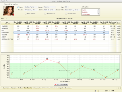
Sage is a platform for running web-enabled desktop applications. It uses a markup language for specifying the UI layout, and allows attaching JavaScript (or Ruby, Python etc) event handlers for the business logic. The CSS-like markup language allows to style not only the UI, but the data as well, providing advanced customization capabilities. Behind the scenes, Sage is using Swing and Java2D to handle the UI control compositing and rendering. The project is developed by Don DeCoteau and is available in 0.9 release.

Sage Medical Application demo

Sage Outlook Clone demo
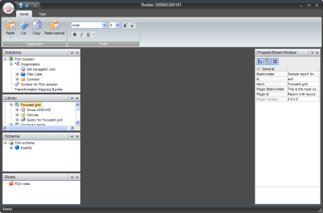
OfficeLAF project aims to create a high-fidelity implementation of Office 2007 UI and its Black skin as a NetBeans module. It is currently under development with the planned 1.0 release around Christmas. Readers of this blog will notice that the top part of the screenshot below features the JRibbon component from the Flamingo project. The main developers of the project, Gunnar Reinseth and Mikael Tollefsen from Exie AS are reusing some of the work being done in Flamingo, providing a high-fidelity skin and additional UI behavior (such as the main application menu button that is currently under development in Flamingo). Mikael has presented a session on OfficeLAF project at this year’s JavaZone conference, and the PowerPoints slides are available here.

OfficeLAF demo
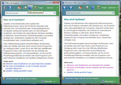
Manuel Kaess has implemented a Vista-style help browser for Swing applications. Noting that the JavaHelp UI is not very easy to use and does not look too attractive, he provides his own help browser implementation that has the usual features that one would expect, including support for search, changing text size and printing. The screenshot below shows his implementation side-by-side with the native Vista help browser.

Vista Help side-by-side


