Today i’m going to talk about the last big change that went into the next release of Substance look-and-feel – enhanced support for component states.
What is a component state? Let’s take a look at buttons – the most basic building blocks on any UI toolkit. Buttons usually have icons and texts so that the users know what will happen when they click them. In addition, modern UI toolkits provide rich texturing capabilities that allow skinning different parts of the button visuals – such as background, border and focus ring. These visuals usually depend on the current state of the button.
If a button does not respond to UI events (such as mouse click, for instance), it is said to be disabled – and usually has a lighter or partially translucent appearance to match its disabled state. A toggle button can be in a selected state, conveying that certain application parameter is toggled on. A selected button is usually painted with different hue to facilitate quick scanning of the application state. There are more button states – rollover when the mouse is moved over it, pressed when the user pressed but has not yet released the mouse and default button which is invoked when the user presses the Enter key.
Different controls have different states. For example, a progress bar can be determinate or indeterminate – depending on whether the application code can reliably assess the overall length of the work to be performed. A text component can be editable or uneditable. Input controls can be marked as required – to prevent the user from leaving the screen until he makes a selection on that control.
Component states in Substance are manager by the org.pushingpixels.substance.api.ComponentState class. Instances of this class correspond to states of Swing core and custom controls. This class provides a number of predefined static instances to cover most action-based controls such as buttons, check boxes and menu items. In addition, application code can define custom component states that create fine grained mapping between arbitrary states of controls and specific color scheme bundles in custom skins.
Each component state is defined by two arrays of component state facets (available in ComponentStateFacet class). The first array specifies the facets that are on, and the second array specifies the facets that are off. For example, when a selected toggle button is pressed, it transitions to PRESSED_SELECTED state. This state has ComponentStateFacet.ENABLE, ComponentStateFacet.SELECTION and ComponentStateFacet.PRESS as its on facets. If a selected toggle button is disabled, it has ComponentStateFacet.SELECTION in its on facets and ComponentStateFacet.ENABLE in its off facets.
The ComponentStateFacet class defines a number of core facets. The ComponentStateFacet.ENABLE facet is universal – it is relevant for all Swing controls. Other facets apply to a wider range of controls. For example, ComponentStateFacet.ROLLOVER facet applies to all controls that can show rollover effects – including buttons, menu items, comboboxes, sliders, scrollbars and many more. Some facets apply to a very narrow range of controls. For exaple, ComponentStateFacet.EDITABLE is only relevant for editable controls, such as text components, editable comboboxes or spinners.
The static instances of ComponentState defined in this class do not aim to cover all possible combinations of on and off facets. In addition to making this class to unwieldy, it is not possible to do since application code can define its own facets. Instead, Substance provides three ways to fine-tune the mapping between the component states and the color schemes used to paint the components.
- When the skin is queried for the color scheme that matches the specific component state – let’s say ComponentState.PRESSED_SELECTED – the skinning layer first looks for the exact state (as passed to SubstanceColorSchemeBundle.registerColorScheme(SubstanceColorScheme, ColorSchemeAssociationKind, ComponentState) or similar APIs). If the exact match is found, it is used. If there is no exact match, the skinning layer will look at all color schemes registered for the specific color scheme association kind in the matching color scheme bundle. The decision is made based on how “close” the registered component state is to the component state of the currently painted component. For example, ComponentState.PRESSED_SELECTED is a better match for ComponentState.PRESSED_UNSELECTED than ComponentState.ROLLOVER_SELECTED – since the ComponentStateFacet.PRESS has more weight than the ComponentStateFacet.ROLLOVER in the decision process. The skinning layer will choose the “closest” registered component state that is sufficiently close. For example, ComponentState.DISABLED_SELECTED will never be chosen for ComponentState.SELECTED, even if there are no other registered component states. This way the application code can register a few color schemes in the specific bundle, and have all other states “fall back” to the smaller subset of states.
- Facets such as ComponentStateFacet.DETERMINATE or ComponentStateFacet.EDITABLE are relevant only for a small subset of controls. In order to simplify the API signature of ComponentState, these facets are not part of any of the predefined static states in this class. Instead, they are used internally in the matching UI delegates (such as for progress bar or text components) to find the best match among all the registered states of the current skin. The specific skin can define its own ComponentState instances that use these facets. For example, NebulaSkin defines a number of component states that use the ComponentStateFacet.DETERMINATE facet, and maps the matching color schemes. At runtime, the procedure described in the previous item will match the state of the specific progress bar to the states defined in this skin, and use the matching color schemes.
- Custom application components may have facets that do not directly map to the core facets defined in the ComponentStateFacet class. In this case, the application code can create its own facet instances, and its own component states that use those facets in the on and off lists. Part of the custom code will be in the UI delegates that compute the current state of the custom component using the new facets. Other part of the custom code will be in the skin definition that maps the component states defined with the new facets to the specific color schemes.
Note that you do not have to create explicit dependency between custom component states used in the skin definition and custom component states used in the painting routines (in the UI delegates). In fact, the custom component states defined in the Substance UI delegate for progress bar are not accessible to the application code. The recommended way to separate the skin definition from the model lookups in the painting is:
The skin definition defines a sufficiently broad set of custom component states that use the new facets. Note that you do not have to create a custom state for every possible permutation of new facets (along with the relevant core facets). A well defined set of component states will provide a good fallback state for every relevant permutation of facets, keeping the skin definition small and manageable.
The UI delegate that queries the component model will use accurate component states that account for all the relevant on and off facets – including the core facets defined in the ComponentStateFacet class. When this (perhaps elaborate) state is passed to SubstanceColorSchemeBundle.getColorScheme(ColorSchemeAssociationKind, ComponentState) API, the the procedure described above will match the this state to one of the “base” states defined in your skin, and use the matching color scheme.
Note that the matching algorithm only looks at the facets in the on and off lists, and ignores the component state name. This allows you to create a broad component state in your skin, and a number of narrow component states during the painting – and have the Substance skinning layer find the best match.
When the matching algorithm cannot find a sufficiently close match, the skinning layer will fall back on one of the three base color schemes passed to the SubstanceColorSchemeBundle.SubstanceColorSchemeBundle(SubstanceColorScheme, SubstanceColorScheme, SubstanceColorScheme) constructor. States with ComponentStateFacet.ENABLE in their off list will fall back to the disabled color scheme. The ComponentState.ENABLED will fall back to the enabled color scheme. The rest of the states will fall back to the active color scheme. To change the fallback behavior pass a non-null fallback color scheme to the ComponentState.ComponentState(String, ComponentState, ComponentStateFacet[], ComponentStateFacet[]) constructor as the second parameter.
Let’s see two examples. As mentioned above, the Nebula skin defines custom color schemes for progress bars using the ComponentStateFacet.DETERMINATE:
ComponentState determinateState = new ComponentState("determinate",
	new ComponentStateFacet[] { ComponentStateFacet.ENABLE,
			ComponentStateFacet.DETERMINATE }, null);
ComponentState indeterminateState = new ComponentState("indeterminate",
	new ComponentStateFacet[] { ComponentStateFacet.ENABLE },
	new ComponentStateFacet[] { ComponentStateFacet.DETERMINATE });
SubstanceColorScheme determinateScheme = schemes
	.get("Nebula Determinate");
SubstanceColorScheme determinateBorderScheme = schemes
	.get("Nebula Determinate Border");
defaultSchemeBundle.registerColorScheme(determinateScheme,
	determinateState, indeterminateState);
defaultSchemeBundle.registerColorScheme(determinateBorderScheme,
	ColorSchemeAssociationKind.BORDER, determinateState,
	indeterminateState);

ComponentState determinateDisabledState = new ComponentState(
	"determinate disabled",
	new ComponentStateFacet[] { ComponentStateFacet.DETERMINATE },
	new ComponentStateFacet[] { ComponentStateFacet.ENABLE });
ComponentState indeterminateDisabledState = new ComponentState(
	"indeterminate disabled", null, new ComponentStateFacet[] {
			ComponentStateFacet.ENABLE,
			ComponentStateFacet.DETERMINATE });
SubstanceColorScheme determinateDisabledScheme = schemes
	.get("Nebula Determinate Disabled");
SubstanceColorScheme determinateDisabledBorderScheme = schemes
	.get("Nebula Determinate Disabled Border");
defaultSchemeBundle.registerColorScheme(determinateDisabledScheme,
	determinateDisabledState, indeterminateDisabledState);
defaultSchemeBundle.registerColorScheme(
	determinateDisabledBorderScheme,
	ColorSchemeAssociationKind.BORDER, determinateDisabledState,
	indeterminateDisabledState);
And the resulting visuals – note that the progress bars use brown color scheme, while all the other controls use gray colors:

The second example is from the Magellan skin that registers a specific color scheme to be used for painting uneditable text components:
ComponentState uneditable = new ComponentState("uneditable",
	new ComponentStateFacet[] { ComponentStateFacet.ENABLE },
	new ComponentStateFacet[] { ComponentStateFacet.EDITABLE });
SubstanceColorScheme uneditableControls = colorSchemes
	.get("Magellan Uneditable Controls");
defaultColorSchemeBundle.registerColorScheme(uneditableControls,
	ColorSchemeAssociationKind.FILL, uneditable);
Note that if your custom components use the DETERMINATE or EDITABLE facets in the computation of their states, they will get the matching visuals from the corresponding core Substance skins.
The animation series that was published on this blog last week has been largely the product of reworking the animation layer in Substance look-and-feel and replacing it with the Trident animation library. This work has some implications for the users of both library, and today i’m going to talk about those.
If you’re using Substance look-and-feel library in your applications, you will need to add the matching Trident jar to your classpath – starting from release 6.0 of Substance. The matching Trident version is 1.2 and it will be officially released at the same time with Substance 6.0. While this is not a major Trident release, it does remove deprecated APIs and as such will break applications that are using those APIs. All the removed APIs have direct replacements, and the final release notes will provide additional information (if you cannot find it in the code). The final Trident 1.2 / Substance 6.0 releases are scheduled for March-April 2010 timeframe.
Substance 6.0 breaks API signatures of most published painter interfaces. The painter interfaces that received two color schemes and the cycle position now only receive a single color scheme. If you are just using Substance as the application look-and-feel, you should not need to worry. If you are using Substance painter APIs to create consistent visuals for your custom / 3rd party components, you will need to change the code. If you have passed the same color scheme to a painter API call, changing your code is simple. If you passed two different color schemes, you will need to call the Substance API twice, changing the graphics composite to match the value of the cycle position.
Breaking the painter APIs is a necessary step to enable multi-state color transitions discussed at length in this series. The old APIs assumed that animating a control always involves two states – previous and current. This assumption is not correct. Suppose your buttons are painted with light blue color. When the mouse is over a button, the button is painted with light yellow color, and when the button is pressed, it is painted with saturated orange. Substance animates the button colors based on the state transitions. Suppose it takes 500ms to complete a single animation. The user moves the mouse over a button, and Substance starts animating the color from light blue to light yellow. Halfway through the animation (250ms), the user presses the button. Now, there are three states participating in the animation: default with light blue, rollover with light yellow and pressed with saturated orange. All the states contribute to the overall appearance of the button as long as the combined animation is in progress.
Tracking state transitions is done internally in Substance – in a layer built on top of Trident base timeline APIs. The tracking layer is not going to be part of Trident 1.2, since it is closely tied not only to Swing classes, but to Substance skinning model. Applications interested in adopting multi-state transitions should not use the internal state tracker layer of Substance. It is subject to change at any point in time. The base rules for multi-state transitions are derived from the examples in this series that have shown different movement paths of a physical object between three points.
The current implementation of the multi-state transitions in Substance 6.0dev does not model most of the physical laws discussed in this series. Handling momentum / inertia, direction change involving smooth turns, and the matching velocity models are not implemented. The work on this will continue throughout 2010, and some of it might find its way to the Trident itself. I am not aware of any other animation library (Java based or otherwise) that provides out-of-the-box support even for simple animations based on the physical rules discussed in this series.
Substance animations deal exclusively with colors. The current straight-line / straight-turn / no-momentum movement paths in the RGB color space result in visually consistent and smooth animations, for any reasonable durations. However, the long term goal for both Trident and Substance is to create mathematically correct animation model which is based on the rules of the physical world – where applicable. At the present moment the mathematics behind the graphs in this series is left as an exercise to the readers.
Over the course of this week i’ve talked about movements of physical objects in the real world, and how they can be applied to animating pixels on the screen. The last two entries have just skimmed the surface of animating UI objects, and even such straightforward areas as color animations and scroll animations can be much deeper and more complicated than it originally seems.
Every movement in the real world is governed by the laws of physics. Sometimes these laws are simple, and sometimes they are not. Understanding and emulating these laws in the virtual world of pixels takes time. It takes time to analyze how the objects in the physical world move. It takes time to find the right physical model for the specific dynamic change on the screen. It takes time to implement this physical model in the code. It takes time to optimize the implementation performance so that it is fluid and does not drain too much device power. Is it worth it?
Is it worth spending your time as a designer? It it worth spending your time as a programmer? Is it worth spending your time as a tester? If you care about your users, the answer is a resounding yes.
People don’t read documentation. Nobody has time do to it, and it gets worse with every passing year. We are confronted with too much information, and the average attention span keeps on shrinking. A recent trend towards separation between data providers and application providers makes it incredibly simple for people to switch between different views on the data of their interest (think Twitter clients, for instance). People will start using your application, play with it for a few moments (minutes, if you’re lucky) and move on to the next shiny thing on a whim. How can you capture such a volatile audience?
Intuitive design is a popular term in the user experience community. Alan Cooper writes the following about intuition in his About Face 3:
Intuition works by inference, where we see connections between disparate objects and learn from these similarities, while not being distracted by their differences. We grasp the meaning of the metaphoric controls in an interface because we mentally connect them with other things that we have already learned. This is an efficient way to take advantage of the awesome power of the human mind to make inferences. However, this method also depends on the idiosyncratic human minds of users, which may not have the requisite language, knowledge, or inferential power necessary to make those connections.
What does it mean that the given interface is intuitive? You click on a button and it does what you expected to. You want to do something, and you find how to do it in the very first place you looked at. The only surprises that you see are the good ones. The application makes you feel good about yourself.
This is definitely not easy. And you must use every available tool that you can find. How about exploiting the user itself to make your job easier? How about building on the existing knowledge of your users and their experiences with related tools in either real or virtual domain? As quoted above, not all knowledge and not all experiences are universal, but the animations are.
We all live on the same planet, and we are all governed by the same physical laws. Applying these laws to the changes in your application (in color, shape, position etc) will build on the prior knowledge of how things work in the real world. Things don’t move linearly in the real world, and doing so on the screen will trigger a subconscious response that something is wrong. Things don’t immediately change color in the real world, and that’s another trigger. Moving objects cannot abruptly change direction in the real world, and that’s one more trigger. A few of these, and your user has moved on.
Drawing on the existing user experience is an incredibly powerful tool – if used properly. Some things are universal, and some things change across cultures. Distilling the universal triggers and transplanting them to your application is not an easy task. It requires a great deal of time and expertise from both the designers and programmers. And if you do it right, you will create a friendly and empowering experience for your users.
 In a roundabout way, this brings me to the visual clues that are pervasive throughout the Avatar movie. If you haven’t seen it yet, you may want to stop reading – but i’m not going to reveal too much. Our first exposure to the Neytiri – the native Na’vi – is around half an hour into the movie. Apart from saving Jake’s life, she is quite hostile, and she does not hide it from him. What i find interesting is how James Cameron has decided to highlight her hostility. It is not only through her words and acts, but also through the body language, the hand movements and the facial expressions. They are purposefully inhuman – in the “not regularly seen done by humans” sense of word. The way she breaks the sentences and moves her upper body with the words, the movement of facial muscles when she tells him that he doesn’t belong there, and the hand gestures used throughout their first encounter certainly do not make the audience relate to her. On the contrary, the first impression reinforced by her physical attitude is that of hostility, savageness and animosity.
The story, however, requires you to associate with the plight of the locals, and root against the invasion of the humans who do not understand the spiritual connectivity of the Na’vi world. The love interest between Jake and Neytiri is a potent catalyst, and it is fascinating to see how Cameron exploits the human emotions and makes you – in words of Colonel Quaritch – betray your own race. If you have seen the movie, imagine what it would feel like if Na’vi looked like real aliens – from Ridley Scott / David Fincher / the very same James Cameron saga. It would certainly cost much less money to produce, but would you feel the same seeing two ugly aliens falling in love and riding equally ugly dragons?
 Na’vi look remarkably humanoid – just a little taller. The only outer difference is the tail and the number of fingers. Other than that – a funky (but not too funky) skin color, the same proportion of head / limbs / torso, the same facial features, no oozing slime and the same places where the hair doesn’t grow. It has certain technical advantages – mapping the movements of real actors onto the Na’vi bodies – including the facial expressions. In Avatar, however, there is a much deeper story behind the facial expressions. Cameron starts building on your prior experience with outward expression of human emotion in order to build your empathy towards Na’vi cause, and make you root for them in the final battle scene. How likely is it that Na’vis have developed not only the same body structure, but the same way positive emotions are reflected with facial expressions?
Our ability to relate to other human beings is largely based on our own experiences of pain, sorrow, joy, love and other emotions. Neytiri displays remarkably human like emotions – especially throughout the Ikran taming / flying scene half way into the movie. Cameron uses our own human emotions to guide us into believing in Na’vi cause, and this is achieved by building on the universally human vocabulary of facial expressions. To believe the story, we must believe in the characters, and what better way to do so than making us associate with both sides of the relationship between Jake and Neytiri.
Make your users productive. Make them happy that they have spent time in your application. Make them want to come back and use your other products. Make an emotional connection. Build on what they know. Make them believe that every choice they make is their own. Or better yet, guide them towards where you want them to go while making them believe that they are in charge.
After seeing how the rules of physical world can be applied to animating colors, it’s time to talk about layout animation. If you’re a programmer, it’d be safe to say that you spend most of your waking hours in your favorite IDE – and if you’re not, you should :) Writing and modifying code in the editor part of IDE takes, quite likely, most of the time you spend in the IDE. A quite unfortunate characteristic of such an environment is that the UI around you is highly static. Of course, you see bunch of text messages being printed to different views, or search view being populated with the search results, or problems view showing new compile errors, or maybe you invoke a few configuration dialogs and check a couple of settings. All of these, however, do not change the layout of the views that you are seeing.
The rest of the world spends their time outside IDE, browsing their Twitter / Facebook / … streams, updating the Flickr / Picasa albums, downloading songs on iTunes, tuning into Pandora, making selections in the Netflix queues and what not. These activities are highly dynamic, and feature “information tiles” – data areas that display information on the status, pictures, songs, or movies that are relevant to the current view. While the amount of available items is certainly finite, it does not – and should not – fit on a single screen. Thus, activities such as searching, filtering and scrolling are quite common. Let’s take a look at one such activity.
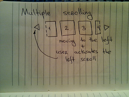
Suppose you have a scrollable widget that shows three pictures from your favorite Flickr stream in your blog footer:
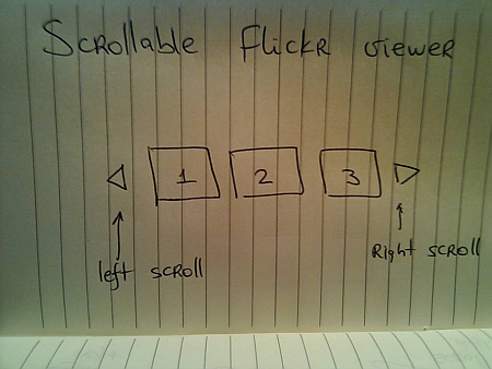
Here, the user can activate the left / right scroll buttons to view the next / previous batch of pictures – scrolling either one by one, or page by page. One option is to scroll immediately – as soon as the user activates the scroll button, the images just “jump” to the new locations:
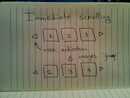
Simple to implement, but very user-unfriendly. You’re making the user remember the previous state of the application – where was each image displayed, and make the mental connection between old state, pressing the button and the new state. It would be fairly correct to say that immediate scroll is a persona non grata in the RIA world:
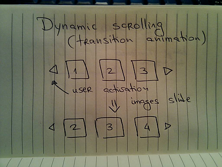
Now that you know that you want to slide the images, the next question is how to do it. Going back to the previous entries, a typical programmer’s solution is constant-speed scroll:
If you’ve followed this series so far, you know that this will not feel natural since it does not properly emulate movement of physical objects. How about emulating the movement of a man-driven vehicle:
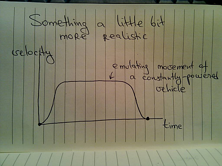
Here, we have a short acceleration phase, followed by the “cruising” scrolling, with the eventual deceleration as the scrolling stops. Is this the correct model? Not so much – the cruising of the physical vehicle happens because you’re constantly applying the matching pressure on the gas pedal (or let the cruise control do it for you).
In this case, the user had a rather short interaction with the UI – clicking the button. The scrolling continues well beyond the point of the press end, and as such there is nothing that can “power” this constant-speed movement. A better physical model is that of the finger flick – a common UI idiom in touch-based devices such as smart phones or tablets:
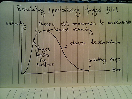
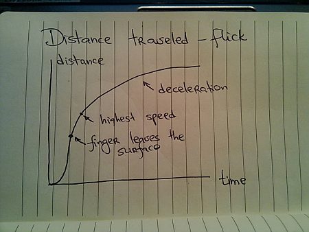
Here, you have very quick acceleration phase as the user starts moving the finger on the UI surface, followed by a slower acceleration attributed to the momentum left by the finger. Once the scrolling reaches its maximum speed, it decelerates – at a slower rate – until the scrolling stops.
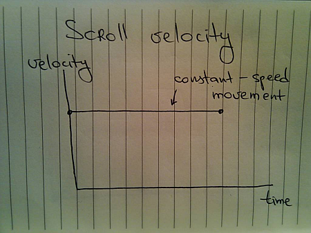
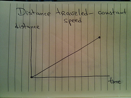
Let’s take a look at the distance graphs. Here’s the one for the constant-speed movement:
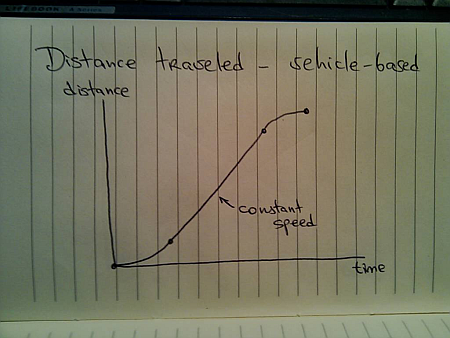
Here’s the one for the vehicle-emulating movement:
And finally, here’s the one for finger-flick model:
Now let’s take a look at what happens when the user initiates another interaction while you’re still processing (animating) the previous one. You cannot ignore such scenarios once you have animations in your UI – imagine if you wanted to go to page 200 of a book and had to turn the pages one by one. In the real world, you do not wait until the previous page has been completely turned in order to turn the next page.
The same exact principle applies to scrolling these information tiles. While you’re animating the previous scroll, the user must be able to initiate another scroll – in the same or the opposite direction. If you have read the previous entries, this directly relates to switching direction in the physical world.
Suppose you’re in the middle of the scrolling animation:
And the user presses the left scroll button once again. You do not want to wait until the current scroll is done. Rather, you need to take the current animation and make it scroll to the new position. Here, an interesting question arises – do you scroll faster?
For the specific scenario that is used here – scrolling the images – you have different options. You can maintain the same scrolling speed, or you can increase the scrolling speed in order to cover more “ground” in the same amount of time. Let’s take a look at some numbers.
- Suppose it takes 1000ms to make the full scroll.
- 800ms after the scroll has started, the user initiates another scroll in the same direction.
What are the options?
- Maintain the same scroll speed, effectively completing the overall scroll in 2000ms.
- Complete the overall scroll in the same time left for the first one – effectively completing the overall scroll in 1000ms.
- Combine the distance left for the first scroll and the full distance required for the second scroll, and complete the combined distance in 1000ms – effectively completing the overall scroll in 1800ms.
There is no best solution. There is only the best solution for the specific scenario. Given the specific scenario at hand – scrolling images, i’d say that option 1 can be ruled out immediately. If the user initiates multiple scrolls, those should be combined into faster scrolls. What about option 2? It’s certainly simpler than option 1, but can result is unsettlingly fast – or almost immediate – scrolls the closer the second scroll initiation gets to the completion of the first scroll. In our case, the second scroll initiation came 200ms before the first scroll was about to be completed. Now, you cover the remaining distance and the full distance for the second scroll in only 200ms. It is going to be fast, but it can get too fast.
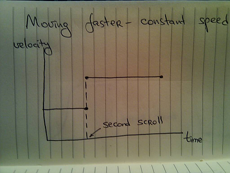
If we adopt the third option for this specific scenario, the velocity graph for the constant-speed scrolling looks like this:
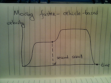
For the vehicle-based model it looks like this:
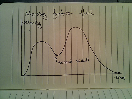
And for the finger flick based model it looks like this:
These two entries (on colors and scrolling) have shown just a glimpse of complexity brought about by adding dynamic behavior to your UIs. Is spending time on proper design and implementation of animations based on the real world justified, especially when the animations themselves are short? This is going to be the subject of the final part.
To be concluded tomorrow.
