Steve Simpson‘s work spans editorial print illustration, packaging design, children’s books, postal stamps, album cover art and much more. His unique approach combines such unlikely elements as retro vintage colors, folk art references and mid-century cartoons, bringing them together in a vibrant and immediately recognizable style. His active digital presence includes his main portfolio site, as well as Behance and Twitter. Selected prints are available for sale at Society6 and The Copper House Gallery.
Today I am thrilled to have an opportunity to ask Steve a few questions about the art and craft of illustration in the digital era.
 Kirill: Tell us a little bit about yourself and how you got started in the field.
Steve: Originally from the UK, I’m an illustrator and designer now based in Dublin, Ireland. I’ve been working in the area of design for print for the last 20 years. Previous to that, I spent 7 years working in TV animation and also had a short spell in comics. I studied technical illustration way back in the early 80s in the time before computer aided design:).
Kirill: You move with ease between a number of illustration styles. Is this a conscious decision to diversify and be flexible?
Steve: With my background in TV animation, the ability to change style from one to project to the next was an essential, even lorded part of the game. When I started to sell myself as an illustrator in Ireland, having multiple styles really helped kick start my career. Mainly, I was being asked to produce brightly coloured cartoony type illustration. It had a broad inoffensive appeal I guess.
It was only later that I noticed a style evolving, particularly in my personal work. Initially it was difficult to sell this new style to local clients, but as the style started to gain success in international award competitions it became easier.
I think these days I tweak my style according to the target audience rather than making wholesale changes to it.
Kirill: You seem to be moving away from your earlier cartoony style. Is it hard to let go of something that is not finding its place among the current trends?
Steve: A few years ago I made the difficult decision (financially) to move away from the cartoony style by removing it from my online portfolios.
Doing this helped consolidate my portfolio into a single(ish) style. There’s still a local market in Ireland (and probably elsewhere) for the cartoony style.
Kirill: How has your own stylistic taste evolved over the years? Is there ever a thought of exploring radically different directions? Is there a concern of falling into a certain rigidity of style?
Steve: I think my style is constantly evolving, but by fractions rather than huge leaps these days. Fashion trends are constantly shifting and working in the areas of design and advertising you get shifted along with it. Getting stuck with a style is always something I’m aware of but I wouldn’t say it was a concern at the moment. I use personal projects to experiment with new ideas.
Kirill: Folk art is one of your stronger visual references. What shapes and informs your taste and style?
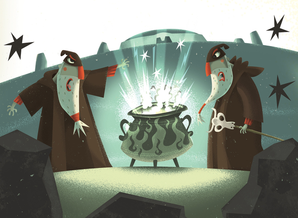
Steve: I’ve had an interest in history and archaeology for as long as I can remember. My parents house is built on the site of a Roman fort and my father was always digging up incredible pieces of decorated pot, coins and broaches. Over the years this has led to an interest in ancient civilizations and in particular folk art which influences much of my work these days. For centuries pictograms, textiles and graphic iconography have been created all over the world and used to communicate and preserve legends, myths and narratives as a part of daily life rather than for commercial gain.
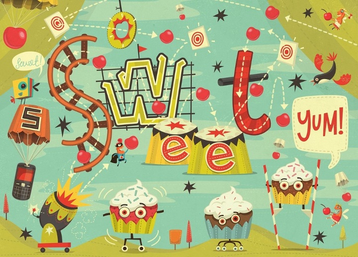
I love South American folk art, everything from the Incas to the Chachapoya in Peru and particularly the imagery based around the Mexican Day of the Dead (Día de los Muertos) holiday. It’s not just the South American influences, there’s also Asian, African and local Celtic imagery. Medieval Bestiary imagery is also fascinating!
Kirill: What do you think when you look at your own work from, say, five years ago?
Steve: This is the main reason I haven’t designed my own tattoo yet:) I’m always pushing myself, experimenting a little. Sometimes it works, other times it doesn’t. If after 5 years my work hadn’t evolved I’d be very disappointed. Naturally, there are some jobs that I’m still happy with but they would tend to be in areas I haven’t been concentrating a whole lot. I do have a piece of technical drawing I did in college in 1983 that I’m still amazed by. This probably proves my point, as I haven’t drawn a technically accurate bevel cog using Rotring pens and ellipse guides since 1983!
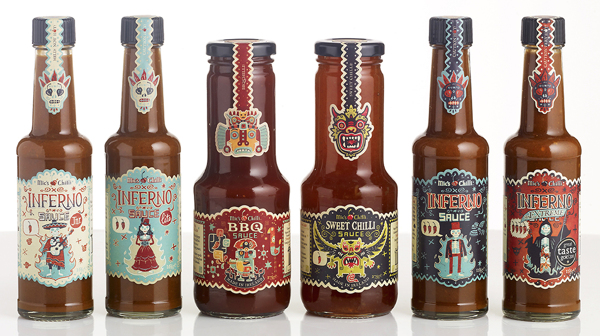
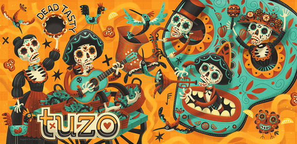
Packaging design and illustration for
BBQ and
Sweet Chilli. Courtesy of Steve Simpson.
Kirill: What draws you into working on physical branding and packaging?
Steve: I like the idea of producing the whole thing, being responsible for the whole design. Especially with packaging projects where you get to fine tune everything down to the tiniest details (I love messing around with barcodes). I like to think of my job on these projects being akin to the commercial artist’s role in ad agencies in the mid twentieth century when they were expected to produce the illustrations, hand lettering, design and even photography and animation. It’s a very fulfilling feeling.
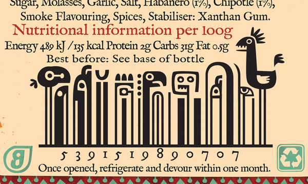
Barcode details for
Sweet Chilli. Courtesy of Steve Simpson.
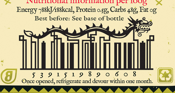
Barcode details for
BBQ Chilli. Courtesy of Steve Simpson.
Kirill: Do you prefer getting a full artistic freedom for a project, or a more defined direction from the client?
Steve: I like having a definite problem to solve. Too much freedom can lead to a lot of indecision:)
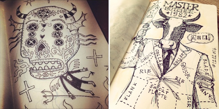
Kirill: Do you keep a sketchbook to develop ideas in between projects?
Steve: I’d like to have one of those beautifully collated sketchbooks, with amazing pieces of art at every turn… unfortunately mine tend to be a mix of hurried scamps, scribbles, lists and the occasional highly considered ink and wash drawing. I’m constantly sketching, mainly on any scraps of paper that come to hand. I’m always planning on sticking them into sketchbooks, but it never happens. My latest idea is an amended version of my previous failed idea, which was to have 2 sketchbooks one for best and the other for scribbles. The amended idea is to have best at the front and then turn it upside down and use the back for scribbles and notes and workings-out…
Kirill: Pen and paper, or digital? How has your choice of tools evolved since you’ve started in the field?
Steve: In 20 years it’s actually evolved very little. It was the early nineties when I first started scanning my pencils and working over them in Photoshop using the vector tool and I still do that now. Along the way I’ve played around with tablets (I’m still using a mouse) and various 3d programs but I’ve always come back to same old method. Works for me I guess:) Previously, when I was working in animation as a background artist, I would have used inks, watercolour, acrylics, collage and even the airbrush.
Kirill: Do you spend time on personal projects, and how important is that for you?
Steve: I always have a personal project on the desk. Something I can work on in between commercial jobs or when I need a break. It’s what keeps me sane!
Kirill: Your site has a special section for children books and projects. Is this a personal passion?
Steve: As anyone knows who works in children’s books, there’s not a huge amount of money involved, you really have to do it for the love. I illustrate a couple of picture books a year. They tend to have long deadlines so I can usually spend the first 2 hours of the day working on one before going back to the tighter deadlines of the design and advertising work.
Kirill: What’s the best thing about being an illustrator?
Steve: Sitting in a coffee shop thinking can be considered working! You can’t get away with that if you’re a window cleaner:)
And here I’d like to thank Steve Simpson for this great opportunity to get a small glimpse into his world. Selected prints are available for sale at Society6 and The Copper House Gallery.
Jack Hughes is a prolific illustrator with active presence on Dribbble, Tumblr and Twitter. Kicking off a new series of interviews on this blog, I’m delighted to have an opportunity to ask Jack a few questions about the art and craft of illustration in the digital era.
 Kirill: Tell us a little bit about yourself and how you got started in the field.
Jack: I grew up on the periphery of Croydon; South London’s ‘rear end’ as I like to think of it. It’s not actually that terrible, there are far worse places in London, Croydon just has a stigma it can’t seem to rid itself of and the London riots definitely helped remind everyone of that. Art was really the only thing I was ever good at as a child, so naturally stuck with it; in hindsight, not a bad decision. After school I enrolled in a Foundation Degree at Wimbledon College of Art. I’ve said it before, and I’ll say it again, but that year was the most humbling, interesting, encouraging and hilarious years of my life. Sadly my time at Wimbledon came to an all-too-sudden end, but there were good things on the horizon; I was fortunate enough to have been accepted onto the Illustration course at Kingston University (just a stone’s throw away from Wimbledon), which was, in hindsight, a rocky yet invaluable three years. During our London degree show I was lucky enough to be scouted by illustration agency YCN. Unexpectedly, I’ve been freelance since then.
Kirill: What influenced you to develop your style?
Jack: I was never that concerned with developing a style whilst at university; my tutors always said that in time style will just come to you. I still don’t believe that I have a definitive style, but I definitely feel like I’m on my way to one. My influences have shifted over the last few years but there are two that have remained and always will; science and mid-century design. Occasionally the two meet (not as often as I’d like!) and the results are very strange indeed.
Kirill: Do you keep a sketchbook to develop ideas in between projects?
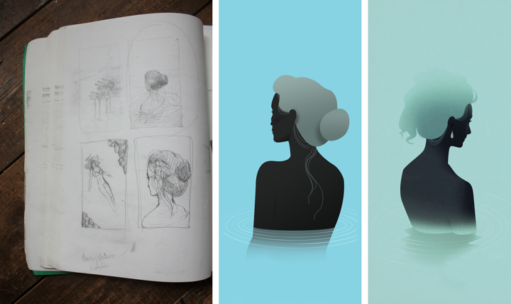
Jack: I have one big sketchbook permanently sat on my desk; everything goes into this one sketchbook: ideas for commissions, roughs, layouts, lists and personal projects. It’s a complete mess (doggy eared, water damaged, torn out pages etc.) and the majority of it looks like a madman’s inane ramblings that only I can decipher (most of the time anyway!).
Process shot: Iceland – SHOP Magazine
Kirill: How do you approach starting a new project?
Jack: Each project usually starts with a sense of determination and wild imaginings, followed closely by panic and the fear that I’m not good enough to give the commission its full potential. When all mental blocks and avenues are explored (and beaten!), I’ll start getting rough ideas and thumbnails down onto a page as quickly as my pencil will allow. It’s at this point where I hope I’ve struck upon something worth running with. If not, start all over again and hope I don’t go insane.
Kirill: How do you develop concepts for your illustrations?
Jack: It depends on the commission and what the client is after. Sometimes the client has an idea they want you to run with and other times the client will let you do what you like. I generally produce better work with the latter, although sometimes if the former is a really good art director, the end result can be far greater and unlike anything I would have achieved alone. Like most illustrators, I’ll try and reduce the article or commission down to its barest elements and work in ways to combine those elements in a clear visual concept.
Kirill: What drives you in your choice of colours and textures?
Jack: I mentioned earlier I liked mid-century design and this definitely feeds into my working process and outcome. Colours are particularly important to me, almost more so than content and concept; I believe colour is the very foundation of my work.
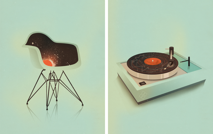
(left) Plastic Chair – Pick Me Up (right) Turntable – Pick Me Up
Kirill: Can you talk about the technical side of your projects? Pen and paper, or digital? What tools do you use and how has that evolved recently?
Jack: My more conceptual illustrations will start out as pencil roughs in my sketchbook, my more figurative fashion illustrations are formed by piecing together parts of photographs, digitally; think Bride of Frankenstein. After that everything is done on the computer, I’m more logical in my technique than I am creative, so working in Photoshop works well for me.
Kirill: How do you preserve colour fidelity when the final product is printed in physical form outside of your control (printing machines vs. the specific monitor setup at your studio)?
Jack: I have two (expensive) TFT monitors which have improved the accuracy of my colour on screen to colour in printed material. Apart from the obvious of working in CMYK, there’s not much else I can do and the rest is in the client’s and printer’s hands.
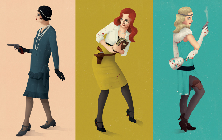
(left) Super 8 – The Gentleman’s Guide to Cocktails (right) Service Charges – FM Magazine
Kirill: What do you love most about being an illustrator?
Jack: Being the boss of my own working hours (which can sometimes be a hindrance) and producing work that not only gives me joy and satisfaction but for others as well. I love to share my work online and scope out how each illustration matches up to the next. Although one thing I do miss is being somewhere, having a studio space and working in a welcoming creative environment. At the moment I work from home because it’s cheaper, but perhaps in the future I’ll have a nice little studio (even if it’s another room besides my bedroom!) to go to, who knows.
Kirill: What do you do when you run out of ideas and get stuck?
Jack: I get annoyed, blame myself and step back to (at least try to) impartially view the situation and what exactly is going wrong. Whenever I find myself in such a mess I’ll just stop working altogether and keep busy doing something fun and distracting for a few hours. I’m an incredibly level headed person, but in the past I used to work myself into small fits of concentrated rage, that doesn’t really happen so much now.
Arkham Investigators – Personal Work
Kirill: How important is it to invest time in your personal projects?
Jack: Incredibly important, although I haven’t had much time recently to work on anything personal, which is a shame; I’m always thinking of new ideas and projects that will sadly never see the light of day, maybe. It’s through personal work where as an illustrator you can really find your voice and develop a style you are happy and comfortable in doing. It’s also a great way to steer your style towards a different set of clientele, especially if you feel like you’re being worked into a rut you’re not happy with.
Kirill: How do you spend time away from work?
Jack: I don’t go a day without thinking about work or doing some, even if it’s a tiny amount, I like to keep on top of things. Although having said that, I do find myself in the same situation of submitting work in the early hours of the day it’s due far too many times. But when I’m not working, I’m either keeping fit, drinking tea, reading, playing video games or getting merry, nothing that exciting really!
Kirill: What keeps you going?
Jack: Determination to do well and to prove any disbelievers or naysayers from my past wrong. Can’t say I had the greatest upbringing, the support was there, but sadly not much else was. Growing up in a less than ideal household, surrounded with people who haven’t really amounted to much and then being the underdog at university has probably driven me to where I am now. I have an incredible fear of failure and of looking back on my life and realising it’s wasted.
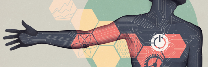
Techman – GfK NOP
Kirill: Do you think that advances in software tools and global connectivity are making it simpler to start in your field, and at the same time creating more competition and diversity for the clients to choose from? Does it make harder to stand out?
Jack: Definitely. Unless you get bolstered early on in your career by some huge magazine, blog, agency or individual than it will take you that little bit longer to get yourself noticed. I was thankful enough to be taken on by my agency YCN before I’d even graduated, without their trust and support I wouldn’t be full-time freelance today.
Kirill: There’s a recent surge of interest in mid-century inspired illustration, photography, fashion and design. Do you see this as a younger “digital” generation trying to recreate the old “analogue” look and capture that spirit?
Jack: I never felt like I actively tried to make my work mid-century inspired, at first the colour palette developed and then the rest followed suit, in the shape of a 1950’s themed cocktail book commission. Although having said that I’ve always had a fondness for it, for as long as I can remember actually, my parents had a lot of encyclopaedias from the 60’s I used to draw from (and sometimes in) as a child. It was after the cocktail book commission where I saw my work being steered into a direction I was totally unaware of. It does feel like the internet is trying to redress itself in a kind of faux analogue, which can’t be a bad thing, so long as it rids the shackles of the early 2000’s horrific digital stamp. I also think people’s tastes are changing (for the better), with the digital age brought digital art and photography, which was new and shiny and heavily influenced the next decade or so. Now we can stand back and realise that although we’re moving progressively into a more digital age, design doesn’t necessarily have to reflect that, hence people’s eagerness to embrace vintage inspired design. We’re so saturated with contemporary design, harking back to where most influences lie can only do us good.

The Gentleman’s Guide to Cocktails – Hardie Grant Books
And here I’d like to thank Jack Hughes for finding time in his schedule to talk with me about his work. It’s been a real pleasure, and thanks for kicking off the new series!
