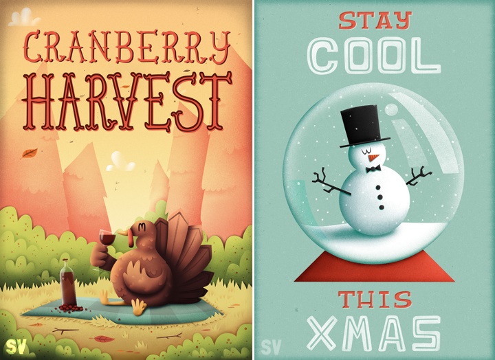
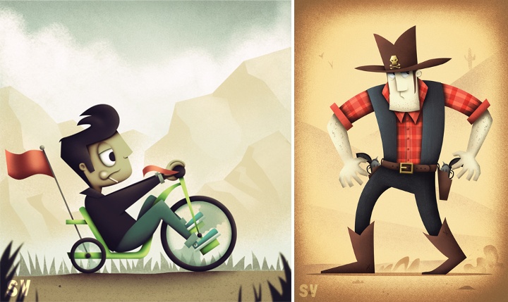
Continuing the ongoing series of interviews with illustrators, today I’m pleased to welcome Natalie Smith on my blog. Natalie’s portfolio is a charming collection with particular emphasis on delightfully quirky character illustration. She also designs T-shirts, and selected illustrations are available for sale over at Society6. Natalie’s Dribbble page, DeviantART gallery and Tumblr stream are full of sketches and work-in-progress snippets that provide a fascinating glimpse into her creative flow.
 Kirill: Tell us a little bit about yourself and how you got started in the field.
Natalie: I am a self-taught, freelance illustrator born and based in Yorkshire, England. Although I’ve always enjoyed drawing, I kind of fell into illustration a few years ago after winning a couple of t-shirt design competitions and through people taking notice of my personal work on Web sites such as DeviantART and Dribbble.
Kirill: Is it important to evolve your stylistic choices? Is there ever a thought of exploring radically different directions? Is there a concern of falling into a certain rigidity of style?
Natalie: I’m not sure if it’s about evolving my stylistic choices per se, but I do think it’s important to experiment and try out new ways of approaching an illustration in order to progress. In fact, it’s more a case of “what can I do to make my work better”? For me it doesn’t even have to be anything too drastic either; it could be something as simple as using a different brush in Photoshop, for example.
As for style, I think it’s ultimately just an amalgamation of what interests you at a given time. As you go through life these interests naturally change and evolve and with it so does your style.
Kirill: From pencil sketches, to the initial transfer to the digital mode, to circling on finer details – what’s your favorite phase?
Natalie: It really depends on the project but generally speaking sketching is my favourite, as that’s the most creative phase of the process and the part where you still have the freedom to do anything. Then it would probably be adding the finer details.
The most tedious part of my process, due to how I work and produce my illustrations, would be laying out the paths and the base colours for my piece.
Kirill: When you transfer your pencil sketches to the digital world, do you try to preserve some amount of hand-drawn imperfection? Is this important to you?
Natalie: I actually do a lot of sketching straight in to Photoshop these days, but when I do use my sketchbook it’s nearly always to put down and explore ideas, crank out thumbnails and try out different compositions and layouts. So my pencil sketches are really just a foundation to build upon rather than a piece of the finished illustration. Sometimes I will do individual bits of the illustration and then piece them together once I’m on my computer.
That being said, I have been trying to incorporate more of a “roughness” to my work, which I think adds a little more character. For this reason I also tend to create a lot of textures, which I use in my work, from traditional sources such as different types of paper and scanning in brush marks.
Above all though, it really depends on what is needed and what will best help communicate the message of the illustration.
Kirill: What do you like about character design and why?
Natalie: I’m not sure exactly what it is, but the first thing I really remember properly sitting down and drawing lots of were the characters from The Simpsons – so I think it’s just something I’ve always been interested in.
Kirill: What’s different about designing t-shirts? Which parts translate well to the wearable medium, and which do not?
Natalie: The biggest thing you have to remember is that a design someone may hang on their wall isn’t necessarily what they would want to wear! But the way I approach designing a t-shirt is largely similar to how I would tackle other illustrative work; composition, colour etc are just as important.
However, there are certain things I do take into consideration when specifically creating a design for t-shirts. For example, where the design is placed on the t-shirt is important – either to give the design more impact or to avoid it from being unflattering. From my own experience, I also tend to find that simpler designs tend to do better (though this may not be the case for others).
Kirill: Do you think that advances in software tools and global connectivity are making it simpler to start in your field, and at the same time creating more competition and diversity for the clients to choose from? Does it make harder to stand out?
Natalie: Not so much advances in software, as I believe it will only take you so far, but definitely having access to sites like Dribbble, which broadcast your work on a global scale, has made it easier for me to get started in the field. At the same time I do think it creates more competition, but I believe that if you have the passion to progress and the talent then you will always, in the end, stand out.
As a side note on this subject, because I’m self-taught the ease at which you can now have access to other artist’s work and be able to communicate with them and learn from them has been a huge boon for me.
Kirill: How valuable is self-initiated work for you?
Natalie: Extremely! First of all, it’s a time when you can really play around and experiment with your illustrations. It also creates a consistent output and allows you to refine your process and become more efficient at what you do.
Kirill: What’s the best thing about being an illustrator?
Natalie: The variety of the work and having a great excuse to watch cartoons (it’s for research purposes, obviously).
And here I’d like to thank Natalie Smith for answering a few questions I had about her art and craft. You can find Natalie online at her portfolio and buy selected prints in her shop. She can also be found at Dribbble, DeviantART, Tumblr and Twitter.
Continuing the ongoing series of interviews with illustrators, today I’m pleased to welcome Owen Davey on my blog. Owen is a prolific illustrator whose work spans editorial print illustration, animation, book cover art, branding and more. And if that is not enough, later this year we’re going to see his third published book, “Laika the Astronaut” (which is already available for pre-order).
Kirill: Tell us a little bit about yourself and how you got started in the field.
Owen: I’ve been working as a Freelance Illustrator for about 4 years, since graduating from University College Falmouth with a First Class BA(Hons) in Illustration. My first professional commission was for the Guardian Weekend, a week before I graduated. An ex student of Falmouth was an art director for them and liked my work, so thought he’d give me a chance. Since then, it’s just snowballed really. I’ve now worked with a range of clients across the globe including Orange, Microsoft, Persil, New York Times, Templar Publishing, Walker Books, Creative Review, Jamie Oliver & Threadless.
Kirill: Your style is rooted in the mid-century period. What attracts you there, and what are your thoughts on bringing that almost analogue look back to life with the modern digital tools at your disposal?
Owen: I discovered a while ago, that my work thrives under constraints. Limiting colour palettes or applying strict compositions just seems to make my work better. That’s what I love about mid-century design. The creativity and strength of design many illustrators managed to accomplish, within the limitations of technology, just inspires me. It is certainly my golden age for design.
In terms of the analogue and digital, that’s something I struggle with constantly in my work. I love the imperfections of image-making, and the evidence of human touch, and yet I also love clean, slick and precise imagery too. I always start with drawing, work digitally, and end with textures and manufactured imperfections; that way I sort of try and get the best of both worlds. I think I’ll just always be sitting on the fence though really.

Left – illustration for “The Feed” project for Orange. Right – illustration for an article about eReader devices.
Kirill: Do you want people to recognize your work the first time they see your new illustrations? Is there a concern of falling into a certain rigidity of style?
Owen: I’d like illustrators and designers to recognize my work, yeah. I discovered a long time ago, that the general public just doesn’t have the eye for it. Family & friends always tell me when they see something they think is mine, when it looks nothing alike. I don’t mind though; it’s my job to know the difference. I never fear falling into a rigidity of style, because I’m never 100 per cent happy with any of the work I do. I’m constantly evolving my work in an attempt to improve and hone. If you look through my blog for example, there’s quite a distinct change from the beginning to the most recent. I live in a world of illustrative evolution.
Kirill: What do you think about making illustrations for web sites? How does the evolution of responsive web design and scaling the design with device size affects that?
Owen: It doesn’t bother me at all really. It’s lovely to see work in the physical world, but I love computers. They are incredibly enabling objects. I’d have sucked at living in any other era. I just love the internet too much. And the joy of work existing in the digital ether, is that you can be 100 per cent sure how the colours are going to look on your screen. Reproduction can be a nightmare!
Just to clarify though, I’m a great lover of objects of art. My bookshelf is my pride & joy. But what everybody has to understand, is that we are now living in an age, when you should only print something if it’s worth it. You either make beautifully crafted objects, or you just do it digitally. The age of the crappy plastic CD has died out but stunning Gatefold Vinyl lives on. eBooks pick up the trashy novel, while art books are printed with spot colour matt stock perfection.
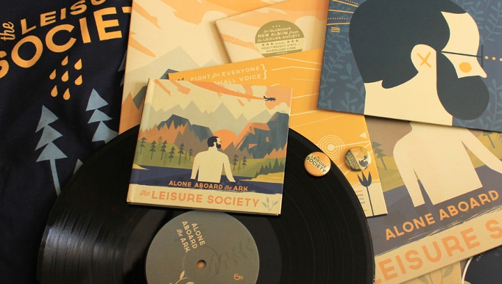
Various branding materials for the Alone Aboard the Ark project.
Kirill: What does it take to create a complete branding for a new music album (“Alone Aboard the Ark”), from album sleeves to booklets to t-shirts to beer labels, all the while maintaining a unified theme across the different physical characteristics? How long did that process take, and what was the most unexpected thing that happened there?
Owen: Well the surprising thing with it, was how long it trailed on for. I completed the cover artwork before Christmas, and I’m still doing little bits and pieces for it here and there. I approached the merchandising etc. in a very self referential way really. I tried to reuse elements as much as I could, simplifying and rearranging, colour picking, dragging and dropping etc etc. It was great fun to do. Each design takes on a slightly new life, and you really get to explore an image and a theme. I hope to do it more.
Kirill: You also did the jacket design for “Wild Boy” novel. How is that field adapting to the world of digital book stores, and what effect are those scaled-down interfaces having on the process of designing book covers?
Owen: Um. I don’t really know. I don’t see much difference in designing for the digital and physical to be honest. They’re both viewed in similar ways. If it’s eye catching online, it should be eye-catching in store.
Kirill: And if we’re talking about books, you are working on your third picture book, “Laika the Astronaut” – due out later this year. How’s the world of physical publishing treating you? Which parts of the long process of publishing a book work well for you, and which parts are still rooted in the pre-digital world?
Owen: Nope. Not working on it. It’s been done for several months. Just takes ages for it to be released. Um.
Well I love picture books. The longer printing side etc. is slightly infuriating, but the creation of them is great fun. I’m used to working to tight deadlines and single images most of the time, so to be able to approach a 32 page picture book over the space of a few months is really refreshing. You get to develop ideas in such exciting ways. You can add extra concepts or fun elements, properly explore pace and flow, hone storytelling, and refine composition. Love it. And Templar are particularly good at letting me choose papers and fonts etc, so that the finished object is one I can be really proud of. I can’t wait to see Laika in the flesh!

One of the illustrations for Laika the Astronaut picture book.
Kirill: Going back to the client work, do you prefer getting a full artistic freedom for a project, or a more defined direction from the client?
Owen: It depends really. The main issues stem from a client not being sure about which they want. If they tell you you have artistic freedom and then essentially steer you to where they originally wanted you, that’s pretty annoying. But in general I’m game for both. I do like to have some input in the conceptual process, even if they give me a strong theme or specific subject matter. I don’t really love being a human paintbrush (but then sometimes that’s where the best money is)
Kirill: Does it ever happen that a client contacts you based on your existing work, but then starts pushing you into a direction you’re not comfortable with?
Owen: Not exactly. I quite like exploring outside my comfort zone, so its fun when they get me to do stuff slightly different. I’ve had clients with just simple bad taste, asking me to add horrific colours or making bad edits to images after I’ve created them etc. That’s annoying, but I dunno. I’m fairly easy going with it all. If I was too precious with my work, I’d have been a Fine Artist, or gallery illustrator. When people commission me, they have to get what they want; otherwise I’m failing at my job.
Animation still from the Wisdomap Schools project.
Kirill: How valuable is self-initiated work for you?
Owen: It’s not valuable per se. It’s just fun. There’s a massive back catalogue of work I want to get done, but I often try and slip it into commissioned work, or books. I don’t usually class my picture books as self-initiated, because there’s still a client, but I suppose it fulfills the same purpose for me; it’s a way of cutting loose and exploring my own ideas.
Kirill: And on a related note, do you ever get to take a break as a free-lance illustrator?
Owen: Nope. It’s all I think about most of the time. I do other creative things, and live my life, but it all leads back into illustration in the end. I take time off, but I usually illustrate in it anyway. My last 3 holidays have all had mini commissions happening throughout them, but they paid for the holidays, so yay to me!
Kirill: What’s the best thing about being an illustrator?
Owen: Being paid to do what I love.
Animation still from the Wisdomap Medicine project.
And here I’d like to thank Owen Davey for taking time to answer my questions. You can find Owen online on his site, his blog and Twitter. Selected prints are available for sale over at Big Cartel.
I can trace the origins of my interest in the world of digital illustration to one artist. And her name is Zara Picken. It was this wonderful combination of shapes, colors and textures that drew me in, and it has been a true delight ever since to see her new work coming out on her blog and her Flickr stream. And today I am quite humbled to welcome Zara on my blog, and ask her a few questions about her art and craft.
 Kirill: Tell us a little bit about yourself and how you got started in the field.
Zara: I’m a UK-based illustrator originally from the Walsall in the West Midlands, currently based in the North East of England. I studied on a foundation course at Stafford College and went on to complete a degree in Illustration at the University of the West of England, Bristol.
I’ve been working as a professional illustrator since graduating in 2008. I work with UK and international clients on a wide range of projects across areas including editorial, advertising and more.
Kirill: How has your own stylistic taste evolved over the years? Is there ever a thought of exploring radically different directions? Is there a concern of falling into a certain rigidity of style?
Zara: I am interested in a wide range of aesthetics, beyond design and illustration – I have always been very interested in art, photography and film, for example. I don’t think I’ve ever had one particular stylistic taste – there is so much out there that I admire. I have a blog called Hovering Cat where I have been sharing my favourite finds since 2007.
Concerns about my own style never figure consciously when I am working – the way I work today has evolved from years of developing my process and will most likely continue to change as I carry on making small alterations based on playing and experimenting.
It’s difficult for me to see my own style, the same way that I don’t hear my own accent when speaking. I never notice it until someone points it out to me. Perhaps that’s what style is – the voice in which you naturally speak, not influencing what you say but how you say it. I use my style to communicate and will sometimes alter my tone or the way I word something but at the core it will always be my pronunciation and delivery.
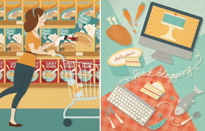
Left – illustration for ShopSmart magazine, right – illustration for Delicious magazine.
Kirill: And on the flip side, do you want people to recognize your work the first time they see your new illustrations?
Zara: People do seem to know it’s my work when they see new pieces but it’s more important to me that the illustrations resonate with people. My work is about communication first and foremost.
My name isn’t the first thing I expect people to think when they see the work, though I think my work is distinct and I aim for it to be eye-catching. There is personality in my work but I don’t want it to be overbearing at the expense of the message I wish to convey.
Kirill: When you transfer your pencil sketches to the digital world, do you try to preserve some amount of hand-drawn imperfection? Is this important to you?
Zara: Sometimes – it depends on the illustration, so I decide on a case-by-case basis. It used to be a bigger concern for me than it is today but I now feel less precious towards my sketches. Imperfection does not equal authenticity – clarity and editing is important, too. Sometimes symmetry and clean lines are required and sometimes a less perfect line or a degree of wonkiness helps.
I aim to be flexible and not so linear in the way I work, both literally and figuratively. My sketching is not hugely influential on the final piece in terms of the finish and manner in which it’s completed. I like to work ideas up a bit more digitally before showing them to clients, to give a better idea of my direction.
Kirill: Do you find yourself spending “too much” time on progressively smaller details? Do you ever wish to go back and tweak a certain illustration after it’s already been published by the client?
Zara: I like to keep illustrations simple and graphic whenever possible. I try not to add smaller details unless they say something or add significantly to the appearance of an illustration. There is always the temptation to dwell on details if work has been completed in advance of a deadline – I’ve found the time is better used by taking a step back and returning with fresh eyes. I try to spend time editing my illustrations, stripping back any extraneous elements.
If a client has published a piece of commissioned work and I later decide to add the image to my portfolio, I might sometimes choose to alter it slightly. It doesn’t mean that I was unhappy with the illustration when published but rather that changing it could help it to fit better alongside other pieces in my portfolio. I guess the fresh eyes also play a part – sometimes time away from an illustration can give a new perspective when revisiting.
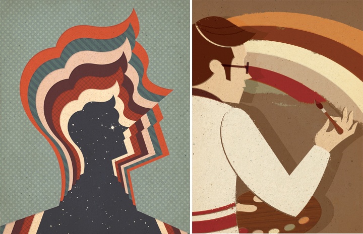
Left – starman, right – retro rainbow.
Kirill: What’s the weirdest client feedback you ever received, if you don’t mind sharing it?
Zara: I was commissioned to create an illustration to accompany an article about wine tasting – upon sending the roughs, I was informed that alcohol could not be depicted within the illustration.
Kirill: Would it be wrong to say that drawing human figures is one of your favorite areas?
Zara: I’ve enjoyed drawing people a lot more since working professionally as an illustrator. At university, I often disliked drawing human figures, due to the way life drawing was taught as a strictly representational exercise. All imagination was eliminated from the process and it certainly was not my favourite area.
I started to enjoy it more when I realised that people could be drawn in a way that matched my graphic design approach and did not have to be so realistic. By simplifying and refining complex areas of human anatomy, worrying less about the “right” and “wrong” ways to do things, people feel more integrated into my compositions and I have more freedom over the way figures can be portrayed.
Kirill: How valuable is self-initiated work for you?
Zara: I would say that it is invaluable. I focus on self-initiated projects whenever I’m not working on commissions. I probably end up doing as much personal work as commissioned – I try to do as much as possible. It’s crucially important to draw images you enjoy and tackle the sort of subject matters you really want to explore. I think this helps me to retain my voice.
Working on self-initiated projects also enables me to try out different ways of working that sometimes inform future commissions. My personal work feeds into my commissioned work, especially when clients cite self-initiated pieces for the direction of a job.
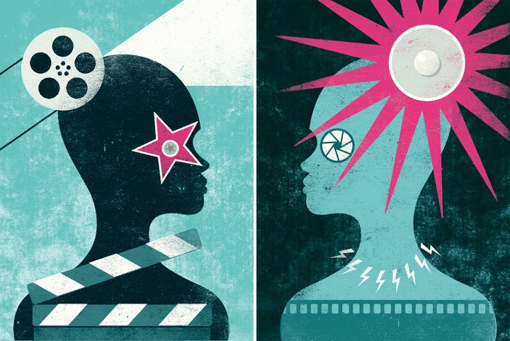
Self initiated “Glare” illustrations (part 1, part 2).
Kirill: And on a related note, do you ever get to take a break as a free-lance illustrator?
Zara: Yes, though I’m still learning to balance my time – I try to make sure that I take the opportunity to have a break when things are quieter, though my immediate impulse is to work on personal illustrations in that time. I think it’s easier when I travel to a different location as the temptation isn’t there to sit behind a desk – the change of scenery can be a pleasant distraction and there is extra motivation to go out and explore.
Kirill: There’s a recent surge of interest in mid-century inspired illustration, photography, fashion and design. Do you see this as a younger “digital” generation trying to recreate the old “analogue” look and capture that spirit?
Zara: I think that this is the reason in some cases. I have a theory that it could be the result of increased access to media from a wider range of times and places. This fits what is happening within wider culture. A comparison could be made to young musicians, who are now able to listen to music from any era thanks to online music services and are therefore influenced or inspired by a broader collection of artists. The sheer volume of material that might never have been seen before is now shared widely with a receptive audience.
Personally, I prefer to embrace the values of mid-century design rather than try to emulate an aesthetic. These principles are appealing in their positivity and playfulness. I want my work to have the same timeless, classic quality inherent in work produced during that era.
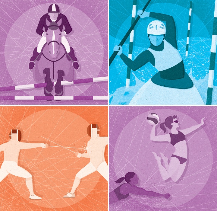
Illustrations for the London 2012 Olympic Games.
Kirill: What do you think when you look at your own work from a few years ago?
Zara: Some pieces stand the test of time better than others but I feel that I have come a long way in the few years I have been working professionally. I sometimes catch sight of illustrations lurking in my archive that I remember being really pleased with at the time and now…not so much.
However, I try not to be too critical of my older work – it has acted as a step towards what I am doing today and one day, the work I am doing today will be considered “old work”. Besides, my favourite piece of work is almost always my most recent.
Kirill: What’s the best thing about being an illustrator?
Zara: I like not knowing what I’ll be doing from one week to the next – it can be a slightly scary way to earn a living but it’s also exciting.
I also like the continuous consumption of coffee.
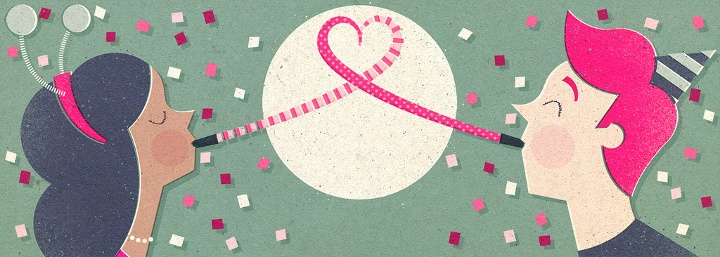
Illustration for an email newsletter.
And here I’d like to thank Zara Picken for taking the time out of her busy schedule to do this interview. You can find Zara’s work on her site, her blog and her Flickr stream. Zara also has active presence on Dribbble and Behance. You can buy selected prints over at Society6.
The work of Mads Berg is a perfect translation of classic poster art into the landscape of contemporary illustration. A flowing effortless interplay of shapes, colors and grainy gradients creates a unique and immediately recognizable style. Mads specializes in posters, editorials and brand illustrations, and his online portfolio is a veritable treasure trove. His art prints are available for sale at Arte Limited, and his extended portfolio is over at Behance. In addition, he’s part of a small team that creates maps for theme parks, amusement parks and zoos all over the world.
Today I am honored to have an opportunity to ask Mads a few questions about his craft.
 Kirill: Your style is very unique and immediately recognizable. What are your influences?
Mads: A mixture of everything really. I like paintings, Italian baroque, Dutch renaissance, Danish Golden Age and of course Art nouveau, Art Deco and cubism.
Kirill: Do you see your style evolving? Is there ever a thought of exploring radically different directions? Is there a concern of falling into a certain rigidity of style?
Mads: Evolving my style is not only a popular demand but also an important way to challenge myself and to continue to be curious in what I do.
Kirill: Do you keep a sketchbook to develop ideas in between projects?
Mads: I often keep my sketches or prints of my visuals in progress in my pocket for days to view it once in a while, and to let it mature over time.
Brand illustration for Tuborg Classic. Courtesy of Mads Berg.
Kirill: Do you prefer getting a full artistic freedom for a project, or a more defined direction from the client?
Mads: I do not mind working from a well defined motive or scene, or even a product as long as I have the freedom executing it.
Kirill: Pen and paper, or digital? How has your choice of tools evolved since you’ve started in the field?
Mads: You cannot beat sketching with pencil or paper. But finalizing images on a computer is really wonderful excellent for exploring color tones and values.
Kirill: What’s the best thing about being an illustrator?
Mads: Vanity i believe. Turning a white nothing into something beautiful.
Kirill: Your final illustrations seem to be reduced to bare essentials. Do you remove clutter until there’s nothing left to remove?
Mads: I try to, yes.
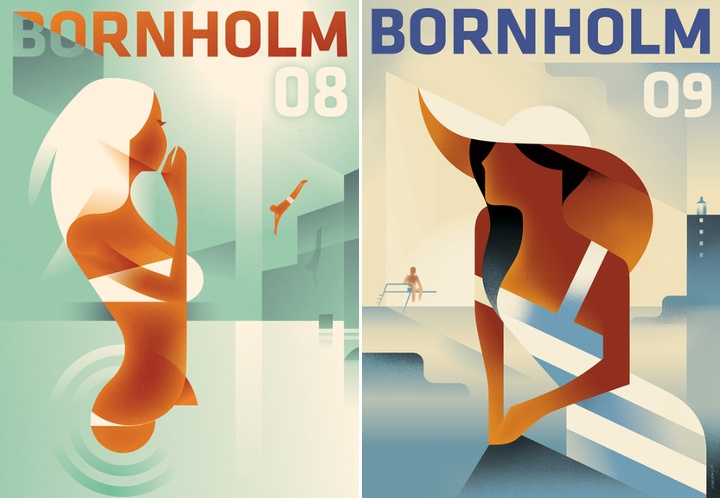
Posters for the Danish Island Bornholm. Courtesy of Mads Berg.
Kirill: And on a related subject, the way you render human body is absolutely fantastic. Would it be wrong to say that it’s one of your favorite things to draw?
Mads: It is indeed one of my favorite things to draw. Apart from depiction of eyes, I think the human body has the strongest attraction in an image.
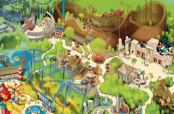
Park map for Legoland Florida. Courtesy of Mads Berg.
Kirill: You’re part of a small team that creates maps for theme and amusement parks. What is the process of creating a new map like?
Mads: Research and description of style and approach. It’s much about laying out pathways and supersizing the essential features and eliminating the less important ones.
Kirill: How do you bridge the gap between staying faithful to the park layout with abstracting away the unnecessary details? Or is there no gap at all and these are two sides of the same coin?
Mads: A lot of stretching and tweaking has to be made, but as long as the paths connect where they do in reality, quite some fantasy can be used.
Kirill: Do you spend time on personal projects, and how important is that for you?
Mads: I make 50 xmas cards every year by hand. That makes me happy, so that must be important.
Healthy community magazine cover. Courtesy of Mads Berg.
Kirill: Do you think that advances in software tools and global connectivity are making it simpler to start in your field, and at the same time creating more competition and diversity for the clients to choose from? Does it make harder to stand out?
Mads: Global connectivity yes, software no. True talent combined with consistent work always stands out, I believe.
Kirill: There’s a recent surge of interest in mid-century inspired illustration, photography, fashion and design. Do you see this as a younger “digital” generation trying to recreate the old “analogue” look and capture that spirit?
Mads: Yes, nostalgia and the search for authenticity is sign of the times. I think that knowledge and appreciation of visual heritage must be combined with fascination of the new. Past time heroes also copied their ideas.
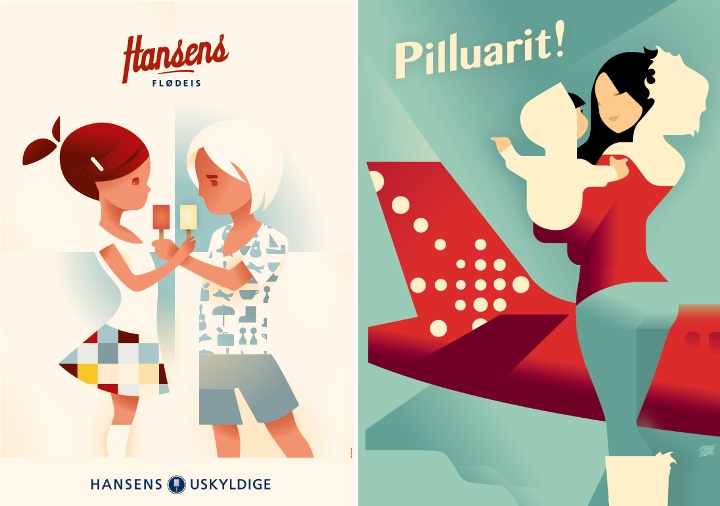
Left – poster for Air Greenland, right – poster for Hansen’s ice cream. Courtesy of Mads Berg.
And here I’d like to thank Mads Berg for graciously agreeing to this interview. Selected prints available for sale at Arte Limited.
