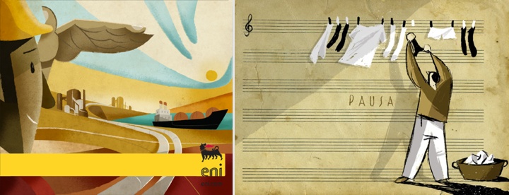
Riccardo Guasco is an illustrator and a painter working with a variety of styles and mediums – ink, watercolor, acrylic, Chinese brush – in addition to creating digital illustrations for clients such as Eni, Diesel, Rizzoli, Moleskine, Thames & Hudson and TBWA. In this interview Riccardo talks about what influenced his taste, not wanting to be tied to a single technique, and conveying motion in a static medium – particularly in his collection about cyclists.

Photography by Lorenzo De Simone
Kirill: Tell us about yourself and how you started in the field.
Riccardo: My name is Riccardo Guasco, I am an illustrator and a painter born in Alessandria, a small town in the northwestern part of Italy. I’ve always been drawing: since I was a little boy, I’ve always got the chance to attend art schools, till the School of Fine Arts in Turin. And this experience helped me to improve my hand and my style, up to turn my passion into a job.
Kirill: What informs and shapes your taste and style?
Riccardo: My style has evolved over time, matured with the passing of the years and with the settling down of my passions. During my studies, I got very interested into Picasso’s, Futurist painters’, Russian Suprematists’ and contemporary street art. Later, my passion has been enriched with comics – with the characters coming from Il Corriere dei Piccoli, the first Italian weekly comic magazine -, posters, or thanks to artists creating advertising placards since the Forties – such as Savignac, Cappiello, Seneca, Dudovich. It is a style taking inspiration from simple images, made up of few lines but full of expressive and emotional content.

Kirill: Your portfolio has work in multiple mediums – ink, watercolor, acrylic, Chinese brush. Is this a challenge to yourself to explore different directions and styles?
Riccardo: I love my art can become a language applicable to all media and through every technique. Technique is just a tool, a mean to communicate; the most important thing is having a message. I don’t want to tie myself down to a single technique or even worse to a single software, I want to try them all. My next collection I have in my mind, it will be a ceramic dinnerware set; this technique is really attractive to me, but I have never tried it up to now.
Kirill: What are your thoughts about digital illustration hardware and software tools?
Riccardo: I often use hardware and software tools in my job. Photoshop, Illustrator and Cintiq digital tablet are useful but not essential tools, luckily. As I told you before, I don’t want to tie myself down to a single software or a single hardware. Almost all my works arise from the paper first, and several times I prefer not to switch them into a digital format because I do not want to loose the freshness they have on the paper.

Kirill: How do you approach capturing and conveying movement in this static medium, particularly in your illustrations of cyclists?
Riccardo: My collection about cyclists was one of my earlier works. I wanted to convey the more introspective side of each cyclist, rather than to portray them just as racers; my attention was addressed to their thoughts and their soul, I wanted to tell something only through their profiles. So, I decided to eliminate the bicycle and everything that was redundant for me. And I was left with faces belonging to heroes, profiles speaking about struggle, noses stuck out in order to reach the finishing line they would have passed shortly.
Kirill: Do you ever find yourself so immersed during painting that you lose track of time?
Riccardo: If I could, I would draw nights and days, and if I am doing a job I like I don’t care about tiredness and time passing. I experience like a trance and my attention is completely enchanted by the work till the end. On the contrary, I never spend too much time on the same painting or illustration because I do not want to loose the freshness and spontaneity of the very first idea I’ve put on the paper.

Kirill: What goes through you head when you look at your own work from a few years ago?
Riccardo: It is a continuous metamorphosis, my works and my style change with the passing of the years (luckily). When I go back to my old works, I see naivety and defects that I would not make again now and I think the same painting or illustration would be different today.
Kirill: As you went back to the academic world, do you miss the more hectic side of client work? Any plans to go back to freelancing or agency?
Riccardo: I like to work with customers and/or agencies that ask me for unusual illustrations. I think that facing and dealing with brief and customer’s requirements is like a training. Usually, I try to explain to the customer that first of all we need to rely on each other and have a mutual consideration; only in this way it is possible to discuss and create an illustration satisfying both. I know I have a really peculiar and codified style, and this is a luck that helps me to meet customers who are exactly looking for my illustrations because they appreciate and consider them interesting from a quality point of view.
Kirill: What do you do when you run out of ideas and get stuck?
Riccardo: I think inspiration does not exist. Creativity and ideas are the result of a teamwork of eye, brain and hart. At the end of this process, the hand realizes what the other three players have imagined. This process cannot be stopped because it is like breathing or running: you need training and perseverance.
Kirill: What’s the best thing about being an illustrator?
Riccardo: The best thing about being an illustrator is the availability in your own hands of a universal communication medium: “drawing”. Having the opportunity to create an image able to reach and touch millions of people in a short time; if you try to think about an image, you realize it is more straightforward than a book, or a song, or rather a movie; but it has a strong tension inside that needs to be well and carefully handle.

And here I’d like to thank Riccardo Guasco for his outstanding work, and for taking the time to answer a few questions I had about his art and craft. You can find his work online at his main portfolio site and his Behance profile. Selected works are available for sale at his Society6 shop.
Continuing the ongoing series of interviews with illustrators, it is my pleasure to welcome the talented and prolific Morgan Schweitzer. He splits his time between editorial illustrations and motion work that includes character design, concept design, asset creation and storyboard art. His clients include Penguin, Businessweek, Maxim, Psyop, Buck, Stardust and many others. In this interview Morgan talks about his roots, his creative process and designing for various media.
 Kirill: Tell us about yourself and how you started in the field.
Morgan: I studied Visual Communications at Washington University in St Louis. When I first graduated I blindly emailed over 100 commercial animation studios all over the world to see if they had openings. It was only one studio, Nathan Love in New York, that started offering me some freelance work here and there. I did some odd-jobs as a freelancer starting out. I was hired by a talented graphic designer/developer and family friend, Gretchen May. She was working for Massachusetts General Hospital at the time, and hired me to build an illustration library for them. Selling the copyrights to all the images allowed me the financial freedom to move to New York City. Once in NYC I started working for Nathan Love more regularly. In fact, the day they called me in to start was the same day I was supposed to start work as a waiter.
I dropped off my portfolio, sent out mailers and started getting some editorial illustration jobs. For about a year I illustrated a weekly column for the Village Voice. Meanwhile, as other freelance coworkers migrated to other studios, my name got spread around and I started working for more animation studios.

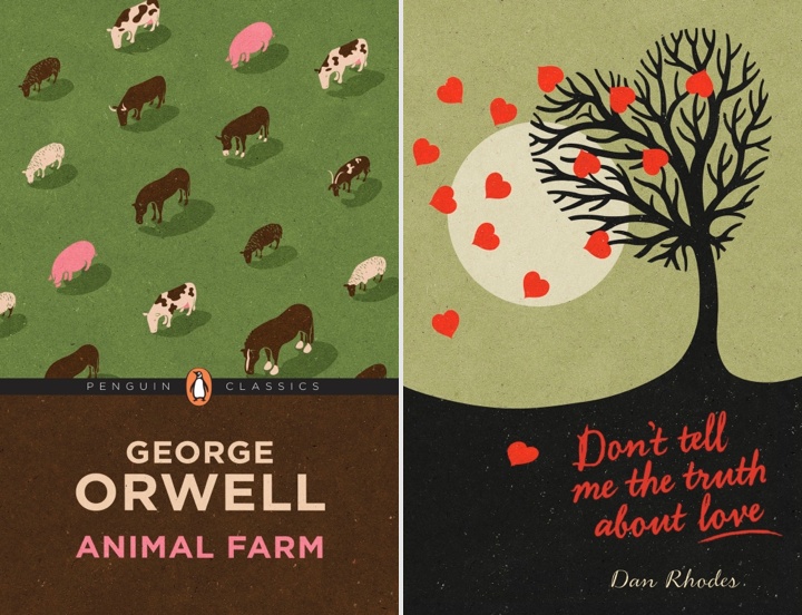
Wraparound cover for PK Pinkerton and the Deadly Desperados book published by Penguin.
Kirill: What informs and shapes your taste and style?
Morgan: I have a real compulsion to discover new artists, designers, and illustrators online. It’s inspiring and eye-opening to see how different artists work, and how they work differently from me.
Kirill: Is there a danger of absorbing too much from what influences you and not finding your own unique voice?
Morgan: There is certainly that danger. My influences are so vast, that I’m never influenced by one artist in particular. I strive to become an amalgam of everything that I love in all that influences me.
However, I struggled for a while…or rather, I thought I was struggling for a while with finding a focus and a voice. As a concept artist I work to invent new styles and aesthetics for each project. Some, styles that I would never pursue within my own artistic exploration. So, for a while I felt like concept art muddled my focus and my own voice. I got confused and thought I needed to stick to a “style” or come up with a “style” that was unique to me.
Then, I stepped back and realized that when given an illustration assignment I would go back to my own default and illustrate the topic in the way that was most comfortable for me. And, while I never equated that with a “style,” what I realized was that the most genuine artistic voices are not determined from a lineup of styles, but rather, just a way of working which is most comfortable and engaging for the artist. That said, I still don’t feel like I have a “style,” and I don’t anticipate ever feeling that way.

Illustration for an article in American Cowboy Magazine about the old Clint Eastwood classic, Fist Full of Dollars
Kirill: There’s a lot of momentum and energy in your illustrations. How do you approach conveying motion in a static image, particularly for human subjects?
Morgan: I’m glad that comes across. My sketches are generally very loose and gestural at first. I try to incorporate some of those gestural qualities to help guide the finished illustration and to exaggerate aspects of the figure that help convey movement.
Kirill: What is the process of designing a book cover? Is it about capturing the story in a single image, or a somewhat looser interpretation that gives you more freedom?
Morgan: For book covers I’ve worked on, I would say it’s not about capturing an actual scene or events from the book, but rather a more general expression of the most iconic elements from the story into an image (without giving anything away). It’s also important for the image to be iconic and readable from afar.
Kirill: Speaking more broadly about cover design, what are your thoughts on increasing prevalence of digital stores – for both music and books? As you’re blocking out the cover elements, do you factor in that people will see the cover – possibly significantly scaled down – on a variety of screen sizes?
Morgan: I think a good cover will hold up. These factors make it even more important for the image to be readable at a small scale. I do tend to examine my illustrations at thumbnail size whether it’s for a cover or not. I find it helps me to see the image more broadly to make sure everything is working together.

Left – illustration for New York Times Magazine, right – illustration for Westchester Magazine.
Kirill: What’s the technical process? Pen-and-paper first, and then transition to digital tools?
Morgan: While I love working with traditional media, my process has become increasingly digital. It’s a time-saver with tight deadlines, and for working in animation with continuous revisions it’s a must. To avoid the sterile, lifeless qualities that digital art can often produce I have amassed a library of paint, ink, and charcoal textures that I use to give my images a bit more of a tactile quality.
Kirill: Once the specific illustration is out of your hands and becomes a part of the final product, do you ever wish to go back and tweak it? Has it ever happened that you had what seemed to be an even better idea after the process has been completed?
Morgan: I have a bad habit of staring at my illustrations for a couple days after I’ve already sent them in to the client. Even when they’re approved I’ll sometimes send in my own revisions after the fact if something starts bugging me later. That said, once I’m finished staring at an illustration, I tend to close the book on it mentally. Overtime, I develop a constructive hatred of all my earlier work. I think that’s an important sign of growth. I’ll never be content with a piece that I’ve improved beyond, so if I weren’t hating everything I’ve ever done, I’d be worried.

Self-initiated work for imagined comic book covers.
Kirill: How do you preserve color fidelity when the final product is targeting print media, such as album or book covers?
Morgan: I’m not as much of a stickler about color as maybe I ought to be. Every monitor is different. Every printer is different. So, it’s kind of an impossible pursuit. I think if the overall color palette is strong as a unit, then it will hold up if all the colors are uniformly shifted.
Kirill: What’s the weirdest client feedback that you’ve received so far, if you don’t mind sharing? Is there any difference between working for smaller publications as opposed to larger corporate clients?
Morgan: To be honest, nothing too weird comes immediately to mind. There are certainly client decisions that I consider to be strange within the context of certain projects, but I can’t think of anything too crazy. Things like the typographic design working against the illustration, or character designs that move away from what the characters are trying to convey.

Type Design for “Crime of Passion” album cover for “Hollywood Kill”.
Kirill: One of the sections on your site is about your lettering projects. Do you see yourself branching out in the future to do type design?
Morgan: I have a background in typography and design, so lettering is something I enjoy. Type is most exciting to me when it’s combined into an illustration. So, I try to incorporate illustrated lettering here and there in my illustrations when possible. However, I don’t have a dedication to type alone the way most type designers do. So, I don’t see that becoming a more prominent aspect of my career.
Kirill: How important is it to invest time in personal projects?
Morgan: I would say it’s very important. It helps to stretch your creativity farther than assignments may allow. Exploring your own creativity in that way is perhaps the most important tool in developing an identifiable voice. All that said, I rarely work on personal projects…something I would very much like to change in the near future.
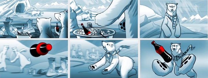
Storyboards for “The Catch” Coca-Cola pitch.
Kirill: What do you do when you run out of ideas and get stuck?
Morgan: I suppose my idea process is a little different for each field. If I ever get stuck coming up with a concept for an editorial illustration, it’s generally as simple as starting to sketch some thumbnails. Seeing different ideas on paper gives way to expanding on those ideas, changing and combining them in different ways. If I ever have trouble starting to sketch thumbnails, I find it helps to start writing down a list of words that correspond to topics in the article.
For character design, when I feel I’ve exhausted all the forms for a particular character exploration, I start to sketch almost without intention. Almost random scribbles. Then I’ll start to turn the scribbles into different forms and generally more exaggerated interesting characters will start to take shape.
Kirill: What’s the best thing about being an illustrator?
Morgan: Hard not to say something totally cliché here. I’d like to say something like…because I love the pursuit of illustration, I rarely feel like I’m working; exploring one’s own creativity is a valuable window oneself; it’s a fulfilling and exciting pursuit to work toward the impossible goal of artistic perfection; but really it’s the danger…and the power, fame, money, cars and women.

Illustration for melba.co.
And here I’d like to thank Morgan Schweitzer for his wonderful work, and for taking the time to answer a few questions I had about his art and craft. You can find his work online at his main portfolio site and his personal Tumblr stream. He’s also active on Facebook and Twitter.
I have first came upon the online presence of Niall McCormack a couple of years ago through his blog dedicated to vintage Irish book covers. Unlike many of the aggregator blogs that simply repackage and post image galleries, every entry on this blog is a breath of fresh air, providing a wealth of background information on the specific authors, genres and publishing houses, along with Niall’s own impressions of the works. And a few months ago I was particularly delighted to find Niall’s portfolio, a thriving and captivating collection of his illustration work with particular emphasis on music packaging and book covers. It gives me a great pleasure to welcome Niall to the ongoing series of interviews with illustrators, and to ask him a few questions about his art and craft.
 Kirill: Tell us about yourself and how you started in the field.
Niall: I’m a designer and illustrator from Dublin, Ireland. I specialise in designing music packaging and book covers. I studied Industrial Design at college in the early nineties but I spent my free time designing posters and playing music while I was there. After college I played with my brothers in a band called Jubilee Allstars. I designed all of our record releases – a few LPs and a bunch of singles and EPs. That gave me a good handle on the technical side of packaging design and I got more jobs on the back of that work.
Since 2007 I’ve been designing CD covers for Ace Records in the UK and I get to work on great music from the fifties and sixties – rhythm & blues, soul, rock ‘n’ roll, girl groups, rockabilly, garage etc.
In the last couple of years I’ve been exploring illustration much more and enjoying the freedom it brings to the design process. Originating the entire visuals for a project is very satisfying and allows a higher degree of control over the process. It also means that you can add you’re own voice to projects and use it as a selling point to new clients.

Left: Giselle, for Birmingham Royal Ballet exhibition organised by Point Blank. Right: Vatican Voodoo Brand for The Art of Superstition exhibition organised by Illustrators Ireland.
Kirill: What informs and shapes your taste and style?
Niall: Collecting records from a young age had a major impact on my visual taste. I’ve always loved the sleeve designs as much as the music and in many ways it was my first exposure to the visual arts. I love design that is simple and direct, I like it to be rough around the edges. I always associate slick design with corporate blandness. I like vernacular design and popular commercial design.
I’m also very interested in the mechanics of printing and how different processes affect the look of the finished piece. I’m fascinated by how ephemera from different eras has a look that is unique to that time, how trends in design as well as advances in print technologies affect the style of that time.
Kirill: Do you want to carve out a consistent and recognizable style? Is there a danger of being influenced too much and not finding your own unique voice?
Niall: My aesthetic preferences and tastes do give my work some semblance of a recognisable style. It is something that I’m conscious of, but I find it hard to actively aim for a consistent style without it becoming a creative strait jacket. I’m not too concerned about having a unique voice, I like my work to retain the feel of the material that I take inspiration from. Some of my work requires me to explore styles from the past in a believable way so there is less room to create a unique voice.

Book covers for Chartered Accountants Ireland.
Kirill: How do you approach designing a book cover? Is it about capturing the story in a single image, or a somewhat looser interpretation that gives you more freedom?
Niall: Most of the book covers I design are non-fiction and the Irish market is quite conservative in terms of cover design. Irish publishers are struggling to embrace the move towards illustration which has occurred in larger markets over the last few years.
With fiction, if you’re lucky, you’ll get to read the full book although sometimes it might only be a chapter or two. I think it’s important to capture the tone or mood of the book rather than a literal representation of a particular scene, character or object. Period style may also need to be evoked and that can be a good starting point.
Non-fiction covers can be a real challenge but it is very satisfying when it goes right. I design a lot of accountancy book covers with impenetrable titles and abstraction tends to work a lot better than stock clichés.

Downtown Soulville CD covers for WFMU Radio.
Kirill: What is your process of designing a record cover? Does it work better if you like the particular album?
Niall: Yes, it definitely helps to like the music and it’s essential that you have a good understanding of the cultural context the music was made in and the market it is aimed at. Luckily I have a fairly broad taste and I’m a fan of the labels I work with. I’m not interested in packaging music that I don’t like and so far it hasn’t been an issue.
The design process is different depending on whether I’m working on a reissue or on contemporary material. For reissues there are usually some photographs or other ephemera which will be used as the starting point. I always relish having a blank canvas to start with which happens more often with contemporary releases. I like to push illustrative solutions but sometimes an artist will feel safer with a photographic cover.
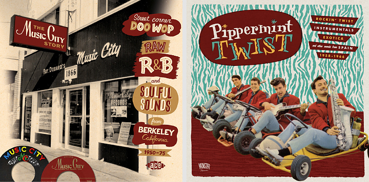
Left: The Music City Story, CD cover for Ace Records. Right: Pippermint Twist, LP & CD cover for Munster Records.
Kirill: Most of your record covers are for compilations of material from a few decades ago. Employing the mix of old photographs and vintage illustration elements, is your intent to stay faithful to the original style of that era?
Niall: The majority of my work is for labels who reissue music from the ‘fifties and ‘sixties and it’s an era I’m drawn to both musically and visually. I do try to stay faithful to the original style of the era and can be a bit obsessive about it. I try to use fonts which are true to the period and employ hand-lettering when necessary. I enjoy exploring the nuances of popular visual style. There’s a big difference between the graphic look of the early-sixties, mid-sixties and late-sixties but some of the differences are quite subtle. I collect books of LP cover art and I’m particularly fond of 45 label artwork, it’s always good to refer to examples from the period, rather than later reinterpretations which can be quite wide of the mark. With some projects I’m less fussy about period style and can employ a more general retro feel.
Kirill: Speaking more broadly about cover design, what are your thoughts on increasing prevalence of digital stores – for both music and books? Do you keep in mind that people are browsing and making impulse purchases on a variety of smaller screens?
Niall: To be honest I’m still focused on the physical product and don’t tailor the design to the digital marketplace unless that is a requirement from the outset. The buyers of reissues tend to be older and still want physical product, particularly releases with extensive sleeve notes and archival images. Most of the packages I work on have at least a 20 page booklet so a digital version would be lacking in comparison.
I’ve designed some digital only music and book releases but haven’t enjoyed the experience. It is essentially a thumbnail icon that you are producing and it is very different from what I’m used to. I’m not sure about the fate of CDs but I believe books aren’t in the imminent danger that some commentators would have us believe.
Kirill: What’s the technical process? Pen-and-paper first, and then transition to digital tools?
Niall: I mainly use brush or dip-pen and ink to create the original elements and then bring them into the computer to add colour, texture and assemble. I avoid clean vector lines if at all possible. With some pieces I’ll mimic the printing process and create separations for each colour, add texture to them individually and then recombine them as a single piece. I go into the process of creating Tomorrow Never Knows for Illustrators Ireland’s Illustrated Beatles exhibition here.

Left: Charlie Parr, gig poster for U:mack Productions. Right: Thee Oh Sees, gig poster for U:mack Productions.
Kirill: Once the cover is part of the final product, do you ever wish to go back and tweak that illustration? Has it ever happened that you had what seemed to be an even better idea after the process has been completed?
Niall: You can have very strong feeling about a piece when you are working on it but feel differently when you view it after some time has passed. This can go both ways, sometimes a job gets compromised and the client wants to use what you feel is a weaker idea. It can be quite dispiriting at the time but oddly, I’ve found that I’m often very happy with the finished cover after the dust has settled. At other times, you can be very happy with a piece as you work on it, but when you review it later on you might not be as enthusiastic. It’s hard to be objective in the middle of a job so you have to trust your instinct, it won’t always be right but it will be most of the time.
Kirill: How do you preserve color fidelity when the final product is targeting print media, such as album or book covers?
Niall: I have a well-calibrated colour printer which gives a good idea of colour in the CMYK range. Colour fidelity is less problematic now than it has been in the past, partly because the technology has improved but also because I’ve a better sense of what is possible within the limitations of commercial printing.

Left: Konono No 1, gig poster for U:mack Productions. Right: Flash Gordon, re-imagined film poster for Hollywood Babylon Dublin.
Kirill: What’s the weirdest client feedback that you’ve received so far, if you don’t mind sharing?
Niall: A client described some of my cover drafts as “old fashioned” and “out of date”. I didn’t have the heart to explain the whole retro phenomenon.
Kirill: They say that the Internet has a place for everybody, no matter how narrow their interest is. What’s the story behind the Vintage Irish book covers blog? How did it start?
Niall: I wanted to start a design blog that focused on an area of design which was generally overlooked. Originally I hoped to post examples of Irish ephemera from the 20th century but I found it very hard to find enough good material. While I was on the look out I noticed that there were lots of very interesting Irish book covers waiting to be discovered. The history of Irish graphic design and illustration has yet to be documented properly and many very talented Irish designers from the past are completely unknown even in their home country. The blog has a very narrow focus but I think that has been a strength rather than a weakness. Most of the covers I post aren’t on the internet already and I think people appreciate the unique content and my efforts to piece together some of the designer’s stories.
Kirill: How much time do you spend on preparing a typical entry on that blog, and how do you get the actual high-resolution images of the covers?
Niall: The blog entries take about 3-4 hours to put together. The majority of covers are from my own collection of books.
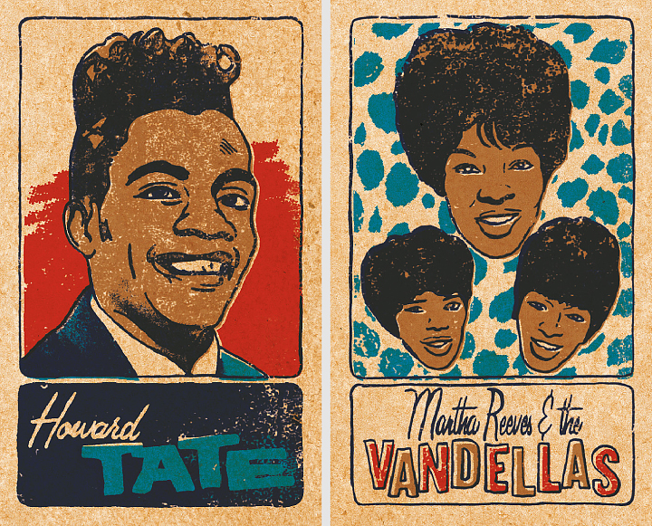
Two cards from a set of 48 Soul & Funk Trading Cards, personal work.
Kirill: How important is it to invest time in personal projects?
Niall: Personal projects are vital and I always enjoy working on them. There is more space to experiment and try new processes and the results usually make for good self promotion pieces.
Kirill: What do you do when you run out of ideas and get stuck?
Niall: Try not to stress out. It’s good to get away from work and get a clear head.
Kirill: What’s the best thing about being an illustrator?
Niall: Having started out as a designer, the best thing for me is the added freedom and control that illustration gives.

Left: WFMU interprets the music of Sun Ra, CD cover for WFMU Radio. Right: Tomorrow Never Knows for Illustrated Beatles exhibition organised by Illustrators Ireland.
And here I’d like to thank Niall McCormack for graciously agreeing to answer a few questions I had about his work, and to share his materials for the interview. You can find more of Niall’s work in his portfolio, and follow his blog dedicated to vintage Irish book covers.
Continuing the ongoing series of interviews with illustrators, it is my pleasure to welcome the talented John Holcroft. Over the last 15 years John has worked with clients such as BBC, Reader’s Digest, Financial Times, The Guardian, The Economist, Conde Nast and many others, capturing ideas and stories with a vigorous, vibrant and expressive visual style. Today I am thrilled to have an opportunity to ask him a few questions about the art and craft of illustration in the digital era.

Kirill: Tell us a little bit about yourself and how you got started in the field.
John: I left college at a time when the UK economy was in recession. I could only get temporary jobs doing anything I could. At the time of my graduation the technology in the design industry was going through lots of change.
As time went by my portfolio of hand rendered type and graphics seemed more and more obsolete and I started to worry about what my future would hold. Illustration was my one strong point and it seemed only natural to pursue this as a career seeing as I didn’t need any kind on technology. At the time I was painting in acrylic on board and it was time consuming and restrictive but it was a start.
Kirill: In your bio blurb over at Behance you say that you’ve reinvented your style about 5 or 6 times. Is this part of finding and refining your own voice, and pushing yourself to explore new directions?
John: Nothing stays still in this constant changing industry. It is fickle and one minute you can be hot next you are yesterdays news. As an illustrator you learn this the hard way which is why any artist worth their salt will adapt and evolve their style to suit the market. I changed my style from time to time either because it wasn’t right, it had run it’s course or because it was too bloody awful and didn’t work. They say an illustrator is only as good as their last job. In my case jobs were so far and few between, no one would remember me anyway. So in answer to your question it did encourage me to explore new avenues with different mediums.
Kirill: On a related note, what has shaped and influenced you over the years?
John: At first my work was more pictorial and figurative like it it now. This I suppose was influenced by Edward Hopper and David Cutter. I later tried to experiment with colour and technique and my style became very off the wall.
I loved the work on Ian Pollock, David Hughs and Rachel Gosling. This inspired me to reinvent my style to become something that in hindsight wasn’t really me. I had work for a while but I could never have really competed with what was already around. After yet another failed attempt at a style change, I threw in the proverbial towel. It was around 2008 that I admitted defeat and looked for work. This was short lived because not long after I had to have an operation on my back and I was out of action for months. It was this incapacity that gave me the change to develop my current winning style.
Kirill: How do you approach the process of creating an editorial illustration? Do you work off of an article pitch, or are you brought in after the article has been fully fleshed out?
John: It depends on the client. Most of the time I just get the copy to read and sometimes the art editor might make some suggestions. If I’m lucky I might have a very ingenious art editor who has already come up with the concepts and I just use that as a starting point. I do prefer to work on the creative process alone unless I know the art editor and have worked with them before. Occasionally my ideas are mutilated by clients and the’ve added pointless and daft elements to the image just to satisfy the editor.
Kirill: As you are expected to distill the idea behind the article – or the main area of the specific issue – into a single cover illustration, do you prefer tackling it from the solitude of your office, or do brainstorming with your art director or other client contact people?
John: Both, depends on the art editor.

Kirill: In the last few years the publishing industry is pushing their content onto a variety of digital mobile platforms. As people now browse and consume content on a variety of smaller screens, do you find yourself scaling down the complexity of your illustrations so that the finer details don’t get lost?
John: Not at all. My work is kept simple anyway and I don’t like to add too smaller detail.
Kirill: You’ve been doing digital illustrations since 2001. Do you still start with pen-and-paper doing quick sketches and then moving to the digital tools? Are you satisfied with the current crop of software and hardware tools? If not, what could use some improvement?
John: I do everything on my wacom tablet. I still use a sketch pad occasionally though. For years I have used Corel Painter do do my work until I bought version 12 which I had problems with. It kept crashing constantly and I would lose work. I just use Photoshop now.
Kirill: And on a related note, there’s so much being created, distributed and consumed in the digital domain. Is there anything being lost when neither the creator nor the consumer interact with the physical print media?
John: Print is still very much alive. Not including books and all aspects of design ( packaging, ads, corporate) Magazines have always been a springboard for many rookie illustrators. All my clients produce both print and digital media and if it were not for the print we would pay more for the online media.
Kirill: Once the illustration is out of your hands and becomes part of a published product, do you ever wish to go back and tweak it? Has it ever happened that you had what seemed to be an even better idea after the process has been completed?
John: All the time. Just got to make sure it’s right by double checking. The beauty of digital artwork is that you can tweak it. Sometime the client has requested tweaks which is no problem. Once I was doing a piece for Employer’s Benefit magazine. On my illustration was a man next to a powerpoint presentation whiteboard. On it were the words ‘Pensions’, ‘Investments’, ‘Savings’ and ‘Shares’ reading down the page. The client got back to me and asked me to configure it differently because the lead letters spelled PISS.
Kirill: What’s the weirdest client feedback that you’ve received so far, if you don’t mind sharing?
John: Most clients are great. Just like anyone else. Sometime you come across a prima donna. I was doing my usual ringing up for appointments that I used to do every couple of years. Sometimes you don’t get through to the people you need to straight away, either because they’re out or away or not at their desk. There was one particular client I really wanted an appointment with, if I was going to London for a week I wanted to make sure it was fruitful. After ringing this client 4 times, I rang again and asked the receptionist to be put through. I was told to hang on and after a minute the receptionist came back on and told me the art editor in question has asked me never to put you through to her and can you not call again. A simple ‘no’ would have been sufficient.
Kirill: What do you think looking back at your own work from a few years ago?
John: Some of it I like, some I want to die of embarrassment.
Kirill: How important is it to invest time in personal projects?
John: Very important. I still do. It’s the only way I can be sure to have the work I really want. Commissioned work is good, but it’s specific to that job and probably wont appeal to a wider audience.
Kirill: What do you do when you run out of ideas and get stuck?
John: Go away and do something else then come back later. I do try to research any topic I’m working on and sometimes just watching TV can trigger ideas.
Kirill: What’s the best thing about being an illustrator?
John: Freedom. I can manage my time more flexibly which is crucial having children. I have to be careful not to over expose my work and become a ‘has been’ too early. I love what I do and all I ever want to do is earn a living.
In the past it has been hard when work dries up as many illustrator out there know too well and if work is trickling in I’m happy.
And here I’d like to thank John Holcroft for this great opportunity to get a small glimpse into his world. You can see more of his work over at his Behance portfolio, and selected prints are available for sale at Society6.
