It’s been a busy year for my desktop-focused projects, and things are look bright going into 2023. Here’s the rough outline of what I’m planning to work on.
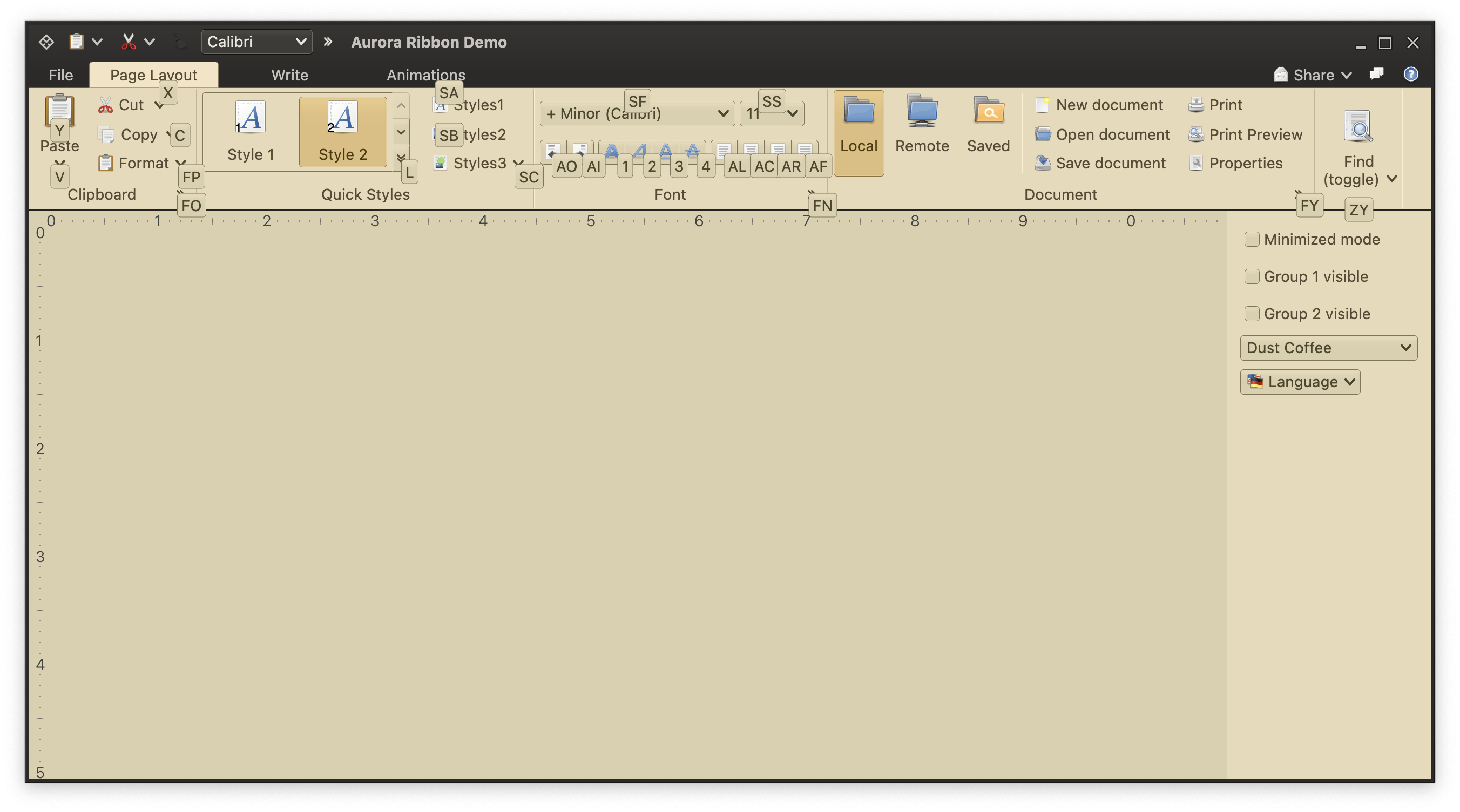
The first big chunk of work that will probably take at least another two or three months to complete is going to be bringing the full ribbon component to Aurora. This has started a few weeks ago, and I’m done with the first pass of prototyping the ribbon APIs. Those are not final yet, and they will get tweaked as I get to the implementation details of the many moving pieces underlying this component.
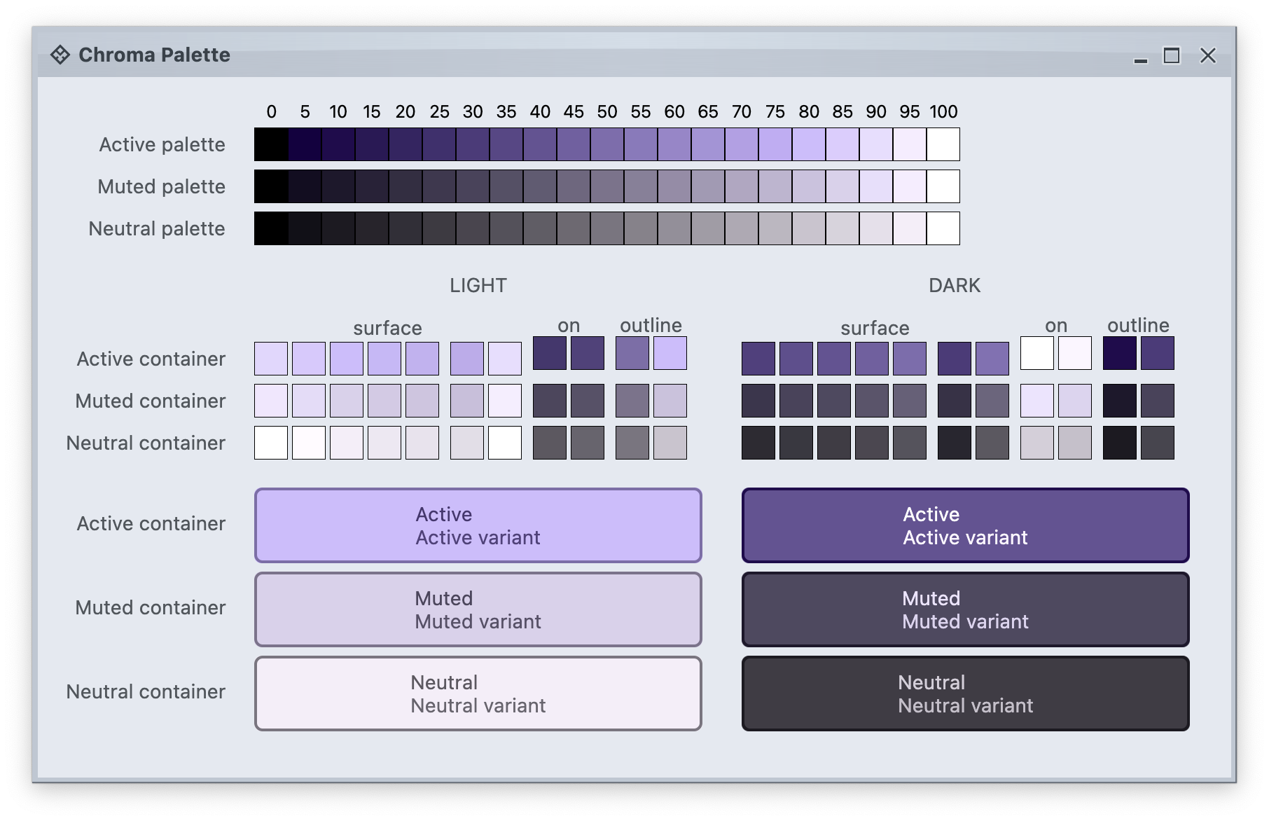
The second big chunk is going to be around defining and using colors. Code-named Chroma, this effort aims to bring more clarity and control over working with colors in core and custom skins, inspired by the ongoing evolution of design systems such as Material and others. Falling under the overall umbrella of the Ephemeral design system, the plan is to introduce it to both Aurora and Radiance, and replace the existing color scheme and their mappings.
And last but most definitely not the least, are the plans to explore the third twin to Radiance and Aurora, and bring the full breadth of Ephemeral, including its theming layer and all the components, to the world of Flutter. Much as Aurora, this is going to be a multi-year project.
Happy New Year and stay tuned for more details!
It gives me great pleasure to announce the fourth release of Aurora. Let’s get to what’s been fixed, and what’s been added. First, I’m going to use emojis to mark different parts of it like this:
💔 marks an incompatible API / binary change
🎁 marks new features
🔧 marks bug fixes and general improvements
Release notes
There’s still a long road ahead to expand Aurora’s capabilities in 2023 and beyond, with the ribbon / command bar planned as the next big addition. If you’re in the business of writing desktop Compose apps, I’d love for you to take Aurora for a spin. Stay frosty for more features coming in 2023!
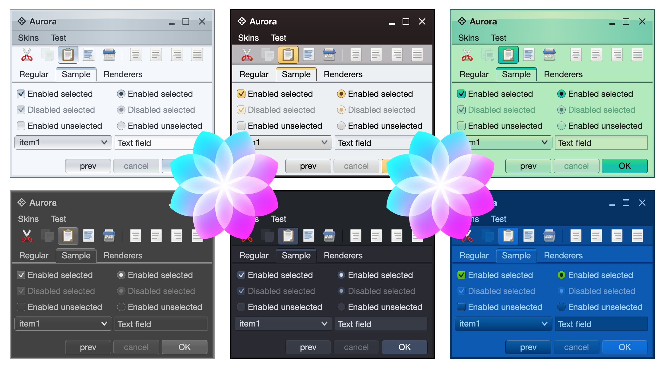
It gives me great pleasure to announce the third release of Aurora. Let’s get to what’s been fixed, and what’s been added. First, I’m going to use emojis to mark different parts of it like this:
💔 marks an incompatible API / binary change
🎁 marks new features
🔧 marks bug fixes and general improvements
Dependencies for core libraries
- Compose Desktop: 1.1.0 ➡ 1.2.0
- Kotlin: 1.6.10 ➡ 1.7.20
Release notes
This release (code-named Cryo) brings a couple of new APIs, and otherwise is focused on stabilizing and improving the overall API surface of the various Aurora modules. There’s still a long road ahead to expand Aurora’s capabilities in 2023 and beyond, with the ribbon / command bar planned as the next big addition. If you’re in the business of writing Compose Desktop apps, I’d love for you to take Aurora for a spin. Stay frosty for more features coming in 2023!
It gives me great pleasure to announce the next major release of Radiance. Let’s get to what’s been fixed, and what’s been added. First, I’m going to use emojis to mark different parts of it like this:
💔 marks an incompatible API / binary change
🎁 marks new features
🔧 marks bug fixes and general improvements
Dependencies for core libraries
- Gradle: 7.2 ➡ 7.5.1
- Kotlin: 1.5.31 ➡ 1.7.10
- Kotlin coroutines: 1.5.2 ➡ 1.6.4
General
- 🔧💔 A new direct rendering model for all core and custom components in Radiance
- Instead of rendering components as multi-layer combinations of cached offscreen images, Radiance now uses direct rendering to the
Graphics
objects passed to the relevant UI delegates and painting methods
- Use
RadianceCommonCortex.paintAtScale1x
for visuals that need to “fall” on exact pixels, line single-pixel borders, separators, etc
- 🔧 Remove all usages of java.security APIs (that are deprecated in Java 17 going forward)
Animation
- 🎁 New default animation pulse source that is based on the display refresh rate
Component
- 🎁💔 Unify fire action trigger logic for command buttons by replacing
CommandButtonPresentationModel.isFireActionOnRollover
and CommandButtonPresentationModel.isFireActionOnPress
with a single actionFireTrigger
enum that has three values:
OnRollover
to fire action on rollover
OnPressed
to fire action on press
OnPressReleased
to fire action on press release (the default)
- 🎁💔 Unify text action/popup click logic for command buttons by replacing
CommandButtonPresentationModel.isTextClickAction
and CommandButtonPresentationModel.isTextClickPopup
with a single textClick
enum field that has two values:
Action
to activate action on text click
Popup
to activate secondary content on text click
- 🎁💔 Revisit breadcrumb bar APIs
- Remove exception propagation APIs (they were no-op in any case since it wasn’t wired)
- Remove index tracking in
BreadcrumbItem
(not wired to anything)
- Switch
BreadcrumbBarCallBack
APIs from StringValuePair
to BreadcrumbItem
- Also rename
getLeafs
to getLeaves
- Rename
BreadcrumbBarCallBack
to BreadcrumbBarContentProvider`
- Rename
BreadcrumbBarModel
to BreadcrumbBarContentModel
- Add
BreadcrumbBarPresentationModel
and support icon filtering
- Remove
StringValuePair
from the API surface altogether
- Revisit the API surface of
BreadcrumbItem
- 🎁💔 Switch presentation models to use
BackgroundAppearanceStrategy
across all components. This applies to
CommandButtonPresentationModel.setFlat
CommandButtonPresentationModel.Overlay.setFlat
CommandStripPresentationModel.setFlat
CommandPresentationModel.setFlat
- 🎁 Add single row resize policy to ribbon flow bands
- 🔧 Fix lost breadcrumb bar path after skin change
- 🔧 Fix separator drawing over the last text character in
MEDIUM
command buttons that don’t display icons
- 🔧 Command menus now toggle open and close on clicks
- 🔧 Fix issues with command popup menus not closing in certain scenarios
Theming
- 💔 Simplified visuals of tabbed panes
- Remove
SINGLE_FULL and DOUBLE_FULL
from TabContentPaneBorderKind
. Apps that wish to draw border around the content area will need to do so explicitly.
- Remove
RadianceSkin.setTabFadeStart
and RadianceSkin.setTabFadeEnd
and do consistent indication for the selected / rollover tab with no alpha fade gradient.
- Consistent corner radius of tabs across all skins.
- 💔 Clean up the signature of fill painters, removing
isFocused
(not used anywhere, and shouldn’t be since the focus indication is painted separately) and hasShine
(specific to StandardFillPainter
visuals).
- 🔧 Fix issues with various color chooser panels, including the correct wiring of the “Reset” button across all the panels
- 🔧 Fix incorrect bounds of maximized decorated frames on Windows
- 🔧 Fix inverted logic of
ComponentOrParentChainScope.setExtraWidgetsPresence
- 🔧 Fix null pointer exception in rollover button listeners
SVG transcoder
- 🔧 Simplify generated code by not emitting identity affine transforms
- 💔 Remove plain templates
As always, I’d love for you to take this Radiance release for a spin. Click here to get the instructions on how to add Radiance to your builds. And don’t forget that all of the modules require Java 9 to build and run.
And now for the next big thing or two.
This release took almost a year to complete. I needed this time to figure out how to continue evolving Radiance in a meaningful way over the next decade or so. The considerations for what went into this work were laid out last October in this post. The two major areas I wanted to focus on are direct rendering and API consistency.
Direct rendering has touched the UI delegates for every single core Swing component, and almost every custom Radiance component, from command buttons all the way up to the ribbon. API consistency has been driven by the ongoing work in Aurora, as well as the drive to clean up the API surfaces that have been misaligned across the codebase for a while.
Making meaningful changes also means making hard choices about backwards compatibility. Deprecating existing APIs but leaving them available leads to a confusing API surface and increases the cost of maintaining and evolving the codebase. Leaving existing APIs in place, and trying to redirect them under the hood to a “v2” variant places noticeable constraints on what is feasible to do. If I want Radiance to be here in the next 10-15 years, the only practical way forward is to cut out APIs that have not aged well, remove them from the codebase and introduce new ones as necessary. I understand that it causes friction during dependency upgrades on the application side of things, but the only other alternative is abandoning any new development altogether.
With all this in mind, what is next, for 2023 and beyond?
The first major change in Radiance is going to be around defining and using colors. Code-named Chroma, this effort aims to bring more clarity and control over working with colors in core and custom Radiance skins, inspired by the ongoing evolution of design systems such as Material and others.
This change will also find its way into Aurora, as these two projects are twins, in a sense. Once Compose for Desktop hits its official 1.2 release, Aurora will go to 1.2 as well. Afterwards, I will work on window APIs, and will start the long-planned work to port the ribbon component to Aurora.
And last but most definitely not the least, are the plans to explore the third twin to Radiance and Aurora, and bring the theming layer and all the components to the world of Flutter.
As I said last October, it’s going to be a long road, and it may take a bit of time again until the next major release of Radiance. The current goal is to fully complete the color work across both Radiance and Aurora, and have them released at the same time. This will probably happen after the ribbon component is added to Aurora. As for the Flutter twin, it is going to be an exciting, and yet completely unpredictable adventure. I may or may not have something for you to play with in 2023. Time will tell.