Even though Microsoft has spent significant effort to branch into mobile, web and console markets, the company’s main revenue stream remains in the desktop space. Gearing up towards the next major Windows release, Steven Sinofsky (president of Windows division) has started extensive blogging about Windows 8. In yesterday’s entry he addresses a lot of criticism of the transition of Windows Explorer to use the ribbon component, the future of Aero and Metro, as well as the high-level approach that the Windows team takes towards the consistency of Windows desktop experience. The entire entry is well worth the read, but the following quotes are particularly interesting:
The unique element of Windows has always been the “open market” approach to interface. We embraced how people used and adapted the Windows APIs to bring unique experiences to market. Within any context there really isn’t a single “desktop” experience. Certainly some have been critical in the past that “Aero” did not achieve a uniformity or consistency, even within Windows.
We’ve long embraced apps that have palettes or toolbars, full screen / windowed / MDI, built-in controls or custom controls. The mechanisms to implement this variety are part of the desktop heritage. Some wish for more uniformity or policing. As a member of the team that built our early Windows tools, I know we tried. Even in the most homogeneous platform, developers will strive to differentiate and build their user experiences for specific purposes and experiences will diverge from commonality. Commonality was an answer to complexity in another era–today we are surrounded by digital experiences of all different types and we readily adapt (just as people adapted to a wide variety of print formats or video formats as these technologies improved from their first generations). The answer today is whether the design works in the context for which it was intended.
While this is not particularly surprising, it further confirms the focus on providing support for diverse experiences that allow differentiation, with particular focus on adapting to the context.
Last Friday we announced a significant update to the Android Market client. A whole slew of features went into this update (and many more are to come), and this week the pixel geek in me will be talking about the new visual design of the application. After talking about custom layouts and overlapping non-rectangular components, it’s time to talk about organizing visual information on landscape orientation. It is rather unfortunate that the vast majority of application designers and developers do not spend time optimizing the user experience for wide screens and just port the “default” portrait layout. Let’s take a look at the old home screen of the Market client:
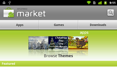
I’ll spare my actual thoughts on this screen, but it looks like ass. From top down:
- Way too much vertical space for the header. The icon is unnecessarily large, the font looks a little dated and the search button just hangs in mid-air.
- The Apps / Games / Downloads look like tabs, but are not actually tabs. Tapping one of these moves to a different screen that shows the relevant content.
- The three-pane promo widget takes almost half the screen height and is a usability disaster. Not only the user cannot swipe to the previous / next triplet. The worst thing is that tapping on the specific thumbnail does not take you to the details of the app. Instead, it takes you to the category of the app, and then you need to “hunt down” the matching row.
- With all this vertical space taken, the actual list of featured apps is not even visible – besides the header, that is.
And here how the landing page of the new Market client looks like in landscape mode:
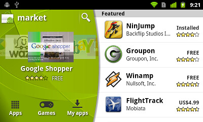
Here, we’re putting the user in control. The screen has now two sections – the carousel + extra controls and the list of featured apps:
- The main title bar (with the search button) does not extend the full screen width and leaves enough vertical space to show full four rows of featured apps.
- The carousel allows swiping to both sides so that you can go to the previous app even after auto-advance animation kicks in and advances the carousel.
- We have enough vertical space below the carousel to show the title, price and rating of the fronted app – leaving enough white space to separate the carousel from the navigation buttons below.
- The navigation buttons now look like actual buttons. They support traversal with D-pad / trackball and show correct highlight outlines on focus and press.
- The list of featured apps spans the full screen height and shows full four rows on the “common” hardware configuration (Nexus-type screen size / density). I personally thing that making each row more narrow is a usability improvement as the price / rating is closer to the app title / developer name.
Next, let’s look at the top-level category listing in the old client:

This one is a tad more usable, with two full rows of categories visible. Of course, the fat title bar is still there, and the promo switcher takes the whole screen width and has a whole bunch of unbalanced white space around it. In addition, there’s a whole lot of white space to the right of each category row. Let’s see how this screen looks in the new client:

Preserving the overall layout of the home screen, the promoted apps are now displayed in a carousel. The user is no longer at the mercy of promo switcher – swiping is fully supported, and if auto-advance animation is too fast, you can always swipe back (and we actually increase the auto-advance interval once the user starts interacting with the carousel). We also have enough vertical space to show not only the promo description, but also the title, rating and price for the fronted app. And since the category list spans the full screen height, we can fit full five rows, and a much taller scroll window.
Next up – the app listing of the specific category. Here is the old client in all its glory:
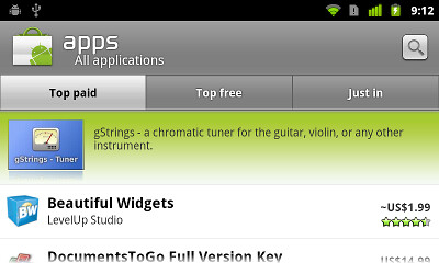
Tabs are actually tabs for a change, but all the rest is still ass. Let’s see how this screen looks in the new client:

As on the previous screen, the promoted apps are in an interactive carousel. The tabs are now much lighter and don’t command too much visual attention. Personally i also like that the tab texts are closer and don’t have too much space between them. And we have enough vertical space to show full four list rows, with a much taller scroll window.
Finally, let’s see the app details page in the old client:
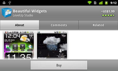
What can i say? Fat title, fat tabs and fat button bar take so much vertical space that the actual content has less than half the screen height to view and scroll. This screen is by far the worst usability offender as far as the content perusal goes. Let’s see how this screen looks in the new client:
Preserving the same top-level organization, the top-level information on the app is displayed to the left – along with the action buttons to install, buy, update or uninstall the app. The rest of the information is displayed to the right, providing the full screen height for comfortable skimming and scrolling. There’s definitely room for improving the visual arrangement and balance of the app info in the left side – remember that we’re not done yet :)
Android devices come in all shapes and sizes, and we strongly encourage the application developers and designers to invest extra effort in addressing usability aspects of landscape orientation. This does not mean that you should fill every single white area with yet another control. But you shouldn’t be blindly forcing the portrait-optimized layout either. And of course, don’t forget the “small” details such as different screen sizes, resolutions or localization. Here is just a small example from the new Market client:
This is running under Korean which has rather long translations for “top paid”, “top free” and “just in”. At runtime, we dynamically find the largest font size that can fit at most two lines of text in the specific tab button. All buttons have exactly the same width and the layout enforces the middle button to be aligned with the horizontal center of the tab strip. Finally, the tab strip itself has custom left padding that pushes it “away” from the curved arc, while the light gray background extends all the way below the arc. You know, pushing pixels :)
That’s it for today’s installment. Tomorrow i’m going to talk about custom drawing and the green swooshes on the new title bars and carousels.
After spending the best part of the last ten years doing desktop development, I shifted gears last December and joined the Android team at Google as a client user interface engineer. It’s been an interesting ride so far, and today i wanted to mention a few things worth keeping in mind if you are a mobile UI developer.
If you glance at the sidebar, you’ll see that my particular interest lies in creating polished, responsive and well behaving user-facing applications that help the end users achieve their goals quickly and painlessly. There are many things similar between designing and implementing desktop and mobile UIs:
- Work with a visual designer to create a polished and aesthetically appealing appearance.
- Make sure that your application remains responsive by running all long operations (such as database access, network access, I/O and so on) on background threads that update the UI when necessary.
- Handle errors in such a way that their exposure to the user is minimal. If the network is not available, switch to offline mode or exponential backoff retries. If the backend returned an abnormal condition, do not bombard the user with the stacktrace and offer automatic error reporting and recovery route.
The main difference between the desktop and the mobile lies in the form factor, how it affects user’s interaction with the hardware and, by extension, with your application.
Desktop monitors and laptop / netbooks are much bigger than phone screens. While some desktop setups allow rotating the monitor, the applications are not expected to change the internal layout – no matter if they are running fullscreen or in a smaller window. Users expect to be able to dynamically resize the application windows. Finally, only now we start seeing the hardware manufacturers push consumer grade (== cheaper) touch screen hardware; the vast majority of user interaction is done with mouse, track pad or some other non-immediate form.
 Phones are small. They fit in your pocket. The user expects to rotate the phone and have the application make the best usage of the available screen estate. Also, gone are the days when flagship models are operated with high-precision pointing devices such as stylus. You interact with the applications using your fingers and, depending on how modern your phone / applications are, some support multi-touch.
This brings me to the first major difference between desktop and mobile – smaller screens and bigger controls. Since the interaction is done with the fingers, you cannot cram as many tiny UI controls as you can – no matter what is the screen density (DPI / PPI). To the right you can see a screen that creates a new calendar event. While you certainly can make the controls smaller and not require the user to scroll the form, your users will hate you for making them miss the intended target and waste their time.
When you have less screen estate, think about every control. If it is optional, consider exposing it as a preference after the flow is done, or hide it in an expandable “more” section. If your form spans more than a couple screen heights, consider splitting it in two separate screens, or even rethink how much information is really necessary to collect from the user. Also, think about portrait vs. landscape orientation, which brings me to the second major difference – rotation and ratio change.
 Due to limited physical size of the screen, you are always in fullscreen mode. When you click on a URL in your Twitter client, the browser window is launched in fullscreen mode and you don’t see multiple windows at the same time. The only exception is overlay dialogs usually used to display temporary and auxiliary information (such as terms of service, for example). Another consequence of form factor is that the phone is not “restricted” to be in always-landscape mode (unlike, say, laptops which would be quite awkward to operate in portrait).
When the user rotates the phone from portrait to landscape, the currently fronted window should reflow itself to make best usage of the screen estate. In the example above, the layout of the Twitter client is clearly designed to be optimized for the portrait mode. The title bar has the global action buttons (refresh, post, search), and the action bar below it shows your current “location” in the application and context-sensitive operations. Then, you have the tab bar to switch between the different lists. Finally, the actual content is displayed in a one-column list where each cell wastes around 60% of its space. On top of this, all three bars remain anchored when the list is scrolled – which amounts to only around 20%-25% of the screen space used to display the information that the user is interested in. In this case, the design should be reworked to, perhaps, move the global and context-sensitive actions to a separate vertical column and let the list span the entire height in a separate vertical column.
The next difference has already been mentioned – user interaction with the application. There is no such thing as cursor, since there is no such thing as mouse. Hence, there is no such thing as rollover effects to provide visual feedback of which elements are actionable (as noted by Derek Powazek a few days ago). Instead, you have a quite different, and very rich interaction mode – touch. Even single-touch applications can expose a wide variety of interactions, including tap, long touch, move and fling. Android’s VelocityTracker is an indispensable utility to keep track of motion events without needing to go inside the details and history of each one. And once the fling motion is over, feed the velocity directly to ScrollView.fling() or translate it to your custom motion path.
Without the mouse, and without targettable scroll bars (that, if permanently displayed, take precious screen estate), you cannot have predictably behaving nested scrollable areas. A popular UI paradigm in screens displaying item lists – such as emails, tweets or search results – relies on the list spanning all available vertical space, where scrolling to the very bottom initiates a request for the next page of items. Instead of thinking what should happen when such a list is placed in the middle of another scrollable view with a few controls below it – revisit your design and adapt it to the mobile platform.
The fourth difference is screen density. This is the subject of many entries on this blog in the last few years (as well as the JavaOne presentation i did with Mike Swingler from Apple). Despite the early promises, desktop / laptop display hardware has not progressed as much as i expected as far as the resolution / density goes. Consumer-grade monitors are mostly in 96-120 DPI (dots per inch) range, and there is little incentive for developers to spend time and money to properly support higher-end monitors (such as 150DPI QSXGA monitors priced at around $14,000 or the discontinued 204 DPI IDTech MD22292 series that was priced around $9,000).
That’s not quite the same as far as the phones go. Existing devices available from different manufacturers vary between 120 dpi for lower end HTC Tattoo / Wildfire and 240 dpi for the higher end Droid series – difference of 100% in screen density. This means that using hardcoded values for pixels and one set of images will lead to one of two things on a higher end phone. Your UI will either be upscaled and fuzzy, or the controls will be too small (in physical units such as inches) to allow comfortable targeting with a finger. This subject is discussed at length in the “Supporting multiple screens” documentation (for Android), with two things to remember – bundle multiple resolution images and use DisplayMetrics to scale your custom drawing code.
And this brings me to the last major difference – limited CPU / memory resources. Medium range hardware in consumer-grade desktop and laptop machines comes with CPU / memory resources that even a modern phone can only dream of. Multiple cores, graphic cards with large dedicated video memory, standard 4GB RAM with cheap expansion options, fast CPUs cooled by large fans – all of these have made the user interface implementer in me quite lazy. I don’t really have to care how many objects i create during each painting (as long as i don’t do something stupid as a database operation in the middle of painting). I fully rely on large memory and fast garbage collection to take care of all these small allocations and to keep the framerate acceptable.
While things may change in the next few years, due to inevitable push from the hardware manufacturers that find themselves in a constant state of competition, today you must be prudent. If you have any custom drawing code in your View.onDraw() – do not allocate any objects in it. Romain Guy has tweeted about this a few days ago, and it has been a subject of the internal code reviews that he did with me over the last week. Any graphic object, such as path, gradient, paint, point or rectangle must be created outside the drawing flow. Objects such as Rect, Point or Path should be created in the constructor of your view and cleared / reset in the onDraw() implementation. LinearGradients and RadialGradients that depend on the width and height of the view should be recreated only in the View.onSizeChanged(). Another option is to create the gradient object once in the constructor and then change its matrix dynamically during the painting. Paint objects should be created in the constructor and have the global settings (such as antialias, color filter, dither or filter bitmap) set once. Then, the onDraw() will only set the dynamic values, such as color, alpha and stroke width. To make sure that you don’t allocate any object in your drawing cycle, run DDMS (Dalvik debug monitor) tool and switch to the “Allocation Tracker” tab.
To summarize, here are the major differences between desktop and mobile UI development, all related to the different form factor:
- Smaller screens and bigger controls
- Rotation and ratio change
- User interaction with application
- Screen density
- Limited CPU / memory resources
Thanks to Romain Guy for reviewing the early draft and completing the missing bits.
In an indirect response to my earlier post, David Grace writes:
All this talk about not being able to create something that looks good in JavaFX is hot air. JavaFX has the functionality to do so, you just have to know how. What JavaFX needs is for the preview controls and layouts to be finished, controls such as a table implemented, and the Prism renderer implemented. When this is done it will be easy to write any application that could be written in Swing quicker, looking much better and with far greater performance. Personally i would of rathered investment in Swing instead, but Sun/Oracle have invested in JavaFX and in many ways its already far better than Swing, except for missing components.
Modern programming languages provide abstraction layers and higher level concepts to shield the programmers from the low level drudgery of writing assembly code. In much the same way modern UI toolkits provide component libraries, image composition, transformations, animations and many other tools that make it simpler to translate the intended design into a living and breathing reality. But eventually, it’s pixels. All the way down.
Just as the vast majority of the programming languages are Turing complete, the vast majority of UI toolkits are what i call pixel complete. If the specific toolkit exposes the ability to control every single pixel in the window (with, say, paintComponent in Swing, onDraw in Android, paintControl in SWT or updateDisplayList in Flex just to name a few), there are no limits to what can be put on the screen. Modulo support for translucent and shaped windows, you can take any design and turn it into reality. Indeed, if you know how to do it, you can do anything. But that’s not the point.
How about this – instead of asking what people can do with JavaFX, ask what people are actually doing with it.


