About five years ago I wrote about vector format, and how it is not quite well suited to be used for application icons. Five years is a long time in our industry, and the things have changed quite dramatically since then. That post was written when pretty much all application icons looked like this: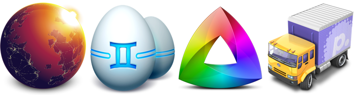
Some of these rich visuals are still around. In fact, the last three icons are taken from the latest releases of Gemini, Kaleidoscope and Transmit desktop Mac apps. However, the tide of flat / minimalistic design that swept the mobile platforms in the last few years has not spared the desktop. Eli Schiff is probably the most vocal critic of the shift away from the richness of skeuomorphic designs, showing quite a few examples of this trend here and here.
Indeed it’s a rare thing to see multi-colored textured icons inside apps these days. On my Mac laptop the only two holdouts are Soulver and MarsEdit. The rest have moved on to much simpler monochromatic icons that are predominantly using simple shapes and a few line strokes. Here is Adobe Acrobat’s toolbar:

and Evernote:

This is Slack:
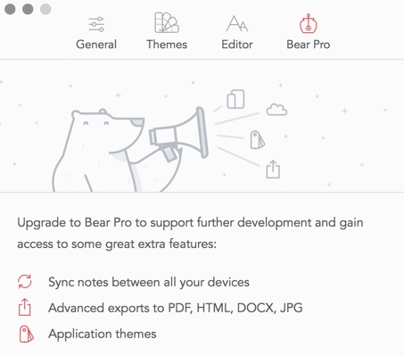
and Bear:
Line icons are dominating the UI of the web developer tools of Firefox:
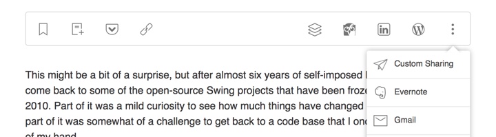
They also have found their way to the web sites. Here is Feedly:
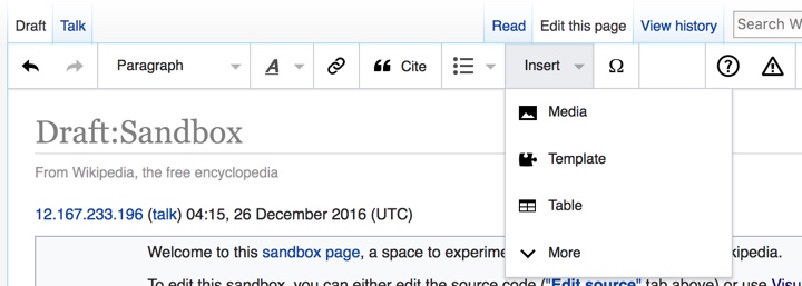
and Wikipedia’s visual editor:
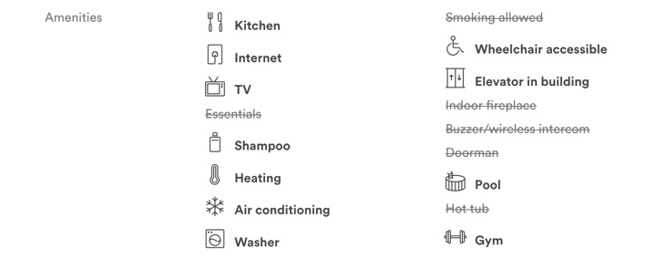
You can also see this style on Airbnb listing pages (with a somewhat misbalanced amenities list):
and, to a smaller extent, on other websites such as Apple’s:

Google’s Material design places heavy emphasis on simple, clean icons:

They can be easily tinted to conform to the brand guidelines of the specific app, and lend themselves quite easily to beautiful animations. And, needless to say, the vector format is a perfect match to encode the visuals of such icons.
Trends come and go, and I wouldn’t recommend making bold predictions on how things will look like in another five years. For now, vector format has defied the predictions I’ve laid out in 2011 (even though I’ve ended that post by giving myself a way out). And, at least for now, vector format is the cool new kid.
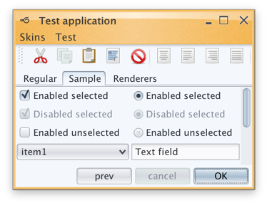
This might be a bit of a surprise, but after almost six years of self-imposed hiatus I’ve decided to come back to some of the open-source Swing projects that have been frozen in time since late 2010. Part of it was a mild curiosity to see how much things have changed in the meanwhile, and part of it was somewhat of a challenge to get back to a code base that I once knew like the back of my hand.
Before delving into the rest of this rather lengthy post, a fair warning. The images seen here are only meant to be viewed on high-resolution / retina / 2x-density screens. Otherwise what you’re seeing is a scaled down version of the original images that has little to do with the actual visuals seen on those screens.
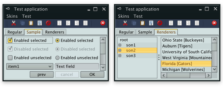
Having said that, what is you see above is what I saw a couple of months ago on my 2013 MacBook Pro that has a Retina screen. Having spent the last four years looking at crisp visuals of pretty much all the native apps (except for Eclipse that is just now starting to get there, but then again calling Eclipse a native app is somewhat of a stretch), this was painful. There are obvious line artifacts, with the two most noticeable being the light outline along left/top edges of the main window and a darker horizontal line across the selected tab. But other that that, everything is just too blocky, pixelated and way too fat.
Two months later, I’m happy to report that Substance is a fully fledged citizen of the Retina universe. Given the amount of work that went into making that happen, the next release will have a version bump to 7.0 code-named Uruguay. The three big themes of this release will be as follows.
Hi DPI support
Searching the web for the initial pointers on Hi DPI support in Swing got me to this post from 2013 by Konstantin Bulenkov. Konstantin is the team lead at Jetbrains – the company behind the IntelliJ platform and all the apps built on top of that platform. Did you know that IntelliJ IDEA is a Swing app? If you didn’t, now you know.
Lucky for me, the code referenced in that post is part of the community edition of IDEA and is available under the quite permissive Apache license. And even though some part of that code is using reflection to query the underlying capabilities, if it’s working for IDEA with its hundreds of thousands of active users, it’s certainly good enough for me.
This code now powers pretty much all the pixels you see in Substance 7.0 – once again, the same warning about images that are meant to be viewed only on retina / high-res screens applies to all the images in this post.
Continue reading »
In my previous lifetime I was a Swing developer. And I liked shiny things. As a proof, here’s the pinnacle (or so I thought, at least) of my explorations in making shiny glossy glitzy buttons. That was around April 2006.
Different UI toolkits provide different capabilities that allow you controlling visual and behavioral aspects. Putting the technical details of styling aside though, UI control styling usually works at the level of an individual control.
And so as I was working on my own look-and-feel library, I heard more and more tidbits about Vista. It was released in January 2007, but it had a long [really really long] history. People kept talking about the three “pillars”, and I was mainly interested in the Presentation one. I don’t have a link, and I can’t even tell if it was a feature that was eventually shelved or just a rumor. But when I heard it, it made a long-lasting impression on me.
The gist of it was that entire UI is a 3D model. You know how they say that buttons should look like something that can be pressed. So you have some kind of z-axis separation. Drop shadows, bevels, some kind of a gradient that hints at the convex surface. And don’t forget to throw in the global lighting model. And so that bit of pixel feature rumor said that the entire UI – from the window level down to an individual control – would be an actual 3D model, with each object living in its own z plane.
So instead of styling each control to create an illusion of z separation (with whatever 2D images are backing each individual control), you would have a spatial model. Each control has its own 3D geometry. Now all you need to do is place the controls in the 3D space, create a few global lights, create a bunch of textures to use on the controls and voila – ship it over to the GPU to compute the final pixels. Want to restyle the UI? Supply a different texture pack and a different lighting model. All the rest is taken care of by the system. Have your own custom control library? Define the 3D meshes for them. All the rest is taken care of by the system.
Now imagine what you can do. If you place two buttons side by side, with just the right tweaking of the meshes and just the right amount of reflection on the textures you can have a button reflecting parts of other buttons around it. And the other way around. You know, all those shiny reflection balls from the early ray tracing demos.
Or, if you model the mouse cursor as an object moving above the window, you can have the back of it reflecting in those controls that it’s passing over. If your control mesh has some kind of a curved contour, the cursor shape would get distorted accordingly as it glides off of the edges.
Or, as you press the button, the press distorts the button mesh as the exact spot of the press, and the entire geometry of the scene reflects that.
I had serious thoughts of doing that. In Swing. That never happened though. Here’s why.
In my mind, there were three big parts to actually doing something like that.
The first one was relatively simple. It would involve transitioning from the point of view of looking at a single control at any point in time towards creating a global view scene that had the entire view hierarchy. There were enough hooks in the API surface to track all the relevant changes to the UI, and even without that you can always say that applications must opt into this mode and have to call some kind of an API that you provide that there are “ready” for you to build that graph.
The second one was also relatively simple. I would need to generate the meshes for all controls. Some are simple (buttons, progress bars), some might be trickier (check marks, sliders). But nothing too challenging. Mostly busy work.
But the last one was the effective non-start. How to actually create the final render of the entire window with acceptable performance? Doing my own 3D engine was kind of out of question. I knew just enough of what is involved to not even begin down that path. So that left me with OpenGL.
JOGL was around at the time, and had a nice momentum behind it. They were gearing towards providing bindings for OpenGL 2.0. There was a lot of activity on the mailing lists. Java3D was another alternative that was under similarly active development. There was even a talk of merging the two. And so I started looking into a simple proof of concept of making a simple JOGL demo on my trusty Windows box.
Around that time (early 2007) Ben Galbraith announced the first (and, posthumously, the only) Desktop Matters conference in downtown San Jose. I left a comment on that announcement. He asked me whether I wanted to make a short presentation on one of my projects. I was quite happy to do so. That was my first public presentation [thanks for the encouragement, by the way!]
It was a nice gathering. Around 100 people, I’d say. And they had quite a few people from the desktop client team at Sun available for informal Q&A. Chris Campbell was my hero at the time (no offense, Chet). The dude was slinging code left and right, showing a lot of great things that could be done with Java2D. He was also working on hardware acceleration of a lot of those APIs. If I remember correctly, he was talking a lot about doing various acceleration on top of OpenGL and Direct3D. Who would be better to validate the overall approach of doing this thing that I wanted to do than him.
I managed to grab him for a few moments. I outlined my thinking. He was polite. He said that it sounded about right. That was just enough encouragement for me.
So after the conference was over I got to actual work. My first private demo was to render a colored sphere. And it looked horrible. It had jagged edges all around it. And it also had visible seams running all over the sphere. I could see the tessellation model before my eyes. It was quite bad.
So I fired off an email to the mailing list. Not about my grand vision. But rather about this specific thing. How to make a sphere look like a sphere. With no jaggies and no tessellation. And they told me to get a “real” graphics card, because whatever integrated graphics card I had on the motherboard is no good for any kind of OpenGL work. And that’s where I stopped.
What’s the point of even thinking going down that road if you must have an expensive graphics card? It might be OK for a demo. It might be OK if I’m satisfying my own itch and showing off my skills with some kind of a thing that runs well on my machine [TM]. But if it can’t be used on “everyday” computers that don’t have those fancy hardware components, it’s a no-go for me.
You might say that I chickened out. I had this grand vision, and folded at the first sign of trouble. But that was – and still remains – my main issue with anything that ends with “GL”. Its never “quite there” promise of commodity hardware availability that is “just around the corner” – and in the meantime, you need this very particular combination of hardware components, drivers and other related software to run. And oh, even if you do have a beefy graphics card, unfortunately it has this driver bug that crashes the entire thing, so you might want to either bug the vendor to fix it, or just disable the whole thing altogether.
Things might have been different. I had really a lot of spare time back then. I might have went down the road of biting the bullet and buying that graphics card (although, as mentioned above, it was not about my own cost, but rather about the reach of the final library). I might have had this thing done in some form or another. Can you imagine buttons reflecting other buttons reflecting the mouse cursor passing above them and rippling as you press them? With the ripple reflected all around that button, and being reflected back in it?
So that never happened. And now it’s all about flat. Flat this. Flat that. Flat *ALL* the things!
Why can’t we just use vector-based icons in our application? This question, in a variety of reinterpretations, keeps on resurfacing in various forums, blogs and articles. It is asked in the context of desktop applications where the same icon is used in different ways, starting from very small 16*16 icons in file lists, up to 128*128 icons used on the dock and all the way to 512*512 icons that mostly serve to highlight the artistic capabilities of icon designers, at least until the computing world is taken over by 1200dpi desktop displays. It is also asked in the context of native mobile applications for the Android platform, where a single vector icon (in SVG format) is proposed as the replacement for multiple versions of the same icon, each optimized for the specific density bucket (usually medium and high).
At first glance, both designers and developers only stand to gain from switching to creating their icons in vector format. A designer is going to create a single version of the icon in his tool of choice, hand it off to the developer to add to the project structure, and have the runtime scale the combined shapes of the icon to whatever context it is used in – be it the small icons for the action bar, or an extra large icon for the “about” page. In fact, a lot of comments on the articles and blog posts referenced later in this entry indicate that this approach works quite well. At least, technically. And so, to summarize the feeling of discontent, Y U NO SVG?
A few days ago I invited one of our visual designers to lunch and asked him about the general process of creating icons for multiple screen resolutions (for the core Android experience). The answer was, at least to me, quite surprising. The first stage happens in a sketchbook or on a whiteboard, where different ideas, shapes and combinations are explored to find the iconography that works well within the overall direction of the platform, while still providing a distinctive shape and form for the specific action or object represented by the icon. Then the flow transitions to the computer, with Adobe Illustrator and Fireworks being the most popular choices. There, the designers create the “master” version of the icon – in a vector format. This version is scaled down to all target resolutions (medium, high, sometimes low and, most recently, extra high), and this is where the fun begins. This is where the designer looks at the scaled down version of the icon, for each resolution, and begins a sometimes painstaking process of pixel-perfecting the visuals.
There’s a lot of art and a lot of craft involved in creating and maintaining a consistent visual iconography language within the specific application, and across the entire platform. Lines should be sharp, rounded corners should have consistent curvature, lighting and gradients should have consistent direction and amplitude. In addition, icons at smaller resolutions should not have too much visual detail, while icons at higher resolutions should not feel too sparse. This is illustrated in the “Icon Design: Bitmap vs Vector” article by Firewheel design:
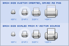
The top row shows the hand-optimized versions of the same application icon at four different resolutions. The bottom row shows icons mathematically scaled from a single source. If you compare the relative sizes and detail complexity of various parts of the icons in the top row, you will see that they don’t scale at the same rate. Some parts grow linearly with the icon size, while some grow at a much slower rate. This is further illustrated in “All the sizes of iOS app icons” by Neven Mrgan:
It’s simply not possible to create excellent, detailed icons which can be arbitrarily scaled to very small dimensions while preserving clarity. Small icons are caricatures: they exaggerate some features, drop others, and align shapes to a sharp grid. Even if all icons could be executed as vectors, the largest size would never scale down well.
Here’s the icon for the Pictures folder in Mac OS X:
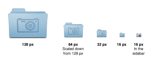
Note that scaling down works to about 64 px; after that, shapes have to be redrawn, simpler and clearer, in order to read. The sidebar version of the icon is entirely different, in fact; since we know it will be shown in the sidebar, it’s not so important that it look like a folder, and other features can be emphasized instead. Creating the large icon as a vector shape –which, to be clear, you should be doing! – won’t help where clarity is really needed: at small sizes. High-resolution displays will in fact make this problem more urgent because today’s 64 px is tomorrow’s 128 px. We’ll have to refine ever larger icons.
Dave Shea takes a closer look at the mechanics of optimizing the original shapes and lines for smaller size in the “Icon Design: Sizing“:
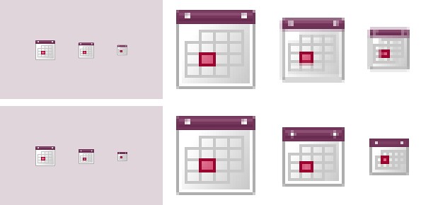
The solution is to start with the reduced version, and tweak it at the individual pixel level. Make the details fit within the pixel grid, remove extra detail that’s causing blur, or even add extra detail if it helps you get to your end goal. Whatever it takes, the solution is to provide a critical eye to the problem and tweak until you get a result you’re happy with, which is why the size variations are so much extra work.
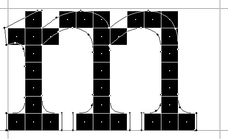
In the calendar above, you’ll notice what I’ve tweaked the two different sizes so the inner boxes end up with whole pixel values on either side. To do this I’ve had to reduce the size of the boxes at 24×24, and actually create more boxes at 16×16. I couldn’t come up with a combination of 4 columns with a 1 pixel wide border that would fit within the space allotted at that smaller size, the only workable combination I found involved adding an extra column and dropping a row. The icon is a bit different than the 32×32 equivalent, but it’s clearly derived from the larger one and works as an acceptable size variation.
Additional examples of small icons moving shapes around and even “losing” some of them can be seen in a variety of modern applications and UI toolkits. Here is an example from the widely-lauded iA Writer for Mac application:
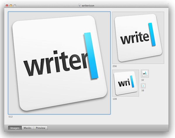
While the central element – a slanted sky blue caret – preserves the overall shape, angle and gradient, the text next to it begins “losing” characters the closer you get to 32*32 size. The 16*16 icon is just the caret, with no characters next to it.
The same approach to simplifying the shapes, textures, perspective and density can be seen in the system icons introduced in GNOME 3.0:


If you trace the progression of the transition to smaller icon sizes across these three icons (and additional icons on the original entry), you will see a consistent approach that starts stripping away dimensionality, complexity, textures, gradients and density, preserving not only the overall shape and feel of the icon, but also the consistency of iconography language across all icons of the same size.
If you do not wish to spend extra time to pixel-perfect your icons at smaller sizes, using a single-source vector format as the “master” and scaling down to any arbitrary size is a perfect fit for SVG. In this context, the following quote from the self-titled “Graphics Ninja” Zack Rusin talking about SVG in KDE is quite illuminating:
The loss of quality in vector graphics at small size is a severe problem. Rendering vector graphics primitives at low resolutions introduces a certain amount of blur into the output. This is mainly caused by horizontal and vertical primitives which happen to fall between pixel boundaries, which in turn makes the anti-aliasing algorithms try to cope with it by rasterizing two, instead of one rows/columns but at a lower color intensity. For primitives which are rendered at small sizes the goals of “resolution independence” and “preserving their good looks across resolutions” diverges a lot. We have the former, we need the latter.
One of the ways of dealing with this problem is hinting. The problem of hinting vector graphics primitives has been extensively researched by the way of font technologies. Grid-fitting (aka. “font hinting”) is a crucial step on the way to produce legible output at small sizes for a lot of fonts. Hinting can be manual (e.g TrueType has a stack-based language for it, each glyph in the font contains its own little hint program and as a result of running that program control points for the outlines can be adjusted in any way the creator of the hints desired) or automatic (as used by FreeType). An interesting medium is described in “Example-Based Hinting of TrueType Fonts” paper, in which a method of reusing hints from one font for another are described. All in all it’s a very common problem for fonts.
The research the engineers from the FreeType project conducted on auto-hinting is outstanding. Right now the way KDE artists go around this problem is by producing certain SVG icons with different viewport sizes. This allows them to manually adjust the rendering for certain native resolutions.
The reality of the situation is that without very high DPI displays the quality of small SVG renderings is going to suffer. A solution would involve introduction of either an auto-hinting algorithm or adding a declarative approach of specifying the hints which the artists could easily utilize. It’s a problem which affects all SVG users and should be handled in the standard itself.
There are a lot of similarities between pixel-perfecting vector graphics and auto-hinting of font glyphs. Both aim to address a very similar problem. Both operate in a flow where the master version is created under extremely high resolutions to look well in booklets, portfolios and promotional material, but versions scaled down to the “real world” use suffer from poor grid fitting, detail clutter, detail loss and blurriness. In fact, some designers go as far as proposing to forgo the standalone icons altogether and use the advanced capabilities of type engines instead. Proposed by Wayne Helman last year, it was further expanded upon by P.J. Onori in his “Font-Embedding Icons: This Is a Big Deal” article that goes on to say:
The article was well-received, but I was honestly expecting more excitement around this idea. From my view, this now seems like the way to set icons in a site. I feel strongly about the potential of this method, so I thought I would take the time to generate a font set for Iconic and to talk about why we should all be using this method for displaying icons.
Listing “one icon, infinite sizes” as one of the advantages, it seems to be a great solution, but only for duotone, or more precisely purely black and white, icons. In addition, it completely fails to address the giant elephant in the room – what to do for complex icons that do not scale well to small sizes? Type engines have two major approaches to solve this problem – embedding bitmaps and font hinting.
Embedding bitmaps is a rather straightforward approach. You start from a high-resolution master definition of the glyph, and identify those glyphs that do not scale down well past a certain point (lowercase ‘m’, ‘s’, ‘a’ and ‘g’ are usually among the prime suspects). For those glyphs, you hand-tweak the visuals for all target point sizes, export them as bitmaps and then embed the bitmaps as binary blobs in the font file. In fact, it can work the other way around, as detailed by Simon Earshow, a typographer at Microsoft:
In the past I’ve been burned starting from outlines and trying to be extra clever in the hinting. So I finally deciding, ‘I’m better off grasping the nettle. What’s most important is to get the bitmaps right at the sizes people use most often.’ So instead of starting with outlines and then working to hint them for the screen, I started by simply making bitmap fonts. No outlines, just bitmaps.
Bitmaps are relatively easy to make and they show exactly how the fonts will look on-screen. This allowed us to make decisions about sizes, weights, and distinctions between serif, sans, roman, italic, all viewed in context. Working this way we came up with a definition for a certain number of critical sizes and weights.
Once the key bitmaps were done, I very carefully wrapped an outline around them. I always have in mind that this outline will then be given to the person responsible for hinting–and they’ll need to be able to hint outline to get back, pixel for pixel, to the bitmap faces where we started.
Embedding bitmaps worked well on CRT monitors, but did not scale into the world of LCD monitors and subpixel rendering. This is where hinting comes into play, as summarized in this great overview by Peter Bil’ak on Typotheque:
This is exactly what hinting is about: programming instructions that fine-tune a font’s rasterisation, the process by which its mathematically ideal outlines are mapped onto a monitor’s pixels. Hinting can control the heights and widths of a font’s uppercase and lowercase letters, the widths of its individual lines, the amount of white space around letters, the size at which uppercase letters start to use different stem-widths from lowercase letters, how the angle of italic characters changes to best fit the pixel grid, and many other extremely technical details, all on a pixel-by-pixel basis. If this sounds like a rather tedious, time-consuming activity, it is, (even for type designers, who are accustomed to tedious, time-consuming activities).
The complexities of type hinting are illustrated in “The raster tragedy at low resolution” article by Beat Stamm that gives just a small taste of what it takes to hint a single glyph – not to mention the implementation complexity of the type engine itself.
Beat Stamm even followed up with RasterTragedy.com, delving much deeper into anti-aliasing, hinting, layout and rendering across a wide spectrum of modern type engines.
To further appreciate the complexities of creating a type-hinting program for a specific glyph, you can start with this “Hello world” tutorial that hints the uppercase ‘L’, follow up with more complex examples for glyphs with curves, serifs and slanted stems, and finally revel in the full TrueType instruction set, the complexity of which rivals, if not exceeds, that of SVG itself.
Throughout the article I stayed away from the complexity of the SVG format itself, and its full implementations. There’s a simple reason – if the format is powerful enough to address the needs and requirements of designers who pay special attention to pixel-level details, it will provide a natural push to have the full implementation of that format to be included in the UI toolkits and platforms. In its present state, however, SVG is not there. Furthermore, extending SVG with capabilities similar to those of TrueType hinting instructions will not only make the full implementation much more complex. A much more important question is whether it’s going to make it easier for icon designers to create a single vector-based version of their icons?
If you’ve followed my reasoning up until now, the simple answer is no, it will not. When each icon line, each icon stroke, each icon shape need to be hinted for precise rendering under small sizes, when you need to go well beyond each individual layer to make sure that they are hinted as one collective assembly, when you need to learn an extra set of tools that will undoubtedly go beyond the current instruction set of type engines as it’ll need to support lighting, gradients, collapsing and hiding detail – this is just not a tenable solution.
As to the process of pixel-perfecting icons? Once you scaled down the master version down to all the target sizes, you can do different things. You can start moving pixels directly, at the expense of redoing the same exact thing when you go back and change the master. Or you can go back to the master and create “secondary” masters, one for each target size. Each secondary master is not meant to be used at the highest resolution, but is instead optimized to create the best pixel-level version when it is scaled down to the target size. The down side is that once the original master is changed, you have many more tweaks to do.
A final thought about the high-resolution displays and the quote above from Neven Mrgan. Making a leap of faith, let’s say that in 50 years we’ll have screens with resolution of 1200dpi (which is “only” four times the resolution of iPhone 4 and Galaxy Nexus, but sixteen times as many pixels in a square inch). In such a world, a single grain of sand will cover four 16*16 pixel icons. In fact, all the mentions of small-size icons in this article refer to the physical scale of small – not the pixel scale. To maintain a usable touch interface, an interface that can be easily scanned with a human eye, you will want to maintain the current physical scale of the icons – making them much larger on the pixel scale. The smallest icon on such a device with the current UI building blocks will be around 128*128 pixels. However, it does not automatically mean that you can all of a sudden cram all the fine details from your (even higher resolution) master icon into the available pixel space. As each pixel gets smaller, it does not mean that you want to progressively increase the detail complexity and density.
As Neven points out, clarity is king, and in such a future icon designers will have to hand-tweak even more icon sizes. And unless the future is a concept video where everybody is walking around with high-end devices that have seemingly unlimited battery life and connectivity, the feature gap between high-end and low-end devices will be even larger. And in such a future, icon designers will have to maintain multiple versions of the same pixel-size icons, each version pixel-perfected for use on a device with a specific density. But then again, in 50 years there may as well be a completely different way to present information and a completely different technology to interact with.
So no, SVG is definitely not the answer. At least not today.
