Every core Swing component inherits the <a href="http://java.sun.com/j2se/1.5.0/docs/api/javax/swing/JComponent.html#setBorder(javax.swing.border.Border)">setBorder()</a> method from the JComponent. In this entry i’m going to talk about what is possible to achieve using custom borders, and what are the limitations of this approach.
As mentioned in the overview of the Swing rendering pipeline, the component border is painted in JComponent.paint() after painting the component itself and before painting the component children. In this sequence lies the biggest strength and the biggest weakness of custom borders. The biggest strength is that it is possible to paint over the entire contents of the component once it has been painted by the paintComponent() call (which in the core implementation goes to the UI delegate), and this is in fact how the current Apple VM implementation paints Aqua buttons. The biggest weakness is that after the border is painted, Swing paints the component children in the paintChildren() call. If your custom border is required to paint outside the border insets (more on this later), most chances are that the children will be painted on top of your custom painting.
Let’s try implementing the validation overlays with custom borders. Note that all classes in this entry are located in the org.pushingpixels.validation.border and in the org.pushingpixels.validation.common package.
First note that we can no longer use the common SampleUi that creates our UI. It needs to be enhanced with setting a custom border on each one of the components that needs to display a validation icon. This border is implemented in the common.ValidationBorder class. The details are very simple – it wraps the original border, calling its methods to compute the opacity and the insets. The paintBorder() implementation calls the super implementation that paints the original border, then checks whether the component should display the validation icon, and if so, paints it. Here we have two immediate problems:
- The original border is look-and-feel specific. Even when our custom border implements the
UIResource interface (which instructs LAFs that they can install their own implementation), it still needs to be reset when the look-and-feel is changed. In our current implementation, we wrap the border only once (for the current LAF). Since we implement the UIResource interface, this border will be uninstalled on LAF change. If we don’t implement this interface, the LAF change will result in an inconsistent border. This can be addressed by:
- overriding the
updateUI() method and rewrapping the border
- installing a property change listener on
UIManager listening to the “lookAndFeel” property
- The painting of our border doesn’t respect the border insets. While the current core implementation of the Swing painting pipeline doesn’t set custom clip before the call to
setBorder(), this might change in the future.
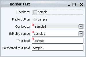
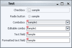
Let’s try our first implementation in the border.BorderComponentFactoryFirstTry. Here is the screenshot of our UI:

What happened with the editable combobox? As i already mentioned in the groundworks entry, an editable combobox is actually a container that has a text field and a button, and so these two are painted after the container (combobox) border is painted. This can be addressed in a number of ways.
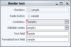
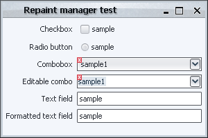
The first is to return insets that match the actual error icon. The border.InsetValidationBorder does just that – in addition to wrapping the original border, it sets adds extra six pixels to the super insets (the actual value should depend on the width of the validation error icon that you’re painting). Here is how the UI under border.BorderComponentFactorySecondTry looks like:
While the validation markers are painted correctly, the UI is far from perfect. The bottom text field doesn’t have our border installed, and so the texts are not left-aligned. In addition, even on fields that have our validation border installed, we’ll have an extra wide gap on the left when no validation overlay is shown. Furthermore, the painting of the first combobox is inconsistent – the background fill (that comes from the UI delegate) doesn’t extend behind the overlay icon.
Let’s try something else – how about installing an extra border on the editor component of the editable combobox that paints the “missing” part of the validation icon? At first, it seems quite easy, and the border.BorderComponentFactoryThirdTry does just that. It fetches the editor component from the combobox, casts it to JComponent (this might fail with ClassCastException if you have a custom editor that is not a JComponent) and installs a custom validation border. The border computes the offsets between the combobox itself and the editor component, and paints the validation icon at the relevant location. Here is how our UI now looks like:
This is a little bit unexpected – it looks like our changes didn’t have any effect. What happened here? The reason for this behavior has to do with the current look-and-feel.
The basic implementation of BasicComboBoxUI.createEditor() returns a text field that overrides the setBorder() and does nothing (see BasicComboBoxEditor.BorderlessTextField class). So, under most look-and-feels, installing a custom border on the combo editor component doesn’t have any effect! Under Metal, however, it gets even more tricky. The MetalComboBoxUI.createEditor() returns an instance of MetalComboBoxEditor which has a custom border that paints only left, top and bottom parts (no right). So, under Metal, our implementation will result in
While the icon is painted correctly (over the editor as well), the outer border is gone. This could have been addressed by wrapping the original border and painting it before painting the icon, but this would still not address the former issue (BorderlessTextField which is used under most look-and-feels).
As you can see, using only borders to paint validation overlays has problems with complex components (such as editable comboboxes and spinners). The amount of code needed to properly address these components starts to become much higher than necessary, and some problems might not be addressable at all without overriding the paint methods of the inner implementation components (which is what we’ll do in the look-and-feel sections).
In conclusion, as in the case of the repaint manager, this approach is not best suited for the specific task.
The last thing that must be mentioned (and it will hold for some of the upcoming techniques as well) is that you have to install a custom repaint manager that extends the dirty region from the editor component to the entire combobox (implemented in the common.ValidationRepaintManagerSimple). The reason is simple – suppose you start editing the value in your combobox, and the validation indication toggles (say, goes from valid to invalid state). As mentioned already, Swing is smart enough to repaint only the editor (and hence paint the validation icon in the editor bounds), but not smart enough to figure out that this editor is an integral part of a “larger” component (which means that the validation icon will not be painted outside the editor bounds, resulting in a clipped indication). Without a custom repaint manager (with its “globalness” shortcoming addressed in the relevant entry) you can end up with temporary visual artifacts (until some event that triggers the repaint of the combobox itself).
The RepaintManager class is one of the major participants in the Swing rendering pipeline and is, perhaps, one of the lesser known and used classes in the core Swing layer. In this entry i’m going to talk about this class, its strengths and weaknesses and hint at why it is so infrequently used in third-party libraries.
As i mentioned a couple of times in my presentation, one of the main disadvantages of using a custom repaint manager is that you can not have more than one repaint managers installed at any given time (singleton pattern). Coupled with asynchronous implementation of the core repaint manager, you can have two or more application modules (some potentially coming from third-party libraries that install their own managers “behind the scenes”) fighting over this global resource. This will very quickly lead to unpredictable painting behavior and severe visual artifacts. However, this is not the only reason why there are so few third-party custom repaint managers. First, i’ll mention three of these.
- The
RepaintManagerX from SwingX project is used to provide support for custom translucency on the JXPanel container (and all its children)
- The
ReflectionRepaintManager from the “Filthy Rich Clients” book samples is used to provide support for painting reflection of the panel’s contents.
- The
ExtensionRepaintManager provides a pluggable repaint manager that can have multiple custom implementations installed at the same time (this must find its way into the core JDK implementation some day).
The interesting thing about all three is that they all override only the addDirtyRegion and leave the paintDirtyRegions from the core implementation. In the first two examples above, the actual custom painting (setting custom alpha composite or painting the reflected contents) is done in the paint() method of the custom container itself. The reason is very simple – the paintDirtyRegions() of the core implementation is extremely inflexible.
The actual core implementation uses private fields that track the actual components to repaint, and the repainting of each such component is not exposed as an extension point. Furthermore, the implementation in JDK 6.0 is radically different from the implementation in JDK 5.0 (the former provides true double-buffer support on the frame level, eliminating the dreaded grey rectangle problem).
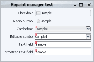
Let’s try and implement the validation overlays in a custom repaint manager without any changes to the paint() method of the actual components. As mentioned already, the core implementation doesn’t expose the list of all the elements that were marked as dirty. To address this, our first try in ValidationRepaintManagerFirstTry (all classes are in the org.pushingpixels.validation.repaintmanager package) would be to track all the dirty components in the addDirtyRegion() and paint the error icons after the call to the super (core) implementation in paintDirtyRegions(). Here is how the UI looks like:
Let’s try and play with it a little. Clicking on the editable combobox reveals the first problem:
What happened? As i already mentioned in the groundworks entry, an editable combobox is actually a container that has a text field and a button. Swing is clever enough to understand that it needs to repaint only the textbox when it’s clicked, but not clever enough to see that the textbox is an integral (and internal) part of another component (our combobox). Thus, our first implementation actually never gets to paint the icon on the combobox, since it only sees the request to repaint the textbox. Note that this can be addressed by changing our application validation logic to handle the textbox-in-combobox explicitly. However, this introduces unnecessary coupling of the application logic with the internal look-and-feel specific implementation of an editable combobox (which may very across different LAFs).
Our second try will take this into account. The addDirtyRegion() of ValidationRepaintManagerSecondTry checks whether the component is a text field, and if it is, whether it lies inside a combobox or a spinner (note that here we assume that the current LAF uses text fields for editable comboboxes as well). If the conditions above are satisfied, we call the same method, but passing the parent container (combobox or spinner). The end result is that during the paintDirtyRegions() we will repaint the actual application component, and not one of its implementation children. Is this enough? It is for the first scenario (clicking inside a combobox). Let’s try something else – click on the button of the first combobox:
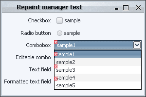
What happened here? The popup of the combo fits inside the frame bounds. In this case, Swing uses a lightweight popup implementation which just creates an additional layer on the frame root pane. However, our implementation of the paintDirtyRegions() first calls the super implementation (which paints all the components, including the popup layer), and then paints the error icons on all components that intersect with the dirty region. The end result is that the error icons are painted incorrectly on top of the popup.
Can this be addressed? It can, and ValidationRepaintManagerThirdTry paints the error icons after clipping out the areas of all the application popups (collected from the entire component hierarchy). The implementation details for such a simple functionality as validation overlays start to pile up rather unnecessarily. One of the main reasons is that we’re operating on a much higher level than we should be doing. While tweaking the dirty region for showing validation overlays is most certainly necessarily (and will, in fact, be used for a few other techniques), the actual painting process is very clumsy and inflexible. At this point, you can still end up with a few other visual artifacts playing with the lightweight / heavyweight popups and minimizing / restoring the frame. Here is one of them (note that the text fields don’t have error icons) – this happened after playing with the popups a few times:
One of the reasons for such behavior could be the optimizations done in the top-level double-buffering support, another could be in the specific implementation of the lightweight and heavyweight popup windows in the JDK itself and the look-and-feel you’re doing.
As you can see, there is a good reason why the available third-party repaint managers only handle the computations of the dirty regions, leaving the actual repainting to the component level itself. In the next sections, we’ll see how this can be achieved, and what are the potential problems along the way.
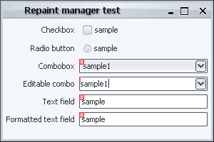
Before i start discussing the different implementations of validation overlays that illustrate the power and flexibility of the Swing rendering pipeline, i want to mention some of the common classes that will be used throughout this series. First, here is the screenshot of the sample UI that will be used for all the techniques:
Note that the code focuses on the painting itself, and leaves the custom validation logic (based on the contents of the text field, selected combobox entry etc) to the application code (which is not relevant for discussing the Swing painting pipeline). The common classes are located in the <a href="https://pushingpixels.dev.java.net/source/browse/pushingpixels/src/org/pushingpixels/validation/">org.pushingpixels.validation</a> and <a href="https://pushingpixels.dev.java.net/source/browse/pushingpixels/src/org/pushingpixels/validation/common/">org.pushingpixels.validation.common</a> packages that contain the following:
- The
SampleUi class is the UI itself. It uses the FormLayout to create a simple two-column layout with a few controls.
- The
common.ValidationUtils provides a very simple implementation of two helper methods. The first is hasError(Component c) that returns boolean indication whether the specified component should show the error overlay. The second is the paintErrorIcon(Component c, Graphics g, int x, int y) that paints small error icon at the specified location. More on these two methods below.
- The
ComponentVisitor interface follows the usual visitor pattern to allow some of the discussed implementations to visit all components starting from a specific root.
- The Visitor class implements the visitor pattern itself, with the
static void visit(ComponentVisitor visitor, Component c, Graphics g) method that recursively visits the entire hierarchy of the specified component, calling the custom visitor logic on each one of the children components.
Note that the first two would be application-specific, and the last two are relevant only for some techniques.
In addition, using the visitor pattern reveals one of the weaker sides of Swing. The basic JComponent class extends Container, which means that every core Swing component can have children components. While it allows some nifty tricks like putting a JOGL-powered icon on a button, it unnecessarily exposes the application code to the implementation details of some more complex components. For example, an editable JComboBox is implemented with a text field and a button. A JSpinner is implemented as a text field and two buttons. Unfortunately, these are counted in the getComponentCount() and returned in getComponent(int index), which makes it rather annoying for the visitor pattern.
Subsequently, the sample implementation of the hasError(Component c) method in common.ValidationUtils makes special checks when it is passed a text field. If the text field has either combobox or spinner parent, it is ignored.
The next entry will show the first extension point in the Swing rendering pipeline – the repaint manager.
In my presentation at OSCON 2007 (PDF slides available) i talked about the Swing painting pipeline and how easy it is to extend it to provide custom painting behavior and effects. In this series i’m going to talk about these extension points in a more detailed way, taking you on a journey along a very well-engineered and extensible implementation that makes Swing one of the best available UI toolkits.
The following two images show a high-level overview of the Swing painting pipeline which consists of three major players, the JComponent, the RepaintManager and the ComponentUI:
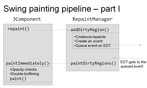
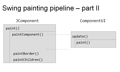
As i mentioned in the presentation, pretty much everything you see in this pipeline is extensible, which makes it very easy to override / extend the basic core implementation and to provide your own custom painting. These extension points (or hooks) vary in three main areas: flexibility, robustness and ease of use.
By flexibility i mean the degree of control exposed by the specific hook. For example, if you want to add drop shadows to all your labels, it’s very easy to do with the UI delegates, but next to impossible with other techniques (such as glass pane, for example, especially for anti-aliased texts). By robustness i mean how sure can you be that your custom code works as expected across different operating systems and JDK versions. In addition, this includes the “stability” itself of the custom logic. For example, the repaint manager is a singleton, and you can have two or more application modules fighting to install their own implementation. Finally, by ease of use i mean the complexity of the implementation itself. While the repaint manager is, in most cases, the hardest to implement, providing custom painting logic with glass pane or by overriding paintComponent might be considered the easiest.
The techniques will be discussed and compared using the following common task – provide validation indication on different controls. The validation indication itself will be painted as a small error icon in the top-left corner of the “invalid” component; in addition, any Swing component can be in the invalid state. The later includes, for example, simple text fields and editable comboboxes (which contain child components as the implementation detail).
The following techniques will be shown (links will be added as each technique is described):
- Repaint manager
- Overriding paint() manually
- Using AOP to override paint()
- Custom border
- Layered pane
- Glass pane
- JXLayer
- Extending look and feel
- Multiplex look and feel
See you in the next entries.
