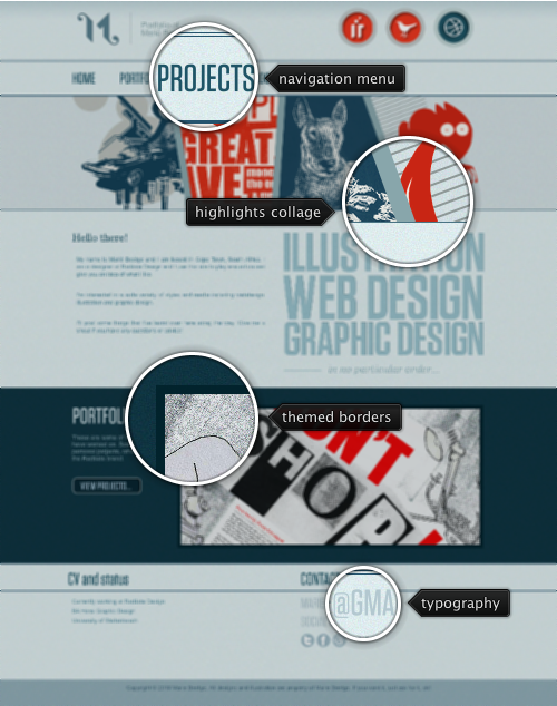
Today’s post highlights the design of MerieBeetge.com. Heavy usage of narrow font faces, bold splashes of solid bright red color across the color steel blue background and an oversized collage of portfolio highlights directly below the navigation menu work well together to create a memorable first impression. The site features attractive transition effects across the different pages (play with the slideshow in the Project section) and consistent theming of icons.
However, it can certainly use more polish in kerning the main logo text, rollover effects over the header / footer icons and the overall appearance of the main “View projects” action button in the portfolio section on the main page.

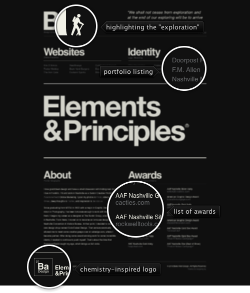
Today’s post highlights the design of BlakeAllenDesign.com (he works at Paramore Redd featured earlier in this series). Striking typography, precise grid and spartan duotone color palette create an impressive and memorable experience. The content is arranged in two major columns broken into multiple sections surrounded by heavy oversized headers. The outline of a walking man which highlights the “exploration” part of the site motto is the only non-typographical element. Note how all the other logo elements are typography-based (including the fully expanded Twitter logo and cleverly arranged “Ba Design” logo that is inspired by the layout of periodical table of chemical elements).
Also note the exact layout of subcolumns in the “portfolio” and “awards” sections, the precise horizontal alignment of “about” and “awards” sections, as well as absence of any white rivers in the rather large “about” section.
Focusing mainly on typography, the design loses a little bit of interactive appeal when browsing the portfolio section. Clicking on a portfolio link shows a rather large slideshow of the related work. Unfortunately each portfolio section has a separate URL and is not replaced dynamically. This means that if you scroll down the page to reveal the full vertical extent of the slideshow, and then click on a different portfolio link, you lose your vertical position in the page. Since the transitions of images in the same slideshow are done with nice animations, i would expect a better UX for switching between different portfolio parts.

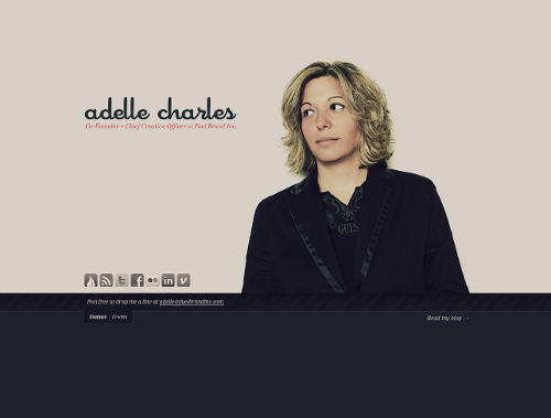
Today’s post highlights the design of AdelleCharles.com. Everything in the posture – from shoulder tilt to slight turn of the head to the actual eye shift – guides the visitor’s eye immediately towards a simple and well-balanced tagline that uses a custom hand-written font for the name and a thin slanted serif for the short description. Note how the shoulder tilt contributes to restoring the visual balance “disturbed” when the picture was move to the right of the center in order to make room for the tagline block.
Tastefully laconic, the rest of the site features duo-tone social links (with full color versions on rollover), a smooth expand / collapse transition on clicking the Contact and Credit links (along with cross fading the content while the extra strip is shown) and a simple link to the author’s blog. The duo-tone palette itself combines dark slate gray and light beige that borrow from the post-processed author picture. The beige serves as a natural surrounding of the face and hair, while the slate gray extends the dark blouse and the jacket.
This highly appealing combination of color, balance and visual guidance is unfortunately lost on the similarly themed sites of three other people behind Fuel Brand Inc. Joshua‘s glance towards the tagline looks quite apprehensive, Doug is not looking at the tagline at all, and Dan‘s picture looks blurry around the edges and is misaligned (the main tagline is projected at his forehead instead of at the eyes). The strong visual perception of Adelle’s picture is also out of place in the team section of the company’s site (where she is looking away from the other team members), as well as on her Twitter page (where she is looking away from the main content).

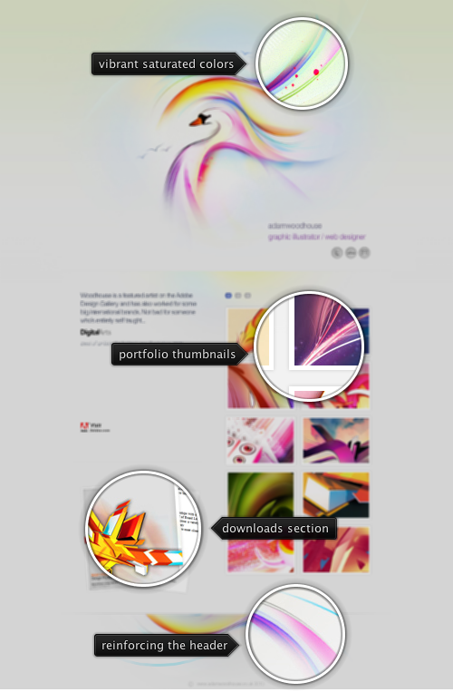
Today’s post highlights the design of AdamWoodhouse.co.uk. A stylized bird illustration painted with large curved oversaturated strokes set on the backdrop of pastel radial gradients sets a vibrant and open tone to the site. A two-column grid of portfolio thumbnails defaults to a set of illustrations that use a very similar abstract style with large swaths of oversaturated primary colors. At the same time, muted drop shadows, subtle pastel background highlights and white space around the text blocks in the left column balance out the rich color palette and guide the visitor towards the download section in the bottom left part of the main section. A beveled horizontal separator with fading edges marks the transition to the footer. This section feels a natural continuation of the header illustration, with hard cutoff at the top edge and more muted colors of the swirling strokes.
Move the mouse over the portfolio thumbnails to see cross-fade effects between different zooms of the same artwork. Click a thumbnail to launch a transition sequence that pops up a lightbox and shows a larger version of the specific entry.