This hasn’t strictly happened in the latest release of Play Store, but worth mentioning nonetheless. The screenshots below show the layout changes made in Play Store 4.1 for editorial pages.
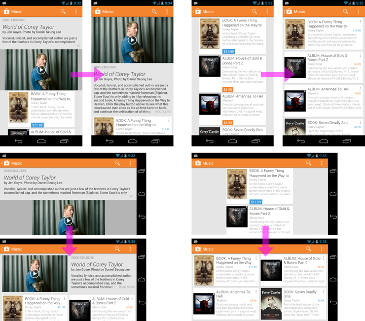
The header underwent quite a few layout changes. In a single-column mode we swapped the description and the video to result in a more pleasing aesthetic flow that begins at the top of the page. The rather random 2-line collapsed description has been replaced to have the description section have the same height as the video element. The video element itself is a fixed 16×9 block that goes edge-to-edge with no unsightly gray pillar bars. Finally, the last few characters of the last line in collapsed description are faded out with superimposed “read more”, removing the rather awkward dangling arrow caret that we used to have.
In landscape mode the header goes to two columns – video element on the left and description on the right. The description is limited to show as many lines as possible without vertically overflowing the video element.
Card content underwent grid alignment as well. In portrait mode the cards go edge-to-edge with consistent visual and layout treatment of the price element. We’ve also tightened up the line spacing of two-line titles and went to two-column layout in landscape mode. Pretty much all pillar bar margins are gone, resulting in a better defined grid and a better usage of available screen estate.
For these screenshots I purposefully chosen an editorial collection that mixes items from various media types. Such collections present an interesting design challenge to balance the exposure of cover art with grid alignment. Cover art for apps, albums, TV shows and movies is fixed aspect ratio (1×1 for the first three, around 1.441×1 for the movies). Books and magazines are mostly in 1.35×1-1.52×1 range, but there is significant variation in some of the genres, particularly children’s books. When you have a collection of items with varying aspect ratio of cover art, what gets aligned?
Our current approach is to have two fixed aspect ratios – 1×1 for apps, music and TV shows and 1.441×1 for everything else. The second aspect ratio is a perfect fit for movies, and lies rather conveniently in the middle of the “regular” range for books and magazines. If you browse those sections in the Play Store you will notice that the covers go edge-to-edge along one axis (vertical or horizontal) with white space on the sides along the other axis.
Mixed content in the same collection (such as editorials, wishlist or recommendations) presents another problem that can be seen in this screenshot:
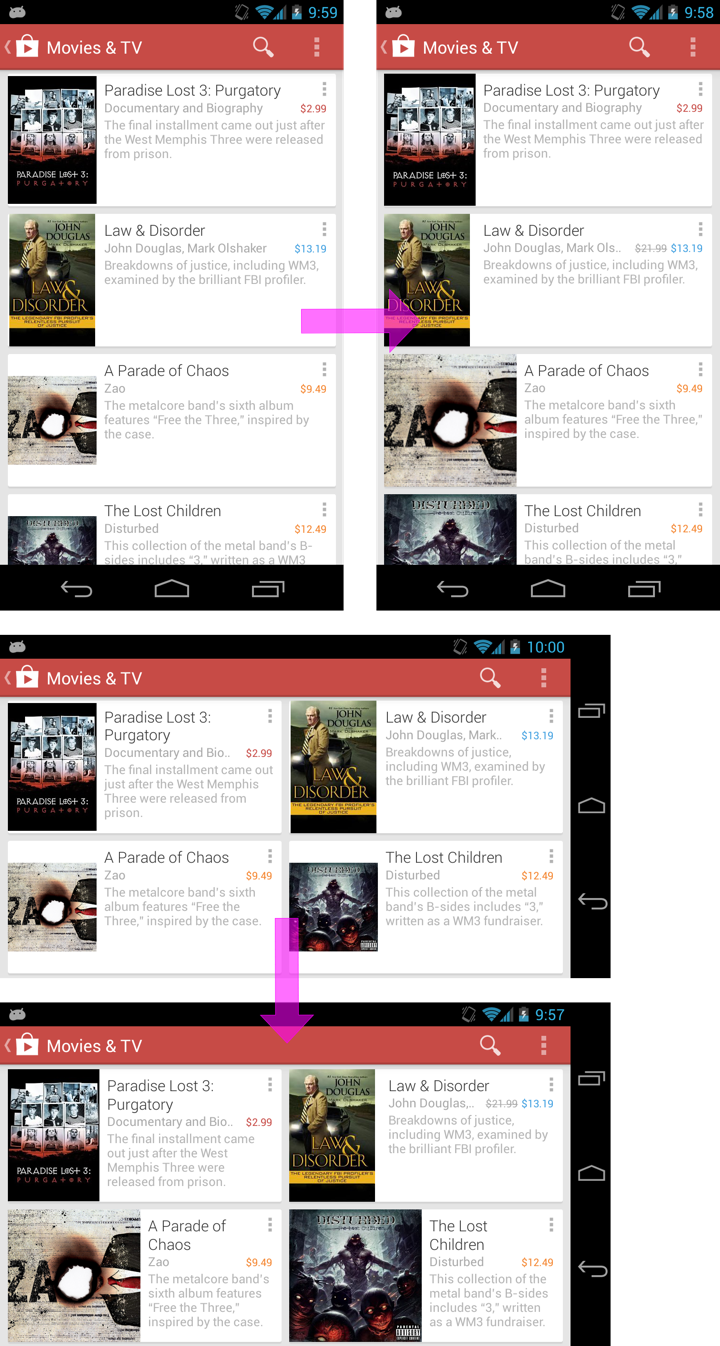
For aesthetic and alignment reasons all cards in the editorial collections have the same height. What happens when you have items of mixed aspect ratio? Our previous approach was to allocate fixed width and vertically center the cover “asking” it to fill as much of that width as possible. It resulted in a rather unbalanced look of cards for items with 1×1 aspect ratio – such as albums in this specific collection.
In the latest release of Play Store we have revisited this approach. The cards still have the same height, but the allocated width depends on the actual type of the specific item. Movies, books and magazines continue getting the width based on 1.441×1 aspect ratio. Apps, albums and TV shows, however, get more width for their cover art – based on the 1×1 aspect ratio. This results in a much more prominent space given to the cover art. As with every design decision, when something gets more space, something gets less. In this case, there’s less horizontal space available to the title and the item description. The title might go from one line to two lines (or even get cut off). In addition, we no longer have a single vertical line that has all titles, subtitles and descriptions aligned to it. Instead, we might end up in something of a zigzag that has its shape defined by the sequence of items within that collection. That is a conscious tradeoff in this decision.
And while up until now I’ve talked about portrait and landscape phones, it doesn’t mean that we forgot about larger devices. If anything, the positioning of the different elements used to be even more random on those devices. The screenshots below show the changes that were made to impose a consistent grid that enforces structure and flow on the editorial collections.

One of my favorites here is how the card grid columns “extend” into the header, forcing the video element to be positioned edge-to-edge in the first column. And, with more horizontal space to give to the header description, this particular one has just enough space to show the full description without the need to go to “read more” collapsed mode.
As part of the bigger redesign of the Play Store (cards, cards everywhere) we also created a new tab strip. What’s nice about this strip that it can fit multiple tab titles on larger screens, while also allowing swiping it independently of the view pager itself and selecting tabs all the way at the “other end”. That functionality, however, resulted in a very jarring sliding transition on the underlying content. It can’t really be conveyed with a sequence of screenshots, but if you have a pre-4.3.10 version on your device, go to the landing page of apps or movies, swipe the tab strip all the way to the end and tap on one of the titles. If you are on a fast connection (4G / WiFi), the data for that tab is loaded before view pager completes its sliding transition to select that tab, and the UI thread is swamped with too many pixel operations to be able to both slide the tab and fill its content. The fact that we’re also configuring the pager to load the content of one tab to the left and one tab to the right of the selected one is not helping.
The omni-present Adam Powell suggested waiting until the view pager sliding transition is complete and only then do the data load. That deceptively simple sentence has lead to a rather gnarly, but stable enough solution that has made its way into the latest release of the Play Store. Let’s look at those gnarly details, starting with what happens when you tap a tab title:
- Click listener registered on the tab text view calls ViewPager.setCurrentItem
- ViewPager calls instantiateItem of its adapter for the newly selected tab and two tabs on the sides.
- ViewPager starts the sliding animation and transitions from IDLE to SETTLING state notifying the registered OnPageChangeListener.onPageScrollStateChanged listener callback.
- ViewPager notifies the registered OnPageChangeListener.onPageSelected listener callback that a new page has been selected.
- ViewPager completes the sliding animation and transitions from SETTLING to IDLE state notifying the registered OnPageChangeListener.onPageScrollStateChanged listener callback.
What we want to do is to set some kind of an indication before step 2 above to defer data loading / display until step 5 has completed. The first gnarliness comes from the sequence itself, where tab selection event happens way after the adapter was requested to instantiate the newly selected tab. If you start data loading in instantiateItem and you’re on a sufficiently fast network (or already have cached data locally), you will end up starting to bind the data for the selected tab well before the sliding transition has completed. I personally would have preferred a slightly different sequence of events, but hey, I’m not going to complain. So…
Given that we “own” our custom tab strip implementation, we can fire a “pre-select” event before calling ViewPager.setCurrentItem. In the handler for that event we propagate the boolean bit to postpone data loading until after step 5 has been completed. In step 2 our adapter checks the value of that bit and does not initiate data loading. In step 5 we go over all deferred tabs and ask each one of them to start data loading.
We end up effectively postponing data load in favor of a much smoother UI response to the tab click. Yes, the data will arrive later than it used to. If you’re on a fast network, the UI will return to a usable state at roughly the same time, as the UI thread completes the sliding transition much faster. If you’re on a slow network, the delay in beginning the data load is not very significant (pager sliding transition completes quite quickly).
There’s a new point of failure here. What happens if we don’t exit that deferred mode? We’re relying on a very specific sequence of events that needs to happen in a very specific order. If, for any reason (not that I’m saying that Adam has bugs in his code, but just saying) we don’t get the SLIDING -> IDLE state transition, the newly selected tab will never have its data loaded. That’s not good. A rather gnarly and brittle (but apparently functioning) hack is to post a delayed Runnable on the UI thread in our pre-select callback handler. If 500ms pass since we’ve posted that Runnable and we didn’t have the IDLE -> SLIDING transition, we force-exit the deferred data load mode for all the tabs. Otherwise, if that transition does happen (step 3 in the sequence above) we cancel the delayed Runnable and let the sequence complete.
This change has been made rather late in the development cycle, and one of the reviewers’ suggestions was to postpone the data binding instead of data loading. The contention is over the UI thread – between tab sliding and tab data binding. Why postpone the data loading then? Start loading the data, and only postpone the binding of the loaded data. Without any guarantee [TM], this is what we’ve added in the development branch. The sequencing of the events is still the same, but instead of deferring the data load in instantiateItem we defer the data binding when we get the data back (from network or local cache). The UI thread is handling the sliding transition, while the background worker threads fetch and massage the data. As the data arrives, we look at the current state of the sequence. If the sequence is complete, we bind the data immediately. If the sequence is not complete, we enter the deferred data binding mode. As the sequence completes, we go over all tabs in that deferred mode and notify them that they can start binding the data.
Gnarly? Check.
Brittle? Check.
Could be better if I knew how to bribe Adam to change ViewPager without breaking a gazillion apps that rely on it? Check.
But hey. It seems to be working. And, nobody said that you will always write nicely looking code that removes jank.
One of Romain Guy‘s hobbies is to file bugs on people to use fewer Views. But you didn’t hear it from me. Anyhow…
The screenshot below shows a full-width banner row with image that cross-fades into solid-color background, with title and (optional) subtitle to its right. In the previous release of the Play Store app we used six child views. Now we use three. What did we remove?

The first one to go was a View that spanned the whole width and height of the parent minus the paddings. That view had the main background fill color set on it. Now that background color is set on the parent view, with one minor caveat. If you call View.setBackgroundColor, it will set the color on the full bounds including the padding. Instead, what you want to do is to use an InsetDrawable and wrap it around a PaintDrawable initialized with your color. I mentioned this before, and I’ll mention it here. Do not use ColorDrawable as a bug on older OS versions will cause it to ignore the insets.
The next one was used to create the cross-fade between the right edge of the image and the solid fill. One option is to tweak the bits of the bitmap itself after you load it from network or local cache. Any kind of device-side image processing (in general so YMMV) is expensive in terms of both memory and CPU, so we opted out for overlaying the right part of the ImageView with a View that had a GradientDrawable set as its background. That drawable was initialized with two end points – full-opacity fill color on the right, and the same fill color with 0x00FFFFFF mask applied to it on the left. You usually don’t want a “random” transparent color used on such a gradient, as the intermediate pixels will not look right across a variety of solid colors. The gradient drawable should be created once in the constructor and then have its setBounds method called from within the onLayout of your custom view group (so that it is properly positioned on its view).
In the latest release we’re achieving the same visual effect using fading edges. Here, you extend the ImageView class and do the following:
- call setHorizontalFadingEdgeEnabled(true)
- call setFadingEdgeLength passing the width of the fade area in pixels
- override getLeftFadingEdgeStrength() to return 0.0f (in our case)
- override getRightFadingEdgeStrength() to return 1.0f (in our case)
- override getSolidColor() to return the ARGB value of the matching solid fill to be used in the fading edge part
- override hasOverlappingRendering() to return true and onSetAlpha(int alpha) to return false
The last two are needed to indicate that the fading edge should be respected during image view fade-in sequence.
Finally, the last view to go was a full-span child that provided light blue highlight visuals for pressed/focused state. Instead, we override the draw method to paint those states explicitly. If isPressed() and isClickable() return true, we call setBounds on the press Drawable and call its draw(Canvas) method. Otherwise, if isFocused() returns true, we do the same for the focus Drawable.
Note that none of this results in improving the overdraw. We’re touching all the pixels the same number of times we used to. However, we’re spending slightly less time inflating the view itself, as well as on measuring and laying out the child views.
There’s this great saying in Russian – доверяй но проверяй. It means “trust but verify”, except it doesn’t have quite the same visceral impact. Probably because it doesn’t rhyme in English. Anyhow.
We got to spend some time in the latest Play Store release to improve scrolling performance. There’s a lot of rules that you can come up with. The most important one for me is – measure everything. If you don’t measure and just blindly start “optimizing”, you’re just treading water. You can improve some things. Or you can make some things worse. And then there’s another rule – trust nobody. Not even the framework code.
In this release we started to support sale prices. Items that are on sale will show the full price as grey strikethrough text right next to the full price.
My first thought was to add another TextView to all cards. But I was right in the middle of a larger refactoring to reduce the number of views on cards (which is a topic for another entry). So that would’ve been quite awkward. And then I though about spans. We essentially have two spans, one for full price, and another for current price. So I whipped up a CL that switched from TextView.setText(String) to use a SpannableStringBuilder with three spans (color+strikethrough for full price, color for current price). It looked as expected, and after testing a few data scenarios I submitted it for review. Then it went in. And then our testers filed a bug about ANRs on scrolling book streams. And general poor scrolling performance on those streams.
And then I started measuring the actual performance of using SpannableStringBuilder on TextView. Because you know, you kind of rely on framework APIs to not only work correctly, but also be fast. Except when they are not fast.
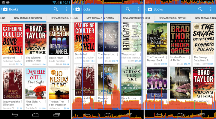
It turned out that using spans is expensive. And by expensive I mean that the cycle of creating spanned content, setting it on the TextView, measuring and drawing it comes up to around 6ms (see links at the end). For one card. Say you have nine cards visible. That’s 54ms. Just for prices. Which is what you see as freakishly tall blue spikes in the middle screenshot. They kind of kick in every time we populate the next row of cards.
Luckily it was found in time before it went public. We ended up creating a custom view that measures and draws these texts with explicit calls to Layout, FontMetrics and Canvas APIs. The performance went down to what we had before. It’s even slightly better than pure TextView with String content, as we could make a few assumptions that the text is always single-line and never elided. So we’re back to normal. Well, you do see a single spike going above the 16ms threshold in the right screenshot, but we’re not done with improving our stream scrolls.
So the lesson is – measure everything. Trust nothing. Even the framework code that’s been there since API v1.
