Continuing the ongoing series of interviews on fantasy user interfaces, it gives me great pleasure to welcome Andrea Braga. In this interview we talk about the beginning of his career working on military / futuristic UI graphics for four installments in the Call of Duty franchise, the transition to the world of screen graphics in feature films, differences in working in pre and post production, the importance of clarity and structure in design, exploring the futuristic technology and making it work to support the story, and the time that goes into creating graphics for dozens of screens that we see in contemporary sci-fi productions. As we discuss all this and more, we dive deeper into Andrea’s work on “Mission Impossible: Rogue Nation”, “Passengers”, “Life” and “Ghost in the Shell”.
Kirill: Please tell us about yourself and your path so far.
Andrea: Going back to the beginning, I studied aerospace engineering in Italy. Then I moved to product design, and finally communication design when I was at the University of Milan. In EU we have the Erasmus program where you can go and study abroad for a few months. I went to Porto in Portugal, and that was the first time I worked with video – filming, graphics, animation. I loved it.
When I finished my studies, I bought a ticket to London. When I got here, I was very lucky that I met Allen Leitch who founded Spov. We both started in product design, and perhaps because of that he was interested. He gave me the chance to work with them, back when the studio was really small. I worked with them for a month, and then I found an internship in Copenhagen with Frame studio. That was a great experience thanks to the amazing people and super talented designers I had the opportunity to work with. A small studio at the time but fully international with full timers and freelancers from all over the world.
Unfortunately I wasn’t hired at the end so I went back to London and Spov offered me a job as a freelancer. My first project was Call of Duty: Black Ops. When I told them I’ve never heard of Call of Duty, everybody was laughing at me. But that probably was a good thing. I had a fresh mind, since I didn’t know anything about it. I spent around ten months out of a year freelancing on these big projects for Spov being part of their design team. The big titles have big budgets, so you can spend more time on designing motion graphics. You can dig into it, and do multiple rounds with the client.
I worked on four installments in the Call of Duty franchise, and it was during that time that I was exploring the military / futuristic UI graphics. The design director at the time, Yugen Blake, was my mentor. He saw that I was doing well in that area, and he gave me more responsibility. As I got into it, I started doing a lot more of it, and I got the chance to lead the screen graphics section of Call of Duty: Black Ops 2. It was a very good experience, designing as well as managing the process of making screen graphics.
And from there, without really knowing it, I jumped into working on movies. It was really exciting. Games are great and the quality is growing so much, but I have never been into them, while movies for me are more fascinating on a personal level.
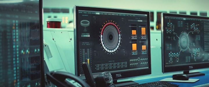
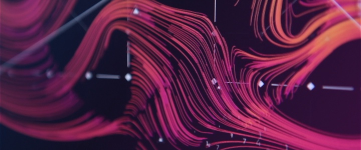
Screen graphics for “Mission Impossible: Rogue Nation“. Courtesy of Andrea Braga.
Kirill: Would you say that screen graphics in movies are mainly there for the camera, with most of it serving as set dressing on all those background screens? It’s not that I as a viewer can interact with those graphics or even spend more than a few seconds looking at them in detail.
Andrea: The screen graphics that I was working on for Call of Duty were mainly cinematic cuts that are shown between levels. It is for the final consumer, but there is no interaction like the UI you find inside the actual game play.
I know what you mean when you’re talking about screen graphics in movies, because you have a lot of background screens. It’s noise that embellishes the shot. But the most important UI in a movie is the one that helps telling the story. Those hero screens are there for the actors to look at, but in the end it’s mainly for the audience to read, as people need to understand what is going on. Especially as sometimes actors have to the deal with “green” monitors filled with graphics only in post production.
The main bulk of the work though is in the background, especially for sci-fi. If you have a spaceship, you have to fill it with loads of screens. That’s more like set design.
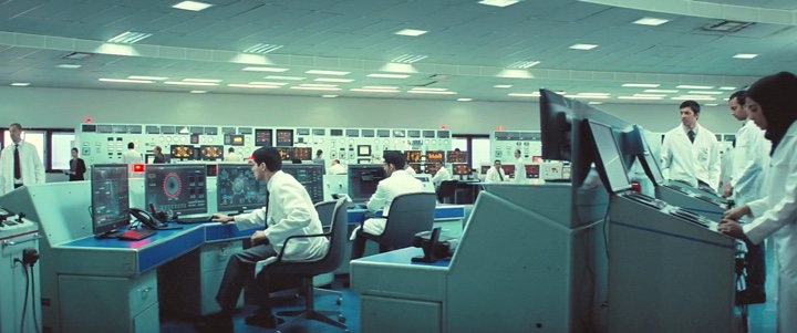
Screen graphics for “Mission Impossible: Rogue Nation“. Courtesy of Andrea Braga.
Kirill: That’s a relatively recent thing as the hardware is so cheap these days. If I look at something like the original Alien, or 2001: Space Odyssey or even the more recent Fifth Element, they didn’t have as many screens aboard the ships as we see these days.
Andrea: That’s true. Everything is more accessible now. But it’s also how you imagine the future. Back in those days, computers were not as present in our daily lives. Maybe when people were imagining the future, they were thinking about having computers, but not as many as we’re thinking of now where everything is interactive.
What we do is based on technology. Every now and then I freeze for a moment. I think about all the applications that I have on my phone, and how I would never have expected certain functionality a couple of years ago. I’m working with technology every day, and I’m still impressed with the progress that we’re making on the daily basis. It’s not about the massive technology, but just the everyday things. And there’s going to be something a year from now we can’t even imagine today that will be a part of our everyday routine.
That might have been the thinking back in 1979 when they were working on the original Alien. The idea wasn’t to have dozens or hundreds of screens on that spaceship. And now when you’re thinking about the future, it’s all screens and holograms. It depends on the context of the time, and what they are pushing.
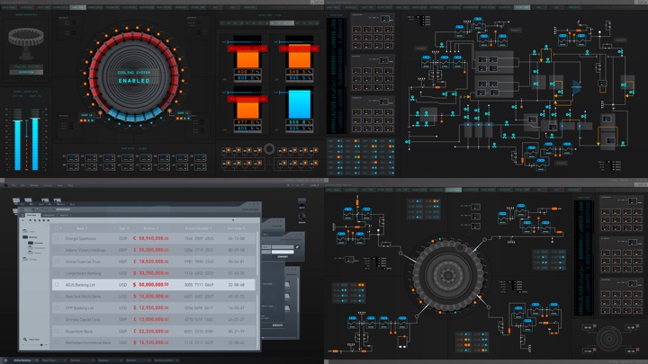
Screen graphics for “Mission Impossible: Rogue Nation“. Courtesy of Andrea Braga.
Kirill: As you started working on Mission Impossible: Rogue Nation as your first movie production, do you remember what was the most surprising or unexpected thing for you in doing screen graphics for feature films?
Andrea: I’ll have to go back to those hero screens that we were talking about earlier. It’s those screens that have to tell the story, and of course I knew that such a screen would have to be done properly. But I think that I was shocked by how important it was for that screen to be 100% clear. Sometimes it’s better to make such a screen extra clear so that the audience understands it immediately. It’s not that the audience is stupid, but you can’t risk them not to follow the story.
Clarity is the main thing in any design. You’re not just doing something for the sake of it. We have to solve a problem, which in this particular case is telling a story. There must be a reason why you’re doing graphics in a certain way. When I was working on MI5 – Rogue Nation both the director and the editor were very insistent on making everything bold and prominent.
It was a bit frustrating in a way. When you’re designing, you have your creative process, and you want to do what you think is right. But I had to compromise that with clarity.
Kirill: What kind of clarity are you referring to?
Andrea: Sometimes when you are happy with your design it still might not be considered clear enough for the audience to understand the message.
And so they keep referencing back to the usual red is bad, green is good. Make it bigger. Make it louder. Make it brighter. In my opinion though sometimes you can achieve the same level of clarity without becoming so obvious.
Continue reading »
Continuing the ongoing series of interviews on fantasy user interfaces, it gives me great pleasure to welcome Ryan Jefferson Hays. Over the last twenty years his career took him through the worlds of multimedia, web design, TV, video games and, most recently, feature films. At Territory he worked on “Guardians of the Galaxy” and “Jupiter: Ascending”. At SPOV, in addition to a variety of game cinematics for major titles, he worked on “Mission Impossible: Rogue Nation”. And as the creative director at MPC his job was to oversee everything that went into making the digital worlds on “Passengers” and “Ghost in the Shell”.
Kirill: Please tell us about yourself and your path so far.
Ryan: I’m from Australia originally, a little place in Western Australia called Perth. I went to an art school there, majoring in multimedia. During my last year, I joined a company called Max Multimedia that specialized in music and sports. Their focus was on multimedia and CD-ROMs, all the way back in 1992-93. The dot-com boom was in full force, and there was a lot of money thrown around, with young kids and fast cars. And then the company went bust after six months [laughs], and I was one of the first ones to fly the coop.
I moved to Sydney in 2000, joining a web company called Massive. They did traditional web sites, and I got bored really quickly. At that point I was into Flash and Director. Director used a programming language called lingo and it was very easy to come up with weird animations. At the time I was part of a design collective called Australian Infront, which grew from a few people to host design meets and doing the conference circuits over time. Through Infront I met Dom Bartolo who worked as a broadcast designer, and after seeing my work he said that I should probably get into TV.
Through that connection I started at Foxtel which is a cable television company that had around 120 channels at the time. I worked on movies, documentaries and other productions, with my main focus on rebranding the sports channels. Then, around 12 years ago, I met my wife Jasmine. We couldn’t afford a house in Sydney so the idea was to move abroad for 2 years and save for a deposit, the aussie dollar at the time was very low so the exchange rate would help when returning to Aus. The choices were New York or London, we chose London as Jasmine has family there. Initially I started working for various television production companies then after a few years in TV I moved into video games, which I guess was the start of the move into feature film work.
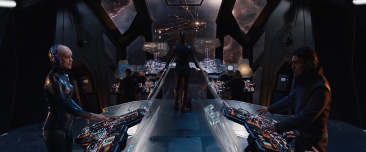
Screen graphics for “Mission Impossible: Rogue Nation”. Courtesy of Ryan Jefferson Hays.
I worked for a company called SPOV for about five years, on game titles such as Call of Duty: Black Ops 1 & 2, Modern Warfare 3, Advanced Warfare, Resistance 3 and Titanfall. I was working on in-game cinematics with Spov, which incorporated UI and 3D narrative work. Then I got a call from David Sheldon Hicks. He used to work at SPOV before starting Territory so new of the work I had produced. I joined them, and my first job at Territory was on Killzone: Mercenary as the 2D lead. The very next production at Territory was my first feature film – Marvel’s “Guardians of the Galaxy”.
Me and another designer, Yugen Blake were tasked with pitching on the project for Territory based on the early script we received. We covered a load of different design aspects in that pitch and worked our asses off which ultimately helped win the job for Territory. As you can see it’s been a linear progression in my career, starting in multimedia, then web sites, then TV, then video games and finally film. I am not sure where the next step is to be honest.
Screen graphics for “Jupiter: Ascending”. Courtesy of Ryan Jefferson Hays.
After Guardians I moved onto “Jupiter Ascending”, working on the set with Wachowskis. It was a great experience to be on that set, even though that was the moment I lost the idea of the ‘magic of film’ [laughs]. You see people with fire extinguishers, pushing the side of a cardboard box with actors inside it imagining it’s a spaceship of some sort. You spend 12-14 hours a day, on a film lot in the middle of nowhere, because all the films that are filmed in London are actually filmed on a lot an hour or two outside the city. You get there when it’s dark, and you leave when it’s dark.
But it was fun project to work on and sitting next to the Wachowskis on set was a great memory. I worked with Nik Hill who was a junior designer at that point, and it was a huge learning curve for the both of us. You need to work very quickly in pre-production, banging out designs all day and not really seeing any of it until it comes out in the theater.
Kirill: As we’re talking about your first couple of productions, do you remember what was the most surprising or unexpected part of it?
Ryan: On Guardians I was not expecting the huge work load needed for the film, it was immense. There was a moment when we first walked into the boardroom filled with concept art. They had hundreds of images along the walls, and miniature sets on the desks. The amount of work and detail that went into the pre-production before they started building anything was incredible. That was the moment when it hit home how big that production was. It wasn’t just a few people working on it before we joined. They had a load of people working on it for years before we had a chance to see it. There was so much hard work gone into it, and it’s really great to see that.
Screen graphics for “Mission Impossible: Rogue Nation”. Courtesy of Ryan Jefferson Hays.
Things in TV production seem a bit more guerilla but you work it out, more or less. You don’t have a lot of time in TV, whereas what I saw on Guardians was a big eye-opener. I didn’t have any problems with that job at all, and it was great experience. The script was so open and vivid, and you could just do whatever you wanted. We were always in discussion with the production designers about the right direction for the film, and they told us to go with it. Usually when you work with UI, you only have a certain amount of colors. You don’t do pink or orange, for example. But they didn’t care.
The world was so vivid in color and there was so much going on, and someone made the comment that the world was vomiting color [laughs]. The Marvel franchise was coming from Iron-Man and Avengers, and I think that’s why they let us go wild with the look-and-feel. And it worked. Probably the only place that had structure was the prison. Those screens reflected that corporate entity inside the world, while everything else was all over the place. Territory is really great at doing those kinds of screens, where everything needs to be based on a strong grid because there’s a lot going on.
Screen graphics for “Jupiter: Ascending”. Courtesy of Ryan Jefferson Hays.
Kirill: You mentioned that your second film was “Jupiter Ascending”. How different was that in the sense that most of the screens were for aliens?
Ryan: Yeah the major challenge for “Jupiter Ascending” was to establish a look-and-feel for the alien interfaces that made it clear what was going on, but also make it feel very alien for the viewer at the same time. One of the screens we needed to work up was the navigation screens used in the small jump ship. The problem we needed to solve was there’s so much space traffic going on and between hundreds of worlds, and there must be a simple but elegant way to navigate this big mess. We came up with the idea of mapping possible routes for star constellations with flowing line work built from thousands of particles for the main interface, these particles could then reform into different maps once the ship had finished its warp jump. The idea was we were mapping out trade routes and paths for the different spacecrafts in different constellations at the same time. In the end it was very basic, but I think it got the point across.
Screen graphics for “Jupiter: Ascending”. Courtesy of Ryan Jefferson Hays.
Continue reading »
Continuing the ongoing series of interviews on fantasy user interfaces, it gives me great pleasure to welcome Peter Eszenyi. Since joining Territory Studio in 2011, he has worked on movies such as “Zero Dark Thirty”, “Mission Impossible: Rogue Nation”, “Avengers: Age of Ultron”, “Guardians of the Galaxy” and “Ex Machina”. In the first part of the interview Peter talks about his earlier work on screen graphics for film, what makes for a compelling experience that supports the story and doesn’t distract the viewer’s eye, the unexpected facets of working in the movie industry and what people think when he talks about what he does for a living.
The second part of the interview focuses on Peter’s role as the creative lead for Territory’s work on the recently released “Ghost in the Shell”. We talk about abandoning the traditional rectangular flat screens, going into curved and holographic spaces, exploring a society that is embracing the potential of cybernetic implants and how that affects the interaction between humans and technology, the evolution of information presentation, and what the urban landscape depicted in the movie tells us about the technology of today.
 Kirill: Please tell us about yourself and your path so far.
Peter: My name is Peter Eszenyi. I was born in Budapest, Hungary, and that’s where I studied television and communication. I started to draw from a very early age, and after graduating, I started as an art director in advertising. I spent quite a few years in that field, working on various projects as creative lead.
As the advertising world was changing, and my real passion is design, I started doing freelance design and art direction work, and I was really keen to get into the 3D world. I was learning about various methods, workflows and software, and my take on that was always to use them as tools. The first package that I used in those early days was 3Ds Max, and from there I moved to LightWave and Cinema 4D. For me, it’s never been super important to stick with one tool – if there is something better or faster, I’d definitely want to use that.
I started to work with advertising agencies on 3D designs, concepts and motion graphics pieces, as the whole motion graphic world was really taking off then. And then around 10 years ago I started to work with agencies outside of Hungary – in places such as Germany and Scandinavia. As I started to travel more, I moved to London with my family. That’s where I got a phone call from David [Sheldon-Hicks], and in 2011 I joined the studio as Head of 3D. I’ve been at Territory since then – I’m basically the oldest employee here!
Screen graphics for Guardians of the Galaxy. Courtesy of Territory Studio
Kirill: Don’t say “the oldest”. Say “the most experienced”.
Peter: That’s true [laughs]. Territory has quite an extensive field of work, but my passion is mostly about films and telling the story to create something that supports the director’s vision. In the past couple of years it started to really happen here.
One of the things I’ve learned about my work is that content is always king. No matter how pretty it is, it needs to sell the thing. And it’s very similar in terms of film. No matter how pretty your UI design or hologram is, it needs to tell the story and support the vision that the director wants to see on the screen. I always try to keep that in mind, which is not easy.
Kirill: And you [motion graphics / vfx] usually don’t have a lot of screen time. Not only you’re “competing” against all the highly paid actors and actresses to get into the frame, but as a viewer I wouldn’t want to stare at some complicated screen while somebody explains exactly what each piece of that UI is for. There are the hero graphics that get a few seconds here and there, and then the rest of the screens are more or less part of the set decoration in the background such as on “The Martian”.
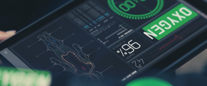
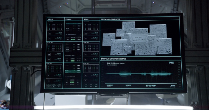
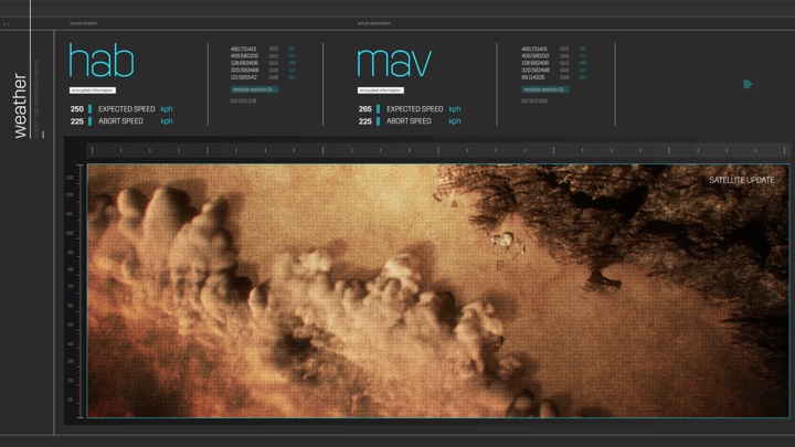
Peter: Marti Romances or David probably have told you this already, but we always try to design our screens to tell the story on its own. Even though most of the stuff that you see on “The Martian” is in the background and seems to be some random data, I’m absolutely sure that 99% of those screens are showing relevant stuff. If you look at the screens in HAB, that shows information on oxygen levels or timezones.
When we do screens at Territory, it’s very important for us to try and keep the “fluff effect” to a minimum – if it’s possible within the constraints. We do not have resources to do a thousand bespoke screens with a thousand pieces of bespoke data. But we try to avoid generating random numbers to put in the background, hoping that the camera is never going too close to that. We try to keep it real, as much as possible.
Screen graphics for The Martian. Courtesy of Territory Studio
That relates mostly to real-world stuff, and we can say that “The Martian” was real-world to a certain extent. However, on films like “Guardians of the Galaxy” or “Ghost in the Shell” you have a fantasy world. There we try to establish the world and the UI language in which the technology exists, and as part of that we define both the potential and limitations of what the technology can do. This process helps us create something that is credible within the context of that film and that story.
The successful examples of screen graphics that I see in film and television are those that, for me, have some sense of reality to them. I think that the viewer immediately recognizes when something is just numbers, or scrolls randomly in the background. I’m not saying that it doesn’t happen. It does, because of various factors. But let’s say you have a spaceship and a screen that shows speeds or distances. I want to try and keep those numbers within a fairly possible limit. That’s how I try to approach it. Maybe that’s not necessary, but I really like to think that most of the designers who work in film do the same.
Kirill: If I can bring you back to when you started at Territory on your first feature film production, is there any particular thing that you remember that was the most unexpected in what needs to be done for movie interfaces?
Peter: The first feature film that I worked on at Territory was “Zero Dark Thirty”. The designs that I did were intended to be utilitarian and reference military screens, and in that sense they were very pared back, minimal and constrained. It was challenging because we were trying to create an authentic version of something that most people, including us, knows nothing about. We researched what information was public, such as drone and satellite footage and military grade HUD and weapons references and designed drone screens and other military screens based on that information. I’m not saying that it was undesigned. We were just really strict with what we allowed ourselves to do on those screens.
“Fast & Furious 6” was my second film, and going back to your question, I was surprised by how most of the UI screen concepts were grid-based – heavily structured, sticking to certain predesigned grids and ideas. I always tried to bring a little bit more free-flowing stuff into my work, so this was an interesting contrast. David, Marti and others were doing strict grid-based designs, and I was fascinated by that.
I never worked with that rigid aesthetic before, and I realised that it was very important to learn. What I’ve learned in the last couple of years is that no matter what you think is a good style, you have to learn all the techniques and have all the tools. Most UI was grid-based for quite a while, and that was the biggest difference in approach for me as a designer. I come from a more traditional background, and I love the broad strokes of the paint brush. But when you design UI, especially for sci-fi and fantasy, you need to be very strict. Quite often, that’s what the story, the aesthetic and the production designer need.
Screen graphics for The Martian. Courtesy of Territory Studio
Kirill: Perhaps on both “The Martian” and “Avengers”, and to a lesser extent on “Guardians of the Galaxy”, you do have a military-style organization that imposes the formality of the structure on all those screens. And on your side, a modular structure would let you define templates and then populate dozens and dozens of screens in a more rapid fashion. So that’s a win-win where the production gets the right ambience of consistency and you don’t need to work on each screen as a separate entity.
Peter: It’s a bit of a chicken-and-egg – which comes first? Is it creating a library of widgets that you can shuffle around, or does it come from the other side? I’m fascinated by the amount of care and sheer work that Marti, David, Nik and Ryan and the fabulous designers put into it.
When I work with them, I try to be the person that does the free-flowing stuff. If I design a widget, or a hero 3D asset that is going to be featured, I try to be the one that breaks the rules – which is a nice contrast. But as you said, it’s an absolute must that you establish a structure that you can use to your advantage to churn out an insane amount of screens with a consistent look and feel.
It’s a good observation that some of the grid-based designs are dictating a more widget-based approach. It’s a shortcut, if you will, to designing a huge amount of stuff.
Screen graphics for Guardians of the Galaxy. Courtesy of Territory Studio
Continue reading »
Continuing the ongoing series of interviews with creative artists working on various aspects of movie and TV productions, it is my delight to welcome Derek Spears. Since joining the Rhythm & Hues Studios about fifteen years ago, Derek has worked on feature films such as “Red Riding Hood”, “The Mummy: Tomb of the Dragon Emperor,” “Superman Returns” and “X-Men: Days Of Future Past”. Most recently, his work as the Visual Effects Supervisor on HBO’s magnificent “Game of Thrones” has won back-to-back Emmy awards for Outstanding Visual Effects.
In this interview Derek talks about the early days of digital visual effects [VFX] and the evolution of the tools since then, the human-intensive parts of the VFX pipeline and his thoughts on what may happen in those areas in the next few years, the discussions that take place between the art department and the VFX department on building things physically, digitally or as hybrid, and the never-ending quest to take the audience on a wild ride of visual storytelling magic. The second part of the interview is all about the last two seasons of “Game of Thrones”, from creating the fire-breathing dragons to meticulously crafting the more “invisible” parts of Westeros and Essos, such as crowds and digital buildings.
 Kirill: Please tell us about yourself and how you started in the field.
Derek: My background is in software engineering. I worked at Silicon Graphics for a few years in the apps development group. During my time there I worked with Kodak to help develop their compositing system, and after that I joined Cinesite to help them start their 3D graphics department. After that I worked at Digital Domain, and now I am a Visual Effects Supervisor at Rhythm & Hues on features and episodic shows. There I’ve worked on “Game of Thrones”, “Black Sails” and “Walking Dead” in the episodic world, and on features such as “R.I.P.D.”, “The Mummy: Tomb of the Dragon Emperor,” “Superman Returns” and others.
My background is in computer graphics and the technology world, but I’ve always enjoyed the intersection of art and technology that visual effects has provided.
Kirill: Would it be correct to say that you’ve joined the field when digital was starting, and there were a lot of special effects with animatronics and other physical approaches?
Derek: Digital was still in its ascendancy back then. People were still trying to understand how it worked. It was very much the Wild West, the frontier type of landscape at that point in time. There were no well-developed ideas that we have now, like pipelines, render cues and various approaches and methodologies. We were learning at the time, and it was very interesting to be a part of that.
Kirill: Do you remember how it felt on your first few productions, as you “lifted the veil” and saw how the magic of movies looks like on the inside?
Derek: It was interesting to learn how a production was done. Coming from an engineering background, filmmaking was a new thing for me. The interesting thing about those early days was that every new show you got to, you had to sit down and decide how to do it. There was no well established methodology.
We didn’t typically use ray tracing. RenderMan was very popular at the time, and there were some other choices – such as Softimage and Mental Ray. The choices then tended to be non-homogenous. The options now are more developed, but also more similar in their approach to solve the problem. It was a bit more interesting in the early days. You had to get out there and figure out how to do things.
It was a much bigger chance of failure because it hadn’t been done before. Now if somebody asks you to do something, the chances are that you’ve done something similar to it, and that it’s going to fit into the existing pipeline. We have tools for various situations, and that is not true for the early days.
Kirill: Looking at the evolution of hardware and software at your disposal, would you say that they’ve kept up with demands from the production side to keep on increasing the level of sophistication of the worlds you’re building?
Derek: There are a couple of interesting things here. There’s always the attempt to decrease the amount of human labour in any given problem. Lighting is the one that has made the most advances out of the many disciplines. It used to be a very difficult and time-consuming problem. Now you can capture light on set and then quickly recreate a very close approximation of it in render without a lot of experimentation. You still have to do a lot of work for modeling and texturing as the setup, but the actual lighting process is rather quick.
Animation and motion capture has helped, but I don’t think that it has taken a lot of labour out of animation. There are tools that are better at rigging, but it’s still an extremely labour-intensive process. The same goes for compositing. There’s a much larger toolset to make things work a lot better in a lot more difficult situations, but what we find is that complexity of the problem matches the efficiency of the tools. For everything that gets faster, the complexity is increasing. It used to take 12 hours to render a chrome sphere and now it takes 12 hours to render a dragon. It’s the same time to render, but you get a lot more for it.
I don’t think that things ever get simpler. It’s rather that the available resources increase the complexity.
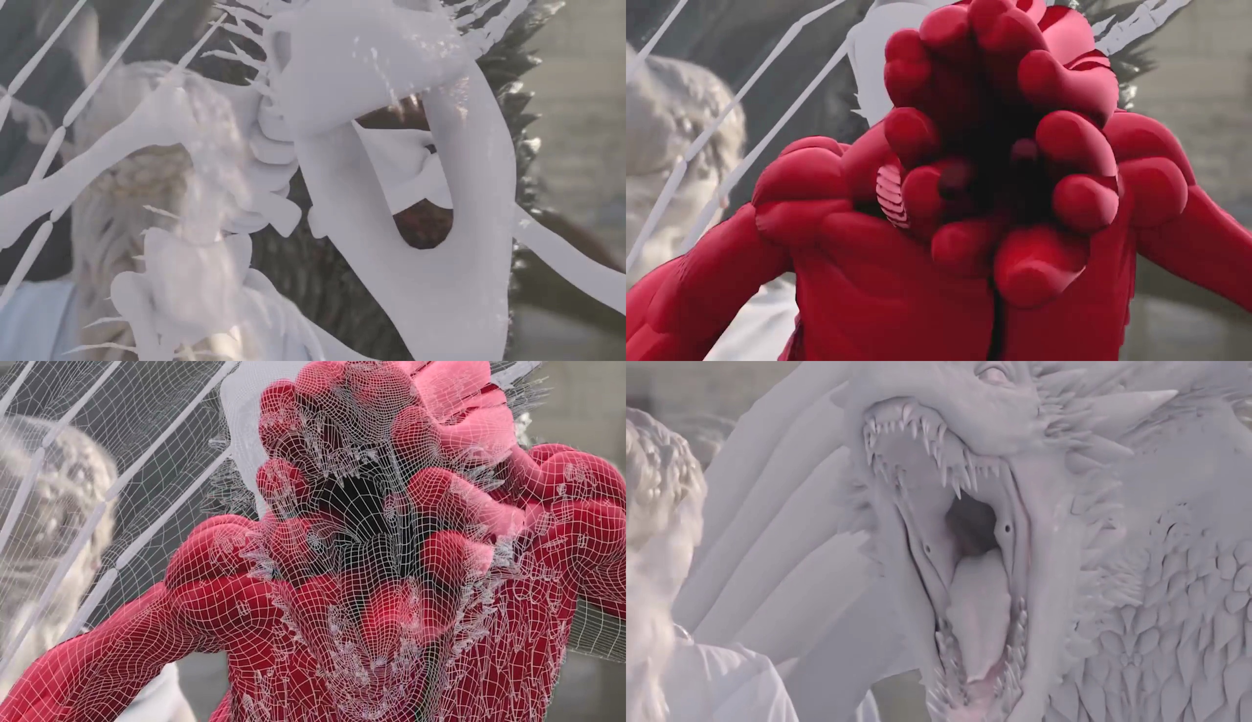
Progressive layers in VFX for “Game of Thrones” by Rhythm & Hues.
Kirill: Now that there’s so much being done in the digital pipeline of VFX, is there any friction between the art department that lives in the world of physical sets, and the VFX department that is creating all these fantastical sets in pixels?
Derek: In many ways, the art department and the VFX department are quite complimentary. What the art department designs, the VFX department has to realize. In some places we’ve seen crossovers, like on “Oblivion” where the art director came from the VFX background. I haven’t seen any tension between the two departments on the productions I’ve been involved with. It’s always very cooperative, to the point of how can we involve the art department to help design and solve some of the VFX problems.
In fact, it gets so close on some of the shows. On one of the shows that we’re working on right now, we’re acting as part of the art department to help design creatures. I view it as a synergistic relationship.
If you’re talking about trade-offs, one of the things that you have to figure out is that everything costs money to do. When you design a big set of platform for your show to work on, one of the things that the two departments have to work out is what is the most cost-effective way to do that. How much are we going to do practically? How much are we going to do in VFX? In no way is that a combative relationship. Together we figure out the best way to not break everybody’s budget. Usually that works very nicely.
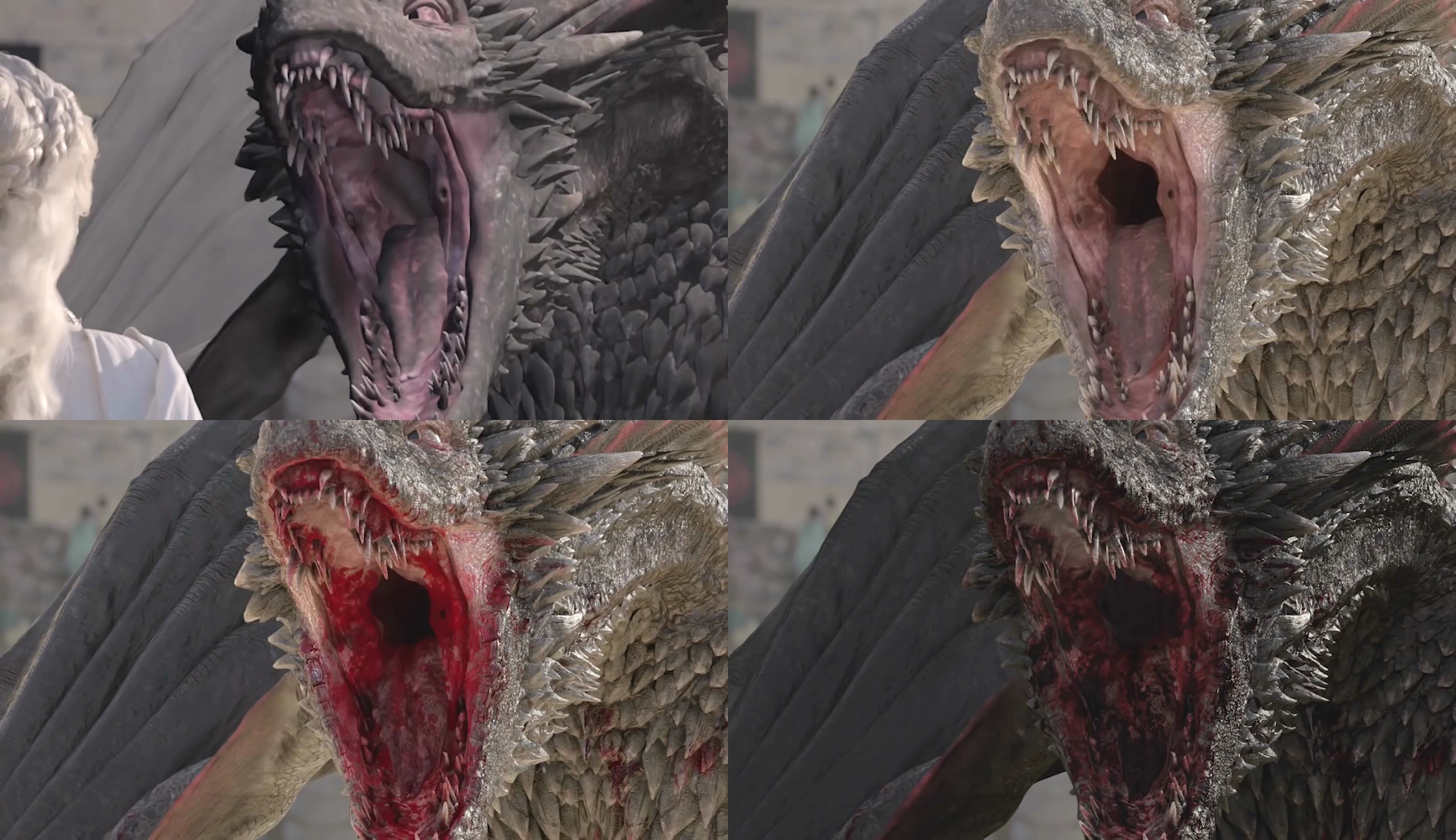
Progressive layers in VFX for “Game of Thrones” by Rhythm & Hues.
Continue reading »
