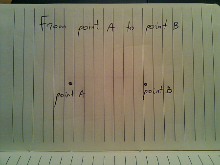
Movement is all around us in the physical world. We take it for granted since we see it from the moment we’re born. Today, i’m going to talk about a seemingly mundane act of moving from one given point to another given point. I would imagine that if you’re reading this, you most probably enjoyed your math lessons in middle school, so the following drawing should be familiar:
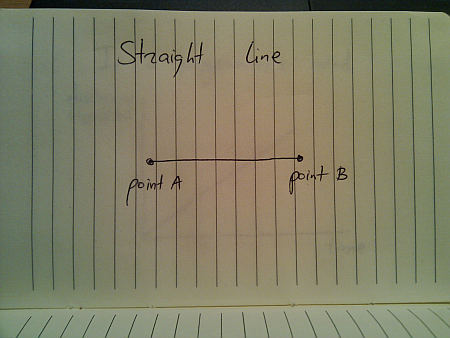
In a perfect world (imagine a deserted highway), moving from point A to point B is just following the straight line:
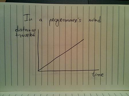
And if you’re a programmer, this is how you would implement this journey:
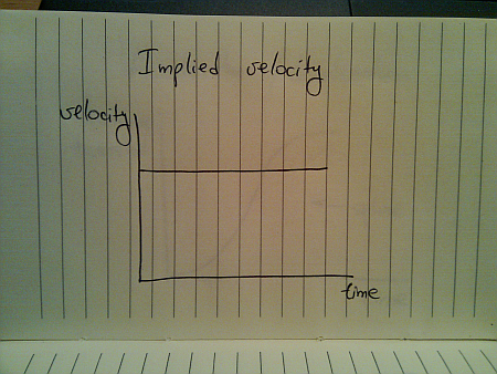
While this seems quite straightforward (and i have seen quite a few presentations that use linear animations), this falls apart once you translate the traveled distance to velocity:
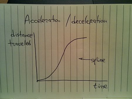
This is hardly the way things move in the real world (be they man-made, inanimate or animate). The usual approach taken by the existing animation libraries is to use a variation of spline (or perhaps a sine / cosine wave) that looks like this:
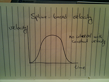
Here, you start from zero velocity, accelerate as you go, reach your maximum speed towards the middle of your journey and then start decelerating towards zero speed as you reach your destination. Translating the distance traveled to velocity, we get this:
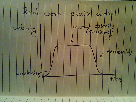
Once again, this is not how things move in the real world. A moving body (human, animal, vehicle or other) has a certain speed limit and a certain preferred speed. It takes some time to reach that speed, but once you get there, you stay until it’s time to decelerate:
This is a better approximation of a slightly less ideal movement. The velocity graph models the “cruise control” mode that you’d employ on a deserted straight highway. Translating the velocity to distance traveled, we get this:
Here, we have a curving acceleration (might be a spline, a sine or even a quadratic curve – depending on the way the object is accelerating), followed by the perfectly linear segment which ends in a curving deceleration.
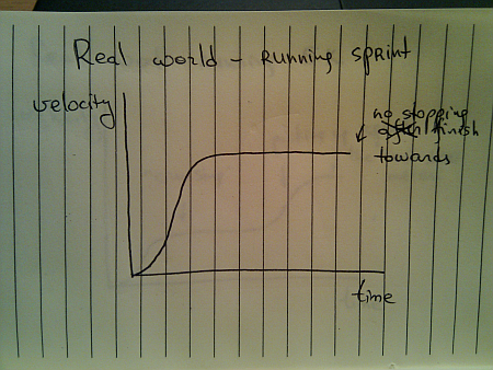
All the examples above assumed that you’re supposed to arrive at point B and just stop there. That is not always the case:
You do stop once you reach the sprint finish line, but you don’t stop until you reach it. Once you gain your maximum speed, in the ideal world you’ll be able to maintain it – especially over a very short distance.
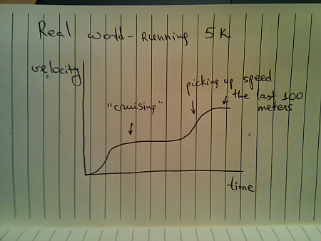
When you’re running sprint, it doesn’t really matter what are your opponents doing. They are running on parallel tracks and do not interfere with your pace. However, if you switch from running sprint to running a longer distance (say 5K), the story gets quite different, and the most common velocity graph looks like this:
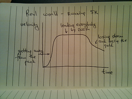
Of course, some runners try to outsmart the competition and end up running like this:
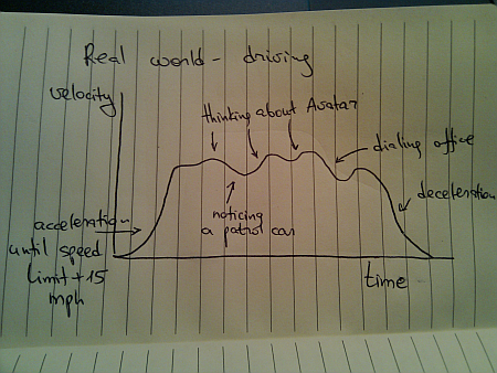
Once you leave a deserted road and have some traffic around you, you cannot always use cruise control. Even if you’re on a straight highway, your velocity graph will likely look like this:
Of course, these graphs are nothing new. We see countless movements of physical objects around you every day. All you need to do is look beyond the simplified approach of “train is moving with constant speed of 40mph” and start analyzing the real world.
Every month this series is tracking the latest design trends and collecting the best examples of modern web designs. Here is the list for December 2009 with over 900 links from 30 aggregator posts:
The year is coming to an end, and it’s time to review what has happened on this blog over the last twelve months. I’ll start the top ten most read posts, and then list my own favorites.
Let’s start with the top ten most read posts published in 2009 as measured by Google Analytics:
Introducing Trident – animation library for Java applications has marked the beginning of the long journey to extract the internal animation layer from Substance and make it available as a general purpose library. Published in February, has around 4,300 reads.
Project Marble – augmented reality in Java with JMF, Java3D, NYArToolkit and Trident is about mashing together a few libraries and adding a touch of virtual reality to the real world. Marble has not progressed beyond that entry due to the work i’ve been doing on Trident, Substance and Flamingo. Published in July, has around 3,700 reads.
Translucent and shaped windows in JDK 7 talks about the published APIs to manipulate top-level windows. This combined with the inclusion of JXLayer (renamed JLayer) is the only client-facing enhancement in Java 7 known so far. Published in May, has around 3,200 reads.
First signs of Nimbus designer in JDK 7 has kept the community hopes of finally seeing the much hyped (at JavaOne and other conferences) visual tool for creating Synth-based look-and-feels. For now Nimbus designer has proven even more elusive than JWebPane hinted to be included in NetBeans 6.9. Published in April, has around 3,100 reads.
New Dust skin for Swing applications showcased one of the new skins added in Substance 5.3 based on the artwork done by Rico Sta Cruz and Kido Mariano for Ubuntu. Published in March, has around 2,700 reads
Substance goals for 2009 talked about refining and refocusing the goal of Substance look-and-feel, outlining the five goals that drove the development of this library throughout the year. Published in January, has around 1,800 reads.
While these have been the readers’ favorites, a few entries that didn’t enjoy a wider readership are worth highlighting. These are my personal favorites that were published in 2008:
Substance goals for 2009 is the only entry from the “most popular” list that is going to appear here. These five goals have driven all the design and implementation decisions that went into the project over the last 12 months.
Why i do open source is for those who wonder why i spend my free time in front of the computer and then give away pretty much everything.
The devil is in the details zoomed in on the finer visual details of the Woopra desktop client, including information organization, color palette choices, and translucent overlays. You can continue to demand the same level of pixel loving from Substance 6.0 and beyond, as evidenced by the work on comboboxes, spinners and text components.
A peek into Substance internals gives a high level overview of the internal implementation details of Substance and is a good starting point for those who want to explore how the library works.
As the name of this blog implies, my passion is to put pixels on screen. I’ve been doing this for about 23 years now, and last 10 doing it professionally. This has started from the TV-connected consoles, and continued into such projects as Substance and Flamingo that are using the full flexibility of the Swing UI toolkit. Over the last few years i’ve been following the developments in competing offerings, such as Silverlight / WPF, Flash / Flex, Qt, SWT and many browsers-based libraries, with the particular eye on the mobile devices.
The mobile devices have enjoyed enormous capabilities growth over the last few years – mainly driven by the simple market laws. As long as the consumers are willing to pay for the new hardware (and the accompanying software), the companies are happy to divert ever growing resources to satisfy those needs. The desktop / laptop manufacturers, of course, have not stopped pushing their own research facilities, but one of the major attraction of mobile devices lies in the very definition of “mobile”. Features such as accelerometer and GPS are simply not relevant to the desktop machines, and i am still waiting to see a single video that highlights how an application running on the laptop switches between landscape and portrait mode when the user rotates the laptop.
Augmented reality is a particularly blooming field for modern mobile devices. As with any new tool, it is easily overused (something which i have been guilty of), but then you have such incredibly ingenious applications as Sun Seeker:
Most of the applications that overlay directions to the nearest underground station answer a question that can be easily answered by (hopefully friendly) passer-byes. However, if you are a professional photographer scouting a new site for the wedding pictures, or a young couple visiting an open house that wants to know that there is enough sun on the back patio in the summer for the kids to play – Sun Seeker is pretty much the only way that can give you a real answer – with an extra bonus of dynamic visual overlays over the current scenery.
Here is another small video that i happened across:
This lies much closer to my heart – how far can you push the user interaction by manipulating the pixels. Note that i’m not necessarily saying that it’s a good user experience. The reliance on thumb agility might be a little too much, and the animations are a little over the top, but i’m mostly seeing how far the hardware of mobile devices has progressed over the last couple of years.
And finally, today I am thrilled to officially become the member of Android team.


 The year is coming to an end, and it’s time to review what has happened on this blog over the last twelve months. I’ll start the top ten most read posts, and then list my own favorites.
 While these have been the readers’ favorites, a few entries that didn’t enjoy a wider readership are worth highlighting. These are my personal favorites that were published in 2008: