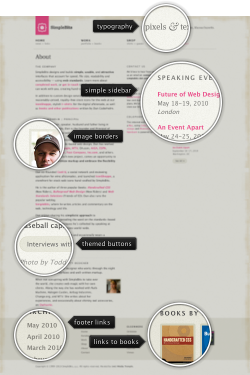
Today’s post highlights the design of SimpleBits.com, a design studio by Dan Cederholm. True to its name, the design is very clean and minimalistic. A spartan beige color scheme with beautiful geometric patterns running along the top, left and bottom edge is offset by increasingly popular shaded desaturated pink color for the logo and links. A simple three column grid provides a lot of whitespace around carefully chosen blocks of text. The navigation menu in the header is perfectly aligned with the main layout columns, and the links in the footer are themed with the darker beige color, blending perfectly with the rest of the site.
A few months ago Pedro Duque Vieira (@P_Duke) has asked me to provide support for menu buttons with checkboxes. This comes in handy when you have a number of options that affect the same visual aspect of the document / application element – such as font style, text alignment, grid borders etc. The relevant core Swing classes are JCheckBoxMenuItem and JRadioButtonMenuItem, but i have never been too happy with the way the API hierarchy of the classes themselves, their basic UI delegates and the UI delegates from core / third-party look-and-feels looked like.
Check box and radio button menu items aim to extend their “standalone” (outside of menus) counterparts. Radio button menu items represent a number of options with single selection – such as text alignment (left, right, center, fill). Check box menu items represent a number of options when multiple options can be selected – such as font style (bold, italic, underlined, strike-through). A good design calls for both types of selection controls to be visually grouped together, and be distinct from other selection groups and controls. This can be done by using extra white space, horizontal separators and group headers.
Placing selection controls in menus provides much less options for separating distinct groups – you can either place them in different menus, or use menu separators between the groups. Suppose you have two single-selection groups that need to go in the same menu. With core Swing, you will be using JRadioMenuButton controls, and you will need to use a menu separator to indicate where one group ends and another begins (unless you opt for much less attractive options such as different fonts, background or foreground colors). If you have a multi-selection group (of JCheckBoxMenuItems), you will also need to “delimit” it by menu separators to make it easier for the user to see that all the menu items belong to the same functional group. Finally, if you have a single JCheckBoxMenuItem, it may or may not require menu separators before and after it – but in most cases the design must make it apparent that this selection control is the only one in its group.
Given the need for extra separation of selection controls placed in menus, i took a few weeks to think about whether the distinction between the radio button and check box menu items – as far as the class hierarchy goes – is required. The only visual difference between these two control types is the check mark icon. The JRadioButtonMenuItem has a small round checkmark (just as JRadioButton), and JCheckBoxMenuItem has a small square checkmark (just as JCheckBox does). The shape of the checkmark thus conveys the selection mode in the group – single or multiple.
It is my current belief that the extra visual message conveyed by the checkmark shape is far outweighed by the resulting complexity of class hierarchy for both the controls and their UI delegates. The placement and grouping of selection controls, as well as the texts associated with the controls should be enough to make it clear whether the group is in single selection or multi selection mode. This decision is reflected in the latest Flamingo 5.0dev that provides support for placing toggle menu buttons in popup menus.
This is a sample popup menu with four toggle menu buttons that belong to the same toggle button group (single selection):

Note that the second option is selected and has a selection visual painted behind its icon. And here is a similar popup menu, but this time with multi-selection group (where toggle menu buttons are not associated with any toggle button group):

We have two elements selected – and they show the matching visuals around the icons.
As usual, to create a popup menu when the user activates the popup area of a command button, use the JCommandButton.setPopupCallback API. The new JCommandPopupMenu.addMenuButton(JCommandToggleButtonMenu) and the new JCommandToggleButtonMenu class can be used to add a toggle button menu to the popup menu. Use CommandToggleButtonGroup to create a single selection group and add one or more of your JCommandToggleButtonMenus to it.
If you want to take the toggle menu buttons for a spin, you will need the following:
Note that the last two are required if you’re running your application under one of Substance skins.
There are two parts to platform UI guidelines, as there are two parts to the “look-and-feel” term. The first part is the visual fidelity across the application surfaces, and the second part is the behavioral fidelity across the application responses to the peripheral devices used to interact with it.
As a developer of a cross-platform look-and-feel, i don’t care that much when a particular application does not conform to the visual guidelines of the specific platform except for two very important areas – matching desktop fonts and font rasterization – as evidenced by the work to extend the font policy support from the Looks library to Gnome, KDE and Mac. The behavioral fidelity is a completely different thing:
From a usability standpoint, behavioral consistency is a more meaningful type of consistency than visual consistency. Being behaviorally consistent means that an application behaves in the same way as other applications, and thus in the way the user would typically expect.
The more consistent the look, the more important behavioral consistency becomes. Visual consistency can hurt usability if it gives a false sense of behavioral consistency, telling the user that a given widget will behave like something he already knows when it does not.
Using “Tahoma 11” in Swing applications on Windows Vista is bad. Using “dialog” which does not resolve to “Lucida Grande” on Mac is bad. What is also bad? Treating ctrl+C as copy when Mac users expect meta+C. It’s not the end of the world, of course. It’s just that people have tendency to memorize keyboard shortcuts, and the more proficient they get, the more they memorize. And they also expect different applications to respond (behave) the same to the same keyboard shortcuts.
An apparently quick solution to appease the differences between Windows and Mac keyboard mappings would be to change all ctrl modifiers to meta. This works for “select all”:
- On Windows: ctrl+A
- On Mac: meta+A
What about “copy”? It has multiple keyboard shortcuts:
- On Windows: ctrl+C, COPY, ctrl+INSERT
- On Mac: meta+C, COPY
Changing ctrl+INSERT to meta+INSERT on Mac is bad. If you’re already doing it, do it right and remove the mapping. What about “moving to next word”?
- On Windows: ctrl+RIGHT
- On Mac: alt+RIGHT, alt+KP_RIGHT
Now this is getting interesting. In some cases you need to replace ctrl with alt and add an extra (but very similar) shortcut. What about “move to beginning of line extending selection”?
- On Windows: shift+HOME
- On Mac: shift+meta+LEFT, shift+meta+KP_LEFT
Now not only the modifiers are different, but the main key is also different. What about “delete previous word”?
- On Windows: ctrl+BACK_SPACE
- On Mac: alt+BACK_SPACE, ctrl+W
You have two different keystrokes on Mac, one similar to Windows, and another completely different. Clearly this calls for an extensible cross-platform solution to address the behavioral guidelines of the specific platform. When do we want it? Now. How do we get it? Read on.
The latest 6.1dev drop of Substance provides first support for platform-specific keyboard input maps. The new SubstanceLookAndFeel.setInputMapSet API can be used to install a set of input maps for all the relevant core Swing controls. The org.pushingpixels.substance.api.inputmaps.SubstanceInputMapUtilities class exposes two static methods that follow the look-and-feel related APIs in the core UIManager class:
- InputMapSet getSystemInputMapSet() to get the system specific input map set
- InputMapSet getCrossPlatformInputMapSet() to get the cross platform input map set
By default you will have the system specific input map set installed – so that you don’t need to call the API above if you want to conform to the platform behavioral guidelines. The cross platform input map set provides functionality identical to that of Metal. The system specific input map set provides the following:
- Input map set identical to that of Windows look-and-feel on Windows platforms.
- Input map set identical to that of Gtk look-and-feel on Gnome.
- Input map set almost identical to that of Aqua look-and-feel on Aqua. While the keystrokes are the same, the difference is in the actions mapped to the keystrokes. In a small number of cases Aqua UI delegates provide platform-specific implementation of actions that are not found in the basic UI delegates (see the list below). In this case i tried mapping the keystrokes to the closest basic action.
- Cross-platform input map set for other platforms.
If you’re interested in the implementation details, start here. This is the cross-platform set, and this is the Aqua set. If you find anything missing for one of the supported platforms (Windows, Mac, Gnome), or wish to contribute an implementation for a different platform (KDE, …) – let me know. To test this new functionality, take Substance 6.1dev for a spin.
P.S. The complete list of Aqua differences:
- All combo keyboard shortcuts are mapped to Aqua-specific actions not present in Basic.
- Up, down, page up and page down keyboard shortcuts in multiline text components (editor panes, text areas, text panes) are mapped to Aqua-specific actions not present in Basic.
- Missing actions for end and home in list.
- Different shortcuts mapped to collapsing and expanding a single node in trees are mapped to Aqua-specific actions not present in Basic.
- Missing actions for collapsing and expanding the full branch in trees.


