Today’s post highlights the design of BlueSkyResumes.com. With an attractive choice of soothing sky blue background, the design features an intricate array of overlaying translucent shaped layers (seen throughout the rest of the site such as the “About us” page). Clean typography, subtle text effects, white space for improved scanning and readability and a clever illustration for the “cookie cutter” message are just a few indicators of how much attention was spent on the design. Move the mouse over the left-hand buttons and the top-right blog link to see rollover effects.

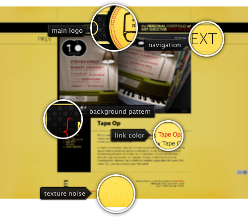
Today’s post highlights the design of StrangeNative.com by Russ Maschmeyer. The saturated yellow color used as the background fill is offset by subtle gradient transitions using darker yellow towards the edges; an extra background layer of texture noise and random smudges adds a welcome relief as well. Strong red reinforces the vibrant choice of colors – it is used as the link foreground color and throughout the various visual elements in the site header, logo and sidebar. The portfolio slideshow embedded in the main page features an attractive layout that highlights the design itself, as well as Russ’s role in the project.

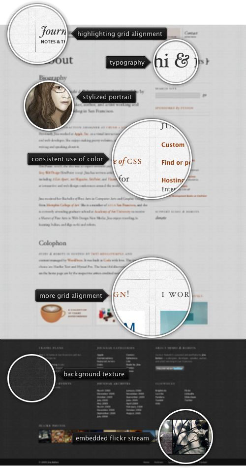
Today’s post highlights the design of SushiAndRobots.com by Jina Bolton. A perfect example of strong grid layout is highlighted by the vertical and horizontal guider lines that help tracing the placement of all visual elements. Note how different elements fit into one or more columns of the six column layout, with extra insets for text sections. All text elements (including the navigation menu, section headers and sidebar links) have their baseline aligned perfectly with the horizontal grid guider lines.
A faded tapestry background texture helps alleviating the string geometrical pattern imposed by the guider lines, and improves readability of the light-on-dark footer section. The main section uses a popular light gray / dark gray / dark orange color scheme with consistent coloring of links and attractive typography for the section headers and rollover effects for the navigation menu elements.
Toggle menu buttons were added to the Flamingo component library a few days ago, and their functionality has been enhanced following feedback from Pedro. In addition to tweaking the visual layout of the area between the icon and the text, the two improvements are:
- Showing a checkmark when the selected toggle menu button does not have an icon
- Popup menus that are not automatically dismissed when a child menu button is clicked
The second entry enhances the usability of popup menus that have multiple toggle menu buttons. Here is a screenshot to demonstrate such a scenario (note checkmarks on the selected buttons):

If this menu controls a set of boolean options / preferences, dismissing the menu after a single button has been clicked (selected toggled) is a bad user experience if the user wanted to change multiple settings. To prevent the auto-dismissal, call the new JCommandPopupMenu.setToDismissOnChildClick(false) API. This way the menu will stay up until the user clicks anywhere outside it or hits the Escape key.
If you want to take the new toggle menu buttons for a spin, you will need the following:
Note that the last two are required if you’re running your application under one of Substance skins.
