It gives me great pleasure to announce the fourth release of Aurora. Let’s get to what’s been fixed, and what’s been added. First, I’m going to use emojis to mark different parts of it like this:
💔 marks an incompatible API / binary change
🎁 marks new features
🔧 marks bug fixes and general improvements
Release notes
There’s still a long road ahead to expand Aurora’s capabilities in 2023 and beyond, with the ribbon / command bar planned as the next big addition. If you’re in the business of writing desktop Compose apps, I’d love for you to take Aurora for a spin. Stay frosty for more features coming in 2023!
Continuing the ongoing series of interviews with creative artists working on various aspects of movie and TV productions, it is my pleasure to welcome Eve McCarney. In this interview, she talks about balancing the art and the craft in the field of visual storytelling, doing research, the ever-rising bar of expectations from episodic productions, and the impact the global pandemic has had on the industry. In between all these and more, Eve dives deep into her work on “American Horror Stories”.
 Kirill: Please tell us about yourself and the path that took you to where you are today.
Eve: I’m a production designer for film and television. I was working at a boutique advertising agency in New York City in 2007 when I started looking for another career since I wasn’t inspired by my work anymore. I remember watching the Oscars that year, and there was an art direction category. I thought, I’m an art director what’s the difference?
I started doing research on what the job entailed, and the more I read, the more interested I became. I had also worked at a newspaper in New York, and with that professional experience together with my work at the advertising agency, it looked to have a lot of overlap with my skillset along with my studies of film and art history. My background as an artist and photographer didn’t hurt either.
I applied and was hired to art direct a short film called Officer Down shooting the very next weekend, and that’s how my journey in the world of art direction and production design began. When I walked into the prison on the first day of shooting, I just knew this it was it. It was exciting and social, creative, and challenging. I was 27 at the time, a bit older than others when they join the industry and already had two careers at that point. About six months later after designing various small jobs around NYC, I quit my job and moved to Los Angeles.
Kirill: Do you find that your background in other industries give you a bit of an edge who have started in this industry straight out of college?
Eve: I think so. I find that my previous experiences help me in ways I couldn’t have envisioned prior to being in this field. Dealing with clients has been quite helpful in dealing with producers. Dealing with ad campaign budgets has translated directly into managing budgetary complications for sets builds. My extensive background in graphic design translated directly into a skill set for creating presentations, concept art and environmental design pitches.
Most production designers come in after having learned architectural design in college. I love taking classes and expanding my knowledge and skill set and I made it a goal to learn the technical side of designing by taking courses to learn hand drafting, sketch up and photo render programs. As I started working on bigger shows around 2010, I gained practical experience with larger set construction and was able to apply the skills I gained into technical applications.
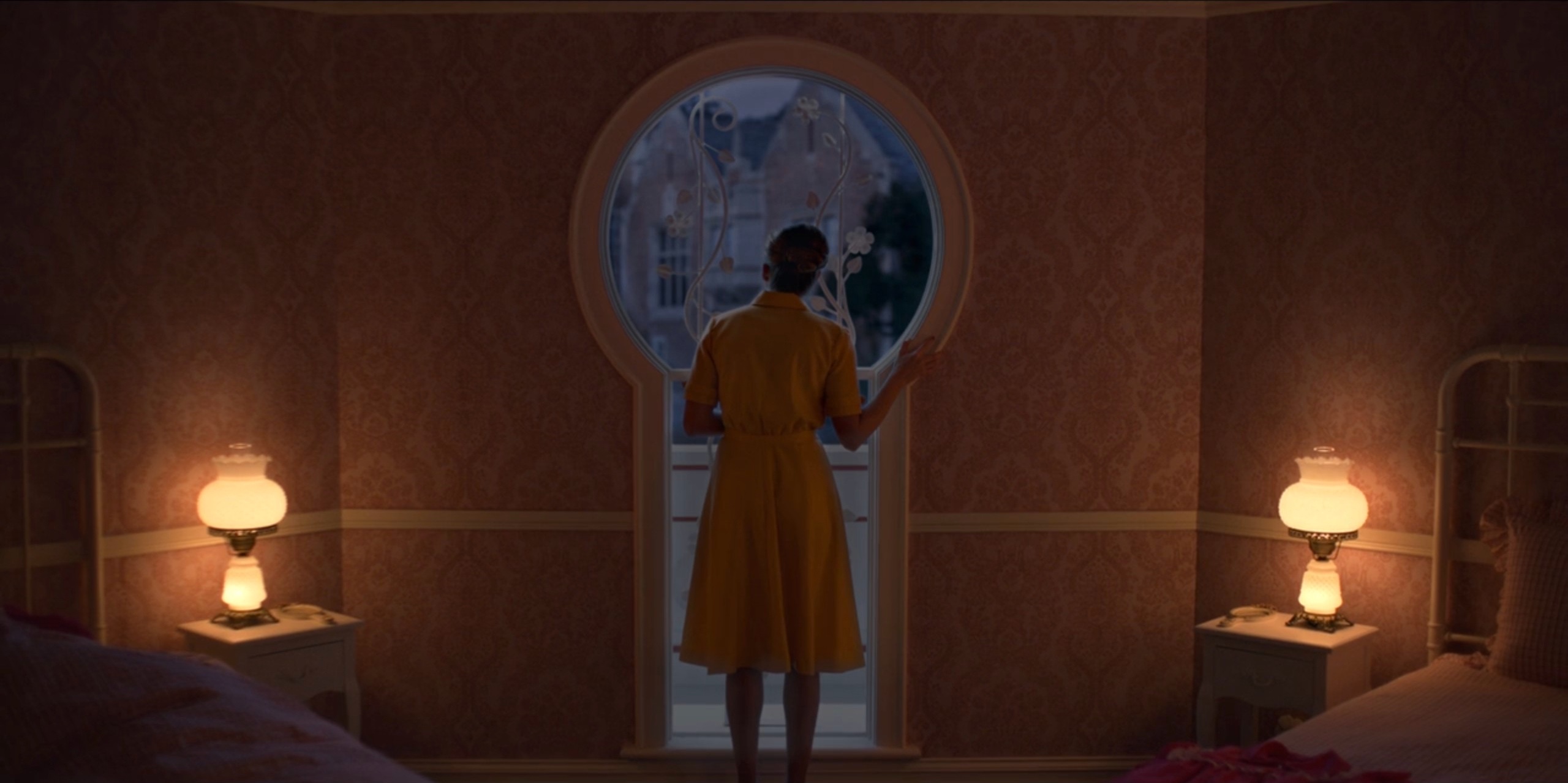
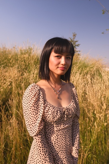
Dollhouse bedroom keyhole, production design of the “Dollhouse” episode of “American Horror Stories” by Eve McCarney.
Kirill: If your start was watching that Oscars ceremony, how much of your work life is glamor, and how much of it is grind and long hours on set?
Eve: Very little glamor [laughs]. It is a grind. It’s hard work, but I was an athlete my whole life, and I’m used to working hard. I used to wake up while it was still dark and practice in the pool in the winter in Pennsylvania, and I would train all summer too. I’m used to that dedication and hard work.
Quite honestly, I thrive off it. When I’m working and creating, I’m at my full potential. The hardest times for me are the breaks between the jobs. It’s definitely a grind, but I’m happy to do it. I find so much joy in designing.
Kirill: How many hats do you wear? You’re an artist, a craftsperson, an accountant, a timekeeper, a psychologist / psychiatrist, and maybe a babysitter for grown people in your department. Does it get overwhelming sometimes?
Eve: Sure, sometimes it can, especially on the smaller projects where you have less support. In that case you are wearing many hats and you’re doing things practically with all of those various hats. I’m designing the graphics, and creating / managing the budget, and helping to paint the set, whatever was necessary on those earlier shows. On the bigger shows, when you have a full team in place and a proper support structure, it makes a world of difference.
I was fortunate to have two amazing art directors on “American Horror Stories” as well as two fantastic set decorators. My construction coordinator is fantastic, along with his whole team. When you have that support in place, it takes a lot of pressure off. Regardless, it can be overwhelming at times. During those moments I’ll take a minute, breathe and try to get some perspective. In my experience, it’s always worked out. You need to stay positive.
Continue reading »
It gives me great pleasure to announce the third release of Aurora. Let’s get to what’s been fixed, and what’s been added. First, I’m going to use emojis to mark different parts of it like this:
💔 marks an incompatible API / binary change
🎁 marks new features
🔧 marks bug fixes and general improvements
Dependencies for core libraries
- Compose Desktop: 1.1.0 ➡ 1.2.0
- Kotlin: 1.6.10 ➡ 1.7.20
Release notes
This release (code-named Cryo) brings a couple of new APIs, and otherwise is focused on stabilizing and improving the overall API surface of the various Aurora modules. There’s still a long road ahead to expand Aurora’s capabilities in 2023 and beyond, with the ribbon / command bar planned as the next big addition. If you’re in the business of writing Compose Desktop apps, I’d love for you to take Aurora for a spin. Stay frosty for more features coming in 2023!
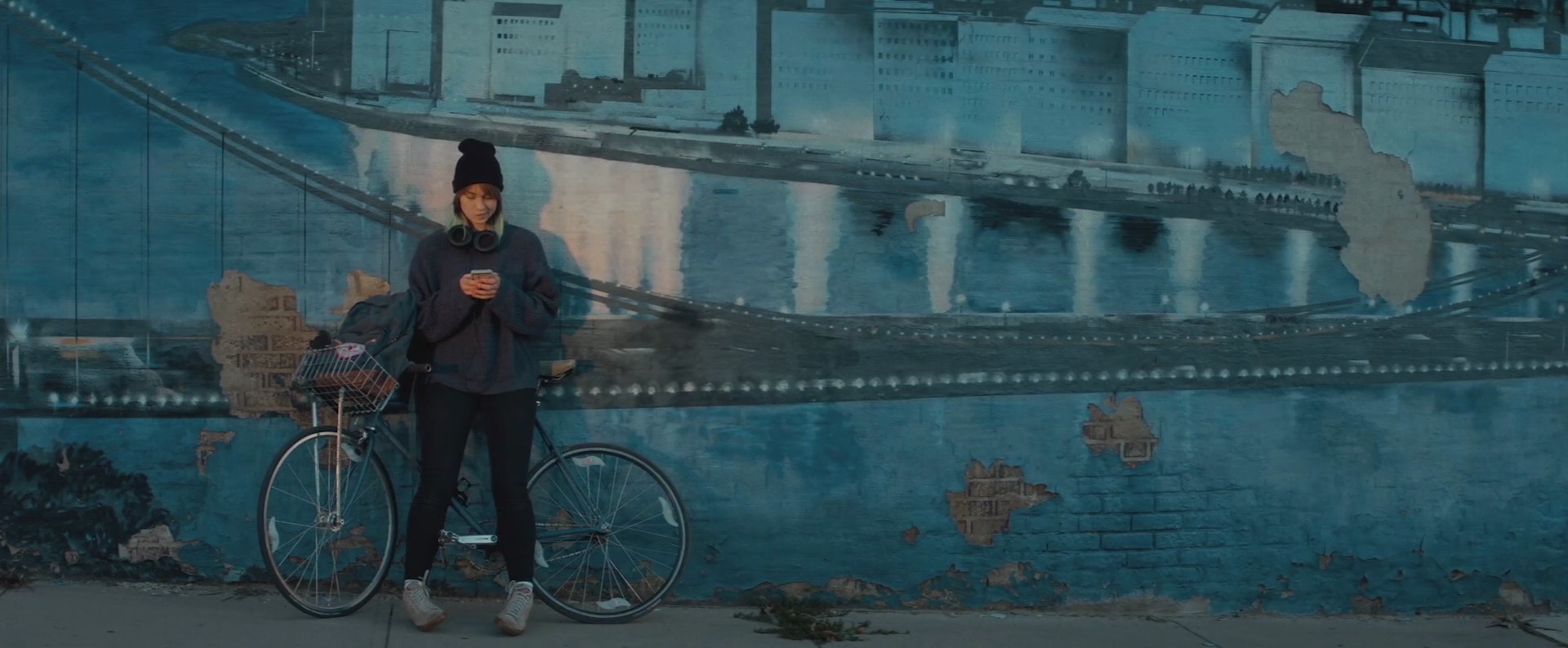
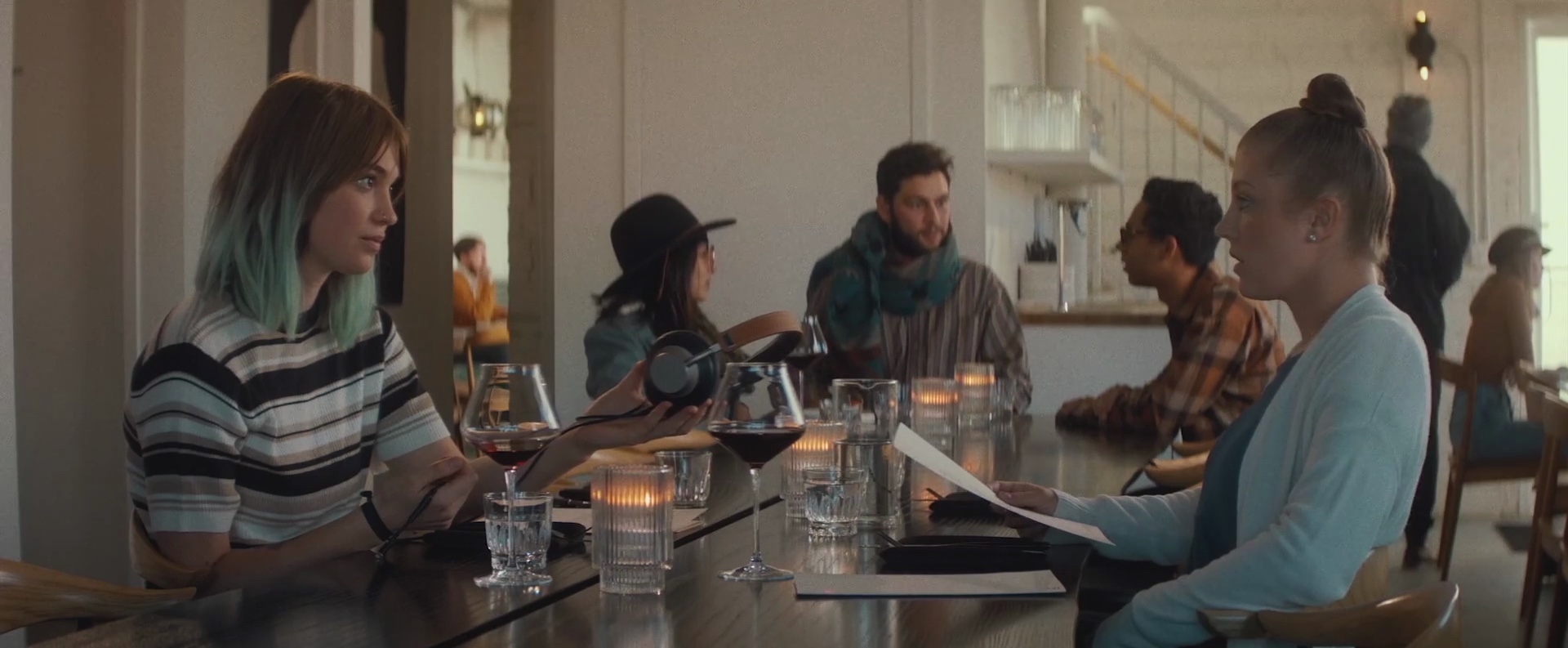
Continuing the ongoing series of interviews with creative artists working on various aspects of movie and TV productions, it is my pleasure to welcome Juli Sasaki. In this interview, she talks about the challenges of making indie films, working within budget restrictions, the variety of screens in our lives, and the ongoing impact of the pandemic on the industry. In between all these and more, Juli talks about her work on the recently released “Poser”.
 Kirill: Please tell us about yourself, and the path that took you to where you are today.
Juli: I think I’ve been very lucky to stumble upon the path I’m on now. I grew up in a small suburb of Columbus, Ohio that felt very much like a bubble. My world view was so limited – I had this obsession with the idea of traveling the world but somehow never thought it would be possible. Then, I decided to take a leap of faith and took a year off of college to pursue an experiential learning program based in Slovakia. That led me to live in Madrid for a while, and that’s where my interest in filmmaking began.
I had no idea what the process of filmmaking was like, but I was very interested in photography at the time, and filmmaking seemed like the pinnacle of photography and all art forms coming together into one. From there, my friends offered me a job back in Columbus working as a production assistant at their small independent production company, Loose Films. We worked on mostly commercials and documentaries together with the goal of saving up and making a feature film. As I learned more, I started producing projects until we finally had the opportunity to make our first feature, which was Poser. From there, I kept wanting to learn more about the art department on bigger sets, so I moved to NYC with the hopes of joining the art department on a tv show. I joined The Marvelous Mrs. Maisel as a background extra, then a Covid PA, then Props PA, then moved to another show as an Art PA, and finally landed at The Gilded Age as a Graphics PA.
This year, I joined the 829 Union, and thanks to my wonderful boss trusting me, now I’m working as a Graphic Artist on The Gilded Age. It’s been a wild path, but I am learning so much and having a lot of fun!
Kirill: What is the biggest thing about your industry that the “outsiders” are not aware of / underestimate?
Juli: I think the biggest thing that people underestimate is the amount of time and resources it takes to make a film. Filmmaking is a huge effort that requires so much coordination between different departments. Everyone from the departments needs to be present just in case something is needed last minute, between takes, etc., and that often means a lot of waiting. That’s why our days are so long, because filmmaking is a little like a relay race sometimes.
Kirill: How difficult is it these days to make an indie film, in terms of raising money, finding the right people to work on it, and connecting to the audiences?
Juli: I would say that making an indie film is never easy, but I am happy that there is a growing support for independent film, and there are a lot of resources and networking groups that I’ve found specifically for BIPOC and under-represented folks in film. This means that more diverse stories are getting out there and engaging new audiences. The best crew I’ve ever worked with was a team of almost all women that I’d met at Sundance. My friend and I drove up to NYC from Ohio to work on a short film with them, and it was a life changing experience. In Ohio, the film community is mostly men, and I was often the only woman on set. There are a lot of supportive film communities online and in person, and those have been a great resource for finding a good crew.
Kirill: What does being an artist mean for you?
Juli: Being an artist means expressing yourself through creating something with intention, no matter what medium.
Kirill: Do you think an artist is somebody who is “born” into it, or can creativity and inspiration be taught?
Juli: I think there are definitely people who are born artistically inclined, but I am a firm believer that experience and hard work practicing one’s skill can make a great artist.
Kirill: Getting closer to “Poser”, do you see Lennon as the “bad guy”, or a person that is trying to find that creativity in herself?
Juli: For me, Lennon is a relatable character for most of the film. She is trying to find herself, and she ends up taking too much inspiration from others instead of using that to fuel her own creativity. Lennon takes the Picasso quote, “good artists borrow, great artists steal” to an extreme, and that’s where she becomes the villain. She becomes obsessed with taking over the persona of Bobbi, and that turns dark very quickly.
Continue reading »
