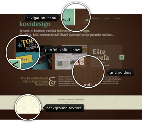
Today’s post highlights the design of KoviDesign.sk by Jan Kovacs. Set on the backdrop of a rich deep brown with a radial highlight and an intricate pattern, the design takes the grid to the extreme by showing the actual grid guider lines on all the pages. The foreground palette of faded ochre, white and desaturated aquamarine is in a perfect harmony with the brown background color, and consistent usage of aquamarine for links / navigation menu rollovers creates a consistent and predictable interaction with the site.
The portfolio slideshow takes the main stage, with a scrollable view that uses consistent colors for the scroller buttons. Click the buttons to see smooth navigation between the portfolio thumbnails. Precise typography used in the header and to the left of the copyright blurb is highlighted by dropshadow effect around the large letters. Browse the rest of the pages to see the consistent usage of these elements throughout the entire site.

Today’s post highlights the design of Kyee.co.uk. A single page design with a clean palette of light gray, sky blue and black places the main emphasis on the portfolio arranged in a precise three-column grid of thumbnails. The section headers use images for high fidelity typography, and all the text sections use a rather unorthodox center alignment. The footer section uses a soothing sky blue noise texture with steel blue foreground elements – texts, separators and icons – with the deep-browns of the coffee cup being the only exception. Note how the global “lit from above” lighting model is preserved in the drop shadows of the designer’s headshot and the inner bevel highlights of the contact form text fields. The legibility of the large text paragraphs in the footer section can be improved by left aligning the text, making the fonts bigger and / or using shorter line length.
Five years ago, on June 28 2005, Scott McNealy has announced that Sun is acquiring SeeBeyond. Along with that acquisition came a private side project that has gathered an immense momentum inside Sun, undergone name rebranding and took an unexpected front stage at JavaOne two years later. One man’s vision, through perseverance and dedication, still lives on to this day. No matter what my thoughts on JavaFX are, I can’t help but respect that.
The original:

The latest:

The differences:
- Fixed “dead” pixel in the bottom right corner of the ribbon band title (to the right of “Clipboard” / “Quick Styles”).
- Using dark color for the separator painted along the bottom edge of the title pane.
- Consistent Y coordinate of the gloss line between the title pane and the taskbar panel (to the right of the round application menu button).
- Fixed “ghost area” in the top-left wedge of the taskbar panel .

