Last Friday we announced a significant update to the Android Market client. A whole slew of features went into this update (and many more are to come), and this week the pixel geek in me will be talking about the new visual design of the application. Here’s a quick recap of the first three posts:
Today i’m going to cover a few miscellaneous bits and pieces. As they say, the devil is in details, and every single bit mentioned in this post is a small step towards improving the user experience and overall aesthetics of the application. I should note that these bits aren’t strictly necessary from the purely functional perspective – and are quite time-consuming to get right. But if you want your app to be less ass and more class, read on.
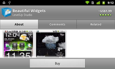
First, let’s take another look at the home screen of the new Market client in the portrait mode:

There’s a whole bunch of visual information that we put in the header section – market-bag icon, market title, search button, carousel, title / rating / price for the fronted app and the navigation buttons. This content can be roughly divided into three sections – the title bar, the carousel and the navigation footer. Following an established UX practice, we want to add some visual separation between the three sections. The separation between the title bar and the carousel is achieved by scaling down and fading thumbnails that are close to the edges. This creates extra vertical space directly below the market-bag icon and the search button. What about the separation between the carousel and the navigation footer?
Here we cannot “rely” on the vertical white space below the outermost thumbnails – that space is negated by a rather long row of views that display the title, rating and price for the fronted app. Instead, the design pushes the middle navigation button down towards the curved header edge. This effectively arranges the navigation buttons along the bottom edge of the container and adds extra vertical space above the middle button. Let’s take a closer look at the actual bounds of these three buttons:

How was this achieved? Here, we extend a LinearLayout with horizontal orientation, giving each button zero width and equal weight. This ensures that the buttons are perfectly placed along the X axis. We don’t override the onMeasure and rely on the parent’s implementation to compute the correct measured width and height. However, we do override the doLayout:
- Call the super implementation so that it can compute the final left and right bounds. We’re not going to change those.
- Compute the height of the curvature area. As mentioned before, this value depends on the pixel size of the screen and is only known at runtime.
- For each visible child button, take two reference points. One is at 25% of its horizontal span, and another is at 75%. For each reference point, compute the matching Y position on the curvature arc. The min of these two Y values will define the bottom bound of the button.
Why choose 25% and 75%? Take a look at the “Apps” and “My apps” buttons in the screenshot above. Each one extends all the way to the container edges, and computing the Y offset based on those would result in unnecessarily high bottom bound. Here you can say – what if the button text is very long and spans the entire button width? There are a couple of other settings at play here – left / right padding and scaling down the text size (will be detailed below) that keep the texts from overlapping the curved arc.
Next up – text scaling. As mentioned in the previous entries, Android devices come in a wide variety of screen sizes and densities. In addition, if you target international markets, you should properly localize your strings. So, unless you want to see your fine-crafted UI looking (say it with me) like ass on a lower end device running under one of the more expressive European languages, you’ll need to make sure that the texts comfortably fit within their intended bounds.
Marking the view with marquee ellipsizing and flipping the selected bit to true is one option. That would enforce auto-scrolling texts that do not fully fit in the padded bounds. This is simple, but quite distracting. If evolution is to be believed, even before our ancestors were hunters, they were prey to large clawed animals. If you detected a suspicious movement in the nearby bushes, you were supposed to run away like a little girl. Or stand there and be eaten like a real caveman. Anyways. Getting back to writing pleasing UIs. User’s eye will be instinctively drawn to scrolling content – which is one of the reasons why we set a relatively large auto-advance interval on the carousel. Now imagine us scrolling the texts on all three navigation buttons at the same time. That’s not really good. They are navigation buttons, not the main content. Unless you’re absolutely sure that this is what you want, you should not marquee anything on the screen. So another option is to scale down the text size based on the available space.
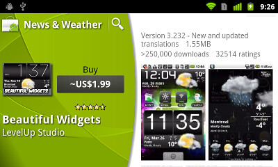
Here is one example:

This is the header section of the new app details screen. We have a nice drop shadow for the thumbnail, the white texts and extra nice vertical alignment of the thumbnail and the control column to its right (both top edge and right edge). If you look closer at the two buttons, you will see that the regular / bold style is not the only difference. The second button also uses a slightly smaller text size to fit the longer string and prevent some of the characters from overflowing into the padding. This is fairly easy to achieve:
- Extend the Button class. In the constructor, call getTextSize() – that would be the default text size, and divide it by the screen density. Store that value.
- In addition, override the onLayout method. The following bullets are relevant to the context of that method.
- Get the measured width and height (for restoring those values later on).
- Starting from the saved text size, call setTextSize() and measure(MeasureSpec.UNSPECIFIED, MeasureSpec.UNSPECIFIED). Assuming that the button is defined to be singleLine, you can now call getMeasuredWidth() to know how many pixels does the button need (including the padding) for the specific text size.
- As long as the measured width is less than available width – use the left and right parameters passed to onLayout, decrease the text size and repeat.
- Once the you found the max text size that makes the text fit in, call setMeasuredDimension to restore the “original” measured width and height.
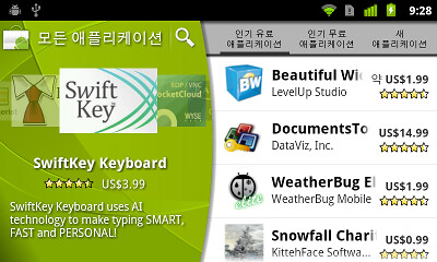
And here’s another example:

Here, we have rather long Korean strings for the tab titles. The algorithm above can be applied here as well to scale these strings to completely fit on one line, but the end result will be quite unreadable. Instead, the tabs allow two lines of text, and the algorithm is slightly different:
- Call setMaxLines(2). Call setLayoutParams with a LayoutParams set to WRAP_CONTENT on both axes.
- Now you want to compute the two-line height of the view given the specific width limitation and see whether it fits in the available height. This will also cover the case where the text can completely fit on one line with the starting text size. Call measure passing the MeasureSpec.makeMeasureSpec(availableWidth, MeasureSpec.EXACTLY) for width and MeasureSpec.UNSPECIFIED for Y. Now call getMeasuredHeight() and compare to the available height. If it fits, you’re good to go. Otherwise, proceed.
- Now call setMaxLines(10). This is an arbitrary setting, but it’s important that the value is larger than 2.
- Starting from the initial text size, call measure with the same values as above. Check two conditions – that the measured height is less than the available height and that getLineCount() is at most 2. The second condition will prevent displaying more than two lines of text – even if three (or more) will fit in. Here, we prefer to show two lines at a smaller size than three lines at a larger size – to maintain visual balance across all three tabs that may have radically different text lengths for their titles.
Now let’s talk about padding. In landscape orientation we display content side by side – the carousel / overview go on the left, and the vertical listing goes on the right. Here is an example of such layout:

We want to prevent the curved right edge of the info section from partially hiding some of the content in the vertical column to its right. This can be achieved by setting the left padding based on the horizontal span of the overlapping area. As mentioned before, we want the section headers (fading vertical gray gradient) to fully extend below the arc – effectively preventing us from setting the left padding on the entire column. This means that we set the left padding on each child view. However, some of the child views may have their own left padding defined in their layout XMLs – for purposes of balance, alignment or hierarchy.
Our first attempt was to call getPaddingLeft(), add our extra padding and then call setPadding(). Surprisingly simple, but not quite working. The layout pipeline can make several passes at measuring and laying out the views, and if you add extra padding on each such pass, you will end up with too much padding. There’s a simple workaround:
- Create a res/ids.xml file and add an item with type=”id” and some name and recompile your project. You should have the new R.id.yourName constant.
- Every time you need to tweak the padding, call getTag(R.id.yourName) and check if it’s null. If it is, get the current left padding and store it with setTag. If it is not null, then the current tag value is the original left padding.
As with everything else, adding animations should be done with restraint. It’s very easy to go over the top and make everything pop, scroll, slide, fly, cross fade and in the process cause great deal of misorientation, distraction and frustration (which, unless you’re selling shady prescription-only drugs or cheesy wedding videos is not a good thing). In the new Market client you should see only two types of non-user-initiated animations: auto-advance on the carousel and marquee scrolling of long app titles. The auto-advance is scheduled to run every 20 seconds, and is bumped to 40 seconds once the user starts interacting with the carousel. It goes down to 20 in decrements of 2 as long as there is no user interaction. This allows us to show that there is more than is currently visible without overloading the screen too much. Long app titles should be scrolled in order to see the full application title without going to the details page.
However, some aspects of the new UI deserve an extra dynamic facet to guide the user through the complete flow.

This is how the new application details page looks in landscape mode. Note the “More” button in the description section. Application descriptions can be quite long (especially with the newly added “recent changes”). The long descriptions effectively push the screenshot section down and result in a large amount of text displayed on the screen by default. Our interaction designers felt that the screenshot section deserves to be at least partially visible above the fold, with the description section collapsed by default to three lines. Note the nice fade-to-white transition on the last line of the description section, hinting that there is more content, and ending in the “More” button. Tapping the button expands the description to show the full contents – in a nice and smooth transition. We felt that this short (around 300ms) transition helps to guide the eye between the two views without being too annoying (==long).
The implementation is quite simple and works well even on older devices going all the way back to 1.6 (looking at you in disapproval, Streak). The vertical column on the right is a LinearLayout with vertical orientation. When the “More” button is tapped, we initiate an animation. On every animation callback, we call getLayoutParams() of the description view and change the height attribute based on the current animation position. This is followed by calling requestLayout(). The framework takes care of the rest – detecting that the child view layout params has been modified and going to the parent (our LinearLayout) to re-layout all its children.
The same transition sequence happens when you click the price button in the info section. The content on the right is replaced with the permission list which slides from the top edge, guiding the user’s eye to connect the tapping of the button and the content change on the screen.
There’s a whole lot more going under the hood and this has been just a small glimpse into the redesign of the Android market client which has been a truly collaborative effort across our designers, developers, testers, dev rel, product management and the guy sitting in the basement with his red stapler. If you’re interested in joining us and seeing your app user base growing by 300,000 people every day, let us know.


Today’s post highlights the design of JBrewer.me by Joshua Brewer, co-creator of 52 Weeks Of UX. A minimal single-page design that fits the entire content above the fold and uses a clever graphic illustration to further reinforce the main tagline. A denim-style slightly worn out pattern is a perfect background for the illustration, and clean typography highlights the austere two-column grid and ample white space.
Last Friday we announced a significant update to the Android Market client. A whole slew of features went into this update (and many more are to come), and this week the pixel geek in me will be talking about the new visual design of the application. Today it’s time to dive into the mechanics behind the swooshy header. The new green header is used in all Market client screens, creating visual continuity throughout the various browsing and purchasing flows. It has a whole bunch of different gradients and highlight streaks, but there’s one important thing to notice – the visuals are the same no matter the size of the header or the orientation of the device. Here is the new header in home screen under portrait mode:

And here is the header of the same screen under landscape mode:

Note how the long diagonal highlight streak that starts around the top-left corner and goes towards the bottom-right corner always intersects the curved edge – bottom in portrait and right in landscape. Let’s see the header in the portrait category listing page:

There are a couple of things worth noticing. First, the visual design maintains the connection to the main browsing pages by adding a curved bottom edge to the tab strip. Second, note how the main header visuals are maintained here without being vertically squished. The long diagonal highlight streak still intersects the curved edge, but much closer to the left edge, and you don’t even see the double converging highlights that run in the bottom part of the taller header. And here is the same header for search results (also used in my apps and all the purchase pages):

With even less height, squishing the full visuals would look very bad; instead, we only show some of the highlight streaks.
And now the fun part – how is this implemented? It’s highly recommended to always consider using nine-patch images as your first choice. It allows you to separate the visual styling from the application functionality, skin controls of different sizes in a consistent manner and take advantage of hardware acceleration (when available) since the vast majority of the system controls are styled using nine-patches. Is this what we’re currently using for the new Market client? No. Let’s see why.
Nine-patches are great if you have visual areas that are “stretchable”. Take a look at the images in the official documentation:
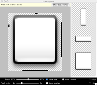
Nine-patch is just a 3*3 grid. The four corners are not scaled at all and are well-suited for rounded corners and varying drop-shadows. The top and bottom pieces are stretched horizontally, while the left and right pieces are scaled vertically. Finally, the center piece is scaled along both axes. This means that if you place any non-linear gradient or path in one of the non-corner areas, it will be stretched. Looking back at the target visuals of the new green header, you can see that there is nothing that can be stretched without ruining the visual appearance. While you can stretch most of the gradients, what about the highlight streaks? Scaling them up or down would result in blurry or pixelated paths. What about the curved edges? As mentioned in the first installment, the actual arc curvature depends on the pixel size of the screen, and scaling a curved anti-aliased path would result, once again, in either blurry or pixelated visuals. Less ass than what we had before, but ass nonetheless.
So instead, we’re drawing the new header visuals in code. There are no images, just a whole bunch of trigonometry, geometry and a few selected Canvas calls. The next screenshot shows a rough analysis of the swooshy header

Here we identify a number of different areas, each one with its own contour and gradient, and a number of highlight streaks, each with its own path, thickness and gradient. I could probably write another 3-4 blog entries documenting all the pixel-level details of the implementation; join the team to see the code. Just a few points worth mentioning:
- Never ever ever allocate new objects in your custom layout or draw methods, especially if you’re doing any type of animation. Allocating lots of small objects makes garbage collector sad and your animations jerky.
- Call setWillNotDraw(false) in the constructor of your custom view group that implements the onDraw(Canvas). Otherwise your custom drawing will not be called. If your custom view does not extend the ViewGroup, no need to call this method.
- Canvas.clipPath(Path) is your friend for any non-trivial custom painting code. Surround it with Canvas.save() and Canvas.restore() so that you don’t need to worry about subsequent graphic calls on the Canvas object. But make absolute sure that they match – if you call Canvas.restore() one too many times, it will affect the visual appearance in most unpredictable ways. You can also use a more reliable Canvas.restoreToCount() – thanks to Romain for the tip.
- If your clip path contains diagonal lines or arcs and you then call Canvas.drawPath when the paint style is FILL, you will end up with aliased edge (diagonal or curved). Instead, you will need to compute the clipped path yourself (brush up on your trig). Don’t forget to call Paint.setAntiAlias(true). This may be less noticeable on higher-density screens such as Droid X or Nexus S, but is extremely visible on lower end hardware such as G1 or Flipout.
- Drop shadows that follow custom paths are tricky. Our design calls for a translucent drop shadow that follows the curved arc. After trying a number of options, with Paint.setShadowLayer and RadialGradient among them, the most performant one turned out to be drawing a series of arcs. The arcs start from the thickest stroke with the lowest alpha and progress towards the thinnest stroke with the highest alpha. There is no best option that fits all requirements. It depends on the specific visuals that you’re looking for and how heavy the performance aspect of each specific implementation is.
- Gradients that use translucent or transparent colors should use the RGB values that match the background color (more info here).
- Don’t use direct pixel values. Multiply all such values by the Context.getResources().getDisplayMetrics().density.
- Don’t use hard coded colors. Extract them to res/colors.xml and load them once with Resources.getColor().
- Math is your friend. Don’t be afraid of it.
- Never ever ever allocate new objects in your custom layout or draw methods, especially if you’re doing any type of animation. Allocating lots of small objects makes garbage collector sad and your animations jerky.

That’s it for today. Tomorrow i’ll talk about various random bits and pieces.
Last Friday we announced a significant update to the Android Market client. A whole slew of features went into this update (and many more are to come), and this week the pixel geek in me will be talking about the new visual design of the application. After talking about custom layouts and overlapping non-rectangular components, it’s time to talk about organizing visual information on landscape orientation. It is rather unfortunate that the vast majority of application designers and developers do not spend time optimizing the user experience for wide screens and just port the “default” portrait layout. Let’s take a look at the old home screen of the Market client:
I’ll spare my actual thoughts on this screen, but it looks like ass. From top down:
- Way too much vertical space for the header. The icon is unnecessarily large, the font looks a little dated and the search button just hangs in mid-air.
- The Apps / Games / Downloads look like tabs, but are not actually tabs. Tapping one of these moves to a different screen that shows the relevant content.
- The three-pane promo widget takes almost half the screen height and is a usability disaster. Not only the user cannot swipe to the previous / next triplet. The worst thing is that tapping on the specific thumbnail does not take you to the details of the app. Instead, it takes you to the category of the app, and then you need to “hunt down” the matching row.
- With all this vertical space taken, the actual list of featured apps is not even visible – besides the header, that is.
And here how the landing page of the new Market client looks like in landscape mode:

Here, we’re putting the user in control. The screen has now two sections – the carousel + extra controls and the list of featured apps:
- The main title bar (with the search button) does not extend the full screen width and leaves enough vertical space to show full four rows of featured apps.
- The carousel allows swiping to both sides so that you can go to the previous app even after auto-advance animation kicks in and advances the carousel.
- We have enough vertical space below the carousel to show the title, price and rating of the fronted app – leaving enough white space to separate the carousel from the navigation buttons below.
- The navigation buttons now look like actual buttons. They support traversal with D-pad / trackball and show correct highlight outlines on focus and press.
- The list of featured apps spans the full screen height and shows full four rows on the “common” hardware configuration (Nexus-type screen size / density). I personally thing that making each row more narrow is a usability improvement as the price / rating is closer to the app title / developer name.
Next, let’s look at the top-level category listing in the old client:
This one is a tad more usable, with two full rows of categories visible. Of course, the fat title bar is still there, and the promo switcher takes the whole screen width and has a whole bunch of unbalanced white space around it. In addition, there’s a whole lot of white space to the right of each category row. Let’s see how this screen looks in the new client:

Preserving the overall layout of the home screen, the promoted apps are now displayed in a carousel. The user is no longer at the mercy of promo switcher – swiping is fully supported, and if auto-advance animation is too fast, you can always swipe back (and we actually increase the auto-advance interval once the user starts interacting with the carousel). We also have enough vertical space to show not only the promo description, but also the title, rating and price for the fronted app. And since the category list spans the full screen height, we can fit full five rows, and a much taller scroll window.
Next up – the app listing of the specific category. Here is the old client in all its glory:
Tabs are actually tabs for a change, but all the rest is still ass. Let’s see how this screen looks in the new client:

As on the previous screen, the promoted apps are in an interactive carousel. The tabs are now much lighter and don’t command too much visual attention. Personally i also like that the tab texts are closer and don’t have too much space between them. And we have enough vertical space to show full four list rows, with a much taller scroll window.
Finally, let’s see the app details page in the old client:
What can i say? Fat title, fat tabs and fat button bar take so much vertical space that the actual content has less than half the screen height to view and scroll. This screen is by far the worst usability offender as far as the content perusal goes. Let’s see how this screen looks in the new client:
Preserving the same top-level organization, the top-level information on the app is displayed to the left – along with the action buttons to install, buy, update or uninstall the app. The rest of the information is displayed to the right, providing the full screen height for comfortable skimming and scrolling. There’s definitely room for improving the visual arrangement and balance of the app info in the left side – remember that we’re not done yet :)
Android devices come in all shapes and sizes, and we strongly encourage the application developers and designers to invest extra effort in addressing usability aspects of landscape orientation. This does not mean that you should fill every single white area with yet another control. But you shouldn’t be blindly forcing the portrait-optimized layout either. And of course, don’t forget the “small” details such as different screen sizes, resolutions or localization. Here is just a small example from the new Market client:
This is running under Korean which has rather long translations for “top paid”, “top free” and “just in”. At runtime, we dynamically find the largest font size that can fit at most two lines of text in the specific tab button. All buttons have exactly the same width and the layout enforces the middle button to be aligned with the horizontal center of the tab strip. Finally, the tab strip itself has custom left padding that pushes it “away” from the curved arc, while the light gray background extends all the way below the arc. You know, pushing pixels :)
That’s it for today’s installment. Tomorrow i’m going to talk about custom drawing and the green swooshes on the new title bars and carousels.
